I have spent a lot of time looking at healed color tattoos, and one pattern is hard to miss. Color is not a decoration you add at the end of a tattoo — it is a structural decision that changes who you should book, how big the piece needs to be, and how it will look in fifteen years.
Black and grey forgives a lot. Color does not. A muddy blend or an underpacked pastel shows up in the healed photo, not the fresh one, which is why so much of the color work that looks incredible on Instagram looks tired two years later.
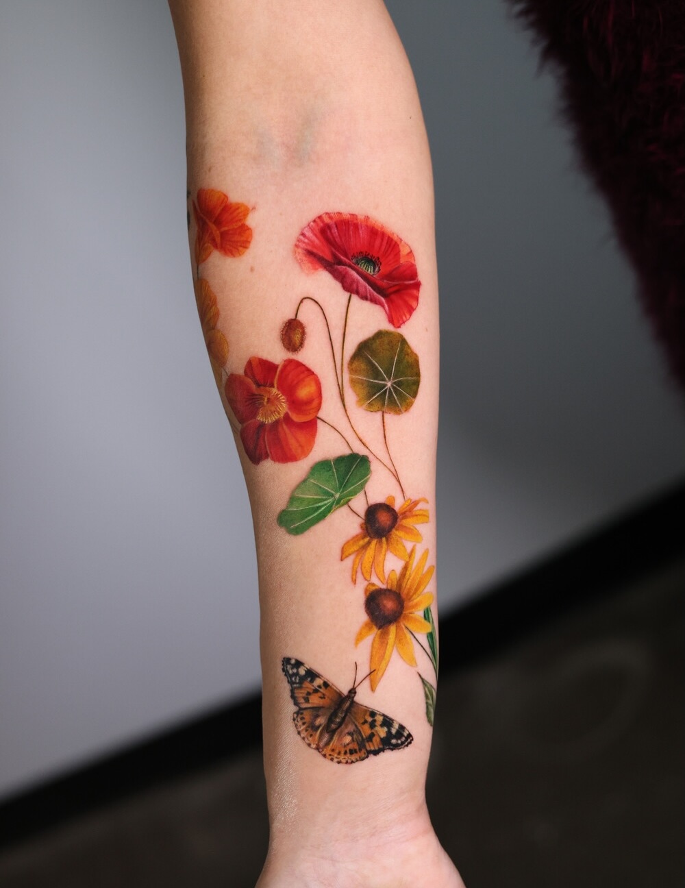
That is not an argument against it. The best color tattoos I have seen are the most striking things anyone in the room is wearing, and nothing in black and grey competes with a well-executed floral half sleeve in full color.
These 20 ideas are for women who want color that is deliberate rather than default — plus what I have learned about which styles hold and which ones ask more of you.
Which Color Style Is Right for You?
The four color styles below behave very differently once healed. This is the comparison I wish someone had shown me before my first color consultation.
| Style | Outlines | Minimum size that works | How it tends to age | Best for |
|---|---|---|---|---|
| Neo-traditional | Bold black | Palm-sized | Very well — the outline holds the shape as color softens | A first color piece, or anyone prioritising longevity |
| Color realism | None | Hand-sized or larger | Softens noticeably; needs size and a specialist | Single large subjects on shoulder, thigh or back |
| Watercolor | Minimal or none | Hand-sized or larger | Least predictable — soft edges blur further | Abstract subjects where soft edges are the point |
| Flat / graphic color | Fine or heavy black | Coin-sized | Excellent — solid packed fill is the most durable option | Geometric, stained glass, illustrative and bold work |
What Actually Affects How Color Heals
Color tattoos read differently on different skin tones, and this is the first conversation to have rather than the last.
Light pigments — pastels, whites, soft yellows — can go faint on lighter skin and often will not read at all on deeper skin tones. Bold saturated colors like deep red, electric blue and forest green typically read strongly across a much wider range.
Ask to see the artist’s healed work on skin similar to yours, not their freshly-wrapped work. In my experience that single request separates artists who genuinely understand color from artists who photograph it well.
Sun exposure does more damage to color than time does. The American Academy of Dermatology recommends keeping a healed tattoo covered or protected with sunscreen, and for color work that advice is the difference between a piece that holds and one that goes flat.
Placement matters too. Hands, feet and anywhere with high friction or frequent sun turn over skin faster, and color on those areas generally needs touching up sooner than color on an upper arm or thigh.
It is also worth knowing that tattoo pigments are not approved by the FDA for injection into skin, and reactions — though uncommon — are reported more often with color inks, particularly reds. If you have sensitive skin or a history of pigment reactions, raise it with your artist and, if in doubt, a doctor before you book.
20 Colorful Tattoo Ideas for Women
Each of these has been chosen because it genuinely needs color — not because color was added to a design that would have worked in black and grey.
1. Watercolor Botanical Sleeve
A half or full sleeve in watercolor technique: botanicals in soft, bleeding washes of color with little or no black outline. Flowers, leaves and vines in pinks, corals, greens and blues that run into each other as if painted on wet paper.
The botanical content gives the piece structure while the watercolor treatment keeps it fluid and painterly. The sleeve at the top of this article is the version of this idea I keep coming back to.
The honest caveat is that unoutlined watercolor is the least forgiving color style there is. In my experience it needs an artist who deliberately builds in enough pigment density to survive a decade, not just to photograph well on day one.
2. Neo-Traditional Floral Forearm
Flowers in neo-traditional style: bold outlines, saturated color, slightly exaggerated petal proportions. Roses in deep reds, peonies in coral and pink, leaves in two or three separate greens.
The heavy outline is the whole point. It holds the shape as the color softens, which is why neo-traditional tends to be the most reliable color style over twenty years.
**If you want color that still reads clearly in middle age, this is the safest bet on the list.** Every artist I have asked about longevity has said some version of the same thing: outlines buy you time.
3. Vivid Butterfly Collection
Rather than one butterfly, a scattered collection of three to six, each in a different palette: a blue morpho, a monarch in orange and black, a swallowtail in yellow.
The collection format lets you add over years, which spreads the cost and the sitting time. I have seen people start with two and finish a forearm five years later.
There is a wide range of symbolism attached to these designs, and our guide to butterfly tattoo ideas covers the variations in more depth.
4. Color Realism Peony
A single large peony rendered in color realism: dozens of blended values, petals that turn from white through blush to deep coral, with real depth in the shadows.
Realism needs size. When I have seen color realism attempted small, the blends collapse into mud within a few years because there is no room for the transitions.
Budget for a large placement — shoulder, thigh, upper back — and expect multiple sessions. A single peony of this quality is rarely a one-sitting piece.
5. Watercolor Galaxy
Deep purples, blues and magentas bleeding into each other with white or light highlights for stars. The galaxy subject suits watercolor better than almost anything else because nebulae genuinely do have soft, undefined edges.
The design is abstract enough to fit any shape of space, which makes it a good filler between existing pieces.
One practical note from experience: the white highlights are the first thing to go. Treat them as a bonus rather than the structure of the design.
6. Tropical Bird of Paradise
Bird of paradise flowers in their real palette: orange bracts, electric blue tongues, deep green foliage. The plant is already so saturated that you barely need to exaggerate it.
This is a strong pick if you want color that looks intentional rather than decorative, because the color relationships come from nature rather than from a mood board.
It works especially well at scale on a calf or outer thigh, where the long vertical shape of the bloom has somewhere to go.
7. Geometric Color Blocks
Flat blocks of color inside geometric shapes: triangles, arcs and bars in teal, mustard, rust and dusty pink, often with a fine black line separating them.
Because the color is packed solid rather than blended, this style tends to hold up unusually well. Flat saturated fill is the most durable way to wear color.
**The risk here is trend, not technique** — a muted mid-century palette is very much of a moment, and it may date faster than the ink fades.
8. Japanese Koi in Color
A koi in the traditional Japanese palette: orange and white, or red and black, with blue water and green lotus leaves around it.
Japanese tattooing has a long-established color vocabulary, which means an artist working in this tradition already knows exactly which pigments heal and hold in this combination.
Direction matters in this style — koi swimming upstream and downstream carry different readings. If that appeals, our koi fish tattoo drawings guide goes through the composition conventions.
9. Surreal Floral Portrait
A portrait where the face dissolves into flowers, or flowers grow from where hair should be, rendered in realistic color but composed impossibly.
Surrealism gives you the technical payoff of realism without the burden of resembling a specific person, which is usually the hardest part of portrait work.
In my experience this is the single hardest style to shop for. Look for an artist whose portfolio has several surreal pieces rather than one, because the composition is as much of a skill as the shading.
10. Color Realism Hummingbird
A hummingbird in color realism: the iridescent green and ruby of a ruby-throated, or the vivid blues of a tropical species.
Natural iridescence is a gift to a color realist, because it justifies putting five or six hues into a single wing without it looking arbitrary.
Scale is the trap. Hummingbirds are small birds and people commission them small to match, which is exactly when the iridescence blurs. See our hummingbird tattoo ideas for placements that give the detail room.
11. Rainbow Mandala
A mandala worked in full spectrum color, each section in a different hue progressing around the circle — effectively a color wheel in mandala form.
The geometry does the heavy lifting, so the piece still reads as ordered rather than chaotic even with every hue present.
Symmetry is unforgiving here. I would only take this to someone whose mandala work is visibly clean in healed photos, not just fresh ones.
12. Botanical Illustration Style
Flowers drawn the way a nineteenth-century botanical plate would draw them: fine accurate linework, restrained naturalistic color, sometimes the Latin name in small script beneath.
The palette here is quieter than anything else on this list, which is exactly why it ages gracefully. Muted greens and dusty petals do not have far to fade.
**This is the style I recommend most often to people who are nervous about color** — it delivers color without committing you to saturation.
13. Vividly Colored Snake
A snake rendered in colors no real snake has: emerald and gold, coral and turquoise, scales picked out individually in two or three values.
The long winding form is one of the best shapes in tattooing for wrapping a limb, so it solves the composition problem before you even start on color.
The imagery carries real weight in several traditions — our piece on snake tattoo meaning is worth a read before you commit.
14. Wildflower Meadow Thigh
A band or panel of mixed wildflowers across the thigh: poppies, cornflowers, cosmos, daisies, grasses, in a palette that reads as one meadow rather than a row of individual flowers.
The thigh gives you the width this idea needs. Squeezed onto a forearm the flowers start competing instead of blending.
It is also one of the easiest pieces to extend later, which is why I have seen so many of them grow into full leg work. More options in our guide to floral thigh tattoos.
15. Stained Glass Effect
Heavy black leading lines dividing panels of saturated jewel color, exactly like a church window. The subject can be anything: a flower, a bird, a saint, a geometric rose window.
Structurally this is the most durable idea on the list. Thick black lines plus flat saturated fill is the combination that survives decades.
Design it knowing the black will spread slightly over time. In my experience the leading should start a touch thinner than looks right on paper.
16. Color Realism Cherry Blossom
Cherry blossom branches in soft pink realism: petals in three or four pink values, dark brown branches, a few petals falling away from the main cluster.
The pale pink is the honest weak point. Soft pastels are the first pigments to lose definition, and on very light skin they can read as almost nothing within a few years.
The fix most artists use is to anchor the piece with dark branch work so there is always contrast holding the composition together.
17. Neon Jellyfish
A jellyfish in electric blues, magentas and purples with trailing tentacles, often with a glow effect around the bell.
The trailing form is enormously useful for filling awkward vertical space — a spine, a calf, the back of an arm — because the tentacles can be lengthened to fit.
Bright cool pigments like these need proper sun protection for the rest of their life. UV is the main driver of color fade, more than time itself.
18. Painted Rose with Dripping Color
A rose rendered as if painted, with color running and dripping off the form, visible brush texture and edges that deliberately do not line up with the drawing.
It is a good compromise if you like watercolor’s looseness but want a recognizable subject holding it together.
Ask to see healed photos of the drips specifically. Thin trailing lines of color are among the first marks to soften, and they are the part that makes this design work.
19. Color Realism Succulents
Succulents and cacti in realistic color: sage greens, dusty purples, the pink flush at the tips of an echeveria, occasionally a bright bloom.
The palette is naturally muted, so you get the depth of realism without the saturation risk of, say, a tropical bird.
The geometric rosette shape also suits round placements well — the inside of a forearm, a shoulder cap, the back of a calf.
20. Full Back Color Piece
A full back piece in color: florals, figures, landscape or Japanese, using the largest single canvas the body offers.
This is a multi-year commitment measured in dozens of hours, and the colorwork usually comes last, after the linework and black shading are settled.
Choose the artist before you choose the design. I have never seen a good back piece that started as a fixed picture; they are all conversations. Our back tattoo ideas for women gallery shows the range.
Lower-Commitment Ways to Wear Color
If a full color piece feels like too much for a first step, there are smaller versions of the same idea.
Color Accents on Black and Grey
A black and grey design with a single color element — one red poppy in a grey bouquet, a gold halo, a blue eye. You get the impact of color with a fraction of the saturation risk.
This is what I suggest most often to people who are genuinely undecided, because the black and grey structure still carries the piece if the accent fades.
Muted and Desaturated Palettes
Sage, terracotta, dusty rose and ochre rather than primary saturation. Because these tones start closer to skin, the visual change as they soften is far less dramatic.
One Small Test Piece First
A single coin-sized flat color design somewhere easy to cover, lived with for a year, tells you more about how your skin holds pigment than any amount of research.
It is the cheapest possible way to find out that you are one of the people whose yellows disappear.
Fine Line Color
Delicate linework with light color fill. Worth knowing up front that fine line work of any kind usually needs touch-ups sooner than bolder styles, and adding light color does not change that.
Aftercare That Actually Protects Color
The healing period is when a color tattoo either keeps its saturation or quietly loses a chunk of it.
Follow your artist’s specific instructions over anything you read online, including this. They know what ink and what technique went into your skin.
That said, the consistent advice across every artist I have asked is the same: keep it clean, keep it lightly moisturised rather than smothered, do not pick, and keep it out of pools, baths and direct sun until it is fully healed. Our guide to using Aquaphor for tattoo healing goes through the moisturising step in detail.
After it heals, sunscreen is the whole game. Daily SPF on exposed color work is the single highest-return habit for keeping a piece looking like it did in month two.
If you see spreading redness, swelling, heat, pus or a fever, or a raised itchy reaction confined to one specific color, stop treating it yourself and see a doctor. Allergic reactions to color pigment are uncommon but real, and they are not something to manage with advice from an article — the Mayo Clinic has a plain-language rundown of the risks worth reading before you book.
Common Mistakes — and What to Do Instead
The mistake I see most often is booking a color piece with a generalist. Color is a specialism, and a brilliant black and grey artist is not automatically a brilliant color artist.
The second is going too small. Almost every disappointing color tattoo I have looked at was a design that needed twice the space it was given.
The third is judging an artist on fresh photos. Fresh color always looks spectacular. Ask specifically for work photographed at one year or later, and be a little suspicious if none exists.
The fourth is treating color as finished. Most color work benefits from a touch-up at some point, and budgeting for that from the start makes it a maintenance plan rather than a disappointment.
Still Not Sure Where to Start?
If you like the idea of color but have no fixed subject yet, browsing by placement tends to be more useful than browsing by style. Our half sleeve ideas for women collection is a good place to see how color behaves across a larger composition.
Frequently Asked Questions
Do colorful tattoos fade faster than black and grey?
Generally yes, though it depends heavily on which colors and which style. Black pigment is the most stable, while light pastels, whites and yellows tend to lose definition soonest. Bold saturated colors and solid packed fill hold up far better than soft unoutlined blends. Sun exposure accelerates all of it, which is why two identical tattoos can age completely differently.
Do color tattoos hurt more than black and grey?
Color packing often feels more intense, mainly because saturating an area means going over the same skin repeatedly rather than because color ink is different. Large color pieces are also usually longer sessions, so fatigue becomes a factor. Most people I have spoken to describe it as more tiring rather than sharper. Eat beforehand and tell your artist when you need a break.
Will color show up on darker skin?
Yes, but the palette needs to be chosen for it. Deep saturated colors — rich reds, blues, greens, oranges — read strongly on deeper skin tones, while pastels, whites and very light yellows often will not. The important step is finding an artist with healed portfolio work on skin like yours, since that is the only real evidence of how their color choices behave.
How much more does a color tattoo cost?
Color work usually costs more than the same design in black and grey because it takes longer, often across multiple sessions. Pricing is normally hourly rather than by color, so the real driver is sitting time. Ask for a session estimate rather than a flat quote, and factor in a possible touch-up later.
Can a color tattoo be covered up or removed later?
Cover-ups with color are possible but constrained — the existing pigment limits what the new design can be, and darker colors are easier to work over than lighter ones. Laser removal of color is harder than removal of black, since different pigments respond to different wavelengths and some, such as certain greens and blues, are notably stubborn. Speak to a qualified laser practitioner rather than assuming anything is straightforwardly reversible, and never attempt DIY removal.
Quick Summary
- Color is a structural choice, not a finishing touch — it changes the artist, the size and the aftercare you need.
- Neo-traditional and flat graphic color are the most reliable styles over decades because black outlines hold the shape.
- Color realism and watercolor need real size; shrink them and the blends collapse.
- Judge an artist on healed photos at a year or more, never on fresh work.
- Bold saturated colors read across the widest range of skin tones; pastels and whites are the least predictable.
- Daily sunscreen on healed color work does more for longevity than anything else you can control.
- Budget for a touch-up from the start and color becomes maintenance rather than disappointment.
- If you are unsure, start with a color accent on black and grey, or one small test piece.