Most tattoo subjects announce themselves. A rose is a rose, a skull is a skull, a wolf is a wolf. Abstract tattooing throws that certainty out and asks you to respond to line, colour and composition instead of subject matter.
I have spent a lot of time looking at abstract work in portfolios, and the thing that separates the good from the forgettable is almost never the idea. It is the artist’s confidence with a mark.
Abstract pieces also behave differently over a lifetime. There is no “wrong” way for them to age into, because there was never a literal thing they were supposed to look like. That is a quiet advantage most people do not think about at the consultation stage.
Below are 20 directions worth considering, grouped by the visual problem each one is solving. If you are still working out where abstract sits relative to everything else, our overview of tattoo styles explained is a useful map to read alongside this.
Which Abstract Approach Is Right for You?
Abstract is not one style. These four families ask very different things of you and of your artist.
| Approach | What it looks like | Best if you | Ageing outlook |
|---|---|---|---|
| Gestural / painterly | Brushstrokes, splashes, loose expressive marks | Trust the artist’s hand more than a drawing | Good — soft edges were the point |
| Pure colour | Washes, gradients, colour fields, no outline | Want mood rather than image | Hardest — needs strong saturation and sun care |
| Geometric abstraction | Circles, polygons, precise line grids | Like order, structure and clean repair-free lines | Strong — but thin lines will soften |
| Deconstruction | A face, flower or object taken apart | Want something half-readable, half-puzzle | Good with black-heavy anchoring |
What Actually Makes a Tattoo Abstract
Abstraction is a spectrum, not a switch. At one end sits work that is loosely interpretive — a flower that does not quite behave like a flower. At the other sits fully non-representational work with no subject at all.
The art-historical vocabulary is genuinely useful here. Tate’s plain-language definition of abstract art is a better shared reference point at a consultation than a folder of screenshots.
The practical difference is that abstract work cannot be approved in advance the way a traditional design can. You are approving a direction and a person, not a line drawing.
In my experience that is where most abstract consultations go wrong. The client arrives expecting a stencil to sign off on, and the artist arrives expecting a conversation.
It also changes what “well executed” means. Judge an abstract piece on composition, on how it sits with the muscle underneath, and on whether the marks look decided rather than hesitant.
20 Abstract Tattoo Ideas Worth Considering
1–3. Gestural Mark-Making, Ink Splashes and Expressionist Strokes
The first family is the loosest. A single confident brushstroke in black, executed with the immediacy of calligraphy or ink wash painting, is not a picture of anything — the speed, the thickness variation and the direction are the whole content.
An ink splash or splatter is the same instinct pushed further: irregular edges, a solid centre, fine drops flying outward. The paradox of a permanent mark that reads as an accident is the entire concept.
Expressionist mark-making stacks several of those gestures at varying weights and directions until the composition feels emotional rather than designed. The marks are made, not placed.
Ask to see a portfolio where the artist has clearly drawn rather than traced. When I have looked at gestural work up close, the tell is always the tapered end of a stroke — a hesitant taper means the artist was copying a shape rather than making one. Tate’s summary of abstract expressionism is worth skimming if this family appeals.
4–6. Colour Fields, Watercolour Washes and Pure Gradients
Here colour stops describing a thing and becomes the thing. Colour field patches are irregular islands of pigment with no outline and no defined shape — blues bleeding into purples, the bare skin between them doing as much work as the ink.
A fully abstract watercolour tattoo takes that further: loose washes, no line definition, no narrative. Just how hues move into each other at their edges.
The most extreme version is a gradient alone — one hue transitioning to another across a stretch of skin, with no form or line at all. It looks like the easiest tattoo on this list and it is close to the hardest.
This family is the least forgiving over time. Unanchored colour with no black to hold it usually softens faster than linework, and sun exposure accelerates that. Every artist I have asked about outline-free colour has said the same thing: pack it saturated, keep it out of the sun, and expect a touch-up eventually.
7–9. Deconstructed Portraits, Flowers and Partial Dissolves
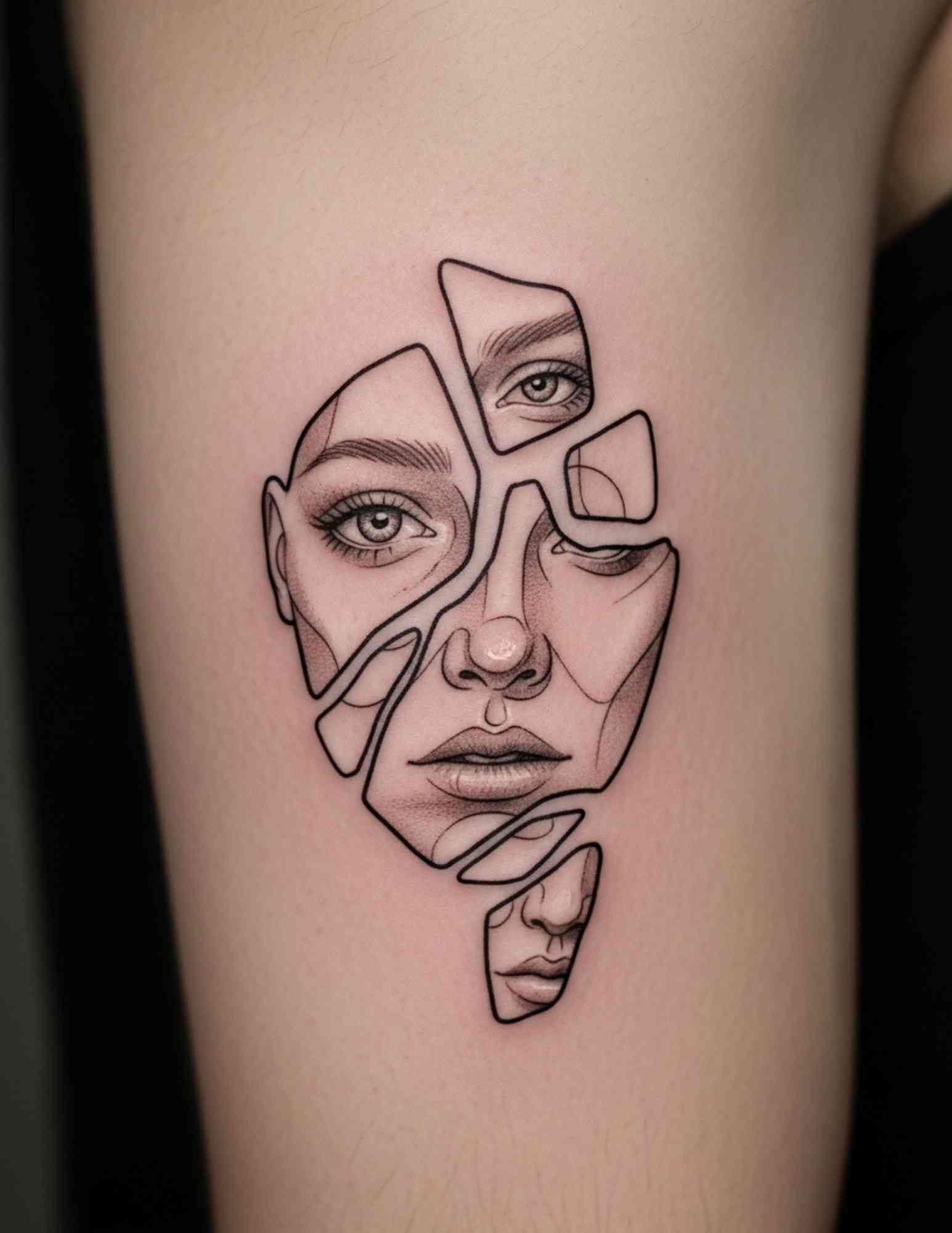
Deconstruction keeps a recognisable subject but refuses to assemble it properly. A face is broken into non-contiguous fragments — features present, but displaced, overlapping or rotated.
The floral version scatters the petals of a rose or peony out of their natural arrangement. You register “flower” a half second late, and that delay is the design.
A third variation keeps one realistic element — a single eye, a jawline, a hand — and lets the rest dissolve into geometric or painterly forms. Presence and disappearance sharing the same square inch of skin.
Deconstructed work needs black to survive. When I have compared healed examples, the pieces that still read clearly at five years are the ones with real black anchoring the fragments; the all-grey ones tend to blur into a smudge.
10–12. Geometry, Pure Line Composition and Architectural Fragments
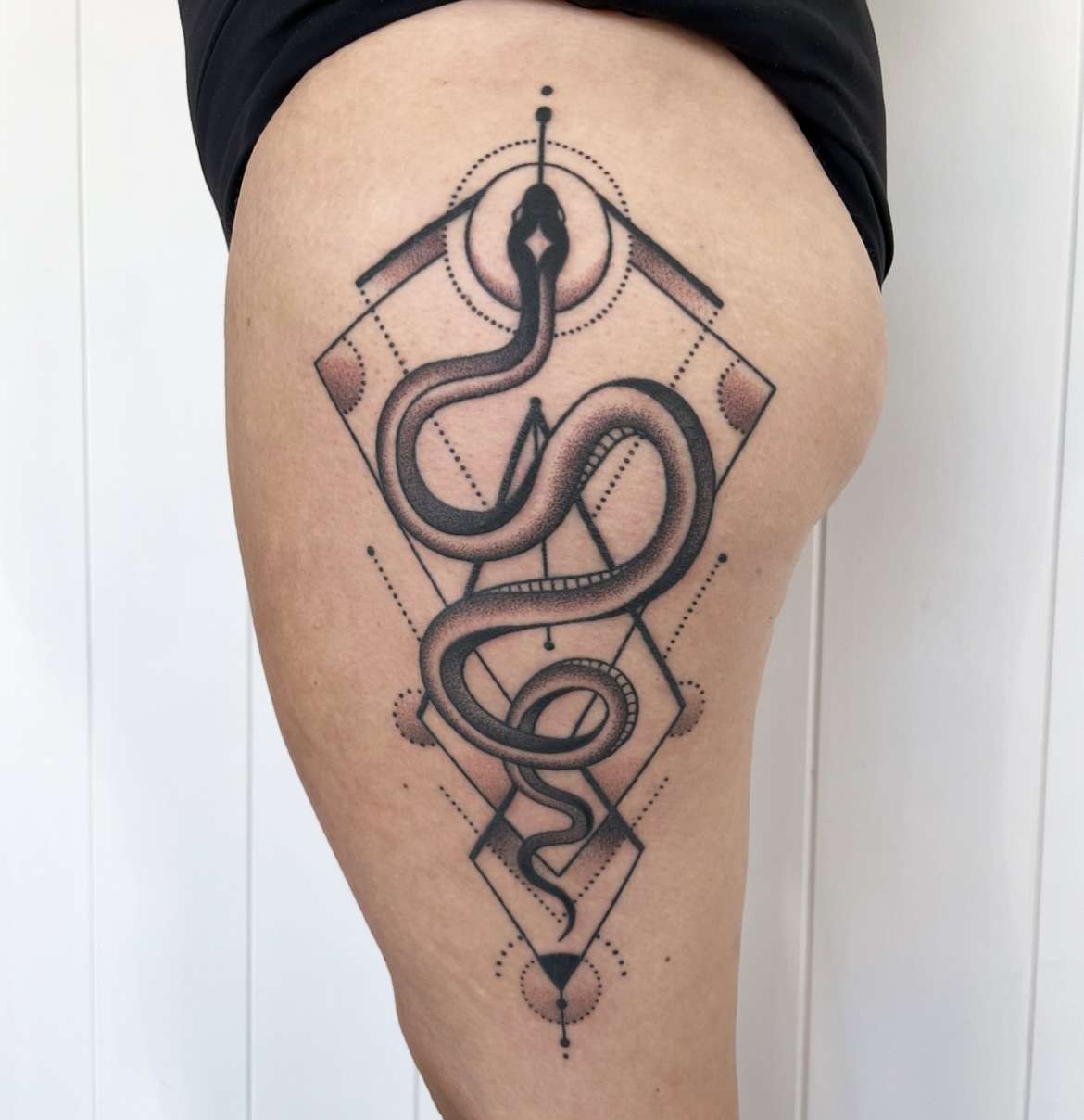
Geometric abstraction uses circles, triangles and nested polygons for visual harmony rather than symbolic meaning. It borrows the vocabulary of sacred geometry tattoos while deliberately dropping the symbolism.
Pure line composition strips it further. Multiple intersecting and non-intersecting lines at different weights, reading as graphic without ever forming an image — the interplay of thick against thin is the whole piece. Our guide to linework tattoo ideas covers what that discipline demands technically.
Architectural fragments take a vault, an arch or a structural joint and abstract it until the source building is unclear. The formal beauty of structure without the specificity of a place.
Precision is the entire promise here, so a wobbly line is not a stylistic choice — it is a mistake you will look at forever. Ask specifically for healed photos of long straight lines, not fresh ones.
13–14. Negative Space and Figure-Ground Reversal
In a negative space piece the skin is the subject and the ink is the background. The uninked areas form shapes that may or may not resolve into something recognisable.
A related idea is the wabi-sabi imperfect circle — the enso — where the gap in the stroke matters as much as the stroke. A perfect circle is a geometry exercise; an imperfect one is a decision made visible.
Negative space is the one abstract family where your skin tone genuinely changes the outcome, because contrast is doing all the work. It is worth a frank conversation with an artist who has photographed healed negative space on skin like yours.
These pieces usually need generous solid black, which makes them cousins of blackwork tattoo designs. Expect longer sessions than the simple-looking design suggests.
15–17. Glitch Art, Abstract Topography and Waveform Marks
Glitch-influenced work borrows the visual language of digital failure: fragmented pixels, displaced colour channels, horizontal scan lines, pixelated dissolution. The aesthetic of malfunction made permanent.
Abstract topography takes contour lines from a map and pushes them until the landscape reference is gone and only the rhythm of the nested curves remains. Formal, repetitive, meditative to look at.
Waveform marks do something similar with audio. Not the literal waveform of a particular recording — just peaks and valleys at varying frequency and amplitude, used as pure composition.
The risk in this family is that data-derived designs can read as decorative noise if nobody edits them. The versions I have seen work best are the ones where the artist deleted about a third of the source data to leave room for the skin to breathe.
18–20. Organic Collisions, Cellular Forms and Artist Collaboration
Some of the strongest abstract work sets two visual languages against each other: soft biomorphic forms interpenetrating hard geometric shapes. The tension between the two is the subject.
Cellular and microscopic abstraction pulls from the shapes of cells, crystals and microorganisms, abstracted until the source is not obvious but the organic geometry survives. It carries the complexity of nature without depicting anything specific.
The twentieth idea is not an image at all. It is designing the piece with your artist from an emotional intention, a painting you love, or a colour that meant something at a particular point in your life.
Abstract tattooing at its best is not sourced from a reference folder. In my experience the pieces people are happiest with a decade later are the ones that could not have existed before that specific conversation.
If Full Abstraction Feels Like Too Much
Not everyone is ready to commit skin to something with no subject. There are sensible halfway positions.
Semi-Abstract Animals and Figures
A recognisable animal rendered in fractured planes or loose washes gives you the abstract feel with an anchor. An abstract elephant tattoo is a good example of how far you can push form before the subject disappears.
Structured Geometric Work
If the open-endedness is the uncomfortable part rather than the lack of subject, conventional geometric tattoo designs give you something you can approve on paper while still reading as non-representational.
Abstract as Connective Tissue
Abstract marks are excellent at joining existing tattoos into a coherent sleeve. This is the lowest-risk way to try the style: it commits a small area and improves work you already have.
Start With One Small Mark
A single enso or one brushstroke on the forearm is a genuine test of whether you like living with abstraction. It also gives you a real sample of that artist’s mark quality before you book a large piece.
Working With an Artist on an Abstract Piece
Bring inputs, not instructions. Paintings you like, a palette, a feeling, a photograph of a texture — abstract artists work far better from raw material than from a description of a finished design.
Agree in advance how much freedom the artist has. I have found the healthiest framing is to name one or two hard constraints — size, placement, colours you cannot live with — and leave everything else genuinely open.
Expect the design to be drawn on your body rather than printed. Many abstract artists freehand with markers so the composition follows your actual anatomy, which means the consultation and the session may run longer than a comparable traditional piece.
Healing matters more for outline-free work than for anything else, because there is no line to hide patchiness behind. Follow your artist’s instructions and our general tattoo aftercare guidance, keep the piece out of direct sun long term, and if you see spreading redness, swelling, heat, pus or a rash, contact your artist and a doctor promptly rather than waiting it out. The American Academy of Dermatology publishes plain guidance on tattoo reactions; nothing here is medical advice.
Still Not Sure? The Mistakes I See Most
The most common one is hiring a technically excellent tattooer who has no drawing practice. Abstract exposes that gap immediately, in a way a clean traditional rose never will.
The second is over-specifying. If you hand an abstract artist a fully resolved sketch, you have bought a tracing, not a collaboration.
The third is choosing colour-only work for a spot that lives in the sun — forearms, shoulders, calves — without accepting that touch-ups are likely.
The fourth is going too small. Abstract needs room for the composition to breathe; a two-inch version of a gestural piece usually just reads as a smudge.
If you are weighing scale and placement, our roundups of forearm tattoo ideas and fine line sleeve tattoo ideas are useful for seeing how much space different compositions actually want.
Frequently Asked Questions
Do abstract tattoos have to mean something?
No, and that is often the appeal. An abstract piece can carry a private meaning, a formal one, or none at all. Because there is no fixed subject, the meaning stays open and can shift as you do. In my experience people who choose abstract are usually more interested in how a piece feels than in what it says.
Do abstract tattoos age well?
It depends entirely on which family you pick. Gestural and black-heavy work usually ages well, because soft edges were always part of the design. Outline-free colour and gradients are the least forgiving, since there is no black holding them in place. Ask your artist for healed photographs of that specific approach, not fresh ones.
Are abstract tattoos more expensive?
Often, but not because of the tattooing itself. Abstract work usually involves a longer consultation and custom design time, and artists with fine art backgrounds tend to sit at the higher end of their local market. Pricing varies widely by city and artist, so treat any figure you see online as a rough signal rather than a quote. Ask about design fees up front.
Can I see the design before the session?
Sometimes, but rarely in the way you would for a traditional piece. Many abstract artists work partly freehand and finalise the composition on your skin. You should still expect to approve placement, scale and general direction, and you can always ask to see the marker layout before any needle touches you.
Can abstract work cover an old tattoo?
Yes, and it is one of the better tools for it. Abstract compositions can absorb an existing shape rather than having to hide it exactly, which gives the artist far more freedom. Heavier black or dense colour approaches usually work best over old ink. A consultation with a cover-up-experienced artist is the only way to know what is realistic for your piece.
Quick Summary
- Abstract is a spectrum, running from loosely interpretive imagery to fully non-representational marks.
- The four main families are gestural, pure colour, geometric and deconstructive — each asks something different of you.
- Judge an artist on mark quality and healed work, not on a fresh photo of a clean stencil.
- Black-anchored abstraction generally ages best; outline-free colour and gradients age hardest.
- Bring inputs — paintings, palettes, textures, a feeling — rather than a finished sketch.
- Give the piece room: abstract compositions need space to read, so going too small is a common regret.
- Aftercare matters more when there is no outline to hide patchy healing, and anything that looks infected is a doctor’s question, not a forum’s.