Black and red is the most confrontational two-colour palette in tattooing, and after years of looking at healed work I still think it is the most consistently powerful. The contrast is absolute: the deepest dark available to an artist set against the most saturated warm pigment in the tray.
Tattoos in this palette have a graphic authority that no other colour combination quite reaches. They read from across a room, they hold their shape as they settle, and they carry the weight of the oldest colour relationship in visual art.
The catch is that red is also the least forgiving pigment on the skin, which is why half of this guide is about execution rather than ideas. If you like the colour but want it used more sparingly, our roundup of red ink tattoo ideas is a gentler starting point.
Below are 20 directions the palette can go, from a traditional rose that has been tattooed for a hundred years to a single red line through an otherwise black design — with what I have seen work, and what I have seen go wrong.
Which Black and Red Approach Is Right for You?
The palette splits into four broad approaches, and they are not interchangeable. The one you pick determines cost, session count and how the piece will look in a decade.
| Approach | How red is used | Best for | Ageing outlook |
|---|---|---|---|
| Traditional fill | Flat red inside heavy black outlines | Roses, cards, classic flash | Strong — the black outline holds the shape even as red softens |
| Blackwork with accent | Small red areas in a mostly black piece | Skulls, tribal, minimal designs | Strongest — very little red to maintain |
| Neo-traditional shading | Red worked as tone, not flat fill | Animals, portraits of objects, florals | Good — softened shading still reads correctly |
| Large flat panels | Big solid areas of red beside big solid black | Geometric and abstract work | Most demanding — patchiness shows most here |
If you are unsure, the accent approach is the one I would start with. It is the easiest to live with and the easiest to build on later.
Why the Black and Red Palette Works
The combination works because the two colours occupy genuinely different visual roles rather than competing for the same one.
Black creates structure, depth and shadow. It is the most stable pigment in tattooing and it is what every other colour in a piece gets measured against.
Red creates emphasis, heat and movement. It has no structural job at all — it exists to tell your eye where to go.
The ratio between them is what changes the character of a piece far more than the subject does. Ninety per cent black with a red accent reads as restraint. Fifty-fifty reads as confrontation. I have watched the same skull design feel completely different depending on nothing but how much red the artist committed.
Red also behaves differently under the skin than black does, and that is worth knowing before you book rather than after. More on that further down.
20 Black and Red Tattoo Ideas
Each of these has been tattooed enough times that there is real healed work to look at. That matters more than novelty when you are choosing.
1. Traditional American Rose
A rose in traditional American style with the petals packed in bold red and the stem, leaves and outlines laid in solid black.
This is the design I point people toward when they tell me they want black and red but have never been tattooed before. It is the safest possible entry into the palette because traditional construction was built around exactly this kind of two-colour separation.
The bold black outline does the structural work. The red only has to sit inside it and stay saturated, which is the easiest job you can give red pigment.
Every traditional artist I have asked keeps some version of this rose in their flash. Expect a palm-sized piece to take somewhere around two to three hours, and expect it to still read cleanly in twenty years.
Photo: @mattkingtattoos
2. Red and Black Geometric Composition
A geometric design where alternating sections are solid black and solid red, the geometry generating a composition of hard-edged shapes rather than a picture of anything.
The geometric approach makes the colour relationship structural instead of representational. There is no rose or skull to carry meaning, so the contrast has to carry it alone.
When I have watched these get tattooed, the difficulty is never the design. It is the packing. Large flat areas of solid colour are the hardest thing in tattooing to make look even, and red shows patchiness more readily than black does.
Ask to see healed photos of flat red fill specifically before you book this one. A portfolio full of fresh photos tells you very little about how that artist’s saturation settles.
Photo: @weschetattoo
3. Gothic Rose with Thorns
A rose rendered in a darker, more gothic register: deep black petals with red bleeding through, or red petals sunk into heavy black shadow with thorned stems wrapping the composition.
The gothic treatment amplifies the death-and-beauty symbolism already sitting inside rose imagery, and the palette intensifies it further.
In my experience this design lives or dies on how much black the artist is willing to commit. A timid gothic rose just looks like a muddy traditional one.
If you like this direction, bring reference showing the specific level of darkness you want. Saying “gothic” to three artists will get you three very different pieces.
Photo: @dages_designs
4. Koi Fish
A koi in Japanese style with the body worked in red and the water, wind bars and outlines in black — a traditional subject reduced to a two-colour scheme.
Red and white koi are the classic combination in Japanese tattooing, so shifting to red and black is a deliberate departure rather than a mistake.
What I like about it is that the black water does something red-and-white koi cannot: it gives the fish a dark field to swim against, which makes the red look lit from inside.
This works best at scale. A koi smaller than a hand tends to lose the scale detail within a few years. Below a hand-span, the scale detail tends to close up within a few years.
Photo: @kodeink.tattoo
5. Blackwork Skull with Red Eyes
A skull rendered in heavy blackwork with red confined to the eye sockets, so the only colour in the piece is also its focal point.
This is minimal-red done properly. The less red there is, the harder it hits.
I have seen this ruined exactly one way: putting red anywhere else as well. The moment a second red element appears, the eyes stop being special.
Blackwork also ages more predictably than colour does, so the bulk of the tattoo will hold while only the small red areas need sun protection. If solid black appeals to you, our blackwork tattoo designs guide covers the style more broadly.
Photo: @patrick_oleson_tattoo
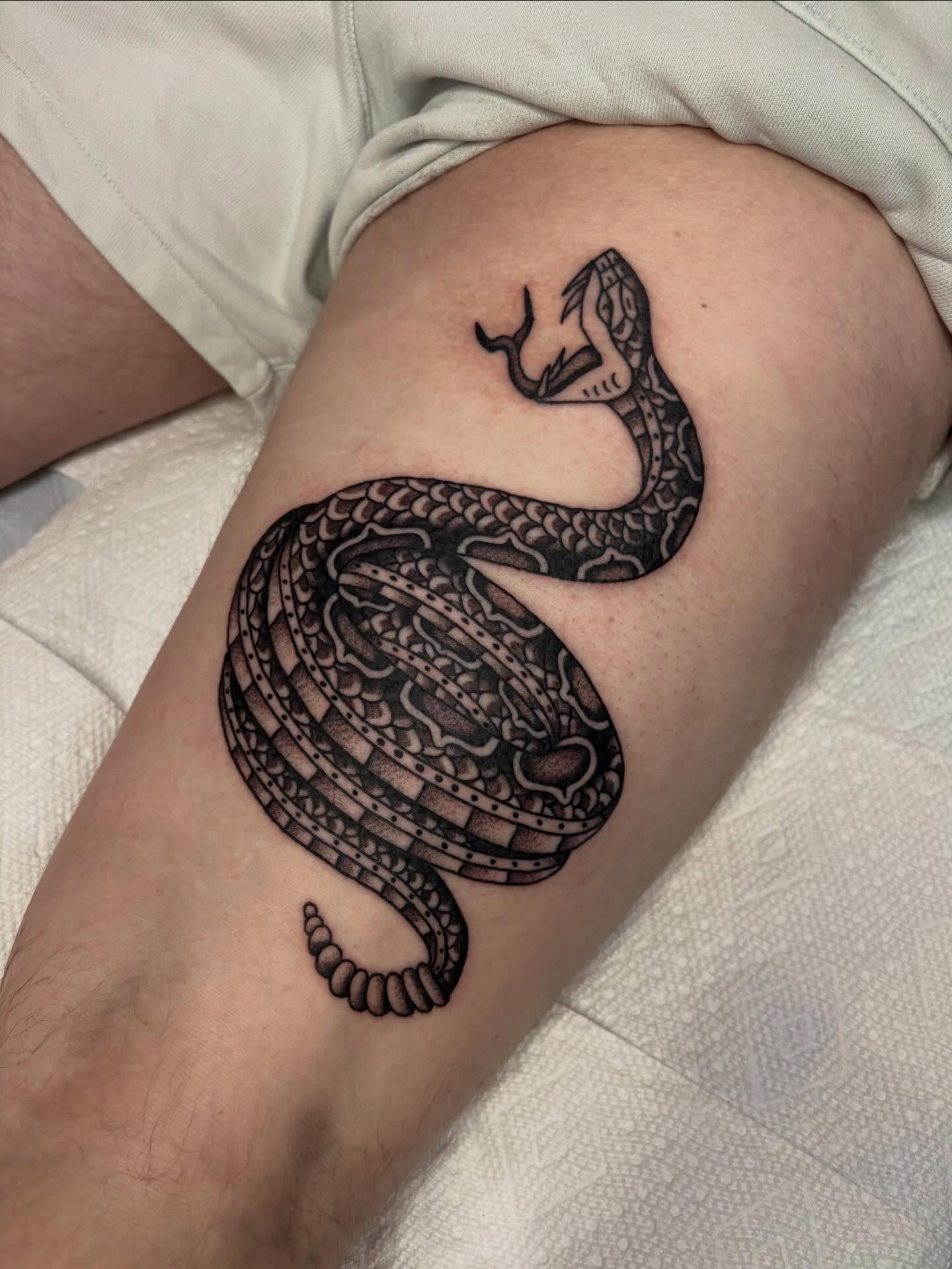
6. Red and Black Snake
A snake with the body in black and the scales, mouth or underbelly picked out in red, coiled around a forearm or running the length of a calf.
Snakes suit this palette better than almost any other subject because the body is long and segmented, which gives an artist a natural rhythm for alternating the two colours.
The wrap also means placement matters more than usual. A snake that circles a limb has to be designed for that limb, not copied flat off a screen.
Snake imagery carries a lot of history — shedding, rebirth, temptation, protection. Our piece on snake tattoo meaning goes through the main readings.
Photo: @nath_holden_tattoos
7. Neo-Traditional Wolf
A wolf in neo-traditional style: heavier line weight than traditional, more dimensional shading, with red worked through the fur and the black holding the form.
Neo-traditional is a good fit here because the style already uses limited palettes with confidence. Red becomes shading rather than fill, which is a different and often more flattering job for the pigment.
When I tested how this ages against flat-fill designs, the shaded approach held up noticeably better. Softened red still reads as red; patchy flat red reads as damage.
Wolves are one of the most requested subjects in neo-traditional work, so most artists in the style will have tattooed several.
Photo: @devinwray_tattoos
8. Red Moon Landscape
A landscape reduced to silhouette: black trees, black hills, black horizon, with a single red moon as the only colour and the only light source.
This is the most atmospheric use of the palette I know. The tattoo works the way a woodcut does, by letting one shape do all the talking.
It is also unusually forgiving over time, because a red circle has no fine detail to lose. If the red softens a little, the composition still holds.
Keep the silhouette simple. Every extra branch you add to the treeline is a place where the black will spread and close up over the years.
Photo: @amourtattooinc
9. Playing Card
A card, a hand of cards, or a set of suit symbols tattooed in the colours the deck already uses: hearts and diamonds red, clubs and spades black.
Nothing else on this list arrives with the palette built in. A card tattoo in black and red is simply a card tattoo done correctly.
That familiarity is the strength and the risk. It reads instantly, but it also means the design has to bring something of its own — a specific card, a specific hand, a date, a name in the border.
Most of the good ones I have seen were traditional in construction, with heavy black and clean red, rather than realistic.
10. Tribal with Red Accents
A black tribal pattern with red lines threaded through the negative space, or with certain shapes filled in red instead of black.
Traditional tribal work is almost always pure black, so adding red is a modern move. Done carelessly it looks like an afterthought.
The version that works, in my experience, keeps the red subordinate: thin lines, small shapes, never a red element as large as the black ones.
If you are drawn to the shape language rather than the colour, the black-only tradition is worth looking at first.
Photo: @niebieska_tattoo
11. Japanese Dragon
A dragon in Japanese style with the body in black linework and shading, the scales, mane or flames picked out in red, set against black clouds and wind bars.
Japanese tattooing has always used a restricted palette with discipline, and black-and-red versions of traditionally full-colour subjects have become common.
Scale is the whole conversation with a dragon. These are back pieces, sleeves and leg pieces. A dragon squeezed onto a forearm loses the flow that makes the subject work.
Budget in multiple sessions and a real consultation. Our overview of Japanese tattoo designs explains how the background work is planned.
Photo: @seventhsontattoo
12. Blackwork Mandala with Red Fill
A mandala built in black dotwork and linework with red filling selected petals, usually toward the centre or along one ring.
Mandalas are radial, so colour placement immediately becomes a question of which ring gets it. Red in the centre pulls the eye inward; red on the outer ring pushes it out.
I have found the inward version far more common and far more successful. It respects what a mandala is actually for.
Dotwork and red fill together are demanding, so ask to see healed dotwork specifically rather than fresh photos.
Photo: @weschetattoo
13. Anatomical Heart
An anatomical heart with the muscle in red and the vessels, shading and outlines in black, usually on the chest, forearm or upper arm.
Here red is not a stylistic choice. It is the actual colour of the thing, which gives the palette a justification none of the other designs on this list have.
The trade-off is that a heart carries a lot of interior detail, and detail is where red fades least gracefully.
Ask your artist to keep the vessel structure in black and let red handle the broad muscle. Detail in black, volume in red is the rule that has held up best in everything I have seen heal.
Photo: @chagotattoos
14. Floral with Red Flowers
A floral composition where the blooms are red and every leaf, stem and outline stays black.
This is the same logic as the traditional rose, extended across a larger arrangement. The flowers become the colour events and the foliage becomes the structure.
It scales beautifully. I have seen it work as a three-inch forearm piece and as a full half sleeve without changing the underlying idea.
If you want it to flow rather than sit as a block, have the arrangement drawn around the limb rather than designed flat.
Photo: @offtattooer
15. Samurai Helmet (Kabuto)
A kabuto helmet with the armour plating in black and the lacquer, cords or menpo mask detailing in red.
Red-lacquered armour genuinely existed, so this is one of the few designs on the list where the palette has a historical basis rather than a purely graphic one.
The construction is hard-edged and mechanical, which suits flat colour far better than organic subjects do.
Placement tends to be shoulder, chest or outer thigh, where the helmet can sit at a size that keeps the plating legible.
Photo: @weshollandtattoo
16. Abstract Brushstroke
Loose ink-wash strokes in black with red strokes layered over or beside them, imitating the gesture of a brush rather than depicting a subject.
This is the least literal use of the palette and the most dependent on the artist. There is no reference photo that fixes a bad composition.
Only book this with someone whose own brushstroke work you have seen healed. It is a specialism, not a style any artist can turn their hand to.
Be aware that loose edges soften more visibly than clean ones as the tattoo settles. That is part of the aesthetic, but it should be a decision rather than a surprise.
Photo: @koray_karagozle
17. Scorpion
A scorpion with the carapace and tail segments in red and the legs, pincers and outlines in black.
Segmented subjects are ideal for two-colour work because the segments themselves tell you where the colour should change.
Scorpions also sit well on a forearm or calf, where the tail can follow the taper of the limb rather than fighting it.
The reading is usually protection or self-defence rather than pure menace, though styling changes that quickly.
Photo: @fournierabrahammichael
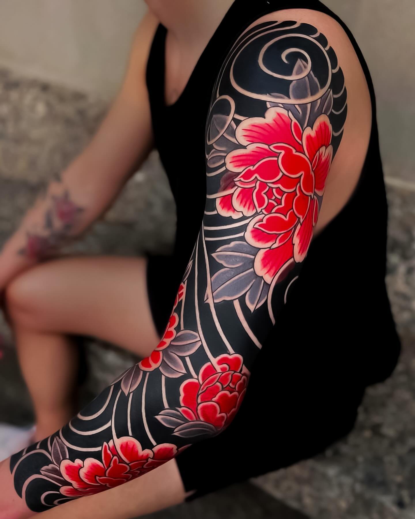
18. Red and Black Sleeve
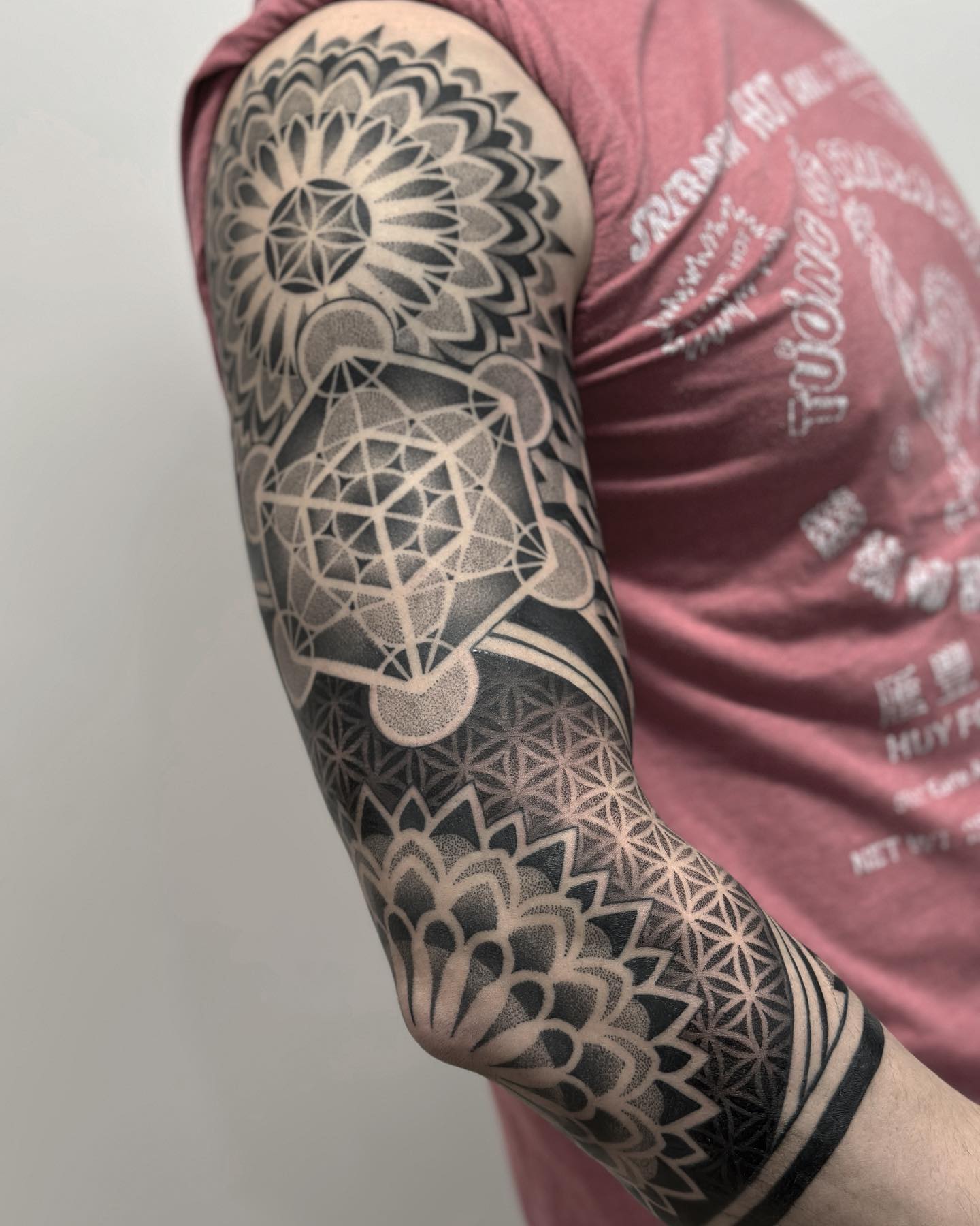
A full or half sleeve built from several subjects but held to black and red throughout, so the arm reads as one piece rather than a collection.
A two-colour constraint is the single most effective way to make a multi-session sleeve feel coherent.
It also makes adding to the sleeve later much easier, because the palette decision has already been made for whoever tattoos the next panel.
Sleeves are a long commitment — plan the whole layout before the first session. Our sleeve tattoo ideas page covers how those layouts are usually structured.
Photo: @japanese.ink
19. Minimal Red Line Accent
A primarily black design interrupted by one red element: a single line, a single dot, one small shape.
This is the most restrained approach on the list and often the most effective. The scarcity is the point.
It is also the cheapest to maintain. One small red area is easy to keep out of the sun, and easy to touch up later if it does soften.
In my experience people who are unsure about red commit to this version and stay happy with it far longer than those who go straight to heavy fill.
Photo: @oz_irezumi
20. Phoenix
A phoenix with the flames and tail feathers in red and the body, wing structure and shading in black.
Of everything here, this is the subject where black and red feels least like a stylistic choice and most like the obvious answer. A bird of fire in fire colours.
The flames give an artist somewhere to put large red areas that does not look like flat fill, because fire is supposed to have movement and gradient.
It wants space. Back, chest or a full sleeve gives the flames somewhere to go.
Photo: @jessicajones_tattoo
Variations on the Black and Red Palette
If straight black and red is not quite right, three adjacent palettes solve different problems.
Black, Red and Grey Wash
Adding grey wash between the black and the red gives you a middle tone, which makes dimensional subjects much easier to render.
It is the standard solution for realistic or neo-traditional work that feels too flat in two colours.
Black with Burgundy or Oxblood
A darker, browner red sits closer to the black in value, which produces a more subdued piece.
In my experience these read as more sophisticated in person and less striking in photographs, which is a trade some people are happy to make.
Red Linework on Bare Skin
Skipping black entirely and tattooing in red alone is a growing approach, particularly for fine-line work.
Be honest with yourself about maintenance here. Without black holding the structure, any fading in the red takes the whole design with it.
Black and Red on Darker Skin Tones
Red can read very differently on deeper skin tones, and some formulations lose contrast that they keep on paler skin.
The only reliable answer is healed photographs of work on skin close to your own. Ask for them specifically, and ask before the deposit.
Keeping Red Ink Looking Good
Red pigment ages differently from black, and pretending otherwise is how people end up disappointed three summers later.
Black is the most stable tattoo pigment and generally holds for decades. Red can lose saturation faster, and it is more sensitive to UV exposure than black is — which makes sunscreen the single most useful thing you can do for a black and red tattoo once it has healed.
Your artist’s specific choice of red matters too. Ask what brand and formulation they use and whether they have healed photos of it. A good artist will have an opinion about their red; a vague answer is information in itself.
Red is also the pigment most often named in reports of allergic and delayed reactions to tattoo ink, which is well documented in the dermatology literature and worth raising if you have reactive skin. The US Food and Drug Administration and clinical summaries such as this one from University of Utah Health both cover the reactions that get reported.
None of that is medical advice and I am not a clinician. If a tattoo stays raised, itchy or inflamed past the normal healing window, see a doctor rather than a forum — and talk to your artist about a patch test beforehand if you have reacted to anything before.
Common Mistakes and Where to Look Next
The most common mistake is using too much red. The palette gets its power from contrast, and contrast disappears when red stops being the exception.
The second is judging an artist on fresh photographs. Flat red looks perfect for about two weeks. Healed photos are the only honest evidence.
The third is designing for a flat screen and then applying it to a curved limb. Snakes, sleeves and dragons all need to be drawn on the body.
If a specific subject on this list pulled you in more than the palette did, it is usually worth exploring that subject first. Our guides to rose tattoo ideas and geometric tattoo designs both cover ground that overlaps with what is here.
A single entry on a list can only say so much about a subject with real history behind it — phoenix tattoo ideas is the obvious next stop if number 20 is the one that stayed with you.
Frequently Asked Questions
Does red tattoo ink fade faster than black?
In most cases, yes. Black is the most stable pigment used in tattooing and typically holds its density for decades, while red tends to lose saturation sooner, especially on sun-exposed placements like forearms and calves. How much faster depends on the specific pigment, the depth the artist works at, and how much UV the area gets. Consistent sunscreen after healing makes a bigger difference than anything else you can control. Touch-ups on the red areas every several years are normal rather than a sign something went wrong.
Is red tattoo ink more likely to cause a reaction?
Red is the pigment most frequently named in reports of allergic and delayed reactions to tattoo ink, and that pattern shows up consistently in dermatology case literature. That does not mean most people react to it — the large majority do not. If you have had reactions to cosmetics, dyes or metals before, mention it to your artist and ask about a small patch test. Any reaction that persists beyond normal healing should be looked at by a doctor rather than managed at home.
How much does a black and red tattoo cost compared to black only?
Expect it to cost somewhat more than the same design in black alone, because packing solid colour takes longer than shading does. A palm-sized traditional rose usually lands in the two-to-three hour range in my experience, and shops price either hourly or per piece depending on the studio. Large flat red areas add the most time. Ask for a quote on the actual design rather than a general rate, since the ratio of red to black changes the number more than the size does.
Will black and red work on darker skin tones?
It can, but the result varies more than it does on pale skin, and some red formulations lose contrast noticeably. Black work generally translates well across all skin tones. The reliable approach is to ask your artist for healed photographs of black and red work on skin close to your own, and to have that conversation before you put down a deposit. Artists who work regularly on deeper skin tones will have those photos ready.
Can I add red to an existing black tattoo?
Often yes, depending on how the original was built. Open areas and negative space take red well; heavily shaded or solid black areas generally will not accept it, because red laid over black simply disappears. An artist needs to see the actual tattoo, healed, to tell you what is possible. If the piece is old and the black has spread, the honest answer is sometimes that a rework is a better option than an addition.
Quick Summary
- Black provides structure and red provides emphasis — the ratio between them defines the piece more than the subject does.
- The safest entry into the palette is a traditional design with heavy black outlines and red confined inside them.
- Minimal red accents on blackwork are the most durable version and the easiest to maintain.
- Large flat panels of red are the most demanding to execute well — judge those artists on healed photos only.
- Subjects with natural segmentation or built-in colour logic (snakes, scorpions, koi, phoenixes, playing cards) suit two-colour work best.
- Red generally fades faster than black and is more UV-sensitive, so sunscreen after healing matters.
- Red is the pigment most often named in reported ink reactions — mention any history of skin reactivity to your artist and see a doctor if healing goes wrong.
- Holding a whole sleeve to two colours is the simplest way to make a multi-session project feel like one piece.