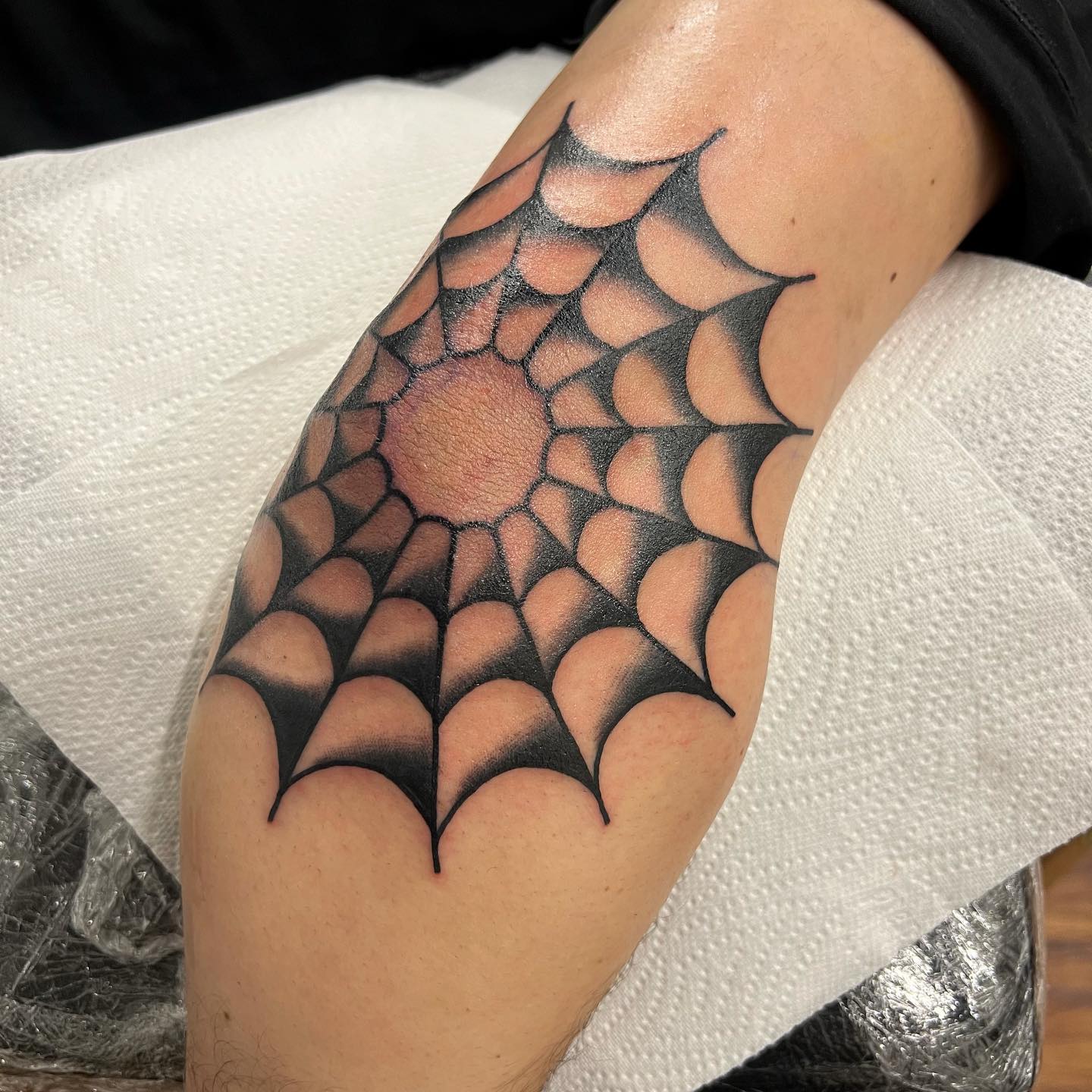
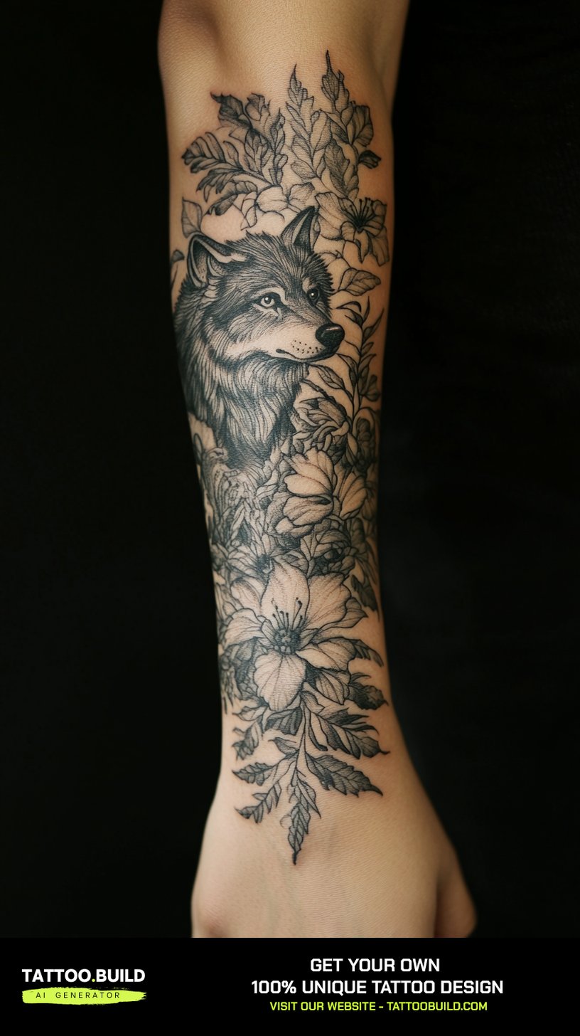
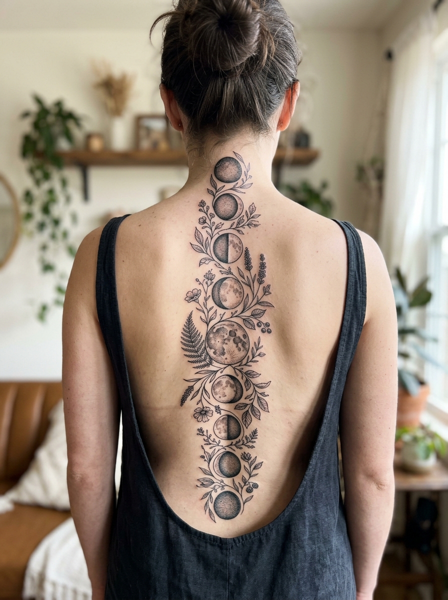
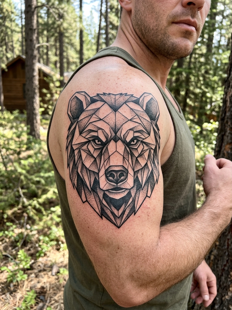
Linework is the most honest tattoo style there is — there is nothing to hide behind when the only tool is a line. No shading to soften a wobble, no colour packing to cover a shaky pass. Just the line, and how well it was pulled.
I have watched a lot of linework heal over the years, on my own skin and on friends who let me photograph their appointments. The pieces that still look sharp years later almost always have one thing in common: the artist committed to a single confident pass instead of going back over the same stroke three times.
That is really what this guide is about. Not just twenty pretty designs, but which linework ideas actually survive contact with real skin, and what to ask for so yours does too. If you are still deciding how delicate to go, the fine line tattoo ideas guide covers the thinner end of this spectrum in more detail.
Every piece below came from a working artist, and I have flagged the ones I think are harder to pull off than they look.
Which Linework Style Is Right for You?
Linework is a family, not a single style. These four branches behave very differently once the tattoo has had a few years to settle.
| Style | Typical Line Weight | Best Placement | How It Tends to Age | Touch-Up Outlook |
|---|---|---|---|---|
| Fine line | Single-needle to 3RL | Forearm, upper arm, calf, sternum | Softens noticeably; very thin lines can blur into each other | Often wanted within 3–7 years |
| Bold linework | 7RL to 14RL | Almost anywhere, including hands and ribs | Spreads slightly but stays legible for decades | Rarely urgent |
| Geometric linework | Mixed, usually 3RL–9RL | Flat planes — outer arm, thigh, back | Holds well if lines are spaced generously | Occasional, usually on the thinnest elements |
| Continuous single line | Consistent, usually 3RL–5RL | Forearm, thigh, ribs | Ages gracefully because there is no crowding | Low |
If you want the most forgiving option on that list, bold linework wins every time. If you want the most striking one on day one, fine line wins — but it asks more of you later.
Why Linework Ages the Way It Does
Tattoo ink does not sit still. It settles into the dermis and, over years, the body slowly nudges those particles outward in every direction.
That spread is why every line you get will end up slightly wider than the day it was tattooed. It is normal, it is gradual, and it is the single most important thing to understand before choosing a linework design.
The practical consequence is that gaps matter more than lines. Two lines sitting close together will creep toward each other until the white space between them closes, and when that happens the design stops reading as separate strokes and starts reading as a smudge.
In my experience, this is the thing people underestimate most. They look at a design on paper, where a one-millimetre gap looks generous, and forget that the same gap on skin has to survive twenty years of drift.
Sun exposure accelerates all of it. Unprotected skin loses line definition faster than covered skin, which is why the linework on someone’s inner forearm usually looks crisper than the matching piece on their outer forearm. Blackwork tattoo designs has the broader colour-and-contrast version of this argument.
20 Linework Tattoo Ideas Worth Saving
I have grouped these by what they ask of the artist rather than by subject, because that is the information you actually need when you book.
1. Continuous Line Portraits and Hands
A continuous line piece is drawn as one path — the needle theoretically never lifts from start to finish. Faces and hands are the classic subjects because the brain fills in the missing information easily.
These look effortless and are anything but. The artist is committing to a route through the design before they start, and a single hesitation shows up as a thickened section that cannot be fixed later.
When I have asked artists about these, the consistent advice is to keep the design under roughly the size of your palm for a first attempt. Larger continuous pieces need longer uninterrupted passes, and the hand gets tired.
Ask to see healed photos specifically, not fresh ones. Fresh continuous line work looks uniform on everyone; healed work is where the difference between a competent artist and a great one becomes obvious. The single line tattoo ideas collection is worth browsing if this is the direction you are leaning.
2. Geometric Animals: Deer, Snakes and Skulls
Geometric animal linework rebuilds a living shape out of straight lines and hard angles. A stag becomes a set of intersecting vectors; a snake becomes a sequence of repeating angular segments.
The appeal is that it reads as both organic and engineered at once. The risk is that a geometric animal with too many facets turns into visual noise from more than a metre away.
I would ask your artist to show you the design at actual size, printed, held at arm’s length. If you cannot immediately tell what animal it is at that distance, it has too many lines in it.
Skulls are the most forgiving subject in this group because the silhouette is so recognisable. Snakes are the trickiest, since the body has to wrap convincingly around a limb without the lines bunching on the inside of the curve.
3. Fine Line Botanicals and Trees
Botanical linework is probably the most requested version of this style, and for good reason — stems and branches are naturally line-shaped, so nothing has to be translated.
The best botanical pieces I have seen follow the limb. A stem that runs with the length of the forearm sits comfortably; one that cuts across it at an angle tends to look pinned on.
Trees are the harder version. Branches naturally taper and multiply, which means the outer edges of the design are where lines get thinnest and closest together — exactly the zone that blurs first.
My honest advice is to let the artist simplify the outer branches more than feels right on paper. A tree with fifteen visible branches at age one often reads better than a tree with forty that has become a smudge at age eight.
4. Architecture, Maps and Cityscapes
Architectural linework is unforgiving in a way the organic subjects are not. A wobble in a branch reads as a branch; a wobble in a building reads as a mistake.
These pieces demand ruler-straight consistency and even spacing across parallel lines, which is a genuinely different skill from freehand botanical work.
When I looked into who does these well, the pattern was clear: artists with a background in technical drawing, drafting or illustration tend to produce noticeably cleaner architectural work than generalists.
Map linework — coastlines, city grids, topographic contours — sits in the same category. Contour lines in particular need generous spacing, because a topographic map with tightly packed rings is the fastest way to end up with a grey patch.
5. Sacred Geometry and Abstract Composition
Sacred geometry linework leans on symmetry: mandalas, the flower of life, repeating polygonal patterns radiating from a centre.
Symmetry is the whole point and also the whole problem. The human eye catches asymmetry in a radial pattern instantly, far faster than it catches an uneven line in an abstract design.
For anything radially symmetrical, I would want an artist who uses stencils and guide marks rather than working freehand. There is no ego in it — the geometry is simply more precise than a hand is.
Abstract linework is the opposite proposition entirely. Loose, flowing lines with no reference shape to get wrong are far more forgiving, and they age beautifully because the spacing is usually generous by design. Browse sacred geometry tattoo ideas and geometric tattoo designs to see how differently the two approaches sit on the body.
6. Celestial and Ocean Linework
Constellation pieces pair small dots with thin connecting lines, usually mapping a real star pattern that means something to the wearer.
They are small, quick and comparatively cheap, which makes them a popular first tattoo. The caveat is that very small dots placed very close together are among the first things to lose definition.
Waves work on a completely different principle. Instead of shading the water, the artist uses line density — lines closer together read as darker water, lines further apart read as foam or light.
It is a genuinely clever trick and it holds up well, provided the densest section still has visible white space in it when the stencil goes on.
7. Anatomical Hearts and Compasses
Anatomical linework — hearts, lungs, hands, bones — is having a long moment, and the fine line version is the most requested.
The subject carries real detail: chambers, vessels, tendons. The temptation is to include all of it, and the pieces that survive are the ones that did not.
Compasses are the more structured cousin. A compass rose is fundamentally a radiating geometric figure, so it needs the same stencil discipline as sacred geometry, plus a clean centre point where every line converges.
That convergence is worth inspecting closely in an artist’s portfolio. If the centre of their compasses looks like a small dark blob rather than a crisp meeting point, the lines are being pulled too close together.
Variations Worth Considering
If straight linework is not quite the answer, these adjacent approaches solve some of its weaknesses.
Linework with Dotwork Shading
Adding stippled dot shading inside linework gives you depth without solid black. It reads softer than blackwork and holds detail better than very thin hatching.
It also adds significant time to the session, since dotwork is slow by nature. Dotwork tattoo ideas covers the technique in more depth.
Mixed Line Weights in One Piece
Using a heavier outline with lighter interior lines creates a hierarchy the eye can follow, and it is the single most reliable way to make a linework piece read well from a distance.
The heavy outer line also acts as insurance: even if the interior detail softens over a decade, the silhouette stays sharp.
Negative Space Linework
Here the lines define a shape by surrounding it rather than drawing it. A moon defined by the lines around it, rather than by its own outline.
It is a striking effect and it ages well, because negative space only gets more generous as ink spreads outward.
Minimalist Micro Linework
Very small linework pieces — a few centimetres, a handful of strokes — are genuinely lovely and genuinely fragile.
I would treat these as a five-to-ten year commitment rather than a lifetime one, and go in expecting a touch-up. Minimalist tattoo ideas has a fuller range if that trade sounds acceptable.
Getting Linework to Heal Clean
Linework is less traumatic to the skin than heavy shading or colour packing, so it usually heals faster — often surface-healed within two weeks, with the deeper settling taking a couple of months.
That speed can be misleading. A piece that looks healed at day ten is still remodelling underneath, and the lines you judge at that point are not the lines you will have at month three.
Keep it clean, keep it moisturised without smothering it, and keep it out of the sun. The American Academy of Dermatology recommends sun protection as the main long-term defence for tattooed skin, and for linework specifically it is the difference between crisp and soft at the ten-year mark. Our own tattoo aftercare guide covers the day-by-day version.
One honest caveat: if something looks wrong — spreading redness, heat, swelling that increases rather than decreases after day three, or any discharge that is not clear plasma — that is a conversation for your artist and, if it is not resolving, a doctor. Mayo Clinic covers the medical risks plainly, and nothing in this article is a substitute for either of those.
Common Linework Mistakes — and Still Not Sure?
The most common one by far is choosing a design at the wrong scale. A design that needs to be eight centimetres wide to breathe, shrunk to five because of placement, is a design that will close up.
The second is picking an artist by style rather than by evidence. Plenty of artists post beautiful fresh linework; far fewer post healed photos from two years ago, and those are the portfolios worth trusting.
The third is underestimating placement pain on bony areas. Linework sessions are shorter than shaded ones, but the ribs and sternum are still the ribs and sternum — the most painful tattoo spots guide is worth reading before you commit to one of those spots.
Still weighing it up? Compare the thinner and heavier ends of the range side by side before you book — the difference in how they age is larger than the difference in how they look on day one.
Frequently Asked Questions
Do linework tattoos fade faster than other styles?
Not faster in terms of ink loss, but the fading is more visible because there is no shading to absorb it. When a thin line spreads, the design changes shape; when a shaded area spreads, it mostly just softens. In practice, bold linework holds its look for decades, while very fine linework often looks noticeably softer within five to seven years. Placement and sun exposure make a bigger difference than the style itself.
How much does a linework tattoo cost?
Pricing varies enormously by city, artist demand and piece size, so any single figure would be misleading. What I can say is that linework is usually quicker than an equivalent shaded piece, which often means fewer hours billed for the same design footprint. Small pieces are frequently charged at a studio minimum rather than hourly. Ask for a quote based on the actual design, not a general rate.
Is linework less painful than shading?
Generally yes, in the sense that a single clean pass is less traumatic to the skin than repeated passes over the same area. Most people I have spoken to describe linework as sharper but shorter. That said, placement dominates — linework on the ribs will outrank shading on the outer thigh for almost everyone. Bony areas and thin skin hurt regardless of technique.
Will I need a touch-up on fine line work?
Often, eventually. Very thin lines are the most likely element of any tattoo to need attention, and many people book a touch-up somewhere in the three-to-seven year range. Some artists include one free touch-up within the first year, which covers healing gaps but not long-term softening. It is a reasonable question to ask before booking rather than after.
Can linework be added to or built on later?
Yes, and it is one of the style’s real strengths. Because linework leaves generous open skin, it integrates into a larger piece far more easily than a dense shaded tattoo does. If you think you might build toward a sleeve, tell your artist at the first appointment so placement leaves room. Adding to an existing linework piece is usually much simpler than working around solid black.
Quick Summary
- Linework hides nothing — the quality of the line is the quality of the tattoo.
- Ink spreads outward over time, so the white space between lines matters more than the lines themselves.
- Bold linework is the most forgiving choice; very fine linework is the most striking but asks for touch-ups.
- Continuous line pieces look effortless and are the hardest thing on this list to execute cleanly.
- Geometric and sacred geometry work needs stencils and guide marks, not freehand confidence.
- Architectural and map linework rewards artists with a technical drawing background.
- Always judge a portfolio on healed photos, not fresh ones.
- Sun protection is the single biggest long-term factor in keeping lines crisp.