A watercolor tattoo is not a style so much as a technique: the artist skips or softens the heavy black outline and lets colour behave like pigment bleeding across wet paper.
I have sat for two of them, and the first thing that surprised me was how quiet the session felt. There is far less lining, so the buzz of the machine changes character — long, soft passes of colour instead of the slow, deliberate scratch of an outline.
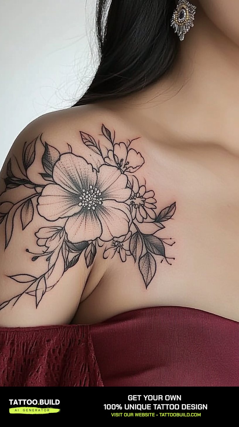
The second thing that surprised me was how differently artists talk about them. Ask five tattooers whether watercolour work holds up and you will get five answers, ranging from “it fades in five years” to “mine look identical after a decade.” The truth sits in the middle, and it depends almost entirely on how the piece is built.
Below are 15 designs I keep coming back to, from a soft butterfly on the inner forearm to a full galaxy sleeve panel — plus an honest look at what actually makes this style age well.
Watercolor vs. Traditional vs. Fine Line: Which Style Fits You?
I find this comparison clears up most of the confusion people bring into a consultation. The three approaches want different things from your skin.
| Style | Outline | Best placement | Ageing | Typical sitting |
|---|---|---|---|---|
| Watercolor | None, or a light sketchy line | Forearm, thigh, upper arm, shoulder blade | Softens at the edges; depends heavily on saturation | 2–5 hours for a mid-size piece |
| Traditional / neo-traditional | Bold black, deliberately heavy | Almost anywhere, including hands and feet | Holds shape longest of the three | 3–6 hours for a mid-size piece |
| Fine line | Single-needle black, very thin | Inner arm, ribs, spine, ankle | Thin lines can blur or lighten sooner | 1–3 hours for a mid-size piece |
| Watercolor + line hybrid | Fine black anchor, colour washed around it | Forearm, calf, upper back | Usually the most reliable of the colour options | 3–5 hours for a mid-size piece |
If you want the look but you are nervous about longevity, the hybrid in the last row is the compromise I recommend most often. You keep the wash, but a structure underneath survives it.
Why Watercolor Tattoos Age the Way They Do
The fading reputation is not a myth, but it is usually explained badly. It has less to do with the colours themselves and more to do with what is holding them together.
A bold outline gives a tattoo a permanent skeleton. When pigment migrates a fraction of a millimetre over the years — which all pigment does — the black line still tells your eye where the shape ends. Take that line away and the softening becomes the whole design.
Saturation matters just as much. In my experience, the pieces that hold up are the ones where the artist packed real colour into the skin rather than feathering a translucent whisper of it. A wash that looks perfectly delicate on day one can look like a bruise-coloured smudge at year six.
Sun exposure is the single biggest variable you actually control. UV breaks down pigment, and pastel tones show that loss much sooner than black does. The American Academy of Dermatology recommends covering healed tattoos or using broad-spectrum sunscreen on them, and for colour work I treat that as non-negotiable rather than optional.
Placement is the last piece. Areas with heavy friction or constant rubbing — hands, feet, the inner wrist edge — wear colour down faster than the flat, protected planes of a forearm or outer thigh.
15 Watercolor Tattoo Ideas That Actually Work on Skin
1. Watercolor Butterfly
This is the design that got most people interested in the style, and for good reason: butterfly wings already look like two washes of colour meeting in the middle.
The version below keeps a thin, broken black line on the wing edges and lets blue and violet bleed outward past it. That contrast is what stops it reading as a blur from three feet away.
In my experience the inner forearm is the ideal spot for a first watercolour piece — flat, low friction, rarely in direct sun, and easy for you to watch heal. Expect two to three hours for something at this scale.
2. Watercolor Floral Bouquet
A bouquet gives the artist multiple colour temperatures to play with in one composition, which is exactly what the technique is built for.
Peonies and garden roses work better than tight, small blooms here. Large petals give the pigment room to gradate from a deep centre out to a pale edge.
Ask for a couple of leaves or stems to be rendered with a real line. Every artist I have asked says the same thing: one anchored element makes the rest of the wash read as intentional.
3. Watercolor Galaxy
Nebula and star-field designs are the most forgiving watercolour subject there is, because a galaxy is supposed to look diffuse.
Deep indigo and purple hold their density better than pastel pinks, so I would push for the darker end of the palette as the base and use the light tones only as accents.
This works beautifully as a panel on the upper arm or as a filler between existing pieces. If you want a bigger version, the galaxy tattoo ideas guide has full-sleeve compositions worth borrowing from.
4. Watercolor Animal Portrait
A realistic pet portrait sitting inside a loose splash of colour is one of the strongest uses of this technique, and it is the one I get asked about most.
The trick is the contrast in rendering: the animal is painted with tight, detailed realism while everything behind it dissolves. Your eye locks onto the face and forgives the softness around it.
This is not a beginner tattoo. Colour realism and watercolour are two different skill sets, and you want an artist whose healed portfolio shows both together — not two separate galleries.
5. Watercolor Feather
A feather is essentially a gradient with a spine, which makes it a natural fit.
The best versions I have seen let individual barbs break off into loose flecks of colour at the top, as though the feather is coming apart in the wind.
Keep the quill itself crisp. That single anchored line down the middle is what holds the whole shape together as it ages, and it costs almost nothing in session time.
6. Watercolor Hummingbird
Small watercolour pieces are harder than large ones, because there is less room for the colour to actually gradate before it hits an edge.
This shoulder-blade hummingbird solves it by keeping the bird itself tiny and detailed, then setting it against a soft pink halo that does the atmospheric work.
If you like this scale, the wider hummingbird tattoo ideas collection shows how the same subject reads in bolder styles for comparison.
7. Watercolor Mandala
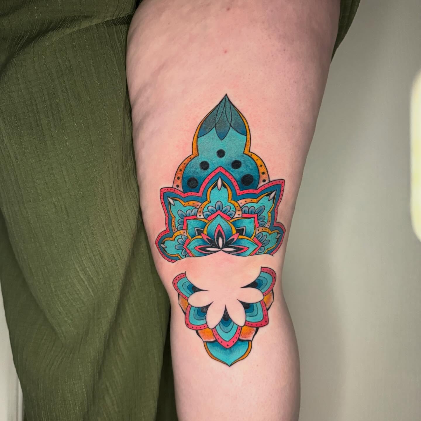
Mandalas are usually the most rigid, geometric thing in a tattoo portfolio, so filling one with saturated colour is a genuinely interesting collision.
The piece below keeps every petal outlined and precise, then floods the interiors with turquoise, coral and orange. That is closer to illustrative colour packing than true watercolour, and it will almost certainly age better for it.
Wrapping placement like this — the back of the knee into the thigh — is a demanding sit. If you want the symmetry without the pain, the mandala tattoo ideas guide has flatter placements.
8. Watercolor Dragonfly
Dragonfly wings are transparent in life, which means a watercolour treatment is arguably more accurate than a solid one.
This forearm piece is a fine line drawing with colour splashed loosely behind it, escaping the outline on purpose. That deliberate overspill is the signature of the style done well.
It is a quick tattoo — often under two hours — which makes it a sensible way to test whether you like living with soft colour before committing to something larger. More options sit in the dragonfly tattoo roundup.
9. Watercolor Geometric Shape
The most striking watercolour tattoos I have seen use negative space rather than ink for the drawing itself.
Here, the star is bare skin. The artist has painted the colour field around it, so the geometry is defined by what is not tattooed — a technique that stays sharp as long as the surrounding pigment stays dense.
Be honest with yourself about touch-ups on this one. If the colour field softens, the shape softens with it, and there is no line to fall back on.
10. Watercolor Moon Phases
A moon phase row is a clean structural idea that gives watercolour a job to do inside each shape.
Filling the moons with galaxy tones rather than grey wash turns a very common design into something specific. The circles keep hard edges, so the piece keeps its rhythm even as the interiors soften.
Forearm placement suits the sequence because the shapes step naturally down the length of the arm. The moon phase tattoo ideas guide covers spine and collarbone layouts if you want the row somewhere less visible.
11. Watercolor Koi Fish
Koi are traditionally a Japanese-style subject with heavy black linework, so the watercolour version is a real departure — and worth discussing with your artist before booking.
Orange and gold hold up better than most colours in the pastel family, which makes koi one of the safer bets for a piece you want to still read clearly in ten years.
The thigh gives you the length the body needs to curve properly. For traditional reference on the same subject, see the koi fish tattoo drawings collection.
12. Watercolor Skull
Pairing a hard, graphic skull with soft colour splashes is the contrast that makes this design work. Neither element would be interesting alone.
Keep the skull itself in black and grey with real structure, and let the colour live entirely outside it. When the two mix, you tend to lose the skull.
This one sits well on the upper arm or outer shoulder, where there is enough flat surface for the splashes to spread without wrapping awkwardly.
13. Watercolor Quote with Floral Accent
Script plus watercolour is a combination I would approach carefully. Lettering needs to stay legible, and soft colour is the enemy of legibility.
The version that works — like the one below — keeps the text in clean black and puts the colour entirely in decorative elements beside it.
Choose a short phrase. Long quotes in small script are the pieces most likely to need a touch-up, and adding colour bleed around them only accelerates the problem.
14. Watercolor Ocean Wave
Water rendered as watercolour is close to a perfect match of subject and technique, and it is one of the few cases where a completely lineless approach genuinely holds up.
Layering matters more than colour choice here. A wave built from three or four passes of blue at different densities reads as depth; a single flat blue reads as a stain.
Ask to see healed photographs of the artist’s blue work specifically. Blues and greens sit differently in skin than warm tones do, and healed shots tell you far more than fresh ones.
15. Watercolor Tree of Life
A tree gives you a built-in structure problem and a built-in solution: the trunk and branches carry the linework, and the canopy becomes pure colour.
Autumn palettes are the obvious choice, but I have seen this done in a single cool green wash and it was more striking for the restraint.
Thigh or upper back suits the proportions. The tree of life tattoo guide is worth a look for branch layouts before you settle on a shape.
Variations Worth Considering Before You Book
Not every idea on this list needs to be executed as pure watercolour. These three variations get you most of the look with less risk.
Watercolor with a Fine Line Anchor
The colour behaves exactly the same way, but a thin black drawing sits underneath holding the shape. This is what I would choose if the piece is going somewhere visible and I wanted it to still read clearly in a decade.
Splash-Only Accent on an Existing Tattoo
Adding a colour wash behind a black and grey piece you already have is a low-commitment way to try the style. It is also a common approach for reviving older work that has gone flat.
Illustrative Colour Packing
This is what several of the pieces above actually are: outlined shapes filled with dense, blended colour that only looks like watercolour. It is the most durable option of the three, and many artists will steer you here without saying so.
How to Get a Watercolor Tattoo That Lasts
Vet the healed portfolio, not the fresh one. Fresh photographs are taken minutes after the needle stops, when every colour is at its most vivid; a piece photographed at two or three years old tells you what you are actually buying.
Push for saturation during the consultation. If you ask for “really soft and subtle,” a good artist will warn you that subtle fades to invisible — and if they do not warn you, that itself is information.
Protect it from the sun for life, not just during healing. I keep a small tube of high-SPF sunscreen with my sunglasses so that covering colour work is automatic rather than something I remember halfway through the afternoon.
Follow your artist’s aftercare instructions rather than advice from the internet, and budget for a touch-up at the one-year mark — many colour pieces need one, and most reputable studios expect it. If you want to know what normal healing looks like day by day, the tattoo healing stages guide walks through it. Anything that looks like spreading redness, heat, swelling or discharge is not part of normal healing: contact your artist and see a doctor, since infections and ink allergies need real medical care, not a home remedy.
Still Not Sure? Common Mistakes to Avoid
The most frequent mistake is going too small. Watercolour needs physical space for the gradient to happen, and a two-inch piece simply does not have it.
The second is choosing an artist by style rather than by evidence. Plenty of tattooers list watercolour on their page; far fewer can show you healed colour work from three years ago.
The third is placing it somewhere high-friction because it seemed like a small, easy spot. Hands, fingers and feet are hard on colour, and the FDA notes that reactions and complications from tattoo inks can also appear well after the session, which is worth knowing before you commit to any colour-heavy piece.
If colour is what you actually want but the softness worries you, browse the colorful tattoo ideas guide first — there is a lot of ground between bold traditional and full watercolour wash.
Frequently Asked Questions
Do watercolor tattoos really fade faster than other tattoos?
They can, but the reason is structural rather than chemical. Without a black outline, the natural softening that happens to all tattoos has nothing to hold it in place, so the change is more visible. Pieces done with dense, well-packed pigment and kept out of direct sun often hold up far better than the style’s reputation suggests. Ask your artist to show you healed photographs rather than fresh ones.
How much does a watercolor tattoo cost?
Pricing follows the same logic as any other tattoo: studio rate, artist demand, size and how long the piece takes. Colour work generally takes longer than equivalent black and grey because of the layering involved, so budget for more chair time than the drawing might suggest. A mid-size forearm piece is commonly a two to five hour sitting. Always get the quote in the consultation rather than assuming.
Can a watercolor tattoo cover up an old tattoo?
Sometimes, but it is a harder job than a conventional cover-up. Cover-ups usually rely on dark, dense ink to hide what is underneath, and watercolour is defined by the opposite. An experienced artist may be able to work a wash around or over a light, faded piece, but they will tell you honestly if the existing tattoo is too dark. Book a consultation and bring good photographs in natural light.
Does a watercolor tattoo hurt less than a lined tattoo?
In my experience it feels different rather than milder. There is less of the sharp, deliberate sensation of lining, but colour packing over a large area involves a lot of repeated passes over the same skin, which builds its own kind of soreness. Placement affects pain far more than style does. Flat, fleshy areas like the outer thigh and forearm are generally easier than ribs, knees or the inside of the arm.
What should I ask an artist before booking watercolor work?
Ask to see healed pieces at least two years old, ask whether they would recommend a fine line anchor for your specific design, and ask how they handle touch-ups. It is also fair to ask which colours they find hold best in their own work, since answers vary by artist and by the inks they use. If any of those questions get a vague answer, keep looking.
Quick Summary
- Watercolor is a technique, not a subject — the artist drops or softens the black outline and lets colour spread.
- Fading concerns are real but overstated; saturation, sun exposure and placement matter more than the style itself.
- A fine line anchor underneath the wash is the most reliable version of the look.
- Butterflies, galaxies, feathers, waves and trees suit the technique because they are diffuse by nature.
- Small pieces are harder than large ones — the gradient needs physical space.
- Forearm, outer thigh, upper arm and shoulder blade are the friendliest placements; hands and feet are the worst.
- Judge an artist by healed colour photographs from two or three years ago, never by fresh shots.
- Sunscreen on healed colour work, and budget for a touch-up at around the one-year mark.
Watercolour tattooing rewards patience more than almost any other style. Pick the artist carefully, give the design room to breathe, and it will look like something painted onto you rather than printed. General health questions about tattoos — allergies, existing skin conditions, medication — are worth raising with a doctor first; Mayo Clinic has a good plain-language overview of the risks.