I have watched more women walk into a studio with a folded piece of paper than with a Pinterest board, and the paper almost always has a sentence on it. A quote tattoo is the one design where the meaning arrives before the artwork does — you already know what it says, so every decision after that is about how it should look and how long it will stay readable.
That second part is where most people get caught out. I have seen beautiful five-word scripts age gracefully for a decade, and I have seen thirty-word paragraphs blur into a grey smudge on a wrist within four or five years.
So this guide is split the way I would actually talk it through with a friend: 22 quote ideas grouped by what they are for, then the practical side — font, length, placement, and the mistakes that cost people a cover-up.
If you are still deciding between words and imagery, it is worth skimming small meaningful tattoo ideas for women first, because a symbol sometimes carries a sentence better than the sentence does.
Which Quote Tattoo Style Is Right for You?
Before the ideas, here is the trade-off in one place. I put this together after asking artists the same question repeatedly: what actually holds up?
| Lettering style | Best length | How it ages | Good placements |
|---|---|---|---|
| Fine-line cursive | 2–6 words | Softens fastest; thin loops can close up over time | Collarbone, inner arm, behind the ear |
| Handwriting replica | 1 short line | Depends entirely on stroke weight, not on the handwriting | Forearm, wrist, ribs |
| Typewriter / serif | 3–10 words | Very well; separated letters resist blur | Ribs, spine, upper arm |
| Bold script | 1–4 words | Best of the group; thick strokes hold shape | Shoulder, thigh, forearm |
| Foreign script (Arabic, Japanese) | 1 phrase | Fine if drawn by someone who reads it | Spine, inner arm, back of neck |
If you want one rule from that table: fewer words at a heavier stroke weight beats more words at a lighter one, every single time.
What Actually Makes a Quote Tattoo Age Well
Skin is not paper. Ink spreads slightly in the dermis over years, and that spread closes the gaps inside letters first.
This is why the letter e is the canary. When I look at a ten-year-old script tattoo, the lowercase e and a are usually the first characters to fill in and turn into dots.
The practical fix is spacing. Every artist I have asked says the same thing — leave more room between letters and lines than looks right on the stencil, because the design will visually tighten as it heals.
Size matters more than people expect, too. A phrase that is legible at three inches wide often becomes unreadable at one and a half, because the stroke weight has to shrink with it.
And placement changes the maths. Areas that stretch, crease, or see a lot of sun — hands, feet, the inside of the elbow — tend to lose definition sooner than flatter, covered areas like the ribs or upper back.
Short and Powerful One-Line Quote Tattoos
1. “She believed she could, so she did”
This is still the most requested quote tattoo I have seen on women, and it earns the popularity — it is a complete story in six words.
Because it is common, the design work is where you make it yours. I have seen it broken across two lines with the word did dropped and underlined, and it read completely differently to the standard single-line version.
Placement-wise it suits the inner forearm at roughly three to four inches, or the collarbone if you want it more private.
2. “Still I rise” — the Maya Angelou line
Three words, taken from Angelou’s poem of the same name, which you can read in full at the Poetry Foundation.
I like this one at a heavier weight than most people request it. It is a defiant line and it reads oddly in whisper-thin cursive.
It sits well vertically along the spine or the outer forearm, and it is short enough that a serif or typewriter face works without crowding.
3. “This too shall pass” for the hard stretches
Five words, and the one I most often see chosen after a specific rough year rather than as a general sentiment.
A detail I have grown fond of: some people have it inked where only they can see it — the inner bicep, the ribs — precisely because it is a private reminder rather than a statement.
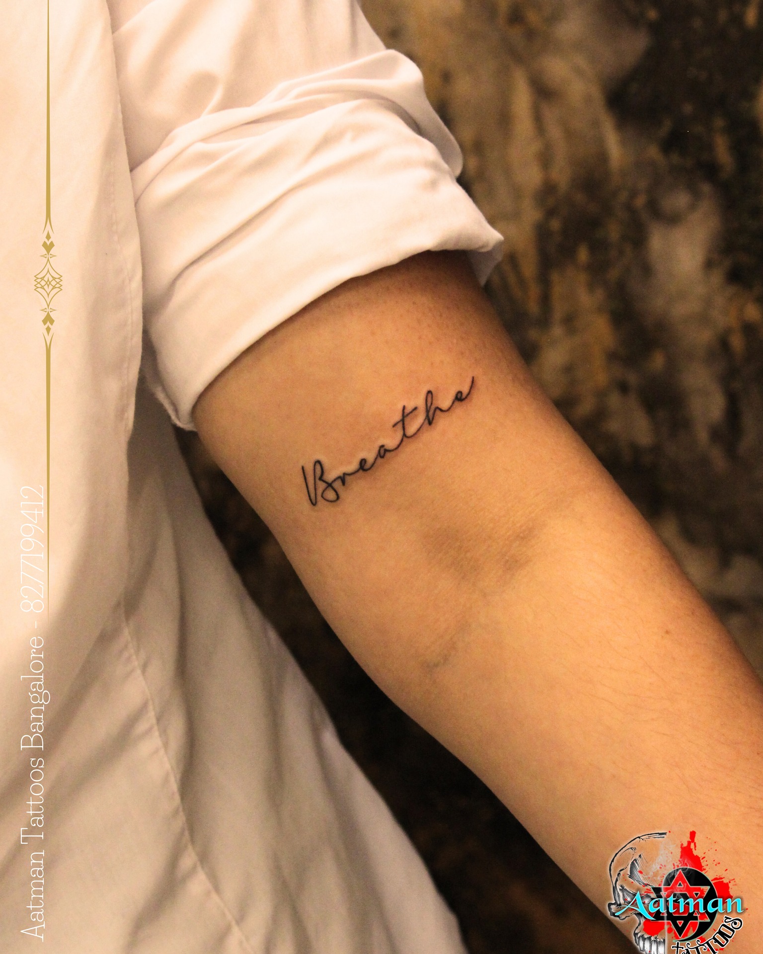
4. Single-word tattoos: “enough”, “breathe”, “anyway”
A single word is the most durable quote tattoo you can get, because one word at a readable size gives you real stroke weight.
“Enough” is the one I have seen carry the most weight per letter — it works as both a boundary and a reassurance depending on how the person reads it that day.
“Breathe” on the wrist or the side of the finger is a genuine mindfulness cue, and there is more in this vein in tiny wrist tattoo ideas for women.
5. “Let it be” and other three-word steadiers
Three-word phrases are the sweet spot for the collarbone, where you have width but very little height to work with.
Other versions I have seen work well there: “and so she”, “keep going”, “be here now”.
If the collarbone is where your head is at, these collarbone tattoo ideas show how much the curve of the bone changes the layout.
Literary and Poetry Quote Tattoos
6. Sylvia Plath and the dark romantics
“I took a deep breath and listened to the old brag of my heart: I am, I am, I am” is long — and that is the point of including it here.
Almost nobody gets the whole line. In my experience the version that works is I am, I am, I am on its own, stacked in three short rows.
That trimming instinct is the single most useful thing you can bring to a literary quote. Take the fragment that already sounds like you and leave the setup behind.
7. Rupi Kaur and contemporary poetry
Contemporary poets write in short, tattoo-shaped lines, which is exactly why their work ends up on skin so often.
Lines like “you are your own soulmate” fit a forearm without any editing at all.
One caution I would give: living poets hold copyright on their work. It is not a legal problem for a personal tattoo, but it is a decent reason to credit the writer if you post it publicly.
8. Jane Austen, Virginia Woolf and the classics
Public-domain literature gives you the freedom to take a phrase without any of that hesitation.
“I am no bird; and no net ensnares me” from Jane Eyre is a favourite I have seen more than once, usually along the spine where the length has room to breathe.
Woolf’s “I am rooted, but I flow” is the other one that keeps appearing, and it pairs unusually well with a small botanical element.
9. Song lyrics that hold up out of context
Lyrics are the riskiest category, because a line that is devastating with the melody can read as flat on an arm.
My honest test: write it out by hand on paper, with no music, and read it a week later. If it still lands, it is safe.
Self-Love and Empowerment Quote Tattoos
10. “Be the energy you want to attract”
Longer empowerment lines like this one need a placement with real estate — the ribs, the outer thigh, the upper back.
Set in a typewriter face across two lines, it stays readable at a size where cursive would already be closing up.
11. “You are not required to set yourself on fire”
This is a boundary written as a sentence, and I have seen it chosen most often by women in caretaking roles — nurses, teachers, mothers.
It is long. If you want it, plan for the ribcage or the back of the arm and accept that it will need three lines.
Long quotes are not a mistake; badly sized long quotes are.
12. “Grow through what you go through”
The wordplay makes it memorable, and it is one of the few longer phrases that still reads cleanly in a single line on a forearm.
I would keep this one plain. It is already doing something clever, and adding florals tends to fight with the phrase rather than support it.
13. “Enough” and other reclaimed words
Some women choose a word that was once used against them and take it back — “too much”, “loud”, “soft”.
It is a small design with an enormous amount of story behind it, which is my favourite category of tattoo.
14. Mantras in your own handwriting
Writing the phrase yourself and having your artist trace it produces something no font can replicate.
A practical note from every artist I have asked: write it at least three times the final size with a fine black pen, and hand over the version you like least-planned. The natural one always tattoos better than the careful one.
Meaningful Quote Tattoos in Another Language
15. Latin phrases with staying power
Latin is compact, which is its practical advantage: memento vivere (“remember to live”) is two words carrying a full sentence.
Dum spiro spero — “while I breathe, I hope” — is the other one I see regularly, usually along the forearm or collarbone.
There are more options gathered in this collection of Latin phrase tattoo ideas, including several that are far less common than the two above.
16. French phrases for softness
French lends itself to cursive in a way English sometimes does not, largely because of the accents breaking up the line.
C’est la vie is the well-worn one; à bientôt and doucement are quieter alternatives I have seen work beautifully small.
Get the accents checked before the stencil goes on. A missing accent is a spelling mistake, not a stylistic choice.
17. Japanese and Arabic script
These are the two scripts where I would push hardest on one point: have the phrase written or reviewed by a native reader before it touches your skin.
Arabic in particular is cursive and connective — letters change shape depending on their position in a word, so a design copied from an image search can end up meaningless.
If Japanese kanji is the direction you are leaning, this guide to Japanese word tattoos covers which characters actually mean what people think they mean.
18. Scripture and verse references
Some women want the verse; others want only the reference — “Isaiah 41:10” in small numerals is discreet and ages well because numbers stay legible.
Both approaches are covered in more depth in Bible verse tattoo ideas for women.
Personal and Family Quote Tattoos
19. A parent’s or grandparent’s actual handwriting
This is the one that makes people cry in the chair, and it is worth doing properly.
Bring the original — a birthday card, a recipe card, a signed note — and photograph it flat in daylight rather than at an angle.
A short phrase or signature works far better than a full sentence, because handwriting is already irregular and irregularity plus small size is where legibility goes to die.
20. Wedding vows and promises
Couples sometimes split a vow across two people, which I like — each half is short, so each half tattoos well.
I would be honest about the obvious: this is a tattoo tied to another person. Plenty of people are entirely at peace with that, and some are not, and it is worth knowing which you are beforehand.
21. A child’s words or a name in a phrase
Something a child actually said — the odd, specific phrasing kids use — makes a far more personal tattoo than a name alone.
If a name is what you want, keep it short and set it at a weight that will survive — a single first name in a clean serif holds up far better than a full name in thin cursive.
22. Your own sentence, written for yourself
The best quote tattoo I have seen was not a quote at all. It was one woman’s own line about her mother, seven words long, that existed nowhere else.
Nobody recognised it, and that was the entire point.
Variations Worth Considering Before You Book
Pairing words with a small illustration
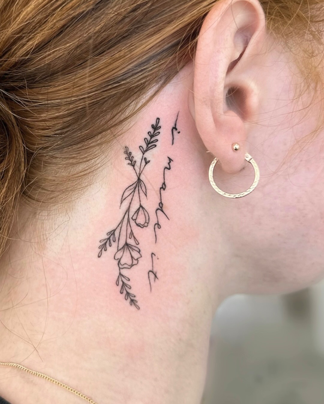
A single fine-line element — a stem, a wave, a bird — anchors a floating line of text and gives the composition a top or bottom edge.
Keep it to one element. Two competing illustrations turn a quote tattoo into a busy panel.
Vertical versus horizontal layouts
Vertical lettering along the spine or the side of the arm suits longer quotes because you are working with the body’s longest lines.
It is also harder to read at a glance, which some people want. Spine tattoo layouts show the difference between stacked and rotated text clearly.
White ink, red ink, and other colour choices
White ink lettering photographs beautifully and, in my experience, disappoints more people than any other choice — it commonly fades to a faint yellowish or barely-visible line, and results vary a lot by skin tone.
Red ink lettering is having a moment and holds up better than white, though red pigments are also the ones most often associated with delayed allergic reactions. Mention any pigment sensitivities to your artist.
Micro-quotes in unexpected places
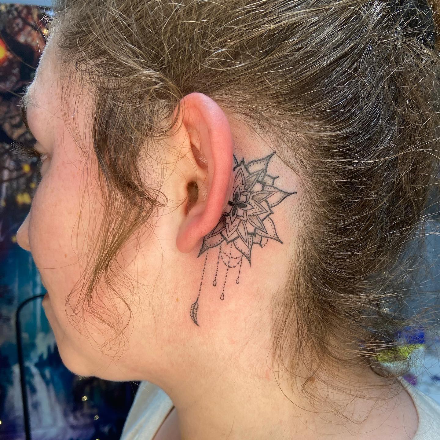
Behind the ear, the side of a finger, the inner lip — all possible, all shorter-lived.
Finger and lip lettering in particular will need touch-ups; treat them as a rolling commitment rather than a one-off.
Practical Tips and Aftercare for Lettering
Proofread the stencil like it is a legal document. Read it backwards, word by word, and then have the artist read it too — misspelled quote tattoos are common enough that most artists have a story about one.
Ask for the stencil to be placed and then walk to a mirror and move. Lettering that looks level on a flat stencil can curve unhelpfully once your arm hangs naturally.
On aftercare, lettering is not special — it heals like any other tattoo. Keep it clean, keep it lightly moisturised, and do not pick, because a lifted scab on a thin letter can pull ink out and leave a gap in a stroke.
Sun is the long game. Daily sunscreen on an exposed quote tattoo does more for its legibility over ten years than any single aftercare product does in the first two weeks; the Mayo Clinic’s tattoo guidance is a sensible baseline on healing and risks.
If a healing tattoo becomes increasingly painful, hot, swollen after the first few days, or starts weeping, that is a doctor’s call rather than an internet call — and the same goes for any rash or persistent itching, which can signal a pigment reaction. The FDA’s tattoo fact sheet covers ink-related reactions. Nothing in this article is medical advice.
Common Mistakes — and What to Do If You’re Still Not Sure
The most expensive mistake is length. A paragraph shrunk to fit a wrist is the single most common cover-up request I have heard artists describe.
The second is font shopping. Picking a display font from a website and asking for it letter-for-letter usually produces something that reads as a computer file rather than a tattoo — a good letterer will redraw it to fit your body.
The third is placement chosen for the photograph rather than the decade. If you want a quote you will actually read, put it where your own eyes land: the inner forearm, the inner wrist, the thigh.
Pain is worth factoring in for lettering specifically, because a long piece means a long sitting on one spot. This body-by-body pain guide is a realistic starting point, and the ribs deserve their reputation.
If you are torn between a quote and something with more visual weight, look at meaningful forearm tattoos for women before you commit. And if you are buying for a partner or comparing approaches, quote tattoo ideas for men covers the same ground from a different angle.
Frequently Asked Questions
How long do quote tattoos stay readable?
With a sensible size and stroke weight, a quote tattoo usually stays clearly legible for many years, though the fine details soften gradually. Thin cursive at very small sizes is the format that blurs soonest, because the gaps inside letters close as ink spreads. Placement matters too — areas with sun exposure and friction lose crispness faster than covered, flatter areas. Most people who keep lettering sharp for a decade or more are the ones using sunscreen and, occasionally, a touch-up.
What is the best font for a quote tattoo?
There is no single best font, but heavier strokes and clear letter spacing outlast delicate ones. Typewriter and clean serif faces tend to age particularly well because the letters stay visually separated. Fine-line cursive is beautiful and very popular, and it simply needs to be sized generously to hold up. The most reliable approach is asking your artist to hand-letter something rather than tracing a downloaded font.
How many words is too many for a quote tattoo?
It depends entirely on the space, not on a fixed number. As a rough guide, a forearm comfortably holds a short sentence, while a full paragraph realistically needs the ribs, back, or thigh. If a phrase has to be shrunk below a comfortable reading size to fit, that is the signal to trim the wording rather than the lettering. Cutting a quote down to its strongest fragment almost always improves both the meaning and the longevity.
Do quote tattoos hurt more than other tattoos?
The lettering itself is not inherently more painful, but long quotes mean longer sittings in one area, and sustained work on a sensitive spot is what people remember. Ribs, spine, sternum, and the inner arm are consistently reported as the harder placements. Forearm, outer thigh, and upper arm are generally more manageable. Eat beforehand, stay hydrated, and tell your artist if you need a break — that is normal and expected.
Should I get a quote in a language I don’t speak?
You can, but have it written or verified by someone who genuinely reads the language before the stencil is made. Scripts like Arabic and Japanese are especially easy to get wrong when copied from an image, because letterforms connect and change shape by position. A translation app is not sufficient verification for something permanent. If you cannot get a reliable check, the safer option is the phrase in a language you read fluently.
Quick Summary
- Trim first. Cut the quote to its strongest fragment before you think about fonts — length is the number one cause of regret.
- Weight beats delicacy. Heavier strokes and generous letter spacing are what keep lettering readable a decade on.
- Match style to length. Bold script for 1–4 words, typewriter or serif for longer lines, fine cursive only when you can size it generously.
- Pick placement for your eyes, not the camera. Inner forearm, inner wrist, and thigh are where you will actually read it.
- Verify other languages with a native reader — never from an image search or a translation app.
- Bring the original for handwriting pieces, photographed flat in daylight, and keep it to a short phrase or signature.
- Proofread the stencil twice, out loud and backwards, with your artist reading it too.
- Sunscreen is the long-term aftercare, and anything hot, spreading, or increasingly painful during healing is a question for a doctor.