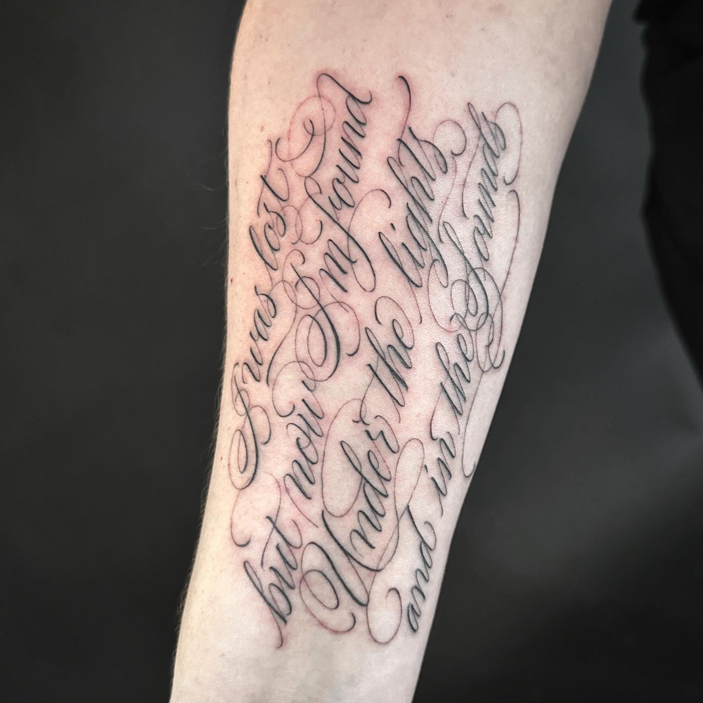
A quote tattoo lives and dies by two things: what it says, and how it looks saying it. Get both right and you have a piece that still means something in thirty years; get one wrong and you are stuck with either a badly chosen line or a typographic mess you spend the rest of your life explaining.
I have sat in on more lettering consultations than any other kind, and the pattern is always the same. Men arrive certain about the words and completely undecided about the font.
That is backwards. In my experience the words take a week to settle and the typeface takes a month, because the typeface is what people actually see from across a room.
Below are 20 quote tattoo ideas for men, ordered roughly from the quietest to the most involved. They lean toward brevity, clean spacing, and typefaces that earn their place on skin. If you are still deciding between a full sentence and a single term, our guide to word tattoo ideas for men is a useful companion read.
Which Lettering Style Is Right for You?
Font choice is not decoration. It is the tone of voice the tattoo speaks in, and it decides how the piece ages.
| Lettering style | Reads as | Best placements | How it ages |
|---|---|---|---|
| Roman capitals / serif | Classical, weighted, permanent | Inner forearm, ribs, chest | Very well; thick strokes hold shape |
| Clean sans-serif | Modern, direct, unfussy | Forearm, bicep, collarbone | Well, if letters are not undersized |
| Fine script | Intimate, personal, handwritten | Collarbone, inner bicep, ribs | Hardest; hairlines can soften over years |
| Blackletter / gothic | Heavy, traditional, confrontational | Chest, back, outer forearm | Strong, but needs space between letters |
| Traced handwriting | Deeply personal, one of a kind | Forearm, wrist, over the heart | Depends entirely on line weight |
If you take one thing from that table, take this: fine script is the most beautiful option on day one and the most demanding option in year fifteen. Ask your artist directly how they would thicken the strokes to make it last.
Why Typography Matters as Much as the Words
A sentence is not a tattoo. Font, scale, placement and letter spacing turn language into a visual object that has to work as shape long before anyone reads it.
Every artist I have asked about lettering says the same thing about size: tattooed ink spreads slightly under the skin over the years, and small text with tight spacing is what suffers first.
That is why a phrase that looks perfect at four inches on paper can close up when it is shrunk to two inches on a wrist. Our tattoo size guide is worth reading before you lock in dimensions.
Placement changes meaning too. The same line reads as a private note on the inner bicep and as a statement on the outer forearm.
Bring font references to your consultation. Screenshots, book covers, a photo of a street sign you like — anything concrete. Never leave that decision entirely to the artist and then act surprised.
10 Quote Tattoo Ideas for Men, Worked Through in Detail
1. A Single Word on the Inner Forearm
One word, chosen precisely, carries more weight than a paragraph. “Endure.” “Forward.” “Still.” “Anyway.”
The compression is the point. With nothing else on the skin to lean on, the word has to mean everything it is capable of meaning, which is a useful filter — most phrases collapse under that test.
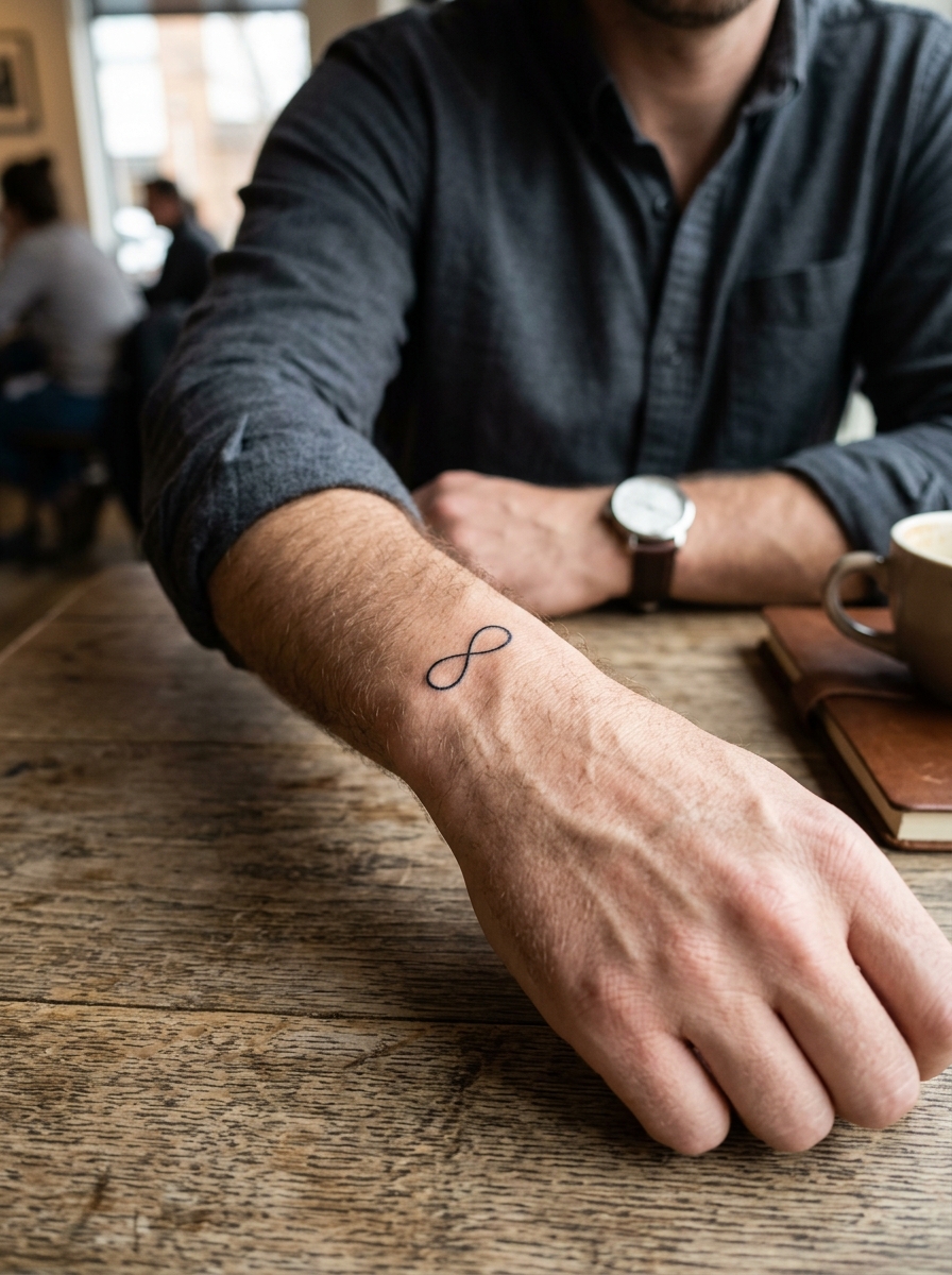
Set horizontally along the inner forearm in Roman capitals or a clean serif, as in the piece above, it reads as personal without being theatrical. This is the placement I recommend most often to men getting their first lettering piece, because the inner forearm is flat, low on the pain scale, and easy to cover with a rolled sleeve.
Budget for something around two to four inches wide. Anything smaller and you are fighting the ink spread problem from day one.
2. A Stoic Maxim in Latin
“Amor fati.” “Memento mori.” “Premeditatio malorum.” Stoic philosophy has produced some of the most tattooed Latin phrases of the last decade, and not without reason.
The ideas are compact, genuinely applicable to an ordinary Tuesday, and the Latin gives them a visual texture that the English translations rarely match.
Research the source before you ink it. Knowing the line traces back to Marcus Aurelius’s Meditations rather than a motivational account changes how you carry it, and it saves you from the one question every stranger eventually asks.
If Latin appeals but the Stoic canon does not, there is a wider field to pick from in our roundup of Latin phrase tattoo ideas.
3. Minimalist Script Along the Collarbone
A short phrase in fine script running along the collarbone is one of the quieter placements available to men, and one of the most underused.
Visible in a V-neck. Completely hidden in a crew neck. That switchable quality suits lines that are emotionally significant rather than declarative.
Be honest with yourself about the pain, though. Bone-adjacent placements are consistently reported as sharper than fleshy ones, and the collarbone sits right on top of the bone with almost nothing in between.
Keep the phrase to four or five words here. The collarbone gives you a long, narrow canvas that curves, and a longer sentence will either shrink past legibility or wrap somewhere it should not.
4. A Date in Roman Numerals
Not a quote exactly, but it is language rendered as visual design, and it belongs in this list.
Roman numerals across the forearm, collarbone or ribcage convert a date into something typographic and abstract. Personal without being explicit — most people register the shapes before they decode the meaning.
The practical warning I always pass on: write the numerals out and have two other people convert them back to a date before you sit down. Numeral errors are the single most common lettering correction artists get asked to fix, and they are painful to repair because there is no spare room between the characters.
For layout options and a refresher on how the numerals are constructed, see our full guide to Roman numeral tattoo ideas.
5. A Song Lyric Fragment
The fragment matters far more than the source.
A line that works as standalone language — that means something without the verse around it — is worth considering. A line that only lands if you already know the song is not.
Test it cold. Write it on a piece of paper, hand it to someone who does not know the band, and watch their face. When I tested this with my own shortlist years ago, two of the three lines died on contact.
There is also the taste question nobody enjoys asking: will you still respect this artist in twenty years? The lyric outlives the fandom more often than people expect, which is an argument for choosing the plainest line rather than the most quotable one.
6. The Name of Someone You Have Lost
A name, placed simply, in a typeface that suits the person’s character rather than a generic memorial font.
This is the most personal idea on the list and the most resistant to trend. Simplicity here is not a limitation — it is the entire point.
The mistake I see is over-designing it: adding a date, a bird, a banner, a set of dates in numerals, all in one session. Each addition dilutes the name. Let the name be the whole tattoo, and add to it later only if it still feels unfinished after a year.
If you are weighing formats, our guides to name tattoo ideas cover the layouts that hold up over decades.
7. Coordinates of a Place That Matters
Latitude and longitude of somewhere specific: where you were born, where something ended, where something began.
The numerical string has the visual quality of a code, which is most of the appeal. The meaning stays yours until you decide to hand it over.
Decide on the format before the stencil, not during. Degrees-minutes-seconds gives you a denser, more decorative string; decimal degrees gives you a cleaner one. They are not interchangeable, and switching after the outline is drawn means redrawing the whole layout.
Check the coordinates in two separate mapping tools. In my experience this is the second most common source of lettering regret after misspelled words.
8. A Phrase in Morse Code
A name or short phrase translated into Morse code becomes a row of dots and dashes that reads as pure pattern to almost everyone who sees it.
It works at small scale on the wrist, along a finger, or behind the ear, which makes it one of the few genuinely discreet options here.
The technical catch is spacing, and it is a real one. Morse depends on three different gap widths — between symbols, between letters, and between words — and if the artist evens them out for aesthetic balance, the message stops decoding correctly.
Mark the gaps on the reference you bring in, and check the stencil against it before the needle touches skin.
9. Arabic, Japanese or Another Non-Latin Script
When a phrase’s meaning comes from a specific cultural context and you have a real connection to that context, the original script usually carries more visual power than a translation.
It also carries more risk. Have a native speaker verify both the translation and the rendering before you commit — not a translation app, and not the artist unless they read the language themselves.
The horror stories are real and entirely preventable. Arabic in particular is written cursively, and characters change shape depending on their position in a word, so a design copied character-by-character from a font preview can come out as nonsense.
If Japanese is the direction you are leaning, our guide to Japanese word tattoo ideas covers which characters actually translate the way people assume they do.
10. Someone’s Actual Signature
A reproduced signature — particularly a parent’s or grandparent’s handwriting — is the most personal idea in this entire list.
It takes the living quality of how someone formed their letters and makes it permanent. No font can imitate that, and no two are alike.
Bring a clean, flat scan rather than a phone photo taken at an angle. A signature photographed on a curved birthday card distorts, and the artist ends up guessing at the true line of the loops.
Ask the artist to thicken the thinnest hairlines very slightly. It feels like a compromise on accuracy, and in most cases it is the only reason the piece will still read as handwriting in twenty years.
10 More Quote Tattoo Variations Worth Considering
The ten above are the ideas I see most often on men who are happy with the result years later. These next ten are the variations worth raising with your artist if none of the first batch fits.
11. A Two-Word Pairing
“Still here.” “Not yet.” “Keep going.” Two words give you a small amount of grammar to work with, which is often enough to say something a single word cannot.
Stacked on two lines it reads as deliberate. Set on one line it reads as an aside. Try both on paper before choosing.
12. A Long Line Down the Ribcage
The ribs give you the longest uninterrupted straight run on the body, which makes them the natural home for a full sentence.
They are also, by broad consensus among artists and clients alike, one of the sharpest places to be tattooed. Expect a long session and plan to eat properly beforehand.
13. A Private Line on the Inner Bicep
The inner bicep is effectively invisible unless you raise your arm, which makes it the right place for something you are not looking to explain at work.
The skin there is soft and the surface curves, so keep the phrase short enough that it does not disappear around the side of the arm.
14. A Quote Paired With One Small Mark
A single line with one small element beside it — a fine-line arrow, a dot, a short rule — gives the eye somewhere to land and stops the text floating.
One mark. Not three. The moment it becomes a composition, the words stop being the subject.
15. A Verse Reference Instead of the Verse
Rather than tattooing four lines of scripture, some men tattoo only the reference — a book, chapter and verse in small numerals.
It takes a fraction of the space, ages far better than a paragraph of small text, and stays legible for decades. The meaning is still fully there for anyone who looks it up.
16. A Phrase in Your Family’s Language
Something a grandparent used to say, in the language they said it in. Gaelic, Punjabi, Portuguese, Tagalog, whatever the household spoke.
The same verification rule from idea nine applies. Get it checked by someone who actually speaks it, ideally someone in the family.
17. A Memorial Line Rather Than a Name
If a name feels too direct, something the person actually said often carries more of them than their name does.
Our collection of memorial tattoo ideas covers how these are usually composed and where men tend to place them.
18. Lettering Cut Out of a Solid Block
Instead of black letters on skin, the letters are left as bare skin inside a solid black rectangle or band.
It is bold, modern, and unforgiving — this technique needs an artist with real blackwork experience, because uneven saturation in the block shows immediately. Ask to see healed photos, not fresh ones.
19. A Phrase Wrapped as an Armband
A sentence that circles the bicep or forearm turns the words into a band, and no single viewpoint shows the whole thing.
Decide with your artist where the sentence should start and end, because the seam will always sit somewhere. Usually it goes on the inner arm where it is least noticed.
20. Your Own Handwriting
The least discussed option and one of the best. Write the line yourself, twenty or thirty times, and pick the version that looks most like you on a bad day rather than your best day.
It costs nothing, it cannot be duplicated, and it removes the font decision entirely.
Getting It Done Well: Practical Advice
Choose the artist by their lettering, not by their overall following. Lettering is a specialisation, and an artist with a beautiful realism portfolio may have tattooed very little text. Scroll their feed specifically for words and ask to see healed lettering from two or more years ago.
Proofread the stencil while it is on your skin, in a mirror, out loud, letter by letter. Every artist I have asked considers this the client’s job, not theirs — and once the outline is in, a misspelling is a cover-up problem rather than an eraser problem.
Aftercare for lettering matters more than for most other work, because fine lines are what suffer when a healing tattoo is picked at, scrubbed, or left to dry out. Follow your artist’s instructions first, and use our tattoo aftercare guide as a general reference between appointments.
Watch for anything that does not look like normal healing. Spreading redness, heat, swelling that increases rather than settles after the first few days, pus, or a fever are reasons to see a doctor promptly — a healing tattoo is an open wound, and infections need medical treatment, not home remedies. The American Academy of Dermatology publishes plain-language guidance on caring for tattooed skin. Nothing in this article is medical advice.
Common Mistakes, and What to Do If You Are Still Not Sure
The four failures I see most often are the same every time: text sized too small for the placement, a phrase too long for the space it was squeezed into, a font chosen from a preview rather than from healed work, and a translation nobody qualified ever checked.
All four are decisions made in the last ten minutes before the needle. None of them are the artist’s fault.
Live with the phrase for a year before you tattoo it. Write it on your arm in pen, put it on your phone lock screen, say it out loud when it applies. If it still means the same thing twelve months later, it is worth wearing.
If the ideas here have not landed, widen the search rather than settling. It is worth reading through quote tattoo ideas for women for lettering approaches that translate across, and small meaningful tattoo ideas for men if a symbol might say it better than a sentence would.
Frequently Asked Questions
How small can a quote tattoo be before it stops being readable?
There is no single safe number, because it depends on the font, the placement and the artist’s line work. As a working rule, artists generally want the height of a lowercase letter to be a few millimetres rather than one, and they want visible space between characters. Tattoo ink spreads slightly under the skin over the years, so letters that touch on day one can merge later. Ask your artist for their own minimum before you commit to a size.
Where do quote tattoos hurt the least for men?
The outer and inner forearm, the outer bicep and the outer thigh are usually described as the more tolerable areas, since there is muscle and fat between the needle and the bone. Ribs, collarbone, sternum, feet and the inside of the elbow are consistently reported as sharper. Pain is individual, though, and a short lettering piece is over quickly wherever it goes. If a placement worries you, ask the artist to break it into two shorter sessions.
Do quote tattoos blur more than other tattoos?
They do not blur faster, but blurring is more noticeable in text than in imagery. A softened line in a rose looks like shading; a softened line in a letter can turn an “e” into an “o”. That is why line weight and letter spacing matter more in lettering than almost anywhere else. Sun protection once the tattoo has fully healed is the single most useful thing you can do to slow the process.
Should I get the quote in English or in the original language?
Choose the original language only if you have a genuine connection to it and can get the wording verified by someone who reads it fluently. The original script often carries more visual character, but the risk of a wrong character or a distorted rendering is real. English is not the lesser choice — a well-set English line you fully understand beats a mistranslated one every time. When in doubt, get the version you can read yourself.
How much does a quote tattoo usually cost?
Most short lettering pieces fall under a studio’s minimum charge or a single short session, because they take far less time than illustrative work. Prices vary enormously by city, studio and artist experience, so the only reliable figure is the quote you get from the artist you actually want. Ask whether they charge a flat rate or by the hour, and whether a touch-up is included. Do not choose a lettering artist on price alone.
Quick Summary
- Decide the words first, then spend longer on the typeface than you think you need to.
- Serif and clean sans-serif age best; fine script looks best on day one but demands the most from the artist.
- Size it generously — ink spreads over the years, and small tight lettering closes up first.
- Inner forearm, outer bicep and outer thigh are the gentler placements; ribs and collarbone are sharper.
- Verify everything twice: spelling, Roman numerals, coordinates, and any translation, ideally with a fluent speaker.
- Proofread the stencil on your skin, out loud, before the first line goes in.
- Follow your artist’s aftercare instructions, and see a doctor for spreading redness, heat, pus or fever.
- Live with the phrase for a year. If it still means the same thing, it is ready.