A name tattoo is the most direct thing you can put on your skin. No symbolism, no interpretation, no explaining it to anyone at a barbecue. It is the only tattoo whose entire meaning lives outside the design, in a person rather than a picture.
I have watched more people agonise over a name than over a full sleeve, and almost always over the wrong question. They worry about whether the name is a mistake. They rarely ask whether the lettering is any good.
That is backwards. In my experience the regret I hear about is nearly always about execution — a script chosen off a laminated sheet in ten minutes, letters set so small they closed up within five years, a placement picked because it was the cheapest spot to reach. The name itself is usually fine.
What follows is 22 approaches to the same idea, sorted by how they actually get built rather than by novelty. If the name in question belongs to a child, the kids’ name tattoo guide goes deeper on stacking and spacing than I will here.
Which Lettering Style Is Right for You?
Before placement, before size, before anything: decide what the letters are made of. This is the comparison I sketch out for people who arrive with a name and no plan.
| Lettering Style | Best For | How It Ages | Typical Size |
|---|---|---|---|
| Fine line script | Wrists, inner forearms, collarbones | Softens over the years; may need a touch-up | 5–12 cm wide |
| Traced handwriting | Memorial pieces, a parent’s or child’s note | Same as fine line, and worth sizing up slightly | 6–15 cm wide |
| Serif or typewriter | Upper arm, ribs, spine | Holds shape well; serifs can thicken slightly | 6–20 cm wide |
| Ornate or gothic block | Chest, shoulder, knuckles, back | The most durable; heavy line weight forgives spread | 10–25 cm wide |
| Initials or monogram | Fingers, behind the ear, ankle | Small placements blur fastest, especially fingers | 1–4 cm wide |
Sizes above are what I see most often, not rules. Your artist may push you larger, and they are usually right to.
What Actually Makes a Name Tattoo Age Well
Tattoo ink sits in the dermis, and over decades the surrounding tissue moves it very slightly. Thin lines placed close together are the first casualty.
That single fact explains most of what separates a name tattoo that still reads at fifty from one that has turned into a grey smudge. Line weight and letter spacing do more work than font choice.
Placement matters for the same reason. Fingers, the outer edges of the hands and the tops of the feet see constant friction and sun, and they hold detail worse than an inner forearm or a shoulder that spends most of its life under a sleeve.
Sun exposure is the other half of it. Every artist I have asked says the same thing about faded lettering — the client almost never wore sunscreen on it.
None of this is a reason to avoid a small tattoo. It is a reason to be honest with your artist about where the piece will live and to accept that some placements are a maintenance commitment. The American Academy of Dermatology has straightforward guidance on protecting tattooed skin long term.
22 Name Tattoo Ideas Worth Considering
These are grouped by construction rather than by theme, because two ideas that look different on a mood board often turn out to be the same tattoo with a different word in it.
1–3. Fine Script on the Forearm, Wrist and Collarbone
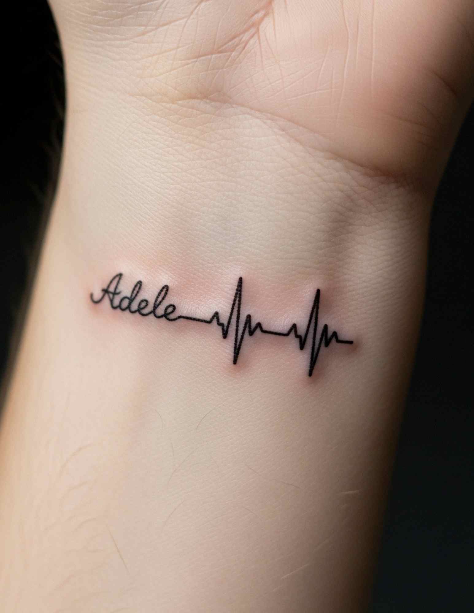
This is the default, and it is the default for good reason. A single name in a light script follows the natural lines of the body better than any block font.
The inner forearm is the most forgiving version: flat, low-friction, easy to cover, and comfortable to sit through. The inner wrist is the same tattoo scaled down, and the collarbone is the same tattoo turned into a curve.
The collarbone deserves a note. Lettering that follows the bone reads beautifully when you stand straight and compresses when you round your shoulders, so ask the artist to stencil it and then look at yourself sitting down, not just standing at the mirror.
For the ribcage version, be ready for it to be sharper than you expect. It is a few minutes of work for a single name, which is survivable, but nobody enjoys it.
4–6. Names Paired With Dates and Roman Numerals
Adding a date changes the register of the piece. A name alone is affection; a name with a date is a record.
Set in small caps or a light serif underneath the script, a birth date sits quietly and gives the composition a base line. This is the most common form I see for children and for memorial work.
Roman numerals do the same job while looking less like a caption — useful when you want the date to be legible to you and opaque to everyone else. There is a fuller breakdown of formatting and common errors in the Roman numeral tattoo guide, and it is worth reading before you commit, because transcription mistakes in numerals are the single most common correction I hear artists complain about.
Whatever format you choose, write the date out on paper, check it twice, and have someone else check it too. A misspelled name gets caught at the stencil stage. A wrong numeral often does not.
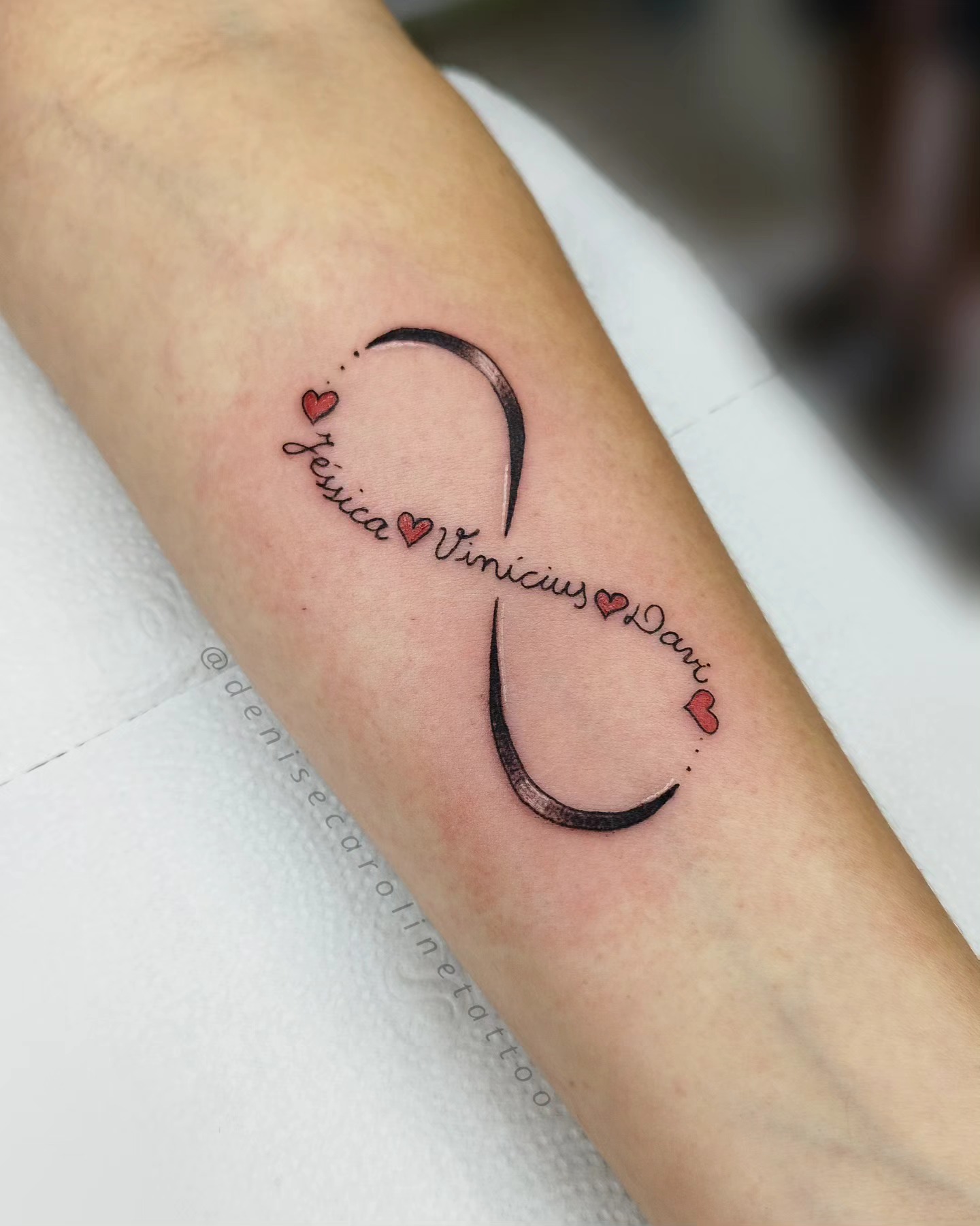
7–9. Children’s Names, Stacked and Spaced
Multiple names need an architecture, not just a list. Stacked and left-aligned is the cleanest solution I know, and it leaves room to add a line later.
That last part matters more than people expect. If there is any chance of another child, plan the layout now — leave the spacing consistent and the alignment on one edge, so a fourth name slots in without redrawing the whole piece.
Mixing weights helps too: the names in a script, the dates in a small clean face beneath each one. It keeps the block from reading as a wall of text. Parents doing a matching version of this with an older child often end up somewhere near these mother and daughter tattoo ideas.
An enclosure — a single continuous heart line, a thin arch, a small flower — can hold a short name together without adding much visual noise.
10–12. Names Built Into Flowers, Hearts and Small Illustrations
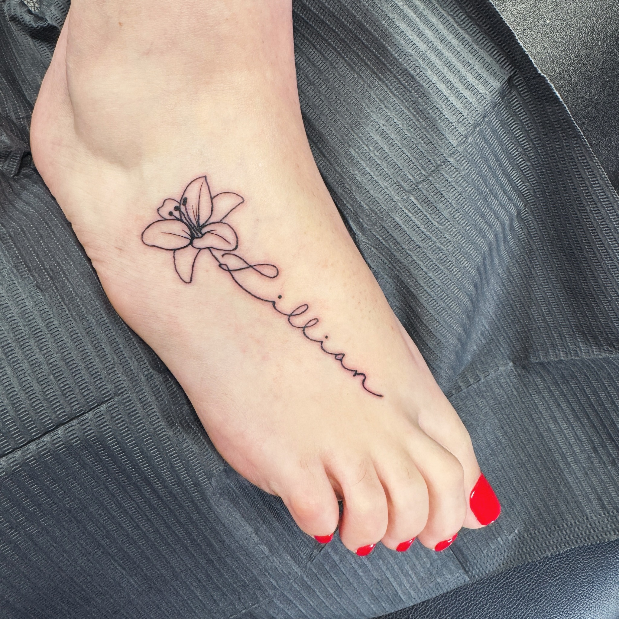
Here the name stops being lettering and becomes part of a drawing. The last letter trails into a stem; the crossbar of a t becomes a branch.
When it works, it is the most elegant version of the whole category. When it fails, it fails because the illustration and the lettering were drawn by two different logics — a heavy botanical next to a hairline script never quite settles.
Ask to see the artist’s own lettering, not just their line work. Plenty of excellent illustrative tattooers are ordinary letterers, and the reverse is just as common.
The pet version belongs in this group. A name beside a single-line portrait of the animal is one of the few tattoos I have never heard anyone regret, which tells you something about dogs.
13–15. Initials, Monograms and Barely-There Lettering
If a full name feels like too much, initials carry the same weight privately. One letter on a finger, two letters joined into a monogram, a set of initials on the ribs.
Wide letter spacing with a soft grey wash is a related trick: the word is fully there, but it reads like a watermark rather than a statement. It suits people who want the tattoo for themselves and not for the room.
Fingers come with a warning. They fade and blur faster than almost anywhere else on the body and often need touching up within a few years — the finger tattoo guide covers what to expect. Get one because you like it now, not because you expect it to look identical in a decade.
16–18. Bold Fonts: Ornate Script, Chest Pieces and Knuckle Lettering
Heavier lettering is the most durable thing in this article. Thick strokes have room to spread without closing up, which is why old-school lettering from decades ago is often still perfectly readable.
Ornate script across a shoulder or a chest gives you scale to play with: flourishes, shading, a crown or a banner setting the top edge. This is where a genuine lettering specialist earns their fee.
Knuckles are the far end of the commitment scale — permanently visible, painful, and prone to needing touch-ups. If you like the look but not the placement, the same energy translates to a forearm or a chest, and there are more legible-at-distance options in these word tattoo ideas.
19–20. Names in Another Language or Script
Writing a name in Arabic, Devanagari, Hebrew, Greek or Japanese changes the tattoo from a word into a shape. It also raises the stakes considerably.
Have the spelling checked by someone fluent who is not the artist, and have it checked again by a second person. Transliteration of names is genuinely difficult, and a tattooer working from a screenshot cannot catch an error they cannot read.
Ask for the reference to be supplied as a high-resolution file rather than a photo of a phone screen, and confirm the direction of the script with the artist before the stencil goes on. If you are drawn to the letterforms themselves more than to a specific name, the Japanese word tattoo guide is a better starting point than a name.
21–22. Hidden Placements and Names Folded Into a Phrase
Behind the ear, along the hairline, on the inside of the bicep, under the bust: placements you choose specifically because most people will never see them.
Behind the ear is the classic. It holds a short name or two initials, it is easy to hide with hair down, and it is a small enough piece that most people find it manageable — the small neck tattoo guide has more on how these sit against the hairline.
The last idea is the quietest one: fold the name into a short phrase. “For Ann, always” reads as a sentence rather than a label, which is a very different thing to have on your arm — and, incidentally, far easier to live with if circumstances change.
If a Name Feels Too Literal
Sometimes the instinct is right but the execution is too on-the-nose. These are the three substitutes I suggest most often.
A date instead of a name
The day someone was born, the day you met, the day you lost them. It carries the same weight and explains itself to nobody.
An object that belonged to them
A pocket watch, a particular flower, a bird they liked. Memorial work leans heavily on this and it ages beautifully — there are worked examples in these memorial tattoo ideas.
Their handwriting, without the name
A signature, a single word from a note, the way they signed off a birthday card. It is the most personal option in this entire article and it does not require the name at all.
Practical Advice Before You Book
Bring a reference of the lettering style, not just of a tattoo you liked. Screenshot the letterforms; that is what you are actually buying.
Ask the artist to print the name at full size and tape it to your skin before the stencil. Ten seconds of looking in a mirror at actual scale prevents the most common size regret, which is going too small.
Healing a small lettering piece is straightforward for most people: keep it clean, keep it moisturised, keep it out of the sun and out of pools for the first couple of weeks, and follow whatever aftercare your artist gives you. Redness that spreads, increasing pain after the first few days, pus, or fever are not normal healing and warrant a doctor rather than an internet search — the Mayo Clinic lists the risks worth knowing about, and the FDA covers ink reactions.
Nothing in this article is medical advice, and no article can assess your skin, your medication or your history. A licensed artist and, where relevant, a doctor should.
Still Not Sure? The Mistakes I See Most
Going too small is the first one. A name at 3 cm looks precise on fresh skin and closes up years later; the same name at 7 cm ages far better.
Choosing the font in the chair is the second. Decide it at home, in daylight, printed out, not from a folder handed to you thirty seconds before the needle.
Assuming a partner name is unfixable is the third — lettering is one of the easier things to work over, and the cover-up guide shows what is realistic. If you and a partner want something joint but less absolute, matching couples tattoos solve the same impulse with far less exposure.
And the quiet one: not asking to see healed photographs. Fresh lettering always looks crisp. Healed lettering, two years on, is the only honest portfolio.
Frequently Asked Questions
Are name tattoos really bad luck?
No — that reputation comes almost entirely from partner names, not from names in general. A child’s name, a parent’s name, a grandparent’s name or a pet’s name carries almost none of the same risk, because the relationship does not end the way a romance can. In my experience the people who regret a name tattoo usually regret the execution — a font they picked in the studio, a size that was too small — more than the name itself. Take the design seriously and the superstition mostly takes care of itself.
How much does a name tattoo cost?
Most small script names land at a studio’s minimum charge, and that minimum varies enormously by city, studio and artist — there is no useful national figure. Larger ornate lettering across a chest or shoulder is priced by time instead, so it scales with how long the piece takes. Custom lettering drawn from scratch, or a traced signature, usually costs more than picking a face off a sheet. Ask for a firm quote before the stencil goes on rather than after.
Where does a name tattoo hurt the least?
The outer forearm, outer upper arm and the shoulder are generally the easiest places to sit through, because there is more muscle and fewer nerve endings close to the surface. Ribs, sternum, the top of the foot, the inner bicep and behind the ear tend to be sharper. A single small name is usually a matter of minutes, so even a tender spot is manageable for most people. Pain is individual, though, so treat these as tendencies rather than promises.
Can a name tattoo be removed or covered later?
Yes, though neither route is quick. Laser removal typically takes multiple sessions spaced weeks apart and results vary with ink colour, depth and skin type — a dermatologist or a licensed laser clinic is the right person to assess it. Cover-ups are often easier with lettering than with heavy solid work, because script leaves gaps a new design can absorb. Never attempt removal creams or any DIY method at home; they can scar and are not a substitute for professional treatment.
What font should I choose for a name tattoo?
Pick line weight before you pick a typeface. A very thin script at 4 cm wide will look different in fifteen years than the same word at 10 cm in a medium weight, and that difference matters more than the specific font. Ask your artist to print the name at actual size and hold it against your skin before committing. If the letters are hard to read on paper at arm’s length, they will be harder to read on healed skin.
Quick Summary
- Line weight and letter spacing decide how a name tattoo ages — more than the font does.
- Fine script suits inner forearms, wrists and collarbones; heavy lettering suits chests, shoulders and backs.
- Size up. Going too small is the most common regret I hear, and it is not fixable without a rework.
- Adding a date turns affection into a record; check every numeral twice before the stencil.
- Stack multiple names on one alignment and leave room for a line you might add later.
- Fingers, hands and feet fade fastest — choose them knowing they are a maintenance commitment.
- Have any non-Latin script checked by two fluent readers, not by the artist.
- Ask to see healed work, not fresh work, before you book a lettering piece.