I have watched roman numeral tattoos go in and out of fashion for years, and they keep coming back for one simple reason. A date written in roman numerals says something enormously personal while looking, to everyone else, like a quiet row of letters.
That built-in privacy is the whole appeal. The people who need to know what MMXVII means already know.
When I have sat with friends planning theirs, the hard part is never the meaning — it is the layout. Numeral spacing, separator style and font weight decide whether the piece still reads cleanly in ten years or turns into a smudged bar of black.
This guide walks through 21 designs I keep seeing done well, plus the practical decisions behind them. If you like the pared-back end of things generally, it sits close to the minimalist tattoo ideas we cover elsewhere.
Which Roman Numeral Style Is Right for You?
Style choice matters more here than in almost any other tattoo, because there is no imagery to carry the piece. Here is how the four main approaches actually differ.
| Style | Best For | Typical Size | How It Ages |
|---|---|---|---|
| Fine line serif | Discreet single dates, wrist and collarbone | 2–4 inches wide | Softens fastest — expect a touch-up eventually |
| Bold serif | Forearm, chest, ribs, anything read from a distance | 4–8 inches wide | The most forgiving option long term |
| Sans-serif / stencil | Modern, architectural look; long numerals | 3–6 inches wide | Holds shape well, but spacing errors show badly |
| Ornamental or framed | Numerals combined with a banner, frame or motif | 4–7 inches | Depends on the surrounding detail more than the numbers |
What Actually Decides Whether a Roman Numeral Tattoo Works
The first thing worth knowing is that roman numeral dates vary wildly in length, and that changes everything about placement.
The year 2000 is just MM. The year 1888 is MDCCCLXXXVIII — thirteen characters for a single year.
Before you commit to a spot, write your full date out and count the characters. A March 1998 birthday becomes III • XIV • MCMXCVIII, which is far too wide for a wrist at a comfortable font size.
The second factor is stroke weight against skin. Very thin lines placed close together tend to blur into each other as ink settles over the years, which is why I always suggest slightly more spacing than looks necessary on the stencil.
The third is simply proofreading. I have heard the same story from more than one artist: a client approves a stencil, and nobody catches that IX was typed where XI belonged until weeks later.
21 Roman Numeral Tattoo Ideas
These are grouped loosely from simplest to most involved. Every one of them I have either seen healed in person or had an artist walk me through.
1. Birth Date on the Inner Forearm
This is the default for a reason. The inner forearm is flat, low on movement and easy to read at arm’s length, which suits a long numeral string better than almost anywhere else.
Run it horizontally along the arm rather than across it. Across the arm the numerals curve away and the last few characters get lost.
In my experience a full date sits comfortably at around four to five inches here without needing a tiny font.
It is also one of the easier spots to sit through, which matters if you are getting your first piece.
2. Birth Year Only
Dropping the day and month is an underrated move. A year on its own is short, balanced and almost impossible to misread.
MCMXCV or MMIV reads as a design element rather than a code, and it fits places a full date never could.
I have seen this done at barely an inch and a half on the side of a finger and still hold up.
It is also the safest option if you want something small now and might expand around it later.
3. Anniversary Date
Wedding and anniversary dates are the second most common request after birthdays, and they carry a slightly different design brief.
Couples often want two matching pieces, which means the spacing and font have to be replicated exactly by the same artist where possible.
Keep it to one line. Stacked anniversary dates tend to look like a receipt.
If you are planning a pair, book both pieces with the same artist on the same day where you can.
4. Roman Numerals and Coordinates
Pairing a date with the coordinates of where it happened is one of the most satisfying combinations in this whole category.
The two lines balance each other visually: numerals on top, degrees and minutes below, set in the same font at a slightly smaller size.
Line them up on a shared centre point rather than left-aligning them, or the block looks accidental.
If the location matters more than the date to you, our guide to coordinate tattoo ideas goes deeper on formatting.
5. Vertical Spine Column
Turning numerals vertical solves the length problem completely. A thirteen-character year that would never fit on a wrist runs comfortably down the spine.
The trade-off is that vertical numerals are harder to read, so this suits people who want the meaning private.
Alignment is everything here and it is genuinely hard to stencil straight, so book an artist who does spine work regularly.
The spine is also one of the sharper spots to sit through — see our notes on fine line spine tattoos for what to expect.
6. Numerals in a Banner
A banner turns a plain date into a piece with structure, which is why it reads as traditional rather than modern.
The ribbon gives the artist somewhere to put shading and depth, so the tattoo does not rely entirely on the numerals to hold interest.
Ask for the banner slightly larger than feels necessary. Cramped ribbons crush the numerals inside them.
This ages well because the banner outline carries the design even as fine internal detail softens.
7. Collarbone Placement
The collarbone gives you a ready-made horizontal line to follow, which flatters a single-line date enormously.
Keep the numerals small and evenly weighted so they track the bone rather than fighting it.
It is a thin-skinned area and most people find it a sharp sit, though it is over quickly at this size.
For more on what suits this spot, we have a full round-up of collarbone tattoo ideas.
8. Roman Numerals with a Clock
Clock faces already use roman numerals, so this combination is the rare one that feels native rather than bolted together.
Some artists set the hands to a meaningful time and put a date beneath, which gives you two pieces of information in one design.
It needs real size to work — a numeral dial under about three inches turns to mush.
There is a lot more on this style in our clock tattoo ideas guide.
9. Wrist Band of Numerals
Wrapping numerals around the wrist as a band is the elegant solution to a long date that will not fit flat.
The spacing has to be worked out on the arm, not on paper, because the wrist tapers and even spacing on a stencil comes out uneven on skin.
Expect a small gap where the band meets, usually placed on the inside where it shows least.
Our guide to wrap around wrist tattoos covers the join problem in more detail.
10. Numerals with a Crown
A crown above the numerals is a common pairing, usually carrying a personal rather than a regal meaning.
Keep the crown simple and linear. Detailed crowns overpower a short date and end up looking like two separate tattoos.
The proportion I have seen work best is a crown roughly two-thirds the width of the numeral line beneath it.
Centre it carefully — an off-centre crown is the first thing the eye notices.
11. Multiple Significant Dates
Stacking two or three dates — children’s birthdays, for instance — is entirely doable, but it needs planning that a single date does not.
Every line has to use the same font, the same weight and the same separator, or the block looks inconsistent.
Leave room. If there is any chance of adding a fourth date later, tell the artist now so the composition allows for it.
Vertical stacking on the ribs or upper arm handles multiple lines better than a wrist ever will.
12. Behind the Ear
Behind the ear is the most concealed placement on this list, which is exactly why people choose it.
It only works for short numerals. A four-character year is realistic; a full date is not.
Fine lines in this spot tend to soften noticeably over the years because the skin is thin and sees a lot of sun.
Plan on a touch-up at some point and go slightly bolder than you think you need.
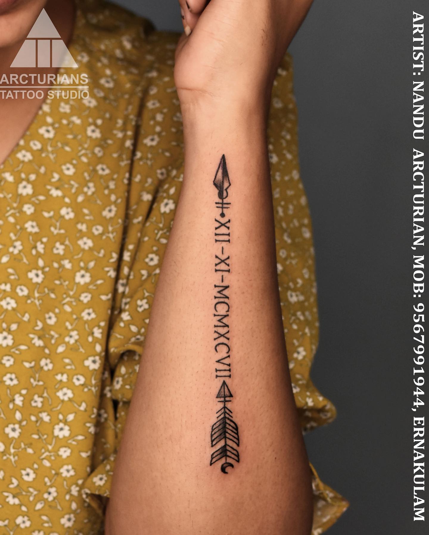
13. Numerals with an Arrow
An arrow drawn through or beneath the numerals gives a horizontal date a spine to sit on.
It also solves a real design problem: a long line of numerals can look like it is floating with nothing to anchor it.
Keep the arrow thinner than the numeral strokes so it supports rather than competes.
Forearms and outer arms suit this best, since the arrow wants a straight run of skin.
14. Chest Placement
The chest is where roman numerals get to be genuinely large, and large is where this style looks its best.
Bold serif numerals at six inches or more read cleanly from across a room and will still read cleanly in twenty years.
Placement across the upper chest follows the natural line between the shoulders; placement over the heart is smaller and more personal.
It is a longer sit than most people expect for what is technically just lettering.
15. Numerals and a Cross
Cross-and-date combinations are usually memorial pieces, and they are worth taking time over for that reason.
A plain, slightly heavier cross alongside a lighter date keeps the two elements distinct.
Placing the cross to the left of the numerals rather than above tends to read better on a forearm.
If this is the direction you are going, our round-up of cross tattoos shows a wider range of styles.
16. Intertwined Dates
Interlocking two dates so they share a character or overlap slightly is a design-forward take on the couple’s tattoo.
It only works when the two dates have something in common to hinge on, so it is worth checking your numerals before you fall in love with the idea.
Executed badly it becomes unreadable, so ask to see healed examples from the artist first.
Expect to pay for design time here — this is drawing work, not a font.
17. Geometric Frame
A thin diamond, hexagon or circle around the numerals gives an otherwise plain date a finished edge.
The frame should be lighter than the numerals so the date stays the focus.
This style suits the outer forearm and shoulder, where there is enough flat skin for the shape not to distort.
Geometric outlines hold up reasonably well as long as the lines are not hairline-thin.
18. Full Date with Month in Numerals
Writing all three parts — day, month and year — in numerals is the most complete version and the longest.
The separator matters more than people expect. Interpuncts, small diamonds and simple dots all work; slashes tend to look cluttered.
Check the order you want before the stencil goes on. Day-month-year and month-day-year produce genuinely different tattoos.
This is a forearm, rib or chest piece. It will not fit a wrist comfortably at a readable size.
19. Numerals with Birds
Small birds above a date is one of the most common memorial combinations, and it stays popular because it is genuinely well balanced.
Two or three birds is the sweet spot. More than that and the eye stops reading the numerals.
Vary the bird sizes slightly so the group looks natural rather than stamped.
Our wider memorial tattoo ideas guide covers other symbols that pair the same way.
20. Large-Scale Forearm Statement
Scaling numerals up to fill the length of the forearm turns a date into the main event rather than a discreet detail.
At this size you can use heavier serifs, shading inside the strokes, or a slight three-dimensional treatment.
It also ages better than any small version on this list, simply because there is more room between the lines.
Be aware this is a visible tattoo in most short-sleeved clothing, which is a separate decision from the design itself.
21. Concealed Placement
Some people want the date to be effectively invisible: inside the bicep, along the ribs, under the hairline, on the inner ankle.
These spots let you go slightly larger than a wrist would allow while keeping the piece private.
Ribs and inner bicep are among the more uncomfortable places to sit, which is worth factoring in.
If discretion is the whole point, decide how visible you want it in a t-shirt before you pick the spot.
Variations Worth Considering
If none of the 21 above is quite right, these adjustments cover most of the remaining ground.
Numerals in White or Light Ink
White and very light inks are sometimes offered for a subtler effect, and they do look striking when freshly done.
Be realistic about longevity, though — light inks fade unevenly and can yellow, and results vary a great deal with skin tone.
Every artist I have asked about this gives the same advice: ask to see their own healed work at a year or more before booking.
Fingerprint or Handwriting Hybrids
Combining numerals with a traced signature or a fingerprint is a way to add a person to a date.
The two elements need clearly different weights so they do not blur together.
Bring the source material in early so the artist can tell you honestly whether it will hold up at tattoo scale.
Negative Space Numerals
Rather than tattooing the numerals themselves, the artist fills a shape in solid black and leaves the numerals as bare skin.
It is bold, unusual and demands a large area — realistically a shoulder, thigh or upper back.
This is a specialist job. Blackwork spreads slightly as it heals, so the negative-space gaps must be cut wider than they look on paper.
Adding a Second Date Later
Plenty of people start with one date and add another years later, and that is easy if the first was planned for it.
The two things to record now are the exact font name and the artist who did it.
Without those details, matching a second line convincingly is much harder than it sounds.
Getting the Details Right: Layout, Font and Aftercare
The single most useful thing you can do is print your date at actual size and tape it to the spot for a day. It is a low-effort way to catch a design that is far wider than you pictured.
Ask the artist for spacing that looks slightly too generous on the stencil. Ink spreads a little over the years, and generous spacing is what keeps MMXVIII from turning into a solid bar.
Proofread the stencil out loud, character by character, before the needle touches skin. I would rather feel silly for thirty seconds than live with a wrong numeral.
For healing, follow the aftercare your artist gives you rather than anything you read online, including here. Lettering is shallow work and generally heals quickly, but if you see spreading redness, heat, swelling or discharge, that needs a doctor — the FDA’s fact sheet on tattoos and permanent makeup and Mayo Clinic’s tattoo guidance both explain the warning signs. Never try to fix or remove a tattoo yourself.
Common Mistakes — and What to Do If You Are Still Unsure
The most expensive mistake is a wrong numeral, and it happens more often than people admit. Convert your date twice, from two different sources, and check the result against a calendar year you already know.
The second is going too small for the character count. A thirteen-character year on a wrist is a request most good artists will push back on, and they are right to.
The third is mismatched separators between stacked dates — dots on one line, diamonds on another — which reads as sloppy even when nobody can say why.
If you are not settled on roman numerals at all, it is worth looking sideways first. Our small meaningful tattoo ideas and family tattoo ideas cover other ways to carry the same meaning without a date.
And there is no rush. A date that matters this year will matter just as much in six months, by which point you will know whether you still want it on your forearm.
Frequently Asked Questions
How do I write my date in roman numerals correctly?
Convert each part separately — day, month and year — rather than the date as one number. The symbols are I for 1, V for 5, X for 10, L for 50, C for 100, D for 500 and M for 1000, and a smaller symbol before a larger one subtracts, so IV is 4 and IX is 9. March 14, 1998 becomes III • XIV • MCMXCVIII. Check your result against a second converter before you take it to a studio, because a single wrong character is permanent.
Do roman numeral tattoos hurt?
Lettering is relatively shallow work, so the pain depends far more on placement than on the design itself. Forearm, outer arm and shoulder are among the more tolerable spots. Ribs, spine, collarbone, sternum and behind the ear sit over thin skin and bone and are usually described as sharper. Most small roman numeral pieces are finished within an hour, which limits how long you have to sit with it.
How much does a roman numeral tattoo cost?
Most studios have a shop minimum that a small date will fall under, so a short numeral piece is often priced at that minimum rather than by the hour. Larger or combined designs — a clock face, a banner, negative space work — are quoted by time and vary a lot by city and artist. Rates differ enough between regions that any figure quoted online is close to meaningless. Ask two or three local studios for a quote on your exact design.
Will a fine line roman numeral tattoo blur over time?
Some softening is normal for any tattoo, and fine lines placed close together are the most likely to show it. How quickly depends on placement, sun exposure, skin type and how the piece was applied. Bolder strokes and more generous spacing between characters are the two things most within your control. A touch-up after several years is common rather than a sign anything went wrong.
Where is the best place for a long roman numeral date?
Anywhere with a long, flat run of skin: the inner or outer forearm, the ribs, the chest, or the spine if you turn it vertical. The forearm is the most popular because it is flat, easy to read and comparatively comfortable to sit through. Wrists, fingers and behind the ear only really suit short strings such as a year on its own. Count your characters first — that number decides the placement more than taste does.
Quick Summary
- Write your date out in numerals and count the characters before choosing a placement.
- Short strings such as a year alone suit wrists, fingers and behind the ear; long dates need a forearm, ribs, chest or spine.
- Bold serif ages best; fine line looks the most delicate but softens fastest.
- Ask for slightly more spacing between characters than looks necessary on the stencil.
- Pairings that work: coordinates, a clock face, a banner, a simple cross, small birds, a light geometric frame.
- Keep font, weight and separator identical across every line if you are stacking multiple dates.
- Proofread the stencil character by character, out loud, before any ink goes in.
- Follow your artist’s aftercare, and see a doctor for spreading redness, heat, swelling or discharge.