A word tattoo lives or dies on the lettering, not on the word. I have watched men agonise for months over which word to choose and then pick the font in ten minutes at the shop — which is exactly backwards.
The word matters, obviously. But almost any word looks good in the right hand and almost every word looks cheap in the wrong one.
What follows is twenty word tattoo ideas for men that I keep coming back to, along with the honest version of how each one behaves on skin: which need width, which need a condensed face, which age well, and which a man is likely to feel differently about in fifteen years.
If this is your first piece, it is worth reading alongside our broader guide to first tattoo ideas for men, because a lot of the placement logic carries over.
Which Word Tattoo Approach Is Right for You?
Before picking a word, it helps to know which of the four broad formats you are actually in the market for. They have very different demands.
| Format | Best Placements | Lettering That Suits It | Main Risk |
|---|---|---|---|
| Single short word (4–6 letters) | Wrist, inner forearm, ribs, bicep | Clean serif or plain capitals | Going too small and losing the letter gaps |
| Single long word (8–10 letters) | Outer forearm, chest, collarbone | Tall condensed block letters | Cramming it into a space that cannot hold it |
| A name or surname | Inner arm, upper back, over the heart | Traced handwriting, or blackletter for surnames | Choosing the wrong relationship |
| A short phrase or quote line | Along the forearm, ribs, under the collarbone | Script or light capitals, one line only | Wrapping onto a second line |
The row that trips people up most is the long single word. Ten letters need roughly twice the width of five, and no font choice gets around that.
Why Font and Execution Decide Everything
Tattoo ink does not stay exactly where it is put. Over years it spreads very slightly into the surrounding skin, which is why old lettering looks softer than it did the day it healed.
That single fact drives every lettering decision worth making. Thin strokes thicken, tight gaps close, and fine serifs round off.
So the practical rule is to leave more space than looks necessary. Letter spacing that feels slightly wide on the stencil usually looks correct five years later.
The second rule is to match the weight of the type to the weight of the word. Heavy words in delicate script and gentle words in aggressive blackletter both read as mismatched, even to people who could not tell you why.
And the third: lettering is a genuine specialism. Plenty of excellent artists are mediocre at type, so ask specifically for healed lettering photos rather than judging from a general portfolio.
20 Word Tattoo Ideas for Men
These are ordered roughly by how often I see them, not by how good they are. Every one of them works if the execution is right.
1. “Stoic”
Stoic is the word I have inked more than any other single term on men in the last few years, and it almost never disappoints on the arm.
It works because it is short, symmetrical, and carries a philosophy behind it rather than just a mood. Five letters give a good artist room to do something interesting with the S and the C.
Set it in a restrained serif rather than a decorative one. The word already carries weight; ornate lettering fights it instead of helping.
I usually steer people toward the inner forearm here, where the text sits on a flat plane and does not warp when the arm bends.
2. “Resilience”
Resilience is a long word, and that is the whole design problem with it.
Ten letters need either a wide placement like the ribs and collarbone, or a tall condensed face that keeps the footprint narrow enough for a forearm.
When I have tried to squeeze it into a small area in a rounded font, the letters closed up within a couple of years. Condensed type is the fix.
Men choose it most often after coming through something specific — an injury, a recovery, a rebuild — which tends to make the placement decision easier too.
3. “Brother”
Brother covers a lot of ground: an actual sibling, a lost friend, a unit, a crew.
It sits well in a heavier script because the word is warm rather than austere, and script gives it that without turning soft.
Every artist I have asked about matching-pair tattoos says the same thing — get them done by the same person on the same day if you can, because two artists will never quite match a script hand.
If it is a memorial, a small date underneath in a plain face reads better than working the date into the script itself.
4. A Specific Name
A name is the most personal word tattoo there is, and the one people are most likely to regret when they choose it for the wrong relationship.
Children, parents and grandparents age well. Partners are a genuinely mixed bag, and any honest artist will tell you so before they start.
The strongest version of a name tattoo uses the person’s own handwriting. A note, a signature, a card — traced and cleaned up rather than redrawn from scratch.
If you are weighing this one, our guide to kids’ name tattoo ideas covers the layout and placement questions in more depth.
5. “Faithful”
Faithful reads differently depending on who is wearing it — religious for some men, loyalty to people for others.
That ambiguity is a feature. The word does not explain itself to strangers, which is usually the point.
It has enough letters to want a wide placement. Across the upper chest is the classic run, following the line under the collarbones.
Classic serif suits it. The small feet on the letters keep long words from blurring together as they settle into the skin.
6. “Endure”
Six letters, hard consonants, no decoration needed. Endure is one of the cleanest word tattoos a man can get.
I like it in block capitals along the ribs, though I always warn people that ribs are genuinely one of the more uncomfortable spots on the body.
The word suits people in the middle of something rather than people looking back on it, which is a slightly different feeling than resilience carries.
Keep it small. Endure loses its bite when it is oversized.
7. A Family Surname
A surname across the upper back is one of the oldest word tattoo formats going, and it still works.
Blackletter is the traditional treatment, and it is traditional for a good reason — it fills width, holds up at size, and reads as heritage rather than fashion.
Blackletter is also the single easiest lettering style to get wrong. Ask to see healed photos of the artist’s blackletter specifically, not just their linework.
Shorter surnames can move to the forearm or the collarbone. Long ones really do need the back.
8. “Honor”
Honor is a five-letter word that sits comfortably almost anywhere on the body.
I would put it in a plain sans-serif capital and leave it alone. No shading, no banner, no laurel.
When I have tested spacing on this one, adding a little extra letter-spacing made a noticeable difference to how it healed — the gaps kept the letters from bleeding into each other.
It pairs naturally with service, sport, or a promise made to someone. It does not need a second element to carry it.
9. “Truth”
Truth is short enough for the wrist, which is where most of the ones I have seen end up.
The wrist is a demanding placement, though. Skin there moves constantly and sits close to bone, so fine detail tends to soften faster than it does on the forearm.
Keep the line weight moderate rather than hairline, and accept that a wrist word will probably want a touch-up sooner than the same word on the arm.
Some men set it in a language other than English to blunt the directness. That is a reasonable instinct if the plain version feels too declarative.
10. A Quote Line
A single line from something — a lyric, a verse, a line a parent used to say — is the natural step up from one word.
The rule I follow is one line, not two. As soon as text wraps onto a second line, the piece stops reading as lettering and starts reading as a paragraph on skin.
Along the forearm, the ribs, or under the collarbone are the three placements that comfortably take a full line.
Read it out loud before you commit. Anything that sounds slightly awkward spoken will feel much worse permanently.
11. “Forge”
Forge is having a moment, and I understand why — it implies work rather than a finished state.
It suits a heavy, squared-off industrial face. This is one of the few single words where a rougher, more textured lettering style genuinely improves it.
Five letters on the bicep is an easy sitting, usually well under an hour in my experience for a simple treatment.
It reads well next to hammers, anvils and mountain work if you are building toward a larger piece later.
12. “Legacy”
Legacy is a word men usually get after becoming a father, or after losing one.
The inner bicep is my usual recommendation. It is private, it is flat, and the skin there is protected from most sun exposure — which matters more for lettering longevity than people expect.
An elegant serif suits it. The word is aspirational rather than aggressive and the type should reflect that.
Some pair it with a date or a set of initials underneath. Kept small, that addition works; kept large, it clutters.
13. “Semper” or “Semper Fi”
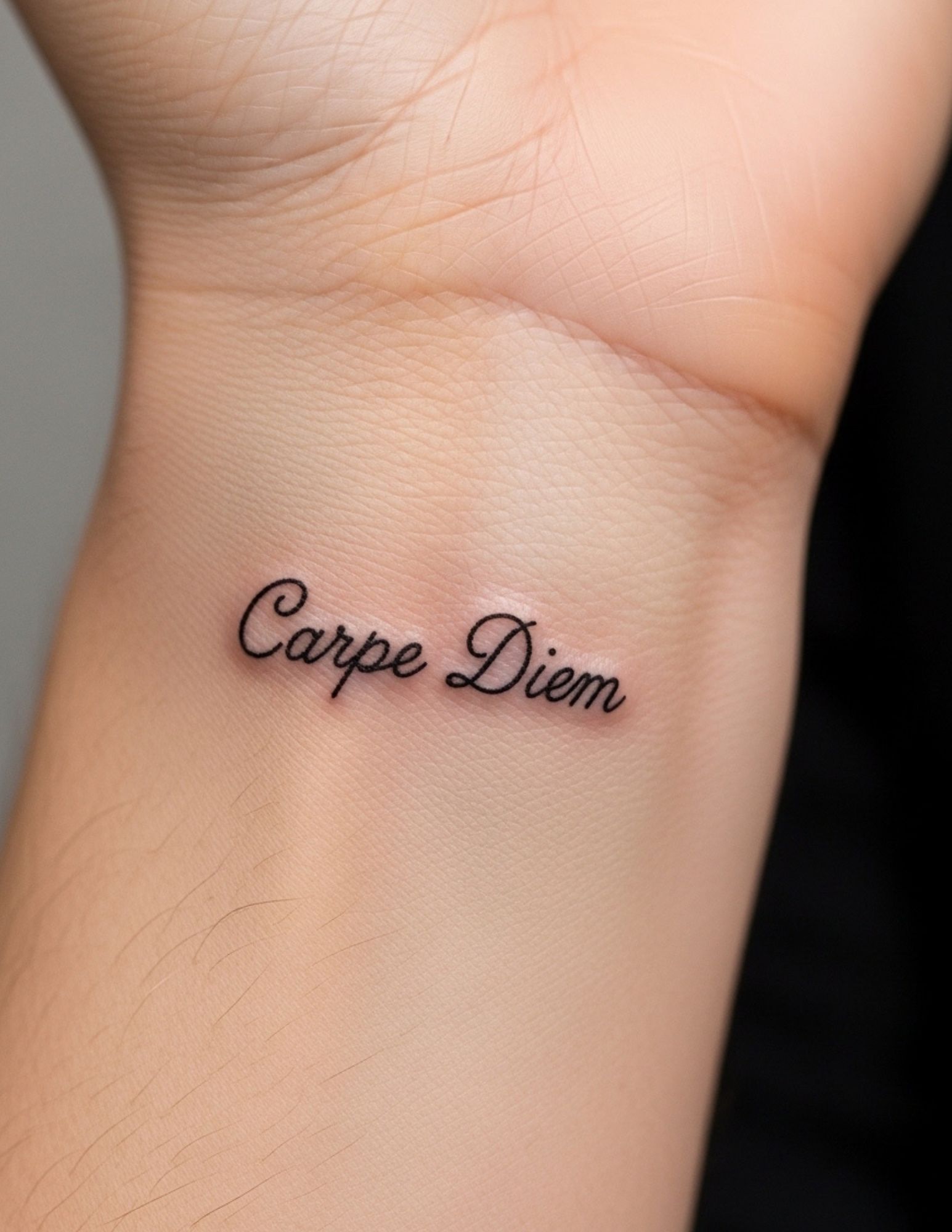
Semper Fidelis is the Marine Corps motto, and the shortened form is one of the most recognisable word tattoos in existence.
If you served, the traditional bold treatment is the right one and there is no reason to reinvent it.
If you did not serve, wear the full Latin word rather than the Corps shorthand — semper alone simply means “always,” and men use it for marriage, sobriety and family commitments.
For other options in the same vein, our roundup of Latin phrase tattoo ideas is a useful starting point.
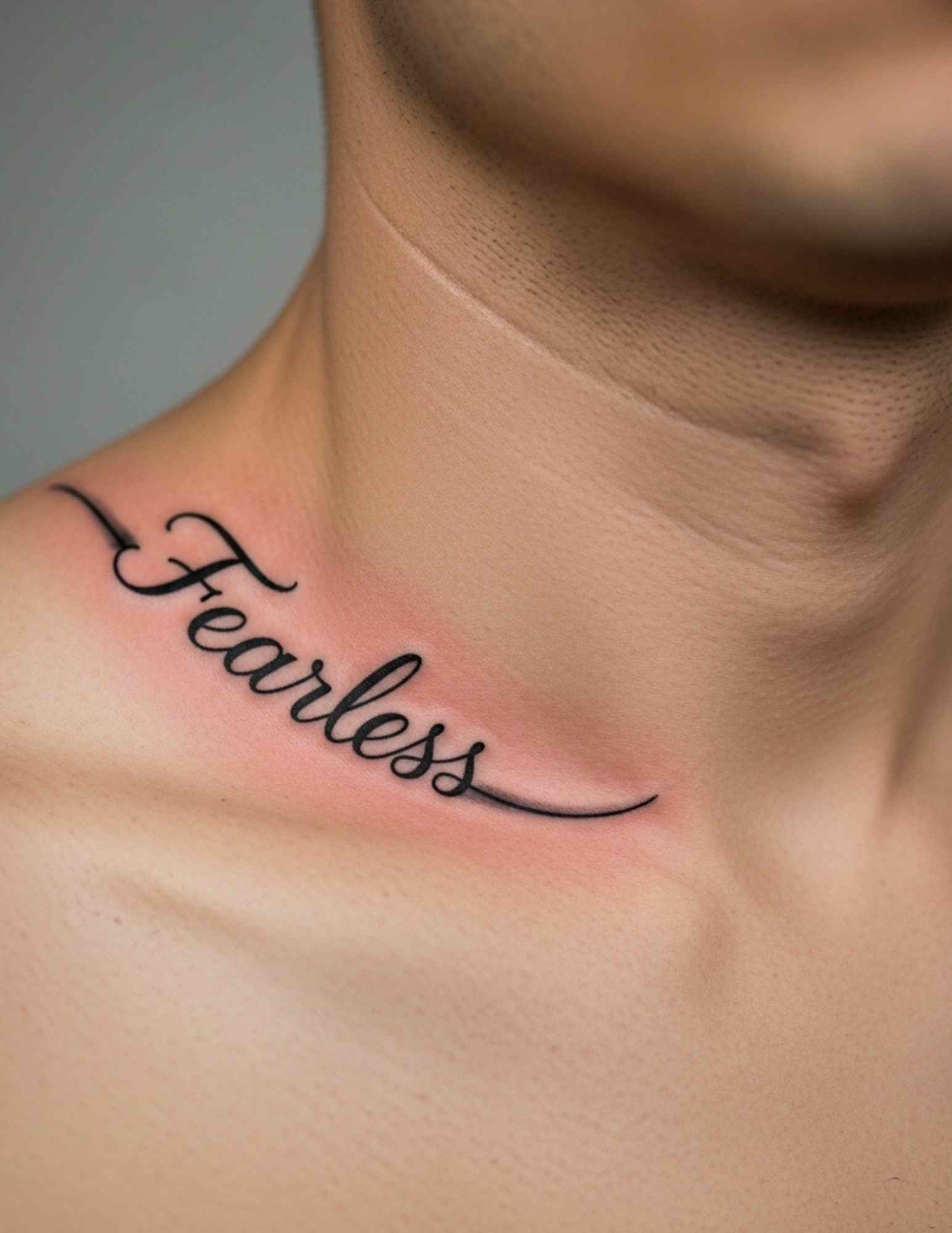
14. “Fearless”
Fearless is a strong-looking word — the double E in the middle gives it a visual rhythm most words do not have.
Upright capitals let it read from across a room, which is usually what people want from this one.
I will say honestly that it is a word some men outgrow. It reads as a young word in a way that discipline or endure do not.
If that gives you pause, that pause is worth listening to. Placement you can cover is a sensible hedge.
15. “Still I Stand”
Four short words that fit on one line, which is exactly the format that works.
It runs beautifully down the ribs or along the outer forearm, following the natural line of the limb.
Script suits it better than capitals because the phrase is a statement of persistence rather than a command.
Have the artist stencil it and then walk to a mirror before any needle touches skin. Multi-word lines almost always need one placement adjustment.
16. A Place Name
A city, a street, a set of coordinates, an area code — place tattoos are underrated and they age unusually well.
The reason is that a place does not change its mind about you. Where you are from stays true regardless of what happens next.
Coordinates in a plain monospaced face are a subtler version of the same idea, and they read as a design element to anyone who does not know what they mean.
Keep the formatting consistent. Mixing a decorative city name with plain numbers underneath rarely looks intentional.
17. “Discipline”
Discipline is ten letters, so it has the same layout problem as resilience — and the same solution.
Narrow block letters keep the footprint manageable on a forearm. A wide face pushes it onto the ribs or the chest whether you wanted that or not.
This is a word I see mostly on people in training of some kind, and it holds up as they age in a way the flashier words do not.
Simple, unshaded capitals are the safest bet for a word this long. Every bit of added detail is another thing to blur over a decade.
18. “Breathe”
Breathe is often tied to anxiety, grief or recovery, and it is usually placed somewhere the wearer can see it themselves.
The inner forearm and the inner wrist are the two placements that make sense for a reminder aimed inward rather than outward.
Delicate script suits the meaning. This is one of the few masculine word tattoos where a lighter hand is clearly the right call.
If the word is connected to something you are actively working through, it is worth saying plainly that a tattoo is a reminder and not a treatment — a doctor or therapist is the right support for that part.
19. “Balance”
Balance is a quieter word than most on this list, and it appeals to men who have already burned themselves out once.
Symmetry is the whole game here. Even letter weight, even spacing, nothing leaning.
A minimal sans-serif in even capitals does the job. Anything with varying stroke weight undercuts the point of the word.
It sits well on the forearm or along the spine, where the placement itself reinforces the idea of a centre line.
20. “Father”
Father closes the list because it is the word that comes up most often in memorial work.
Bold traditional lettering across the chest is the standard treatment, and standard is right here — this is not a piece that benefits from being clever.
Some men add dates, some add nothing. In my experience the ones with nothing added tend to hold up better visually over time.
If you are getting it while grieving, there is no hurry. Every good artist I know would rather you came back in three months than rushed it.
Variations Worth Considering
If none of the twenty land, these are the directions men most often move in next.
Another Language
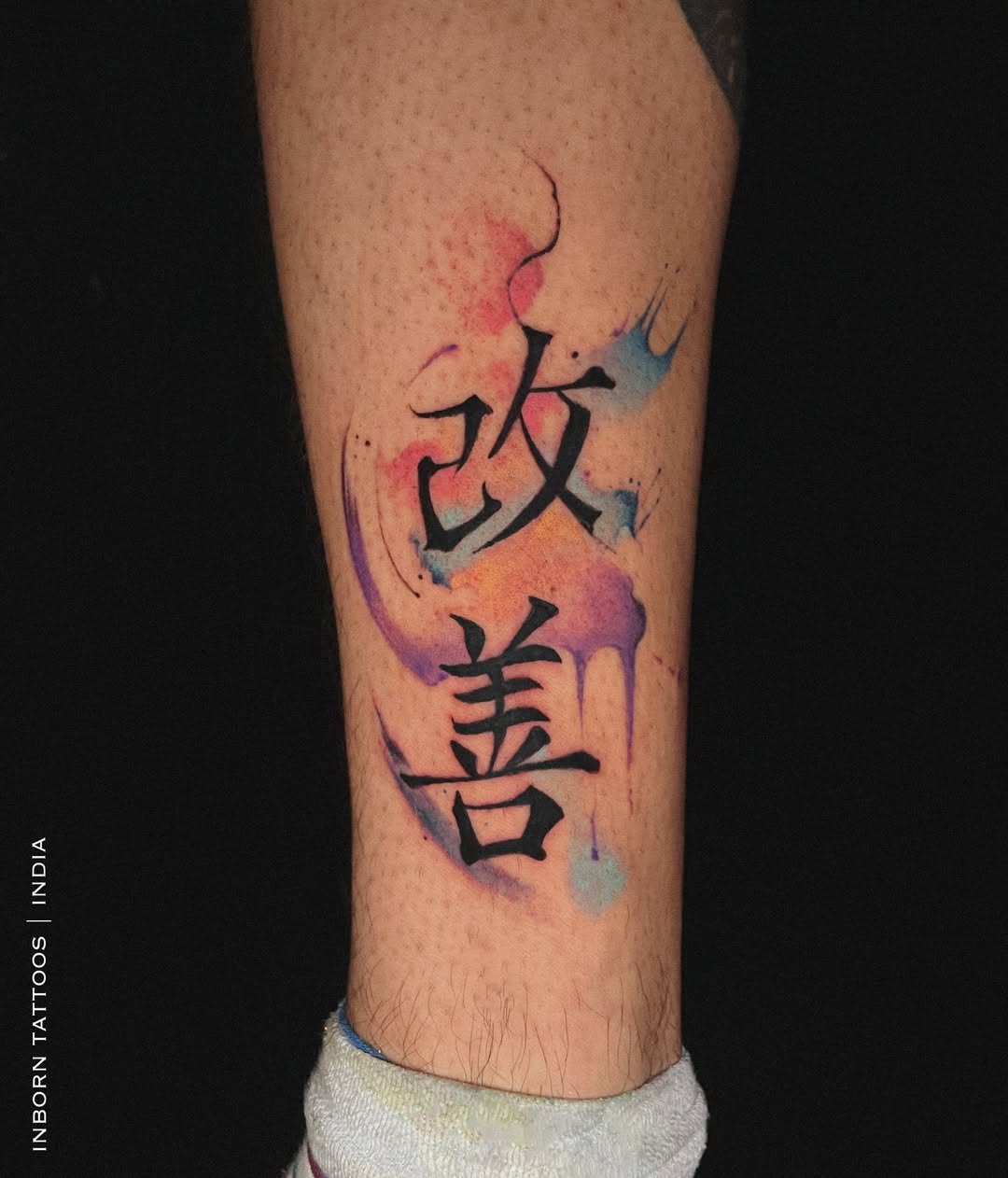
Translating a word into Latin, Japanese or a heritage language adds privacy and, often, a better-looking set of characters.
The obvious warning applies: verify the translation with a native speaker rather than a translation app, and verify the script direction too. Our guide to Japanese word tattoo ideas covers the specific pitfalls there.
Initials Instead of Full Names
Two or three letters carry the same meaning as a full name in a fraction of the space, and they are far less exposed if a relationship changes.
A monogram treatment can make initials look deliberate rather than abbreviated.
Word Plus a Small Symbol
Pairing a word with one small element — a line, a date, a tiny icon — gives the piece a visual anchor without turning it into an illustration.
Keep the symbol clearly subordinate. Once it competes with the text, you have two tattoos fighting for the same space.
Numbers and Dates
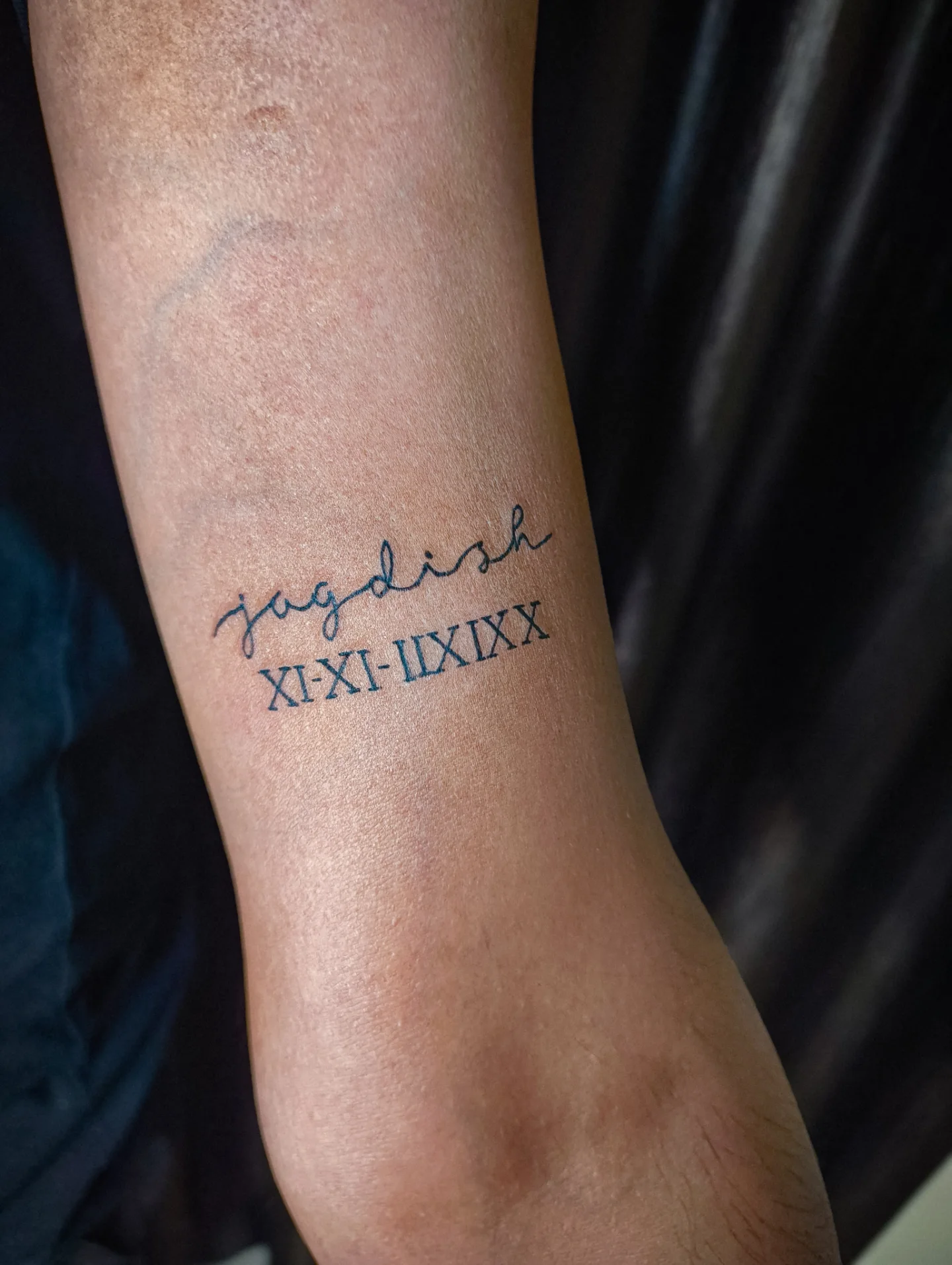
Roman numerals and plain dates function like word tattoos and follow the same rules: one line, generous spacing, no decoration.
Double-check the numerals. I have seen more errors in Roman numeral tattoos than in any other lettering format.
Placement, Pain and Practical Advice
The wrist is the most visible spot and the most demanding one — constant movement and thin skin over bone mean lettering there softens sooner than elsewhere.
The inner arm is the opposite: flat, protected from sun, easy to cover, and in my experience the single best surface on the body for text.
Ribs and sternum take long words well but they hurt considerably more than the arm. If it is your first tattoo, our tattoo pain management tips are worth reading before you book a rib piece.
On aftercare, follow the artist’s instructions rather than anything you read online, and keep healed lettering out of direct sun — UV exposure is the main reason old text looks faded. The American Academy of Dermatology has straightforward guidance on caring for tattooed skin.
If a healing tattoo becomes increasingly painful, swollen, hot or starts weeping after the first few days, see a doctor rather than waiting it out. The FDA and the Mayo Clinic both cover the infection and allergic-reaction signs worth knowing. Nothing in this article is medical advice.
Still Not Sure? Common Mistakes to Avoid
The most common mistake is picking the font from a printed sheet at the counter. Ask the artist to draw the word properly instead — hand-drawn lettering beats a font every time.
The second is going too small for the budget. Lettering is not where to economise on size; if the price is the constraint, our breakdown of what a small tattoo costs will help you plan properly rather than shrink the design.
The third is not proofreading. Photograph the stencil, zoom in, and read it letter by letter before the machine starts — spelling errors in tattoos are far more common than anyone admits.
And the fourth is choosing a word for how it looks rather than what it means. Words you have to explain are fine; words you have to justify are not.
Frequently Asked Questions
How much does a one-word tattoo usually cost?
Most shops have a minimum charge, and a simple single word normally falls at or just above it. Size, placement and how much custom lettering work the artist does all push it up from there. Blackletter and heavily customised type cost more than plain capitals because they take longer to draw. Ask for a quote on the specific word and placement rather than a general estimate.
Which font lasts the longest on a word tattoo?
Plain block capitals and simple serifs hold up best, because they have consistent stroke weight and clear gaps between letters. Very thin script and highly decorative faces soften fastest, since fine detail is the first thing to spread. Generous letter spacing matters as much as the font itself. In my experience an unshaded sans-serif word on the inner arm still looks sharp long after a delicate script on the wrist has softened.
Where is the least painful place for a word tattoo?
The outer forearm and the outer bicep are generally the most comfortable placements for lettering, as there is more muscle and less bone directly under the skin. Ribs, sternum, wrists and ankles are noticeably more uncomfortable for most people. Pain varies a lot between individuals, so treat any ranking as a rough guide. A short word takes a fairly short sitting regardless of placement.
Should I get a word tattoo in another language?
It can work well, and it does give the piece some privacy. The essential step is verifying the translation and the writing itself with a fluent speaker before the stencil is made, not with an online translator. Ask the artist to treat unfamiliar characters as artwork to be copied exactly rather than drawn freehand. Mistakes in non-Latin scripts are common and difficult to correct afterwards.
Can a word tattoo be covered up or removed later?
Lettering is one of the easier things to cover, because a larger, darker design can absorb it more readily than a detailed image can. Laser removal is also possible but it takes multiple sessions over many months and results vary with ink colour and skin type. Both routes are more expensive and slower than getting it right the first time. Speak to a licensed professional about either option rather than attempting any at-home removal method.
Quick Summary
- The lettering matters more than the word — pick the artist for their healed type work, not their general portfolio.
- Short words (4–6 letters) suit the wrist, ribs and inner forearm; long words need the chest, collarbone or a condensed face.
- Leave more letter spacing than looks necessary, because ink spreads slightly as it ages.
- Names age best when they are parents, children or grandparents, and best of all when traced from real handwriting.
- Keep quote lines to a single line — wrapped text stops reading as lettering.
- Match the weight of the type to the weight of the word, and skip shading on anything small.
- Proofread the stencil in a photograph, zoomed in, before any needle touches skin.
- Keep healed lettering out of direct sun, and see a doctor rather than the shop if healing goes wrong.