I have sat in on more matching tattoo consultations than I can count, and the sister ones are always different. The design matters far less than whether both people would still want it if the other one never got hers.
That is the test I keep coming back to. A matching sister tattoo should work as a good tattoo first and a shared symbol second.
Below are 21 ideas I have either watched get inked, been asked about repeatedly, or seen hold up beautifully years later. If you want a wider net, our full round-up of sister tattoo ideas covers non-matching options too.
A quick note before the list: everything here assumes a licensed artist and a proper studio. Nothing in this article is medical advice.
Which Matching Sister Tattoo Approach Is Right for You?
There are five broad ways sisters usually approach matching ink. Choosing the approach before the design saves a lot of back-and-forth at the consultation.
| Approach | What It Looks Like | Best For | Watch Out For |
|---|---|---|---|
| Identical | The exact same design on both sisters | Twins, or sisters with the same taste | Different skin tones and placements change how it reads |
| Complementary Pair | Two related but distinct designs, like sun and moon | Most sisters, most of the time | Deciding who gets which half |
| Split Design | One image cut in two, whole only when joined | Sisters who want the dependency to be the point | Each half can look unfinished alone |
| Same Theme | Different subjects, one shared style | Sisters with very different personalities | Needs the same artist to stay cohesive |
| Same Design, Different Placement | One design, two body locations | One sister wanting it visible, one not | Size usually has to change with placement |
In my experience the complementary pair wins most consultations. It gives each sister a tattoo that stands alone while still obviously belonging to a set.
What Makes a Matching Sister Tattoo Actually Work
The strongest matching designs are ones each sister would have chosen on her own. The shared meaning is a bonus layer, not the entire reason the tattoo exists.
Designs that only make sense together put a lot of weight on the relationship staying exactly as it is. That is a heavy thing to ask of a drawing.
Consistency of style matters more than consistency of subject. Two different flowers drawn by the same artist in the same line weight read as a matched set instantly. Two identical flowers drawn by different artists often do not.
Scale is the detail people forget. If one sister is getting a two-inch piece on the wrist and the other a five-inch piece on the ribs, the same design will not carry the same amount of detail.
Sibling dynamics also show up in the ink. If you have brothers involved, our sibling tattoo ideas guide covers designs that scale to three or more people, which is a genuinely different design problem.
The Best Matching Tattoo Ideas for Sisters
1. Sun and Moon
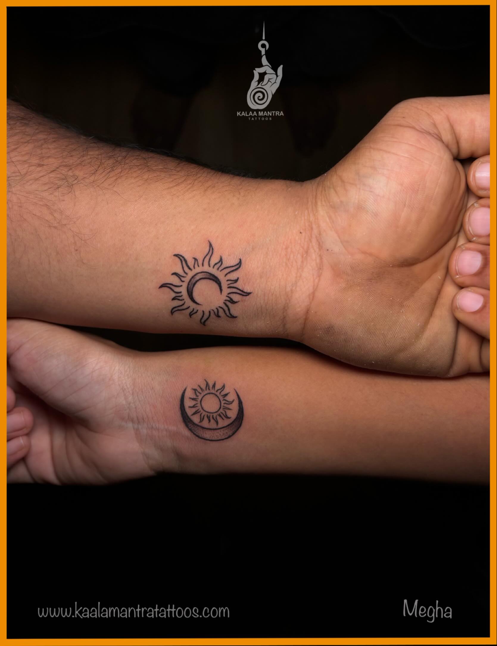
One sister wears the sun, one wears the moon. Two forces that govern the same sky and never occupy it at the same time.
It is the design I get asked about most, and it earns the popularity. Each half is a complete, recognisable tattoo on its own, so neither sister is left with something that looks like half a sentence.
The interesting decisions are stylistic rather than symbolic. A fine line sun with a hairline face reads very differently from a bold blackwork sun with heavy rays, and the two sisters do not have to match on weight if they match on approach.
Placement-wise, I have seen this work best on the inner forearm and the back of the upper arm. Both give a clean, flat canvas that keeps circular designs from distorting.
If you want to see the range before committing, the sun and moon tattoo ideas collection shows how far the concept stretches. The pair pictured at the top of this article is a good baseline version.
2. Matching Birth Flowers
Each sister gets her own birth month flower, rendered in the same style by the same artist. Different subject, unified execution.
This is my favourite answer for sisters who cannot agree on a design, because it removes the need to agree. You are not compromising on a shared symbol, you are commissioning a matched set.
It works especially well in fine line botanical work, where the shared line weight does the matching for you. Neo-traditional colour also works if both sisters want something bolder, though colour choices will need coordinating.
One practical note from watching these get done: some birth flowers are far more complex than others. A larkspur has a lot more going on than a marigold, so sizes may need to differ to keep the detail readable.
Our birth flower tattoo ideas guide lists the traditional flower for each month if you are not sure which is yours.
3. Matching Constellations
Small dots joined by hairline strokes, mapping either your two star signs or a single constellation split between you.
Constellations are one of the few designs where very small size is genuinely appropriate rather than a compromise. A handful of dots stays legible at two inches in a way that a portrait never will.
The honest limitation is ageing. Fine dotwork this delicate will soften over the years, and dots that sit close together can blur into each other after a decade or so.
Every artist I have asked about this says the same thing: go slightly larger than feels necessary, and keep the dots further apart than the real star chart suggests.
There is more on sizing and star chart accuracy in our constellation tattoo ideas guide.
4. Split Heart
A single heart divided down the middle, one half on each sister. The most literal expression of the matching idea.
I will be honest about this one: it is the design I most often talk people out of, and then occasionally talk them back into.
The problem is that half a heart on its own can read as unfinished rather than intentional. The fix is to make each half a complete composition, usually by closing the cut edge with a clean line rather than leaving it ragged.
Done that way, it stops looking like a broken object and starts looking like a deliberate design that happens to have a twin. That distinction is the whole ball game.
5. Matching Script
A shared word, a family motto, or a phrase only the two of you would recognise, set in the same typeface on both sisters.
Script is deceptively difficult. Lettering is one of the specialisms where the gap between an average artist and a great one is most visible, and the flaws show up years later as the lines spread.
Ask specifically to see healed lettering in an artist’s portfolio, not just fresh work. Fresh script almost always looks crisp. Healed script is the real test.
If you want handwriting, gather the source material early. Tracing a parent’s or grandparent’s actual handwriting from a card or letter is far more meaningful than a font that imitates one, and artists usually need a clean scan to work from.
6. Flowers from the Same Stem
Two blooms drawn as if they grew from a single plant, one on each sister, with the stem cut at the same point.
This sits somewhere between the split design and the complementary pair, and it solves the split heart problem elegantly. Each flower is complete; only the stem is shared.
It also handles size differences gracefully. If one sister wants something smaller, you shorten her stem rather than shrinking the bloom, and the pairing still reads.
Fine line and single-needle work suit this best. Heavier traditional styles tend to want a full framed composition rather than an open-ended stem.
7. Matching Coordinates
The latitude and longitude of a place that means something to both of you, inked in the same numerals on both sisters.
Usually it is a childhood home, a grandparent’s house, or the town you both left. The appeal is that it is personal without being legible to strangers.
Two practical warnings. First, check the coordinates carefully before the needle goes in, because a transposed digit is a permanent mistake that nobody else will ever notice and you will notice forever.
Second, decide on the format in advance. Decimal degrees, degrees with minutes and seconds, and abbreviated versions all look quite different, and both sisters need the same one.
I have seen this done as a slim strip along the inner forearm and along the collarbone. Both suit the horizontal shape of a coordinate string.
8. Matching Animals
Either the same animal on both sisters, or two different animals drawn in one shared style.
This is where personality comes through most clearly. I have seen a pair of foxes, a bear and a wolf, and two very different birds all work well for the same reason: the drawing style carried the match.
Illustrative and neo-traditional styles hold up best here. Animals need enough line weight and internal detail to stay readable, and very fine line animal work tends to lose definition as it settles.
If the animals carry meaning for you, keep the reasoning to yourselves rather than explaining it in the design. Tattoos that try to spell out their own symbolism usually end up cluttered.
More Matching Sister Tattoo Variations
The remaining thirteen ideas are shorter but no less workable. Several of them are what sisters land on after ruling out the more obvious options.
9. Matching Initials
Each sister wears the other’s initial, or both wear both. Lettered by one artist so the two pieces genuinely match.
Small, quick, and cheap enough that it is often a first tattoo for both people. The main risk is choosing a script so ornate the letter stops being readable.
10. Matching Botanical Element
A sprig, a leaf, a fern frond. The same small plant element on both sisters, identical rather than complementary.
Botanical work is forgiving as it ages because a slightly softened leaf still looks like a leaf. That is not true of geometric work.
11. Arrow and Feather
One sister takes the arrow, one takes the feather. Related objects with an obvious visual relationship and enough distinction to feel chosen.
Both shapes suit long, narrow placements like the forearm, the spine, and the outer ankle.
12. Lock and Key
The classic complementary pair. It leans sentimental, which is either the appeal or the problem depending on your taste.
Ornamental and neo-traditional treatments keep it from feeling twee. Very simple line versions tend to read as generic.
13. Matching Phases of the Moon
A row of moon phases on each sister, or the phases split so each of you carries part of the cycle.
It reads cleanly at small sizes and suits the length of a forearm, a spine, or a collarbone almost perfectly.
14. Yin and Yang Elements
Not necessarily the literal symbol. More often two opposing elements, like water and flame, drawn as a balanced pair.
This is a good fit for sisters who are genuinely different people, because the design is built on contrast rather than similarity.
15. Matching Roman Numeral Dates
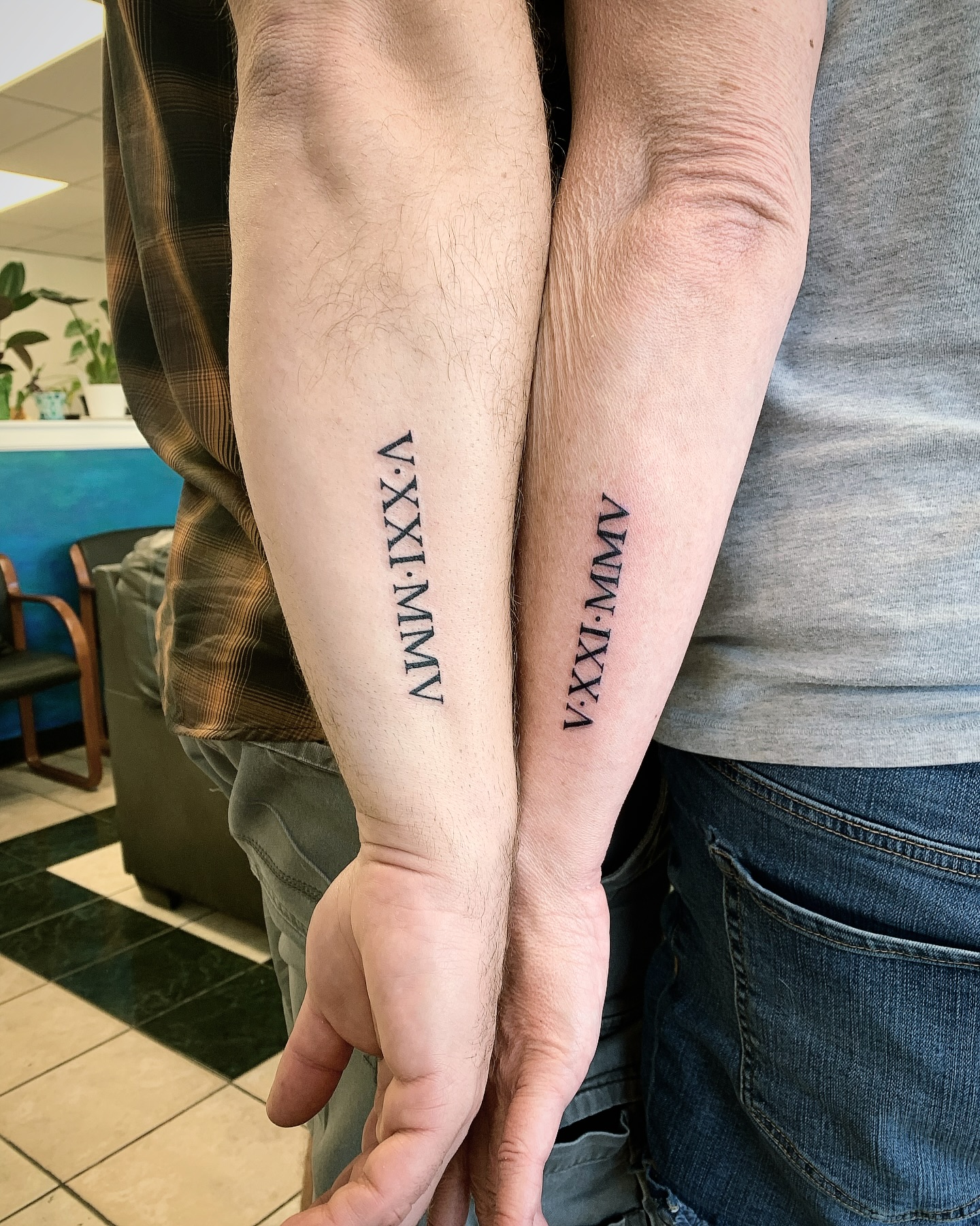
A shared date, most often a birth date or the date of a loss, written in Roman numerals on both sisters.
Check the numerals themselves rather than trusting an online converter, and see our Roman numeral tattoo ideas guide for formatting conventions.
16. Matching Butterflies
Common, and common for a reason. Butterflies suit almost any placement and scale from tiny to full panel without losing their shape.
To avoid a generic result, ask for a specific species rather than a stylised butterfly. A monarch and a swallowtail are visibly different tattoos.
17. Complementary Geometric Shapes
Two shapes that relate to each other, such as a circle and a triangle, or two halves of one geometric pattern.
Geometric work is the least forgiving style over time. Straight lines and perfect circles show every bit of spread, so pick an artist whose healed geometric work you have actually seen.
18. Same Quote, Different Script
The same words on both sisters, but each set in a typeface that suits her. Shared meaning, individual expression.
It is a good compromise when one sister wants delicate handwriting and the other wants something bolder.
19. Matching Celestial Bodies
Stars, planets, comets. Broader than the sun and moon pairing and easier to personalise, since there are more bodies than there are sisters.
Works particularly well as a scattered arrangement rather than a single centred object.
20. Matching Fine Line Portraits
Single continuous line portraits, usually of each other or of a parent. Modern, distinctive, and technically demanding.
This is not a design to take to a generalist. Continuous line portrait work is a narrow specialism and the results between artists vary enormously.
21. The Same First Memory
An object from a memory you both share. A specific toy, a car, a tree in a garden, a board game piece.
These are the matching tattoos I like most, because nobody outside the two of you can decode them. The meaning is fully private and the tattoo just looks like a well-drawn object.
How to Plan the Session Together
Book both sisters with the same artist, in the same appointment if the studio allows it. This is the single change that most improves the result, because line weight and shading habits vary between artists more than people expect.
Bring reference images to the consultation rather than a finished design copied from elsewhere. Most artists would rather interpret a mood than trace someone else’s work, and the tattoo will be better for it.
Agree on style before you agree on subject. If one of you wants bold traditional and the other wants single-needle fine line, no shared subject will make the two pieces look related. Our fine line tattoo ideas guide is a useful reference if that is the direction you are leaning.
Aftercare is on each of you individually, and healing varies. Follow the studio’s written instructions rather than advice from the internet, and see a doctor rather than an artist if you develop spreading redness, swelling, fever, or discharge. The Mayo Clinic’s overview of tattoo risks covers the warning signs worth knowing before you book.
Common Mistakes, and What to Do If You Are Still Not Sure
The most common mistake is rushing the decision because you are only in the same city for a weekend. A matching tattoo is permanent for both people, and a deposit held for a future date is cheaper than a cover-up.
The second is going too small. Sisters often choose tiny versions to keep the cost down, then find the detail has softened within a few years.
The third is skipping the studio check. Sterile equipment and single-use needles are not optional, and the FDA’s tattoo fact sheet is clear that unsterile equipment can transmit serious infections.
If the matching idea itself is what you are unsure about, it is worth reading around the format. Our guides to matching tattoos for best friends and matching tattoos for couples cover the same design problem from different angles, and the solutions often transfer.
And there is no rule that says the tattoos have to be done on the same day, in the same year, or even in the same country. Some of the best matched sets I have seen were completed months apart by the same artist.
Frequently Asked Questions
Do matching sister tattoos have to be identical?
No, and in most cases they are better when they are not. Complementary designs that share a style but differ in subject give each sister a tattoo that stands on its own. Identical tattoos also read differently depending on placement and skin tone, so even a deliberately identical pair rarely looks truly identical in practice. The style consistency is what makes a set feel matched, not the subject.
How much do matching sister tattoos usually cost?
It depends entirely on size, detail, placement, and the artist’s rate, so any single figure would be misleading. Small fine line pieces are typically priced at a studio minimum, while larger illustrative work is priced hourly. Ask for a quote for both pieces together, since some studios will price a paired booking more favourably. Always confirm the deposit terms in writing before you book.
Should we use the same artist?
Yes, wherever it is practical. Line weight, shading style, and the way an artist handles small details vary enough that two different artists will produce two visibly different tattoos from the same reference. If distance makes one artist impossible, ask the second artist to work from photographs of the first tattoo rather than from the original reference image.
What if we fall out later?
It is a fair question and worth answering honestly before you book. Designs that are complete on their own, like a sun or a single flower, remain good tattoos regardless of what happens to the relationship. Designs that are visibly half of something else do not have that safety net. If the possibility bothers you at all, choose the complementary approach over the split one.
Where is the least painful place for a first matching tattoo?
Generally the outer forearm, the outer upper arm, and the outer thigh are reported as more tolerable, because there is more muscle and less bone directly under the skin. Ribs, sternum, spine, feet, and hands tend to be sharper. Pain varies a lot between individuals though, so treat this as a rough guide rather than a promise. Tell your artist if you feel faint at any point, and eat properly beforehand.
Quick Summary
- Choose an approach first: identical, complementary pair, split design, shared theme, or shared design in different placements.
- Pick designs that each work as a good tattoo on their own, not only when the two are side by side.
- Match on style and line weight rather than on subject; that is what makes a set look intentional.
- Use the same artist if you possibly can, and see healed work in their portfolio before booking.
- Go slightly larger than feels necessary, especially with fine dotwork, script, and geometric shapes.
- Double-check anything factual before the needle goes in: coordinates, Roman numerals, spelling, and dates.
- Verify the studio’s hygiene practices, and follow the written aftercare rather than online advice.
- See a doctor, not an artist, for spreading redness, swelling, fever, or discharge during healing.