The shoulder blade is the placement I recommend most often to women who want something real without announcing it. The scapula gives you a naturally framed canvas that a crew neck hides completely and a backless dress turns into the whole outfit.
What makes it work is the bone underneath. The scapula sits just below the skin with a defined triangular edge, so a design laid along it reads as deliberate rather than floating.
I have watched artists reshape the same flower three times on paper before it finally followed that edge properly. The placement rewards planning more than almost any other spot on the back.
Below are 20 shoulder blade tattoo ideas for women, grouped by the kind of look they produce rather than in a random list, so you can skip straight to the section that sounds like you.
One Shoulder Blade or Both?
This is the first decision, and it changes everything downstream: size, budget, how many sittings you need, and whether the piece can grow later.
A single scapula piece is complete in itself. A paired design uses both blades and reads as one composition across the upper back.
Neither is more serious than the other — but paired work is much harder to abandon halfway, so I tell people to be honest about their appetite for a second session before committing to it.
| Approach | Best for | Typical size | Sittings | Trade-off |
|---|---|---|---|---|
| Single blade, small | First tattoos, subtle botanicals, script | 2-4 in | One, often under 90 minutes | Can look lost if placed too low |
| Single blade, full scapula | One statement piece: peony, lion, mandala | 5-8 in | One long or two shorter | Asymmetry is permanent, plan it on purpose |
| Paired blades, mirrored | Wings, matching florals, symmetry lovers | 5-8 in each side | Usually two or more | Highest cost, hardest to stop midway |
| Blade into shoulder cap | Designs you want partly visible in a tank top | Varies | Two or more | Less concealable than pure scapula |
| Blade toward spine | Vines, script, trailing stems | Long and narrow | One or two | Spine area stings noticeably more |
Why the Shoulder Blade Suits Almost Everyone
The skin over the scapula is relatively flat and stable. It does not crease the way an inner elbow does, and it does not stretch the way a stomach or upper arm can over the years.
That stability is the practical reason fine detail survives here. Every artist I have asked about long-term line quality puts the upper back near the top of their list.
It is also a forgiving placement for a first tattoo. You are not looking at it constantly, which means the settling-in period — when the lines still look a touch heavy — passes without you staring it down every morning.
The pain is moderate for most people, not mild. The muscle over the blade cushions the needle, but the bony edge of the scapula and anything creeping toward the spine is sharper. In my experience people describe the centre of the blade as a hot scratch and the edges as something they actively count down through.
The one genuine drawback is that you cannot see it without two mirrors or a phone. If seeing your tattoo daily matters to you, a forearm or shoulder cap placement may suit you better.
Fine Line and Delicate Ideas
This is the largest category by far, and for good reason: delicate work and a framed, bony placement flatter each other.
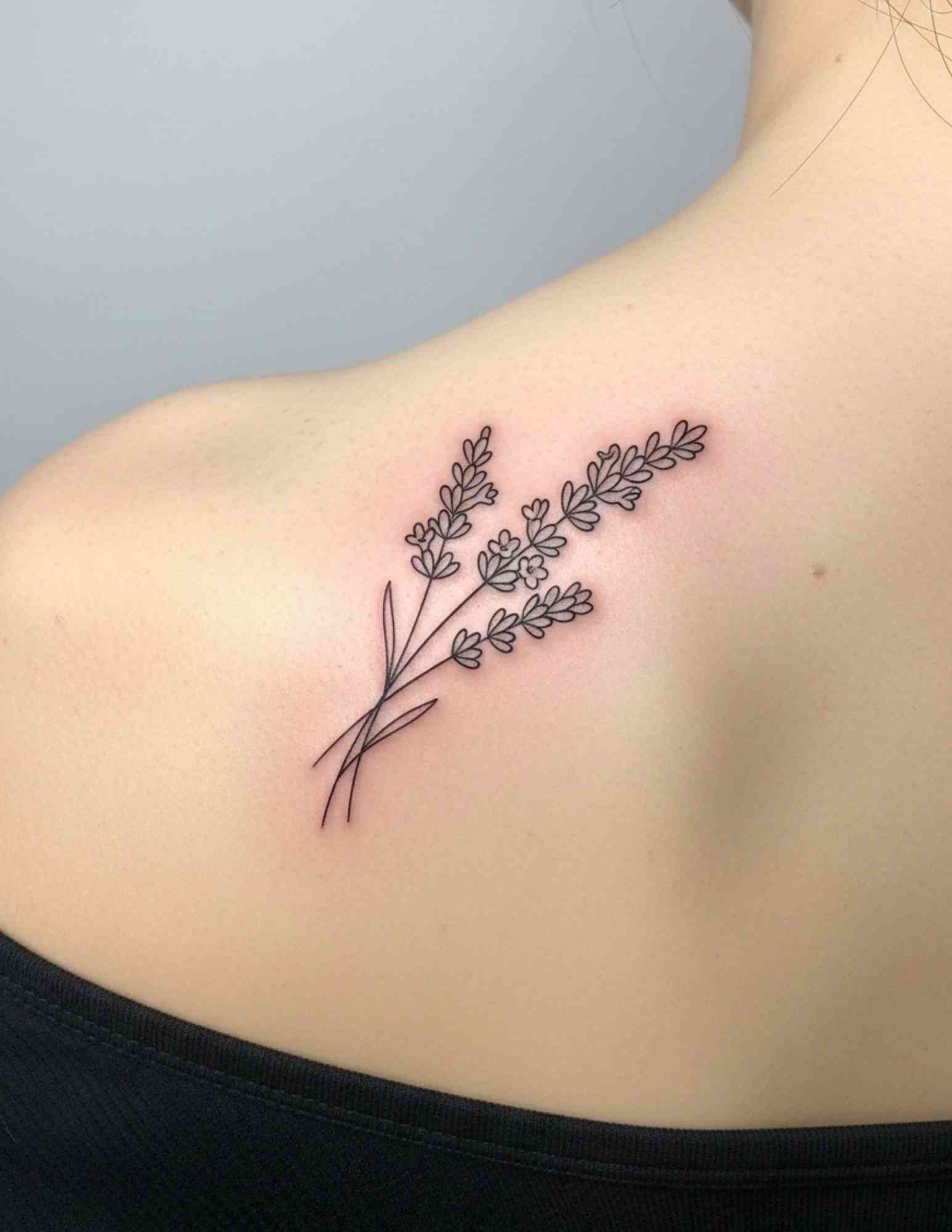
1. Fine Line Botanical Spray
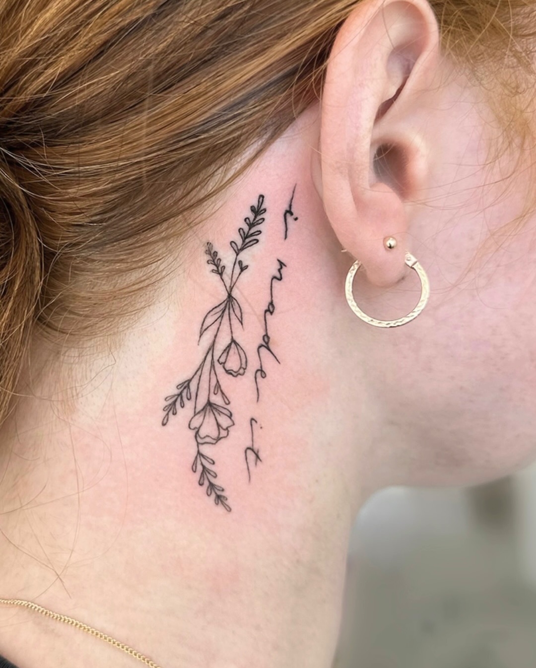
Several stems, a few leaves and two or three buds arranged in a loose bundle that follows the line of the bone, as in the photo above.
The reason this design keeps showing up is flexibility. A spray can be stretched, narrowed or rotated to fit your specific scapula, which a rigid symmetrical design cannot.
Ask for varied line weight rather than one uniform hairline. Fine line work done entirely in the thinnest needle can soften faster than people expect, and a little weight in the main stems keeps the piece readable in five years. If fine line is the look you want, the same principles apply to a fine line spine tattoo.
2. Single Peony
One bloom, large, centred on the blade. No filler, no frame, no banner.
Peonies suit this placement because the layered petals give an artist somewhere to put shading, so the flower has depth instead of reading as an outline.
Soft black and grey is the safest long-term choice here, though a single muted colour pass works well too. If the flower needs to mean something specific, look at a birth flower instead of defaulting to a peony.
3. Crescent Moon with Stars
A crescent on the blade with a handful of small stars scattered up toward the shoulder or in toward the spine.
This is the idea I most often see chosen as a first tattoo, and it is a sensible one: short sitting, low cost, genuinely open-ended.
Keep the stars slightly irregular. Perfectly even spacing reads as a print; uneven spacing reads as a sky.
4. Dragonfly
A dragonfly in fine line or light stipple shading, body running roughly vertical down the blade, wings spread across it.
The shape is a quiet technical gift: a long body and two wide wings map almost exactly onto the proportions of the scapula.
Wing veining is where this one lives or dies. Ask to see healed dragonflies in the artist’s portfolio, not fresh ones, because dense veining is exactly the kind of detail that can blur together over time.
5. Quote Following the Scapula
A short line of text curved along the upper or inner edge of the blade, in fine script or a simple serif.
The trick is following the bone rather than the horizon. Text laid perfectly level across the back looks printed on; text that curves with the scapula looks like it belongs to your body.
Keep it short — a few words, not a sentence — and proofread the stencil yourself before anyone starts. I have seen a misspelling survive two artists and a client because everyone assumed someone else had checked.
Floral Shoulder Blade Tattoos
Florals dominate this placement because they are the one subject that can be drawn to any shape, any size, and any level of detail.
6. Rose Garden
Several roses at different stages — a full bloom, a half-open flower, one tight bud — with leaves filling the gaps across the whole blade.
Mixing stages is what separates this from a row of identical flowers. It gives the composition a focal point instead of three equal competitors.
Leave more negative space than feels right in the stencil stage. Gaps that look empty on paper are what keep the piece from reading as one grey mass once it heals.
7. Cherry Blossom Branch
A slim branch travelling diagonally across the blade, dotted with small blossoms and a few petals drifting loose.
The diagonal is the point. It uses the widest part of the scapula and makes a fairly small tattoo feel like it covers ground.
Falling petals are also the easiest element to add later if you decide to extend the piece toward the shoulder or spine.
8. Lotus in Bloom
An open lotus, usually symmetrical, centred on the blade with the petal rows fanning outward.
Because a lotus is symmetrical, placement accuracy matters more here than with a loose botanical. A centimetre off-centre is visible, where the same error in a rose garden would vanish.
Stand up for the stencil, let your arms hang naturally, and check it in a mirror from a few steps back. The lotus has a long design history worth reading before you settle on a style.
9. Hummingbird and Hibiscus
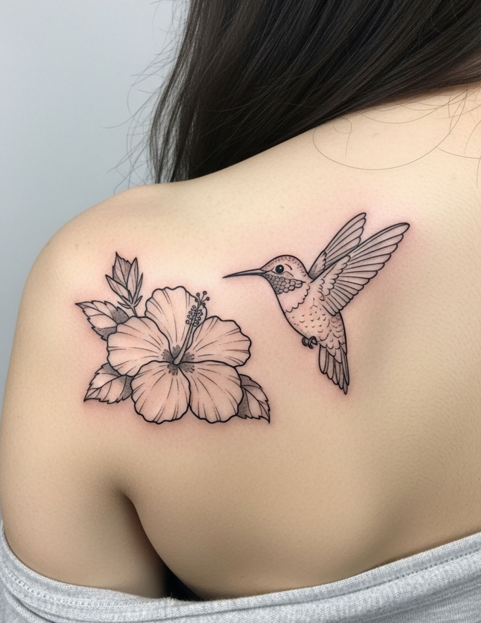
A hummingbird mid-hover next to a hibiscus, the bird’s beak angled toward the flower.
Pairing a bird with a flower gives the tattoo a narrative the flower alone does not have, and the blade has room for both without crowding.
This is one of the few cases where I think a touch of colour earns its place — usually in the flower, with the bird kept in black and grey. More hummingbird approaches are worth browsing before you commit to a pose.
10. Matching Floral Panels
Related floral compositions on both blades — not mirror images, but arrangements that clearly belong to the same garden.
True mirroring can look mechanical. Complementary panels, where one leans left and the other leans right with different flowers, read more naturally.
Have both panels designed before the first needle touches skin. Adding a second side months later, from memory, is how mismatched pairs happen.
Winged and Symbolic Designs
The scapula is where wings would attach if humans had them, which is why this category exists at all and why it is almost always a paired piece.
11. Angel Wings
One wing on each blade, feathers rendered in detail, the inner edges pointing toward the spine.
It is the most literal interpretation of the placement and it still works, because the anatomy genuinely supports it.
Scale is the thing people get wrong. Small wings can read as decorative rather than anatomical; full-length wings that reach toward the lower back are a considerably bigger commitment in time and money. Browse wing tattoo styles first, because the difference between realistic and stylised feathering changes the whole piece.
12. Feather Dissolving into Birds
A single feather on the blade, its upper barbs breaking apart into small birds that scatter toward the shoulder.
Yes, it has been done a great deal. It also remains one of the most effective ways to make a small tattoo occupy a large area without much ink.
If you want it to feel less familiar, ask for a specific bird species rather than generic silhouettes, and keep the flock count low — three or four, not a dozen.
13. Butterfly with Flowers
A butterfly with open wings sitting above or among a small cluster of flowers.
The symmetry of open wings lines up neatly with the symmetry of the blade, which is why this composition sits so comfortably here.
Wing pattern detail is the difference between a sticker and a tattoo. Ask for a real species and let the artist render the actual markings rather than inventing swirls.
14. Mystical Eye
An eye motif — sometimes inside a triangle, sometimes framed by rays, sun and moon symbols, or ornamental line work.
It is a bolder choice than most of this list and reads as esoteric rather than pretty, which for a lot of people is exactly the appeal.
Do a little reading on the symbol you pick. Several eye motifs carry specific religious or cultural weight, and it is worth knowing what you are wearing on your back.
Geometric and Ornamental Ideas
Geometric work is the most demanding category on this placement, because any wobble in a straight line or circle is immediately obvious.
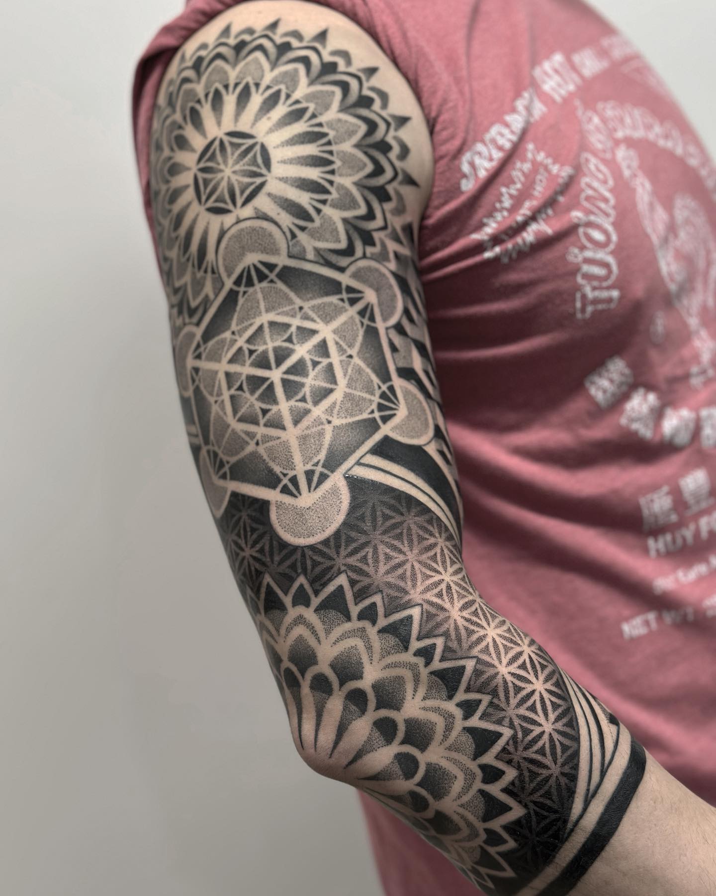
15. Mandala on the Scapula
A circular mandala centred on the blade, built from concentric rings of dotwork and repeated geometric petals.
The flat plane over the scapula is one of the few places on the body where a circle can actually stay a circle when you move.
Mandalas are slow work, and dotwork is slower still. Expect a longer sitting than the size suggests, and book a specialist rather than a generalist — uneven dot spacing cannot be fixed later.
16. Geometric Compass
A compass rose rendered in fine geometric lines, rays radiating out from a central point on the blade.
Compasses carry an obvious direction-and-journey reading, which makes them a common pick for people marking a move or a turning point.
Long straight rays are unforgiving. Ask how the artist handles long lines on a curved back — the good answer involves stretching the skin and working in sections, not one heroic single pass.
Bold and Illustrative Ideas
Not every shoulder blade tattoo needs to whisper. The blade holds a heavy, high-contrast piece extremely well.
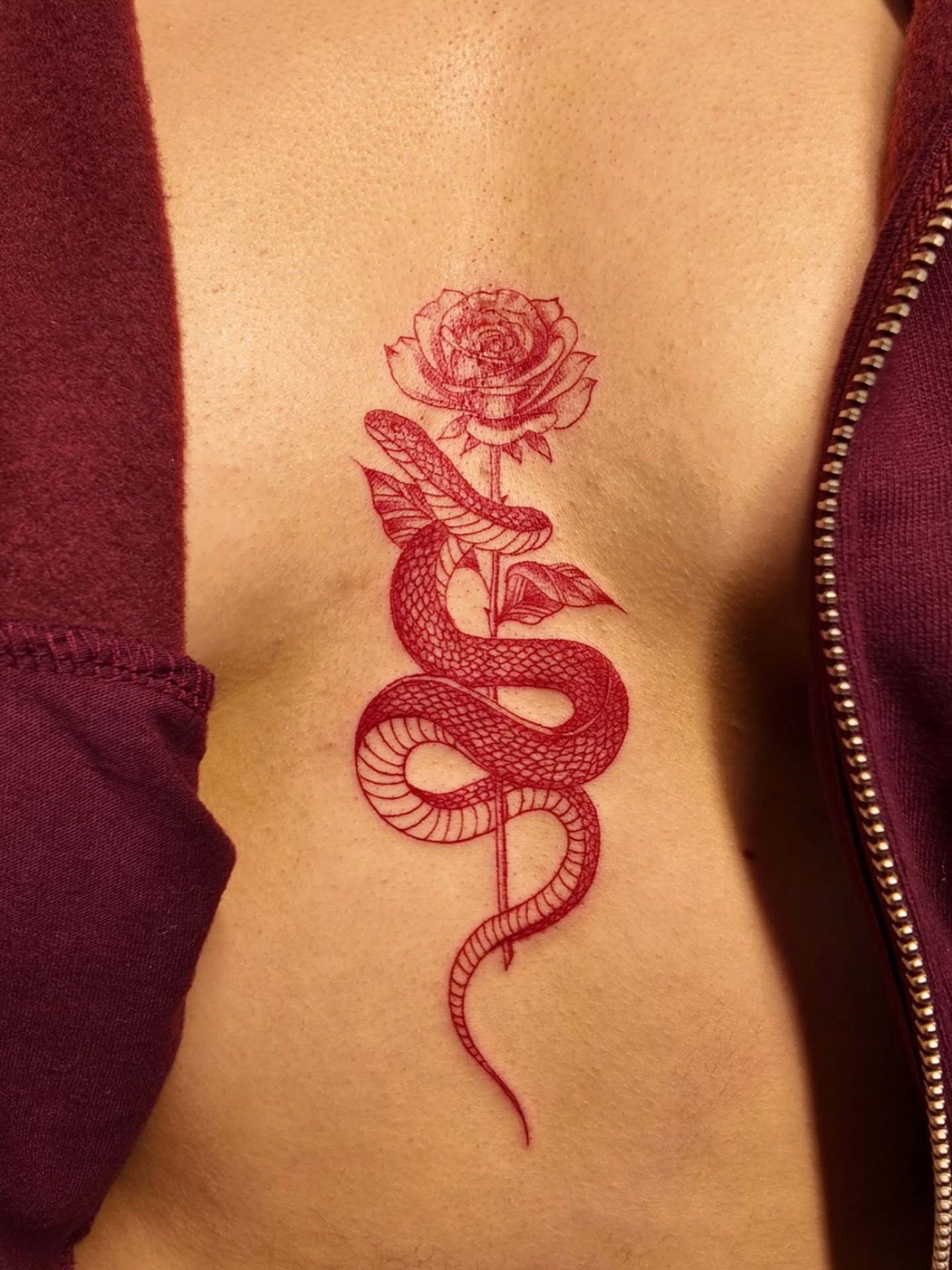
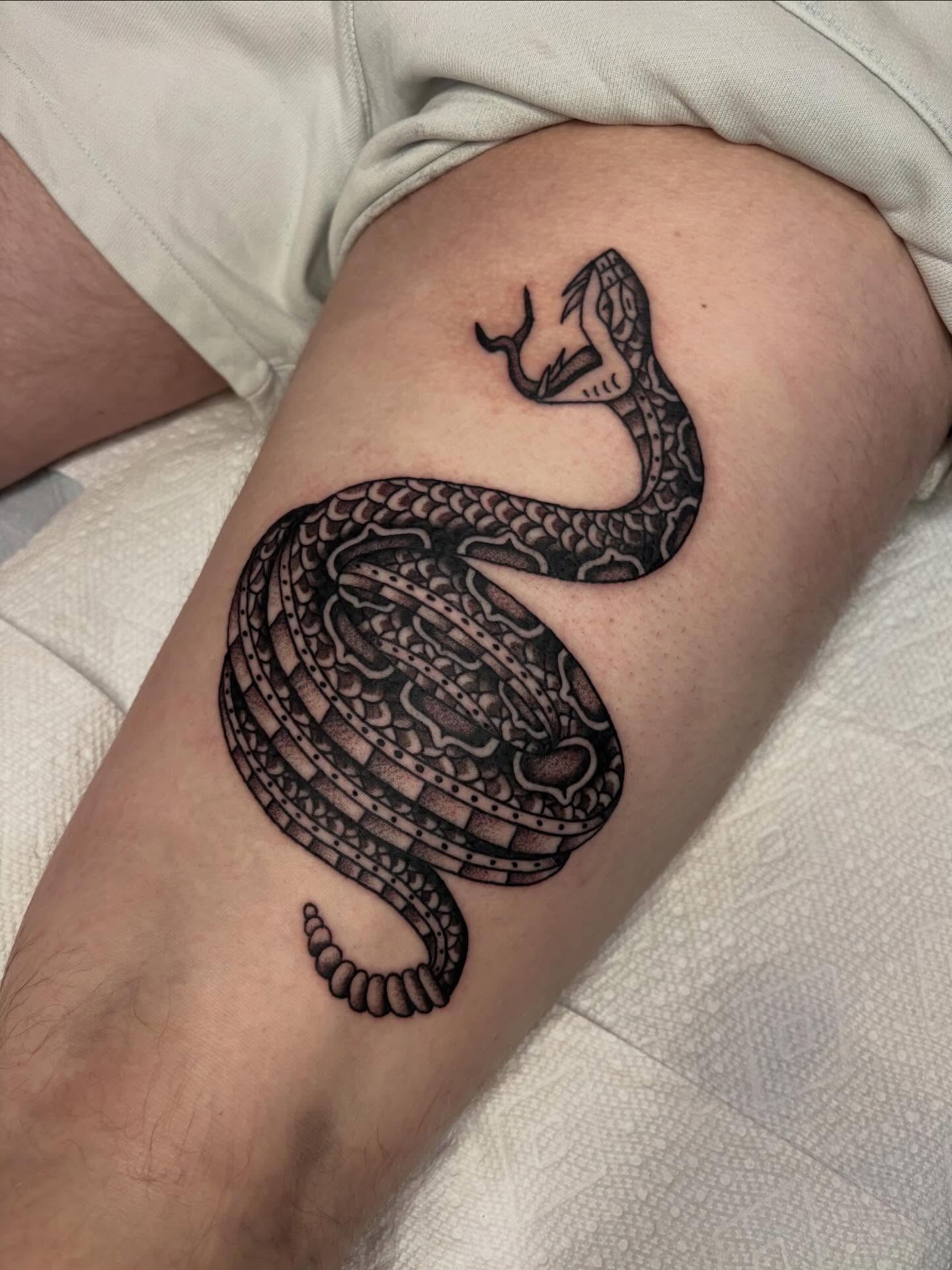
17. Snake Coiling Around the Scapula
A snake whose body traces around the edge of the blade, sometimes with the head curling over the top toward the shoulder.
This is the design that uses the bone most cleverly. The snake is not placed on the scapula so much as wrapped around it.
It also moves better than anything else on this list — roll your shoulder and the coil genuinely appears to shift.
18. Tiger Head
A tiger’s head filling the blade, usually in black and grey with heavy contrast in the stripes and eyes.
Animal portraits need size to work. A tiger squeezed into three inches loses the fur texture and eye detail that make it convincing.
If you want it smaller, a stylised or neo-traditional tiger holds up at a reduced scale far better than a realistic one.
19. Lion Profile
A lion seen from the side, the mane spreading out to fill the width of the blade.
The profile view is the practical choice here: it fills a triangular space more naturally than a front-facing portrait, which wants a square.
Mane direction is worth discussing. Flowing it toward the spine keeps the composition contained; flowing it outward makes the piece feel like it wants to keep growing onto the arm.
20. Portrait of a Significant Person
A realistic portrait — a grandparent, a child, a figure who matters — rendered in black and grey on the blade.
This is specialist territory. A portrait that is eighty per cent right is worse than no portrait at all, because the face belongs to someone you love and you will see the gap every time.
Only book an artist whose healed portrait work you have seen, bring a high-resolution photograph with good lighting, and accept the size the artist asks for. Portraits cannot be shrunk without losing the likeness.
Placement Variations Worth Considering
“Shoulder blade” covers more ground than people realise, and shifting the design an inch or two changes how often anyone sees it.
Upper Blade, High and Hidden
Sitting the design on the upper third of the blade keeps it under nearly every neckline, including most tank tops.
This is the version I suggest to people with strict workplace policies, because it is concealed by default rather than by careful dressing.
Inner Edge, Toward the Spine
Running a design along the inner edge of the blade suits vertical subjects: trailing stems, script, a narrow branch.
Be warned that the closer you get to the spine, the sharper it feels. Most people I have spoken to rate spine-adjacent work noticeably above the centre of the blade, which is also true of vine designs that run down the spine.
Wrapping Over the Shoulder Cap
Letting the design cross from the blade over the top of the shoulder makes part of it visible in everyday clothing.
It also turns a single-session tattoo into a staged project in most cases, since wrapping work needs the skin approached from two angles.
Treating It as Step One of a Back Piece
A scapula tattoo is a reasonable opening move for a larger upper-back composition later.
If that is even a possibility, tell your artist now. A design drawn with expansion in mind costs nothing extra and saves an awkward conversation in two years.
Sizing, Pain and Healing: What to Expect
Size first. Fine line botanicals and small symbols usually land between two and four inches; a statement piece that fills the blade generally needs five to eight. Our tattoo size guide is useful if you are trying to picture those numbers on your own body.
On pain, the honest answer is that it varies a great deal between people. In my experience the centre of the blade is manageable for most, while the bony ridge and the area toward the spine are where people start shifting in the chair.
Healing is where this placement is slightly awkward. You cannot easily reach your own shoulder blade, so washing and moisturising properly takes either a long-handled approach or someone helping you.
Follow the aftercare your artist gives you, since it is tailored to the work they did and the products they used. For general guidance on keeping new ink clean and moisturised, the American Academy of Dermatology publishes plain-language care advice, and our note on healing ointments covers the product side.
Sleeping matters more than people expect. If you normally sleep on your back, plan a few nights on your front or side, and use a clean pillowcase each night while the tattoo is still raw.
One safety point I will not soften: spreading redness, increasing pain after the first few days, heat, pus, or a fever are not part of normal healing. Contact your artist and see a doctor — tattoos carry real infection and allergic-reaction risks, which the Mayo Clinic sets out clearly. Nothing in this article is medical advice.
Common Mistakes and What to Do Instead
The most frequent error is placing the design too low. A tattoo centred below the blade sits on soft tissue that moves, and it loses the framing effect entirely.
The second is going too small for the subject. Detailed animals, portraits and dense geometry all have a minimum viable size, and pushing below it costs you the detail you were paying for.
The third is checking the stencil while seated and hunched. Stand with your arms relaxed, because that is the position the tattoo will be seen in. I have seen two otherwise excellent pieces end up slightly crooked for exactly this reason.
Still not sure which direction to take? If you are torn between placements, it is worth comparing this against our wider round-up of shoulder tattoo designs before booking anything.
Frequently Asked Questions
How much does a shoulder blade tattoo hurt?
Most people describe it as moderate rather than severe. The muscle over the centre of the blade provides some cushioning, so that area tends to feel like a sustained hot scratch. The bony ridge of the scapula and anything close to the spine are sharper and are usually the parts people remember. Pain tolerance varies enormously, so treat any description — including this one — as a rough guide rather than a prediction.
Will a shoulder blade tattoo stretch or distort over time?
It is one of the more stable placements on the body. The skin over the scapula does not crease like an inner elbow or stretch like a stomach, which is why fine detail generally holds up well here. Normal ageing and sun exposure will still soften lines over the years, as they do everywhere. Keeping the area covered or protected with sunscreen once it is fully healed makes a visible difference.
Can I get just one shoulder blade tattooed, or does it look unbalanced?
A single scapula piece looks completely intentional and is the more common choice. Unbalanced is only a risk when a design reads as half of a pair — one wing, for instance, or one side of a mirrored motif. If your design is self-contained, one side is fine. If it implies a partner, decide upfront whether you will ever commit to the second.
How long does a shoulder blade tattoo take to heal?
The surface usually looks settled within two to three weeks, while the deeper layers generally take a couple of months to finish recovering. The complication with this placement is access: you cannot reach it easily, so washing and moisturising often needs help or a long-handled workaround. Follow the specific aftercare your artist gives you. If anything looks or feels wrong, ask them before asking the internet.
What size should a shoulder blade tattoo be?
Small symbols and fine line botanicals commonly sit between two and four inches, which suits a short single session. A piece meant to fill the blade — a peony, a mandala, an animal portrait — typically needs five to eight inches to hold its detail. Let the subject set the minimum rather than the other way round. A good artist will tell you honestly when a design is too small to survive healing.
Quick Summary
- Decide early whether you want one blade or both — it sets your size, budget and number of sittings.
- Let the design follow the edge of the scapula rather than sitting level with the floor.
- Fine line botanicals, crescent moons and dragonflies are the easiest entry points and the cheapest to try.
- Peonies, mandalas, lions and snakes are the strongest full-blade statement pieces.
- Portraits, dense geometry and realistic animals all need size; do not shrink them to save money.
- Expect moderate pain in the centre of the blade and sharper sensation at the bone and near the spine.
- Plan for help with aftercare, because you cannot comfortably reach this spot yourself.
- Tell your artist now if you might extend into a larger back piece later — it costs nothing to design for it.