“I want a tattoo” is the start of a decision, not the end of one. What you actually want is a tattoo in a specific style, drawn by an artist who lives inside that style, placed somewhere the visual language suits.
I have sat in consultations where the client had a perfect reference folder and still walked out unbooked, because the reference was six styles stacked on top of each other and no single artist could honestly execute all of it.
This guide walks through every major tattoo style in the current landscape: what each one looks like, what it demands technically, how it behaves ten years later, and the kind of person it tends to fit. Once you know your style, finding the right artist becomes a much narrower and much easier search.
Read this before you book anything.
Which Tattoo Style Is Right for You?
This is the fast version. Everything in it is expanded further down, and the ageing column reflects what I have consistently seen in healed work rather than any published figure.
| Style | Visual Signature | How It Tends to Age | Best Suited To |
|---|---|---|---|
| American Traditional | Thick outlines, flat colour, limited palette | Excellent | Anyone who wants it legible in forty years |
| Neo-Traditional | Bold outlines, rich gradients, ornate detail | Very good | Animals, florals, decorative portraits |
| Japanese (Irezumi) | Set subjects, wind bars, wave and cloud fills | Excellent | Large-scale, multi-session body coverage |
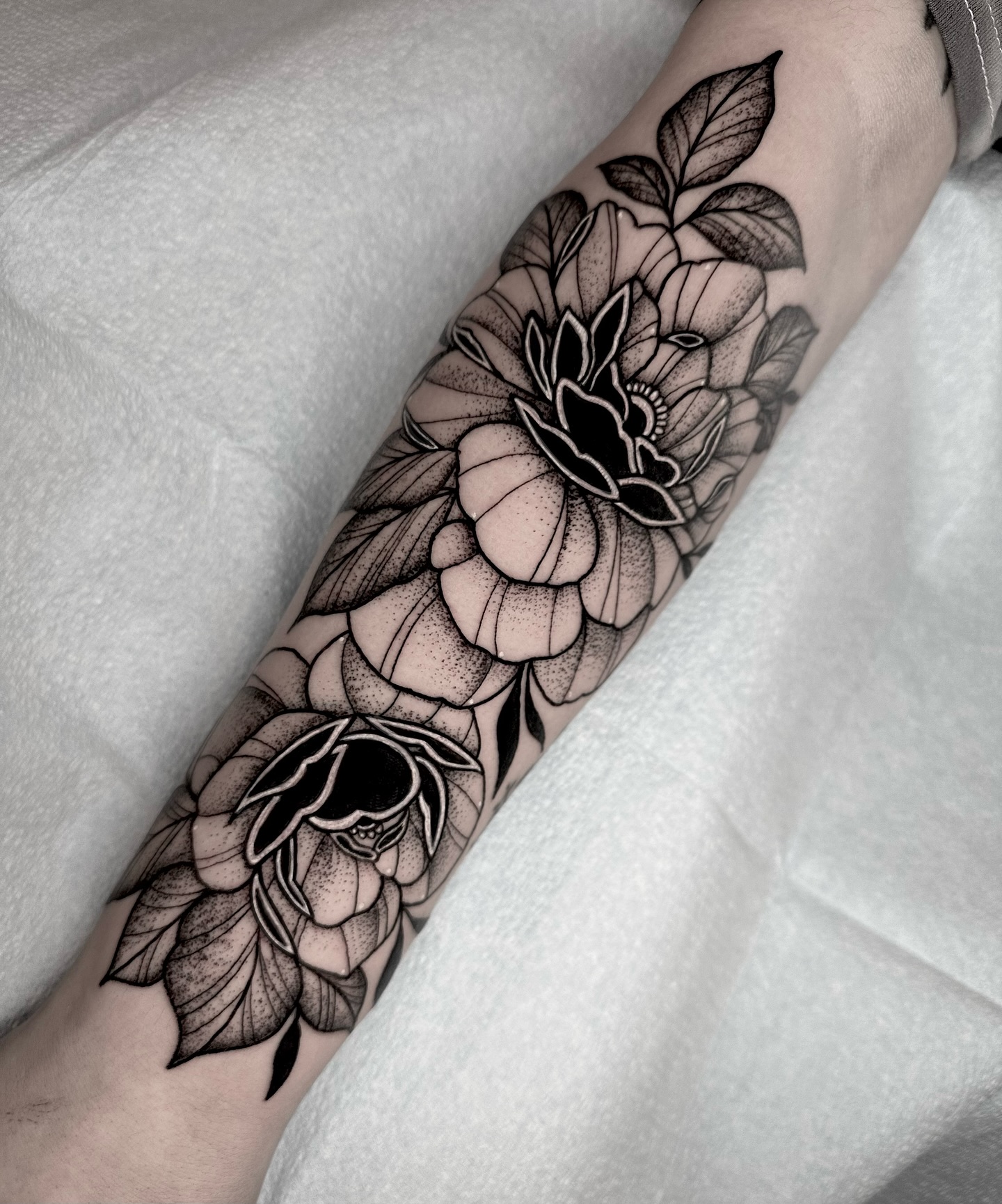
| Blackwork | Black ink only, heavy contrast | Excellent | Graphic impact and large solid areas |
| Fine Line | Hair-thin lines, minimal shading | Poorest of the group | Small, delicate, low-friction placements |
| Realism / Black & Grey | Photographic tone, often no outline | Good in black and grey, mixed in colour | Portraits and single large focal pieces |
| Watercolour | Loose washes, splatter, bleeding edges | Weak without underlying structure | Colour lovers willing to commit to touch-ups |
| Geometric | Polygons, grids, repeating symmetry | Good | Precision-minded people, ornamental placement |
| Dotwork | Tone built entirely from stippling | Good, softens gradually | Mandalas, texture, engraving-like work |
| New School | Cartoon proportions, saturated colour | Very good | Pop culture, humour, character work |
What Actually Separates One Tattoo Style From Another
Style is not a mood board. It is a set of technical decisions about line weight, colour handling, contrast, and composition, and those decisions are what a specialist has spent years drilling.
The first variable is line. A traditional artist runs a heavy, even outline that will still be a hard edge decades from now. A fine line artist runs a single needle at a fraction of that width. Those are different machines, different needle groupings, and often different hand speeds.
The second is how tone is built. Some styles build depth with outlines and flat fill. Some build it with diluted grey wash. Some build it with thousands of individual dots. None of these are interchangeable skills.
The third is how the design meets the body. Japanese tattooing has explicit rules for how a sleeve wraps a shoulder. Ornamental and geometric work follows the limb. Realism often ignores body flow entirely and treats the skin as a canvas, which is a legitimate choice with real trade-offs.
Tattooing itself is old and geographically near-universal, and much of what we now call “style” is really regional tradition that got codified and exported — Britannica’s overview of tattooing is a decent starting point on that history. In practice, though, the useful question is narrower: which of these decisions do you want made on your skin?
The Major Tattoo Styles, One by One
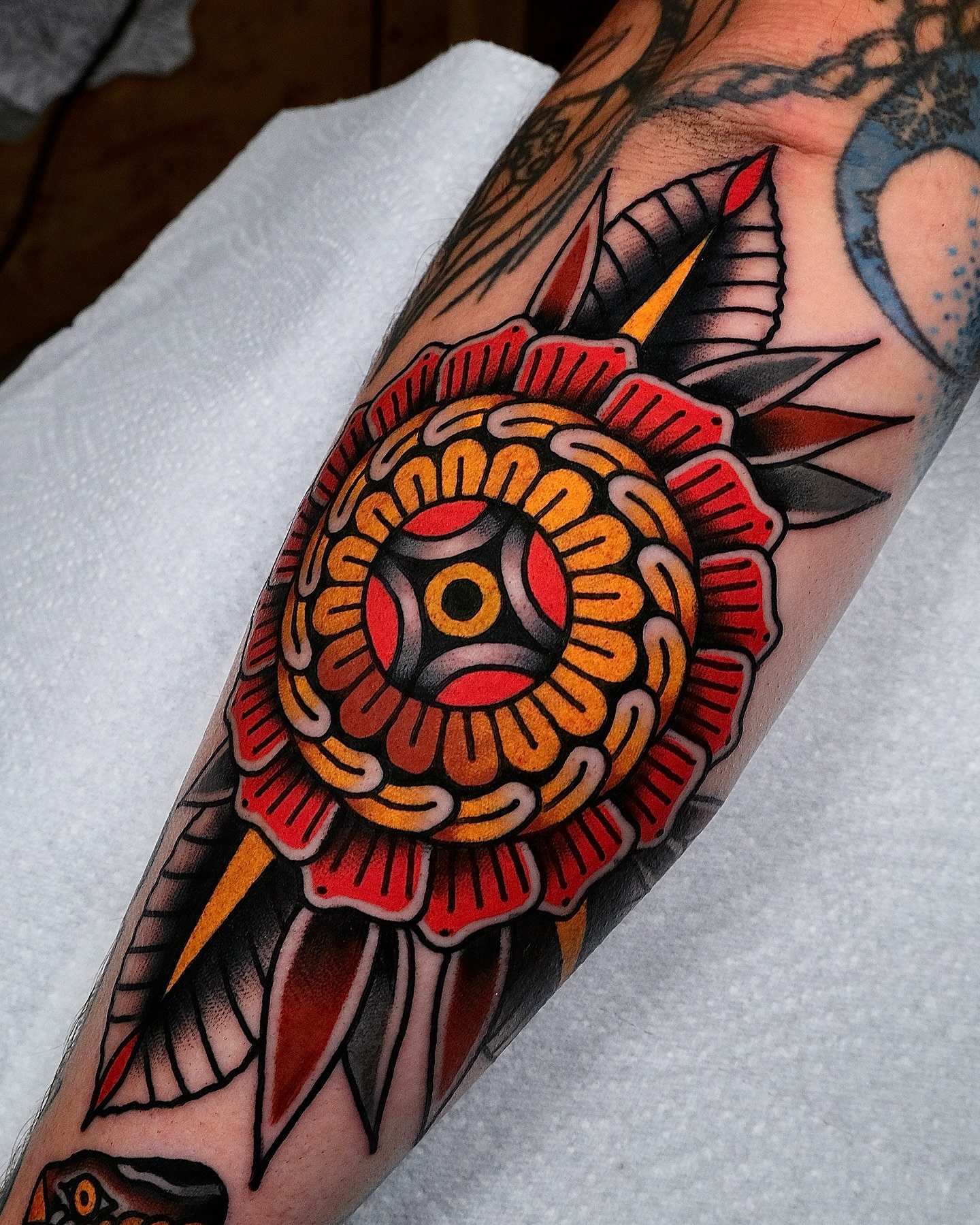
American Traditional
Bold black outlines, a deliberately limited palette of red, green, yellow and black, and a flat graphic quality that owes more to printed illustration than to fine art.
It is the oldest codified Western style, built in port cities and sailor culture across the late 19th and early 20th centuries, and its subject vocabulary — anchors, eagles, roses, daggers, ships, swallows — was chosen because those shapes read clearly at distance.
Its longevity is not sentimental. Thick lines hold their edges. Simplified colour blocks do not blur into one another. In my experience it is the single most age-resistant approach available, and the healed twenty-year-old traditional pieces I have seen still look intentional in a way that almost nothing else does.
Who it suits: people who care more about how it looks in 2046 than how it photographs next week.
Neo-Traditional
Neo-traditional keeps the structural outline of its predecessor but permits complex colour gradients, finer internal detail, and a far wider range of subjects and compositions.
It sits between traditional and illustrative work. The framework is there; the rigidity is not. Animals, ornate florals, decorative portraits and figurative work all translate well, and the colour work tends to be genuinely rich rather than merely bright.
When I have compared portfolios, the neo-traditional artists whose work holds up are almost always the ones with a real illustrative drawing background — the ones who can build a composition on paper before it ever reaches a stencil. Neo-traditional compass designs are a good example of how much ornament the style can absorb without losing its outline discipline.
Japanese (Irezumi)
Japanese tattooing developed independently over centuries into one of the most compositionally sophisticated traditions in the world.
It has a specific subject vocabulary — dragons, koi, oni, peonies, chrysanthemums, phoenixes, tigers — specific connective elements such as wind bars, waves and cloud fills, and specific compositional logic designed to work with the body over large areas.
Finding a genuine specialist matters more here than in any other style. This is a visual grammar that takes years to internalise, and an artist who has “done some Japanese-inspired work” is not the same thing as an artist who has studied the tradition. Every serious Japanese-style artist I have asked has said the same thing: the background is the hard part, not the dragon.
Plan for scale. A full sleeve or backpiece in this style is usually a multi-session, multi-month commitment. Browse Japanese tattoo designs to see how the elements fit together.
Blackwork
Blackwork is any tattooing done exclusively in black ink, which makes it less a style than a family of them.
It covers geometric pattern work, bold illustrative pieces, ornamental and tribal-derived forms, abstract compositions, and full solid-black coverage. What connects them is the absence of colour and the use of black alone to create form, contrast and depth.
It ages well for the same reason traditional does: boldness. Solid fill and heavy line have structural integrity under the skin that thin work does not. When I have looked at healed blackwork at the ten-year mark, the usual issue is softening at the very edges, not loss of the image.
The honest caveat is coverage. Large solid black is difficult to cover or lighten later, so it is a decision worth making slowly. Blackwork tattoo designs show the range before you commit.
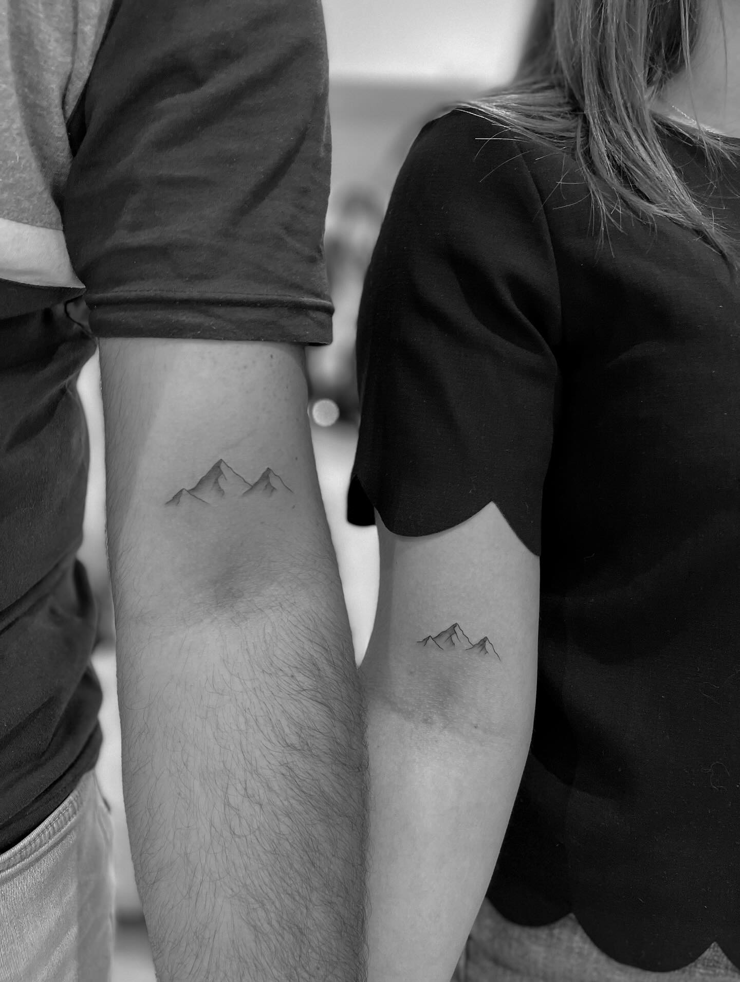
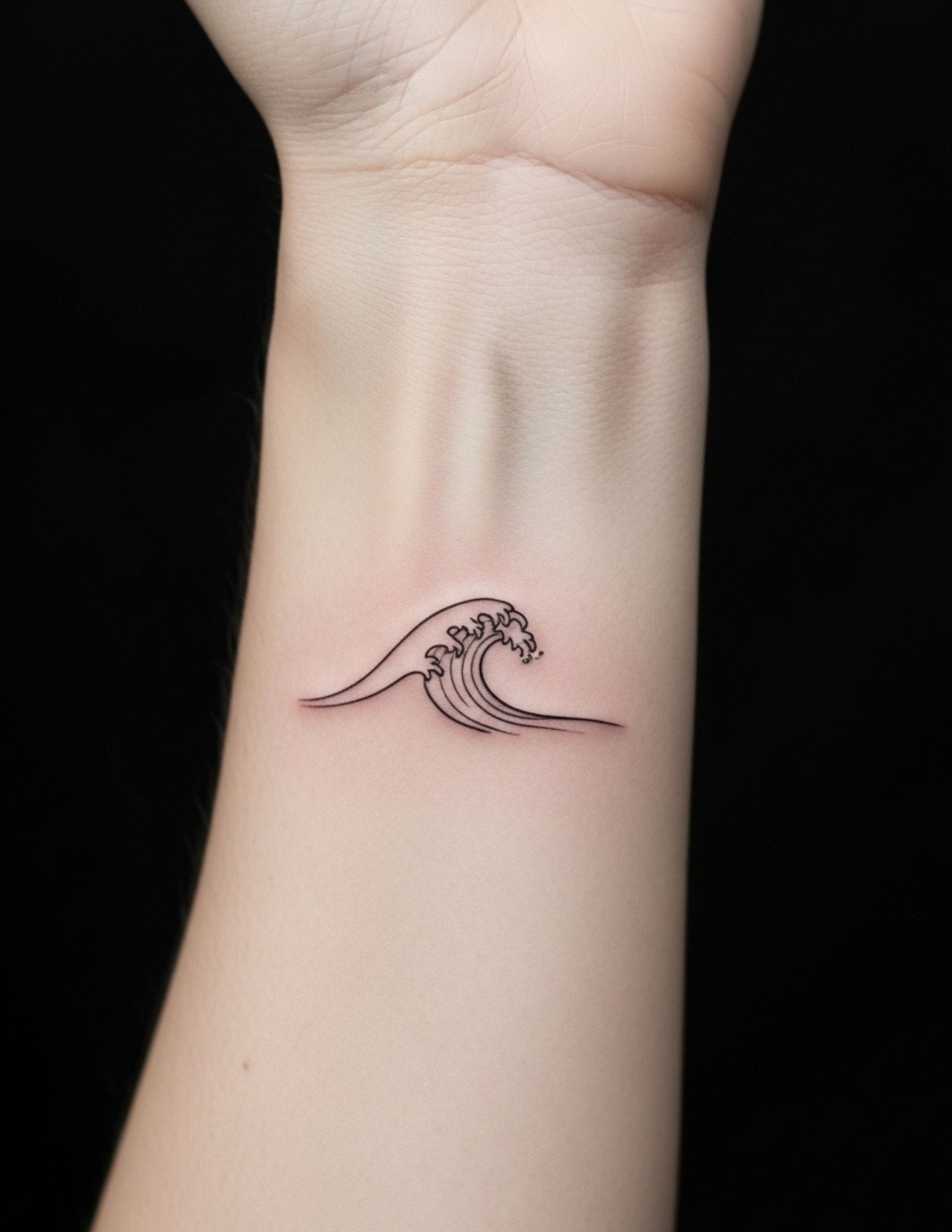
Fine Line and Single Needle
Fine line tattooing uses very thin needle configurations to create delicate, precise marks. Single needle work takes it to the extreme: one needle, producing lines close to the width of a technical pen.
The results are detailed, quiet and genuinely elegant, and the style has driven a lot of the last decade of tattoo aesthetics.
The honest caveat is durability. Thin lines carry less ink and have less structural integrity under the skin, so fine line work blurs and fades noticeably faster than bold styles. In practice that means more frequent touch-ups and a real preference for placements with less sun and less friction.
I would not talk anyone out of fine line work. I would talk them out of putting it on the side of a finger. Fine line tattoo ideas are worth reviewing with placement in mind.
Realism and Black and Grey
Realism aims to reproduce the tonal depth and detail of a photograph or painting. Black and grey realism does it with ink diluted to a range of grey values, building form without colour and often without any outline at all.
Both demand extraordinary technical control, and the gap between an average realism artist and a great one is wider than in any other style on this list.
The single most useful thing you can do is ask to see healed examples, not fresh ones. Realism photographs magnificently on the day. The real test is how the tonal range settles over the following twelve months, and plenty of portfolios quietly avoid showing that.
Black and grey generally holds its structure better than colour realism over the long term, which is part of why so much large-scale realism work is done that way.
Watercolour
Loose colour washes, splattered edges and the visual quality of watercolour painting translated onto skin. The appeal is immediate and the caveats are real.
Watercolour work built without any underlying linework loses definition relatively quickly as skin ages and pigment migrates. The technique that looks most like painting is also the one most exposed to time.
The practical solution most good artists use is a blackwork skeleton beneath the colour: lines and anchor shapes provide the structure, the washes provide the mood. Together they hold far better than either alone, and I have not seen a well-aged watercolour piece that did not have something structural underneath it.
If you want the effect, ask the artist directly how they are building structure into it. Watercolour tattoo ideas will help you spot the difference.
Geometric
Geometric tattooing uses precise mathematical forms — polygons, grids, symmetry, repeating angular structures — often set against organic subjects to create tension between precision and nature.
It is technically unforgiving. There is nowhere for a wavering line to hide when the line beside it is straight, and mirrored or repeating elements make any inconsistency obvious.
It also has to be planned against the body. A grid that sits perfectly on a flat drawing will distort across a shoulder or the inside of a forearm, and the artists who do this well account for that at the stencil stage rather than discovering it mid-session.
Check line consistency in healed photos specifically. Geometric tattoo designs give a sense of how much structure the style can carry.
Dotwork
Dotwork builds an entire image from individual points rather than lines, creating tone and texture purely through the density of the stippling.
The result sits somewhere between engraving and photography, with a soft, granular quality that no other technique reproduces. Mandalas, ornamental patterns, geometric forms and organic subjects all translate well.
It is slow. Every shadow is placed one point at a time, sessions run long, and pricing reflects the labour rather than the size of the piece. When I have asked dotwork artists for time estimates, they are consistently longer than clients expect for the same square inches in another style.
It softens gradually rather than failing sharply, which I would call one of its quieter advantages. Dotwork tattoo ideas show the texture range clearly.
New School
New school is the cartoon-influenced, deliberately exaggerated counterpart to traditional tattooing.
Thick outlines, saturated colour, caricature proportions and a general disregard for restraint give it an energy nothing else on this list has. It is built for humour, pop culture and heavily illustrative subjects.
Because it inherits traditional’s bold outlines and solid colour, it also inherits a lot of traditional’s durability — which surprises people who assume anything this loud must age badly. In my experience it does not.
It is the one style where being funny is the point, and it needs an artist whose sense of humour you actually share.
Styles Worth Knowing That Did Not Get Their Own Section
These overlap with the categories above or sit slightly outside them, but they come up constantly in consultations and are worth recognising by name.
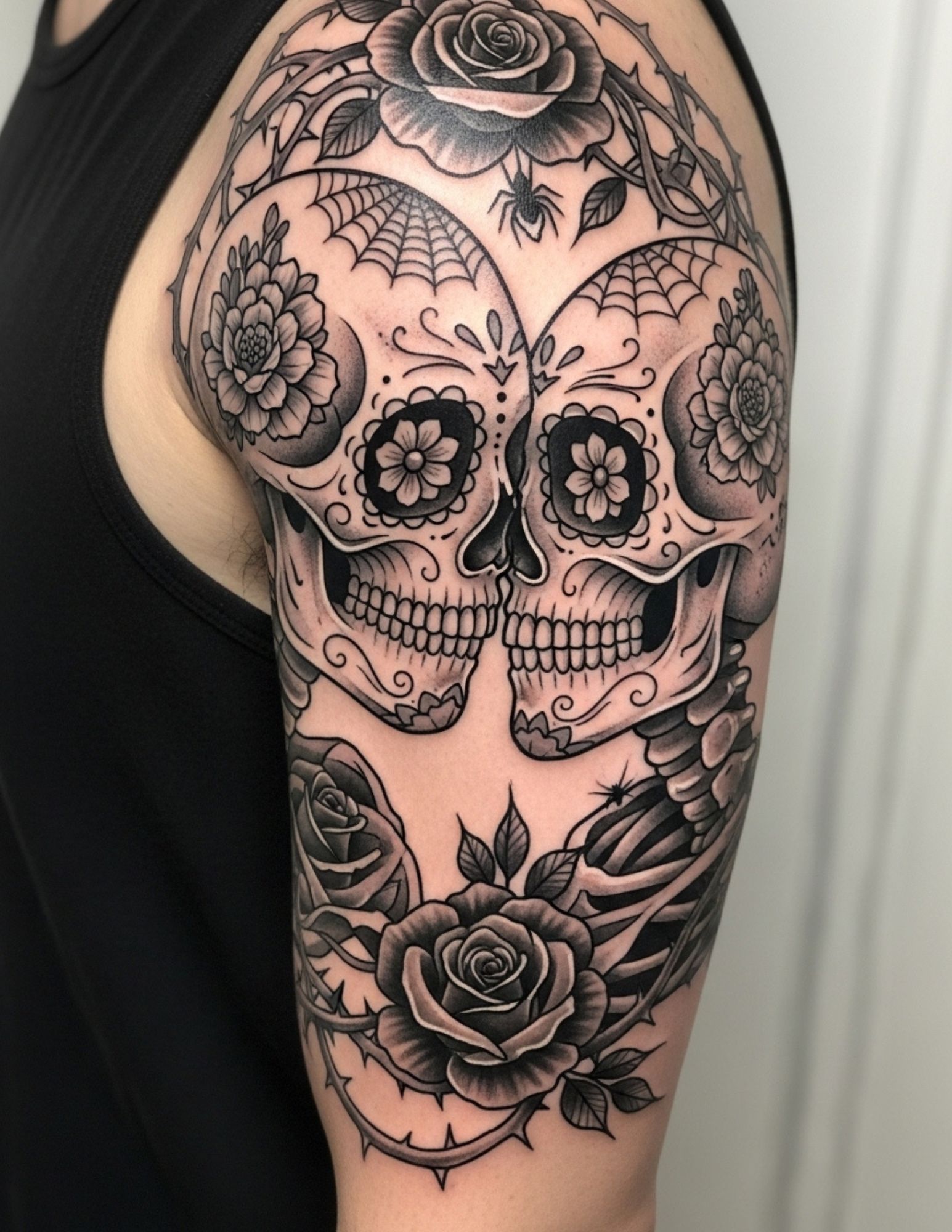
Chicano
Fine black and grey work rooted in Mexican-American culture, with a specific subject vocabulary: script lettering, religious imagery, lowriders, roses, clowns and portraiture. It has its own history and its own conventions, and it deserves an artist who knows both.
Trash Polka
A red-and-black collage approach mixing photorealistic elements with brushstrokes, smears and typographic fragments. Highly graphic, highly divisive, and dependent almost entirely on composition rather than individual elements.
Ignorant and Naive Style
Deliberately crude, childlike linework that rejects technical polish as the point. Done well it is genuinely charming; done badly it is indistinguishable from a bad tattoo, which is the risk you are accepting.
Tribal and Ornamental
Bold black patterning derived from Polynesian, Bornean, Māori and other Indigenous traditions, plus contemporary ornamental work that borrows the flowing-black language without the cultural specifics. If you are drawn to a specific cultural tradition, research its meaning and its protocols before committing.
Sketch and Illustrative
Work that keeps the look of a pencil sketch — construction lines, hatching, unfinished edges. It is a growing category and sits close to fine line in durability terms, so weight the line thickness accordingly.
Anime and Manga
A distinct contemporary category with its own colour handling and its own specialists. Cel-shaded flat colour tends to hold better than heavily airbrushed gradient work, in the healed examples I have looked at.
How to Pick Your Style, and What to Do Before You Book
Start with what is already true about you. Look at how you dress, what art is on your walls, what you have saved on Instagram for the last two years. Style preference is usually already present in the choices you make daily — a tattoo should extend that language, not argue with it.
Then separate the style from the artist. The style is the category; the artist is everything that happens inside it. Once you know you want, say, neo-traditional, your search is for the two or three artists whose specific execution genuinely excites you, not for the nearest available appointment.
Ask for healed photographs at consultation, and ask what the piece will look like in ten years. A good artist will answer that honestly, including telling you that the thin script you want on your ribs is going to need a touch-up. In my experience, the artists who volunteer the downsides are the ones worth booking.
On safety: tattoo inks are not approved by regulators for injection into skin, infections can occur even with good hygiene, and allergic reactions — though uncommon — can be difficult to resolve because the pigment is hard to remove. The FDA’s tattoos and permanent makeup fact sheet is worth reading before a first tattoo. Choose a licensed studio, follow the aftercare your artist gives you, and see a doctor rather than the internet if a healing tattoo becomes hot, spreading, unusually painful or produces discharge. Nothing here is medical advice, and never attempt DIY tattooing or at-home removal.
Common Mistakes, and What to Do If You Are Still Not Sure
The most common mistake is mixing styles in one reference folder and expecting one artist to reconcile them. Pick a lane first.
The second is choosing an artist by proximity or availability rather than by portfolio. A four-hour drive to the right specialist is cheaper than a cover-up.
The third is choosing a delicate style for a high-friction placement — hands, feet, inner fingers, anywhere that rubs. That is a durability problem, not a taste problem.
If you are genuinely undecided, start by looking at a style you already respond to and see how it handles a subject you care about. American traditional animal tattoos are a useful test case, because the style is so defined that you will know quickly whether it is yours.
And whichever style you land on, read up on tattoo aftercare before the appointment rather than after it. Healing has more influence on the final look than most people expect.
Frequently Asked Questions
Which tattoo style ages the best?
Bold styles age best: American traditional, blackwork, Japanese and new school all rely on heavy outlines and solid fill, which hold their structure under the skin for decades. Fine line and unstructured watercolour work sit at the other end and generally need touch-ups sooner. Placement matters almost as much as style, since sun exposure and friction accelerate fading regardless of technique. In my experience, a bold piece in a protected placement is the most reliable combination there is.
Can I combine two tattoo styles in one piece?
Sometimes, and it depends on how close the two styles are technically. Neo-traditional and illustrative work blend comfortably because they share outline logic, and watercolour over a blackwork structure is a well-established pairing. Combining Japanese with realism, or geometric with new school, usually produces something that reads as unresolved rather than intentional. Ask the artist directly whether they think the combination works, and take a no seriously.
How do I know if an artist really specialises in a style?
Look at volume and consistency rather than the single best piece in the portfolio. A genuine specialist has dozens of examples in that style across different subjects and body parts, not three. Ask for healed photographs specifically, since fresh work flatters everyone. Every artist I have asked has been happy to show healed results, and hesitation there is worth noticing.
Is one style more painful than another?
Style affects duration more than intensity, and duration is what most people actually feel. Solid black fill, heavy colour packing and dotwork all involve long passes over the same area, which tends to be more wearing than fine line work of the same size. Placement is still the bigger variable — ribs, sternum, hands and feet are difficult regardless of style. Eat beforehand, and tell your artist when you need a break.
Should my first tattoo be in a specific style?
There is no rule, but bold styles are more forgiving for a first piece because they age well and are easier to build on later. Starting with something small and highly detailed can limit your options if you later want a larger cohesive piece in the same area. Think about where you might want to go eventually, then choose a first tattoo that does not block that path. If you have no long-term plan at all, that is fine too — just pick something durable.
Quick Summary
- Decide on a style before you decide on an artist — the style narrows the search, the artist decides the result.
- Bold styles (traditional, blackwork, Japanese, new school) hold up best over decades.
- Fine line and unstructured watercolour look beautiful early and need more maintenance later.
- Japanese and geometric work are composed against the body, so plan placement and scale up front.
- Always ask to see healed photographs, not just fresh ones.
- Match the style to the placement: delicate work does not belong on high-friction skin.
- Use a licensed studio, follow your artist’s aftercare, and see a doctor for any sign of infection.
- If your reference folder contains six styles, that is the problem — not the artists turning you down.