I have lost count of how many times a client has sat down in a shop, said “yin yang,” and then immediately apologised for it. The symbol carries a reputation problem it did not earn. A yin yang tattoo only looks generic when nothing inside the circle belongs to the person wearing it.
The structure is fixed — two interlocking teardrops, two opposing dots, one unbroken circle. Everything else is open. What fills the halves, how the line is weighted, where it sits on the body: that is where the design either becomes yours or stays a sticker.
The 20 ideas below are the directions I keep seeing work in real skin, from fine line pieces the size of a coin to blackwork panels that take up a shoulder blade. Some are quiet enough to sit beside small meaningful tattoos you already have; others are the centrepiece of a sleeve.
I have also included the practical parts most idea lists skip — how the symbol ages, which fills survive at small sizes, and what to actually ask your artist before you commit.
Which Yin Yang Style Is Right for You?
This is the comparison I sketch out for people who like the symbol but cannot decide how far to take it. Sizes are the smallest I would personally recommend for the design to still read clearly in a few years.
| Style | Smallest size that holds up | Best placement | Ages like |
|---|---|---|---|
| Fine line | About 5 cm / 2 in | Inner forearm, ankle | Softens; may need a touch-up in 5–10 years |
| Blackwork | About 6 cm / 2.5 in | Outer arm, shoulder, calf | Very well — solid black is the most durable fill |
| Illustrative fills (koi, animals) | About 9 cm / 3.5 in | Forearm, thigh, back | Well if the detail was not crammed |
| Watercolour | About 8 cm / 3 in | Upper arm, shoulder blade | Fades fastest; plan on touch-ups |
| Geometric / mandala | About 10 cm / 4 in | Back, thigh, chest | Well, though fine internal lines can blur |
| Micro / dot pair | Under 2 cm / 0.75 in | Wrist, behind ear, finger | Spreads noticeably; finger placements rarely last |
What the Taijitu Actually Says
The diagram most people call a yin yang is properly the taijitu, and the concept behind it runs through classical Chinese philosophy and Taoist thought. It is worth reading the Britannica entry on yinyang before you commit it to skin.
The two halves are not good and evil. They are complementary forces — dark and light, receptive and active, rest and motion — that define each other by contrast.
The curved boundary matters. The halves flow into one another instead of dividing cleanly, which is the whole point: nothing here is a hard border.
The two dots are the detail most artists get asked to remove, and the one I would never let go. Each half carries a seed of its opposite. Delete the dots and you have drawn a divided circle, not a taijitu.
I have watched people change their design three times once they understood that. Usually they stop asking for something that looks balanced and start asking for the two things in their own life that actually need each other.
20 Yin Yang Tattoo Ideas
1. Classic Yin Yang in Fine Line
The standard symbol drawn in precise, consistent fine line: no fill, just the outline and the two dots. It is the version I recommend most often to first-timers.
Restraint is the design choice here. Without solid black to lean on, everything depends on the artist’s line control, so this is a piece worth booking with someone whose healed fine line work you have actually seen — not just their fresh photos.
One honest caveat: fine line softens as it ages. In my experience a 5 cm piece on the inner forearm still reads cleanly after several years, but the same design shrunk onto a finger usually does not.
2. Contrasting Animals in Each Half
One half holds an animal associated with one quality, the other its counterpart. A wolf and a fox. An owl and a hare. A whale and a bird.
This is the fastest way to make the symbol specific without abandoning its structure. The animals carry the duality narratively, which most people find easier to explain than the abstract diagram.
Give it room. Two recognisable animals inside a circle need roughly 9 cm before the faces stop turning into shapes, and I would rather see one animal per half than a crowded menagerie.
3. Koi Fish Yin Yang
Two koi, one dark and one pale, swimming in opposite directions so their bodies form the taijitu curve. It is probably the single most requested variation I see.
The koi already carries perseverance in Japanese tattoo tradition, so the combination adds meaning rather than just decoration.
It also solves a design problem elegantly: the fish tails and heads naturally produce the teardrop shapes, so the composition does not feel forced. Ask for the scale work to be kept open rather than packed — dense scales are the first thing to blur.
4. Floral Yin Yang
A dark bloom fills one half, a pale one the other. A black rose against a white lotus is the pairing I see most, though peonies and magnolias both work.
Botanical fills give the symbol warmth and organic texture while keeping its formal circle intact. It reads softer than blackwork without becoming vague.
The trick is contrast. If both flowers are rendered at the same value the halves stop separating and the whole thing muddies within a few years. Ask your artist to commit to genuinely dark and genuinely light.
5. Sun and Moon
The light half carries a sun, the dark half a moon. Day and night, waking and sleeping, active and receptive.
It is the most common elemental reading of the symbol and genuinely effective when both bodies get real detail instead of being reduced to clip-art. A stippled lunar surface against engraved solar rays is worth the extra hours.
If the celestial side is what pulls you, it is worth looking at moon phase tattoo ideas before you settle — some people find the phases say what they wanted more directly.
6. Watercolour Yin Yang
The halves rendered as washes rather than solid fill, one in warm tones and one in cool, with the pigment allowed to bleed past the line.
The loose edges soften the symbol’s hard geometry and make it look painted rather than diagrammed. It suits people who want the meaning without the graphic severity.
Be realistic about longevity. Watercolour work relies on light, low-saturation pigment, and in most cases it fades faster than a lined black piece. Every artist I have asked about it says the same thing: keep a black skeleton underneath so the design still holds when the colour softens.
7. Fire and Water
Flames curl through one half, a breaking wave through the other. Of all the elemental pairings this is the most visually dynamic, because both elements are already made of motion.
It also fits the philosophy neatly — fire and water do not cancel each other so much as define each other’s limits.
The composition risk is symmetry. Flames naturally want to rise and water naturally wants to fall, so ask to see the stencil on your body before the needle starts; a design that balances on paper can sit lopsided on a curved forearm.
8. Tree and Roots
Branches occupy the upper half, a mirrored root system the lower. Growth and foundation, the visible and the hidden.
I like this one because it turns a circular symbol into a vertical statement. It reads well on the spine, the outer thigh, or the back of the calf where the body already gives you an axis.
Keep the branch and root density lower than feels right in the drawing stage. Fine twigs sitting close together are the classic candidate for blur after a decade.
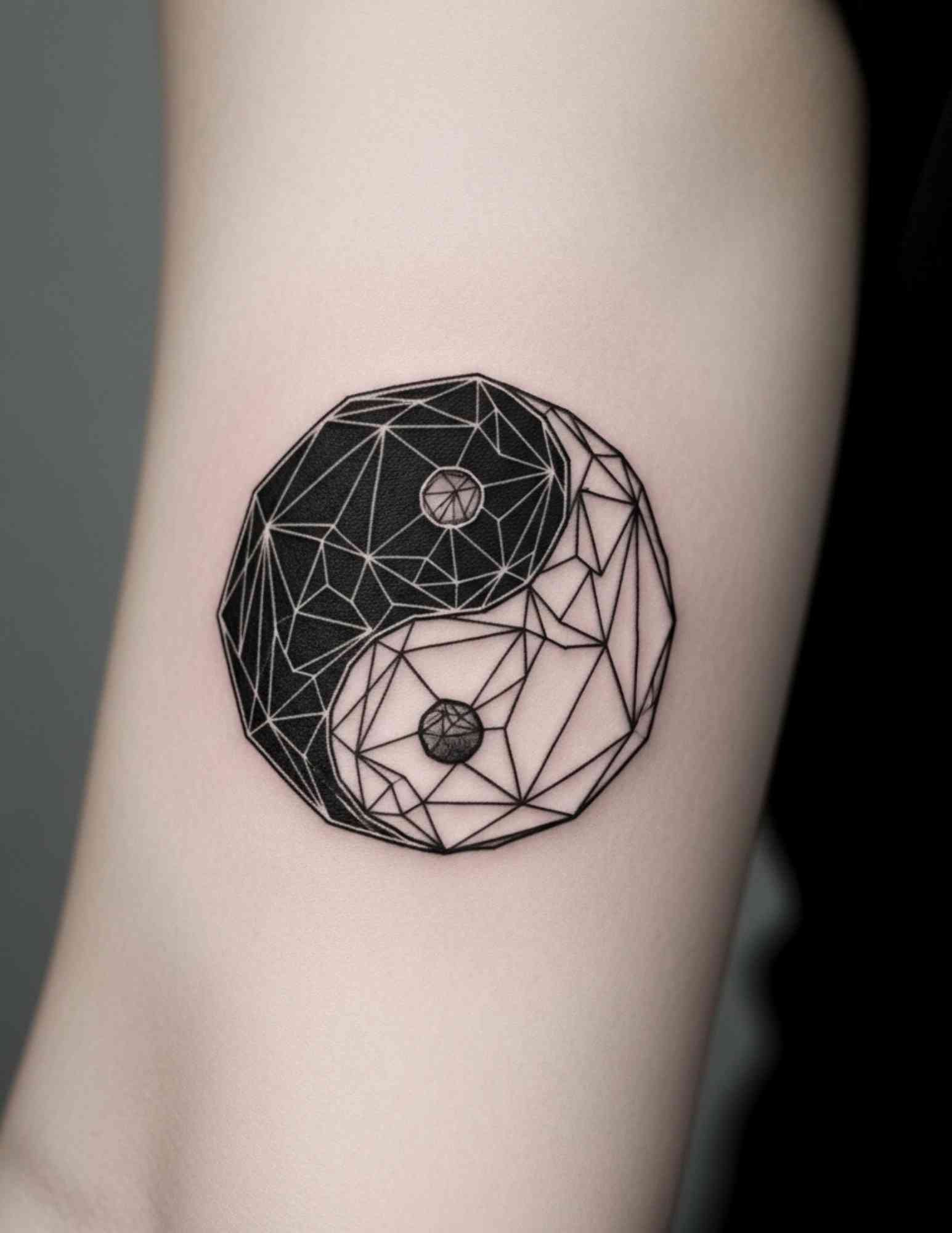
9. Geometric Yin Yang
The symbol rebuilt from angular facets, repeating lines, or a fractured grid rather than smooth curves.
It trades flow for structure, which is arguably a contradiction of the source idea — and some people choose it precisely for that tension.
Geometric work is unforgiving. Any wobble in a straight line is visible forever, so this is one of the few styles where I would pay a premium for a specialist rather than take a cheaper slot.
10. As an Element Inside a Larger Sleeve
Rather than standing alone, the yin yang anchors a bigger composition — clouds, waves, peonies or geometry flowing outward from the circle.
This is how I would approach it if you already have work on that arm. The symbol becomes a focal point instead of a floating badge, and the surrounding imagery does the personalising.
Plan the whole sleeve before the first session, even if you tattoo it in stages over a year or two. Retrofitting a background around an existing circle almost always looks retrofitted.
11. Nature-Based Yin Yang
Mountains in one half, ocean in the other. Forest and desert. Sky and earth.
Landscape fills work because they carry an atmosphere the abstract symbol cannot. They also let you encode somewhere real — the coastline you grew up on, the range you can see from your window.
This is one of the few variations where I would push for a larger canvas. Landscapes need horizon lines and depth, and both disappear below about 10 cm.
12. Mandala Yin Yang
The taijitu at the centre, surrounded by concentric ornamental rings that extend its circular logic outward.
The pairing is coherent rather than decorative: both forms are about order radiating from a centre, so the styles do not fight each other.
If this direction appeals, the composition rules are much the same as in lotus mandala designs — symmetry has to be near-perfect, which means placement on a flat area of the body matters more than usual.
13. The Minimalist Dot Pair
The symbol stripped to its two seeds: one solid dot, one open circle, placed a few centimetres apart.
It is the most abstracted version on this list and the only one most people will not recognise, which for some wearers is the entire appeal.
It is also the version most likely to need touching up. Small solid dots spread as ink settles into the skin, so keep them at least a couple of millimetres across and off the fingers and palms.
14. Filled With Your Own Symbols
Instead of a stock pairing, each half holds something from your own life. A city skyline and a wheat field. A stethoscope and a guitar. Two dates.
This is the version I push hardest for when someone worries about looking generic. The structure stays universally readable; the content is unrepeatable.
Bring your artist two or three reference objects rather than a paragraph of explanation. In my experience the design gets much stronger when the brief is concrete, and the shapes have to be simple enough to survive inside a teardrop anyway.
15. Tiger and Dragon
The oldest animal pairing associated with the symbol in East Asian art: the tiger of the earth against the dragon of the sky.
It carries real weight in traditional Japanese and Chinese design and suits large-scale work — back, chest panel, full outer arm.
Both creatures need detail to look like themselves, so this is not a small tattoo. If you want one of the two rather than the pair, dragon tattoo designs stand on their own perfectly well.
16. Blackwork Yin Yang
Heavy solid black fill with the light half left as bare skin, sometimes extended into a larger black panel or ornamental border.
This is the most durable option on the page. Solid black holds its edge longer than anything else, and the symbol is already built on the exact contrast that blackwork does best.
Two practical notes: large areas of saturated black take longer to heal and are harder to cover or remove later, so it is a decision worth sitting with for a few weeks.
17. Yin Yang With Sacred Geometry
The symbol inscribed within a Flower of Life, a hexagonal lattice, or a set of nested circles that continue its geometry outward.
Both traditions are concerned with underlying order, so the combination is conceptually honest rather than just visually busy.
Ask for the internal lattice lines to be spaced more generously than the reference art suggests. Tight repeating geometry is the pattern I most often see grey out into a solid tone as it ages.
18. Split Between Two People
Each partner wears one half. Not matching — complementary. Apart, each is visibly incomplete; together they close the circle.
It says something more interesting than a heart does: that the point is necessary difference, not sameness. It also works for siblings and long-standing friends, which is how I see it done most often now.
If you want it to read on its own as well, ask for each half to be a finished composition rather than a torn edge — the same principle behind the better couples tattoo designs.
19. Yin Yang Spine Piece
The symbol centred on the upper back, with the halves extending into elements that travel toward the shoulders or down the vertebrae.
The spine is the body’s own axis of balance, which makes it the most thematically apt placement available — and a symmetrical symbol suits a symmetrical location.
It is not a gentle spot. Bone-close placements are commonly reported as among the sharper areas to sit through, and the session is long if the design extends. Spine tattoo placement is worth reading up on before you book.
20. A Yin Yang That Is Specifically Yours
The structure is fixed. What fills it is not.
The best version of this tattoo is almost never the one from a philosophy textbook. It is the two things in your own life that look opposed from outside and are obviously interdependent from inside — the work and the rest, the leaving and the returning, the two people you came from.
When someone can tell me what their two halves are in a sentence, the design usually draws itself. When they cannot, no amount of ornament fixes it.
Variations Worth Considering Instead
Not everyone who likes the idea of balance wants the circle itself. These are the redirections I suggest most often when the standard symbol does not quite fit.
The Two Dots Alone
Keep only the seeds — the black dot in the white field and its mirror. It is the most private version of the idea and fits almost anywhere.
It also sidesteps the recognisability problem entirely, which matters if you work somewhere conservative.
A Broken or Open Circle
The taijitu drawn with a deliberate gap in the outer ring. Balance as something ongoing rather than achieved.
I have inked this for a few people in recovery and for one person a year after a divorce. It is a small change that shifts the whole meaning.
The Character Rather Than the Diagram
Some people prefer the written characters for yin and yang to the symbol. If you go this route, have the calligraphy checked by a native reader before the stencil, not after — font-rendered characters frequently come out wrong.
Asymmetric Halves
The two halves deliberately unequal, because most people’s balance is not a 50/50 split. It breaks the classical form, so decide whether you want the tradition or the truth.
Getting It Right: Sizing, Placement and Aftercare
Size the piece for the fill, not for the circle. A bare outline works small; two animals, a landscape or a mandala border does not. If your artist suggests going bigger, that advice is usually about the tattoo still reading in ten years.
Watch the placement curve. A circle wrapped over the outer bicep or the ankle bone distorts when the limb moves, so flatter areas — inner forearm, shoulder blade, outer thigh, upper back — keep the geometry honest. Ask to see the stencil while standing, not just seated.
On healing, follow the aftercare your artist gives you, because it is tailored to the work they just did. The general principles — keep it clean, keep it moisturised, keep it out of the sun and out of pools while it heals — are set out well by the American Academy of Dermatology.
If you see spreading redness, swelling that worsens after the first few days, pus, or a fever, that is a doctor’s call rather than an artist’s. This article is not medical advice, and an infected or allergic reaction is not something to manage from a forum thread.
Longer term, sunscreen does more for a black tattoo than any ointment. Every artist I have asked names UV exposure as the main reason line work looks tired sooner than it should.
Common Mistakes and What to Do Instead
The most frequent one is scale: a design with two detailed animals booked at 5 cm because that was the budget. Shrink the ambition rather than the tattoo — a clean fine line circle at 5 cm beats a crowded illustrative piece at the same size every time.
The second is dropping the dots for a cleaner look. It reads as tidier on the drawing and as wrong to anyone who knows the symbol.
The third is booking on style rather than on healed work. Ask any artist for photos of the same design six months to a year after it was done. If they cannot produce them, that is information.
Still not sure? Budget and pain are the two things people underestimate most, and both are worth checking before you book — see our guides to what a small tattoo costs and to managing tattoo pain.
Frequently Asked Questions
Is a yin yang tattoo considered cultural appropriation?
The taijitu is a philosophical symbol with a long history in Chinese thought rather than a closed religious emblem, and it is widely worn outside East Asia without objection. That said, the way you wear it matters more than whether you may. Learning what the halves and the dots actually represent, and avoiding pairing it with unrelated imagery you have not looked into, is the difference most people care about. If you are unsure, reading a serious source such as the Stanford Encyclopedia of Philosophy entry on yinyang is a reasonable starting point.
How small can a yin yang tattoo be?
A plain outlined symbol usually holds up from around 4–5 cm on a flat area like the inner forearm. Below that the two dots tend to spread into the surrounding fill as the ink settles, and the design gradually loses the detail that makes it a taijitu rather than a divided circle. Anything with an illustrative fill needs considerably more room, generally 9 cm or up. Fingers, palms and the sides of the feet are poor choices at any size because those areas fade fastest.
Which placement hurts least for this design?
Fleshier, flatter areas are generally the more comfortable ones — the outer thigh, the upper outer arm and the calf are the placements clients most often describe as manageable. Ribs, sternum, spine, feet and the inside of the elbow are commonly reported as sharper because the skin sits close to bone or is thin and nerve-dense. Pain varies a lot between individuals, so treat any ranking as a rough guide rather than a promise.
Should the yin half or the yang half go on top?
There is no rule your artist will enforce, but the conventional orientation places the light (yang) portion rising on one side and the dark (yin) descending on the other, with the whole figure read as rotating. Most people choose the orientation that suits the body part, which is a legitimate reason. If the symbol’s traditional reading matters to you, bring a reference image you are happy with so the stencil is not mirrored by accident.
Will a yin yang tattoo date badly?
The symbol itself has been in continuous use for centuries, so the shape is about as trend-resistant as tattoo imagery gets. What dates is the treatment: heavy tribal borders and certain colour palettes tie a piece to the decade it was done in more than the taijitu ever will. A simple, well-executed version in solid black or clean line is the safest bet if that worries you.
Quick Summary
- The structure is fixed; the fill is what makes the tattoo yours.
- Keep the two dots — without them it is a divided circle, not a taijitu.
- Fine line and micro versions start around 4–5 cm; illustrative fills need roughly 9 cm or more.
- Blackwork ages best, watercolour fades fastest, geometric work is least forgiving of a shaky line.
- Flat placements — inner forearm, shoulder blade, outer thigh, upper back — keep the circle from distorting.
- Koi, sun and moon, and tiger and dragon are the pairings with the deepest traditional grounding.
- Ask any artist for healed photos, not just fresh ones, before you book.
- Follow your artist’s aftercare, use sunscreen long term, and see a doctor for anything that looks infected.