Balance tattoo ideas do not need to share one symbol. A level scale makes the subject direct, mirrored plants emphasize symmetry, and an overlapping pair of circles can suggest two parts of life finding common ground. These 16 original concepts compare those approaches so you can choose a visual direction before discussing size and placement with an artist.
Start by deciding what balance means in your own brief. Do you want equality between two sides, a steady center, room for opposites, or a reminder to adjust your priorities? Those are different ideas, and they do not all need the same drawing. A tattoo can serve as a personal reminder without promising to change your wellbeing or circumstances.
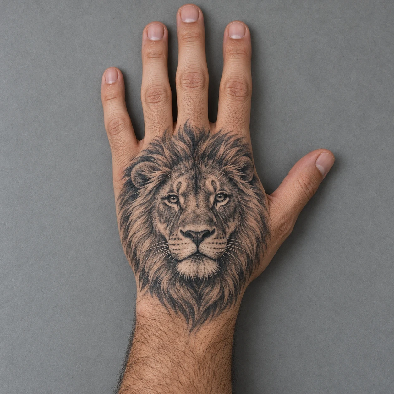
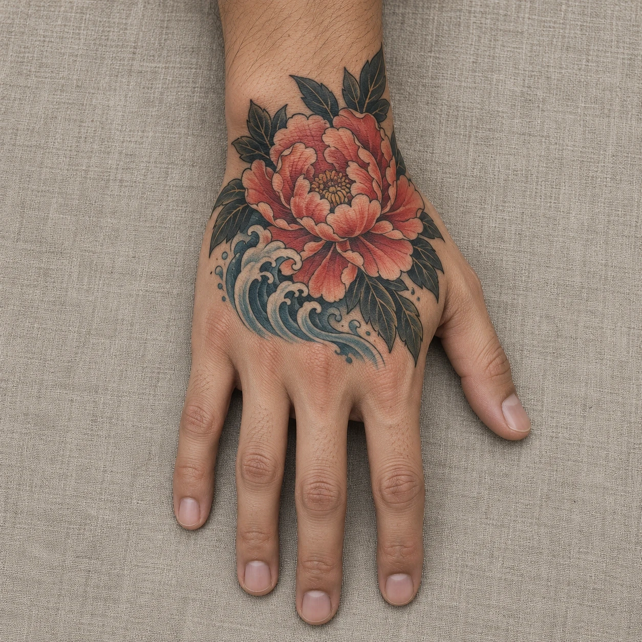
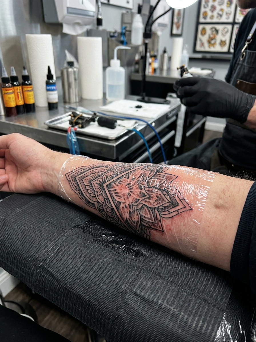
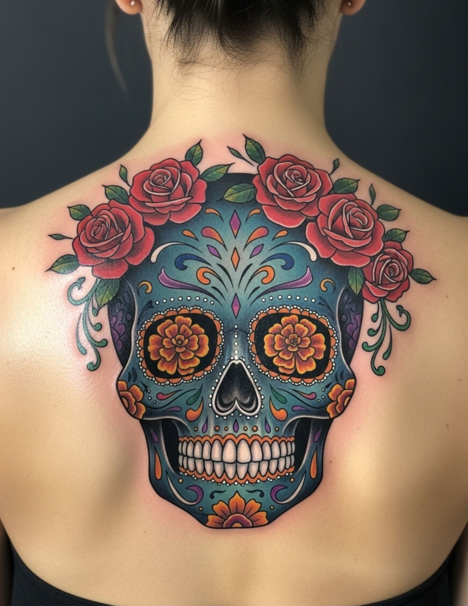
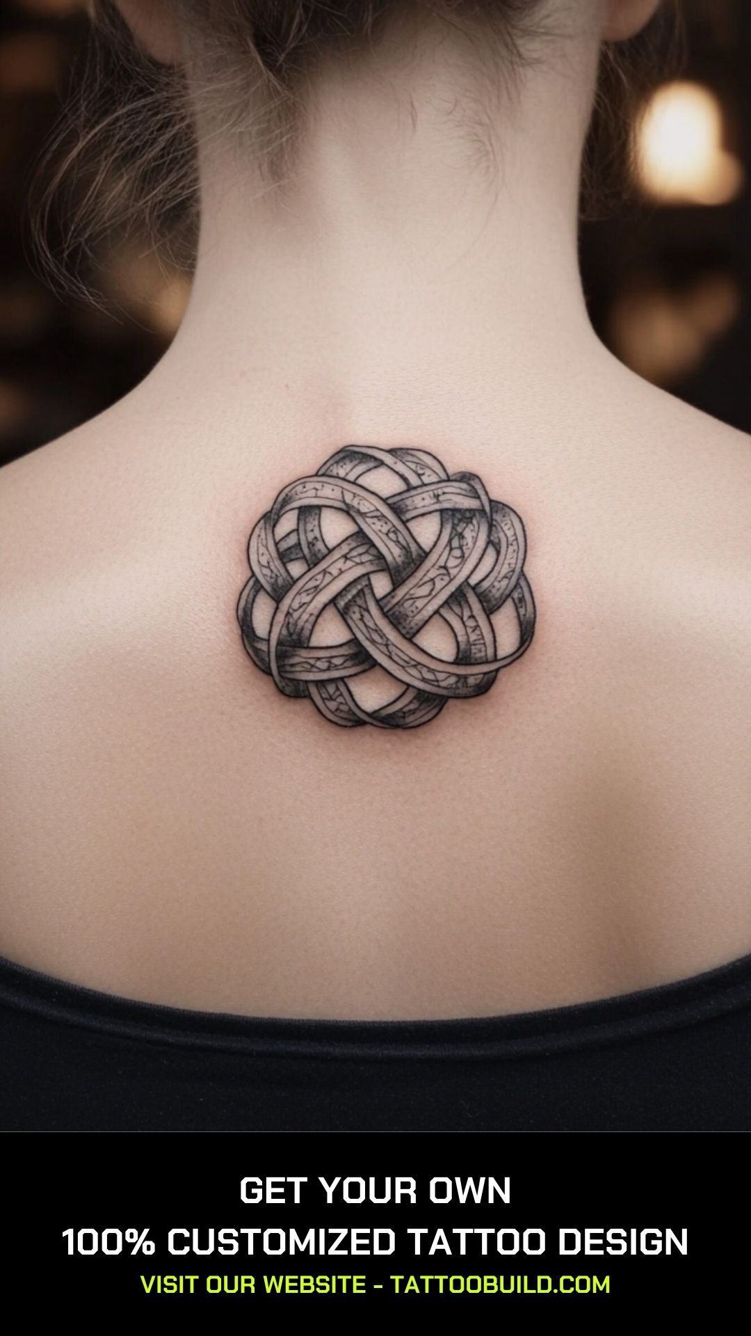
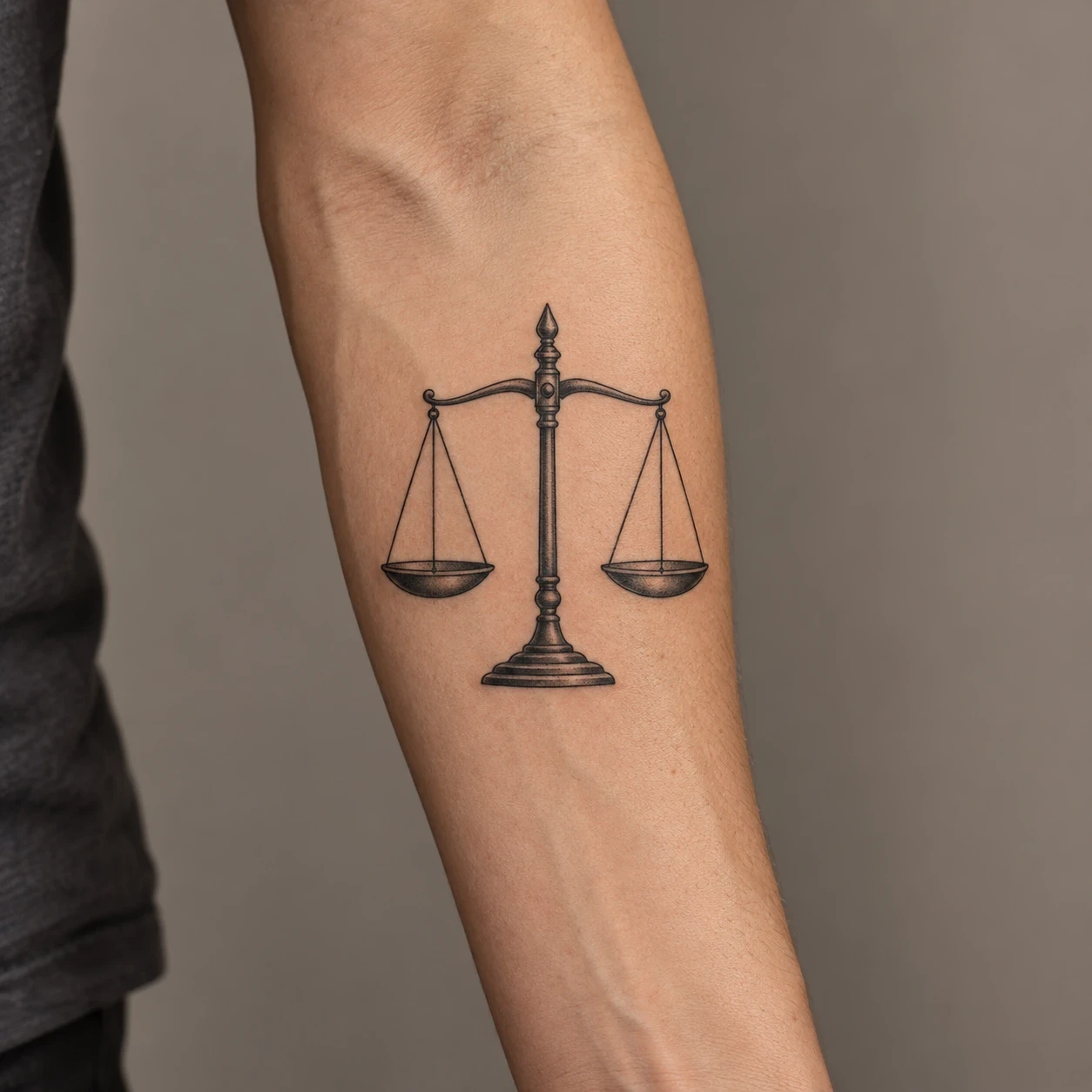
Image disclosure: All 16 design images and the separate forearm hero are AI-generated concepts. They are not real or healed client work, historical artifacts or ready-to-use stencils. The ivory background is paper; pale areas may become open skin rather than white ink. Your artist should independently redraw the reference for your body and chosen scale.
Choose the kind of balance you want to show
There is no single meaning shared by every design below. The explanations describe possible personal readings and visible compositional choices. They do not turn a plant, animal or geometric shape into a universal symbol. If a particular cultural or religious symbol is what you want, research that specific symbol rather than treating all balance imagery as interchangeable.
| Your preferred idea | Designs to compare | What to discuss |
|---|---|---|
| Two sides in equilibrium | Scale or seesaw | Level alignment and matching visual weight |
| Symmetry in nature | Ferns, leaf or butterfly | Precise mirroring versus natural variation |
| A clear center | Compass or pendulum | Direction and the main axis |
| Shared space or contrast | Overlapping rings or split disc | Fill, open skin and the relationship between shapes |
Some readers will prefer a more specific motif. We have separate guides to yin-yang tattoo ideas and Libra tattoo ideas. Those are narrower subjects with their own contexts; a general interest in balance does not require choosing either one.
1. A level balance scale
A level scale makes the idea visible without needing a word beneath it. The two pans have the same size and height, and the central post gives the drawing a clear axis. This is a useful reference if you want an object that expresses your idea directly, rather than a design whose meaning only you know.
Ask your artist to check the beam, cords and pans together. Tiny differences can make the scale appear tilted even when that is not your intention. The pans need room to remain separate from the post. If your interest is specifically astrological, our Libra tattoo ideas explore that narrower brief.
2. Three stacked stones
The stones offer a softer alternative to straight geometry. Their rounded shapes and visible contact points make the stack feel settled, while the change in size keeps the arrangement from looking like three identical circles. You can choose it as a personal reminder of steadiness without assigning it a religious or universal meaning.
Decide how realistic you want the surfaces to be. A few dark contact shadows can explain the stack; a heavily textured miniature may become a very different drawing. Ask the artist how they would simplify the stones at your chosen scale, and keep the broad lower stone visible so the base still feels supported.
3. A seesaw with matching weights
This concept is deliberately simple: a level beam, a central support and two matching round forms. It treats balance as a relationship between two sides. Compared with the hanging scale, its shorter height makes it worth considering for a wider, shallower area, subject to an artist's assessment of the actual placement.
The circles should appear to rest on the beam, and the beam should meet its support clearly. Bring up those contact points when reviewing the drawing. If you want an uneven seesaw to express change or effort instead, describe that intention explicitly so a tilted version does not look like an accidental mistake.
4. An equals sign inside a circle
Two parallel bars make a compact, direct graphic. The surrounding circle gives them an outer boundary and makes the whole design feel like a small emblem. An equals sign may also communicate equality to someone seeing it, so choose it only if that reading sits comfortably alongside your personal idea of balance.
Compare the gap between the bars with their thickness before choosing a size. The open space is part of the design. Ask your artist to show the circle on your body while relaxed; a circle on flat paper is a reference, not a guarantee of how the same outline will look around a curved limb.
5. Overlapping rings with a shared center
The two rings suggest separate things that share some ground. A rust-colored central lens makes that overlap the focus, while the rest stays open. This is a less literal brief than a scale: it can reflect a relationship between work and rest, independence and connection, or another pair you define for yourself.
Tell your artist what the two circles represent, if anything, and whether equal size matters to the idea. You could keep the overlap unfilled, change the accent color, or remove it. The most important visual check is that the two complete curves remain easy to follow through their intersection.
6. Mirrored fern fronds
Two outward-curving fronds turn symmetry into a botanical design. Their shared base gives them a connection, while the open space between the stems keeps the center light. This option suits someone who likes an organic drawing but still wants a clear left-and-right relationship instead of an asymmetrical sprig.
Decide how exact the mirroring should be. A near match can feel natural; a precise match feels more graphic. Ask the artist to prioritize the stems and larger leaflets before adding every tiny division. If you want the design smaller, reducing the number of leaflets may preserve the overall shape more clearly.
7. A mountain reflected in water
A horizontal line separates the peak from its reflection, making the lower half answer the upper half. The drawing uses one recognizable shape twice rather than adding several unrelated symbols. It can work as a personal image of perspective or steadiness, but the reflection itself does not impose a fixed meaning.
Check whether you want a precise mirror or a slightly broken reflection. The first looks more geometric; the second introduces a sense of water and movement. Keep that choice intentional. Ask your artist where the lake line will sit on the body, since its position anchors the entire composition.
8. A fan-shaped ginkgo leaf
The leaf offers a quiet central axis without using a mechanical object. Its spreading veins and broad fan create a balanced outline, while the small notch prevents the top edge from becoming a plain semicircle. The gold wash is optional and should be discussed as an actual color plan rather than copied literally from paper.
You can choose the leaf for its shape alone. This article does not claim that a ginkgo tattoo has one established meaning for everyone. Ask your artist which veins need to remain visible at the proposed size, and whether the stem should be centered or gently angled to suit the placement.
9. A compass rose with four clear points
Four points radiating from one center suggest orientation rather than equal weights. The contrast between solid and outlined points makes the construction visible without labels or a crowded background. It is useful if your idea of balance involves checking your direction, rather than staying perfectly still.
Decide whether you want an abstract compass-like emblem or a diagram with literal directional labels. This concept uses no letters. Ask the artist to check the alignment of opposite points and the spacing inside the outer circle, then test which point should face along the limb before approving the stencil.
10. An hourglass with a matched frame
The hourglass brings time into the brief. Its two bulbs share the same outline, while the narrow neck creates a clear middle. Here both halves contain sand; that choice is a visual arrangement, not a claim about a precise moment or a promise that every part of life receives equal time.
Ask whether you want the sand to be still or visibly falling. Those details change the scene and can require more space. The frame and glass should remain distinguishable, particularly near the center. If the design needs to be small, a simplified outline may be a clearer starting point than a miniature realistic object.
11. A sun and crescent joined by a line
A bright disc and an open crescent give the two sides different shapes while keeping them in conversation. The fine connecting line gives the pair a common axis. You might use it to mark activity and rest or another personal contrast; those are choices for your own brief, not universal definitions of the imagery.
Compare how much visual weight each side carries. Equal outer dimensions do not always look equally prominent when one shape is filled and the other is mostly open. If this celestial pairing is the part you like most, our sun and moon tattoo ideas offer a more focused set of variations.
12. A circle split into dark and open halves
This version uses the same outer shape on both sides and changes only the fill. A straight dividing line keeps it graphic and distinct from a curved yin-yang composition. Choose it if your interest is the visual contrast itself, and be prepared for different viewers to give that contrast their own interpretation.
Discuss how the open half will read against your skin and how the outer edge should be drawn. The ivory in the reference is paper, not a requirement to fill half the tattoo with white ink. Ask to compare the outline and solid fill at the proposed size before adding any texture.
13. A butterfly built around a central body
The butterfly makes bilateral symmetry the main feature. A narrow body anchors the drawing, and the wings repeat their larger shapes on either side. The rust accents soften the black pattern without creating another subject. You can choose this for the balanced outline without needing to attach a story of transformation to it.
Check that the complete body, antennae and four wings make sense in the artist's redraw. Matching broad shapes matter more than copying every small mark from a generated image. If the placement is narrow, ask how the wings would be reshaped rather than forcing this wide reference into a compressed rectangle.
14. A pendulum at the center
The hanging weight gives the eye one clear point of rest beneath a simple arch. Unlike the seesaw or scale, it has only one suspended object. That makes it a quieter reference for someone who wants to suggest returning to a center rather than comparing two equal sides.
Ask the artist to check where the cord meets the arch and how the weight aligns beneath it. The design should read as a deliberate, coherent object. Keep motion marks out if you want a still composition; if movement is important to your idea, have the artist redesign the whole arrangement around it.
15. A circle on a triangular support
A round shape perched on a pointed support introduces a little tension. The centered alignment suggests balance, while the narrow contact point makes that balance seem delicate. This is an abstract design, so it can remain private in meaning rather than advertising a particular identity or belief.
Discuss how much separation or contact you want between the shapes. The circle should not accidentally merge into the triangle's outline. A small change in line weight can alter which element dominates, so ask your artist to compare those weights before adding a frame, more dots or a longer central line.
16. Two apples on a shared branch
The final idea gives the two sides a common botanical structure. Matching fruit hangs to the left and right of the center, with restrained color and a small amount of leaf detail. The branch is a visual metaphor, not a working balance mechanism, which allows a gentler and less technical drawing.
Ask whether the apples should be exactly alike or only similar. Their spacing, stems and relationship to the branch should remain clear. If color is not part of your plan, an artist can distinguish fruit and leaves through outlines and shading. Keep the overall branch visible before considering extra blossom, fruit or lettering.
Placement starts with the outline
Bring two or three preferred concepts to your consultation and identify what you like about them: the symmetry, the open middle, the botanical detail or the contrast of fill and line. Your artist can then draw for the actual area. A tall stone stack and a wide pair of fern fronds need different proportions, even if you initially imagined both on the same forearm.
For a design with a strong center line, ask to see the stencil while your body is relaxed as well as moving. The appearance of a level beam, circle or reflected peak depends on the surface carrying it. A flat image cannot show every angle of a curved limb. If the symmetry matters strongly to your idea, make that part of the brief before the final stencil is prepared.
Small designs often need fewer internal elements, but there is no universal minimum size for these concepts. Ask the artist which gaps and details they would preserve and which they would remove. Their healed portfolio is a more useful point of discussion than assuming that every line in a generated image will translate unchanged to skin.
Review the drawing before adding more detail
- Alignment: Check the beam, central stem, cord or dividing line that organizes the design.
- Contact: Stones should meet, weights should connect to cords, and geometric forms should touch or separate deliberately.
- Visual weight: A dark shape may look more prominent than an equally sized outline. Decide whether that contrast is wanted.
- Open space: Leave room around the bars of an equals sign, between fern leaflets and inside overlapping rings.
- Interpretation: Consider what another person might see in the symbol as well as what it means to you.
Lettering is optional. If you add a personal word or date, check the exact spelling yourself and ask the artist to draw it separately at the intended size. None of these images contains lettering. For a broader look at contrasting subjects, our sun and moon tattoo ideas can help you decide whether a paired motif is the part you value most.
Plan for care as well as the design
Ask your artist for written aftercare instructions and a doctor or pharmacist about individual health concerns. For tattooed skin, the American Academy of Dermatology advises sun protection because UV light can fade some inks. It recommends broad-spectrum, water-resistant SPF 30 or higher, applied 15 minutes before going outdoors and reapplied at least every two hours. Ask when sunscreen is appropriate for a new tattoo rather than treating this as fresh-tattoo wound care. Consult a dermatologist about a skin reaction or a change in tattooed skin.
Balance tattoo questions
What tattoo can represent balance?
A scale, paired shapes, a reflection or a centered object can express different versions of the idea. Choose the design according to your own brief. None of the concepts here comes with a meaning that every wearer or viewer must share.
Do both sides need to be identical?
No. Exact symmetry is one option. Two different shapes can also create a balanced composition through their spacing, size and contrast. Ask the artist whether your preference is mathematical mirroring or a looser relationship between the two sides.
Is an equals sign the same as a balance symbol?
An equals sign can suggest equality, which may overlap with your personal idea of balance, but the two words are not interchangeable in every context. Think about the public reading of the sign before choosing it only for its appearance.
Can a balance tattoo be a matching design?
Yes. Two people might choose the same complete image or related motifs. If each tattoo is only half a design, review how it looks on its own too. A shared story does not remove the need for each drawing to work independently on its wearer.
Will a tattoo help me feel more balanced?
It may be a meaningful personal reminder, but this article makes no promise that a tattoo changes mental health, habits or life circumstances. Choose the artwork because you want to wear it, rather than expecting the image itself to solve a problem.
Skin-care source checked October 24, 2026: American Academy of Dermatology, Caring for tattooed skin. Interpretations and design comparisons are editorial suggestions for a tattoo-artist consultation.