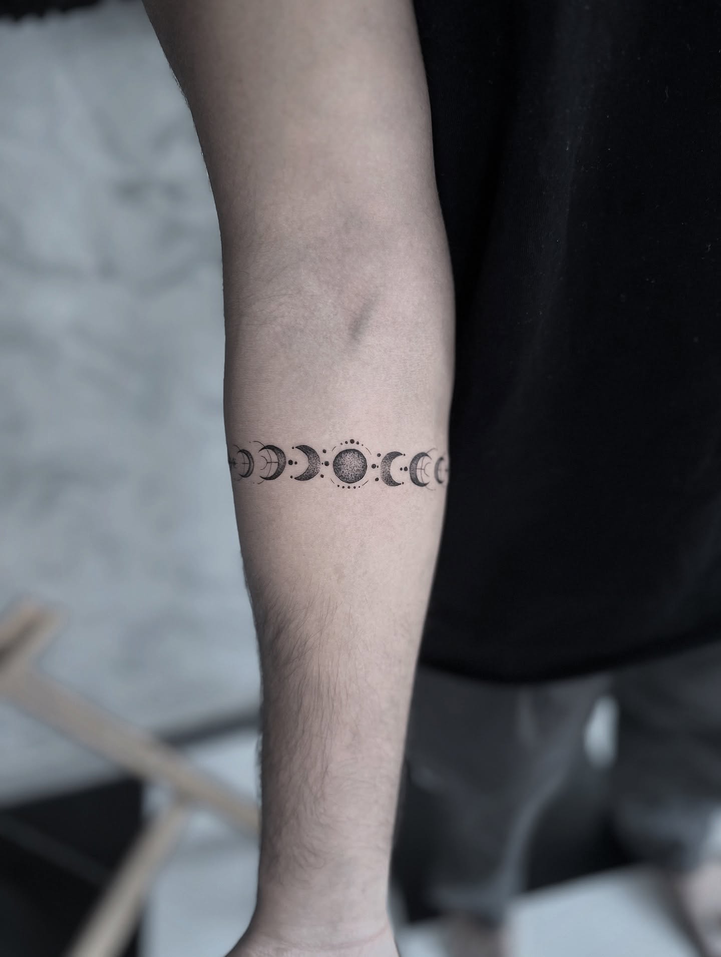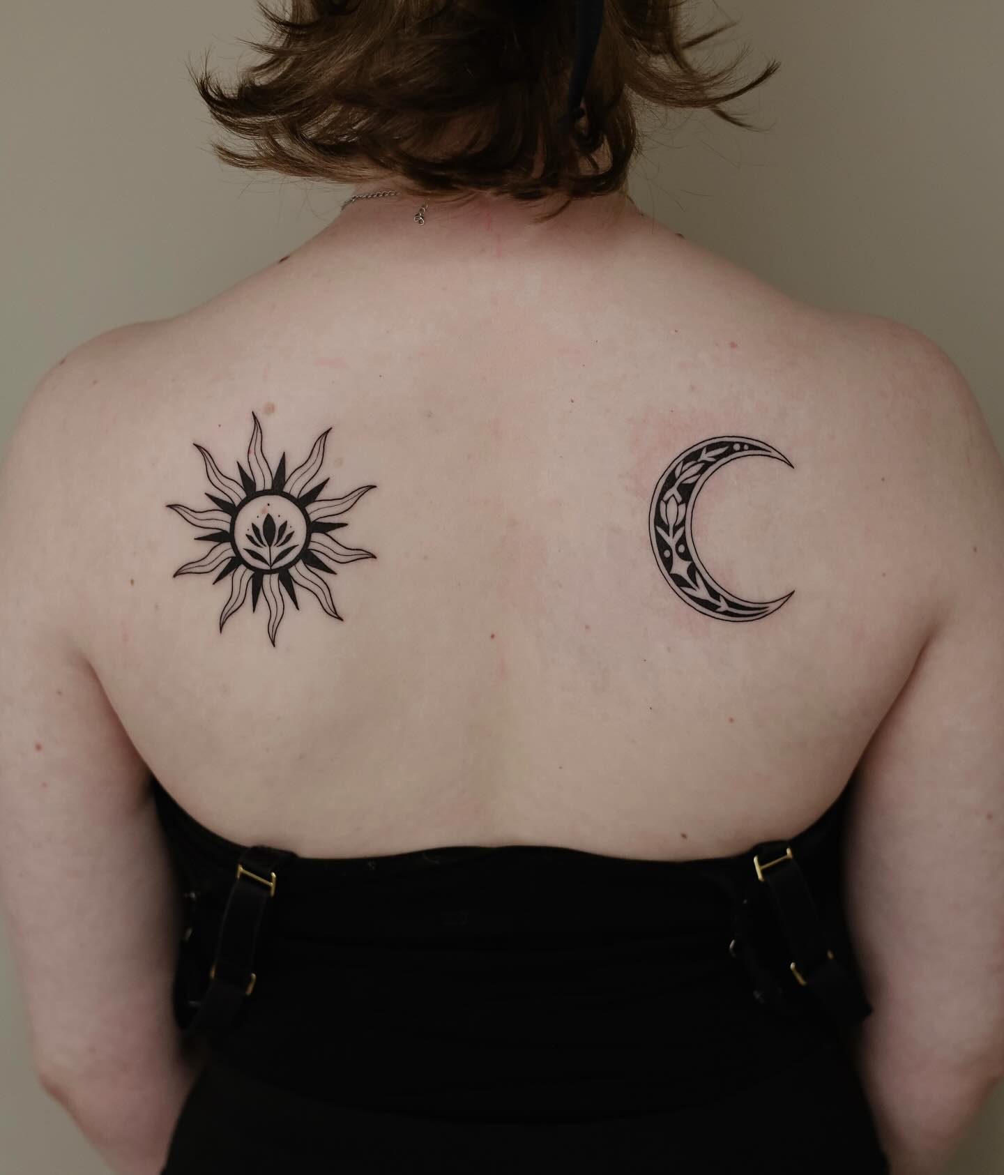
The sun and the moon have been paired in human symbolism for as long as either has had a name, and after years of looking at celestial tattoos I still think it is the most durable idea in the category. What separates a sun and moon tattoo that reads as considered from one that reads as a trend is almost never the artwork — it is whether the wearer knows which specific opposition they are marking.
Light and dark. Waking and sleeping. The part of yourself other people see and the part they do not. The pairing carries all of those readings at once, which is a strength when you have chosen one and a weakness when you have not.
These 22 sun and moon tattoo ideas cover the full range, from spare geometric versions that sit under two inches to full-back celestial scenes built over multiple sessions. I have grouped them so you can find the execution that matches your placement and your tolerance for upkeep, and I have been honest about which styles age well and which do not. If you want the wider category first, our celestial tattoo ideas guide covers stars, planets and constellations alongside the sun and moon.
Every photo here credits the artist who made it. If a design speaks to you, that credit is the fastest route to someone who can actually draw it.
Which Sun and Moon Style Is Right for You?
This is the comparison I end up drawing on a napkin for almost everyone who asks me about this subject. Sizes are the practical minimums I would work to, not hard rules.
| Style | Smallest size I would go | How it ages | Best for |
|---|---|---|---|
| Geometric line | 1.5 in | Very well if lines are spaced | First tattoos, small placements |
| Fine line | 2 in | Softens noticeably over years | Delicate, drawing-like results |
| Blackwork | 2.5 in | Best on this list | Bold statements, long horizons |
| Dotwork | 2.5 in | Good if stippling is open | Texture without hard edges |
| Watercolour | 3 in | Needs a line skeleton to hold up | Colour-led, expressive pieces |
| Ornamental / mandala | 3 in | Very well at scale | Symmetry, larger placements |
| Illustrative faces | 4 in | Depends entirely on line weight | Storytelling, antique feel |
Why the Sun and Moon Work Together So Well
Symbolically the pairing earns its place easily. Solar and lunar deities appear across a remarkable range of unconnected cultures, and the Encyclopaedia Britannica entry on solar deities is a good starting point if you want to trace where your own reading comes from.
Visually it solves a compositional problem that most two-object tattoos fail. One shape is circular and radiates outward; the other is a crescent defined by its arc. They occupy the same visual space in completely different ways, so they contrast without competing.
That contrast is why the design survives shrinking better than almost any other pairing. Even at an inch, a filled crescent and a rayed circle stay distinguishable from each other, which is not true of, say, two flowers or two animals.
There is a practical benefit too. Because the two elements are separate objects, a good artist can adjust the gap between them to fit your anatomy without redrawing anything — the composition stretches and compresses in a way a single locked-together design cannot.
The one genuine risk is familiarity. This subject has been tattooed a great deal, so the versions that stand out are the ones with a specific point of view: an unusual rendering method, a personal detail worked in, or a placement decision that only makes sense on your body.
22 Sun and Moon Tattoo Ideas
1. Yin-Yang Sun and Moon
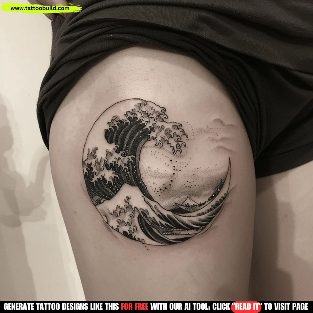
Rather than placing the two symbols side by side, this version folds them into a yin-yang structure so the pairing reads as one object instead of two. The crescent occupies the dark half, the rayed sun fills the light, and the S-curve between them does the work that a gap would otherwise have to do.
What makes this design hold up over time is that the composition is closed — there is no loose edge for the eye to fall off, which is exactly the quality that keeps a small circular tattoo readable a decade in.
In my experience this is the version people ask for when they want the meaning to be obvious without the tattoo looking literal. Artists tend to like it too, because the circular boundary gives them a fixed frame to design inside rather than an open field.
Size matters more here than with most celestial designs. Below roughly two inches the interior detail starts fighting itself, and I would rather see a clean three-inch version than a cramped one on the wrist.
Photo: @babz_tattoo — image shown in the introduction above.
2. Facing Portraits: Celestial Faces
Giving each body a human face and turning them toward one another is one of the oldest visual treatments of the pairing, and it still carries more warmth than any geometric version.
The reference points here are medieval woodcuts, alchemical plates and old tarot iconography — which is why the design reads as antique even when it is drawn with entirely modern linework.
Neo-traditional and illustrative artists handle this best, because faces need weight in the line to survive healing. Fine line faces at small scale are the single most common regret I hear about in this category.
Ask to see healed photos before committing. A face that looked crisp in the fresh photo can soften into a smudge if the linework was too tight for the placement.
3. Geometric Sun and Crescent Moon
Both subjects stripped back to their structural essentials: a circle with evenly spaced rays for the sun, a single crescent arc for the moon. Nothing decorative survives the edit.
This is the version that works smallest without losing its identity, which makes it the safest choice for a forearm, ankle or behind-the-ear placement.
Geometry is also the least forgiving style on the list. A wobble in a straight ray or an uneven arc is visible immediately, so this is worth booking with someone whose portfolio is full of clean line work rather than colour realism.
If you like the language but want more presence, see how the same vocabulary scales up in dotwork tattoo designs, where stippled shading fills the shapes without adding lines.
4. Celestial Half-and-Half
A single circle divided vertically, one half rendered as a sun with rays, the other as a night sky with a crescent and scattered stars. The division itself becomes a design element rather than a compromise.
I like this one because it solves the spacing problem that trips up so many sun and moon tattoos — there is no awkward gap to fill between two separate objects.
The split line is where the whole design lives. A hard straight edge reads graphic and modern; a soft gradient reads dreamier and needs an artist comfortable with shading.
It sits well on the inner forearm, the back of the arm, or the sternum, where the body gives you a natural vertical axis to line the split up against.
5. Sun and Moon With Phases
Running the moon’s full phase cycle around or beneath a central sun adds a temporal dimension the basic pairing does not have. The phases represent change; the sun is the constant that change is measured against.
It also gives you a shape that suits linear placements — along the spine, down the forearm, or curved under a collarbone — better than a compact two-object design does.
Eight phases is the standard, though I have seen artists use five or seven when the space is short. Keep the spacing mathematically even; irregular gaps are the thing people notice years later.
If the cycle is the part you actually care about, our full guide to moon phase tattoo ideas goes deeper into layout and placement than there is room for here.
6. Fine Line Sun and Moon
Single-weight thin linework, no shading, no fill. The appeal is obvious: it looks like a drawing rather than a tattoo, and it sits lightly on the skin.
What I always say to people set on fine line is that the style trades longevity for delicacy. Thin lines spread as they heal and keep spreading over the years, and detail packed too tightly can blur together.
That is not a reason to avoid it — it is a reason to design for it. Leave more space between elements than looks necessary on paper, and expect the tattoo to soften rather than stay razor-sharp.
Placement helps. Inner forearm, outer upper arm and calf hold fine line better than hands, feet, fingers and ribs, which take more friction and movement.
7. Watercolour Sun and Moon
Loose washes of pigment behind or bleeding past the linework — warm amber and gold for the sun, cool blue and violet for the moon — turn the symbolic contrast into a colour contrast.
The style photographs beautifully and it is genuinely striking fresh. It is also the style that changes most with age, because soft washes without a line or shadow structure underneath have less to hold their shape.
The versions I have seen age best keep a light black or dark-toned skeleton under the colour. Purely edgeless watercolour tends to look softer and less defined after a few years.
Ask any artist you are considering for healed photos at three years or more, not fresh ones. It is a fair question and good watercolour artists expect it.
8. Sun and Moon With Botanical Elements
Wrapping the pairing in wildflowers, ferns or trailing leaves softens what is otherwise a very geometric subject, and it gives the artist somewhere to run the composition off into.
There is a symbolic argument for it too: the celestial pairing governs time, and plants are what time visibly acts on. The combination reads as growth under cycles rather than as decoration.
Choose the plants for a reason. Night-blooming flowers beside the moon and sunflowers or wheat beside the sun turn a pretty design into one that actually says something.
Botanical elements also disguise awkward placement edges nicely — they can be thinned or extended to follow a shoulder curve in a way a hard circle cannot.
9. Matching Wrist Pair
A sun on one wrist and a moon on the other, drawn in the same hand and at the same weight, so the pair only makes sense when both arms are visible.
Small wrist pieces have a specific constraint: the skin is thin, the area moves constantly, and the inner wrist gets more sun exposure than people expect. Simple beats intricate here almost every time.
I would keep each element at roughly an inch and a half and resist adding stars, script or dot fields. The empty skin around them is doing real work.
Wrists also rank on the more sensitive end for most people. If it is your first tattoo, our tattoo pain management guide is worth reading first.
10. Sun and Moon Mandala
Building the pairing into a mandala turns a two-object design into a symmetrical field. The sun becomes the radiating centre; the moon is usually worked into the outer rings or the negative space.
This is the style that scales up most gracefully. A sun and moon mandala can run from a three-inch shoulder cap to a full back piece without the design logic changing.
Symmetry is unforgiving on curved body parts. A mandala that looks perfect on a flat stencil can read as skewed on a shoulder, so it is worth checking the stencil in a mirror from several angles before the needle starts.
If the geometry is the draw rather than the celestial subject, lotus mandala designs use a similar structure with a different centre.
11. Blackwork Sun and Moon
Heavy solid fill, hard edges, and negative space doing the drawing. Blackwork gives this subject a weight that line-only versions cannot reach.
In terms of how a tattoo looks in twenty years, this is the strongest option on the page. Large areas of saturated black hold their shape long after fine detail has softened.
The trade is commitment. Solid black is the hardest thing to cover or lighten later, so this is the version to choose only when you are certain about both the design and the placement.
Expect a longer session and a more demanding heal than a line piece — packed black takes more out of the skin. Broader style options live in our blackwork tattoo designs collection.
12. Sternum: Stacked Celestial
Stacking the sun above the moon down the centre line of the chest uses the body’s own symmetry as the frame. The design does not have to invent a vertical axis — the sternum supplies one.
Ornamental artists often extend the composition with drop chains, small stars or a fine underline that follows the ribs outward.
Sternum is consistently reported as one of the more painful placements because of how close the bone sits to the surface, and sessions there tend to feel longer than the clock says.
Healing needs attention too. The area creases when you move and rubs against clothing and bra bands, so loose tops for the first couple of weeks make a real difference.
13. Sun Setting Into Moon
Instead of showing two fixed objects, this version shows the moment of change: the sun dissolving into the crescent, or the two overlapping mid-transition.
It is the most narrative way to draw the pairing. The subject stops being two symbols and becomes a single event.
The overlap is the whole design. Ask the artist to show you exactly how the two forms meet at stencil stage, because that junction is what the eye goes to first and it is difficult to adjust later.
Horizontal placements suit it — along a forearm, under a collarbone, or across the upper back — because the transition reads left to right like a sentence.
14. Dotwork Celestial Pairing
Tone built entirely from stippling rather than from lines or solid fill. Density does the shading, so the design has texture without hard edges.
Dotwork suits this subject unusually well, because the graininess reads a little like the surface of the moon and a little like radiant light — it does two jobs at once.
It is slow work and priced accordingly. A palm-sized dotwork piece can take considerably longer than a line design of the same footprint, and the cost usually reflects that.
Loose, well-spaced stippling ages better than tightly packed dots, which can gradually merge into flat grey. Any experienced dotwork artist will already be designing around this.
15. Moon Eclipse Composition
An eclipse is the one moment the two bodies physically occupy the same place, which makes it the most literal version of the pairing available.
Visually it is a dark disc with a corona of light around it — a strong, simple silhouette that reads instantly from across a room.
The corona is where artists separate themselves. Even radiating light around the disc looks flat; irregular, flaring light looks like an actual eclipse.
It also works as a cover-up shape more often than you would expect, since the solid dark centre can absorb an existing small tattoo.
16. Sun and Moon With Arrows
Crossing arrows through or beneath the pairing adds direction to a symbol set that is otherwise about balance and stillness.
The usual reading is intention: the celestial pair marks the cycle, the arrow marks the choice to move through it. Whether that lands for you is personal, and it should be.
Watch the visual noise. Arrows introduce long straight lines that compete with the sun’s rays, so the composition needs deliberate space between the two elements.
Forearm and outer bicep placements handle this best, because both give you a straight run of skin for the arrow shaft to follow.
17. Negative Space Crescent Moon
Instead of tattooing the moon, the artist tattoos everything around it — the crescent is bare skin inside a filled field. The sun is then drawn conventionally beside it.
The technique creates a genuine contrast of method, not just of shape, which fits a subject built on opposites better than almost anything else here.
Negative space only works with clean, saturated fill. Patchy black destroys the effect, so this is a design that depends entirely on the artist’s packing.
One honest limitation: negative space does not tan, and the untattooed crescent will shift in contrast with the rest of your skin through the year.
18. Full Back Celestial Scene
At full-back scale the sun and moon stop being symbols and become a landscape — clouds, star fields, mountains or water can all enter the composition without crowding it.
The shoulders usually take the two main bodies, with the scene resolving down the spine. It is a project measured in multiple sessions rather than one sitting.
Do not design a back piece around a single reference image. The good ones are built around how the composition sits on your specific shoulder blades and spine, which is why the consultation matters more than the drawing.
Budget realistically and book with someone whose healed large-scale work you have actually seen. Related large-format ideas sit in our galaxy tattoo ideas collection.
19. Sun and Moon for Two People
One person wears the sun, the other wears the moon, and the designs are drawn to complete each other only when both are in the room.
Split designs carry meaning in the separation as much as the reunion, which is why this works for siblings, close friends and long-distance pairs as readily as for couples.
Get both halves drawn by the same artist in the same session where you can. Two artists working from the same reference will still produce two different line weights, and the mismatch is obvious side by side.
More split and mirrored concepts are collected in our guide to matching tattoo ideas for couples.
20. Minimalist Silhouette Pair
A solid filled circle for the sun. A solid filled crescent for the moon. Two shapes and nothing else.
At this level of reduction the meaning is not in the execution at all — it is entirely in what the shapes represent and what you have decided they mean.
Reduction is also the most durable choice on this list. Two solid shapes with no interior detail will look essentially the same in fifteen years as they do healed.
It suits people who want the reference without the ornament, and it is one of the few designs on this page that genuinely works at under an inch.
21. Ornamental Sun and Moon Necklace
The pairing hung as pendants from a fine chain that drapes across the collarbones, treating the celestial symbols as jewellery rather than as illustration.
The ornamental approach integrates the design into the body’s architecture instead of placing it on top of the body, which is a meaningfully different effect.
The chain has to follow your actual anatomy to work. A drape drawn from a stock template will sit wrong on the collarbone; it needs to be adapted on the skin at stencil stage.
Ornamental artists — the ones who work in chains, lace and drop details rather than illustration — are the right people to ask for this.
22. Abstract Expressionist Sun
The sun drawn not as a circle with rays but as a loose gestural form, brushstroke-quality marks radiating outward with deliberate imprecision, set against a sharply precise crescent.
The tension between the two rendering approaches mirrors the tension between the symbols themselves, which is a smarter piece of design thinking than most versions of this subject attempt.
Looseness on skin has to be planned, not improvised. Marks that read as spontaneous in a tattoo are almost always the result of a carefully worked stencil.
This suits artists with an illustration or painting background. If a portfolio is all clean geometry, this is probably not the piece to ask them for.
Variations Worth Considering Instead
If the straightforward pairing does not feel like yours, these are the directions I most often see people move toward.
Sun, Moon and a Third Element
Adding a single star, a planet or a small landscape line turns a symmetrical pairing into a scene, which reads less like a symbol and more like a place.
Keep it to one addition. Two or more and the composition loses the clean opposition that made the original work.
Moon Only, Sun Implied
A crescent with light falling across it from one side implies the sun without drawing it. It is a subtler solution and it halves the space the design needs.
This is a good option when you want the meaning but not the obviousness.
Astronomical Rather Than Symbolic
Drawing the moon with accurate maria and craters, or the sun with visible surface texture, shifts the tattoo from mythology toward observation.
It suits people who came to this subject through astronomy rather than through symbolism, and it usually needs at least four inches to be worth doing.
Sun and Moon in Script or Language
Some people prefer a written form — a date, a phrase, or a name for the pairing in a language that matters to them — set beside a small celestial mark.
If you go this route, have a native reader check the text before the stencil goes on. Script errors are the most common permanent mistake in tattooing and the easiest to prevent.
Getting It Done Well: Practical Advice
Bring at least three references and be specific about what you like in each one. “This line weight, this composition, that colour approach” gives an artist something to work with; “something like this” does not.
Ask to see healed work in the exact style you want, not fresh photos. Fresh tattoos all look sharp. Healed photos at two or three years are the honest test, and any artist worth booking will have them.
Follow whatever aftercare instructions your artist gives you rather than advice from the internet — including this page. Practices differ by artist and by ink, and yours knows what went into your skin. General guidance from the American Academy of Dermatology is a reasonable background read, not a substitute.
Sunscreen after healing is the single highest-return habit for this subject. These designs live on forearms, wrists, shoulders and backs, and UV exposure fades line and colour faster than time alone does. If you notice spreading redness, swelling, heat or discharge while healing, contact your artist and see a doctor — that is a medical question, not a design one.
Still Not Sure? Common Mistakes to Avoid
Choosing the design before the placement. Decide where it goes first, then design for that space — a piece drawn flat and applied to a curved shoulder rarely sits the way the drawing promised.
Packing too much detail into too little skin. Almost every disappointing sun and moon tattoo I have seen was a four-inch design tattooed at two inches.
Underestimating healing time. Line work and packed black heal differently, and full recovery of the deeper skin takes longer than the surface suggests — our guide to how long a tattoo takes to heal sets realistic expectations.
Booking on price alone. This subject looks deceptively simple, which means a lot of people will agree to do it. Fewer will do it well, and the difference shows within a couple of years.
Frequently Asked Questions
What does a sun and moon tattoo mean?
Most commonly it represents the balance of opposites — light and dark, conscious and unconscious, presence and absence — held together as a single idea rather than set against each other. In many traditions the sun is associated with the outward, active self and the moon with the inward, reflective one, though those associations vary by culture and are not universal. Some people wear it for a relationship, some for two sides of their own personality, and some for a cycle they came through. The pairing is broad enough to hold whichever of those you bring to it, which is exactly why it helps to decide which one is yours before you book.
How much does a sun and moon tattoo cost?
It depends almost entirely on size, style and where you live, so any specific number would be misleading. As a rough guide, a small geometric or minimalist version is usually a shop-minimum job, while dotwork, mandala and back-piece work is priced hourly and can run across several sessions. Dotwork and packed blackwork take longer than line work of the same footprint, so expect them to cost more even at identical dimensions. The reliable approach is to send your reference and placement to two or three artists you would actually book and compare their quotes.
Where does a sun and moon tattoo look best?
Inner forearm, outer upper arm and the sternum are the placements I see work most consistently, because each gives you a clear axis for a two-object composition. Wrists and behind the ear suit the smallest geometric and minimalist versions. Shoulders, the upper back and the full back are where mandala, ornamental and scenic versions have room to breathe. The honest answer is that placement should be chosen before the design, not after, because the shape of the available skin changes what will actually look good there.
Does a sun and moon tattoo hurt more in certain places?
Yes, and the pattern is fairly predictable. Areas where bone sits close to the surface — the sternum, ribs, spine, ankles and the tops of the feet — are generally reported as more painful than fleshier areas like the outer arm or thigh. Individual pain tolerance varies a lot, though, and how you slept and ate beforehand makes more difference than most people expect. If pain is a real concern, talk to your artist about breaking the work into shorter sessions rather than pushing through one long one.
Will a fine line sun and moon tattoo still look good in ten years?
It will still look good, but it will not look the same. Fine lines spread gradually as ink settles in the skin, so a design that was crisp at healing will read softer after a decade, and detail placed too close together can merge. That is normal and not a sign anything went wrong. If long-term sharpness matters more to you than delicacy, a slightly heavier line weight with more space between elements will hold its shape considerably better — and blackwork holds it best of all.
Quick Summary
- Decide which specific opposition the pairing marks for you before you look at any artwork — that decision is what keeps the design from reading as generic.
- Choose the placement first, then design for the skin you actually have there.
- Geometric and minimalist versions are the safest choices under two inches; illustrative faces and watercolour need four inches or more.
- Blackwork ages best of any style here, dotwork is close behind, and fine line and watercolour soften the most.
- Ask every artist you consider for healed photos at two or three years, not fresh ones.
- Keep additions to one — a single star or plant element enriches the composition, several crowd it.
- Split designs for two people should be drawn by the same artist in the same session so the line weights match.
- Sunscreen after healing does more to preserve this kind of tattoo than anything else you can do.