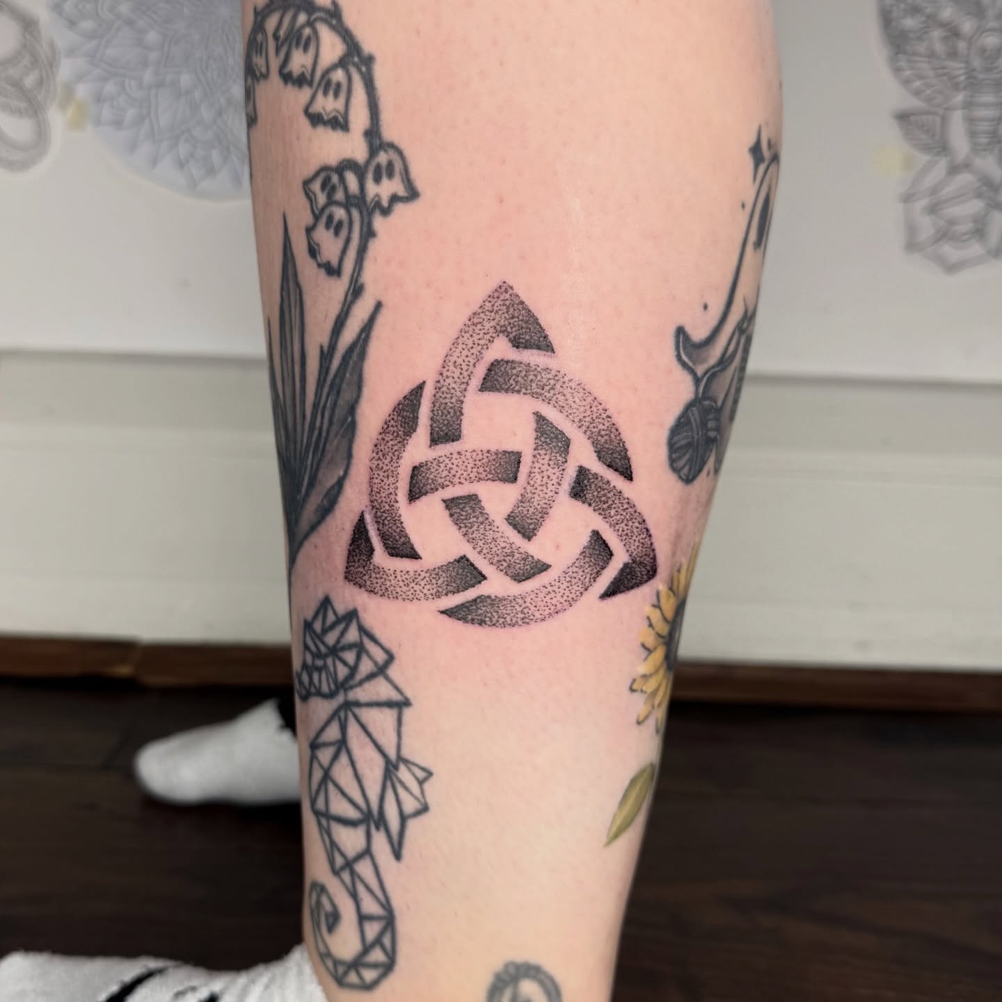
Dotwork tattooing is exactly what it sounds like: a design built entirely from individual points of ink, with no solid lines and no packed black fill doing the work.
The whole image is made of dots, and every shadow in it exists only because the dots are closer together there than somewhere else.
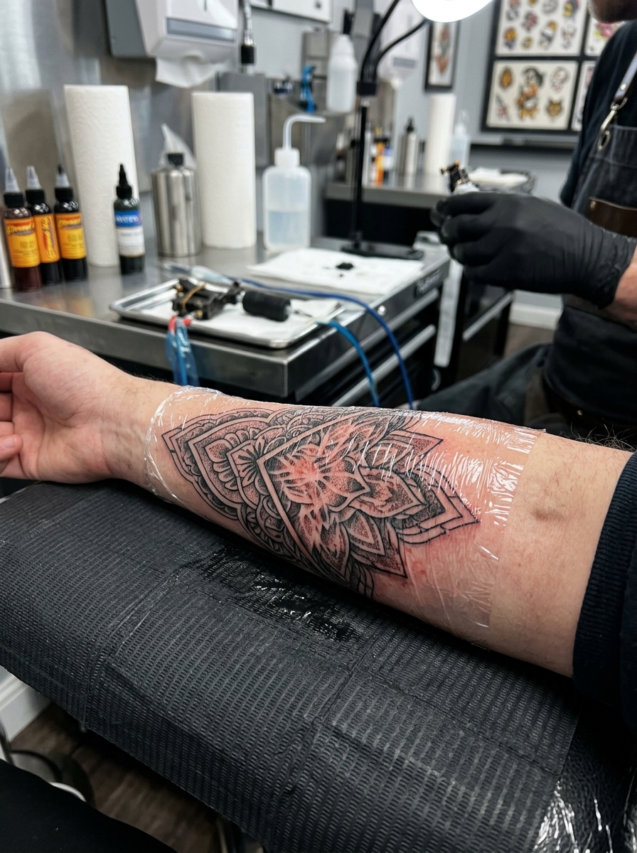
The first time I watched a stippled mandala go on, what struck me was the pace. There is no long confident line pull, just a steady tapping rhythm that goes on for hours, and the shape only resolves in the last stretch of the session.
That slowness is the point. Dotwork sits alongside blackwork in the black-ink family, but where blackwork commits to saturation, dotwork negotiates with it — building tone in increments you can still count.
Below are twenty designs that show the range of the technique, from strict geometry to full stippled landscapes.
Which Black Ink Style Is Right for You?
Dotwork is often chosen against three close neighbours. This is roughly how I would set them side by side for someone deciding at a consultation.
| Style | How tone is made | Session feel | Best for |
|---|---|---|---|
| Dotwork | Density of separate dots | Long and slow; a dull persistent buzz | Mandalas, sacred geometry, stippled texture |
| Blackwork | Solid saturated black | Faster coverage; heavier on the skin | Bold graphic shapes, high contrast, cover-ups |
| Fine line | Thin continuous lines | Quick; sharp and precise sensation | Small delicate designs, script, botanicals |
| Whip shading | Flicked tapering strokes | Moderate; rhythmic | Soft gradients inside traditional linework |
None of these is better than the others. They simply fail in different ways, and dotwork’s failure mode — dots merging into a flat grey patch — is the one you want to understand before booking.
Why Dotwork Ages the Way It Does
Every tattoo spreads a little over the years, because ink particles migrate slightly within the dermis and the skin around them changes.
In solid linework that spread shows up as a thickened, softened line. In heavy black fill it shows as a faded, patchy field. In dotwork it shows as dots quietly getting a fraction wider.
That last outcome is usually the kindest, because dotwork never depended on a crisp edge in the first place. The image is carried by relative density, and relative density survives a uniform amount of spread.
The exception is scale. If the dots were placed very close together to begin with, spread can close the gaps and turn a graduated area into flat grey. This is the single most common way dotwork disappoints people a decade in.
Which is why most experienced stipple artists will push back on tiny designs. It is not upselling; it is the only way to leave room for the technique to age gracefully.
20 Dotwork Tattoo Ideas
These are grouped loosely from the most classic dotwork subjects through to the more demanding ones. Photo credit for each design is listed beneath it.
1. Dotwork Mandala
A mandala built entirely in dotwork is the piece most artists point to when they want to show what the technique can do. The concentric rings and repeating petals are composed of thousands of separate points, and the shading inside each ring comes from how tightly those points are packed.
The difference from a linework mandala is texture. A line mandala reads as drawing; a dotwork mandala reads as something closer to engraving, with soft tonal steps between the geometric bands.
This is the design I most often recommend to someone new to dotwork, because the symmetry hides small inconsistencies better than an open field of stippling does. If you like the shape language but want it larger, our guide to mandala tattoo ideas covers scaling it across the chest and shoulder.
Photo: @laurenadriennetattoo
2. Geometric Dotwork Composition
Abstract geometry in dotwork trades outline for gradient. Triangles, arcs and angular blocks are defined by where the dots crowd together and where they thin out.
The effect I like most here is the illusion of layered planes. Dense clusters read as forward-facing surfaces and sparse fields fall back, so a flat composition gains depth without a single line of shading.
When I have watched artists work these pieces, the stencil is usually just the outer boundaries. Everything inside is judged by eye during the session, which is why portfolio consistency matters so much for this style.
Photo: @vikky_tattoo
3. Stippled Portrait
A portrait in pure stippling is one of the hardest things to pull off in tattooing. The cheekbone, the jaw, the shadow beside the nose all have to emerge from dot spacing alone.
Stippling has a long history in printmaking and engraving that predates its use in tattooing by centuries, and the best tattooed examples still look like they came off a plate rather than out of a machine.
In my experience this is the design where artist selection matters more than anywhere else on this list. A stippled portrait done by someone who mostly does bold traditional will heal into a smudge, not a face.
Photo: @kelseyraetattoo
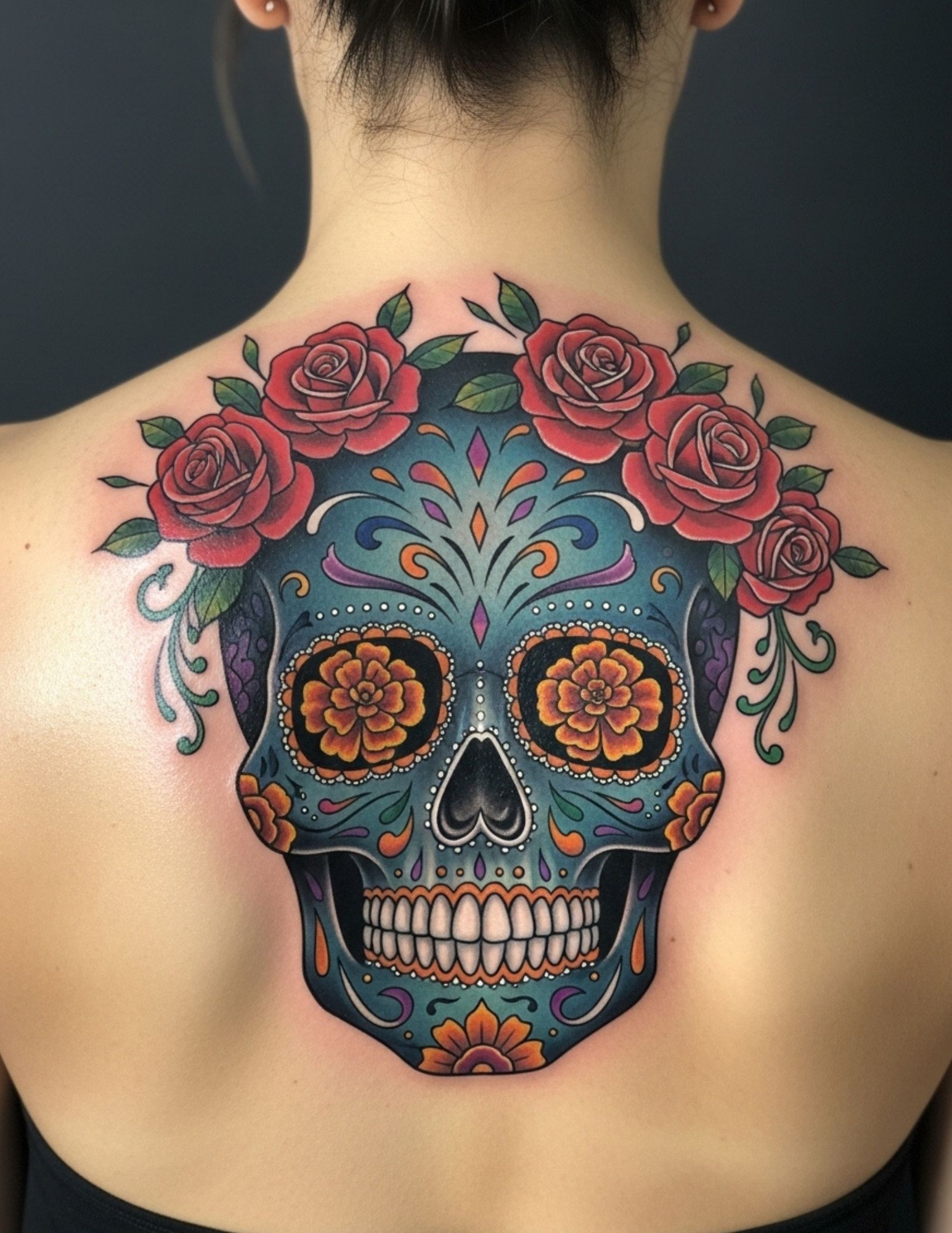
4. Dotwork Skull
A skull rendered in dotwork behaves differently from a linework skull. There is no outline holding the form together, so the eye sockets, temple hollows and cheek ridges have to be built out of gradation.
The result is usually more three-dimensional than a lined skull of the same size, and it sits more quietly on the skin. It reads as texture from across a room and as detail up close.
Bone is forgiving subject matter for stippling because real bone already has a mottled surface, so small irregularities in dot placement look intentional rather than sloppy.
Photo: @shawntriple6
5. Sacred Geometry Dotwork
The Flower of Life, the Seed of Life and Metatron’s Cube are all built on repeated circles, which makes them a natural fit for a technique that is itself built on repetition.
Rendering them in dots rather than lines changes the feeling completely. The symbol seems to surface out of the skin instead of sitting on top of it, which is the specific quality most people are after when they ask for this style.
Symmetry is unforgiving here. Any wobble in a circle is visible, so ask to see healed examples of circular work specifically. Our roundup of sacred geometry tattoo ideas has more layouts worth bringing to a consultation.
Photo: @setharcane
6. Dotwork Rose
A rose in dotwork loses the heavy black shading of a traditional rose and gains softness. Each petal curls because the dots crowd along the inside of the fold and thin out toward the edge.
It is a good example of a familiar subject transformed by technique alone. Same flower, completely different mood: quieter, more botanical, closer to an old plant illustration than a tattoo flash sheet.
Every artist I have asked about roses in this style says the same thing: keep it bigger than you think. A small stippled rose loses its tonal range as it heals.
Photo: @eatattoosph
7. Cosmic Scene in Dotwork
Space is arguably the subject dotwork was made for. A starfield is literally dots, so the technique and the subject agree with each other from the start.
Planets get their curvature from a density gradient across the sphere, nebulae from loose drifting clusters, and the void from whatever the artist leaves untouched.
The pieces I have liked most in this category are restrained. When every square inch is filled, the sense of open space disappears and the design starts to look like grey noise.
Photo: @mike_stout_tattoo
8. Dotwork Animal Portrait
Fur in stippling is a question of direction as much as density. The dots follow the lie of the coat, and that alone is enough to suggest texture without a single hair being drawn.
Eyes are usually the exception. Most artists will tighten the dots almost to solid black in the pupil to give the animal a focal point, then let everything else stay open.
Wolves, bears, stags and big cats show up most often, but I have seen the technique work beautifully on birds, where feather edges give the stippling a natural pattern to follow.
Photo: @robiscoffee
9. Botanical Dotwork
Botanical dotwork borrows directly from scientific illustration, where stippling was the standard way to shade a specimen plate long before anyone put it on skin.
Ferns, seed heads, thistles and grasses all work because their real texture is already granular. The technique is describing something that genuinely looks that way.
This is one of the few dotwork subjects that holds up at a smaller scale, since a stem or a single leaf needs only a narrow band of tone to read correctly.
Photo: @jes_pardoart
10. Dotwork Butterfly
Butterfly wings have natural pattern blocks, which gives stippling a clear map to follow. Dense patches become the dark markings and open areas stay light.
The delicacy of the insect and the delicacy of the technique reinforce each other. A bold-lined butterfly reads as graphic; a stippled one reads as observed.
Placement tends to be forearm, shoulder blade or ribs. Whatever you choose, remember that stippling needs room to breathe and shrinks badly if the design is squeezed.
Photo: @ashrosetattoos
11. Geometric Dotwork Sleeve
A full dotwork sleeve is a serious commitment of both time and sitting tolerance. Stippling is slower than almost any other fill technique because coverage happens one point at a time.
The sessions I have sat through for large stippled work ran long, and the sensation is different from lining. It is less sharp and more of a persistent, grinding vibration that gets tiring rather than acute.
Plan the whole sleeve before the first session. Dotwork does not blend easily with work added later, because matching another artist’s dot size and rhythm is close to impossible.
Photo: @tattooyourface
12. Eye of Providence in Dotwork
The all-seeing eye suits dotwork because the radiating light around it can be drawn as dots that thin out with distance, which is exactly how the symbol is meant to read.
The eye itself is usually the densest point in the composition, with the triangle and rays getting progressively sparser outward.
It carries a lot of symbolic baggage depending on who you ask, so it is worth deciding what it means to you before you sit down. Related symbolism is covered in our third eye tattoo guide.
Photo: @_donbraga
13. Dotwork Tree
A tree in dotwork solves a problem that lined trees struggle with: foliage. A canopy drawn as thousands of dots looks like leaves at a distance and like texture up close.
The trunk usually carries the heaviest stippling, with bark furrows built from tight vertical clusters and the light side left almost bare.
Root systems extending down the forearm are a common extension of this design and give the stippling somewhere natural to fade out rather than stopping at a hard edge.
Photo: @reyhanbeyenirsoy
14. Geometric Animal
Geometric animals split the difference: crisp angular lines define the creature, and dotwork fills the facets with tone.
This hybrid is often the most practical entry point into the style, because the linework carries the structure and the stippling only has to supply shading.
It also ages predictably. Even if the finest dots soften over decades, the geometric skeleton underneath keeps the design legible.
Photo: @animalisticbones
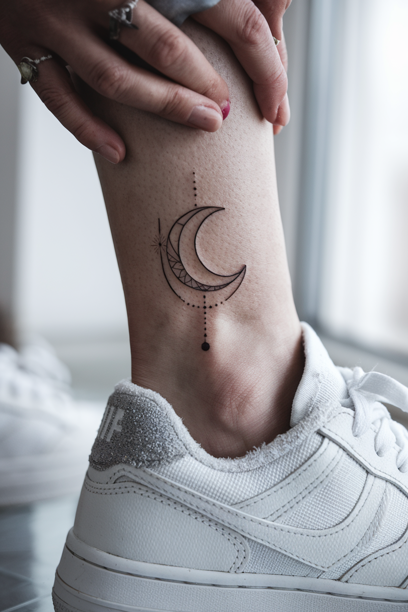
15. Dotwork Sun and Moon
Sun and moon designs depend on contrast, and dot density gives you a whole range of it without ever needing solid black.
The usual treatment leaves the sun open and sparse while the moon is packed tight, or reverses it so the crescent glows out of a dense field.
Lunar surfaces in particular suit stippling, since craters are naturally represented by irregular clusters rather than clean outlines.
Photo: @yar_ink_
16. Compass in Dotwork
A compass rose is built from repeated symmetrical points, which is the same logic as a mandala and works for the same reasons.
Each point gets darker on one face and lighter on the other, so the star reads as a raised, faceted object rather than a flat diagram.
Many people pair it with coordinates or a map fragment. If you are weighing the symbolism, our piece on compass tattoo meaning goes through the common readings.
Photo: @soul_imagez_tattoo
17. Blackout with Dotwork Detail
Blackout work with dotwork detail is the most dramatic combination on this list. Large areas are saturated solid, and the pattern survives as untouched skin inside them.
Because the contrast is absolute, the stippled detail has to be planned before the black goes down. There is no adding it afterwards.
This is not a starting point. Blackout is extremely difficult to cover or remove later, so treat it as a decision you make after you already know how your skin takes and holds ink.
Photo: @adamwilliamstattoos
18. Dotwork Geometric Face
A human face fragmented into geometric planes and shaded with stippling sits somewhere between portraiture and abstraction.
The features stay recognisable while the surface breaks into facets, each one carrying its own dot density. It is a look that photographs far better than most tattoo styles.
Because it is so dependent on planning, ask for a full drawn design rather than a rough stencil. Improvising a faceted face on the skin rarely ends well.
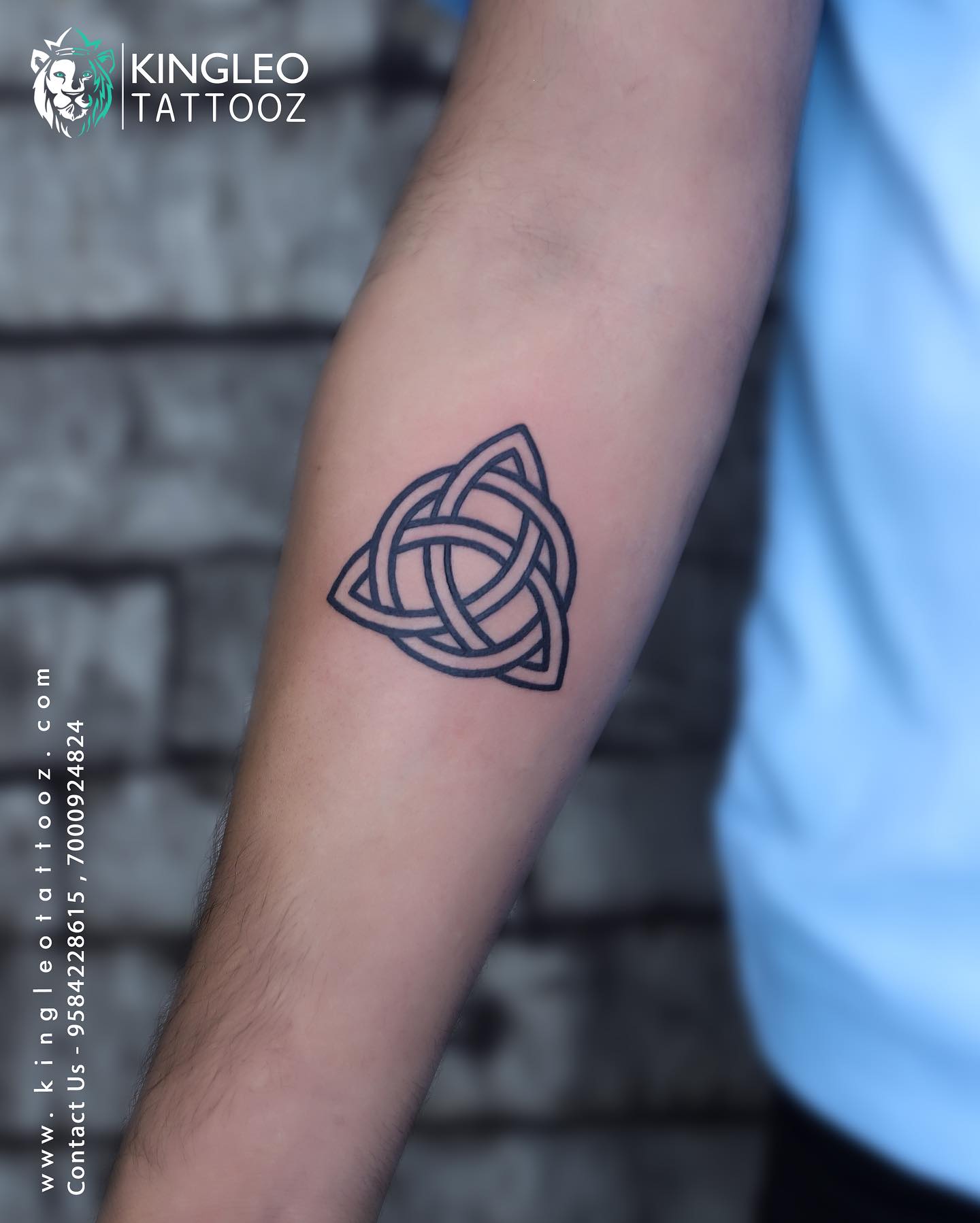
19. Celtic Knotwork in Dotwork
Celtic interlace in dotwork loses the heavy black outline of the traditional treatment and gains something older-looking, closer to worn carved stone than to inked line.
The over-and-under weave still has to be perfectly tracked, so the artist needs to plan the whole knot before starting. A dropped crossing is obvious and permanent.
If the traditional bold-line version appeals more, compare it against the examples in our Celtic knot tattoo collection before committing.
Photo: @mick_cage_tattoos
20. Realistic Dotwork Landscape
A landscape in pure stippling is the closest tattooing gets to a nineteenth-century engraving. Sky stays sparse, the treeline packs tight, and the ridgeline is defined by nothing but a change in density.
The absence of a horizon line is what sells it. Nothing is outlined, so the scene has the soft, printed quality of an old woodblock.
These pieces need physical space. On a forearm panel a stippled landscape can hold its detail; shrunk to a two-inch circle, the tonal separation collapses within a few years.
Photo: @viktornagy
Dotwork Variations Worth Knowing
Not all stippling is the same, and the vocabulary is worth having before a consultation so you can describe what you actually want.
Pure Stippling
No lines anywhere. Every edge, shadow and shape emerges from dots alone, which is the purest and most demanding version of the technique.
It is slow and it depends entirely on the artist’s eye, but it is also the version that produces those engraving-like results people come to dotwork for in the first place.
Dotwork Shading Inside Linework
Far more common in practice. Clean lines carry the structure and stippling fills the interior with tone.
For most people this is the more sensible first dotwork piece, because the linework guarantees the design stays legible no matter how the shading ages. It pairs naturally with the approaches in our linework tattoo collection.
Ornamental and Pattern Dotwork
Bands, lace, chandelier drops and border patterns built from repeating stippled motifs, usually wrapping a limb rather than sitting as a single panel.
This is where dotwork overlaps heavily with ornamental tattooing, and the two are often done by the same specialists.
Negative Space Dotwork
The design is defined by what is left blank. Dense stippling surrounds untouched skin, and the shape you read is the gap.
It is striking, and it demands accurate planning, because negative space cannot be recovered once the surrounding area is filled.
Aftercare and Healing for Dotwork
Dotwork heals like any other black ink tattoo, but the fine detail means small losses are more visible, so the basics matter more than usual.
Follow whatever aftercare instructions your artist gives you, since they know their own inks and technique. In general that means keeping the area clean, applying a thin layer of the product they recommend, and leaving scabs and flakes completely alone. The American Academy of Dermatology publishes general guidance on caring for tattooed skin that is worth reading alongside it.
Picking at a healing dotwork piece can pull out individual dots, and a missing dot in a graduated field is genuinely noticeable. That is the main practical difference from healing a bold traditional tattoo.
Sun exposure is the long game. Consistent sunscreen once the tattoo is fully healed does more to preserve tonal separation over decades than anything else you can do. Our walkthrough of the tattoo healing stages covers what is normal week by week.
If you see spreading redness, swelling that worsens after the first few days, heat, pus, or a fever, contact a doctor rather than waiting it out. Allergic reactions to tattoo pigment are uncommon but real, and the US Food and Drug Administration maintains consumer information on tattoo ink risks. Nothing in this article is medical advice.
Still Not Sure? Common Dotwork Mistakes
Going too small is the mistake I see most often. A design that needs tonal range needs surface area, and shrinking it removes the very thing that makes dotwork worth doing.
Choosing an artist on price rather than portfolio is the second. Stippling is a specialism, and a generalist who rarely does it will usually produce dots of inconsistent size that heal unevenly.
Adding to a dotwork piece later, with a different artist, is the third. Dot size and rhythm are close to a signature, and mismatched stippling beside existing work is obvious.
Look for consistent dot size, clean placement without trails or blurring, and smooth density transitions rather than abrupt steps. Ask specifically for healed photographs, not fresh ones — fresh dotwork almost always looks good.
If after all that dotwork still does not feel right, the softer end of fine line tattooing may get you closer to what you had in mind.
Frequently Asked Questions
Does a dotwork tattoo hurt more than other styles?
It is usually described as different rather than worse. Lining feels sharp and brief, while stippling is a repetitive tapping that is less intense moment to moment but goes on much longer. Because dotwork covers ground slowly, total session time is often the real difficulty rather than peak pain. Most people I have spoken to found the fatigue harder than the sensation itself.
How long does a dotwork tattoo take?
Longer than the equivalent design in almost any other style, because coverage happens one point at a time. A small stippled piece can still be a single sitting, but a detailed mandala or a full sleeve is normally spread across multiple sessions. Your artist should be able to give a realistic estimate once they have drawn the design. Treat any quote that sounds unusually fast with some caution.
Will a dotwork tattoo fade into a grey blur?
It can, if the dots were placed too tightly or the design was made too small. Ink spreads slightly over the years, and closely packed dots can merge as that happens. Well-spaced dotwork at a sensible scale tends to hold its tonal separation very well, because the image never relied on crisp edges. Scale and dot spacing are the two variables that decide this.
Can dotwork be done in colour?
Yes, though the overwhelming majority is black or black and grey. Coloured stippling exists and can look striking, but colour tends to fade faster than black, which is a bigger problem in a style that depends on subtle density differences. Most specialists will steer you toward black for a piece meant to last. Ask to see healed colour examples before deciding.
Is dotwork a good choice for a first tattoo?
It can be, provided you pick a design at a reasonable size and an artist who does this style regularly. Dotwork shading inside clean linework is a particularly forgiving entry point, since the lines keep the design readable regardless of how the shading settles. Where it becomes a poor first choice is at very small sizes or in pure stippled portraiture. Both of those are better attempted once you know how your own skin holds ink.
Quick Summary
- Dotwork builds an entire image from individual points; tone comes from how densely those points are packed.
- It ages well because the design never depended on crisp edges, only on relative density.
- Scale is the deciding factor. Too small, and spreading dots merge into flat grey within years.
- Mandalas, sacred geometry, skulls, botanicals and landscapes are the subjects that suit it best.
- Dotwork shading inside clean linework is the most forgiving version and a sensible first piece.
- Sessions run long. The sensation is a dull persistent tapping rather than a sharp line pull.
- Choose the artist on healed portfolio work, checking dot size consistency and smooth density transitions.
- Plan large pieces fully up front, because matching another artist’s stippling later is close to impossible.