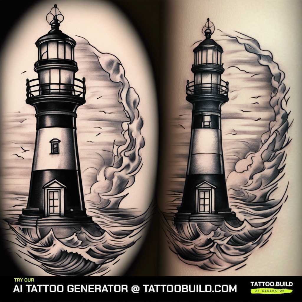
A black and gray lighthouse tattoo is one of the quietest, most durable pieces of ink you can commit to. It trades bright color for contrast and mood, and that choice is exactly why it still looks good a decade in.
I have been drawn to nautical imagery for years, and the lighthouse keeps pulling me back for one reason. It stands for guidance and for holding steady when everything around it is rough water.
In my experience grayscale suits this subject better than color ever does. Gray wash reads as weather, wet stone and sea spray, and it lets a single bright beam of untouched skin do all the dramatic work.
This guide walks through the designs I keep coming back to, how placement changes the entire feel, and the practical things I wish someone had told me before my first large piece. If you want the wider category first, browse these lighthouse tattoos for context.
Which Placement Is Right for You?
Placement is the first decision I push people toward, because it decides how much detail an artist can realistically fit.
Here is how the most common spots compare for a grayscale lighthouse, based on the pieces I have seen in person and the questions I have put to artists.
| Placement | Detail It Holds | Typical Pain | Best For |
|---|---|---|---|
| Outer forearm | Moderate — one tower, simple sky | Low to moderate | A first piece you want to see every day |
| Upper arm / shoulder | Good — tower, clouds, small boat | Low to moderate | Grayscale skies and soft gradients |
| Full sleeve | Very high — full coastline | Varies wildly by panel | A long-term project across several sessions |
| Thigh | Very high — flat, wide canvas | Moderate on the outer thigh, sharp inside | Large detailed scenes you can cover easily |
| Back | Highest — full seascape | Moderate, sharp over the spine and shoulder blades | The deepest blacks and widest tonal range |
| Calf | Good — tall vertical tower | Moderate | A narrow upright design that suits the shape |
| Ribs | Moderate — distorts when you move | High | Private placement, simpler linework |
Pain columns are a rough guide only. Two people sitting for the same thigh piece can describe it completely differently.
Why Black and Gray Works So Well for Lighthouses
A lighthouse is architecture sitting in weather. That is a subject built out of value shifts rather than hue, which is precisely what grayscale does best.
Black and gray gives you a tonal ladder instead of a palette. The artist controls how far the sky recedes and how much the tower steps forward purely by how dark each area sits.
The beam is the clearest example. In almost every strong design I have seen, the light is not tattooed at all — it is bare skin left deliberately open, framed by dark clouds on either side.
There is a practical argument too. Solid black and well-built gray hold their edges over time better than most bright pigments, which is part of why traditional maritime tattooing leaned on black so heavily. The National Park Service maritime heritage program is a genuinely good source of reference photos if you want a real tower rather than a generic one.
Finally, grayscale plays well with other work. If you already wear black ink, a gray lighthouse will sit beside it naturally instead of fighting it, which matters a lot if you are slowly building toward a full sleeve.
Black and Gray Lighthouse Tattoo Ideas by Placement and Style
These are the directions I would actually suggest to a friend, grouped by where the piece lands and how detailed it wants to be.
Full-Sleeve and Wrapping Arm Designs
A sleeve is where a lighthouse can finally be a place rather than an object. The tower sits on the outer arm, the water wraps the forearm, and the sky closes over the bicep.
The thing to get right is flow. The design has to read from any angle, which usually means the coastline spirals rather than stopping at a hard border.
Expect several sessions. Every artist I have asked plans a grayscale sleeve in stages — linework and blacks first, then shading passes once the earlier panels have healed.
Wrapping designs also let you add companions without crowding: gulls, a small boat on the horizon, a band of rope. If a full sleeve is more than you want right now, a lighthouse shoulder tattoo gives you the same scale on a single panel.
Simple and Small Arm Pieces
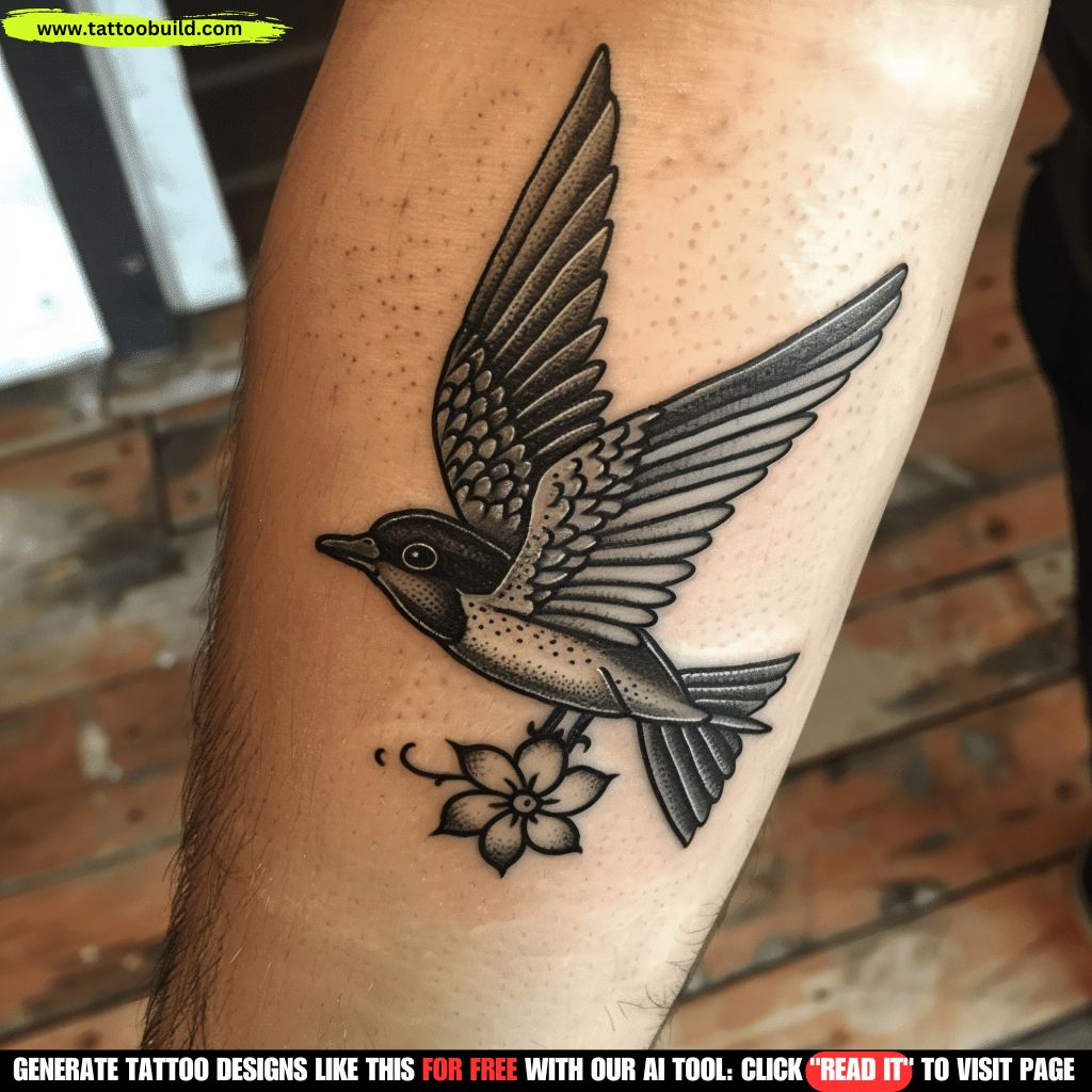
Not every lighthouse needs a storm behind it. Some of the best small pieces are a tower, a horizon line and a few clouds.
When I tested ideas at this size, the pieces that survived were the ones that cut elements instead of shrinking them. A four-inch tattoo can carry a tower and sky, or a tower and water, but rarely both plus a boat.
Keep the line weight honest. Very fine lines at small scale can blur as they settle, so a slightly heavier outline usually ages better on a compact arm piece.
This is also the friendliest option for a first tattoo. A simple outer-arm design is a short sit, it heals easily, and it tells you a lot about how your skin takes gray wash.
Lighthouse Tattoos on the Thigh
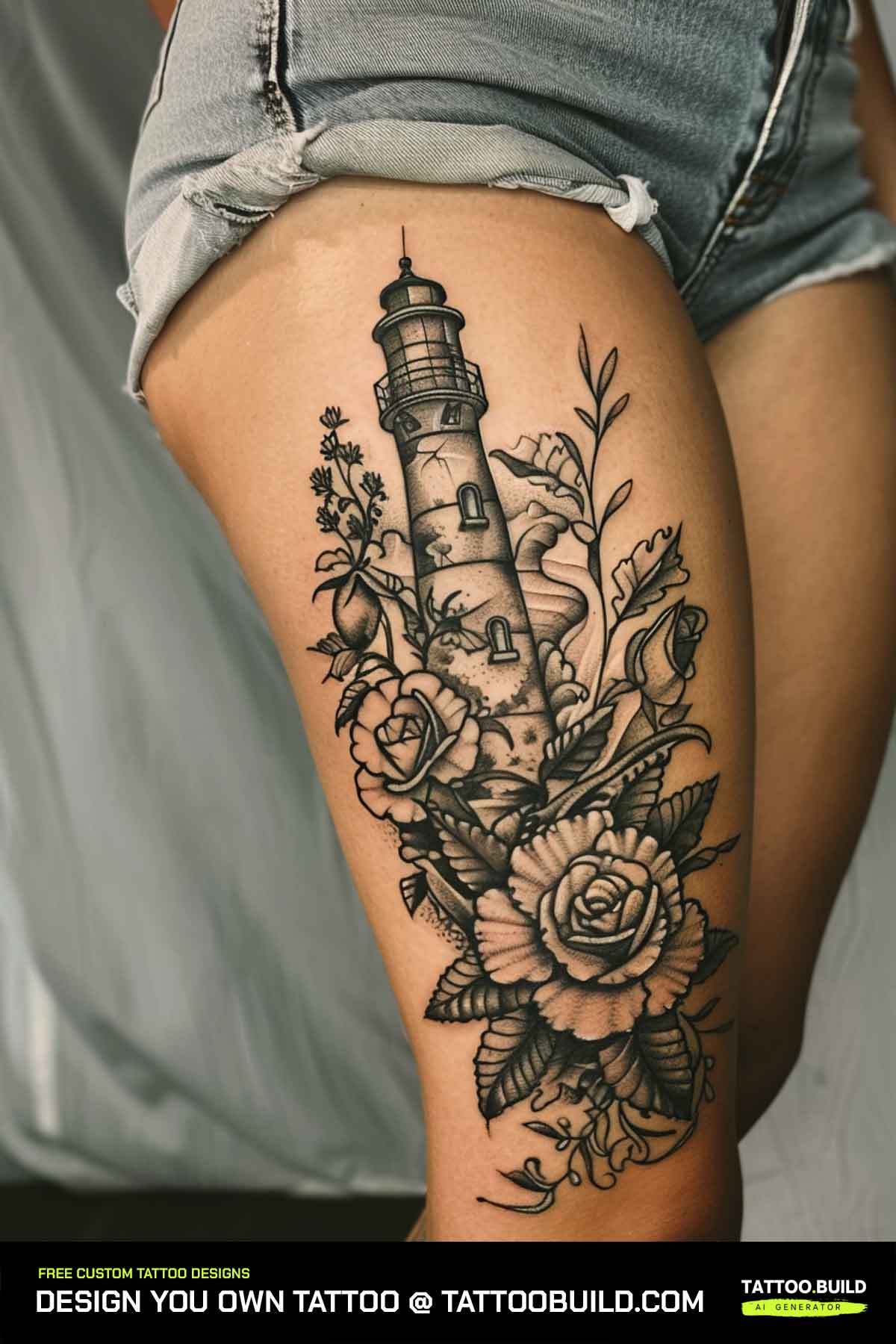
The thigh is quietly the best canvas for this subject. It is flat, wide and vertical, which is exactly the shape a lighthouse wants.
Detail that would be impossible on a forearm becomes straightforward here — individual stones in the tower, foam on the rocks, a full moody sky above the lantern room.
The outer thigh is far more comfortable than the inner. If you are planning a long shading session, ask your artist to keep the composition on the outside where possible.
It is also easy to cover, which matters to a lot of people. A large thigh scene can be completely private on a work day and fully visible in summer, and it sits naturally alongside other thigh tattoo ideas.
Floral Lighthouse Designs
Pairing a beacon with flowers sounds like a mismatch until you see it done well. The soft organic shapes offset all that hard geometry.
Roses and peonies are the usual choices because their petals give an artist somewhere to put deep blacks, which stops the whole piece from drifting pale.
The trap is competition. If the flowers carry as much contrast as the tower, your eye has nowhere to land, so ask for the blooms to be shaded a step lighter than the lighthouse itself.
If that combination is what drew you here, it is worth looking through dedicated black and gray flower tattoo designs before your consultation.
Stormy and Cloudy Seascapes
Storm scenes are the most dramatic version of this tattoo and the most demanding to execute. Everything depends on how the artist handles clouds.
Smooth gray wash gives you soft weather. Stippling and whip shading give you grit and texture. Both work, and they age slightly differently, so ask to see healed photos of each from your artist’s portfolio.
Leave more open skin than feels comfortable. In my experience the single most common regret with storm pieces is a sky so uniformly dark that the beam stops reading as light.
Adding a keeper’s house, rocks or a small vessel in trouble turns the design into a narrative. For more of that maritime vocabulary, these ocean tattoo ideas are a useful reference.
Back Pieces and Larger Scenes
The back is the only placement where a lighthouse scene can be truly large without distorting as you move.
It allows the deepest blacks, because there is room to balance them. A tower on a shoulder blade with a whole sky behind it can be almost black at the edges and still feel bright at the centre.
Circular and framed compositions work particularly well on the upper back. A border keeps a big idea contained instead of sprawling toward the ribs.
Plan for real commitment here. A back piece means multiple long sessions and a healing routine you cannot manage entirely on your own — worth reading alongside other symbolic back tattoo approaches.
Lower-Arm and Forearm Beacons
The forearm is the placement people actually live with. You see it constantly, which is either the point or the problem depending on your job.
A tall narrow tower fits the limb shape almost perfectly. Run it lengthwise and the design needs very little adjustment to look right.
Stippled and dotwork shading holds up notably well down here, partly because it does not rely on very pale wash surviving years of sun and sleeve-rolling.
If you want the tattoo to be legible from a conversational distance, keep the horizon high and the detail sparse. Crowded forearm pieces turn into a gray smudge from six feet away.
Variations and Elements to Add
Once the tower and placement are settled, these are the decisions that give the piece its character.
Nautical Companions
A compass, an anchor, rope framing or a distant ship all extend the story without touching the tower itself.
Keep companions smaller and lighter than the lighthouse so the hierarchy stays obvious. If a ship appeals, these ship tattoo ideas show how much weight one adds to a composition.
Line Weight and Style
Fine-line grayscale looks delicate and modern but asks more of your aftercare. Bolder neo-traditional outlines are far more forgiving over time.
Realism sits in the middle: no heavy outline at all, just value. Beautiful when healed well, and the least tolerant of a rushed artist.
Adding a Beam of Light
The beam is usually negative space, sometimes with faint radiating lines. It is the element most worth discussing in detail at the stencil stage.
Decide early whether the light points toward the viewer or across the scene. That single choice changes the whole mood from welcoming to lonely.
Dates, Names and Coordinates
Small text beneath a tower is common — a set of coordinates, a year, a name. Keep it short and set it in a simple typeface.
Long passages of small script tend to thicken as they settle, so anything you want readable in ten years needs more space than it looks like it needs.
Tips Before You Book Your Lighthouse Tattoo
Pick the artist for their healed grayscale work, not their fresh photos. Fresh gray always looks crisp; healed gray is the real test.
Bring reference for the tower and separate reference for the mood. Artists find it much easier when those two things arrive as two different images.
Ask for the stencil at two sizes. Holding both against your skin settles the scale argument in about thirty seconds and prevents the most common regret with this subject.
Talk about your sun exposure honestly. If you spend summers outdoors without a shirt on, say so, and let the artist build in slightly more contrast than they otherwise would.
Aftercare and Keeping the Grayscale Sharp
Follow your artist’s instructions first — they know their inks and your skin. What follows is general guidance, not medical advice.
Surface healing usually takes around two to three weeks, and the deeper layers settle over a couple of months. Gray wash often looks patchy in week two and evens out afterwards, so resist judging it early.
Keep it clean, keep it lightly moisturised, and do not pick. Sunscreen once healed is the single most effective thing you can do for a grayscale piece, a point the American Academy of Dermatology makes repeatedly in its tattoo care guidance.
Watch for genuine warning signs rather than normal healing. Spreading redness, increasing pain after the first few days, heat, pus or a fever are reasons to contact a doctor promptly, not something to manage at home — the FDA’s tattoo safety page covers reactions worth knowing about. For the routine version of all this, see our full tattoo aftercare guide.
Common Mistakes and Still Not Sure?
The mistake I see most often is going too small. A lighthouse needs vertical room, and shrinking a detailed scene produces mud rather than a miniature.
The second is a sky with no light left in it. Without open skin the beam disappears and the tattoo loses its whole point.
The third is choosing an artist for their color realism and assuming grayscale transfers. It is a different skill set, and portfolios usually show which one an artist actually lives in.
If you are still weighing designs, it helps to look wider before narrowing: browse general lighthouse tattoo ideas, then the more delicate women’s lighthouse tattoo ideas to see how far the same subject can stretch.
Frequently Asked Questions
What does a black and gray lighthouse tattoo mean?
For most people it stands for guidance, steadiness and finding the way home after a rough stretch. A lighthouse does not move, and that permanence is the whole appeal. Stripping the color out pushes the meaning further toward memory and endurance rather than seaside charm. Plenty of wearers also tie it to a specific person, a place on a coast they grew up near, or a period they came through, and that private layer matters more than any general symbolism.
Does black and gray fade faster than color?
Solid black is the most stable pigment in tattooing and generally outlasts bright color, but the light gray washes in a piece like this are the vulnerable part. Very diluted grays sit sparsely in the skin and can soften noticeably over years, especially on sun-exposed placements. Every artist I have asked said the same thing twice: sunscreen is the single biggest factor. A grayscale lighthouse built with a real range of tones, rather than all pale wash, ages far better.
Where does a lighthouse tattoo hurt the least?
The outer forearm, outer upper arm and outer thigh are usually the most tolerable spots because there is muscle and fat between the needle and bone. Ribs, sternum, inner arm, knee and ankle are generally the sharpest. Pain is individual, though, and a long shading session anywhere gets uncomfortable toward the end. If you are nervous, start with a forearm piece and see how your body handles it before booking a back or rib session.
How big should a lighthouse tattoo be?
A lighthouse needs vertical room, so the honest answer is bigger than most people first ask for. In my experience a tower with a beam, some sky and a hint of water rarely works well under about four inches tall, and a full scene with a keeper’s house and rough sea wants eight inches or more. If you want something small, cut elements instead of shrinking everything — a bare silhouette at three inches reads better than a crowded scene at the same size. Ask your artist to print the stencil at two sizes so you can hold both against your skin.
Can I add color to a black and gray lighthouse later?
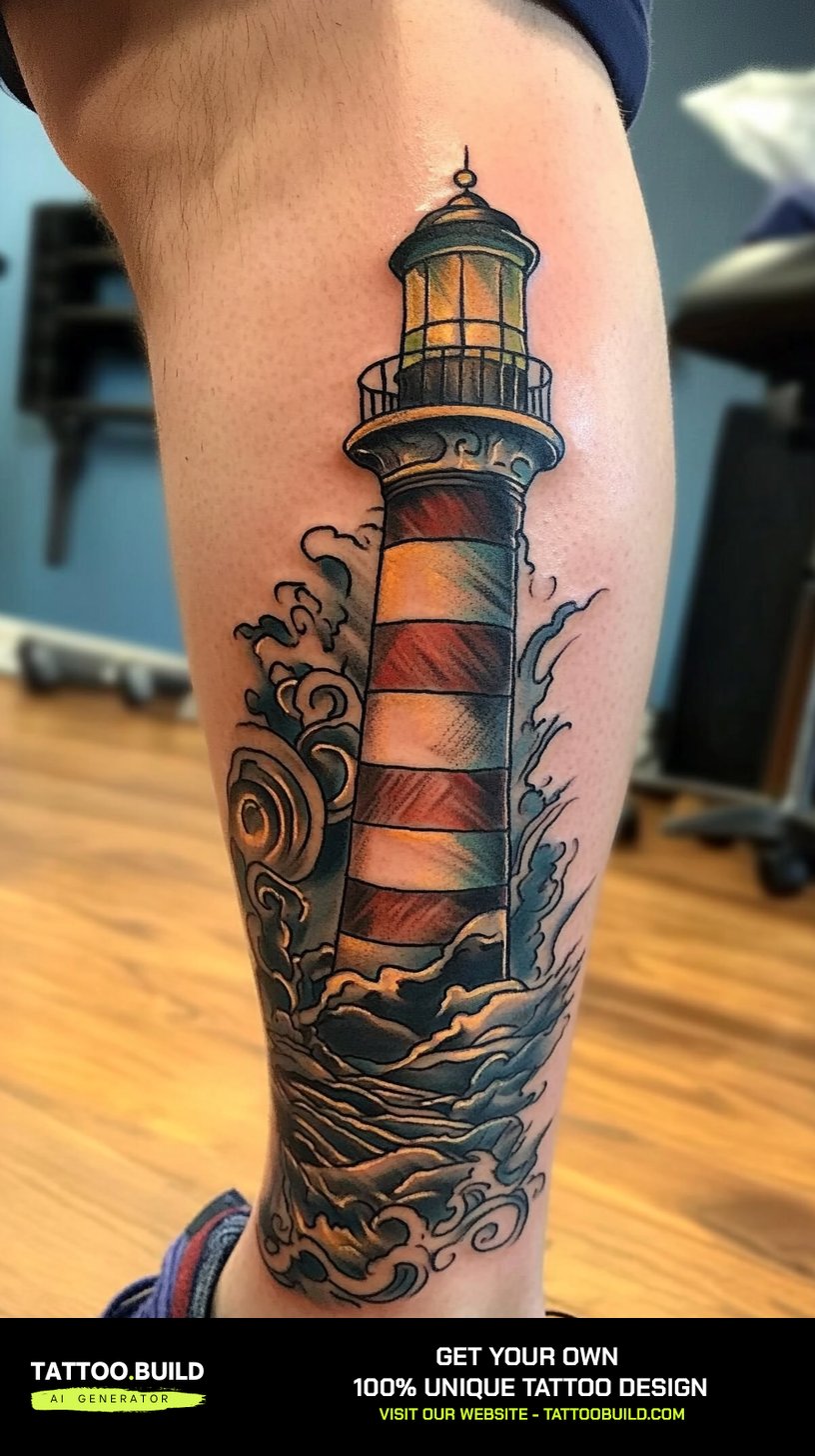
Yes, and artists do it fairly often, usually as a single accent such as a warm beam or a touch of sky. It is easier when the original piece left some lighter areas open, because color laid over dense black shading will barely read. Tell your artist at the design stage if colour is even a maybe, so they can plan the values around it. Adding it later is a second healed session, not a quick touch-up, so budget time and money for it.
Quick Summary
- Grayscale suits a lighthouse because the subject is built from weather and value, not color.
- The beam almost always works best as untouched skin framed by dark sky.
- Thigh, upper arm and back hold the most detail; forearm is the most livable day to day.
- Size up rather than shrink — cut elements instead of reducing the whole scene.
- Leave more open space in the sky than feels comfortable, or the light stops reading.
- Choose your artist on healed grayscale work, not fresh photographs.
- Sunscreen after healing is the biggest single factor in how well gray wash lasts.
- Treat spreading redness, heat, pus or fever as a reason to see a doctor, not to wait it out.