I have been collecting lighthouse flash for years, and the same thing happens every time I bring a reference sheet to an artist. They flip past the photorealistic towers without comment, then stop dead on the crude, bold, hundred-year-old drawing. A traditional lighthouse tattoo drawing works because it was designed to be a tattoo first and a picture second.
That distinction matters more than most people realise. A photograph of a lighthouse has soft gradients, atmospheric haze and a hundred shades of grey. Skin has none of that patience.
The old-school drawing throws all of it away. Heavy black outline, a small number of flat colours, shapes simple enough to read from across a room — and, crucially, simple enough to still read in fifteen years.
Below are the drawings I keep coming back to, what makes each one structurally sound, and the questions I would ask before handing any of them to an artist. If you want a broader sweep of the subject first, the wider collection of lighthouse tattoos covers styles beyond traditional.
Which Lighthouse Tattoo Style Is Right for You?
I put this together after watching too many people book a style that did not match the placement they had in mind. Read across the row, not down the column.
| Style | Line Weight | Colour Approach | Smallest Size I Would Attempt | Best For |
|---|---|---|---|---|
| American traditional | Heavy, uniform | Flat red, yellow, green, black | Around 4 inches tall | Forearm, calf, outer thigh |
| Traditional black and grey | Heavy outline, soft fill | Black wash only | Around 4 inches tall | Inner arm, ribs, shoulder |
| Neo-traditional | Varied weight | Wider palette, some blending | Around 6 inches tall | Thigh, back, half sleeve |
| Blackwork / bold graphic | Very heavy, solid fills | Black only | Around 3 inches tall | Forearm, calf, upper arm |
| Fine line | Light, single weight | Usually black only | Around 2 inches tall | Ankle, wrist, behind the ear |
The size column is the one people argue with me about, and it is the one I am most stubborn on. A traditional drawing has a minimum size below which the outlines start to merge as the tattoo ages.
What Makes a Lighthouse Drawing Work as a Tattoo
A lighthouse is an unusually good tattoo subject, and the reason is geometric rather than sentimental.
It is a tall vertical cylinder with a wider base and a distinct cap. That silhouette fits the natural shape of a forearm, a calf and an outer thigh almost perfectly, which is why the subject has survived in flash books since the early twentieth century.
The second reason is that a lighthouse gives the artist somewhere to put the black. The beam, the cloud bank, the waves at the base — each is an excuse for a large area of solid ink that anchors the design and keeps it readable.
Traditional drawing conventions grew out of practical necessity. The pigments available to sailors and early shop artists were limited, healing was unpredictable, and touch-ups were not guaranteed, so designs were built to survive the worst case. You can read more about how those conventions formed in the history of the old-school tattoo style.
The compromise is that traditional drawings are not subtle. If you want haze, distance and delicate tonal shifts, you want a different style — and that is a legitimate choice, not a lesser one.
Traditional Lighthouse Tattoo Drawings Worth Studying
These are drawings I would happily hand to an artist tomorrow. I have noted what each one does structurally, because that is the part you can borrow even if you want a completely different composition.
1. The Flash Sheet Approach
A flash sheet puts several lighthouse drawings on one page, usually alongside compasses, clocks and banners. It is the cheapest way to see how a motif behaves at different scales.
What I look for on a sheet is the repetition of the same shape solved three different ways. One tower will be stripy, one plain, one wrapped in rope, and comparing them teaches you more than any single drawing does.
Flash also tells you what the artist is comfortable tattooing. If a lighthouse appears on a shop’s wall, someone there has drawn that shape enough times to do it from memory.
The compass motif that often sits beside it is worth understanding in its own right — the meaning behind a compass tattoo overlaps heavily with the lighthouse as a guidance symbol.
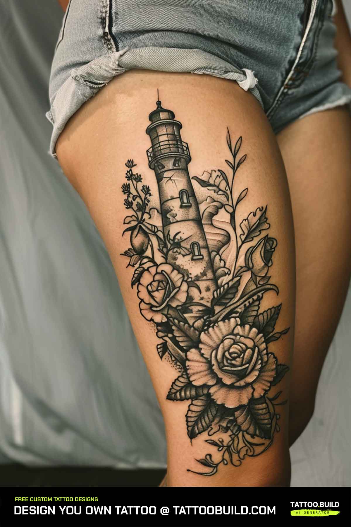
2. The Thigh Sentinel
The thigh is the most forgiving canvas on the body for this subject. It is flat, it is broad, and it ages slowly compared with hands or feet.
This drawing uses the extra width for a full wave base and a pair of seabirds, which is the sort of detail that gets cut when the same design is squeezed onto a wrist.
In my experience the thigh also lets you go larger than you planned without the price climbing as sharply as it does on ribs or the back of the knee, because the artist is not fighting the anatomy.
The one thing I would check is how the design sits when you are seated. A tall vertical tower on the front thigh compresses when you sit down, so most artists will angle it slightly outward.
3. Rope and Leaf Framing
Framing devices are the most underrated tool in traditional tattooing. A rope border or a run of leaves gives the composition an outer edge, which stops it drifting into the surrounding skin.
A frame also solves the awkward gap problem. Without one, a narrow tower on a broad arm leaves dead space either side that looks unfinished.
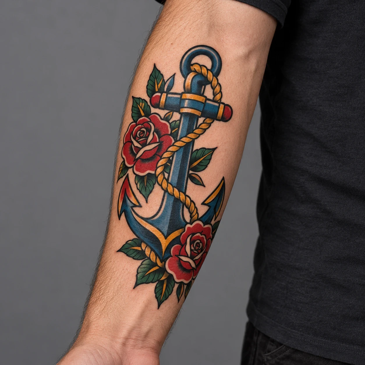
Nautical rope is the obvious choice, and it carries the same maritime language as what an anchor tattoo symbolises, so the two sit together naturally if you plan to build outward later.
Leaves are the softer option and read as less strictly nautical, which some people prefer if they want the lighthouse to mean guidance rather than the sea specifically.
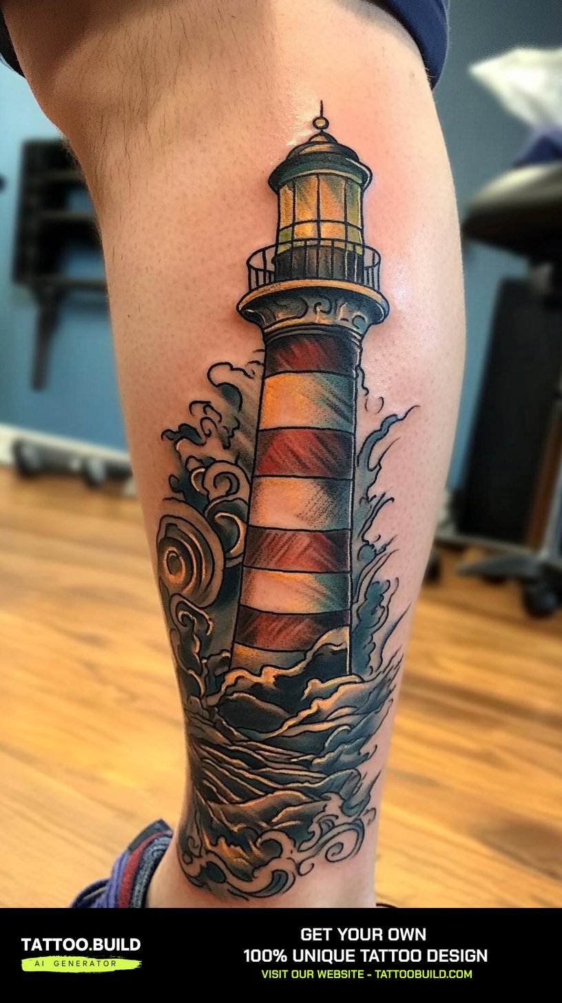
4. Red and Black on the Calf
Restricting the palette to red and black is the single easiest way to make a modern drawing look genuinely traditional.
Red holds its saturation reasonably well in most skin over time, and the contrast against solid black is strong enough that the design still reads from a distance after years of wear.
The calf suits this treatment because it is a muscle that changes shape as you move, and a high-contrast, simple design tolerates that movement better than a finely detailed one.
I have seen this combination go wrong exactly once, and it was a case of the red being laid over a heavily shaded black area rather than beside it. Ask to see healed photographs, not fresh ones.
5. Floral Sentinel
Surrounding the tower with bold flowers softens the subject without diluting the style, because traditional roses and peonies use exactly the same line weight as the lighthouse itself.
This is the version I most often recommend to people who like the symbolism but not the nautical framing. Flowers move the design from maritime to something closer to a personal emblem.
Birds fill the upper corners, which is a purely compositional trick. Traditional artists have used small flying birds as filler for a century because they occupy space without demanding detail.
If the floral direction appeals, it also gives you a clean path to expand into a larger piece later, since flowers tile outward far more easily than waves do.
6. The Striped Beacon
The diagonal or horizontal stripe is the most recognisable lighthouse marking, and in a drawing it does structural work as well as decorative work.
Alternating bands of solid black and bare skin give the tower a sense of volume without any shading at all. That is a genuinely old trick and it is why striped towers appear so often in early flash.
The risk is spacing. Stripes placed too close together will visually merge as the lines spread over the years, so most artists I have watched deliberately widen the bands beyond what the reference photo shows.
A burning beacon at the top gives you a natural place for yellow or a solid black burst, depending on whether you are working in colour.
7. Lighthouse on a Heart
Setting the tower on a heart is a sentimental move, and traditional tattooing has never been shy about sentiment.
Structurally the heart does something useful: it gives the design a wide, solid base, which balances a tall narrow tower and stops the whole thing looking top-heavy.
Cloud banks behind the tower serve the same purpose horizontally. Between the two, you end up with a composition that fills a rectangle rather than a thin strip.
This is also the version that most often carries a banner with a name or a date, which is worth deciding on before the drawing is finalised rather than after.
8. The Arched Window Frame
An arched frame around the scene is borrowed from stained glass and religious iconography, and it has become common in modern traditional work.
The arch turns a picture of a lighthouse into a portal, which changes how the design reads. The viewer is looking through something rather than at something.
It is also an efficient way to include rough seas without the waves sprawling. The frame contains them, so you get drama in a contained shape.
I would only choose this on a placement with enough flat area to hold the frame square, which in practice means the outer thigh, the back or the upper arm rather than the forearm.
Variations Worth Considering
Two placements change the drawing enough that they are worth treating separately rather than as size adjustments.
The Solitary Tower on the Shoulder
The shoulder rewards a stripped-back composition. A single tower, a few clouds, nothing else.
The curve of the deltoid means any wide horizontal element — a long wave line, a banner — will distort when the arm moves, so removing them is not a compromise but the correct answer.
If that placement is where you are heading, the dedicated guide to the lighthouse shoulder tattoo goes further into how the curve affects the drawing.
The Full Seascape on the Back
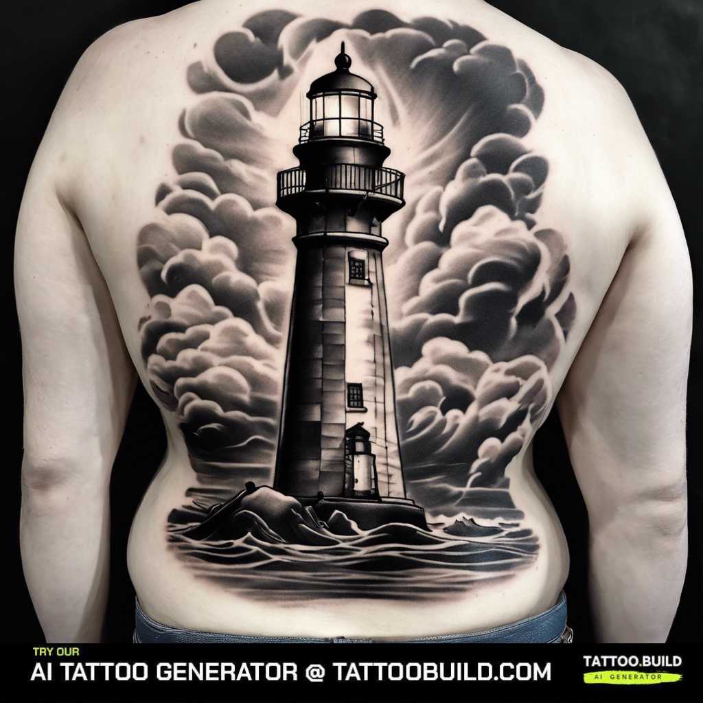
The back is the only placement where a lighthouse can genuinely become a scene rather than an emblem.
You get room for a headland, a boat, a horizon and a sky, and the flat expanse means none of it distorts. The trade is time and cost — a back piece at this scale is a multi-session commitment in almost every shop.
If a vessel is going into the composition, it is worth looking at how ships are drawn in the tradition first, because the rigging is unforgiving. The collection of ship tattoo ideas is a reasonable starting point.
A wide seascape also pairs naturally with the broader ocean tattoo ideas if you are still deciding how much water you want in the final piece.
Getting the Drawing Right Before You Book
Bring three to five reference images rather than one. A single image tends to be read as an instruction to copy, while a small set communicates what you actually like across the examples.
Ask for the stencil to be placed and then walk to a mirror before any needle touches skin. Every artist I have asked considers this normal, and the ones who resist it are telling you something useful.
Discuss the line weight explicitly. A traditional drawing done with a light outline is not a traditional tattoo, and this is the single most common way the style gets diluted.
On healing, follow the aftercare your artist gives you rather than anything you read online, including this page. Healing typically takes two to four weeks for the surface and longer underneath, but that varies by person and placement — and any sign of spreading redness, heat, swelling or discharge is a reason to contact a doctor rather than wait it out. The FDA fact sheet on tattoos and permanent makeup covers the general risks worth knowing before you book.
Common Mistakes and How to Avoid Them
The mistake I see most often is choosing a photorealistic reference and asking for it in a traditional style. Those are different drawings, not the same drawing rendered differently.
The second is going too small. A four-inch traditional lighthouse holds up; a two-inch one with the same level of detail will lose its internal lines over time, and no artist can prevent that.
The third is unresolved colour. Deciding between colour and black and grey halfway through the drawing process produces a composition that suits neither — the black and gray lighthouse tattoo guide is a good place to work out which camp you are in before the appointment.
The fourth is ignoring how the piece will expand. If there is any chance of a sleeve later, say so now, because the wider range of lighthouse tattoo ideas show how much the surrounding composition changes the tower itself.
Still not sure which direction suits you? Working through a set of finished examples usually settles it faster than more theory — the women’s lighthouse tattoo ideas collection and the bolder blackwork tattoo designs are the two I point people to most often.
Frequently Asked Questions
What does a traditional lighthouse tattoo mean?
Most commonly it stands for guidance, safe return and holding steady through difficulty. The tower stays put while the weather changes around it, which is the whole point of the symbol. In sailor tattooing it also carried a literal meaning: the lighthouse marked the approach to home port. Plenty of people choose it with no nautical connection at all, simply for the idea of a fixed point, and that reading is just as valid.
How big does a lighthouse tattoo need to be?
In a traditional style I would not go below roughly four inches tall, and most artists I have spoken to say something similar. Below that, the internal details — window, railing, stripe edges — sit too close together and tend to blur as the tattoo ages. If you want something genuinely small, ask for a simplified silhouette rather than a shrunken version of a detailed drawing. That usually gives a much better result at two or three inches.
Does a traditional lighthouse tattoo have to be in colour?
No. Black and grey traditional work is a long-established variant, and it keeps the heavy outline while replacing flat colour with black wash. The choice mostly comes down to whether you want the piece to read boldly from a distance or more quietly up close. Colour holds attention more strongly; black and grey is easier to blend into future work. Both age acceptably when the outline is done properly.
Where does a lighthouse tattoo look best?
The forearm, outer calf and outer thigh suit the shape best, because a tall narrow subject fits a tall narrow area of flat skin. The shoulder works well for simplified versions. The back is the only placement that comfortably holds a full seascape. I would avoid the wrist, hands and feet for a detailed traditional drawing, since those areas tend to fade and spread faster.
How long does a lighthouse tattoo take to heal?
The surface usually settles within two to four weeks, while the deeper layers commonly take a few months to finish healing. Larger pieces with heavy solid black often feel sore for longer than small outline work. Follow the specific aftercare your artist gives you, since it is tailored to what they actually did to your skin. If you see spreading redness, increasing pain after the first few days, heat or any discharge, contact a doctor rather than a tattoo forum.
Quick Summary
- A traditional lighthouse tattoo drawing is built for skin first — heavy outline, flat colour, simple shapes that stay readable for decades.
- The tall cylindrical silhouette fits the forearm, calf and outer thigh naturally, which is why the motif has survived in flash for a century.
- Aim for roughly four inches tall or more in a detailed traditional style; simplify the drawing rather than shrink it if you want something smaller.
- Framing devices — rope, leaves, an arch, a cloud bank — close the composition and prevent dead space on a wide limb.
- A red and black palette is the quickest way to make a modern drawing read as genuinely traditional.
- Decide on colour versus black and grey before the drawing stage, not halfway through it.
- Bring three to five references, check the stencil in a mirror, and talk about line weight explicitly.
- Follow your artist’s aftercare, and treat spreading redness, heat or discharge as a reason to see a doctor.