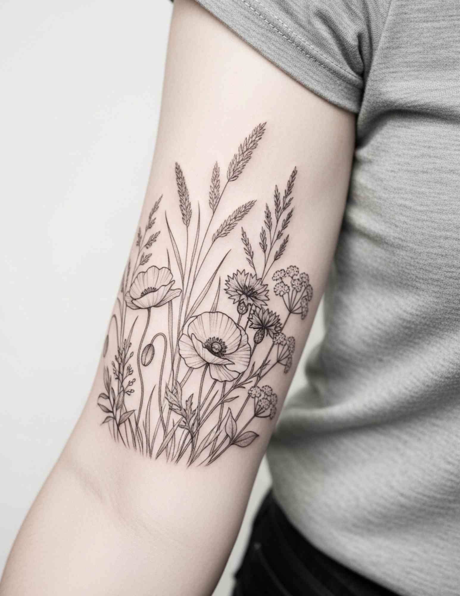
A black and gray flower tattoo lives or dies on its shading, not its outline. That is the single biggest thing I have learned from years of looking at floral work, and it is why two roses drawn from the same reference can age so differently.
I have spent a long time collecting black and gray floral pieces for this site, and the ones that still look good five and ten years later share a pattern: strong contrast, deliberate white space, and petals that are big enough to hold detail.
The palette itself is deceptively simple. Black ink diluted into washes gives you an enormous range of grays, and skilled artists use that range the way a pencil artist uses graphite.
Below are the designs I keep coming back to, along with the practical notes on placement, size, and healing that I wish someone had given me before my first floral piece. If you want a broader look at the whole category first, our flower tattoo drawings gallery is a good starting point.
Which Black and Gray Flower Style Is Right for You?
Not every floral approach suits every body part or every budget. This is the comparison I sketch out for friends when they ask where to start.
| Style | Best For | Typical Size | How It Tends to Age |
|---|---|---|---|
| Smooth black and gray realism | Forearm, thigh, upper arm, back | Palm-sized and larger | Very well when contrast is strong; soft grays may need a touch-up |
| Fine line botanical | Wrist, ankle, spine, ribs | Small to medium | Lines soften over time; usually needs the most maintenance |
| Dotwork and stipple shading | Shoulder, sternum, outer arm | Medium | Holds up well if dots are spaced properly |
| Illustrative or sketch style | Forearm, calf, thigh | Medium to large | Ages gracefully; loose lines hide small changes |
| Bold blackwork florals | Arm, leg, back | Medium to large | The most durable of the group; solid black stays readable |
If you are torn between two rows of that table, the safer choice is usually the bolder one. Ink spreads slightly under the skin over the years, and bold designs absorb that spread better than delicate ones.
Why Shading Matters More Than the Flower You Choose
When people bring me a reference photo, they are almost always focused on the species of flower. In my experience, that is the least important decision in the room.
What actually determines whether the tattoo reads as a flower from across a room is the value range: how dark the darkest shadow is and how much untouched skin is left as the highlight.
Artists build that range by diluting black ink into a series of washes, sometimes four or five steps between solid black and bare skin. A piece with only two or three values tends to look flat once the initial swelling settles.
Skin tone changes the maths as well. On deeper skin tones the lightest gray washes can disappear entirely, so experienced artists lean on negative space and heavier blacks instead of relying on pale gray.
This is also why I push people toward artists who specialise. A portfolio full of healed black and gray photos, not just fresh ones, tells you far more than a price quote does.
Black and Gray Flower Tattoo Designs Worth Copying
Here are the specific design directions I recommend most often, grouped by what they actually do well rather than by flower name alone.
The Single Rose, Shaded in Full Value Range
The rose is the backbone of black and gray floral work for a reason: its overlapping petals create natural pockets of shadow that give an artist somewhere to put the darkest black.
A well-shaded rose has a clear light source. Look at any piece you are considering and ask which direction the light is coming from — if you cannot tell, the shading is probably inconsistent.
I would not go smaller than roughly the width of your palm for a detailed rose. Below that, the petal shadows start merging into one gray mass as the tattoo settles.
Hand-and-flower compositions, like the one below, work well because the hand gives the eye a familiar shape to anchor on. For more variations on this theme, our black and gray rose tattoo drawings collection covers a lot of ground.
Full Bouquets and Layered Arrangements
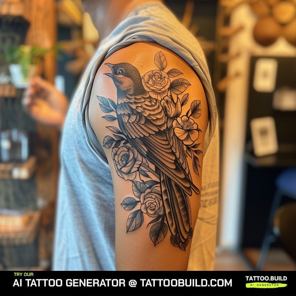
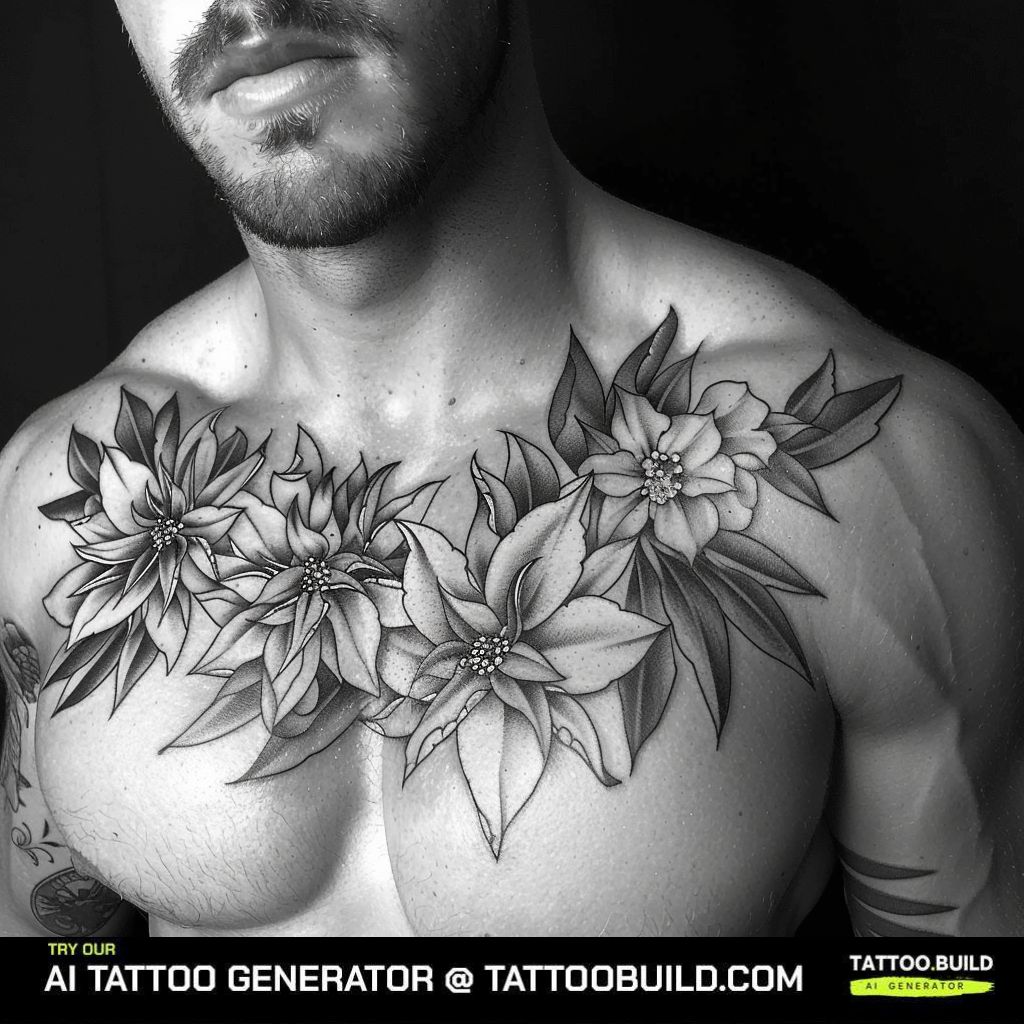
A bouquet gives an artist room to vary petal size, and that variation is what makes a large piece interesting instead of repetitive.
The rule I have seen good artists follow is a clear hierarchy: one or two dominant blooms, a handful of mid-sized supporting flowers, and small buds or filler to soften the edges.
Bouquets suit thighs, upper backs, and outer arms where there is enough uninterrupted skin for the composition to breathe.
Expect a bouquet to take more than one sitting. Most of the larger arrangements I have seen were built across two or three sessions with healing time in between.
Fine Line Botanicals for Delicate Placements
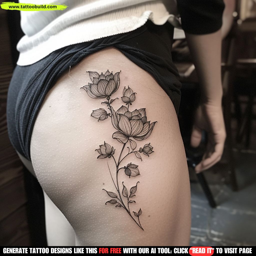
Fine line work trades depth for elegance. Instead of heavy shading, the design relies on clean contour lines and a lot of open skin.
It suits the neck, sternum, ankle, and inner arm — places where a heavily shaded piece would feel too dense.
The honest trade-off is maintenance. Thin lines placed close together tend to blur into one another faster than bold ones, particularly on high-friction areas like fingers and feet.
If you like this direction, our guide to fine line tattoo ideas goes deeper into placement and longevity.
Small Single Stems for First Tattoos
A single stem is the design I recommend most often to people getting their first piece. It is quick, comparatively affordable, and easy to build on later.
Ankles, wrists, and the back of the upper arm all take a small stem well. Sessions for pieces this size are often under an hour in my experience.
Keep the detail count low. One flower head, two or three leaves, and a clean stem will hold up far better than a miniature version of a full bouquet.
Black and gray flower designs and the prompts behind them
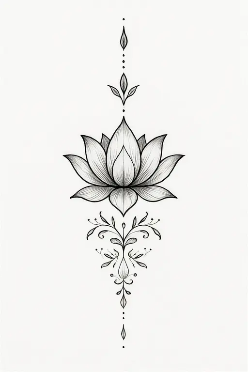
Elegant black and gray linework tattoo of a lotus flower centered on the spine, with ornamental details extending vertically up the nape of the neck and down the upper back. Symmetrical fine lines, soft shading, delicate mandala-inspired accents with dots and leaves. Minimal yet intricate, graceful and feminine style.
Use this idea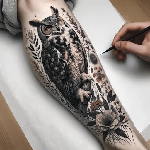
Nature shin tattoo with great horned owl on the calf surrounded by flowers and nature in black and grey and some color
Use this idea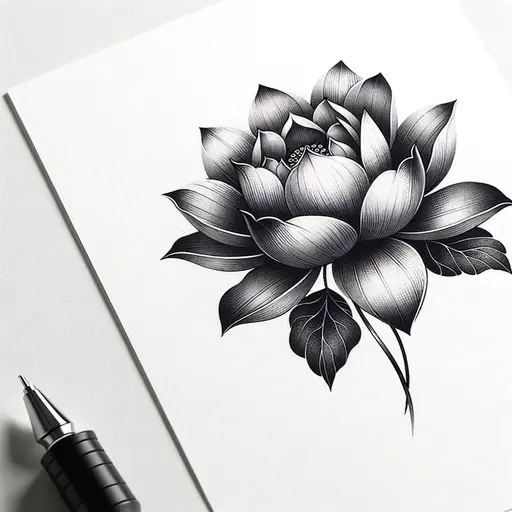
lotus flower tattoo design
Use this idea
Flowers Paired With Insects and Small Animals
Adding a bee, a butterfly, or a moth turns a static flower into a small scene, and it gives the artist a second texture to play against smooth petals.
Wings are the technical showpiece here. Good wing work uses tight, controlled stipple or whip shading to suggest translucency rather than filling the shape with flat gray.
I would give the insect its own space rather than overlapping it heavily with the flower. Overlap at this scale muddies both subjects once the tattoo heals.
Sketch Style and Illustrative Roses
Sketch style keeps the construction lines visible, so the tattoo looks like a page torn out of an artist’s notebook rather than a finished painting.
It is one of the more forgiving styles as it ages. Because the linework is intentionally loose, small amounts of blur read as part of the aesthetic instead of as a flaw.
This approach also works well as a cover-up base, since the busy linework can absorb an older design underneath.
Trumpet-Shaped Blooms: Lilies, Magnolias and Orchids
Lilies and other trumpet-shaped flowers give you something roses cannot: a deep interior shadow where the petals funnel inward.
That interior is the darkest point of the whole design, and a good artist will use it as the anchor for the rest of the value range.
Long stamens also add a linear element that breaks up all the curves, which is useful on larger pieces that risk feeling monotonous.
If lilies appeal to you, our lily tattoo ideas page has a wider spread of shapes and placements.
Larger Compositions That Follow the Body
The best large floral pieces I have seen were drawn onto the body, not designed flat on paper and then transferred.
Stems that follow the line of a thigh, a spine, or the curve of a hip make the tattoo look like it belongs there rather than like a sticker.
This is worth asking about directly at your consultation. Artists who freehand or heavily adjust their stencil on the skin usually get better flow than those who print and apply.
Variations Worth Considering Before You Book
If the standard smooth-shaded flower is not quite what you want, these variations change the character of the piece without leaving the black and gray palette.
Whip Shading Versus Smooth Shading
Whip shading is applied with a flicking motion that leaves a soft, grainy gradient. It reads as more textured and slightly rougher than the airbrushed look of smooth black and gray.
I find it suits wildflowers and looser botanical designs better than polished realism.
Dotwork and Stippled Petals
Dotwork builds tone from thousands of individual points instead of continuous washes, which gives the flower an engraved, almost etched quality.
It takes longer to apply than smooth shading, so budget for a longer session. Our dotwork tattoo ideas guide shows how the technique looks across different subjects.
Negative Space and Silhouette Florals
Instead of shading the petals, some designs fill the background solid black and leave the flower as bare skin.
This is the most durable option on the list, but it is also the hardest to cover or modify later, so it is worth being sure.
Adding a Second Subject Later
A single flower is easy to extend into a half sleeve down the line, provided the first piece was placed with room around it.
If a larger project is on your mind eventually, mention it at the first appointment so the artist leaves the composition open. Our floral half sleeve tattoo gallery shows how those extensions usually go.
Aftercare That Actually Protects the Shading
Black and gray pieces are more vulnerable during healing than solid colour work, because the light gray washes sit shallower in the skin and can lift away with a scab.
The single most damaging habit is picking. Every scab you pull off takes some pigment with it, and on a gradient that shows up as a patch of missing tone rather than a missing line.
Follow the aftercare instructions your artist gives you over anything you read online, including this page — they know what they put in your skin and how deep it went. Our general tattoo aftercare guide covers the usual routine if you want a reference.
Keep it out of direct sun once healed. Sun exposure fades gray washes faster than it fades solid black, which is what causes older floral pieces to look washed out and flat.
If you notice spreading redness, heat, swelling that increases after the first few days, pus, or a fever, contact a doctor rather than your artist. The FDA notes that tattoo infections can result from contaminated ink and sometimes require antibiotics, and Mayo Clinic lists allergic reactions, granulomas and keloids among the possible complications. Nothing here is medical advice.
For the same reason, never attempt a home tattoo or a DIY removal. The FDA specifically flags do-it-yourself kits as a contamination risk, and removal is a job for a licensed professional.
Still Not Sure? Avoid These Common Mistakes
Almost every regret I have heard about a floral tattoo traces back to one of these four decisions.
Going too small for the level of detail. This is the most common one by a wide margin. If the reference image has ten distinct petals, it needs to be big enough that each one gets real space.
Choosing an artist by price rather than by portfolio. Black and gray shading is a specific skill, and a great colour traditional artist is not automatically a great black and gray artist.
Ignoring pain and placement together. Ribs, sternum, and the inside of the arm are considerably harder to sit through than a forearm — our tattoo pain chart is worth reading before you book a long session in a rough spot.
Picking a flower purely for its symbolism without checking whether it tattoos well. Some blooms translate beautifully into black and gray; others rely on colour to be recognisable. Browsing our peony tattoo ideas and wildflower tattoo ideas side by side makes the difference obvious.
Frequently Asked Questions
Do black and gray flower tattoos fade faster than colour ones?
In my experience they hold up at least as well as colour, and often better. Black ink is generally the most stable pigment, so the solid areas of a black and gray piece tend to stay strong. What does fade is the lightest gray wash, which can soften noticeably after several years of sun exposure. Keeping the tattoo covered or under sunscreen once fully healed is the single most effective thing you can do.
How big does a black and gray flower tattoo need to be?
It depends entirely on how much detail the design carries. A single simple stem works fine at a few inches, while a shaded realistic rose usually needs at least the width of your palm to hold its petal shadows. As a rule of thumb, if you have to squint at the reference to count the petals, the tattoo is too small for that design. Ask your artist directly what the minimum size is for the piece you want — most will tell you honestly.
How long does a floral piece take to heal?
The surface usually looks settled within two to three weeks, but the deeper layers keep repairing for a couple of months afterwards. During that window the shading can look patchy or cloudy, which is normal and not a sign of a bad tattoo. Avoid judging the final result until at least a month has passed. If anything looks infected rather than simply healing, see a doctor.
Can a black and gray flower cover an old tattoo?
Often yes, though it depends on how dark and how large the existing piece is. Busy, high-contrast floral designs are among the more effective cover-up subjects because the shading gives an artist somewhere to hide old lines. Bring the existing tattoo to a consultation before committing to a design — a cover-up specialist will tell you quickly whether it is realistic or whether laser lightening first is the better route.
Which flower works best for a first tattoo?
A rose or a simple wildflower stem is usually the easiest place to start. Both are forgiving at moderate sizes, both suit a wide range of placements, and both are easy to extend later if you decide you want more. Beyond that, pick the flower that means something to you — you will be looking at it for a long time, and personal significance outlasts trends.
Quick Summary
- Shading quality matters more than which flower you pick — judge portfolios on healed photos, not fresh ones.
- Bold designs with strong contrast age better than delicate fine line work.
- A detailed rose generally needs at least palm-width to keep its petal shadows readable.
- Fine line botanicals suit the neck, wrist and ankle, but expect more touch-ups over time.
- Large pieces look best when the stems follow the natural lines of the body.
- Never pick scabs — on a gradient, lost pigment shows up as a flat patch rather than a broken line.
- Sunscreen once healed is what keeps the light gray washes from washing out.
- Any sign of infection is a doctor’s job, not an artist’s — and never attempt a DIY tattoo or removal.