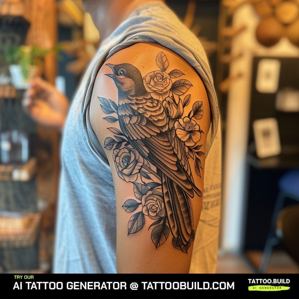
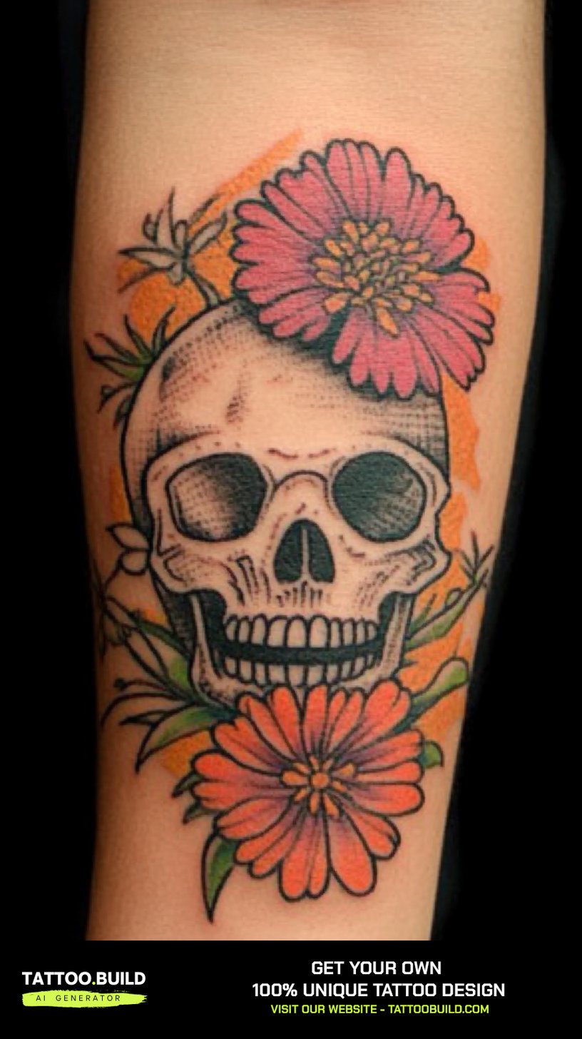
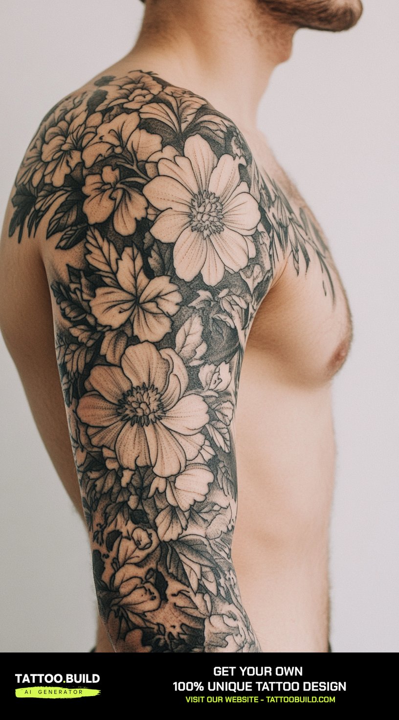
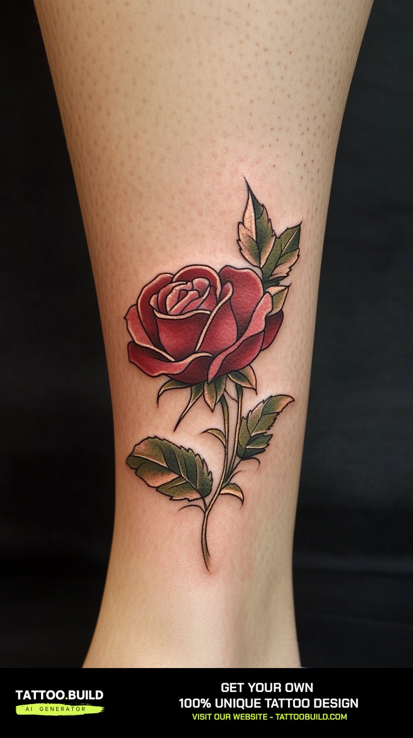
I have spent more hours than I want to admit sitting with a sketchbook, redrawing the same peony until the petals finally sat right. A flower tattoo drawing is not the tattoo — it is the argument for the tattoo, and the gap between those two things is where most people get tripped up.
The forty designs on this page are drawings. They are references, starting points, things to screenshot and bring to a consultation. None of them are stencils yet.
What I want to give you is a way of reading them. Which lines will survive on skin, which ones are paper-only flourishes, and how to tell an artist what you actually want without handing over a picture and saying “this.”
If you already know which bloom you want, skip ahead — there are separate sections for lilies, peonies, hibiscus and lotus below, and a wider set of floral tattoo drawings if none of these land.
Which Flower Tattoo Drawing Style Is Right for You?
Every drawing in this collection falls into one of four broad approaches. They age differently, cost differently, and suit different amounts of skin.
| Style | Smallest size I would trust it at | Typical sitting | How it tends to age | Best for |
|---|---|---|---|---|
| Black and gray realism | Around 5–6 inches tall | 3–6 hours | Softens gradually; mid-tones merge first | Forearms, thighs, calves |
| Fine line | Around 3–4 inches tall | 1–3 hours | Lines thicken and can blur; often needs a touch-up | Inner arm, ribs, ankle, spine |
| Bold outline / traditional | Around 3 inches tall | 1–3 hours | Holds its shape the longest of the four | Upper arm, shin, anywhere that takes friction |
| Colour and watercolour | Around 5 inches tall | 3–6 hours, often split | Depends heavily on sun exposure and ink choice | Areas you can keep covered or sunscreened |
Those size figures are my own rule of thumb from looking at healed work, not an industry standard. Your artist may push back, and they are usually right to.
Why a Drawing and a Tattoo Are Not the Same Thing
Paper holds detail that skin does not. Graphite can sit a hair’s width from another line and stay separate forever; ink in skin spreads a little, always.
That spread is the single most useful thing to understand before you pick a reference. Artists call it blowout when it goes wrong and softening when it goes normally.
It means the pencil sketch with forty tiny stamens and hatching finer than a hair will not come out looking like the sketch. It will come out looking like a slightly softer, simpler version of the sketch.
A good artist redraws your reference rather than tracing it, opening up the gaps, thickening the lines that need to carry the shape, and cutting the detail that was never going to survive.
So when you bring one of these drawings in and your artist says “I want to change a few things,” that is the process working. It is not them ignoring what you asked for.
The other half of the gap is the paper itself. Several drawings here sit on cream or gold backgrounds, which flatters the shading in a way bare skin will not.
Flower Tattoo Drawings by Bloom
The collection leans heavily toward lilies and peonies, which is not an accident — both have large, structured petals that give an artist something to shade.
Lily Drawings
Lilies are the workhorse of this collection. Six broad petals, a strong central line, and stamens that give the eye somewhere to land.
What makes them work as tattoos is the petal geometry. Each petal is big enough to hold a full light-to-dark gradient, which is what creates the illusion of depth on a flat surface.
In my experience they are also forgiving. A lily that has softened over fifteen years still reads clearly as a lily, because the silhouette does the work rather than the internal detail.
The trade-off is scale. A lily drawn small enough for a wrist loses the gradient entirely and becomes an outline — still fine, but a different tattoo. If that is the direction you want, the lily tattoo ideas gallery has smaller pieces.
Peony and Ranunculus Drawings
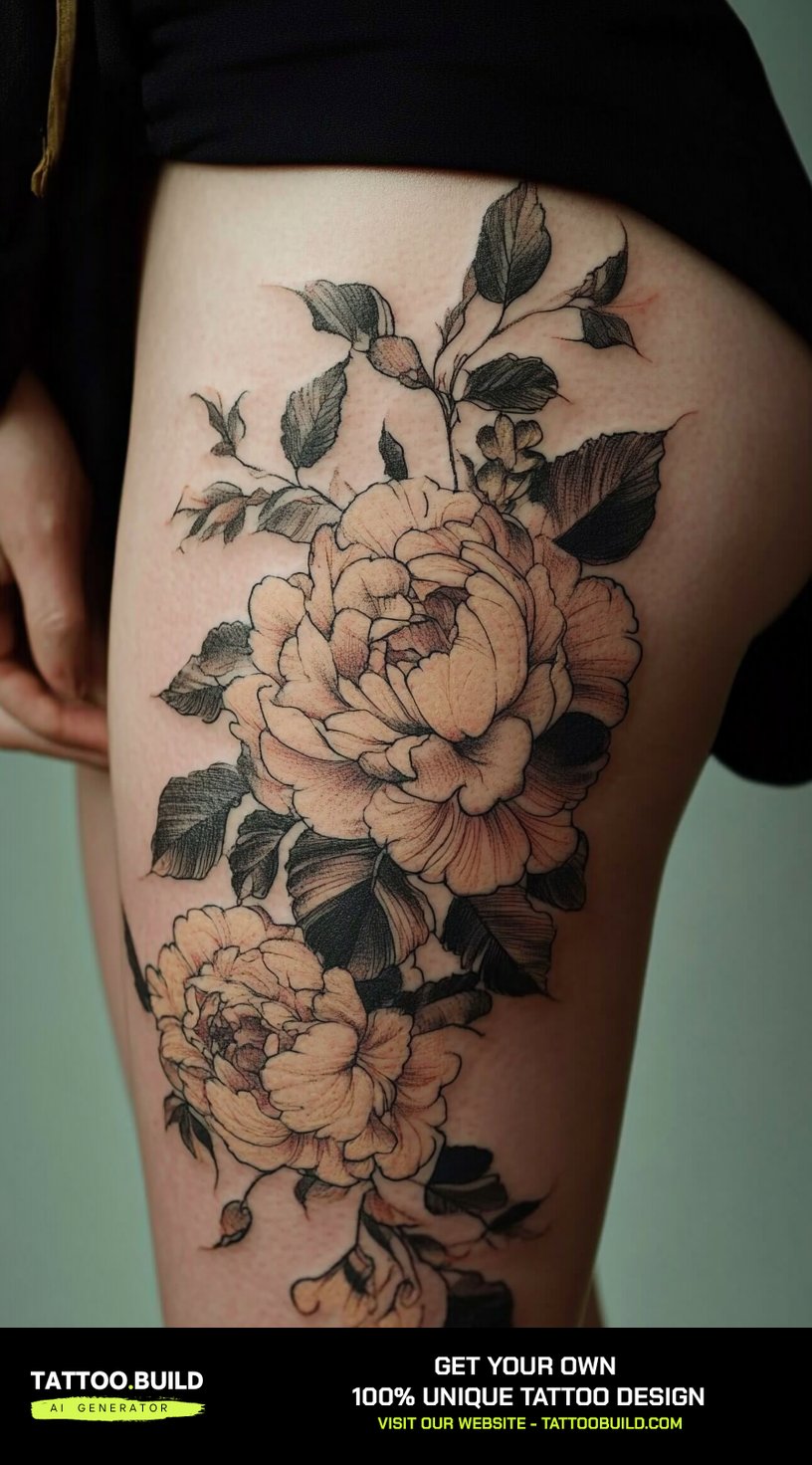
Peonies are the opposite problem. Where a lily has six clear petals, a peony has dozens of overlapping ones and no obvious silhouette.
That density is why peonies look extraordinary at size and turn into a grey blob when tattooed small. The whole design depends on the artist keeping separation between petal layers.
Every artist I have asked about peonies says the same thing: the negative space between the petals is the tattoo. The petals themselves are almost secondary.
Look at the outline drawing in this group — no shading at all, and it still reads as a peony. That is the test. For more, the peony tattoo ideas collection goes deeper.
Fine Line and Single-Stem Drawings
These are the quietest designs here and, in a way, the hardest to get right.
A single lily on a thin stem has nowhere to hide. There is no shading to cover a wobbly line and no density to disguise an uneven curve.
When I have watched fine-line florals heal, the pattern is consistent: they look almost too faint at three weeks, settle by three months, and often want a light touch-up somewhere in the first two years.
That is normal and worth budgeting for. Ask about touch-up policy before you book. The fine line tattoo ideas guide covers what to expect in more detail.
Hibiscus and Bold Outline Drawings
The two hibiscus drawings in this set are the most tattoo-ready things on the page, and it is because of the line weight.
Thick outlines, big open petals, a ruffled edge that is decorative rather than fussy. This is close to how traditional tattooing solved the flower problem a century ago.
Bold outline work is also the most honest about aging. It is going to soften, and the design already assumes that.
If you want a floral that will still look deliberate in twenty years, start here. The hibiscus tattoo ideas gallery has more in this vein.
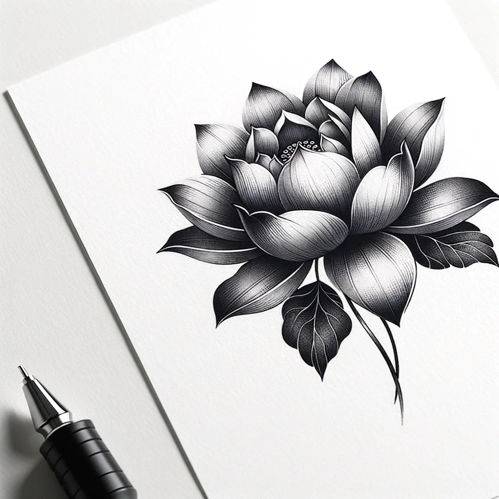
Lotus and Colour-Accent Drawings
Three designs here use colour as an accent rather than a fill, and that restraint is doing something clever.
Red on black and gray costs less chair time than a fully coloured piece, and it gives the eye a single focal point instead of competing areas of interest.
The lotus in particular carries meaning across several traditions — rebirth, emergence, resilience. It is worth reading up on what it means in a culture before wearing it, rather than after.
When I tested this kind of accent approach on my own arm, the red was the first thing to need attention after two summers of sun. Keep it covered. More options in the lotus flower tattoo designs gallery.
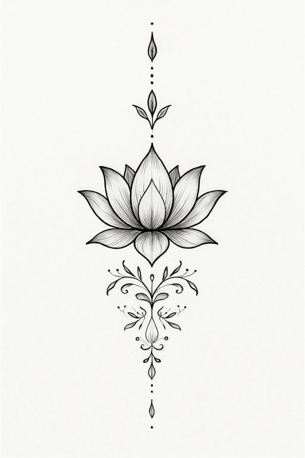
Ornamental and Filigree Drawings
Filigree is the secret weapon of floral tattooing and almost nobody asks for it by name.
Those curling scrolls and ribbons do three jobs: they lengthen a design to fit a limb, they fill space that would otherwise look empty, and they give the piece a place to taper out.
They also age well. A scroll is a simple curved line with even weight, which is exactly the kind of mark that stays crisp.
In my experience, adding filigree is the cheapest way to make a small floral look like a considered piece rather than a sticker.
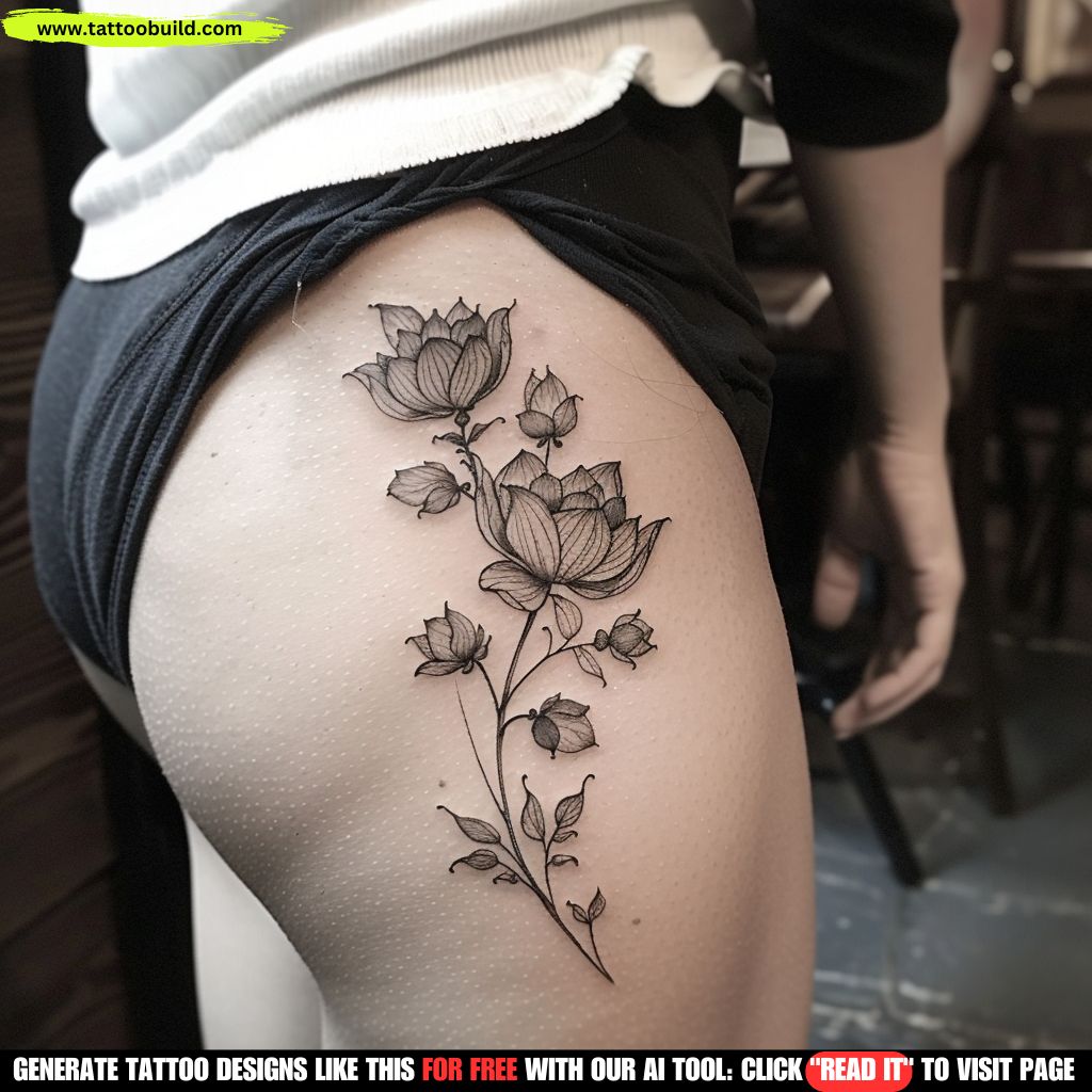
Delicate Cluster Drawings
Clusters of small blooms are the most requested thing I see and the most frequently regretted.
The appeal is obvious — they look soft, feminine, botanical, and they wrap around a limb beautifully.
The catch is that a cluster is really twelve small tattoos next to each other, and every one of them has to hold its own edges. Tattooed too small, the gaps close and you get a shaded patch.
Ask your artist to size the smallest bloom, not the whole design. If the smallest flower is under about an inch, expect it to soften.
Variations Worth Considering
Two things separate most of these drawings from each other, and neither is the flower.
Colour Versus Black and Gray
Black and gray dominates this collection, and there is a practical reason: it is the most flexible. It suits every skin tone, it heals predictably, and it does not date.
Colour buys you impact and costs you maintenance. Reds and oranges in particular sit high in the skin and fade fastest under UV.
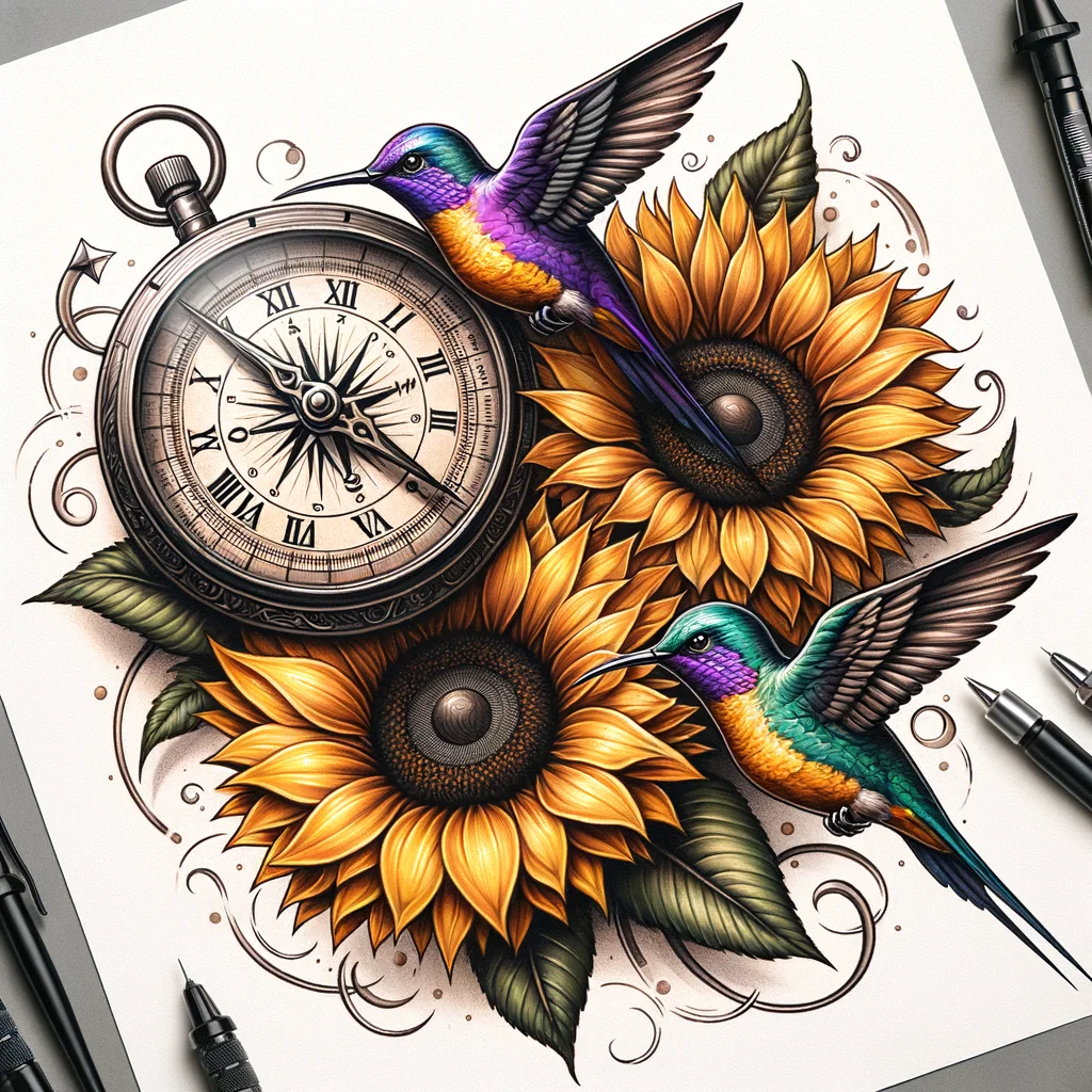
One of the drawings here is a blue-toned gradient, which is a rendering effect rather than an ink plan. Ask specifically which pigments an artist would use before assuming a digital colour is achievable.
If you like the look but want it to last, black and gray flower tattoo designs are the safer starting point.
Sketch Rendering Versus Stencil-Ready Line Work
Several drawings sit on tinted paper with soft pencil shading. They are gorgeous and they are also slightly misleading.
The warm background does a lot of work — it lifts the mid-tones and makes the shading look richer than the same marks would on white.
When you look at a reference like this, mentally strip the background out. What is left is the line work, and the line work is what gets tattooed.
I now judge every reference in greyscale on my phone before saving it. It has stopped me from bringing in at least three designs that were mostly paper.
Placement: Match the Drawing to the Limb
Almost every design in this collection is vertical and elongated, roughly two to three times taller than it is wide.
That is not a coincidence. It is the shape of a forearm, a calf, a spine, and the outside of a thigh.
Curved limbs also mean a design is never seen flat. A piece that wraps the forearm is only ever half visible from any one angle, which is why artists build in curling stems that follow the muscle.
Bring the reference to your consultation and hold it against the actual spot before you agree to anything. If you are leaning toward the arm, floral half sleeve forearm designs shows how these shapes sit in place.
Healing and Aftercare for a Floral Tattoo
Floral work tends to involve a lot of shading over a wide area, which usually means more surface irritation than a small line tattoo and a slightly fussier heal.
The general guidance is unglamorous and consistent: keep it clean, keep it lightly moisturised, keep it out of the sun and out of pools while it closes. Mayo Clinic puts most tattoos at around two weeks to heal on the surface, with deeper settling continuing for longer.
Take the risks seriously rather than fatalistically. The US FDA notes that infections can come from contaminated ink as well as from poor aftercare, that allergic reactions to pigment can persist because the ink is permanent, and that no pigments have been approved for injection into skin for cosmetic purposes.
None of that is a reason not to get tattooed. It is a reason to choose a licensed studio, watch them open sterile equipment, and follow the aftercare sheet they give you.
If something looks wrong — spreading redness, heat, pus, fever, or a rash that will not settle — call a doctor, not the internet. Your artist can tell you what a normal heal looks like; only a clinician can treat an infection or an allergic reaction. Nothing on this page is medical advice.
One thing genuinely within your control long term: sunscreen. Sun is what turns crisp black and gray into a soft grey smudge, and it is the easiest variable to manage.
Common Mistakes — and What to Do If You Are Still Not Sure
The mistakes I see most often are not about taste. They are about process.
- Bringing one reference instead of five. One image tells an artist to copy. Five tells them what you actually respond to.
- Sizing to your budget rather than to the design. A dense drawing shrunk to fit a price is the most common source of regret I hear about.
- Choosing an artist by price rather than by portfolio. Look specifically for healed floral work, not fresh photos taken ten minutes after the session.
- Ignoring the smallest element. Whatever is tiniest in the drawing sets the minimum viable size for the whole piece.
- Copying another person’s tattoo exactly. Most artists will decline, and the ones who agree are usually not the ones you want.
If you are still undecided on the bloom itself, meaning is a decent tiebreaker. Birth flower tattoo ideas anchors the choice to your birth month, which is a lot easier than picking from forty drawings.
And if you are worried a floral will read as too soft for you, that concern is mostly outdated — floral forearm tattoos for men shows how much the same shapes change with heavier line weight and darker shading.
Frequently Asked Questions
Can I take one of these flower tattoo drawings straight to a tattoo artist?
You can and you should, but bring it as a reference rather than a stencil. Most artists will redraw it to fit your body, adjust the line weights so the design survives healing, and change the proportions to suit the placement. In my experience, artists respond much better to “I love this shape and this level of detail” than to “copy this exactly.” Bringing three or four images that share a mood works better than one image you are attached to.
What size does a flower tattoo drawing need to be to keep its detail?
It depends entirely on the finest element in the drawing, not on the overall design. As a rough guide from healed work I have looked at, dense black and gray florals want at least five or six inches of height, while a simple bold-outline bloom can work at around three. Fine-line clusters are the risky ones because the gaps between petals close up as the ink settles. Ask your artist to size the smallest flower in the design and work outward from there.
Which flower tattoos age the best?
Generally, bold outlines with open negative space age best, because a thick even line stays readable even as it softens. Heavy black and gray realism holds up well at size but loses its mid-tones first, which flattens the depth. Fine line and delicate colour work usually need the most maintenance. Sun exposure matters more than style for almost every piece, so sunscreen once the tattoo is fully healed is the single highest-value habit.
How long does a floral tattoo take to heal?
The surface usually closes in about two weeks according to general medical guidance, though larger shaded pieces often feel irritated for longer and the skin keeps settling underneath for a month or more. Follow the aftercare instructions your artist gives you, since they know exactly what they put into your skin. Keep it clean, moisturised, out of pools and out of direct sun while it heals. If you see spreading redness, heat, pus or a rash that will not settle, contact a doctor rather than waiting it out.
Should I choose colour or black and gray for a flower tattoo?
Black and gray is the more forgiving choice in most cases: it heals predictably, suits every skin tone, and does not date the way colour palettes can. Colour gives you impact that black and gray cannot match, but reds and oranges in particular tend to fade fastest under UV and may need refreshing sooner. A middle path that works well is black and gray with a single colour accent, which is what several of the drawings on this page do. Talk to your artist about which pigments they use and how those have healed on skin like yours.
Quick Summary
- Treat every drawing as a reference, not a stencil. Expect your artist to redraw it.
- Size to the smallest element in the design, not to the overall footprint or your budget.
- Lilies are forgiving, peonies need room — the silhouette carries a lily, negative space carries a peony.
- Bold outlines age best; fine line and delicate colour need the most upkeep.
- Filigree and scrollwork lengthen a design to fit a limb and stay crisp for years.
- Strip the paper out mentally — tinted backgrounds flatter shading that skin will not.
- Hold the reference against the actual placement before you commit to anything.
- Clean, moisturised, out of the sun while healing — and see a doctor, not a forum, if it looks infected.