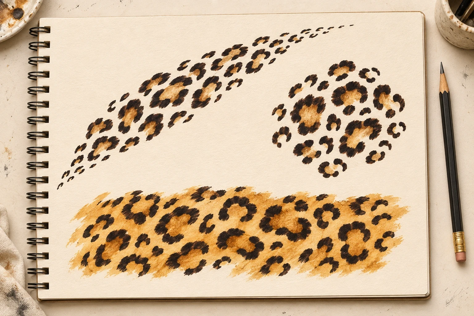
A leopard print tattoo can be as small as a few open rosettes or as bold as a band of black and ochre. Start by deciding what you want to notice first: the irregular spots themselves, the shape they make together, or an outline such as a heart or butterfly that holds the pattern.
These 20 leopard print tattoo ideas show how spacing, direction and color change the same motif. Use them to narrow your artist brief and compare placements at the intended size.
Image disclosure: The illustrations are AI-generated tattoo concepts on paper. They do not show actual tattoos or healed client work. Ask your artist to redraw the pattern for your placement.
What makes a print read as leopard?
Begin with irregular rosettes: broken or uneven dark outlines around lighter centers. The San Diego Zoo leopard profile describes these markings on the back and contrasts them with the central dots often found in jaguar rosettes. The Smithsonian’s cheetah profile describes a different starting shape: solid dark spots. A tattoo can mix open rosettes with a few small solid marks, but keep the open forms prominent if you want the print to read as leopard.
The visual reference and the personal meaning are separate decisions. You might like the pattern for its association with a favorite garment, its contrast, or the way its irregular edges fit an existing tattoo. The print does not have to stand for any one personality trait.
1. Three-rosette cluster
A few large shapes leave enough room to see the openings, even in a small composition. Try a loose triangle, with one rosette visibly wider than the others.
Place a paper mockup near the intended spot and check whether the group still reads when the arm is relaxed. Widen the gaps before adding more marks.
2. Diagonal spot trail
A rising trail gives the pattern direction without drawing a straight border. Keep the largest shapes near the middle, then let small marks bring each end to a stop.
Compare the angle on a flat mockup with the angle on the body. A trail that looks level on a desk can appear to point somewhere else when the limb turns.
3. Crescent of open rosettes
A broad curve leaves a clean interior opening. The eye follows the line of spots without needing an outer contour.
Try it around an existing motif on paper before adding ink. The gap between the new curve and the old tattoo should feel intentional all the way around.
4. Open cuff panel
A low strip of staggered rosettes suggests a cuff while keeping the ends soft. Vary the vertical position of the spots so the rows do not look like a repeated tile.
Decide whether the strip should stop on the front of the arm or continue around it. If it wraps, inspect both ends of the stencil before approving the seam.
5. Tapered vertical cascade
A wide upper group narrows into a short tail. This makes a patch of spots feel more like a single composition from a distance.
Put the broad end where the available skin is widest. Shorten the tail if it runs into a joint or distracts from an adjacent tattoo.
6. Loose field of spots
An asymmetrical field gives the larger rosettes room to stand on their own. A few smaller accents at the edge can give the eye a softer exit.
Start with generous gaps. Ask the artist to sketch a denser version beside it if you are deciding how much unmarked space to keep.
7. Split print with a clear lane
A stripe of untouched space breaks the pattern into two groups. The gap is part of the design, not an area that needs to be filled later.
Try different widths for the diagonal lane at full size. It should remain apparent when you look at the pattern from the side.
8. Brushstroke rosettes
Broad, rough-edged arcs put more emphasis on the individual marks than a tightly packed print. A large opening inside each one keeps the shape recognizable.
Choose which brush details are essential. An artist can simplify very fine texture while retaining the varied edge and bold silhouette.
9. Stipple fade
Solid outlines on one side give way to smaller stippled marks on the other. That change in density works as a deliberate edge.
Pick the side you want the eye to enter first. Keep the small dots out of the large rosette centers if you want the two textures to remain distinct.
10. Black rosettes with ochre centers
A limited ochre accent emphasizes the center of each spot without turning the whole design into a filled swatch. The black outlines still carry the pattern.
Ask to compare the design in black only and with the proposed ochre. Use the color because it adds something you want, not because the print needs it to be identifiable.
11. Rust wash beneath the print
A warm wash ties the group together and gives the background an irregular edge. Keep the rosettes dark enough to read separately from the wash.
Choose how far the color should travel past the spots. A small amount on one edge can feel more deliberate than an even cloud around every mark.
12. Black print over pale blush
Pale pink changes the mood while the black pattern remains the focal point. Try leaving a few spots partly outside the color area.
Discuss the palette using the artist’s healed examples on skin with a similar tone. A pale wash on ivory paper is a color concept, not a promise about healed contrast.
13. Heart made of rosettes
Let the pattern itself suggest the heart instead of outlining it. Give the two upper lobes and the bottom point enough space to read clearly.
Take a step back from a full-size print. If you see a blob before you see a heart, simplify the clusters rather than adding more tiny spots.
14. Print inside a lightning bolt
An angular outer shape can contrast with rounded rosettes. The strongest versions leave breathing room where the bolt narrows.
Ask where the print should stop near the tip. A few clear partial shapes can be easier to read than trying to squeeze in whole rosettes.
15. Folded spotted ribbon
Putting the pattern on only one side of a twisting ribbon helps show the turn. The reverse can stay plain and shaded.
Choose a fold with a clear silhouette before adding the spots. If the flat ribbon is hard to follow, extra print will make the overlap harder to see.
16. Flower with patterned petals
A handful of spotted petals makes the print an accent. The unpatterned petals give the flower enough quiet space to hold its shape.
Pick the petal size first and then fit a small number of rosettes. Keep the flower center simple so it does not compete with the print.
17. Butterfly with printed upper wings
Broad upper wings make room for several open rosettes while plainer lower wings clarify the silhouette. A little variation in the spots keeps the pattern from looking mechanically copied.
Review the wing outline before reviewing the texture. For other approaches to the shape, compare our butterfly tattoo gallery.
18. Leopard print crescent moon
A crescent with an outer line is different from a crescent made only of spots. Here the moon is the first shape you read and the print is the detail inside it.
Make the curve broad enough for the rosettes to retain their centers. Let the print break naturally at the narrow tips.
19. Small rosette pendant
A pendant frame groups the spots in one compact shape. Its narrow top line gives it a clear direction without making the rosettes follow a straight grid.
Keep the ornament secondary to the patterned drop. Remove unnecessary borders if the frame and the spots begin to merge at the proposed size.
20. Reverse-print blackwork patch
Here the dark ground carries the outer shape and the pale marks create the print. Ask the artist to show which areas will stay uninked; white paper in a reference is not necessarily white ink.
Try a smaller dark patch before committing to a large solid area. Compare other uses of blank space in the blackwork tattoo gallery.
Choose a footprint before adding detail
Pick the footprint that suits the space: a triangle for a compact cluster, a strip for a cuff, a taper for a longer area, or a silhouette when the pattern sits inside a shape. Print the chosen footprint at two sizes and try it against the intended placement. Check it from front and side before choosing which one to take to your appointment.
What to bring to your artist
Bring one close reference for the rosettes, one full-size outline for the footprint, and a note about the amount of empty space you want. Point out whether your favorite detail is the open center, the irregular border or the way the pattern tapers. That gives the artist something to preserve even if the final marks look different from the concept.
Frequently asked questions
Can a leopard print tattoo be small?
Yes. Begin with a small number of larger, open shapes. If the openings or the gaps are hard to read on a full-size mockup, ask the artist to simplify or increase the size.
Does it need tan or brown ink?
No. Irregular dark rosettes with open centers can carry the print by themselves. Ochre, rust and blush are optional ways to change the palette.
What if I already have a tattoo nearby?
Use a mockup to see whether the spots can frame it without closing off the gap around it. Let your artist look at the existing tattoo in person before planning a wrap or cover-up.