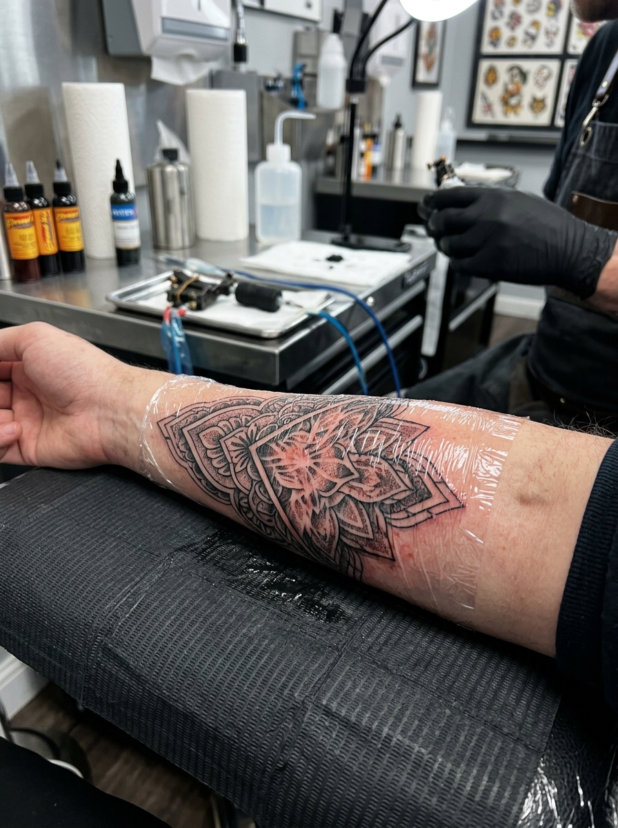
Om tattoo ideas can be as simple as a black symbol or as detailed as a lotus, mandala or ornamental frame. The useful question is how much decoration the character needs on your chosen placement. A clear standalone Om may suit a smaller area, while a petal mandala needs room for both the symbol and the surrounding pattern.
Om, also written Aum, has religious significance. Choose the design with an understanding of that context, and keep the written character accurate. These fifteen concepts explore different arrangements without treating a sacred symbol as a generic promise of peace, protection or good luck.
About the images: All sixteen images in this guide, including the hero, are original AI-generated tattoo concepts made with ImageGen. They show possible compositions, not real client work or healed results. An artist should redraw the chosen idea for your anatomy and check the symbol before tattooing.
What does an Om tattoo mean?
The Hindu American Foundation’s explanation of Om describes its importance in Hindu philosophy and its association with the sacred sound of creation. It also explains an interpretation connecting the symbol’s curves with states of consciousness, and its dot and crescent with further spiritual concepts. These are religious interpretations, rather than claims about a tattoo changing your physical health.
Someone may choose Om as an expression of faith, a connection to a spiritual practice or a reminder of something they have studied. Those intentions deserve more thought than simply liking the shape. Personal meaning can sit alongside religious context, but it does not replace it. If you are exploring several subjects, our spiritual tattoo ideas guide gives a broader starting point.
Keep the symbol accurate before adding decoration
The character shown throughout this guide is the familiar Devanagari Om: ॐ. Its curves and upper crescent and dot are part of the form, not spare details to remove when the tattoo becomes small. Written forms and calligraphic styles can differ, so use a trusted reference for the version you want.
Ask someone familiar with the script to check the final drawing. Avoid mirroring the symbol to make it fit an arm, fusing it with a border or guessing at extra Sanskrit text. If you add words or a mantra, have the exact spelling and meaning checked separately. A visually convincing AI concept cannot replace that check.
1. A classic black Om symbol
A standalone Om is the clearest starting point. The broad black curves carry the design, while the separate crescent and dot remain visible above them. This version does not need a frame, flower or quotation to feel complete. It suits someone who wants the symbol itself to be the focus.
The inner forearm lets you see the tattoo easily, and an upper-arm version offers more room. Ask your artist to preserve open space in the curves instead of thickening every stroke equally. Check the orientation from the viewpoint you intend before approving the stencil.
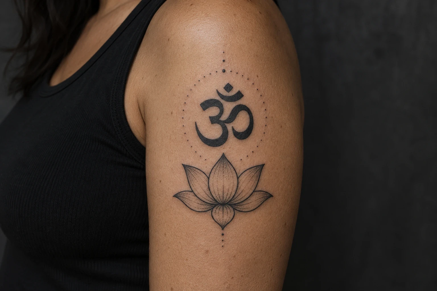
2. Om above an open lotus
An outlined lotus creates a broad base beneath the Om. The black symbol remains the darkest element, while the petals and two leaves use lighter linework. Keeping the flower separate prevents its central petal from becoming an accidental part of the character.
The outer upper arm suits this tall arrangement. Ask for clear petal groups and a visible gap between the flower and symbol. If you want a smaller tattoo, simplify the lotus first. Our lotus flower tattoo designs offer different bloom shapes to compare.
3. Om at the centre of a mandala
This mandala places Om in an open circular centre, surrounded by outlined petals and sparse dots. The central space matters as much as the ornament: the crescent and dot need to remain identifiable rather than disappearing into the pattern. The frame can be decorative without assigning each petal a religious meaning.
The upper back gives the design a broad surface. Check the stencil while standing naturally so the shoulders do not pull the pattern out of balance. A smaller version needs fewer rings and petals. See our lotus mandala tattoo ideas for other ways to arrange the surrounding linework.
4. Om inside an open brushstroke circle
A single brushstroke-style circle frames the Om without enclosing it in a rigid badge. The open section gives the border a lighter feel, while the solid central symbol stays easy to recognise. Treat the circle here as a visual frame; it does not need to be presented as a traditional Om emblem.
An outer forearm gives the circular composition enough width. Leave generous skin between the symbol and border, particularly above the dot. Ask the artist to choose a few clear textured breaks rather than many tiny scratches that compete with the character.
5. Om with a soft dotwork halo
A cloud of stippled dots gives a plain black symbol a softer edge. The strongest dots sit close to the character and become more widely spaced toward the outside. This adds texture without requiring a second object, and keeps the composition compact.
The shoulder offers a rounded surface for an oval halo. Ask the artist to keep the skin around the crescent and dot light enough for those marks to remain distinct. More dots are not automatically better: the symbol should remain the darkest, clearest shape when viewed from a distance.
6. Om framed by short sun rays
Short black rays make this a bolder variation. They sit outside the Om rather than growing out of its curves. The result has a clear centre and a simple outer rhythm. The sun motif can be a personal association; it should not be described as giving the tattoo a fixed spiritual power.
The upper arm provides space for the rays to stay separate. Check the gap above the dot so it cannot be mistaken for another ray. If the composition must be reduced, fewer rays with larger gaps are a useful option to discuss with the artist.
7. Om beside a slender crescent
A slender crescent frames one side of the symbol, while three dots balance the other. The extra crescent is a decorative element in this composition; it is separate from the smaller crescent that already belongs to the Om character. Keeping both visible avoids altering the glyph.
The inner forearm suits the slightly vertical shape. Let the outer crescent follow the composition without touching the large lower curve. If the additional dots make the top of the symbol ambiguous, remove them or move them further away. A quieter design is preferable to a crowded one.
8. Om within a simple triangle
A plain upright triangle brings a geometric frame to the symbol. It leaves all parts of the Om inside the border and uses open skin rather than shading to separate them. This is an original composition, not a claim that a triangle changes the religious meaning of Om.
The outer upper arm gives the triangle enough height and width. Ask the artist to leave space above the dot and around the right-hand curve. Keep the border simpler than the centre, and check that its corners remain readable when the arm is relaxed.
9. Black Om with a muted red accent
An offset red disk is a colour option for someone who does not want another decorative motif. The black symbol stays intact and readable above the muted brick-red area. The disk is a design accent rather than an added sacred mark, and its position can be adjusted around the character.
The inner upper arm works for this compact pairing. Ask to see healed colour examples on comparable skin tones, because this generated image cannot predict the final shade. Discuss the pigment and contrast with your artist; a colour name alone does not establish ink safety.
10. Om between two botanical sprigs
Two narrow leafy sprigs create an open botanical frame. Their lighter outlines make a useful contrast with the solid black symbol. Keeping their upper tips below or away from the crescent prevents the leaves from looking like extra strokes of the character.
The outer upper arm offers room for both branches. For a smaller version, remove some leaves rather than crowding the stems together. The plants are decorative here; there is no need to claim a traditional religious connection for a generic botanical border.
11. A calligraphic Om with tapered strokes
Calligraphic strokes give the symbol a different texture from the evenly weighted classic version. Tapered ends and a fuller lower curve can make the drawing feel fluid. The change belongs to the stroke style: the main curves, right-hand shape, crescent and dot should still remain recognisable.
An outer forearm provides room for the broad curves. Ask for a clean drawing before deciding how much brush texture to include. Avoid turning the character into an unrelated flourish. Our linework tattoo ideas can help you compare heavier and lighter approaches.
12. Om in an ornamental oval
A scalloped oval creates a pendant-like frame, with three teardrop ornaments beneath it. The central Om remains on open skin and the border carries the decoration. This is an ink drawing of an ornamental arrangement, not jewellery attached to the body.
The upper back below the nape suits the long silhouette. Keep the frame away from the dot, and check the overall width with your usual neckline. If the tattoo becomes too detailed at the proposed size, simplify the scallops and hanging dots before shrinking the central symbol.
13. Om above a three-lotus border
Three small lotus blooms create a horizontal border beneath the Om. This changes the proportions of the larger single-lotus idea: the flowers become a light supporting pattern, while the symbol remains the clear focal point. Sparse dots separate the blooms without filling every gap.
The upper arm has enough width for the row, though the final arrangement should follow its curve. This example is a short border, not a band wrapped around the arm. Ask to see the stencil from the side as well as the front so the outer flowers remain visible.
14. Om above a simple mountain scene
A few mountain peaks create a landscape base for the symbol. Black slopes and open-skin snow shapes keep the scene concise. You might choose mountains for a personal connection to a place or experience; the composition does not establish a new religious meaning for Om.
The inner upper arm suits the wide arrangement. Keep the tallest peak below the lower curve with a visible gap. If the tattoo needs to be smaller, reduce the mountain detail first and keep the symbol large enough for the crescent and dot to remain separate.
15. A smaller standalone Om
A smaller standalone version is useful if you want less coverage without adding a fine decorative frame. Its success depends on preserving the character rather than making it as tiny as possible. The inner spaces, crescent and dot still need to be visible in the finished stencil.
The inner forearm above the wrist gives the artist a relatively open area to work with. Ask them to set the minimum size for the chosen line weight. If the upper marks merge in the drawing, increase the size. Our minimalist tattoo ideas offer other examples of designs built around a few clear shapes.
Choosing size and placement thoughtfully
The forearm and upper arm offer room to check the whole character; a back placement can accommodate a wider mandala or longer ornamental frame. Have the artist test the stencil with your body relaxed, then check it from the intended viewing direction. Do not rotate or mirror the character merely to fill a narrow gap.
Because Om is sacred to many people, consider what the placement communicates as well as whether it fits. If you are unsure how a foot, lower-body or intimate placement would be received in the tradition you are drawing from, speak with a knowledgeable practitioner before committing. There is no single opinion that represents every Hindu community.
- Give the upper marks room. The crescent and dot should stay separate from each other and from any surrounding petals or rays.
- Choose detail around scale. Larger mandalas can carry more ornament; smaller versions benefit from fewer elements.
- Check healed portfolios. Use real healed examples to discuss line weight, colour and spacing. These generated concepts cannot predict ageing.
- Keep the brief specific. Bring the exact character reference, the chosen composition and your preferred placement, rather than asking an artist to copy a thumbnail blindly.
Linework, colour and long-term care
No tattoo can be promised to stay identical for a fixed number of years. For an Om design, clarity depends especially on the open spaces within the curves and the separation of the upper marks. Discuss those details with the artist before choosing the smallest possible size. A wider spacing or simpler border may be more useful than an extra decorative ring.
The American Academy of Dermatology says ultraviolet light can fade some tattoo inks. For healed tattooed skin exposed to sunlight, it recommends broad-spectrum, water-resistant sunscreen with SPF 30 or higher, applied before going outside and reapplied at least every two hours. Follow your artist’s fresh-tattoo aftercare instructions separately.
If you choose a colour accent, ask about the ink and the studio’s hygiene practices. The FDA’s tattoo safety guidance explains that contaminated inks can cause infections, even when a container is sealed or labelled sterile. If you have a skin condition or a history of reactions, speak with a healthcare professional before tattooing.
Questions about Om tattoo designs
Is it Om or Aum?
Both spellings are used when writing the sacred syllable in the Latin alphabet. The Hindu American Foundation discusses A–U–M and its religious interpretations. The written character used in these concepts is ॐ; it is not simply the English letters “OM” in a decorative font.
Can someone who is not Hindu choose an Om tattoo?
Do not treat the decision as a universal yes or no on behalf of a religious community. Learn the symbol’s context, consider your reasons and talk with someone knowledgeable in the tradition you are drawing from. A thoughtful conversation is more useful than assuming that everyone will view the design the same way.
Does an Om tattoo have protective or healing powers?
A tattoo can express a belief or remind you of a practice. This guide does not claim that putting the symbol on skin treats illness, changes your energy or guarantees protection. Spiritual interpretations should be distinguished from medical claims.
Which design works best for a small tattoo?
The standalone symbol is the most direct starting point. A simple circle or crescent can also work if it leaves space around the character. Dense mandalas, tiny lotus petals and ornamental scallops need more room. Let the artist set the minimum size for a legible stencil.
Should the symbol face me or other people?
Choose the intended viewing direction and review the stencil from that perspective. Ask the artist to explain how it will appear with the arm relaxed and raised. Keep the character’s actual structure intact; orientation is a placement decision, not a reason to mirror the script.
A useful brief for your tattoo artist
Start with the exact Om reference, then choose one supporting idea: a lotus, a circle, a textured halo or a larger frame. Explain why you want the symbol and where you want it placed. Ask the artist to refine the scale, spacing and surrounding details, and have the final character checked before your appointment. The design should remain recognisable without needing decoration to hide an uncertain drawing.