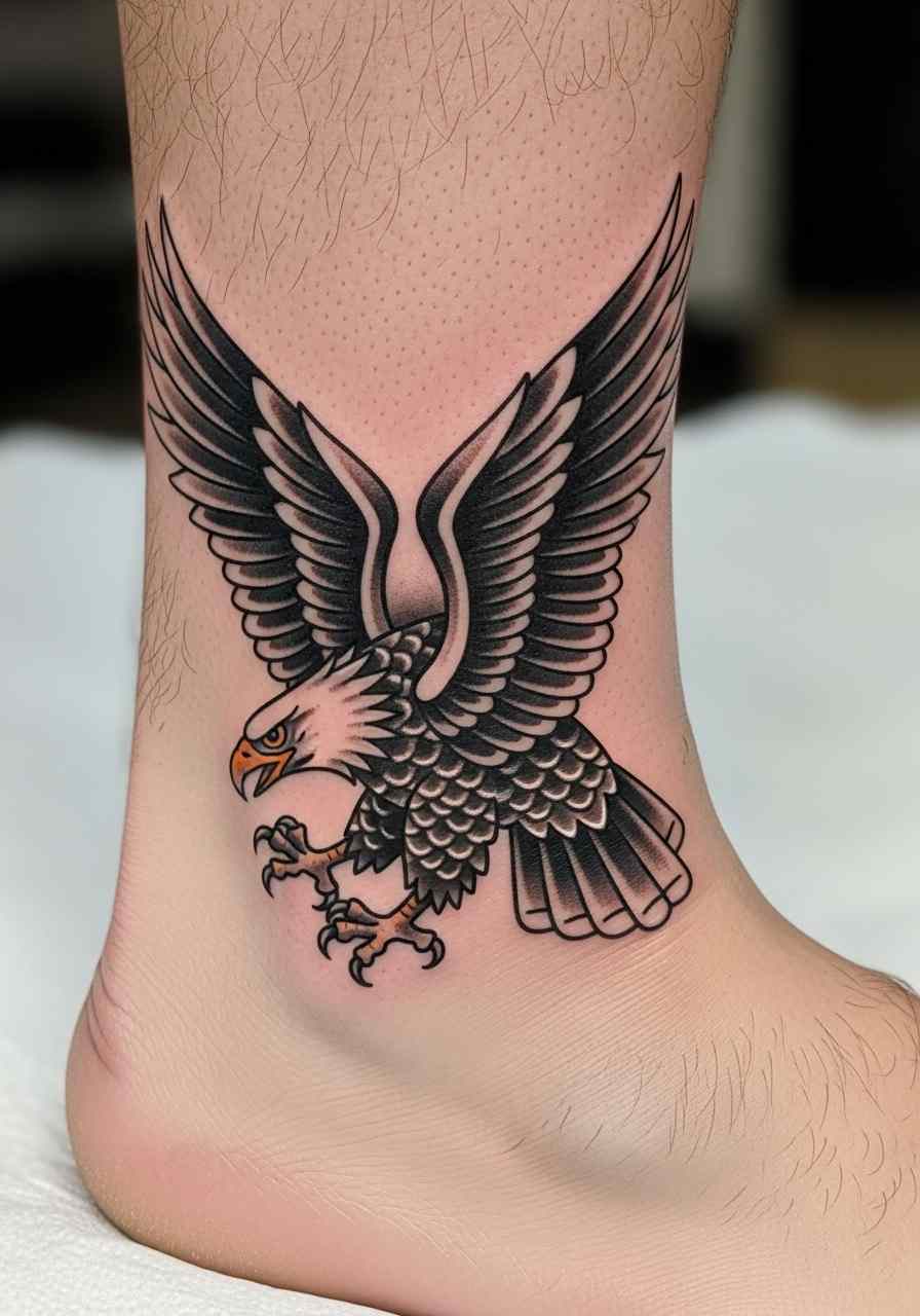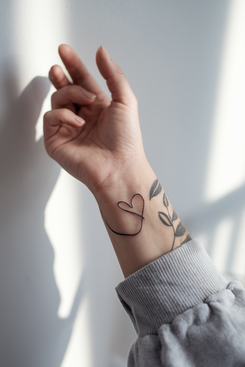
A minimalist tattoo succeeds or fails on restraint, not on how small it is. That is the single most useful thing I have learned after a decade of sitting in studios and watching people talk artists into adding one more detail.
The pieces that still look sharp five and ten years later are almost always the ones where somebody was willing to remove an element rather than squeeze it in.
Below are 21 minimalist tattoo ideas I keep coming back to, grouped by the visual approach behind them rather than by subject. If you are drawn specifically to the unbroken-stroke look, the single line tattoo ideas guide goes deeper on that one technique.
I have also included the practical parts nobody posts about: what actually holds up, what blurs, and where these designs sit best.
Which Minimalist Style Is Right for You?
Minimalist is a category, not a technique. These are the five approaches I see most often, and they age very differently.
| Style | Looks Like | Ages | Best For |
|---|---|---|---|
| Fine line | Thin, even black outlines | Softens gradually; may need a touch-up in 5–10 years | Botanicals, script, delicate symbols |
| Single needle | The thinnest possible line | The most fragile of the five — expect fading first | Very small, very detailed pieces |
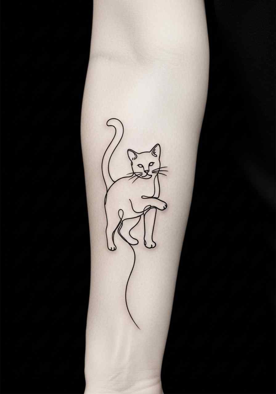
| Continuous line | One unbroken stroke, no lift | Well, because there is nothing to blur into | Faces, hearts, abstract shapes |
| Geometric | Straight lines, exact angles, symmetry | Well if the lines are given real weight | Mandalas, triangles, framed designs |
| Dotwork | Shape built from stippled dots | Depends entirely on dot spacing | Texture, shading, constellations |
If you are choosing between two of these, I would pick the one with the heavier line almost every time. Thin is easy to admire in a fresh photo and harder to live with.
What Actually Makes a Minimalist Tattoo Age Well
Tattoo ink does not sit still. It is deposited in the dermis and, over years, the surrounding cells shift a fraction of a millimetre in every direction.
On a large piece that movement is invisible. On a design where two lines sit a millimetre apart, it is the whole story — those two lines eventually read as one thicker line.
This is why the minimalist tattoos that survive tend to share three traits: generous negative space, lines of a consistent weight, and a shape that is still recognisable if it thickens by twenty percent.
Placement matters just as much. Skin that stretches, rubs, or gets constant sun — hands, fingers, feet, the outer forearm — will push a delicate design toward a touch-up sooner than the inner arm or the ribs will.
None of this is a reason to avoid small work. It is a reason to budget for it honestly. If cost is part of your decision, the small tattoo cost breakdown covers shop minimums, which are usually what you pay for a piece this size rather than an hourly rate.
21 Minimalist Tattoo Ideas, Grouped by Approach
I have organised these by the visual logic behind them, because that is how artists think about them and how you will get the best result from a consultation.
1. Continuous Line Designs: Heart, Infinity, and Wave
The continuous line approach means the artist does not lift the needle between elements. One stroke, start to finish.
A single line heart is the classic entry point — it reads instantly at any size, and because there is no interior detail there is nothing to blur.
The infinity symbol works the same way and has the advantage of being genuinely one loop by nature, so nothing about it is forced.
A wave rendered as one flowing line is my favourite of the three, because the curve carries the meaning without needing spray, foam, or a horizon to explain it.
The catch with continuous line work is that every wobble is permanent and visible, since there is no second line nearby to hide behind. Ask to see healed photos, not fresh ones.
2. Celestial: Moon Phases, Sun and Moon, Stars, Constellations
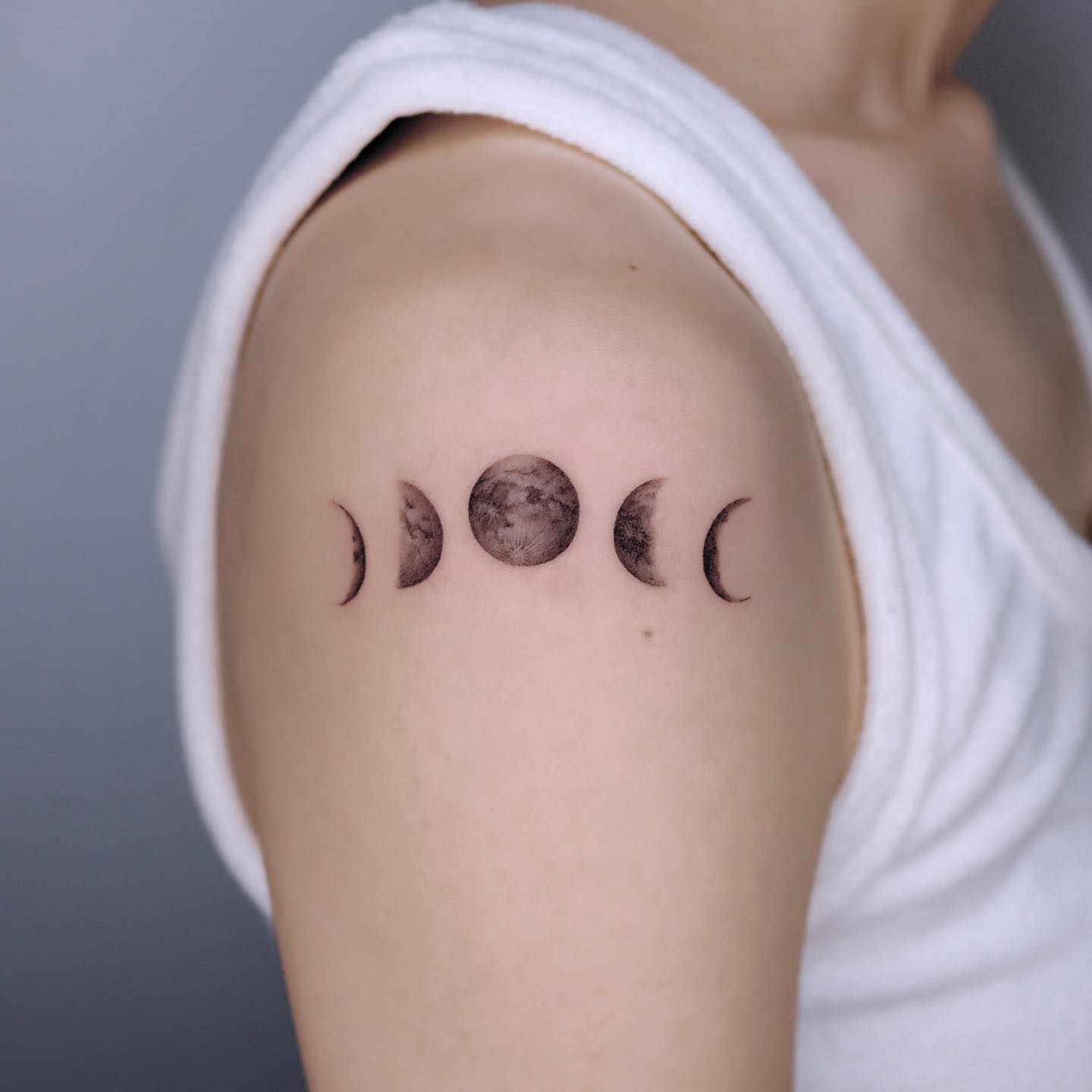
Celestial designs are the most requested minimalist category in every studio I have asked, and the reason is practical as much as symbolic: circles and crescents survive fading better than most shapes.
A moon phase row along the forearm or spine is a design where spacing does all the work. If you want to see the range, the moon phase tattoo ideas collection shows how differently the same eight shapes can be arranged.
A combined sun and moon compresses two ideas into one silhouette. Keep the rays short — long thin rays are the first thing to soften.
Simple star outlines and constellation tattoos both rely on dots. My standing advice is to have the star dots made slightly larger than looks right on the stencil, because they shrink visually as they heal.
3. Geometric: Mandalas, Triangles, and Framed Circles
Geometric minimalism trades softness for precision. A pared-back mandala keeps the symmetry of the traditional form but strips out the dense interior fill.
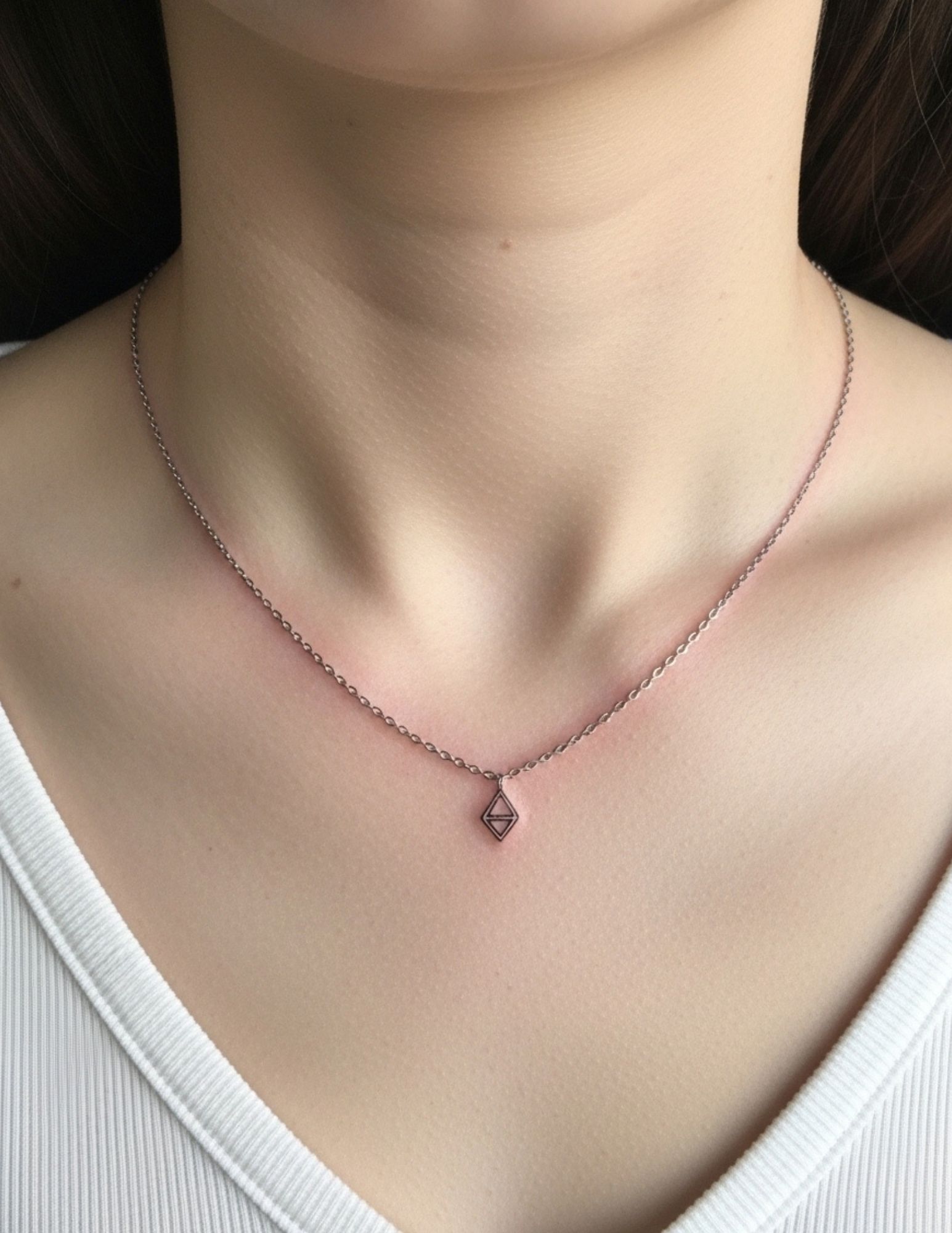
A triangle is about as simple as a tattoo gets, and it is far harder than it looks — three straight lines with three clean corners leave nowhere to hide an unsteady hand.
A fine line circle used as a frame around a small scene is a device I have seen used well hundreds of times. The frame gives a tiny design visual weight it would not have on its own.
For anything geometric, the artist matters more than the design. When I have watched people go cheap on a mandala, the giveaway is always the symmetry, not the linework.
4. Nature Lines: Mountains, Plants, and Branches
Natural subjects suit minimalism because you can remove enormous amounts of detail and the eye still fills in the rest.
A tiny mountain range reduced to three or four peaks and a single horizon line will read as mountains from across a room. Adding trees, snow caps, and a sun almost never improves it.
Small botanical stems — a sprig, a succulent, a single leaf — are the most common first tattoo I see on wrists and ankles, and they are forgiving.
A branch or twig is a good choice if you are nervous about line quality, because organic curves conceal small irregularities that a straight line would advertise.
5. Symbols with Personal Weight: Crosses and Semicolons
Some minimalist tattoos are chosen for meaning rather than aesthetics, and the design brief changes accordingly.
A single needle cross is about the thinnest work a reputable artist will agree to do. It looks beautiful fresh and it is the most likely piece on this page to want a touch-up.
The semicolon has become shorthand for continuing through a hard chapter. If that is why you are considering it, the semicolon tattoo guide covers the symbol’s background and the variations people use.
I will say one honest thing here: a tattoo can mark a turning point, but it is not treatment. If you are in a difficult stretch right now, please talk to a doctor or a mental health professional as well.
6. Dotwork and Texture Without Weight
Dotwork builds a shape from stippled points rather than lines, which lets you suggest shading without any solid black at all.
The whole technique lives or dies on spacing. Dots placed too close together will migrate into each other and read as a grey smudge within a few years.
I ask artists directly how much space they leave between dots on small work, and the good ones have an immediate, specific answer. The ones who shrug are telling you something.
Dot and line combinations — a few dots trailing off the end of a line, or a dotted arc — are an easy way to add interest without adding mass.
7. Direction and Movement: Arrows and Birds
Arrows and birds both do the same job: they give a small tattoo a sense of direction, which stops it reading as a static mark.
An arrow is a long straight line, which means placement is critical. It wants a flat, stable stretch of skin — the forearm or the outer bicep — rather than anywhere that curves sharply.
A bird in flight built from three or four strokes is one of the most efficient designs in tattooing. Anything more detailed at this size stops being a bird and starts being a blob.
If you want several birds, resist the urge to make them all different sizes. In my experience the version that ages best keeps them close in scale and varies the angle instead.
8. Micro-Lettering and Single Words
Text is the minimalist category I am most cautious about recommending, and it is worth being clear why.
Letters have interior gaps — the hole in an a, the loop of an e — and those gaps are the first thing to close as ink spreads.
A short word in a clean sans-serif at a reasonable size will be fine. The same word in a thin script at fingertip scale often will not be.
If you are set on lettering somewhere small, ask about placement first. The finger tattoo guide explains why that particular location is the hardest place on the body to keep crisp.
Variations Worth Considering
If none of the above is quite right, these adjacent approaches keep the minimalist feel while changing one variable.
Blackwork at a Small Scale
Instead of thin outlines, use small solid black shapes. A filled crescent, a solid triangle, a black band.
This is the single most durable option on the page. Solid black holds its edge for decades in a way that a hairline outline cannot.
Fine Line With One Accent Colour
A black linework design with one small area of colour — a red dot, a muted green leaf — keeps the restraint while adding a focal point.
Be aware that lighter colours fade faster than black, so the accent will likely soften before the outline does.
Negative Space Designs
Rather than drawing the shape, the artist tattoos around it, leaving the design in bare skin.
It is a striking effect and it requires more ink, not less, so do not expect it to be cheaper than the outline version.
Matching or Companion Pieces
Minimalist designs are the natural fit for matching tattoos, because two simple shapes read as a pair far more clearly than two complex ones do.
Splitting a single design across two people — half a sun each, two halves of a line — is the version I have seen hold up best over time.
Getting the Best Result: Practical Advice
Book a consultation before you book the appointment. Fifteen minutes with the artist will tell you more about line quality than an hour of scrolling their feed, because feeds are full of fresh work photographed under ring lights.
Ask specifically for healed photos of small work, at least a year old. Any artist who does a lot of fine line will have them, and the ones who do not have them usually do not do much of it. Placement is worth the same scrutiny — the tattoo pain chart by placement is useful for narrowing this down if you are new to it.
Aftercare for delicate work is the same as for anything else, just less forgiving of shortcuts. Keep it clean, keep it moisturised, keep it out of the sun, and do not pick. The American Academy of Dermatology publishes straightforward guidance on caring for tattooed skin, and the FDA tattoo fact sheet covers ink safety and reaction risk.
Sun protection is the highest-return habit for a minimalist tattoo specifically. A thin black line has very little pigment to lose, so UV exposure costs it proportionally more than it costs a heavy piece. And if something looks wrong while healing — spreading redness, heat, pus, a fever — that is a doctor’s call, not an internet one. The tattoo healing stages guide explains what normal actually looks like week by week, and Mayo Clinic lists the risks worth knowing before you sit down.
Common Mistakes and What to Do Instead
The most frequent one is going too small. People pick a size that fits the idea perfectly today and leaves no room for the ink to move.
The second is adding detail during the stencil stage. If you find yourself asking for one more line, that is usually the moment to stop.
The third is choosing the artist by price. Minimalist work looks cheap to produce because it takes twenty minutes, but you are paying for line control, and that is the most expensive skill in the room.
Still not sure what you want? Browsing by scale rather than by subject often helps. The tiny wrist tattoo ideas and simple tattoo ideas collections are both good places to see what works at this size before you commit to a concept.
Frequently Asked Questions
How long do minimalist tattoos last before they need a touch-up?
It varies far more than most guides admit, because it depends on line weight, placement, and sun exposure more than on any fixed timeline. Fine line work on a protected area like the inner arm often holds for many years without attention. The same design on a finger, a foot, or a hand can look noticeably soft within a couple of years. Your artist can give you a realistic estimate for the specific piece and placement, and many will do a small touch-up at a reduced rate.
Do minimalist tattoos hurt less because they are small?
They usually take less time, which is a real advantage, but the sensation itself depends far more on where the tattoo goes than on how big it is. A tiny piece on the ribs or the sternum can be considerably more uncomfortable than a larger one on the outer thigh. Fine line work with a single needle is often described as a sharp scratch rather than the vibration of a heavier machine. Most small designs are finished in well under an hour, so the whole experience is short.
Can a minimalist tattoo be covered up or removed later?
Small, light designs are generally among the easier tattoos to cover with a larger piece, because there is little dense black to work around. Laser removal is also an option, and fine line work typically needs fewer sessions than heavy solid black would. That said, removal is a medical procedure with real costs and skin risks, so it should be discussed with a licensed practitioner rather than treated as a casual undo button. Never attempt any at-home removal method.
Is fine line tattooing safe for sensitive skin?
For most people it is no different from any other tattooing, but sensitive or reactive skin is worth raising with the artist before you book. Some people react to specific pigments, and red inks are the most commonly reported culprit. If you have eczema, psoriasis, keloid scarring, or a known ink allergy, speak to a dermatologist first — they can advise on placement and whether to patch test. A good studio will not be annoyed by the question.
What is the best placement for a first minimalist tattoo?
The inner forearm is the placement I recommend most often for a first small piece. It is comparatively low on the pain scale, easy to keep clean while it heals, easy to cover for work, and it is not a high-friction or high-sun area. The upper arm and the shoulder blade are close seconds. I would steer a first-timer away from fingers, hands, and feet, not because they look bad but because they fade fastest and disappoint people who were not warned.
Quick Summary
- Minimalism is about restraint, not size — removing an element usually improves the design.
- Negative space is what keeps a small tattoo readable as the ink spreads over time.
- Heavier lines age better than the thinnest possible ones; when torn between two options, pick the bolder.
- Placement drives longevity: inner arm and ribs hold up, while fingers, hands, and feet fade fastest.
- Celestial, geometric, and nature subjects adapt to minimalism best because detail can be stripped without losing meaning.
- Dotwork lives or dies on spacing — ask your artist how much room they leave between dots.
- Always ask to see healed photos of small work, ideally a year or more old, not fresh studio shots.
- Sun protection is the highest-return aftercare habit for thin black linework specifically.