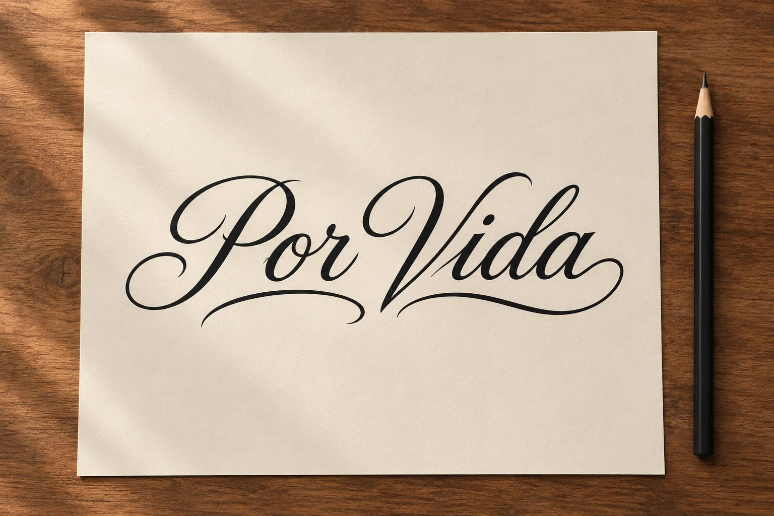
A Por Vida tattoo is commonly understood as “for life”: a statement of lasting commitment. What that commitment refers to depends on the wearer. It could be a relationship, family bond, memory or personal promise. The words also have documented use in gang-related writing, so the translation alone does not explain every tattoo or how other people may read it.
If you are choosing the phrase, decide what you mean by it before choosing a font. If you are trying to understand someone else's tattoo, avoid assuming their story from two words. This guide separates the language, the documented context and the design decisions.
Every image on this page is an AI-generated lettering concept. These are not photographs of real or healed client tattoos, historical artifacts, or ready-to-use stencils. Have an artist redraw the design and check the wording before tattooing.
What does “Por Vida” mean?
In this tattoo context, the intended reading is usually “for life,” with the idea of an enduring bond or promise. It does not identify the object of that promise. “For life” leaves an obvious question: for life with whom, or committed to what?
There is a useful language distinction. Collins lists the fuller Spanish expression de por vida as “for life.” A historical source discussed below records Por Vida in a specific cultural setting. A short tattoo inscription and a complete everyday sentence are not interchangeable in every situation. Ask a fluent Spanish speaker to review any longer wording you plan to add.
| Layer | What it tells you | What it cannot establish |
|---|---|---|
| Translation | A lasting or lifelong commitment is the intended idea | Who or what the commitment concerns |
| Personal explanation | The wearer's own relationship to the phrase | How every other viewer will interpret it |
| Surrounding imagery | Additional context that may clarify the message | A reliable conclusion about someone's identity from appearance alone |
Gang and prison associations: why context matters
The association should be acknowledged accurately. The California POST Gang Awareness instructor guide dated March 1, 1994, archived by the U.S. Office of Justice Programs, includes “P/V (Por Vida)” and the translation “For Life” in a section on Hispanic gang graffiti. That is evidence of historical use in gang writing. It is not a census of tattoo wearers or a current guide to every community.
The document does not establish that every Por Vida tattoo indicates gang membership, or that the phrase belongs to one particular group. Equally, a personal intention cannot guarantee that strangers will read it as intended. Some viewers may associate the wording with gang or prison imagery, especially when it appears with additional identifiers. Do not copy an unfamiliar emblem, abbreviation or number from a reference image just because you like the layout.
For a new tattoo, discuss the complete design with an artist who understands its local context. For an existing tattoo on someone else, the wording alone is not a sound basis for labeling the person. Chicano art, Spanish-language lettering and gang identification should not be treated as interchangeable categories.
Possible personal meanings
The following are ways a person might explain their choice, rather than fixed meanings assigned to everyone who wears the phrase.
- A lasting relationship: the words can express an intention to remain committed to a partner, family member or friend.
- Remembrance: someone may use the phrase to describe a bond they intend to carry after a loss. A name or date can make that private reference clearer, if the wearer wants to share it.
- A personal promise: the inscription may be a reminder of a value or commitment the wearer wants to maintain.
Try writing your explanation as one plain sentence: “This means ___ to me.” If that sentence is difficult to complete, choosing an elaborate font will not resolve the uncertainty. You can keep the explanation private while still being clear with yourself and your artist.
Lettering concepts to discuss with your artist
These examples show different visual treatments of the same words. A rose, heart or ribbon is a design choice here; none removes the contextual questions above or guarantees a particular reading. Compare spacing, weight and layout before adding more symbols.
1. Open cursive
Open loops and a long lower flourish give the words a flowing horizontal shape. The large capitals establish the beginning of each word.
Keep the decorative stroke separate from the letters. Ask the artist to preserve the word break and the small spaces within the o, d and a at the intended size.
2. Understated serif capitals
Serif capitals emphasize the inscription itself. The straight underline makes a simple boundary without adding another subject.
Compare spacing around the V and I. This is a useful direction if you want a clear typographic statement, but a plain font does not guarantee that others will overlook the phrase’s associations.
3. Two-line brush lettering
Stacking Por above Vida changes the proportions from wide to nearly square. Broad brush shapes make the two words feel like one compact composition.
Ask the artist to balance the word widths rather than forcing every letter to the same size. Keep enough room between the lines for the words to remain separate.
4. Lettering with a rose
A red rose adds a separate visual focal point below the black words. In a personal brief, the flower could refer to someone or simply reflect a preferred design.
Decide whether the lettering or bloom should lead. Let the artist adjust the flower size without covering the bottom of the words, and explain any specific personal reference yourself.
5. Lettering within a heart
The single heart outline frames the phrase as one contained emblem. It can support a relationship-focused intention when that is the wearer’s own explanation.
Keep the border away from the letter edges. Do not assume that a heart makes every viewer understand the same relationship or removes the wording’s other possible associations.
6. Lettering on a ribbon
A curved ribbon gives capital lettering a defined surface. Folded ends add depth while the words remain on one front-facing band.
Read the letters independently of the folds in the stencil. Avoid letting a ribbon edge become an accidental stroke in the P, R or A.
7. Botanical framing
Two leafy sprigs leave the words in an open center. The side elements frame the inscription without turning it into a dense floral panel.
Check the gaps between the leaves and flourishes. If the plants have a personal connection, name that reference in your brief rather than assuming the image communicates it automatically.
Choose placement around readability
A two-word inscription can look wide and relaxed in one line or taller and more compact in two. Compare paper layouts before deciding on a body location. Ask the artist to place the stencil on the actual area and let you read it with your body relaxed.
Focus on the space inside the letters and between the words. In cursive, make sure the P, r, V and d remain distinct and that a flourish is clearly decoration. In capitals, watch for crowded spacing around the V and I. Ask to see healed lettering in the artist's portfolio so you can assess their work beyond a fresh photograph.
Our initials tattoo ideas explore related choices about letter shapes and personal references. For a more restrained treatment, compare the open spacing in our minimalist tattoo ideas. Neither collection replaces a spelling and context check for this phrase.
What to put in your artist brief
- Supply the exact wording. Write “Por Vida” separately from the image. If you want a longer Spanish dedication, get that complete sentence reviewed first.
- Explain the intended reference. Tell the artist whether the phrase is about a person, memory or promise, and which details you want to keep private.
- Choose a lettering direction. Bring one example for the letterforms and another for the overall arrangement. Ask for an original drawing.
- Review every added mark. Understand any emblem, initial, date or abbreviation before including it. A decorative addition can change how an inscription is read.
- Read the final stencil slowly. Check each letter and word break, then look again from the intended viewing angle.
If you are researching the broader visual tradition, our Chicano tattoo drawings collection offers examples of lettering and black-and-grey composition. Treat it as further visual research, not evidence that every Spanish phrase has the same history.
Frequently asked questions
Is a Por Vida tattoo always gang-related?
No. Historical gang-graffiti use is documented, but that does not establish the meaning of every tattoo. The wearer's explanation and the surrounding context matter. Avoid drawing conclusions about a person from the phrase alone.
Does Por Vida mean “for life” or “forever”?
“For life” is the useful direct reading in this context. A wearer may use it to express an enduring bond, but “forever” is a broader personal interpretation. For a longer inscription, have the complete Spanish wording checked rather than translating each word separately.
Can it be a family or memorial tattoo?
It can be intended that way. Explain the specific connection in your brief and decide whether the words alone express enough for you. Adding a name, date or familiar flower can make a personal reference more explicit, but the choice is yours.
Does the lettering style change the meaning?
It changes the appearance and can influence associations. It does not create one reliable, universal definition. Choose the style for readability and its relationship to your intended message, and understand the complete design before committing.
Is “de por vida” the same wording?
It is a fuller Spanish expression that dictionaries translate as “for life.” It is not the identical inscription. Ask a fluent speaker which expression fits your intended sentence or dedication before changing the text.
Sources and limits
Checked November 5, 2026: Collins Spanish-English Dictionary, “de por vida”; California POST, Gang Awareness, March 1, 1994, PDF page 51. The latter is a historical training document, not a current directory of tattoos or a basis for identifying an individual. Personal-meaning examples and lettering advice on this page are editorial suggestions.