Initials tattoo ideas start with the letters themselves: one capital, two spaced initials or a small group arranged as a monogram. These 16 designs compare serif, sans serif and cursive forms with simple frames, flowers and a few color accents. The sample letters are placeholders for your own choice, so begin by checking how your actual initials change each layout.
All 17 images are AI-generated: 16 distinct design concepts plus a separate forearm placement mockup. They are not photographs of real tattoos or healed client work. The lettering is illustrative, not a traced signature or a finished stencil. Ask your artist to redraw and verify your chosen letters.
Choose the letterforms before the decoration
A serif is a small finishing stroke attached to a letter; a sans serif form omits those strokes. Adobe’s guide to serif and sans serif type explains the distinction. It is a vocabulary aid for describing the look you want, rather than evidence that one style always works better as a tattoo. Source checked November 1, 2026.
Spacing is a separate decision from the shape of the letters. Adobe distinguishes kerning, which adjusts a pair of characters, from tracking, which adjusts a selected range. In an initials design, ask the artist to compare the spaces around the actual pair. An A beside a J leaves a different-looking gap from two broad letters. Source checked November 1, 2026.
Decide what each letter stands for and in what order you want it read. A personal monogram, two people’s first initials and three letters from one name do not have to use the same arrangement. Write the meaning and order in plain text before discussing any overlap, larger center letter or decorative frame.
If a complete name feels more appropriate, compare our name tattoo ideas. For a parent-focused layout with names or dates, the kids’ name collection offers a related direction. The designs below concentrate on the shape, spacing and framing of initials.
1. One serif capital A
A single capital is the most direct place to start. The serif A has small finishing strokes, a triangular interior space and a clear crossbar. With no frame or illustration, the quality of the letter outline becomes the entire composition.
Your initial may have a very different silhouette. Ask to compare two or three drawn versions of the actual letter, then look at them at the proposed size. Pay attention to the interior openings as well as the outline, especially if you are choosing a more ornate form.
2. Two spaced sans serif initials
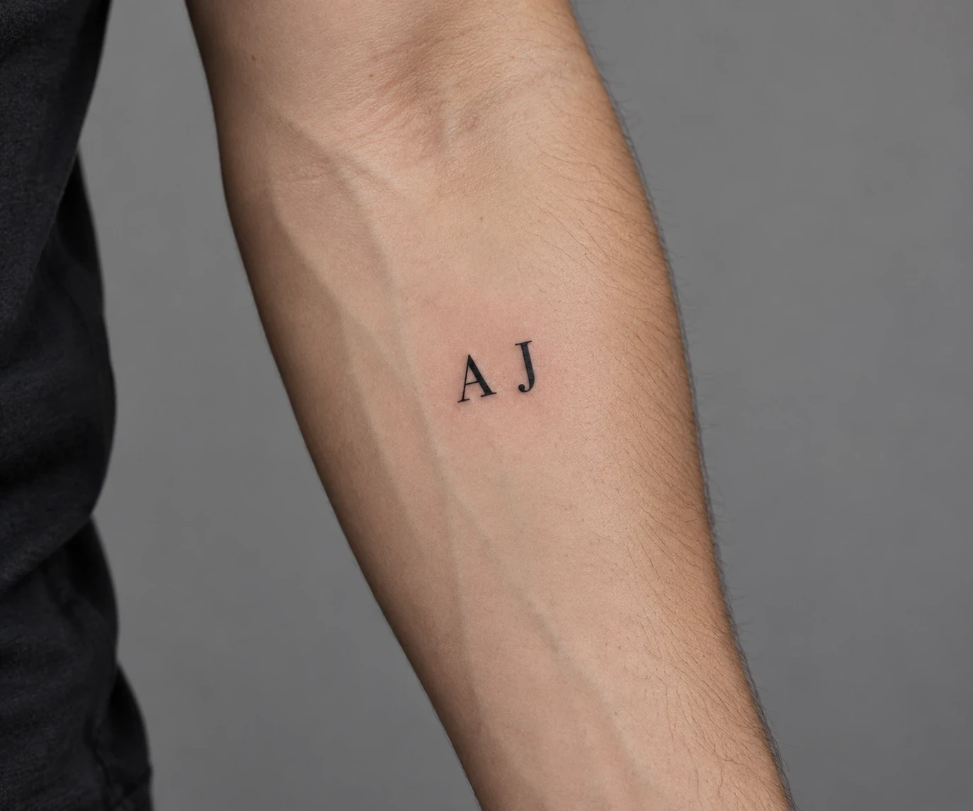
The sample A and J share a baseline but remain separate. Their plain strokes keep attention on the pair and the gap between them. Removing serifs and connectors creates a quiet, compact composition without making the initials look like a single invented symbol.
Check the spacing visually rather than asking for two mechanically identical boxes. A narrow J and a broad A occupy space differently. Before approving the design, confirm which initial comes first and whether both should have equal height and weight.
3. A cursive L with one restrained loop
This version uses one looping capital L and a short trailing stroke. The curve gives the letter a handwritten character, while the limited flourish leaves the main form easy to follow. It is a generated lettering example, not anyone’s actual handwriting.
If your idea depends on a loved one’s handwriting, bring the original note or a clear scan. A generic cursive font cannot establish that connection for you. For a newly drawn letter, ask the artist to keep the part that makes it recognisable before adding extra loops.
4. A and J in a vertical stack
Stacking the two initials changes the composition from a horizontal pair into a taller mark. The sample keeps their heights equal and leaves open space between the A and J. The top-to-bottom reading order is clear because the letters do not touch.
Compare the full stack against your intended placement rather than assessing each letter separately. Your initials may need different spacing to feel balanced. Decide whether both letters should remain equally prominent or whether one has a deliberate reason to be larger.
5. An M inside a thin circle
A simple circular outline gives one letter an enclosing shape. The sample M sits in the center with room between its serifs and the frame, making the two elements distinct. The circle adds a badge-like outline without needing a larger illustration.
Look at the relationship between letter weight and frame weight. A heavy outline could dominate a light initial, while a tight circle could make the composition feel crowded. Ask for a version with more open space before deciding how compact it should be.
6. A leafy wreath around two initials
Two curving branches create a soft frame around the A and J. The opening above keeps the wreath from becoming a solid enclosure, and the letters remain separate from the leaves. It offers more botanical detail than a plain circle without turning the initials into stems.
Replace the sample pair before refining the branches. Wider initials may need a broader wreath; taller ones may change the opening above. Keep the leaves away from letter openings so the decoration supports the reading of the initials rather than competing with it.
7. A red flower beside the letter A
A small flower and green stem add color to a clear black capital. The botanical element sits beside the letter, leaving the A’s main strokes and interior opening visible. The contrast is between one structured form and one organic form.
Choose the flower for a reason that belongs to you, or simply for its shape. This sample does not assign it a birth month or fixed meaning. Ask the artist whether a smaller flower, a shorter stem or a different leaf angle helps your actual initial remain the focal point.
8. Two initials inside a heart
The A and J sit within a thin heart outline, with blank space around both letters. Keeping the pair separate avoids turning the center into a dense knot. The frame supplies the familiar shape, while the initials carry the personal reference.
The relationship can be romantic, familial or another connection you choose. Specify the intended reading order and compare a plain heart against any extra flourish. If the outline passes near a letter, check that the two do not look accidentally joined.
9. A lightly overlapping A and B
A two-letter monogram can feel like a single mark while still allowing both initials to be read. Here, the A and B overlap slightly instead of sharing every stroke. Their open interior spaces are important to recognizing each letter.
This is the option to review most critically when substituting your own initials. Some pairs combine clearly; others become ambiguous. Ask the artist to show the letters separately and together, then confirm that the combined form still reads as the exact pair you intended.
10. Three initials at the same height
The A, B and C run along one line in a typewriter-like serif treatment. Each letter has the same visual status, with no enlarged center character. This makes the layout more like a short line of lettering than a traditional-looking central monogram.
Write the order explicitly in the brief. If you want a larger middle letter, explain which name it represents instead of assuming everyone uses the same convention. Compare the three-letter string as a whole, including the space before the first and after the last character.
11. Lowercase a and j
Lowercase letters change the rhythm of the pair: the a has an enclosed bowl, while the j brings a dot and a descender below the baseline. Their different parts make the layout less rigid than two equal-height capitals.
Case matters, so mark it clearly in your reference. Check that the j’s dot remains separate from any decoration and that its descender has room below. If a lowercase letter could be mistaken for another character, compare a different drawn form before approving it.
12. An A in negative space
This design reverses the usual relationship between ink and letter. A light A is reserved inside a black disk, so the surrounding shape makes the initial visible. The triangular opening and crossbar still need to read as parts of the same letter.
Treat the black area as part of the composition when judging scale. It has a different visual weight from a thin circle outline. Ask the artist to compare the interior spaces and explain how they would draw the final version for your placement; the image cannot predict a finished result.
13. An M inside a tall diamond
An elongated diamond turns the single initial into a vertical composition. The M stays separate from the four sides, while the pointed ends extend the design above and below it. Straight frame edges give it a different character from the circular version.
Check the overall length as well as the letter size. A tall frame can occupy more room than the initial suggests on its own. Compare the stencil with the body relaxed and turned, and keep the letter visibly distinct from the nearby frame lines.
14. A blue J with a separate underline
A muted blue capital creates a color-focused version of the single-initial idea. A short black underline adds a second element without enclosing the letter. The gap between the J and the line keeps them from reading as an accidental extension of one stroke.
Compare it with an all-black version before deciding which contrast you prefer. The generated color is an illustration, not a forecast of how ink will look on your skin. Ask to see the artist’s own work and discuss the intended balance between letter and underline.
15. A and J on a small ribbon
The ribbon gives the pair a flat central panel and shaded folded ends. The letters sit on the front surface, leaving the folds free of text. This separates the message from the decorative structure and avoids trying to wrap characters around a bend.
Keep both initials away from the panel edges. If you change the letters or add another, the banner may need to be redrawn rather than stretched. Decide whether the lightly shaded folds contribute enough to justify the extra detail compared with a plain framed pair.
16. An L with a small four-point star
One small star balances a single serif L without surrounding it. The two elements remain separated by blank space, so the initial keeps a clear outline. Compared with the blue J, this option adds a symbol rather than a second color.
Choose the position of the star after setting the final letterform. A different initial may already have a strong upper flourish, and the star could then feel crowded. The symbol can carry your own association, but the design does not require a universal meaning to work.
Review the actual initials at the actual size
A sample A and J are a layout demonstration. Replacing them with other letters can change the width, the open spaces and the balance of a frame. Ask to see your complete design as a stencil at the intended scale before judging it from an enlarged screen image.
- One letter: compare the shape and the open spaces inside it.
- Two initials: check the order, baseline and gap between the forms.
- Three or more: decide whether they have equal status or a deliberate hierarchy.
- A framed design: judge the overall outline as well as the lettering.
For a simpler direction, compare our minimalist tattoo collection. If the initial will sit among other small pieces, our patchwork ideas can help you think about the space around it.
Check every letter, dot and connecting stroke
Give the artist the intended characters in plain text, including upper- or lowercase, punctuation and the reading order. Review the final drawing letter by letter. Check the openings in forms such as A and B, the dot above a lowercase j, and any flourish that could be mistaken for another character.
A monogram does not need to hide its ingredients to feel personal. If an overlapping design becomes hard to read, compare a separated version before adding more ornament. Ask to see the stencil in the intended orientation and decide how you want it to face when your body is at rest.
Prepare a short, specific artist brief
For example: “The uppercase initials A then J, equal height, spaced apart in black serif lettering, with no connecting flourish.” Add the placement, the approximate space available and any reference lettering you want discussed. Ask the artist to review the final drawing and provide aftercare instructions.
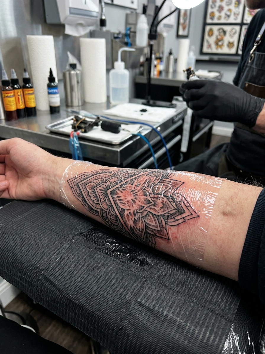
The mockup does not establish a suitable line weight, minimum size or healed appearance. Compare the artist’s own lettering work and discuss the details of your proposed design. If the concept uses handwriting, keep the original reference available so changes can be checked against it.
Initials tattoo questions
Should initials be separated or joined?
Either can work visually. Separated letters make the order obvious; overlapping forms create a more compact mark. Compare your actual pair in both arrangements and choose the one you can read without explanation.
What order should three initials use?
Use the order and hierarchy you intend, then state it explicitly. Equal-height letters and an enlarged middle initial can suggest different arrangements. Explain what every character represents before the artist develops the composition.
Can the sample letters be replaced with my own?
Yes, but the artist may need to redraw the layout. Different letter widths, loops and openings can affect the frame and spacing. Treat the samples as starting points rather than templates that can be changed without review.
Do these pictures show actual clients’ tattoos?
No. The images are AI-generated concepts and a placement mockup. They are not traced handwriting, finished stencils or healed results. Verify the exact letters in the separate final drawing with your artist.