Zelda tattoo ideas work best when you begin with the game, object or memory you actually care about. A Triforce has a different shape and emphasis from an ocarina, a shield or a mask. These 16 designs compare recognizable symbols and inventory-inspired objects, with practical notes on simplifying them for an artist’s drawing.
All 17 images are AI-generated, unofficial fan-inspired concepts: 16 distinct designs plus a separate forearm placement mockup. They are not official Nintendo artwork, photographs of real tattoos or healed client work. Use the game reference you prefer alongside these interpretations when discussing the final design.
Choose the reference before combining symbols
The series spans different games and visual treatments. Decide whether your reference is a particular game’s equipment, a recurring symbol or a broader memory of playing. Mixing objects can be a personal choice, but an exact game-specific tribute needs a consistent reference set.
Nintendo’s official Triforce page identifies its three pieces as Power, Wisdom and Courage, associated with Ganondorf, Princess Zelda and Link respectively. That establishes the fictional context; it does not assign a compulsory meaning to anyone’s tattoo. Source checked November 2, 2026.
For older-game references, Nintendo’s Ocarina of Time 3D quick guide documents the ocarina, rupees, life-energy display and inventory screens. Its Majora’s Mask instruction booklet is a separate reference for that game. Check the actual item appearance you want, rather than assuming every version has identical details. Sources checked November 2, 2026.
Bring your artist a small selection of clear references and identify the features you want preserved. For a wider comparison of game-inspired compositions, our gaming tattoo collection explores other approaches to symbols and objects.
1. A clear three-part Triforce
Three equal upright triangles create the larger triangular silhouette, leaving an inverted opening at the center. That gap is as important as the filled shapes. The muted gold treatment gives the symbol color while keeping the geometry uncomplicated.
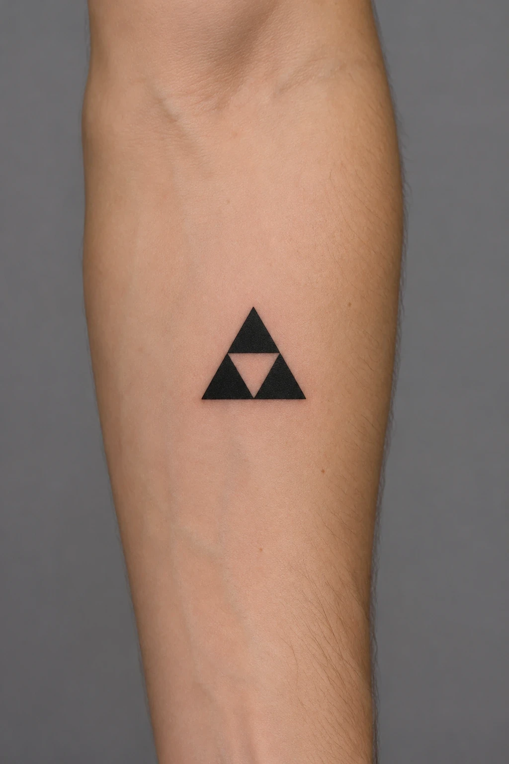
Check that the three triangles match and the central opening stays clear in the final drawing. You could choose black instead of gold, as the separate hero mockup demonstrates. Describe the visual color you want without expecting a metallic finish from the generated illustration.
2. The Master Sword on its own
The long silver blade and purple-blue guard make a tall composition with an obvious center line. Leaving the sword separate from flowers, text and other equipment lets the shape of the hilt do more of the identifying work. The sample uses restrained color around the guard.
Choose the version of the sword before refining the details. Ask the artist to check a continuous blade, a balanced guard and the transition into the grip. Review its full length against your intended placement rather than judging the hilt in isolation.
3. A blue Hylian Shield
The blue field, silver border and red bird motif give the shield several distinct areas. A small Triforce above the bird adds another recognizable detail. The outer shield shape needs to remain clear even if the internal decoration is simplified.
Start by deciding which details are essential at the proposed size. The small triangles and wing shapes can become the busiest area. Ask to compare a simplified crest against a more detailed version instead of reducing every line unchanged.
4. A blue ocarina
The rounded body and short mouthpiece make the ocarina a compact alternative to a long sword. Finger holes give the surface a clear structure, while the blue shading distinguishes it from a generic bottle or stone. A small collar detail provides a second focal point.
The illustration is an interpretation, so compare it with the game instrument you remember. Check which holes are visible from the chosen angle and how the mouthpiece attaches. If you want musical notes added, provide the intended sequence separately and verify it before it becomes part of the drawing.
5. Majora’s Mask as the focal object
The heart-like outer shape, large eyes and pointed edges give this mask a dense, graphic silhouette. Purple, orange and green create contrasting panels. Keeping it as a standalone object leaves room to assess the face and the surrounding spikes.
Review symmetry without demanding that every small decorative mark be copied at miniature scale. Ask which panels and spikes carry the recognition. If the eyes become too crowded, compare a larger drawing or a simpler treatment before adding a background.
6. A small blue fairy
A luminous central orb and translucent wings make this Navi-inspired design light and compact. The concept uses four distinct wings, with two larger above and two smaller below. It avoids adding a face or a miniature human body inside the glow.
Check that every wing has a clear attachment and a separate edge. The glow is an illustrative effect, not a prediction of the finished tattoo. Ask the artist how they would keep the orb and wings distinct using their chosen outlines, shading and color.
7. Three colored rupees
Green, blue and red gems create a short diagonal group. Each crystal remains separate, with facets that explain its shape. The color differences give the composition rhythm without adding numbers, a wallet total or another inventory object.
Decide whether you want one rupee or a deliberate group before changing the scale. Three separate gems need space between them as well as inside their facets. If their game values matter to your idea, verify the rules for your selected title rather than treating this color arrangement as a numeric message.
8. A red Heart Container
A red heart-shaped center sits within a gold ornamental rim. The simple inner shape and more detailed border give the design two levels of complexity. The center should remain recognizable before the eye begins following every small part of the frame.
Choose the game reference you want because heart-item artwork varies. This interpretation is not a screen-accurate inventory icon. Ask the artist which pieces of the rim can be simplified while preserving the red center and the overall heart silhouette.
9. A Hookshot-inspired mechanism
The blue housing, short chain and grappling end make the subject more mechanical than the other objects. Keeping the chain fairly direct gives the eye a path from the main body to the hook. The three prongs need to read as one connected end piece.
This is a stylized interpretation, so bring the exact game reference if its mechanism matters to you. Review the chain connections, handle and hook as a single object. A longer chain or more complicated curve may change the whole layout rather than simply adding detail.
10. An ornate boss key
The gold shaft and rectangular teeth give this key a clear working-object outline, while the skull-like bow and red jewel add a fantasy treatment. The contrast between rounded upper decoration and straight lower stem gives the piece direction.
Choose which key design you mean before the artist develops it further. A general dungeon-key reference and an exact inventory icon are different briefs. Check that the bow, shaft and teeth connect coherently, then simplify small openings if they compete with the full silhouette.
11. A corked red potion bottle
A simple glass vessel and cork make a quieter inventory-inspired design. The red fill creates a clear color area, with open glass above it to show the bottle’s structure. The plain neck band avoids introducing lettering that would need a separate review.
This is a fantasy-game object, not a medicinal claim or a documented physical product. Compare the bottle’s outline with the version you want to reference. If a fairy or another item belongs inside your idea, have the artist redraw the composition rather than inserting it into this sample.
12. A wooden Deku Shield
Wood grain and a red spiral-like marking distinguish this small shield from the blue Hylian design. Its rounded outline creates a compact composition, and the simpler surface decoration leaves more visible wood around the emblem. The sample keeps the shield as a single object.
Ask the artist to check the emblem against your preferred reference instead of treating a loose spiral as exact game artwork. Decide how much wood texture contributes to the design. The outer shape and red marking should still read clearly with fewer grain lines.
13. A curved yellow-orange boomerang
The bent form offers a broad diagonal silhouette with relatively little internal decoration. A blue grip accent breaks up the yellow-orange surface. Its two swept arms can create movement without adding a character or a large scene around them.
The generated shape is an interpretation of a game item. Compare the bend and proportions with a reference from the title you have in mind. Check the whole object at the proposed size before adding a trail, background or another piece of equipment.
14. A bow with one separate arrow
The wooden bow and blue grip make one curved shape, while the arrow provides a straight counterpoint. Keeping the arrow separate makes it easier to check the string, arrowhead and fletching. The pair gives the artist more layout choices than a single centered icon.
Specify the game version if that distinction matters. Ask for one coherent string and a straight arrow shaft, then compare their angle and spacing on the stencil. Avoid compressing the two objects until the arrow appears accidentally joined to the bow.
15. A simplified Hylian crest
The red winged emblem and gold Triforce make a broader composition than the three triangles alone. The two wings need clear, balanced shapes, while the upper symbol keeps its open center. The sample uses a simplified fan-inspired treatment rather than an exact official asset.
Compare the crest’s full width with the available space before refining small feather shapes. If the lower emblem overwhelms the triangles, adjust their relationship. You can also return to the plain Triforce if the simpler geometry is the part that matters most to you.
16. A wooden Deku Mask
A rounded wooden face, eye openings, projecting snout and leaf cluster make this mask distinct from Majora’s Mask. The wood and green leaves give it a more organic palette. As a standalone object, it can be assessed without a full character pose.
Check the mask against your chosen game reference, especially the eyes and the shape of the snout. These generated details are an interpretation, not an exact model sheet. Ask the artist to keep the mask’s depth clear while simplifying any small wood marks or leaves.
Match the object to the available shape
A sword creates a long line; a shield or mask needs a broader area; an orb or rupee can form a more compact mark. Compare the outer silhouette with your chosen placement before deciding how much internal decoration belongs in it. The same object may need a different angle rather than a smaller copy.
For sparse compositions, compare our minimalist tattoo ideas. If you plan to collect separate game objects over time, our patchwork tattoo collection offers ways to think about the open space between pieces.
Keep the reference and the interpretation distinct
Save the game title and reference image with your brief. Mark the details you want retained: three triangles, a particular guard shape, the shield emblem or the eye arrangement of a mask. Ask to review those details in the final drawing rather than relying on the generated concept to supply them accurately.
For mechanical objects, follow each connection from one end to the other. For symbols, count the parts and compare the negative spaces. If you add lettering or fictional script, supply the exact intended characters and a reliable reference for their meaning before approving the stencil.
Prepare a focused artist brief
A useful brief might say: “A standalone Master Sword based on this game reference, point down, with a clear blue guard and no surrounding lettering.” Add the intended placement, available space and details you want discussed. Review the artist’s own work and ask for aftercare instructions.
The generated mockup cannot establish a suitable line weight, minimum size or healed appearance. Treat it as a composition aid, then assess the actual drawing at the proposed scale. If the color treatment interests you, our colorful tattoo collection offers other palettes to compare.
Zelda tattoo questions
What does the Triforce represent?
In Nintendo’s fictional setting, its pieces are Power, Wisdom and Courage. The official page linked above explains the associations. Your personal reason for choosing it can be a game memory, a connection to one of those qualities or the geometry itself.
Do all these objects come from the same game?
No. This collection includes references associated with different entries and simplified inventory-inspired objects. Choose a consistent set if you want a tribute to one particular game; a personal collection can also intentionally combine your favorites.
Can several items become one tattoo?
Yes, but choose a focal object before adding more. A sword, shield and crest may need a different composition from any one alone. Ask the artist to show the complete outline and open spaces at the proposed size.
Are these official designs or real tattoos?
No. They are unofficial AI-generated fan-inspired concepts and a placement mockup. They are not official Nintendo artwork, finished stencils or healed client work. Verify the item details in a separate final drawing with your artist.