A Sanskrit tattoo starts with the word you want to carry, then the lettering and placement that let someone read it. Choose the intended sense before adding a flower, a line or a decorative frame. A beautiful arrangement cannot correct a word that says something different from what you intended.
These 18 Sanskrit tattoo ideas for women show nine words in two distinct compositions each: an open linear version and a botanical version. They are eighteen design concepts, rather than eighteen different translations. The words and layouts are not restricted to a gender; choose them for their personal relevance.
Image disclosure: Every image is an AI-generated lettering concept on paper, not real or healed client work. The typed text below each heading is the reference for the intended word. Have a qualified Sanskrit reader check the final wording and an artist prepare the stencil before any permanent application.
Check language, script and intended sense separately
Sanskrit is a language; Devanagari is a writing system. Learn Sanskrit's Devanagari guide explains the left-to-right script, vowel signs and consonant clusters. Keep those marks part of the lettering, rather than treating them as decoration that can be removed to make a design smaller.
The words here are presented as standalone dictionary-style forms, not complete Sanskrit sentences or quotations. Adding a person, action or possessive phrase may require a different grammatical form. The English gloss is a starting sense, not the whole range of meanings a word can have.
For example, the university-hosted Monier-Williams entries describe śānti in terms of peace and tranquillity and karuṇā in terms of compassion. The vidyā entry includes knowledge and learning. Word references checked 10 November 2026.
1. Peace in an open composition — śānti
Intended word: शान्ति (śānti). The word reference gives peace or tranquillity as a sense. The fine rule gives the word a quiet horizontal base. Keep the two dot accents away from the letterforms so the reader can distinguish ornament from the text. Small side sprigs accompany the fine rule in this concept.
A wide strip on a paper mockup is a useful way to compare the lettering with the surrounding empty space. Judge the full word at the intended size, including the signs that extend beyond its main body.
2. Peace with botanical sprigs — śānti
Intended word: शान्ति (śānti). The branches introduce a softer lower edge while leaving the word as the main subject. Their stems should remain separate from the headline and vowel marks.
Ask the artist to choose the plant shapes after the lettering is settled. A few clear leaves can be easier to balance than a dense wreath that squeezes the text into a small opening.
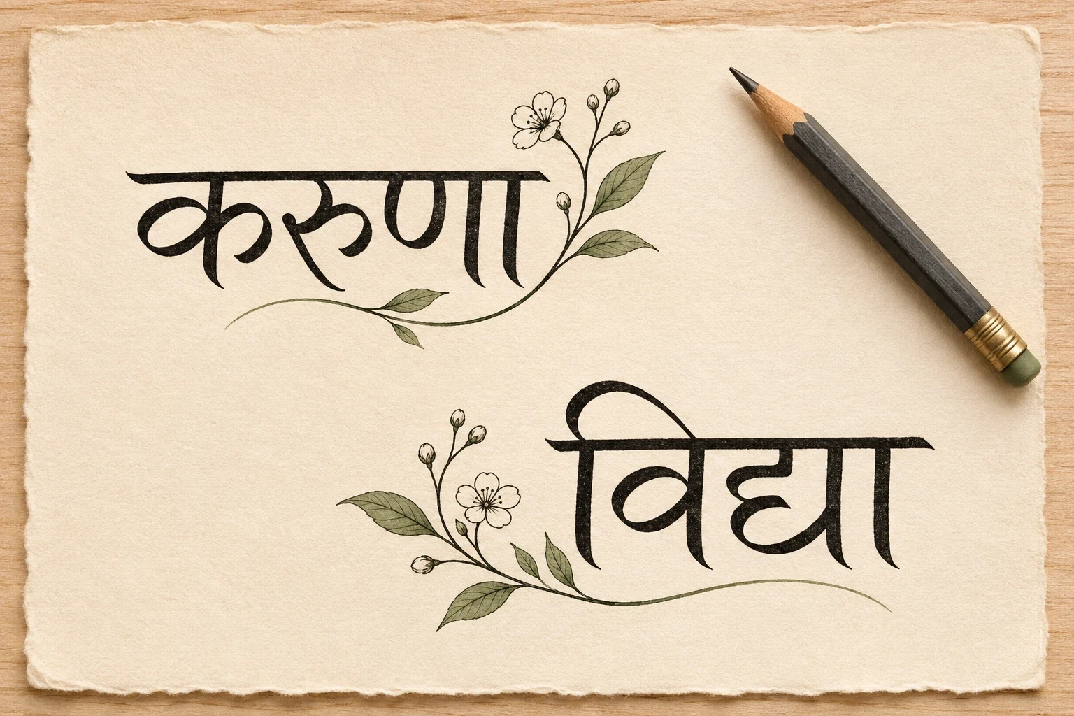
3. Compassion with a fine rule — karuṇā
Intended word: करुणा (karuṇā). The word reference gives compassion as a sense. This version gives the word space to stand alone. The straight line and dots create a second visual level without needing a complex emblem. Small side sprigs accompany the fine rule in this concept.
Keep the top of the lettering readable as a continuous word. If you prefer a shorter overall width, discuss the letter spacing with a reader and artist instead of deleting a character or vowel sign.
4. Compassion with a leafy frame — karuṇā
Intended word: करुणा (karuṇā). The botanical accents sit below the word and give the composition a broad base. The leaves are a design choice, not part of the translation.
Try the lettering without the branches first. Then add just enough foliage to support the word, checking that a leaf tip cannot be mistaken for a mark belonging to the script.
5. Friendship in a linear layout — maitrī
Intended word: मैत्री (maitrī). The word reference gives friendship or friendliness as a sense. A simple baseline lets the compact word remain the focus. This can be a starting point for someone who wants to mark a friendship without adding names. Small side sprigs accompany the fine rule in this concept.
If two people choose related tattoos, each can use a different placement or frame while keeping the agreed wording. Check both stencils individually; matching the idea does not guarantee matching text.
6. Friendship above two sprigs — maitrī
Intended word: मैत्री (maitrī). Separate branches suggest a paired composition without turning the lettering itself into two pieces. Keep the entire word together on one reading line.
For a companion tattoo, compare each version at the same printed scale. Decide whether the shared element is the word, the plant shape or both before asking the artist to vary it.
7. Joy with a light underline — ānanda
Intended word: आनन्द (ānanda). The word reference gives joy or happiness as a sense. The long opening character and joined lettering give this word a broad profile. A sparse underline leaves room for that silhouette. Small side sprigs accompany the fine rule in this concept.
Use a plain printout to decide which way the word should face on the body. Make the reading direction explicit in the brief so a reference photograph is not accidentally treated as a mirrored stencil.
8. Joy in a botanical setting — ānanda
Intended word: आनन्द (ānanda). The open foliage leaves space below the word rather than building a dense enclosure around it. The visual mood can be personal without assigning the leaves a Sanskrit meaning.
Choose the amount of color after the black lettering works by itself. A muted leaf accent should remain secondary to the word, especially when the design is viewed from a normal distance.
9. Truth with a single rule — satya
Intended word: सत्य (satya). The word reference gives truth as a sense. This is a compact word with a clear horizontal emphasis. The rule offers a restrained alternative to adding a second symbol. Small side sprigs accompany the fine rule in this concept.
Keep the joined consonant form legible in the final redraw. If you want a sentence about truth rather than a word used as a label, commission that translation separately.
10. Truth with botanical balance — satya
Intended word: सत्य (satya). The branches widen the overall shape without requiring the word to become a long inscription. The composition keeps letterforms and plants in separate zones.
Ask for a version with fewer leaves as well as the fuller reference. Compare which one gives the lettering enough space at your chosen placement.
11. Non-injury in an open layout — ahiṃsā
Intended word: अहिंसा (ahiṃsā). The word reference gives non-injury or nonviolence as a sense. The word is the subject; the thin rule helps organize the remaining space. A personal reminder to avoid harm can be expressed without inventing a new slogan. Small side sprigs accompany the fine rule in this concept.
Keep the dot within the written word distinct from the decorative dots below it. A simplified sketch must still preserve every mark that belongs to the text.
12. Non-injury with a botanical base — ahiṃsā
Intended word: अहिंसा (ahiṃsā). Two sprigs give the word a wider foundation while leaving the upper letter shapes unobstructed. This is an aesthetic arrangement, not a claim that one plant defines the principle.
Discuss your intended personal connection with the reader who checks the wording. Avoid presenting a single English gloss as an explanation of every tradition that uses the term.
13. Knowledge with minimal accents — vidyā
Intended word: विद्या (vidyā). The word reference gives knowledge or learning as a sense. This short form can carry a clear lettering-led composition. The thin line gives the design a finish while keeping the word visually independent. Small side sprigs accompany the fine rule in this concept.
Pay attention to the vowel sign and joined consonants when reviewing the stencil. Ask the artist to enlarge the word if those details become cramped at the proposed scale.
14. Knowledge with leafy detail — vidyā
Intended word: विद्या (vidyā). The botanical version offers a broader composition for the same word. The text remains on one line with open space below its lower marks.
This could mark a personal connection to study or learning. That connection is yours; the illustration does not turn the word into a specific graduation phrase or a quotation from a text.
15. Compassion in a compact word — dayā
Intended word: दया (dayā). The word reference gives compassion or sympathy as a sense. Dayā is a different word from karuṇā, even though the short English glosses overlap. This version uses the simpler word shape as the focus. Small side sprigs accompany the fine rule in this concept.
Choose between the two words for the sense and context you intend, rather than assuming that every dictionary synonym can replace another in a longer phrase.
16. Compassion above small branches — dayā
Intended word: दया (dayā). The short word leaves room for the foliage to spread on either side. Keep the branches proportionate so the small lettering does not disappear between them.
Try a slightly larger word and smaller leaves in the artist’s redraw. The relationship between these elements matters more than matching the illustration’s dimensions exactly.
17. Power with a fine baseline — śakti
Intended word: शक्ति (śakti). The word reference gives power or capacity as a sense. The word has a compact outline with marks that need clear space. An underline can provide structure without adding another major subject. Small side sprigs accompany the fine rule in this concept.
Use the ordinary sense of power or capacity only if that is what you mean. If you intend a specific theological reference, ask a knowledgeable reader to help define that context before you finalize the brief.
18. Power in a botanical composition — śakti
Intended word: शक्ति (śakti). The leaves soften the base of the design while preserving the word as its visual center. They do not change the word’s meaning or create a universal feminine symbol.
Compare a plain version alongside this one. Keep the botanical treatment because you like its visual role, rather than because a stock image claims that a particular frame is required for women.
Choose a placement for the whole word
Begin with a full-size paper mockup. Compare the word with the usable area, the position of nearby jewelry and how clothing crosses it. Keep enough space around upper and lower marks so they do not collide with a decorative frame.
A horizontal word does not have to become vertical simply because the available area is narrow. Discuss another placement or a larger scale before rotating individual letters or stacking them. The artist and language reader should review the final composition together.
For other restrained compositions, compare our minimalist tattoo ideas. If you want to plan around a short inscription, our initials tattoo gallery can help you think about spacing and framing, while the Sanskrit wording still needs its own check.
Make the lettering review concrete
- Write down the English idea you intend, including whether it is a word, name or sentence.
- Ask a qualified Sanskrit reader to confirm the sense, spelling and grammatical form.
- Keep the approved Unicode text, transliteration and a clear reference together.
- Have the artist prepare a readable stencil that preserves the approved marks.
- Review the actual stencil in its intended orientation and size before application.
Do not use a decorative flourish to fill a gap that may belong to a letter or vowel sign. Keep the approved text beside the drawing so a change to line weight or spacing can be checked against the same reference.
Frequently asked questions
Are these eighteen different Sanskrit words?
No. The gallery has eighteen distinct compositions built from nine words. Each word appears in an open layout and a botanical layout so you can compare how framing changes the design.
Are the words specifically feminine?
The gallery is selected for readers looking for women's tattoo ideas. It does not claim that these words belong to women or that grammatical gender determines who can use a design.
Can I turn one word into a sentence?
Ask for a fresh translation. A dictionary-style form is not a complete sentence, and adding context can require changes to the wording. Do not assemble a phrase by copying several unrelated tattoo captions.
Can I remove small marks to make it minimalist?
Keep all marks that belong to the approved text. Simplify the surrounding ornament first. If the lettering becomes too dense, increase the scale or choose a different layout.
Can I copy the AI image directly?
Use it as a starting reference. Have the word checked and the final design redrawn for the placement. The image is not a certified translation or a demonstration of healed linework.
Does a leaf or flower change the translation?
The separate botanical frames here are decorative choices. Their role in the composition does not add a word or turn the lettering into a longer Sanskrit phrase.