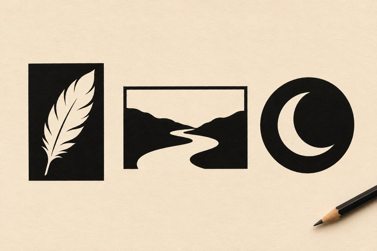
A negative-space tattoo uses the skin you leave open to make part of the design. A crescent can appear inside a black circle without a line drawn around it. A river can take shape in the gap between two dark banks. These ideas show how to use the open areas as silhouettes, paths, highlights and breaks between larger sections of ink.
Image disclosure: The hero and all 23 illustrations are AI-generated concepts. They do not show real clients or healed tattoos. The pale areas in the drawings show where an artist could leave skin uninked.
Start by deciding what the open area does
In its guide to formal analysis, the Getty describes negative space as the area around the main forms. It can define the edge of a form or become a recognizable shape in its own right. The Museum of Modern Art’s description of figure and ground is useful here: the same design can make the eye switch between an inked figure and the space around it.
To choose between these ideas, look first at the pale part. Does it depict the subject, suggest light or separate two dark forms? Pick one job for it to do, then see how much of the dark area you actually want. Browse blackwork tattoo designs if you want to compare different amounts of solid ink.
1. Crescent inside a black disk
Let the untouched crescent carry the image. Keeping its center broad gives the two narrow tips somewhere to taper. Use the small dots only if they balance the disk at your chosen size.
2. Feather cut from a tapered panel
A narrow black panel can turn a feather into a light shape. Ask your artist to preserve a few big notches along the edge; at small scale, those do more work than lots of fine barbs.
3. Fern in a black capsule
The long axis gives this design a natural direction along a forearm or shin. Check the space between the leaflets at actual size. It may read more clearly with fewer leaflets and a slightly fuller stem.
4. Moth inside a dark diamond
A dark frame sets off the pale wings. Keep the antennae and the join between the upper and lower wings recognizable before adding dots or other wing markings.
5. Open river between two banks
The S-bend is the subject; the banks give it a boundary. The open ends make it easier to connect to another piece later, or to leave the river flowing right out of the composition.
6. Snow ridge splitting a black arch
The jagged pale line suggests a mountain ridge with very little detail. Put the most distinctive peak where you’ll see it straight on rather than where the design turns around the limb.
7. Breaking wave in a circular seal
A pale curl and a few small openings suggest foam inside a dark circle. Choose one point where the crest breaks and keep the spaces around it simple so the movement reads first.
8. Pine silhouettes in a black capsule
Vary the tree heights and let the middle tree stand tallest. A short horizontal capsule can fit a wide opening between other pieces. Keep the white branch shapes simple instead of asking for individual needles.
9. Sun and open rays over water
The sun stays plain while horizontal openings suggest light across the water. If the piece is going on a narrow area, shorten some of the rays instead of shrinking every gap together.
10. Interrupted orbit rings
The open center and the breaks in the rings do different jobs. The center holds the overall shape together while the breaks pull the eye across it. Compare a version with and without the dot before settling on the final layout.
11. Pale spiral lane
A wide spiral turns the untouched area into a path you can follow. Check that the outer entrance remains easy to find from arm’s length. Too many turns can take the emphasis off that movement.
12. Stepped channel in a tile pattern
Leave a gap between staggered rows so the open area reads as a path. Keep the surviving tiles simple; their regular shape makes the breaks easy to see.
13. Nested arches with an open doorway
The repeated curves lead to an untouched center. Try a draft with fewer arches if the design is small, so the middle still reads as a doorway rather than a narrow stripe.
14. Split hourglass
Opposing black points imply a waist without touching. Check that the pale gap remains visible when the stencil wraps around a curved part of the arm. Align the tips if you want the two halves to read as one shape.
15. Leaping hare in an oval
A pair of long ears and a stretched outline are enough to suggest a hare in motion. Set the ears and legs apart so their shape remains easy to read inside the oval.
16. Fish in a black current
The pale fish sits within a curved dark mass. Let the tail take up enough space to stand apart from the body and aim any ripple shapes in the same direction as the curve.
17. Rose with open petal seams
Leave broad spaces between black petal shapes to suggest one bloom. Build the reading order from center to edge, then compare the sketch with and without leaves if you want a compact tattoo.
18. Reaching hands with a spark between them
The open gap separates the two gestures and gives the tiny black spark room to stand alone. Check that the spark still reads at stencil size or leave it out and let the gap carry the gesture.
19. A vase framed by two profiles
The pale middle reads as a vase while the outer edges of the dark forms show two outward-facing faces. Look at the drawing upright and from arm’s length. Keep the lip of the vase and the profile outlines clear so both readings survive.
20. Two bands with a broken seam
A broad zigzag leaves a route between two dark strips. For a wraparound version, have your artist show where the seam begins and ends and how it lines up when the arm rotates.
21. Leaf openings along a black edge
Open some leaf shapes to the outer edge so they connect with the surrounding skin. That lets a bold patch taper toward a nearby tattoo without needing an extra outlined border.
22. Flame inside a black drop
The drop gives a simple, stable border to a pale flame. Keep just a few broad tips in the flame. A fine fork looks different on a small stencil than it does in a large drawing.
23. Bridge with three open arches
The blank ground flows into the three arches. This is a useful shape to test on a horizontal placement where the openings can be seen together. If the railing gets busy, simplify it before shrinking the arch openings.
Fit the open shapes to the placement
- Small opening: Try a crescent or simple flame. Compare the stencil with the smallest details removed. Keep the open shape that makes the motif recognizable.
- Long, narrow area: A fern, river or curved fish gives the drawing a clear direction. Test both orientations to see which feels natural when the limb is relaxed.
- Wraparound band or larger piece: Ask to see the stencil from the front, side and back. Make sure the most important opening doesn’t disappear around the turn.
What to point out to your tattoo artist
Mark the areas you want left as skin on your reference and say which gaps are essential. Look at the sketch from arm’s length and then at the stencil at its intended size. Ask to see healed examples of similar dark fills and open shapes. If you like the idea of combining a crescent or orbit with a larger theme, these space tattoo ideas focus on astronomy motifs.
Negative-space tattoo FAQs
Does the open area use white ink?
In these examples, the pale paper stands in for skin left uninked. White ink is a separate design choice. If you want a white highlight somewhere, tell your artist which parts should stay as bare skin.
Can a negative-space tattoo be small?
Yes. Start with one uncomplicated shape and test it at the size you plan to wear. An artist can help simplify tight openings and decide which details the design can lose.
Can existing ink be part of the design?
Bring a current photo and show the artist where you want the open shape. Areas that are already inked won’t behave like bare skin in the drawing. An artist can assess whether it makes sense to shift the design, use the existing outline or choose a new placement.