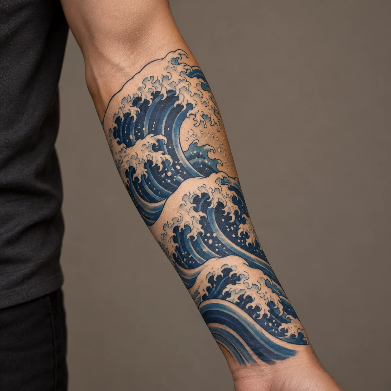
Japanese wave tattoo ideas can range from one bold crest to a full sleeve of interlocking water. The most useful starting point is the direction of the wave: a tall curl, a low band or a wrapping panel each asks for a different shape and amount of space. These 16 concepts compare those choices, along with frames, color accents and companion motifs.
Choose the overall outline before deciding how much foam, shading or spray to add. A clear dark-water shape and an open area inside the curl give your artist something specific to build around. If you prefer fewer elements, our minimal Japanese tattoo ideas offer another way to think about restraint.
About the images: All 16 design images and the separate forearm hero are AI-generated concepts. They are not photographs of real or healed client tattoos, historical Japanese artworks or ready-to-use stencils. Paper-colored areas may translate into open skin rather than white ink. A tattoo artist should redraw and adapt any reference for your body, skin tone and chosen size.
Japanese wave references: what to bring to your artist
One well-known reference is Katsushika Hokusai's Under the Wave off Kanagawa, also called The Great Wave. The Metropolitan Museum of Art's collection record dates the woodblock print to about 1830–32 and identifies it as part of Thirty-six Views of Mount Fuji. Its distant mountain and large foreground wave are useful compositional references. That does not make every curling-wave tattoo a reproduction of the print, or every modern wave drawing a historically traditional tattoo design.
For an artist consultation, separate three things: the artwork you admire, the tattoo style you want, and what the water means to you personally. You might associate waves with a particular coast, change or persistence, but this article does not assign one universal meaning to the motif. If tradition and established motif combinations matter to you, choose an artist whose Japanese tattoo portfolio you can discuss in detail.
| Your main preference | Concepts to compare | Question for the artist |
|---|---|---|
| One clear subject | Single crest or blackwork | What can be simplified at this size? |
| A defined outer edge | Circle, fan or diamond | How will this frame sit on the body? |
| A long, narrow placement | Vertical stack | Which way should the flow travel? |
| A secondary focal point | Sun, moon, mountain, koi or crane | Which subject should dominate? |
| A larger connected piece | Wave-only sleeve panel | How will the composition join around the arm? |
1. A single curling crest
Start with a wave that works as one silhouette. Here the dark water rises from a narrow base into a large curl, while the pale opening inside the crest gives the eye somewhere to rest. This is a useful reference if you want the wave itself to be the subject, without adding a fish, flower or landscape.
For a forearm or calf, ask the artist to test the direction of the curl on your body. The foam can point toward the inside or outside of the limb; those choices change the way the design greets someone looking at you. Keep the opening generous rather than filling it with extra spray.
2. Blackwork with pale channels
This version builds the water from dark ribbons and leaves the foam light. Without blue to separate the layers, the gaps between the black shapes become the main organizing feature. It is a strong option to compare if the rest of your tattoos use black and grey, or if you prefer a graphic drawing to a colored seascape.
Bring up the balance of solid fill and open skin during the consultation. The paper background in this concept is not a request for a blanket of white ink. Your artist can explain where untouched skin, grey shading or a small highlight would best express the pale areas at the chosen scale.
3. Waves inside a circle
A round frame makes the water feel like a contained scene. The larger crest sits to one side, with smaller swells carrying the movement around the lower edge. The empty sky is part of the composition: covering it with more objects would change the calm center that distinguishes this design from an all-over wave panel.
Try this shape on the upper arm, shoulder blade or thigh before settling on the size. A circular drawing on flat paper can look different once it wraps around a narrow limb. Ask to see the border positioned with your body relaxed, and decide whether you want a complete circle or a softer, interrupted edge.
4. An upward-flowing wave stack
A vertical stack gives you several crests without turning the design into a horizontal seascape. The movement travels up the page, and the changing widths create a long S-shaped rhythm. Use this as a starting point for a shin, calf or outer forearm rather than squeezing a wide ocean scene into a narrow strip.
The important detail to discuss is the path through the whole piece. Each crest should contribute to that path, rather than competing as a separate focal point. Ask the artist which small curls they would remove if the panel needs to be shorter, and where the narrowest open channel would sit on your body.
5. A horizontal wave band
A low row of rolling crests changes the emphasis from height to repetition. It can suggest a horizon or a strip of moving water, while keeping the surrounding skin relatively open. This is a different brief from the vertical stack: compare how the repeated peaks look across the arm or along a wider area of the leg.
Decide whether you want a partial band or a complete wrap. If it goes all the way around a limb, ask the artist to plan the join instead of stretching this flat image into a closed loop. Leave room for the peaks to vary; identical repeated curls can make the band feel mechanical.
6. A wave beneath a red sun
The red disc adds a second focal point without introducing a complicated object. Its flat shape contrasts with the busy foam and sweeping water bands. The blue-and-red combination also makes the spacing between the two elements especially visible, so the clear area around the sun deserves as much attention as the crest.
Choose whether the sun or the wave should dominate. For a smaller piece, a single red accent and one large crest may be enough. This concept uses a plain disc without rays or lettering. If you want to add another symbol, discuss its context separately rather than assuming that every red-sun composition carries the same meaning.
7. Mount Fuji between the crests
A distant mountain gives the water a sense of scale. The small snow-capped triangle is framed by larger foreground waves, so the landscape remains readable without needing a crowded sky. This is an original wave-and-mountain concept, rather than a reproduction of the complete composition of Hokusai's print.
Tell the artist whether the mountain is essential to your idea or simply a background option. If it matters personally, allow enough room for its outline and the gap around it. A larger forearm panel, upper arm or thigh gives the artist more flexibility to separate foreground water from the distant peak.
8. A wave under a full moon
The pale moon makes the empty space above the wave feel intentional. Compared with the red-sun version, the quieter color relationship puts more attention on the dark water and its curved outline. The moon remains a separate shape, with enough clear space to avoid merging visually into the spray.
You can choose this pairing for its appearance without assigning it a fixed symbolic definition. If a personal meaning matters, tell the artist in your own words. For a discussion of interpretations rather than just composition, see our wave and moon guide. Keep the moon simple if the wave already contains dense foam detail.
9. Cherry blossoms above turquoise water
Pink blossoms introduce softer, rounded shapes against the pointed foam and long water bands. The flowers float in the open areas rather than being packed into every gap. That separation is what lets you read both subjects. This concept offers a brighter palette while keeping the water as the largest element.
Choose whether you want a few complete blossoms or scattered individual petals. Those are different drawings, especially at a smaller size. Ask your artist to make the petals and foam clearly distinguishable in the stencil and final color plan, and avoid adding flowers solely to fill spaces that help the wave stay readable.
10. Red maple leaves over a diagonal wave
Two red leaves shift the accent color away from a sun disc and into smaller drifting shapes. The wave cuts diagonally through the composition, while the leaves provide a contrasting direction above it. This version is worth comparing if you like a more angular companion motif than the rounded cherry blossom.
If you want a composition rooted in a particular Japanese tattoo tradition, let an artist familiar with that tradition advise on seasonal motifs and their arrangement. The generated image is a visual suggestion, not proof of a historically established combination. Keep the leaf silhouettes distinct from the foam before considering extra falling leaves.
11. Water breaking around a rock
A dark central rock gives the wave something solid to move around. The pale foam marks the meeting point between the two shapes, and the lower water bands spread outward. This creates a grounded, wide composition instead of the open hollow found in the single-crest design.
Ask the artist to decide which edge belongs to rock and which belongs to water before adding texture. Too many similar dark marks can make those surfaces run together. A wide upper-arm, thigh or chest area may suit the spread of this design; a narrower placement would call for a different rock shape and a more vertical flow.
12. An orange koi among blue waves
The koi becomes the main subject, with the waves acting as a frame and a path through the image. Its warm orange body stands apart from the blue water. This is a more detailed brief than a wave-only design, so compare it at a larger scale instead of shrinking the fish into the same space as a simple crest.
Check the whole fish in the drawing: the head, fins, body and tail need a clear relationship, even where the water overlaps them. Ask your artist how much of the koi should remain visible and which way it should travel on your body. Personal meaning and traditional interpretations can be discussed separately from the direction chosen for the composition.
13. A crane above low waves
The crane changes the rhythm by introducing a tall, quiet shape above a low band of moving water. The bird's light body and long neck contrast with the dark rock and blue waves beneath it. Keeping the water lower prevents the foam from competing with the head and beak.
This concept needs room for the bird's outline to remain clear. Ask the artist to check the neck, beak, feet and folded wings before adding feather detail. If the available space is too narrow, simplify the water or choose a wave-only design rather than compressing the entire scene into a crowded miniature.
14. A wave painted across a folding fan
The fan supplies an object-shaped border, with its ribs leading down to a single pivot. The wave sits across the open panels, so the design combines two different directions: the outward spread of the fan and the curl of the water. A small red sun provides a restrained accent within that frame.
Ask how much of the rib structure should show through the illustration. The fan should still read as one coherent object, rather than a set of unrelated triangles. This is a useful option for an upper arm or thigh where the wide top edge has room; a narrow placement may require a partly closed fan drawn from scratch.
15. A wave inside a diamond frame
The diamond gives the curved water a sharp geometric boundary. Its long axis can help organize a vertical placement, while the four corners keep the overall shape distinct from a free-flowing crest. The clean frame also makes the contrast between dark water and pale background especially apparent.
Check the corners against the intended placement before choosing the final proportions. A paper-perfect diamond may need adjustment to sit comfortably on a curved surface. Decide whether the foam must stay inside the border or can cross it in a few places; both can work, but the choice should feel deliberate rather than accidental.
16. A wave-only sleeve planning panel
This final idea treats the waves as the whole composition instead of background around an animal or flower. Several large crests create separate areas of interest, connected by dark water bands and open channels. The taper suggests a broader upper section and a narrower lower section, but it is only a flat planning reference.
For a sleeve, the next step is a body-specific drawing that accounts for the shoulder, elbow, inner arm and wrist. Ask where the main crest will sit in the front view and how the water continues around the back. Do not treat this image as a ready-to-wrap stencil; the joins and changes of direction need to be designed on the actual arm.
Choosing placement, scale and a color plan
Match the design's outline to the space you are considering. A narrow vertical wave can follow the forearm or calf, while a wider arrangement may have more room on the upper arm or thigh. These are starting points for a consultation, not guarantees that a particular drawing will fit everyone. The artist needs to assess the real area and the way it curves.
Ask to compare the proposed stencil in a relaxed position and with the nearby joint bent. For a wrap, check the less visible side too: a front view alone cannot show where water bands meet. For a larger project, our Japanese full sleeve tattoo ideas can help you decide whether you want waves as the central subject or as part of a broader composition.
Color can separate the water from a companion motif, as orange does for the koi and red does for the sun. Blackwork makes the open channels and changes in value more important. Neither choice removes the need for clear spacing. Discuss healed examples in your artist's portfolio and how they would adapt the palette to your skin, rather than treating a generated paper illustration as a prediction of the finished result.
What to check before approving the drawing
- The large shape: Can you follow the crest and the main path of the water before looking at the small details?
- The open areas: Is there enough separation between foam, water bands and any second subject?
- The companion motif: Check the complete fish, bird, flower or fan structure. Generated references can contain errors, so your artist should independently redraw them.
- The wrap: Ask where the design joins and which elements cross onto the inner side of the limb.
- The brief: Explain whether you want an original Japanese-inspired drawing, a specific historical artwork interpreted for tattooing, or a composition within an established Japanese tattoo practice.
Choose two or three references and note what you like about each: the dark water, pale foam, outline or placement. That is a clearer brief than asking an artist to combine every element from all 16 images. If your preference is still broader than waves, compare our ocean tattoo ideas before settling on the subject.
Planning for care
Get written aftercare instructions from your tattoo artist and ask a doctor or pharmacist about individual health concerns. For tattooed skin, the American Academy of Dermatology notes that UV light can fade some inks. Its sun-protection advice includes broad-spectrum, water-resistant SPF 30 or higher, applied 15 minutes before going outdoors and reapplied at least every two hours. For a new tattoo, ask your artist and clinician when sunscreen is appropriate; this is not a fresh-tattoo wound-care routine. A skin reaction or a change in tattooed skin warrants a dermatologist's advice.
Japanese wave tattoo questions
Does a Japanese wave tattoo need blue ink?
No. Blue is one option in these concepts, while the blackwork version uses dark fill and pale channels to describe the same movement. Decide which treatment works with the rest of your tattoo plans and discuss the actual ink and shading choices with your artist.
Can a wave tattoo be small?
A simpler crest can be adapted for a smaller area, but there is no single minimum size that works for every drawing. Ask the artist what they would remove from the reference. Keeping one clear curl is often a more useful brief than preserving every drop and foam branch in a tiny design.
Is every Japanese wave tattoo based on The Great Wave?
No. Hokusai's print is one specific artwork. A tattoo may reference it directly, borrow the idea of a large curling wave, or use a different wave arrangement. Tell the artist which relationship you want rather than describing every option as a copy of the same print.
What does a wave and moon tattoo mean?
People can give this pairing different personal interpretations; it has no single meaning imposed by this article. Our wave and moon tattoo meaning guide explores that pairing separately. For design planning, focus on whether the moon remains distinct from the foam and how the two shapes share the space.
Can I use a wave design to start a sleeve?
Yes, but tell the artist about the sleeve plan before the first piece is placed. The direction of the water, available open skin and future joins all affect the larger drawing. The sleeve panel above is a starting reference, not a complete layout for the front, back and inner arm.
Sources checked October 23, 2026: Metropolitan Museum of Art, Under the Wave off Kanagawa collection record; American Academy of Dermatology, Caring for tattooed skin. Design comparisons and placement suggestions are editorial guidance for an artist consultation.