A clock tattoo drawing only works as a tattoo if the dial stays readable once the design is scaled to your arm. That single constraint explains almost every good and bad clock piece I have looked at.
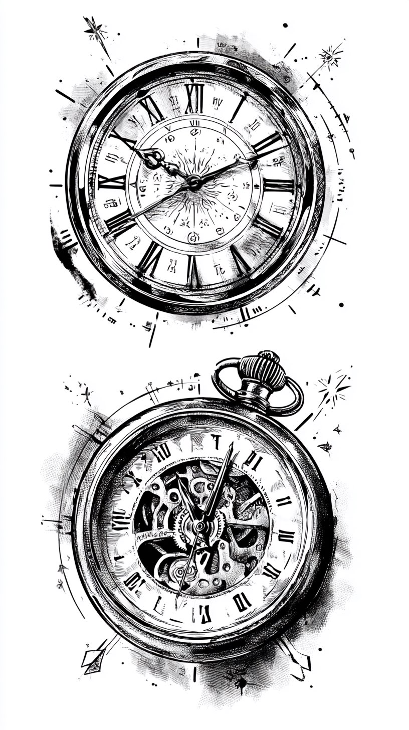
I have spent a lot of time going through reference sheets like the ones below, and the pattern is consistent. The drawings that fail are not the ugly ones — they are the beautiful, over-detailed ones that lose their numerals at tattoo size.
So this guide is organised the way I would actually use it: styles first, then what each one costs you in space and healing, then the variations worth asking your artist about. If you want a broader sweep of the theme, the clock tattoo ideas roundup covers finished pieces rather than drawings.
Everything shown here is a drawing, not a healed tattoo. That distinction matters more than most people expect, and I come back to it throughout.
Which Clock Tattoo Style Is Right for You?
This is the comparison I wish I had seen first. The right-hand column is the one people skip and later regret.
| Style | Best For | Minimum Size I Would Suggest | How It Tends to Age |
|---|---|---|---|
| Realistic pocket watch | A single strong focal piece | About 5–6 in / 13–15 cm tall | Grey wash softens; numerals usually survive if they were cut cleanly |
| Ornamental / filigree | Forearms, sternums, symmetry lovers | About 6 in / 15 cm tall | Fine scrollwork is the first thing to blur — ask for spacing |
| Steampunk / exposed gears | People who want mechanism over meaning | About 7 in / 18 cm tall | Small cogs merge into grey mass if packed too tightly |
| Splatter / dispersion | Filling a long limb without hard edges | About 6 in / 15 cm tall | Ages well; flecks spread slightly, which usually reads as intended |
| Fine line / sketch | Subtle placements, inner arm, first tattoos | About 4 in / 10 cm tall | Softest of the group — expect touch-ups sooner |
| Clock plus added subject | Memorial and date pieces | About 7 in / 18 cm tall | Depends entirely on the second subject, not the clock |
Those sizes are a starting point for conversation, not a rule. Every artist I have asked adjusts them for skin, placement and their own line weight.
Why the Drawing and the Tattoo Are Not the Same Thing
A drawing on paper has effectively unlimited resolution. Skin does not.
Ink spreads slightly under the surface over years, so two lines drawn a millimetre apart on paper can close into one solid mark on an arm. This is the single most useful thing to understand before you take a reference in.
It is why the sheets below look more detailed than the tattoos they produce, and why a good artist will redraw rather than trace. In my experience the redraw is where the tattoo actually gets designed.
The second difference is contrast. Graphite gives you a hundred shades of grey; a black and grey tattoo has fewer usable steps, so the artist has to decide which parts of the drawing get sacrificed.
None of this makes reference sheets useless — the opposite. They are the fastest way to show an artist a direction. They are just a brief, not a blueprint.
Clock Tattoo Drawing Styles Worth Bringing to an Artist
These six cover almost everything in the collection below. I have ordered them roughly from most to least forgiving.
1. The Realistic Pocket Watch
This is the backbone of the whole category: a Roman numeral dial, a hinged case, a crown at the top and a chain or ribbon trailing off.
It works because it has a natural hierarchy. The dial is the focal point, the case is the frame, and everything below it is filler that the artist can expand or cut to fit your limb.
The mechanical pocket watch has been around since the sixteenth century, and the long history of the portable watch is part of why the shape reads instantly as “time” rather than just “circle”.
If you want this on a forearm, the pocket watch tattoo drawing guide is a useful companion for thinking about how the shape sits along the muscle.
The trap here is the hands. Ask for them to be angled across the numerals, not lying flat over them — overlapping hands are what makes a healed clock unreadable.
2. Ornamental and Filigree Frames
Here the dial is small and the scrollwork around it does the talking. The results are some of the most striking drawings in this set.
They also carry the most risk. Filigree relies on thin, closely spaced lines, and that is exactly what softens first.
When I have asked artists about this, the fix is always the same: fewer, thicker curls with more negative space between them. The drawing loses a little delicacy and the tattoo gains a decade.
Symmetrical versions like the crest designs below sit beautifully on a sternum or centre chest, where the body gives you a mirror line to work against.
3. Exposed Gears and Steampunk Movements
Instead of a closed dial, you see the mechanism — cogs, springs, a skeleton movement behind glass.
This is the style that most often needs to be bigger than people want it to be. Gear teeth are tiny repeating shapes, and repeating shapes are the first casualty of ink spread.
I would give this one real estate: an outer forearm, a full inner arm, or a thigh. At small sizes the cogs stop being cogs and become texture.
It pairs naturally with blackwork tattoo designs if you want the whole piece kept in solid black rather than grey wash.
4. Splatter, Smoke and Dispersion
A clean dial at the top, dissolving into flecks, smoke or ink drips as it travels down the limb.
Of everything on this page, this is the style I would call the most reliable. The randomness is the point, so a little spread over the years genuinely does not hurt it.
It also solves a practical problem. A circle is a hard shape to end — dispersion gives the tattoo somewhere to go instead of stopping abruptly at the edge of the case.
The one thing to insist on: keep the numerals and hands out of the splatter zone. Contrast is what sells the effect.
5. Clocks with a Second Subject
Birds, roses, chains, branches, skulls. The clock becomes the anchor and something else carries the meaning.
Birds leaving a watch face is easily the most requested version I come across, and it works because the two subjects share a story rather than competing for space.
Roses are the other classic pairing — the skull and rose drawing is a good look at how the two subjects can be balanced when neither is meant to dominate.
For memorial pieces specifically, this is usually the right family of designs. The memorial tattoo ideas guide covers how people handle dates and names alongside a central image.
6. Sketch and Fine Line Clocks
Deliberately loose: visible construction lines, an unfinished edge, light shading rather than solid black.
These are the gentlest option and often the best first tattoo in this theme, because there is less packed ink and usually a shorter session.
Be honest with yourself about upkeep, though. Fine line work generally needs attention sooner than a heavily shaded piece, and that is a trade rather than a flaw.
If you are heading in this direction, small forearm tattoo ideas is the place to look for scale and placement.
Variations Worth Asking About
If none of the six above is quite it, these are the adjacent directions I would raise with an artist.
Roman Numeral Dates Instead of a Dial
A date rendered in Roman numerals gives you the meaning of a clock without the drawing complexity.
It is far easier to place and far easier to keep legible. Roman numeral tattoo ideas covers the formatting question, which is worth getting right before the needle touches skin.
Hourglass in Place of a Clock
Same theme, different shape — and an hourglass tapers naturally, which suits a forearm better than a circle does.
Look at hourglass tattoo ideas side by side with the drawings above before you decide; the two read very differently once healed.
Compass and Clock Together
A common pairing for travel and direction themes, usually with the compass as the larger element.
The meaning behind compass tattoos is worth reading first, because the symbolism is more specific than most people assume.
The Melting or Surreal Clock
Softened, drooping dials in the surrealist tradition. Harder to draw well and much harder to tattoo well, because the numerals distort with the shape.
I would only take this route with an artist who can show you a healed example of their own.
Taking a Drawing to Your Artist
Bring three or four references, not twenty. A small, clear set tells an artist what you actually want; a huge folder tells them nothing.
Say what you like about each one in plain words — “the shading here”, “the shape of this case” — rather than asking for a copy. Artists work faster from intent than from images.
Agree the size on your skin, not on paper. Ask for a stencil placed on the limb and look at it in a mirror before anything starts.
On healing, follow the aftercare your artist gives you rather than anything you read online, including this page. General guidance from the American Academy of Dermatology is a reasonable baseline, and the US Food and Drug Administration is worth a look on ink safety, but neither replaces the person who did the work.
If a healing tattoo becomes increasingly painful, hot, swollen or starts weeping after the first few days, contact your artist and see a doctor. That is a medical question, not a design one, and I am not the right source for it.
Common Mistakes I See With Clock Tattoos
Choosing a drawing at a size the drawing cannot survive. This is the big one, and it is almost always about detail density rather than the design itself.
Setting the hands to a meaningful time and then burying them in shading, so the meaning is invisible six months later.
Adding a second and third subject to a design that was already full. If you want a scene, plan the whole layout from the start rather than growing one accidentally.
And treating a reference sheet as a finished tattoo. Every drawing on this page is a conversation starter. If you are still weighing the broader theme, clock tattoo design ideas is what I would read next.
Frequently Asked Questions
What time should I set the clock to?
Most people choose a birth time, an anniversary or the time of a moment they want to keep. There is no traditional rule here, so the choice is entirely yours. Whatever you pick, ask your artist to angle the hands so they do not sit on top of the numerals. That single adjustment is what keeps the time readable years later.
How big does a clock tattoo need to be?
In most cases a realistic pocket watch needs roughly five to six inches of height to hold its detail, and a gear-heavy design needs more. Fine line and sketch versions can work smaller, around four inches. These are starting points rather than limits — your artist will adjust for placement, your skin and their own line weight. Ask to see the stencil on your arm before you commit.
Do clock tattoos blur over time?
All tattoos soften as ink settles beneath the skin, and the finest lines go first. Splatter and dispersion styles usually age well because the effect is meant to look irregular. Tight filigree and small gear teeth are the most vulnerable. Spacing the detail out slightly at the design stage does more for longevity than any aftercare product.
Where do clock tattoos sit best?
The forearm is the most common placement because a clock’s vertical drop suits the shape of the limb. Chest and sternum work well for symmetrical ornamental designs, and the outer upper arm or thigh gives gear-heavy pieces the room they need. Hands, fingers and feet are harder places to keep detail sharp. Placement is worth discussing before style, not after.
Can I just take one of these drawings straight to a shop?
You can bring them, and you should — they communicate direction quickly. Most artists will redraw rather than copy, partly out of professional practice around other people’s artwork and partly because a drawing has to be adapted to your body. Treat the sheets as a brief. The redraw is usually where the design genuinely improves.
Quick Summary
- Readability of the dial is the constraint that decides whether a clock drawing works as a tattoo.
- Realistic pocket watches are the most forgiving starting point and the easiest to scale.
- Ornamental filigree looks best on paper and needs the most spacing adjustments in practice.
- Gear and steampunk designs need real size — give them a forearm, inner arm or thigh.
- Splatter and dispersion age the most gracefully, because irregularity is the intended effect.
- Adding a second subject like birds or roses works best when the two share a story.
- Bring three or four references and describe what you like about each, rather than asking for a copy.
- Check the stencil on your skin, and take healing questions to your artist or a doctor.