I have been collecting and redrawing clock designs for years, and the same thing happens every time someone brings one to a shop: they arrive with a photo of a hyper-detailed pocket watch and leave with something half as busy. The clock tattoo drawings that survive a decade on skin are almost never the ones that look most impressive on paper.
That gap between a drawing and a healed tattoo is the whole reason this page exists. A clock is a circle full of small marks — numerals, hands, gear teeth — and small marks are exactly what skin blurs first.
So this is a design gallery, but it is also a filter. For each style below I have noted roughly how much space it needs and what tends to go wrong, because the drawing is only half the decision. If you want a broader pool of concepts first, our full collection of clock tattoo ideas covers placements and layouts this page does not.
Every image here is a drawing or design concept rather than a healed tattoo, which is worth remembering as you scroll — healed work always sits softer than the linework you see on a page.
Which Clock Tattoo Style Is Right for You?
The honest way to choose is to start from how much room you actually have, not from which drawing you like most.
| Style | Smallest size I would draw it | Ages well? | Best for |
|---|---|---|---|
| Minimalist / single-line | 2–3 inches | Very well | Wrist, inner forearm, ankle |
| Classic pocket watch | 4–5 inches | Well if shaded, not if line-only | Forearm, chest, calf |
| Roman numeral dial | 3–4 inches | Well, with spaced numerals | Inner arm, ribs, shoulder |
| Melting / surreal | 5–6 inches | Well — soft shapes forgive blur | Upper arm, thigh, back |
| Steampunk gearwork | 6 inches and up | Only at size | Half sleeve, full sleeve, thigh |
| Clock and skull | 5–6 inches | Well in bold traditional or blackwork | Forearm, chest, upper back |
| Watercolor clock | 4–5 inches | Softens noticeably; needs a line skeleton | Shoulder, thigh, upper arm |
Those size figures are my own working minimums from drawing these, not an industry standard — a different artist may push a design smaller or insist on going bigger.
What Actually Decides Whether a Clock Tattoo Works
A clock face is a grid. Twelve reference points around a circle, two or three hands crossing the middle, and often a ring of numerals between them.
That grid is unforgiving in a way a rose or a wolf simply is not. If the numerals drift by a couple of degrees, or the hands sit at a lazy angle, the eye catches it immediately — we have all been reading clock faces since childhood, so we notice when one is wrong.
The second issue is line density. Tattoo ink spreads slightly in the skin over years, so lines drawn close together tend to migrate toward each other and eventually read as one grey mass.
That is why a gear-heavy steampunk drawing that looks spectacular at A4 can turn muddy at three inches. In my experience the fix is almost never better technique — it is more space, or fewer elements.
The third factor is contrast. Designs with genuine black anchors hold their shape far longer than designs built entirely from thin grey line, which is worth weighing before you commit to a delicate pocket watch tattoo drawing at a small size.
Clock Tattoo Drawings by Style
Classic Pocket Watch Drawings
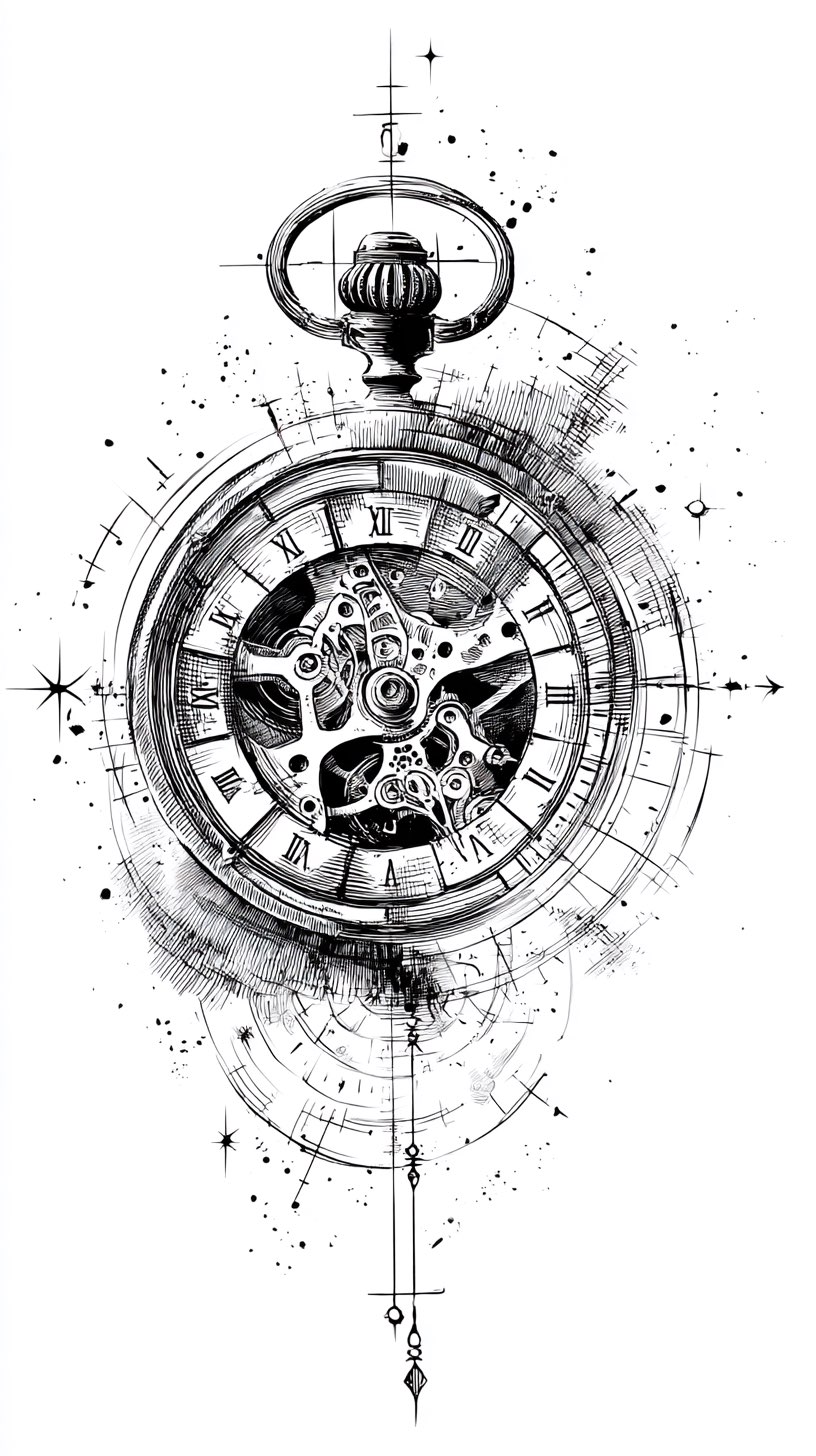
The pocket watch is the origin point for most clock tattoos, and it is still the design I get asked to draw most often.
What makes it work is the frame: an ornate case, a hinged lid, a chain that can be routed to follow the limb. That chain is genuinely useful, because it gives an artist a way to fill awkward space without adding more detail to the dial itself.
The trap is the engraving. Real pocket watches carry filigree that is finer than any needle can hold at tattoo scale, and copying it faithfully guarantees a blurred mess in ten years.
Ask for the case detail to be simplified by roughly half from your reference photo. When I have done that in drawings, nobody ever notices what was removed — they notice that the piece still reads clearly from arm’s length.
Melting and Surreal Clock Drawings
The melting clock comes from Salvador Dalí’s The Persistence of Memory, painted in 1931 and held by the Museum of Modern Art in New York.
As a tattoo it has one real advantage over a rigid dial: a drooping, warped clock has no correct geometry to get wrong.
That forgiveness extends to ageing. Soft, curved forms blur gracefully, whereas a perfect circle that softens by a millimetre starts to look like a mistake.
In my experience the melting clock also drapes well over the shoulder, the outer thigh, and the ribs — places where a strict circle would distort with the body’s curve anyway.
Clock and Rose Combinations
Clock and rose is the pairing I would call the safest bet in this entire gallery.
The reason is compositional rather than symbolic: roses supply organic curves that break up the hard circle of the dial, so the two shapes never compete for attention.
Symbolically the reading is straightforward enough — a flower that blooms and fades set against the mechanism that measures the fading.
If you are weighing which flower to build around, our guide to rose tattoo ideas is worth a look before you settle the layout, since petal count and bloom angle change how much room the clock gets.
Broken and Shattered Clock Drawings
A cracked or shattered clock is usually chosen to mark a moment that ended something — a loss, a diagnosis, a date the person does not want to soften.
Design-wise, breakage is a gift. Cracks give an artist somewhere to put deep black, and deep black is what keeps a piece legible for decades.
The thing to watch is fragment count. Twenty small shards drawn on paper become a scattered grey cloud on skin; six or eight larger ones hold their shape.
If the idea of a frozen moment appeals more than the mechanism itself, hourglass tattoo designs carry a similar meaning with far less fine detail to maintain.
Clock and Skull Drawings
This is memento mori in its most direct form, and it has been part of Western tattooing since long before it was a trend.
The pairing works best when one element clearly leads. A skull with a small clock set into the forehead or eye socket reads instantly; a skull and a clock at equal size fight each other.
Bold traditional and blackwork both suit this combination better than fine line does — the imagery is heavy, and thin grey rendering undersells it.
Adding a third element is common but risky. Candles, ravens, and moths all belong to the same visual family, though each one takes space the clock wanted, as our skull and rose tattoo drawings page shows in practice.
Clock Drawings with Eyes
Setting an eye where the dial should be is a surrealist move, and it is the design in this gallery that most depends on the artist.
An eye is a portrait element. It needs graduated shading, a wet highlight, and an iris that is not simply a ring — and an artist who is brilliant at bold line work may not be the right person for it.
When I have looked at healed examples, the successful ones all shared the same thing: the eye was drawn large, at least two inches across, with the clockwork kept deliberately plain around it.
Rushing this one is how you end up with a flat, staring circle that never quite reads as an eye.
Roman Numeral Clock Faces
Roman numerals are the most common way to lock a specific date or time into a clock tattoo without writing it out.
The technical demand is spacing. Numerals must sit on an even radius and taper consistently toward the centre, and a stencil that is a fraction off will look wrong the moment it heals.
Traditional watch dials use IIII rather than IV at the four o’clock position — a convention that goes back centuries in horology, and one many clients do not expect. Decide which you want before the stencil goes on.
If the numerals matter more to you than the clock does, Roman numeral tattoo designs without a dial around them give the date far more room to breathe.
Steampunk and Exposed Gearwork
Steampunk clock drawings open the mechanism up: cogs, escapements, springs, sometimes drawn as though the skin itself has been peeled back.
This is the most demanding style on the page, and the one I would most often talk someone out of at small size.
Gears are concentric circles with teeth. Draw a dozen overlapping and you have created exactly the dense linework that blurs first — at three inches this becomes grey soup within a few years.
Give it six inches or more, or pick a different style. On a half sleeve, where the mechanism can spread and each gear gets its own breathing room, it is genuinely spectacular.
Minimalist and Fine Line Clocks
Minimalist clocks strip the design to a circle, two hands, and perhaps four numerals — and they are the pieces in this gallery I would bet on ageing best.
There is a caveat worth being honest about. Fine line work is thin by definition, so it fades sooner than bold work and is more likely to need a touch-up somewhere down the line.
That is a trade, not a flaw. If you want something quiet on the inner wrist, our fine line tattoo ideas cover what to expect from that style over time.
One practical note from every artist I have asked: fine line clocks want an artist who specialises in it, not a generalist doing you a favour.
Variations Worth Considering
If none of the styles above is quite right, these are the adjustments I suggest most often.
Build It Into a Sleeve Instead
A clock makes an unusually good sleeve anchor, because gears, chains, smoke, and clouds all flow outward from it naturally.
That means you do not have to decide the whole sleeve today — the clock can go on first and the surrounding work can follow over a year or two. Our sleeve tattoo ideas show how those transitions usually get handled.
Drop the Numerals Entirely
A dial with hands and index marks but no numbers is cleaner, ages better, and still reads instantly as a clock.
It also removes the single most common stencil error, which is uneven numeral spacing.
Use a Partial Clock
Showing only two thirds of the dial, cropped by the edge of the placement, often looks more intentional than a full circle sitting in the middle of a forearm.
It also solves the problem of circles distorting on curved limbs.
Practical Advice Before You Book
Set the hands deliberately. If the time is meaningless to you, ask for roughly ten past ten — it is the classic display position in watch photography, and it frames the dial symmetrically.
Bring three references rather than one: the composition you want, the style of rendering you want, and the level of detail you want. Those are three separate decisions, and handing an artist one photo forces them to guess at two of them.
Ask directly how the design will look in ten years, and take the answer seriously. A good artist will tell you which parts they expect to soften, and will usually offer to simplify them before the needle comes out.
On healing, follow the aftercare your artist gives you — they know their ink and their technique. The American Academy of Dermatology also publishes general guidance on caring for tattooed skin, and the US Food and Drug Administration keeps a plain-language fact sheet on tattoo inks and risks.
If a healing tattoo becomes increasingly painful, hot, swollen, or starts weeping after the first few days, that is a question for a doctor rather than a forum. Nothing on this page is medical advice, and no clock design is worth risking an untreated infection over.
Common Mistakes — and What to Do If You Are Still Not Sure
The most frequent mistake by a wide margin is booking too small. People choose three inches because it feels like a safe first step, then ask for a design that needs six.
The second is copying a photograph of a real watch line for line. Photographs contain detail that skin cannot hold, and a straight copy is the fastest route to a blurred piece.
The third is picking an artist by price rather than portfolio. Look specifically for healed photos of circular, geometric work — not fresh shots, and not flowers.
If you are still undecided, it often helps to look at what else carries the same meaning. A memorial tattoo design can mark a person without a dial at all, and if the pull is really about direction and time passing rather than clockwork itself, that is worth naming before you book.
Frequently Asked Questions
What does a clock tattoo symbolise?
Most commonly it stands for the passage of time and the value of the time you have. Beyond that the meaning is set by what you attach to it: hands frozen at a birth time make it a celebration, a cracked dial makes it a marker of loss, and a skull alongside it turns it into memento mori. There is no fixed meaning that a viewer will read automatically. In my experience the people happiest with theirs chose one specific reason rather than a general idea about time.
How big does a clock tattoo need to be?
It depends entirely on the style. A minimalist dial works from around two to three inches, a classic pocket watch wants four to five, and steampunk gearwork realistically needs six or more. Those are my own working minimums rather than an industry rule, so your artist may set them differently. The test is simple: if two lines in the drawing would sit closer than a couple of millimetres at your chosen size, go bigger.
Should I set the clock to a specific time?
If a time genuinely matters to you, yes, and tell the artist before the stencil is made rather than at the chair. If it does not, roughly ten past ten is the conventional display position and frames the dial symmetrically. Avoid times where both hands overlap or sit vertically, because they flatten the composition. This is one of the few decisions that is effectively permanent within a permanent piece.
Do clock tattoos age well?
Bold ones do, detailed ones are a gamble. Ink spreads slightly in the skin over the years, so densely packed gearwork and hair-thin engraving tend to soften into grey while simple dials with real black anchors hold their shape. Fine line clocks look beautiful but are more likely to want a touch-up eventually. Ask your artist which specific parts of your design they expect to blur, since they will usually be able to point to them on the drawing.
Where is the best placement for a clock tattoo?
The inner and outer forearm are the most popular, because a circle sits flat there and stays visible to the wearer. The chest, upper back, and outer thigh all give more room for larger compositions. Curved areas such as the elbow or knee distort a circle, which is exactly why partial or melting clocks tend to suit them better. Placement also affects fading, since hands, feet, and sun-exposed areas usually need touch-ups sooner.
Quick Summary
- Choose the style from the space you have, not from the drawing you like most — the comparison table above lists my working minimum size for each.
- Simplify any real-watch reference by around half; photographic detail does not survive on skin.
- Melting and surreal clocks age most forgivingly, because soft shapes have no correct geometry to lose.
- Steampunk gearwork needs six inches or more, or it turns grey within a few years.
- Decide your numerals early — including whether you want the traditional IIII at four o’clock.
- Set the hands to a time that means something, or use roughly ten past ten for a balanced dial.
- Pick your artist from healed photos of circular and geometric work, not fresh shots.
- Follow your artist’s aftercare, and see a doctor rather than a forum if healing goes wrong.