A colour sleeve is the loudest decision you can make in tattooing. It is not a bigger version of a black and grey sleeve — it is a different commitment, with different maintenance, a different artist search, and a different price.
I have sat through consultations for colour sleeves that went well and a few that did not, and the pattern is always the same. The projects that succeed start with a palette decision before a single subject is chosen.
The 19 ideas below are the directions that consistently produce sleeves worth the chair time. Some are centuries-old traditions, some are barely twenty years old, and a few only work on the right arm with the right artist. If you are still deciding on scale, our broader guide to sleeve tattoo ideas for men covers the black and grey side too.
I have flagged the ones I would send a first-time sleeve client toward, and the ones I would talk almost anybody out of unless they have found a genuine specialist.
Photo: @japanese.ink
Which Colour Sleeve Style Is Right for You?
This is the comparison I actually run through with people who cannot narrow their shortlist. Ageing is the column most people ignore and later regret ignoring.
| Style | How it ages | Artist pool | Best for |
|---|---|---|---|
| Japanese (irezumi) | Excellent — bold outlines and background hold shape | Narrow; look for dedicated Japanese specialists | Anyone who wants the sleeve to read from across a room in 20 years |
| American traditional | Excellent — designed for it | Wide | First-time sleeve clients and lower budgets |
| Neo-traditional | Very good | Wide and growing | People who want traditional structure with a richer palette |
| Colour realism | Demanding — softens fastest, needs touch-ups | Very narrow | Clients willing to travel and wait for the right artist |
| Watercolour | Weakest of the group without an underlying line structure | Narrow | People who accept it as a softer, painterly piece |
| New school / psychedelic | Good — heavy outlines protect it | Moderate | Loud, character-led, cartoon-influenced ideas |
What Actually Determines Whether a Colour Sleeve Works
Colour behaves differently in skin than it does on paper, and that single fact explains most of what follows.
Your own skin tone is part of the palette, not a blank canvas. On deeper skin tones, high-opacity colours and strong value contrast carry far better than pale pastels — and any artist worth booking will raise this before you do rather than after.
Fade is not uniform. In my experience the light end of the palette goes first: yellows, whites, pale pinks and light blues soften long before reds, deep greens and black do. That is why good colour artists anchor a sleeve with dark values that hold the composition even after the brights settle.
Sun is the other half of it. Ultraviolet exposure is the single largest controllable factor in how a colour sleeve looks a decade from now, and the American Academy of Dermatology’s guidance on caring for tattooed skin is worth reading before you start rather than after.
Budget and timeline matter too. A full colour sleeve is usually a multi-session project spread over months, and colour packing is slower per square inch than line and shade — if you want real numbers, our breakdown of what a sleeve tattoo costs is more use than any quote you will get on Instagram.
19 Colourful Sleeve Tattoo Ideas for Men
Each of these is a full-arm direction, not a single design. Take one as a brief to your artist rather than a picture to copy.
1. Full Japanese Traditional Sleeve
The Japanese sleeve is the benchmark every other colour sleeve gets measured against, and there is a reason for it. Koi, dragons, tigers, chrysanthemums, waves and wind bars are arranged in a compositional tradition that was built specifically for the shape of an arm.
The palette is deliberately narrow: red, black, deep blue and gold against a background wash. That restraint is what makes it age so well — you are never relying on a delicate tone to carry a section.
In my experience this is also the style where the artist matters most and substitutions matter least. A specialist will tell you which subjects can share an arm and which cannot. If dragons are the draw, our dragon tattoo ideas for men gallery is a useful shortlist to bring in.
2. Neo-Traditional Botanical Sleeve
Neo-traditional takes the bold outlines of old-school work and opens the palette up — muted greens, dusty roses, ochres, deep teals.
A botanical sleeve built this way flows naturally around the arm because plants do not need a rigid focal point. Foliage fills the awkward inner-bicep and elbow ditch areas that trip up subject-led designs.
It is one of the safest bets on this list. The line weight protects it as it ages, and the palette is forgiving on most skin tones.
3. Watercolour Abstract Sleeve
Photo: @joza.ink
Watercolour sleeves imitate paint bleeding into paper — soft edges, splatter, colour running past its own boundary.
I will be honest about the trade-off here, because plenty of articles are not. Work with no underlying line or value structure tends to soften noticeably faster than outlined work.
The version I would recommend is hybrid: a real drawing underneath, watercolour effects layered over it. You keep the look and you keep the sleeve legible in fifteen years.
4. Realism Sleeve: Ocean Theme
Photo: @saneltattoos
Ocean realism is one of the few themes with a built-in reason for a continuous colour field. Water justifies wrapping teal and blue around an entire arm without a visible seam.
Sharks, turtles, kelp, a wave breaking over the shoulder — the subjects sit inside the water rather than floating on skin.
This is specialist work. Every colour realism artist I have asked says the same thing: the highlights sell it, and highlights are the first thing an inexperienced artist gets wrong.
5. Video Game or Comic Art Sleeve
New school and comic-influenced sleeves are having a long moment, and the good ones are genuinely impressive rather than merely nostalgic.
Heavy outlines, flat saturated fills and exaggerated proportions are exactly the properties that make a tattoo survive. This style ages better than its reputation suggests.
The risk is licensing your enthusiasm from a decade ago onto your arm permanently. I usually suggest committing to the art style rather than one specific character.
6. Traditional American Colour Sleeve
Photo: @leanjors_art
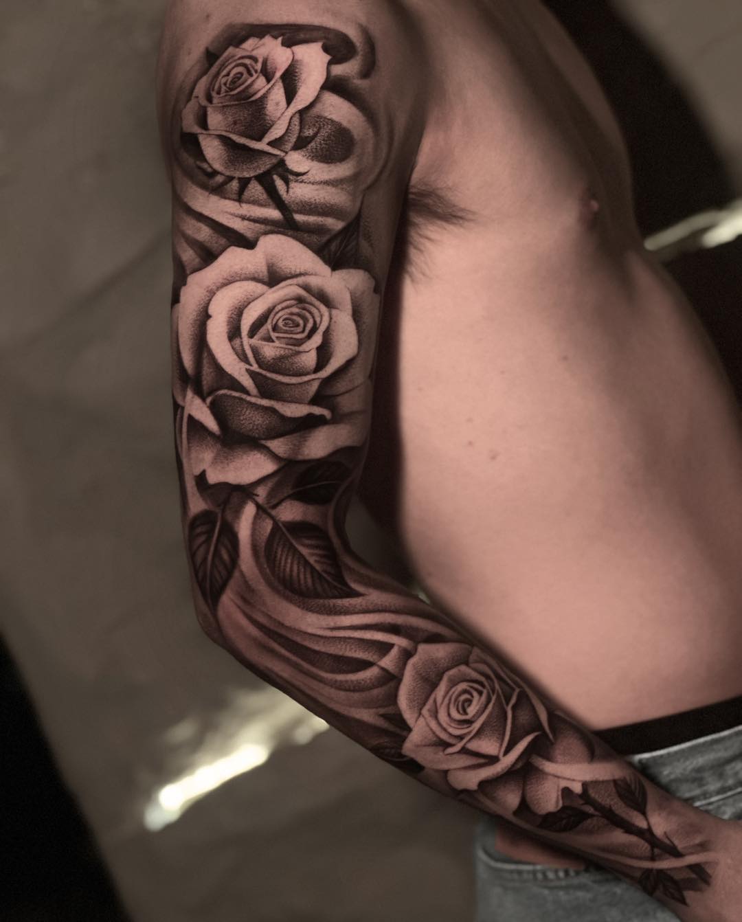
Roses, eagles, daggers, panthers, anchors and swallows in the classic red, green, gold and black palette.
There is no style on this list that ages better, and none with a wider pool of competent artists. That combination makes it the most reliable first colour sleeve.
It is also the most affordable route to a finished arm, because the work is faster to execute than realism or heavy detail. A finished traditional sleeve beats an unfinished realism one every time.
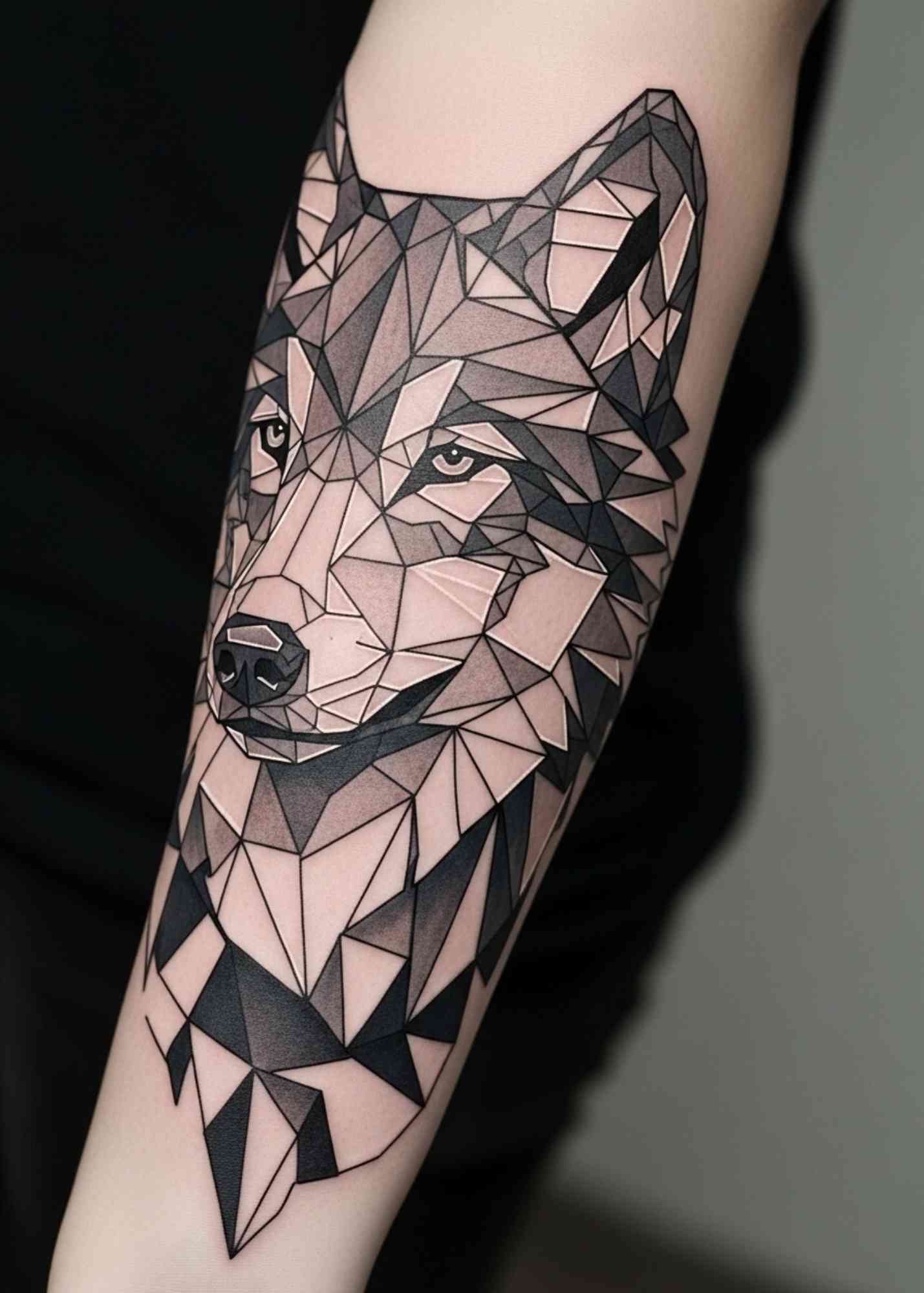
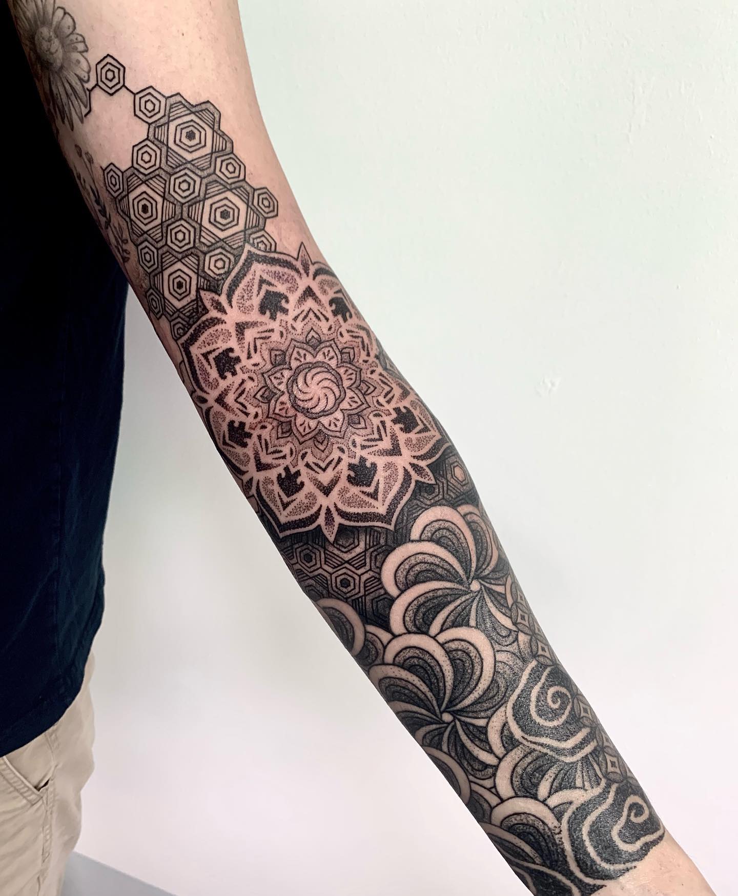
7. Geometric Colour Sleeve
Mandalas, sacred geometry, tessellation and linework given a colour treatment rather than left in black.
Colour in geometric work usually functions as accent rather than fill — a gradient behind a mandala, a single warm tone running through an otherwise cold pattern.
Precision is the whole game. If you want to see how the black and grey versions are structured before adding colour, our geometric sleeve tattoo ideas collection shows the underlying logic clearly.
8. Jungle or Tropical Wildlife Sleeve
Photo: @rustemtattoo
Toucans, macaws, poison dart frogs, monstera leaves, orchids. Tropical subjects give you permission to use the full spectrum without the sleeve looking arbitrary.
The foliage does structural work here. Leaves connect the animal focal points and solve the transitions that otherwise leave dead space at the elbow and inner arm.
It reads as one continuous environment rather than a collection of separate tattoos, which is what most people actually want from a sleeve and rarely ask for directly.
9. Space and Cosmos Sleeve
Photo: @joegregorytattoos
Nebulas, planets, star fields and the occasional astronaut. Cosmic work is one of the few themes where saturated purple and magenta look natural rather than novelty.
The background is the design. Unlike most sleeves, the negative space here is filled, which means the whole arm is being tattooed — plan for the session count accordingly.
Placement of the light sources matters more than the subjects. Our space tattoo ideas gallery has good examples of how artists handle the darkest passages.
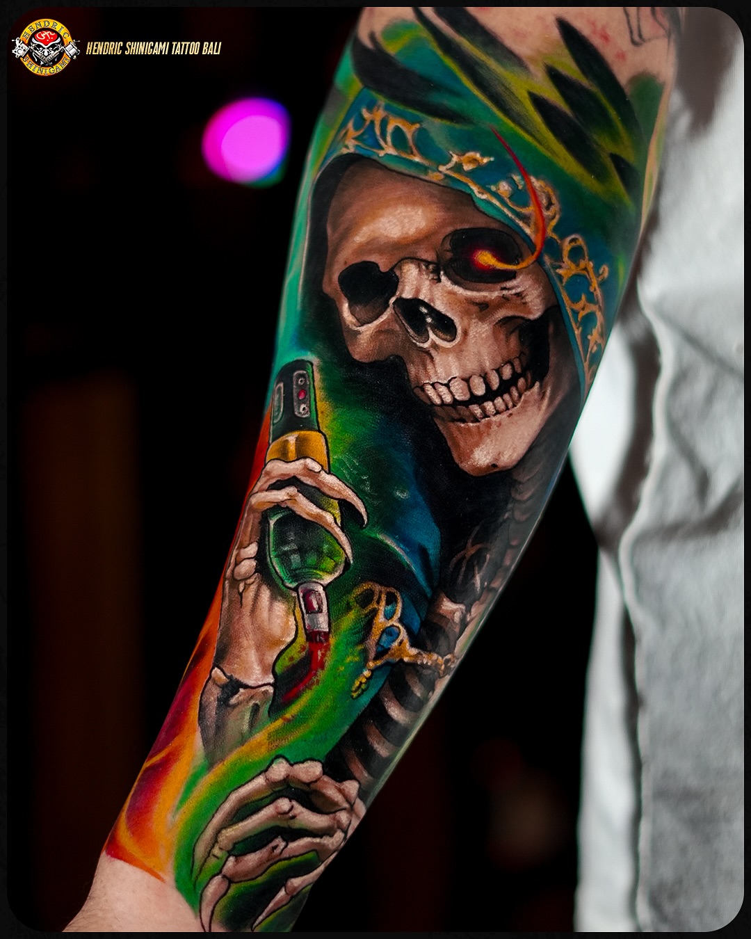
10. Day of the Dead Sleeve
Photo: @hendricshinigamitattoobali
Calaveras, marigolds, candles and papel picado in the orange, magenta and cobalt palette of Día de los Muertos.
This is one of the most genuinely celebratory colour themes in tattooing, and it is worth understanding the tradition rather than borrowing the aesthetic blind.
The decorative sugar skull is the anchor most designs build around — our sugar skull tattoo ideas page covers the ornamentation in more detail than a sleeve consultation usually allows time for.
11. Portrait Sleeve in Colour
Photo: @ken_tattoo
Family, musicians, film characters, historical figures — rendered in full colour rather than black and grey.
This is the least forgiving work on the list. Skin tones expose every error in saturation and value, and a portrait that is slightly wrong is far worse than one that is obviously stylised.
Only book this with an artist whose healed colour portraits you have seen in person or in unedited photos. Fresh-work photos tell you almost nothing about a colour portrait.
12. Samurai and Cherry Blossom
Photo: @artofcjcook
Red lacquered armour against pale pink blossom is one of the highest-contrast pairings in tattooing, and it carries an arm without needing much else.
It sits adjacent to formal Japanese work but is usually executed with more realism and less traditional background structure.
If you go this route, decide early whether you want it inside the irezumi tradition or as a realism piece with Japanese subjects. They are different sleeves and different artists.
13. Norse Mythology Colour Sleeve
Photo: @isar.oakmund
Odin, ravens, Yggdrasil, longships and runes, usually in a cold palette of blues, greys and steel with selective warm accents.
The restraint is intentional. Norse subjects lose their weight when the palette gets cheerful, so most good examples keep saturation low and value contrast high.
For the wider range of subject matter, including the knotwork and weapon motifs, our Viking tattoo ideas for men guide is a better starting point than a search feed.
14. Psychedelic Art Sleeve
Photo: @c.von.art
Swirling patterns, optical distortion and rainbow saturation with no single subject to focus on.
It is the most divisive style here and it is not trying to be tasteful. That is the point of it.
Practically speaking it ages well, because the heavy outlines and dense saturation give it structure. It is also nearly impossible to cover later, so treat it as permanent in a way even other tattoos are not.
15. Mexican Folk Art Sleeve
Photo: @joelmejiatattoo
Otomí embroidery patterns, Talavera tile motifs, alebrije creatures and painted tin work translated onto skin.
The palette comes from textiles and folk painting rather than from tattooing, which is exactly why it reads as warm and human rather than neon.
It is pattern-led, so it fills an arm evenly and does not leave you negotiating awkward gaps. Bring reference from the actual craft traditions, not from other tattoos.
16. Biomechanical Colour Sleeve
Photo: @tymcewen
Machinery, pistons and cabling appearing beneath torn skin, rendered in metallic teals, coppers and oranges.
Colour biomech is harder than the black and grey version because metal has to be sold entirely through highlight placement and reflected colour.
The best examples I have seen follow the actual anatomy of the arm, so the machinery looks like it belongs under that specific limb. Generic biomech that ignores anatomy always looks pasted on.
17. Nature Four Seasons Sleeve
The arm divided into four passages — spring blossom, summer green, autumn ochre, winter blue — flowing into each other around the limb.
It solves the palette problem elegantly. You get an enormous colour range with a built-in reason for every shift, which is rare.
The transitions are the difficult part and need mapping across the whole arm before the first session. Ask to see the full wrap-around design, not just the outer-arm view.
18. Abstract Colour Field Sleeve
Photo: @sirota_ink
No subject at all. Blocks, gradients and overlapping fields of pure colour treated as a composition in their own right.
This is a small niche and it demands an artist with a real fine-art sensibility rather than a strong technical hand alone.
When it works it is the most modern-looking thing on this list. When it does not, it looks like an unfinished background — there is very little middle ground.
19. Mythology Mashup Sleeve
Photo: @dirty_rasel
Greek, Norse, Egyptian and Celtic figures brought together in one arm, unified by a single imposed palette.
The compositional challenge is real: disparate sources with different visual conventions have to look like they were designed together.
The mashups that succeed pick one palette and one line language and force every borrowed element into it. The ones that fail are four tattoos sharing an arm.
Alternatives If a Full Colour Sleeve Is Too Much
A full sleeve is not the only way to commit to colour, and it is often the wrong first move.
Colour half sleeve
Shoulder to elbow, or elbow to wrist. You get a finished-looking piece in a fraction of the sessions and you keep the option to extend later if you still want it in two years.
Black and grey sleeve with colour accents
A black and grey structure with one or two colours doing selective work — a red flower, a single blue eye. It ages like black and grey but does not read as monochrome.
Colour panels with negative space
Several separate colour pieces spread across the arm with untattooed skin between them. This is the standard Japanese approach to an unfinished arm and it looks intentional at every stage.
Start with a forearm piece
The forearm is the most visible and least painful part of a sleeve. If you cannot live with a colour piece there, you have learned something cheaply.
Getting the Best Result From a Colour Sleeve
Book a consultation with the specific artist, not the shop, and bring reference for the palette separately from reference for the subjects. Those are two different conversations and merging them wastes the appointment.
Ask to see photographs of their colour work healed at two years or more. Every artist can post a fresh photo. Healed colour is the only honest evidence, and a confident colour artist will have it ready.
Plan the whole arm before the first needle goes in, even if you are paying for it a section at a time. Sleeves built one piece at a time almost always end up with a composition problem at the elbow, and sleeve filler is a repair, not a plan.
For aftercare, follow your artist’s instructions over anything you read online, keep the healing tattoo out of direct sun entirely, and use high-SPF sunscreen on it for the rest of its life once healed. If you notice spreading redness, heat, pus or a fever, that is a doctor’s appointment, not a forum question — and the FDA’s consumer guidance on tattoos covers the ink-reaction risks worth knowing about before you sit down.
Common Mistakes — and What to Do If You Are Still Not Sure
The most expensive mistake is choosing an artist for their black and grey portfolio and assuming the colour work will match. It frequently does not. Colour saturation and blending are separate skills.
The second is collecting reference from twenty different artists in five different styles. Your artist cannot merge those into one arm, and being asked to try is how sleeves end up incoherent.
The third is underestimating maintenance. Colour needs touch-ups, sun discipline and honesty about your lifestyle. If you work outdoors without cover, say so at the consultation.
If you are still narrowing the field, comparing against geometric sleeve designs and reading through tattoo pain management tips before your first long session are both better uses of a week than more scrolling.
Frequently Asked Questions
How long does a full colour sleeve take?
Most colour sleeves are multi-session projects spread across several months, and colour packing is slower per square inch than line and shade work. In my experience artists book them in sessions of four to six hours with several weeks of healing between, so the calendar time is usually longer than the chair time suggests. Realism and dense background work sit at the long end of that range. Your artist can give you a realistic session count once the full design is mapped.
Do colour tattoos fade faster than black and grey?
Generally yes, and the light end of the palette fades first — yellows, whites, pale pinks and light blues soften before reds, deep greens and black do. Sun exposure is the biggest controllable factor in that process. Good colour sleeves are built with dark anchoring values so the composition still reads after the brights settle. Periodic touch-ups are a normal part of owning one, not a sign something went wrong.
Does colour work on darker skin tones?
Yes, but the palette choices are different and any competent artist will raise this at the consultation. High-opacity colours and strong value contrast carry well, while pale pastels and low-contrast blending tend not to. Look specifically for artists with healed colour work on skin tones close to yours in their portfolio. That single filter matters more than any other advice on this page.
Is a colour sleeve more painful than black and grey?
Colour packing usually involves more passes over the same area, so most people describe it as more wearing rather than sharper. Elbow ditch, inner bicep and the area near the armpit are the difficult zones regardless of style. Eating properly beforehand and breaking long sessions up makes a real difference. Tell your artist when you need a break rather than pushing through it.
Can a colour sleeve be covered up or removed later?
Cover-ups over dense colour are considerably harder than over black and grey, and the new design will usually need to be darker and busier than you might want. Laser removal is possible but colours respond unevenly, with greens and light blues being the most stubborn, and it takes multiple sessions with a qualified practitioner. Treat a colour sleeve as permanent when you are deciding. That assumption leads to better choices at the design stage.
Quick Summary
- Decide the palette before the subjects — it is the decision everything else depends on.
- Japanese, American traditional and neo-traditional age the best of the colour styles.
- Colour realism, watercolour and colour portraits need a genuine specialist, not a good all-rounder.
- Judge every artist on healed colour photos at two years or more, never on fresh work.
- Light colours fade first; a dark value structure underneath is what keeps a sleeve readable.
- Sun protection for life is the single biggest thing you control after the tattoo is done.
- Map the whole arm before the first session, even if you pay for it in stages.
- Treat a colour sleeve as permanent — cover-ups and removal are both harder over dense colour.