I have watched a lot of sleeves come together over the years, and geometric work is the one style where the design has to be finished before the first needle touches skin. There is no improvising your way out of a triangle that lands two centimetres off.
Organic sleeves forgive you. A rose can be nudged, a filler leaf can cover a gap, smoke can hide a bad transition. Geometry cannot.
Every artist I have asked about this says the same thing in different words: the consultation matters more than the session. A geometric sleeve is a drafting job first and a tattoo second, which is why the good ones look designed rather than accumulated.
Below are 19 directions worth considering, drawn from sleeves I have seen finished and healed rather than from flash sheets. If you are still deciding on style at all, the broader sleeve tattoo ideas for men guide is a useful place to start before you commit to geometry.
Which Geometric Sleeve Style Is Right for You?
These four approaches cover most of what artists actually book. The differences that matter in practice are session count, how well the work ages, and how much precision the artist has to hold across the whole arm.
| Approach | Typical sessions | How it ages | Best for |
|---|---|---|---|
| Fine line geometric | 4-7 | Softens fastest; thin lines can blur after a decade | Detail lovers who accept touch-ups |
| Blackwork geometric | 6-10 | Ages best; solid black holds its edge longest | Bold, high-contrast results |
| Dotwork geometric | 6-10 | Lightens gradually; sparse stippling fades first | Soft, textured, atmospheric sleeves |
| Sacred geometry | 5-8 | Depends on line weight used | Symbolic, symmetrical, system-based designs |
Session counts here are what I have seen quoted for full sleeves at studios that specialise in this work. Your artist’s estimate beats mine, because it accounts for your arm, your pain tolerance and their own pace.
Why Geometric Sleeves Are Harder Than They Look
Geometry is unforgiving because the eye is unforgiving about it. We notice a line that is one degree off a neighbour long before we notice an imperfect petal.
The arm makes this worse. It is a cone, not a cylinder, and it is thicker at the bicep than the wrist. A pattern that tiles perfectly on flat paper will stretch and compress as it wraps.
Good geometric artists solve this by drawing directly on the skin, or by stencilling in stages and adjusting between sessions rather than laying the entire sleeve down at once.
Then there is the elbow. It is the hardest square inch on the whole arm to hold geometry across, because the skin folds, and a pattern that lines up straight-armed can break when you bend. In my experience this is where most amateur geometric sleeves visibly come apart.
Ask to see healed photographs, not fresh ones. Fresh geometric work always looks sharp. What you want to know is what those lines look like at eighteen months, which is also worth checking before any blackwork design that relies on large solid fills.
19 Geometric Sleeve Tattoo Ideas for Men
1. Sacred Geometry System
A sleeve built entirely from sacred geometry: the Flower of Life across the deltoid, Metatron’s Cube sitting at the elbow, the Sri Yantra running down the forearm.
Each symbol connects to the next through geometric bridgework rather than filler, so the arm reads as one continuous system.
What makes this work is that the symbols already share a construction logic – they are all built from circles and equilateral triangles – so they sit together without visual argument. If the symbolism is the draw more than the pattern, the sacred geometry tattoo collection goes deeper on individual meanings.
I would only book this with an artist who can draw these forms freehand. Traced sacred geometry has a slack, wobbling quality that shows up badly at scale.
2. Mandala Chain
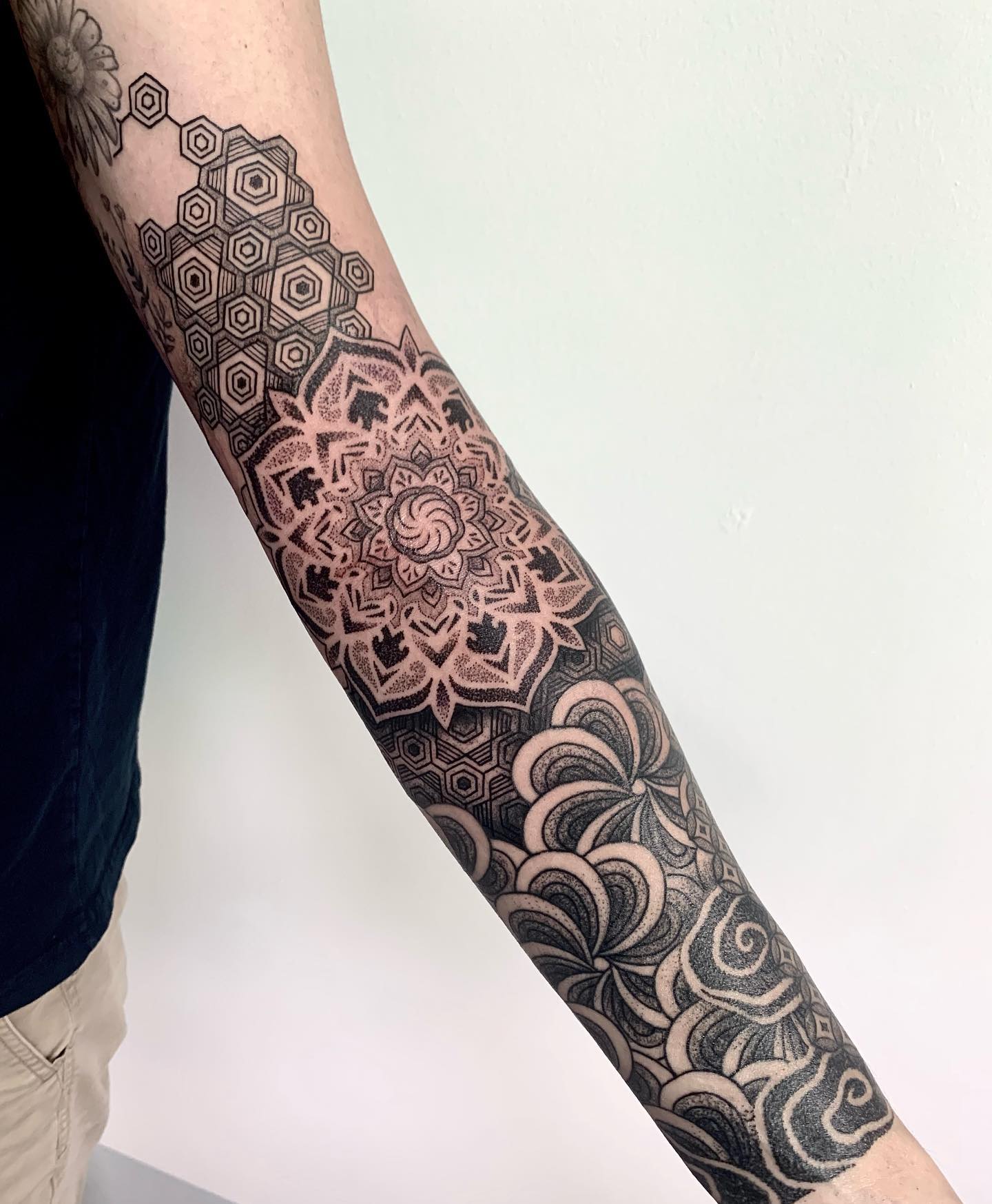
A large mandala at the shoulder, a second at the elbow, a third mid-forearm, each joined by fine geometric linework flowing between them.
The chain structure gives the sleeve something most geometric designs struggle with: obvious focal points with obvious connective tissue.
Mandalas also solve the elbow problem elegantly. A radial pattern centred on the joint bends with the arm instead of fighting it, which is why so many artists place one exactly there.
Scale matters more than detail count here. Three well-spaced mandalas beat seven crowded ones every time, a principle that holds across mandala tattoo designs generally.
3. Low-Poly Animal Sleeve
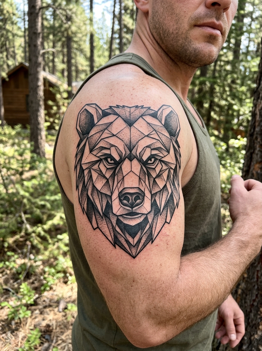
Wolf, bear or eagle heads rebuilt from angular faceted planes, the way a 3D model looks before it is smoothed.
Low-poly keeps the subject recognisable while translating it fully into geometric language, which is the trick most geometric animal work misses.
Two or three animals in the same faceting style will connect into a full sleeve without any additional theme holding them together – the shared treatment is the theme.
The risk is flatness. Ask your artist how they plan to separate the planes: subtle grey fill, varying line weight, or negative space. Uniform outlines alone tend to read as a mesh rather than an animal.
4. Architectural Linework
Cathedral facades, bridge trusses, ruins and invented structures in fine black line with no fill and no shading.
The arm becomes a vertical landscape of buildings, usually running the long way rather than wrapping.
Perspective is doing all the work in this style. A single vanishing point that drifts will make the whole sleeve feel wrong even if every individual line is clean.
This is one of the few geometric approaches where I would actively want to see the artist’s drawings, not just their tattoos. If they can draw architecture on paper, they can tattoo it.
5. Blackwork Geometric Blocks
Large triangles, rectangles and angular fields packed in solid black, alternating with passages of fine linework.
The contrast is the point: dense black against bare skin, broken by delicate sections that only reveal themselves close up.
Solid black is also the most durable thing you can put on an arm. It stays legible far longer than thin line, which is worth knowing if you want this to still look sharp in twenty years.
Be honest with yourself about coverage though. Large blackwork is difficult to cover or rework later, and laser removal on heavy black is a long, expensive process.
6. Geometric Nature: Tree and Mountain
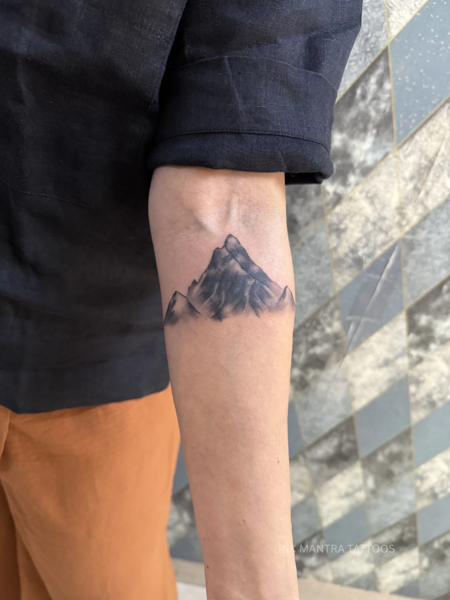
A mountain in angular low-poly form, trees reduced to stacked triangles, a sun or moon as a pure unbroken circle.
Organic subjects rendered in strict geometric vocabulary, joined by linework transitions and scattered dot elements.
This is probably the most requested geometric sleeve theme I come across, and it suits men who want landscape imagery without the softness of a realistic mountain tattoo.
Keep the shape count low. The version of this that ages best uses maybe five distinct geometric forms repeated at different scales rather than twenty different ones.
7. Dotwork Geometric
Geometric forms built from stippling rather than solid line, with dot density creating the shading and the sense of depth.
The texture is completely different from linework geometry – softer at the edges, more atmospheric, closer to an etching than a diagram.
Dotwork is slow. Expect noticeably longer sessions for the same coverage, because every gradient is placed one dot at a time, something anyone who has sat for dotwork tattoo work will confirm.
It also demands consistency. A single patch of uneven density is more visible in dotwork than an uneven line is in linework, so portfolio review matters here more than usual.
8. Polygon and Triangle System
One consistent vocabulary of triangles and polygons, repeated at varying scale across the length of the arm.
Unity comes from repetition rather than from a subject, which makes this a genuinely abstract sleeve.
It works in crisp black outline, or with selective fill in black and grey to create rhythm between filled and open shapes.
The advantage of a system-based sleeve is that it can be extended later. Add another session, add more of the same vocabulary, and the composition still holds – which is rarely true of subject-based sleeves.
9. Geometric Optical Illusion
Impossible shapes, forms that appear to lift off the arm, patterns that suggest movement when you look away.
Op-art geometry is the highest-difficulty option on this list. The effect either works or it does not; there is no partly successful illusion.
Precision requirements are brutal – the perceptual trick depends on angles being exact, and the curved surface of the arm is already distorting them.
I would ask specifically for healed photographs of op-art work, because slight line spread during healing can dissolve an illusion that looked perfect on the day.
10. Metatron’s Cube Full Sleeve
A single Metatron’s Cube on the upper arm, with its internal geometry traced outward across the elbow and down the forearm.
The figure contains all five Platonic solids plus a stack of derived forms, which is more than enough material for a full arm.
Because everything descends from one source figure, the sleeve has a built-in logic that most compositions have to manufacture.
It is also symmetrical, which cuts both ways: beautiful when it lands, and glaringly obvious when a section is off by a few degrees.
11. Half Black, Half Line
Upper arm in bold geometric blackwork, lower arm in intricate fine line geometry, with a deliberate transition between them.
The split gives you dramatic variety inside a single visual language, and it lets you spread the work over two clearly separate phases.
In practice this is a smart way to stage a sleeve financially. Do the blackwork upper first, live with it, then commit to the fine line section.
The transition point is the whole design. Ask to see how your artist plans to handle it before anything else gets stencilled.
12. Geometric Tribal Fusion
Polynesian, Maori-influenced or Borneo-derived tribal forms combined with contemporary geometric linework.
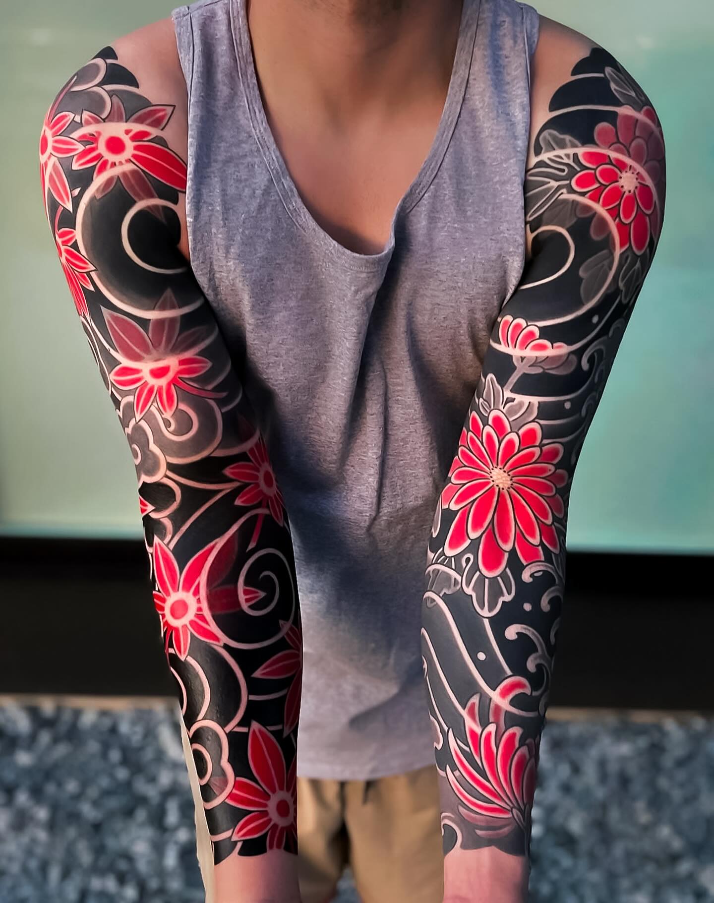
The tribal elements bring rhythm and flow; the geometric elements bring precision. The mix is more interesting than either alone.
One caution worth stating plainly: several of these traditions carry specific cultural meaning, and some motifs are not intended for outsiders. Read up before you choose, and talk to an artist who knows the tradition rather than borrowing shapes from a tribal tattoo gallery.
Done respectfully, this is one of the strongest-looking sleeves on the list, because tribal forms were designed for arms in the first place.
13. Cubist Portrait
A face or figure fragmented into geometric planes, with several viewpoints visible at the same time.
The Cubist sleeve treats a human subject as a geometry problem, which is a very different proposition from a realistic portrait.
It is a hard concept to get right and an easy one to get badly wrong – the failure mode is a face that just looks broken rather than deliberately fragmented.
Bold linework with black and grey fill suits it best. Fine line Cubism tends to lose the structural clarity that makes the style read.
14. Geometric Compass and Navigation
Compass roses, coordinate grids, star charts and sextant geometry in precise linework.
Navigation gives the sleeve a coherent theme and a naturally geometric subject, which is a rare combination.
It reads well from shoulder to wrist because the elements vary in scale naturally: a large rose at the shoulder, finer grid work toward the hand. If you are drawn to the symbolism, the compass tattoo meaning guide covers what these designs traditionally stand for.
Coordinates of a real place are the most common personalisation here. Check them twice – I have heard more than one story about a set of digits that pointed at the wrong hemisphere.
15. Penrose Patterns
Aperiodic tilings of the kind described by Roger Penrose, which cover a surface completely without ever repeating.
The non-repetition is what makes them hold attention on skin: the eye keeps looking for the loop and never finds it.
They are built from a small set of tiles, so the sleeve has consistency without monotony.
This one asks a lot of the artist’s drafting. The tiles must interlock exactly, and a gap that would be invisible in an organic design will be obvious here.
16. Geometric Animal Skull
Wolf, bull or deer skulls rebuilt as geometric compositions, with the bone structure abstracted into planes and angles.
Skulls suit this treatment because they are already angular – the geometry is describing something that is genuinely there rather than imposing itself.
A single large skull works well as the anchor of a sleeve, with lighter geometric elements running out from it across the rest of the arm. The geometric bear tattoo approach shows how far this can be pushed on one animal.
Placement is worth thinking about. A skull at the outer bicep is seen constantly by other people; one on the inner forearm is mostly seen by you.
17. Islamic Geometric Patterns
Star patterns, interlocking polygons and complex tessellations drawn from Islamic architectural geometry – a tradition the Metropolitan Museum of Art documents extensively in its Islamic art collection.
The mathematical sophistication here is on another level from most Western geometric tattooing, and the visual richness follows from it.
These patterns are constructed, not drawn freehand, from an underlying grid of circles. An artist who understands that construction will produce something far cleaner than one copying the surface appearance.
As with tribal work, be thoughtful. These patterns come out of a religious architectural context, and it is worth understanding what you are wearing.
18. Geometric Cityscape
A skyline in geometric linework – real or invented – wrapping the arm as a continuous urban horizon.
The forearm suits this best, because a horizontal composition has room to run without being interrupted by the elbow.
A specific city works if the skyline is distinctive enough to be recognised in outline. If it is not, an abstract urban geometry usually looks better than a half-recognisable one.
Negative space is the tool that makes this style work. The gaps between buildings need to be as considered as the buildings themselves.
19. Mixed Scale Geometric: Macro to Micro
Large-scale geometry at the shoulder shrinking progressively to very fine detail at the wrist.
The gradient creates a perspective effect down the arm and lets one sleeve demonstrate an artist’s range from bold fill to hairline work.
It also happens to match how the arm tapers, so the design and the anatomy agree with each other.
Plan the endpoint carefully. Very fine geometry near the wrist is beautiful and also the first thing to blur, since that area sees constant sun and friction.
Variations Worth Considering Before You Commit
A full sleeve is not the only way to wear geometric work, and for a lot of men it is not the right first move.
The Half Sleeve First
Shoulder to elbow, finished properly, then stop and live with it for six months. Geometric designs extend downward cleanly because the vocabulary is already established.
I have never met anyone who regretted staging a sleeve this way. If that appeals, the half sleeve options for men are worth browsing alongside these full-arm ideas.
Forearm Only
The forearm takes geometric work well, hurts considerably less than the inner bicep, and is the section you will actually look at most days.
It also gives you a complete-looking piece rather than an obvious fragment of something larger.
Negative Space Geometric
Instead of tattooing the pattern, tattoo around it – the geometry appears as untouched skin inside a blacked field.
This ages differently and reads very differently in sunlight. It is uncommon, and it demands an artist who has done it before.
Colour Accents Inside Black Geometry
A single red triangle or a band of blue inside an otherwise black sleeve creates an anchor point the eye returns to.
Use it once. Two accent colours in a geometric sleeve almost always looks like indecision rather than design.
Getting a Geometric Sleeve Done Properly
Book the consultation as a paid design session, not a free chat. A geometric sleeve layout takes an artist real hours to draft, and paying for that time gets you a better drawing and a more invested artist.
Space your sessions honestly. Most artists I have spoken to prefer two to four weeks between sittings on a geometric sleeve, partly for healing and partly because they want to see the last section settled before stencilling the next one against it.
On aftercare, follow your artist’s instructions first and general guidance second – the American Academy of Dermatology has sensible, non-commercial advice on caring for new tattoos and protecting them long term. Sun is what destroys fine geometric line, so sunscreen on a healed sleeve is not optional if you want it sharp in ten years.
If something looks wrong while healing – spreading redness, heat, pus, fever – that is a doctor’s question, not a forum’s. Infections are uncommon with a reputable studio but they are not rare enough to ignore, and geometric work covers a lot of skin at once.
Still Not Sure? Common Geometric Sleeve Mistakes
The most frequent one I see is hiring a brilliant artist who has never done a sleeve. Individual geometric pieces and a full-arm composition are different skills, and a portfolio full of gorgeous standalone triangles proves nothing about flow across an elbow.
The second is starting without a full layout. Adding geometry to geometry after the fact rarely aligns, and the mismatch is permanent.
The third is cramming. Geometric sleeves need breathing room, and the ones that look expensive are usually the ones with the most bare skin left in them – the same lesson that applies to fine line sleeve designs.
The fourth is budgeting for a tattoo rather than for a project. A full sleeve is many sessions across many months; the realistic cost of a sleeve tattoo is worth reading before you book anything, and if you are still weighing styles overall, the wider geometric tattoo ideas for men guide covers smaller commitments.
Frequently Asked Questions
How long does a geometric sleeve take to finish?
Most full geometric sleeves I have seen run somewhere between five and ten sessions, spread over six months to well over a year. The spread depends on your artist’s session length, how much solid black is involved, and how quickly you heal between sittings. Dotwork and heavy blackwork sit at the longer end because both are slow to lay down. Your artist can give you a real estimate once the layout is drawn, and that number is far more reliable than any general figure.
Do geometric tattoos age well?
It depends almost entirely on line weight. Solid black and bold linework hold their shape for decades; very fine lines placed close together can blur into each other over time as ink spreads slightly under the skin. Sun exposure accelerates this more than anything else. Choosing slightly heavier line than you think you need, and using sunscreen on healed work, are the two things most within your control.
Is a geometric sleeve more painful than other styles?
The style matters less than the placement and the duration. Inner bicep, elbow ditch and wrist are the difficult areas on any sleeve regardless of what is being tattooed. Where geometric work does differ is in session length, since large areas of solid black or dense dotwork mean long sittings over ground that has already been worked. Eat properly beforehand and tell your artist when you need a break.
Can a geometric sleeve be added to existing tattoos?
Sometimes, but it is harder than with organic styles. Geometry needs to align with itself, and existing tattoos rarely sit where a clean grid would want them. Skilled artists do integrate old pieces by building the geometric system around them, treating them as fixed points in the layout. Bring photographs of everything you already have to the consultation so the layout accounts for it from the start.
Should I choose blackwork or fine line for my first geometric sleeve?
If longevity is your priority, blackwork is the safer choice, because heavy black stays legible far longer. If detail and subtlety matter more to you, fine line delivers something blackwork cannot, at the cost of touch-ups down the line. In my experience, people who want maximum visual impact from across a room pick blackwork, and people who want a piece that rewards close inspection pick fine line. There is no wrong answer, only a trade-off.
Quick Summary
- Geometric sleeves must be designed in full before the first session – there is no improvising later.
- Hire an artist with finished geometric sleeves in their portfolio, not just standalone geometric pieces.
- Ask for healed photographs, especially around the elbow, where most weak geometric work falls apart.
- Blackwork ages best, fine line offers the most detail, dotwork gives the softest texture, sacred geometry gives the strongest built-in structure.
- Leave negative space. Crowded geometric sleeves look cheaper than sparse ones.
- Stage the work – a finished half sleeve is a better outcome than a rushed full one.
- Sunscreen on healed work is the single biggest factor in how sharp the lines look years later.
- Any sign of infection during healing is a question for a doctor, not for the internet.