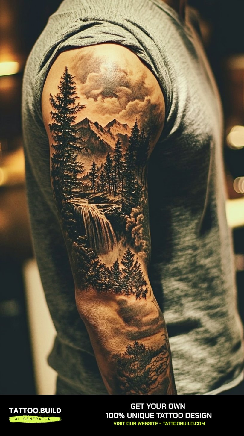
I have lost count of how many mountain and tree tattoos I have watched get drawn up, and the pattern is always the same. People walk in with a reference photo of a peak they climbed or a forest they grew up beside, and they walk out with something far simpler than the photo. A mountain and tree tattoo works because it compresses an entire landscape into a handful of lines, not because it reproduces one.
That compression is the whole craft. A ridgeline is two or three angles. A conifer is a triangle with texture. Put them together and the eye fills in the rest — scale, distance, weather, the cold air at the top.
This guide walks through the styles that actually hold up on skin, the placements that suit each one, and the mistakes I keep seeing repeated. If you are still deciding between a range and a single summit, the broader collection of mountain tattoo ideas is a useful starting point before you narrow down.
Everything below comes from watching these designs age, not from a mood board. Some of it will talk you out of a design you liked. That is the point.
Which Mountain and Tree Tattoo Style Is Right for You?
Style choice matters more than subject choice here. The same peak-and-pine composition reads completely differently depending on how it is rendered, and each approach ages on a different curve.
| Style | Best Size | How It Ages | Suits You If |
|---|---|---|---|
| Fine line | Small to medium | Softens noticeably; lines thicken over years | You want something quiet and understated |
| Blackwork | Medium to large | Very well; solid black holds its edge longest | You want maximum contrast and low upkeep |
| Dotwork / stipple | Medium | Dots merge slightly; stays readable if spaced well | You like soft gradients without grey wash |
| Geometric | Small to medium | Good, though crooked lines get more obvious | You want structure and symmetry |
| Illustrative scene | Large | Depends heavily on detail spacing | You want a full landscape, not a symbol |
| Colour / watercolour | Medium to large | Fades fastest; needs a black skeleton underneath | You want warmth and are fine with touch-ups |
What Actually Makes a Mountain and Tree Tattoo Work
The single biggest factor is depth separation — the visual gap between the trees in front and the mountains behind. When those two layers share the same line weight and the same shading value, the design flattens into a blur within a few years.
Good artists solve this by making the foreground trees darker and crisper, then pushing the peaks back with lighter, broken linework. It looks slightly exaggerated on paper and correct on skin.
The second factor is negative space. Skin is not white paper, and every gap you leave is doing work — it becomes sky, snow, or mist. Designs that fill everything in have nowhere to breathe once the ink settles.
Third is scale honesty. A landscape crammed into a two-inch circle will not stay a landscape. In my experience anything smaller than about three inches wide should drop to a single peak and two or three trees, no more.
Finally, placement drives the shape of the composition rather than the other way round. A forearm wants a horizontal band, a spine wants a vertical stack, a calf wants something tall and narrow. Fighting that is how you end up with a design that never quite sits right. The wider world of nature tattoo designs follows the same logic.
Mountain and Tree Tattoo Ideas That Hold Up Over Time
These are the eight directions I see working most consistently. Each one solves the depth problem differently.
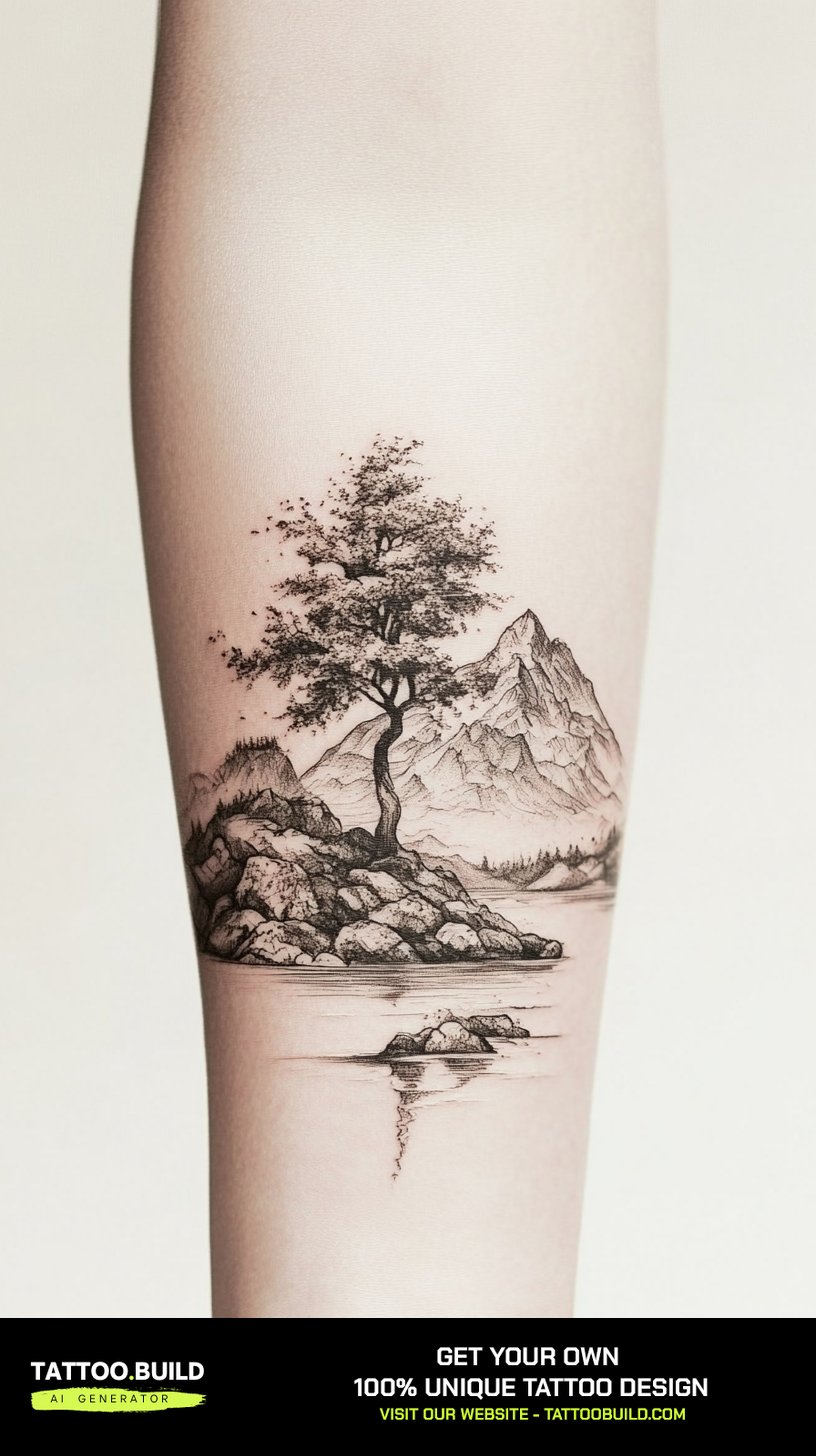
1. Fine Line and Single Needle Landscapes
Fine line is the most requested version of this design and the one most likely to disappoint if it is done too small. Single needle work lays down very little pigment, so the margin for error is thin.
What makes it succeed is restraint. Two ridgelines, a scattered treeline, and a horizon — nothing else. Every extra element you add competes for the same delicate line weight and the composition muddies.
I have watched fine line pieces from five or six years ago soften considerably, particularly on the inner arm where the skin is thin and sun exposure is low but movement is constant. That softening is normal and not a sign of bad work.
If you want fine line, ask your artist to leave more space between elements than looks right in the stencil. It will close up on its own. Sketching a few versions first helps — the same principles that apply to tree tattoo drawing ideas apply here.
2. Blackwork and Heavy Negative Space
Blackwork is, in my honest opinion, the most durable way to wear this subject. Solid black holds its boundary longer than any grey wash or coloured pigment.
The trick is inverting the usual thinking. Instead of drawing mountains, you fill the sky and let bare skin become the snowfield. The result reads instantly from across a room.
Heavy black also hides the depth problem entirely, because there is no shading to blur — only shape. Every artist I have asked about longevity puts blackwork at the top of the list.
The trade-off is commitment. Large areas of solid black are harder to cover or rework later, and they take longer to heal because more skin is worked over in a single pass.
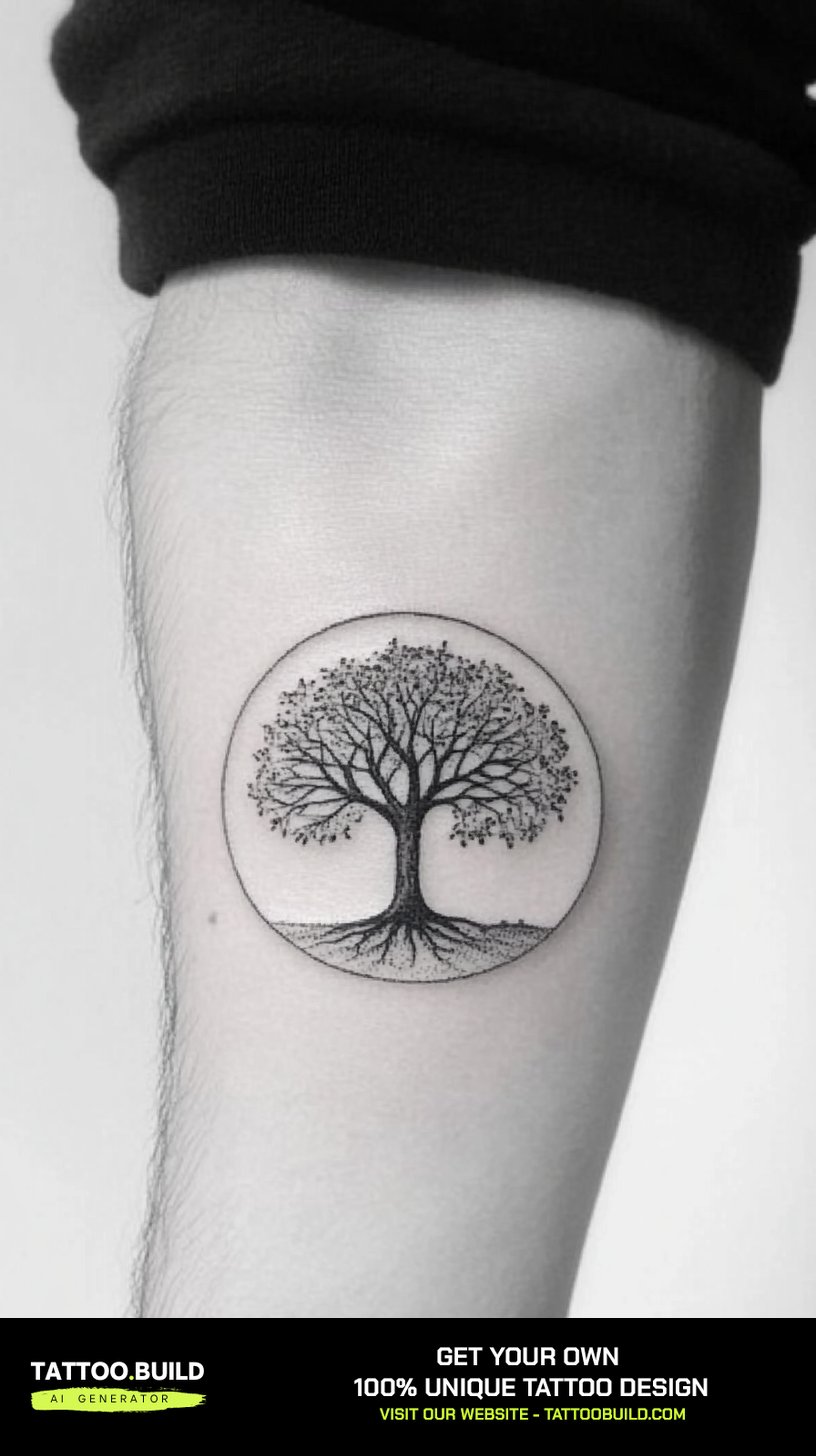
3. Geometric and Framed Compositions
Framing a landscape inside a circle, hexagon, or rectangle does two useful things: it gives the design a hard edge so it does not drift into the surrounding skin, and it makes placement decisions much easier.
Geometric versions build the peaks from clean triangles and straight lines rather than organic contours. It is a stylised look, and it either appeals to you immediately or it does not.
One caution from experience: a perfect circle on a curved limb will not look like a perfect circle. Good artists compensate by drawing the stencil slightly oval so it reads round once wrapped.
Framed geometry pairs naturally with other angular nature work, in the same family as geometric bear tattoo ideas.
4. Dotwork and Etching Textures
Dotwork replaces smooth grey shading with thousands of individual points, and etching replaces it with fine parallel hatching. Both give you gradient without the flat wash that tends to blur first.
For mountains this is genuinely well suited. Rock face is textural in real life, so a stippled or hatched surface looks correct rather than stylised.
These techniques take considerably longer to apply than solid shading. A palm-sized dotwork range can easily run three to five hours, and the skin is often more irritated afterwards because of the repeated needle passes.
Ask to see healed photographs before booking. Dotwork that was spaced too tightly merges into grey mush within a couple of years, and healed work is the only reliable proof.
5. Full Scenes With Water, Camps and Wildlife
Once you add a river, a lake reflection, or a tent and campfire, you have stopped making a symbol and started making a picture. That is a different commitment in both size and budget.
Scenes need room. In my experience the minimum that works is roughly a half sleeve, a full calf, or a substantial thigh panel — anything smaller and the added elements become unreadable specks.
The payoff is that scenes tell a specific story. A lake reflection turns a generic range into a place you can name, and a campfire adds warmth that a bare landscape never has.
Plan the whole scene before the first session even if you intend to build it over several appointments. Adding a river to a finished mountain later almost always looks bolted on.
6. Colour, Watercolour and Sunrise Palettes
Colour is where I give the most cautious advice. It can be beautiful, and it will fade faster than black — particularly the soft blues, oranges and greens that suit landscapes.
The version that lasts is colour laid over a proper black structure. If you removed every drop of pigment and the design still read as a mountain and a tree, it will age acceptably.
Pure watercolour with no outline is the highest-risk choice. It looks incredible in a fresh photograph and it is the style most likely to need touch-ups within a few years.
Sun exposure is the main accelerant, so if the piece is going somewhere routinely uncovered, factor sunscreen into the decision rather than treating it as optional aftercare.
7. Large-Scale and Placement-Led Pieces
Some of the strongest work I have seen was designed for the body part first and the landscape second. A wide back panel can carry a panoramic range that no forearm could hold.
Ribs suit long horizontal scenes. Inner bicep suits vertical stacks with real foreground-to-background depth. Upper back suits width.
Larger pieces also let the artist spread detail out, which is the single best insurance against blurring. Space is what keeps a tattoo readable at twenty years, not detail.
Be realistic about sitting time. A back panel is usually several sessions, and healing between them is not optional.
8. Small and Minimal Versions
Small mountain and tree tattoos are enormously popular and they are the ones I most often see people return to fix.
The rule I would give anyone: at wrist, ankle or finger size, drop to one peak and one tree. Not a range. Not a forest.
Fingers are the hardest placement on the body for ink retention. Skin there regenerates quickly and is constantly abraded, so touch-ups are common rather than exceptional.
A small piece done sparsely will outlast a small piece done densely every single time. That is the whole trade.
Variations and Add-Ons Worth Considering
If a plain landscape feels incomplete, these three additions are the ones that integrate most naturally rather than looking stuck on.
Compass and Directional Elements
A compass rose sitting in the sky above a range is one of the most common combinations in this category, and it works because the two shapes occupy different zones of the composition.
The stronger execution integrates the compass into the mountain outline itself rather than floating it separately. It takes a better drawing but the result stops looking like two tattoos sharing space.
The symbolism is doing real work here too — direction, finding your way, returning home. The full breakdown of compass tattoo meaning is worth reading if that meaning is part of why you want the piece, and compass forearm placement covers how the shape sits on that placement.
Wildlife and Realism
Adding an animal shifts the emotional register completely. A wolf silhouette in the foreground makes the landscape feel inhabited rather than empty.
Silhouettes integrate more easily than fully rendered animals, because a solid black shape sits cleanly in front of shaded peaks without competing for detail.
If you want a fully realistic animal, budget the space for it. A detailed face crammed into a small landscape usually loses to the landscape. The wolf tattoo ideas collection shows how much room a good one actually needs.
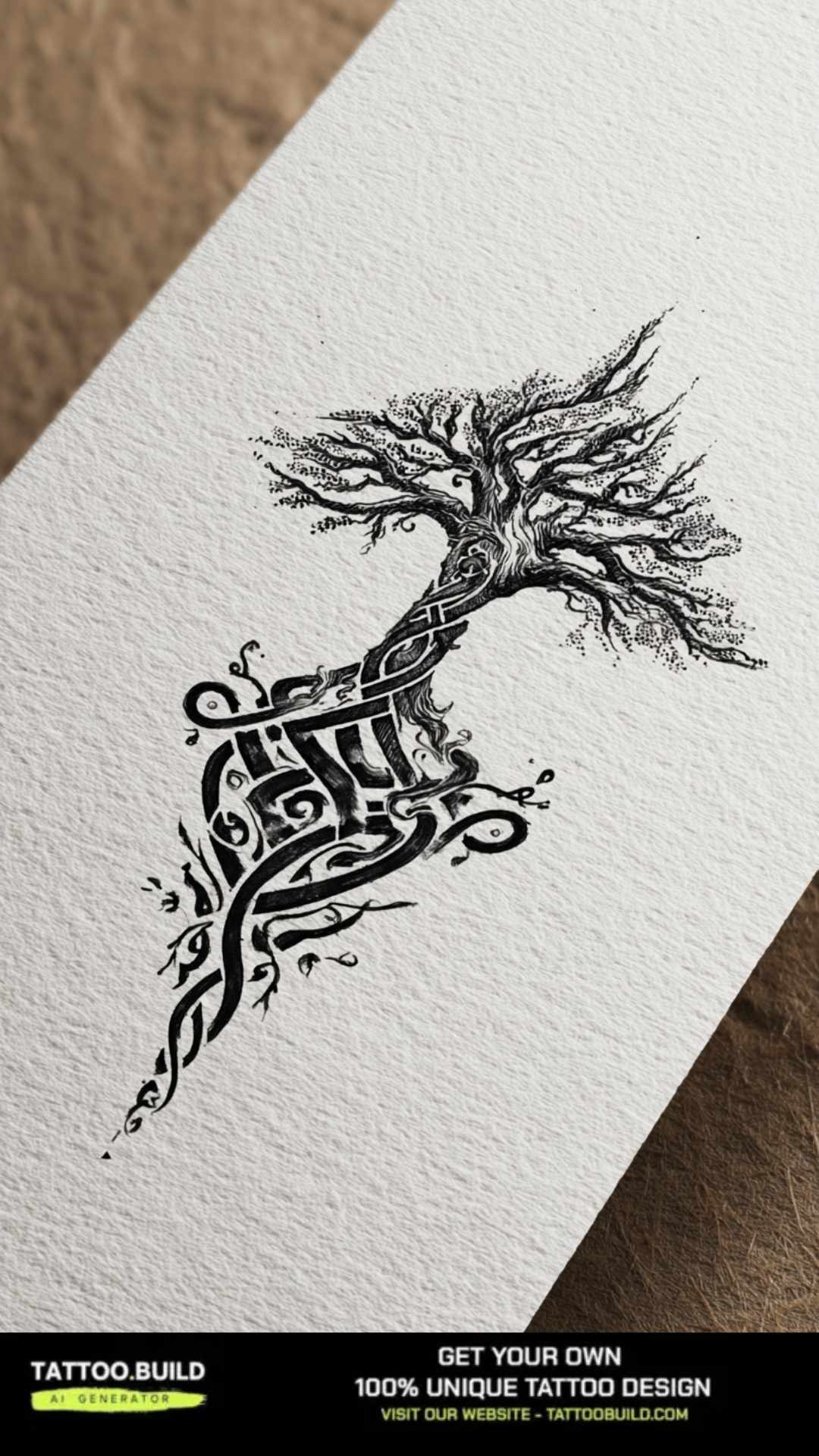
Roots, Growth and Tree of Life Crossovers
Extending roots below the mountain line pulls the design toward growth and grounding rather than adventure and distance. It is a meaningful shift, not just a decorative one.
This variation overlaps heavily with tree of life tattoos, and some of the strongest pieces borrow the symmetry of that tradition while keeping a real ridgeline behind it.
Roots also solve a practical problem: they give a vertical design somewhere to end, instead of stopping abruptly mid-forearm.
Getting It Done Well: Practical Advice
Bring reference photographs of real places, not other people’s tattoos. Artists translate landscapes far better than they translate someone else’s translation, and you avoid wearing a copy.
Ask specifically to see healed work in the style you want. Fresh photographs flatter every tattoo equally; healed photographs are where the difference between artists actually shows.
Aftercare for landscape work is the same as for anything else — keep it clean, keep it moisturised, keep it out of the sun while it heals. The American Academy of Dermatology guidance on caring for tattooed skin is a reliable, non-commercial reference, and the FDA consumer guidance on tattoos explains what to check before you book.
If anything about the healing looks wrong — spreading redness, swelling that increases rather than settles, discharge, or a fever — contact your artist and see a doctor. That is a medical question, not a tattoo question, and Mayo Clinic on tattoo risks outlines the risks worth knowing about. Nothing in this article is medical advice.
Common Mistakes and What to Do Instead
Going too small is the mistake I see most. A full range with a forest, a river and a sun does not survive at wrist size no matter who tattoos it.
Copying a photograph literally is the second. Photographs have atmospheric haze and infinite tonal range; skin has neither. A good stencil is an interpretation.
Choosing the artist by price rather than portfolio is the third, and it is the expensive one. Reworking a blurred landscape costs more than doing it properly once.
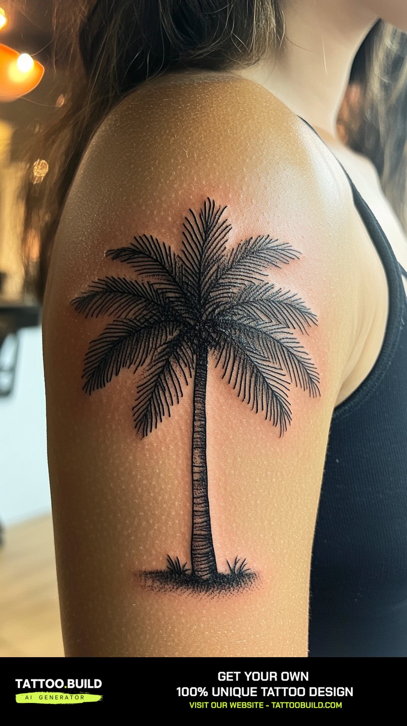
Still weighing it up? It often helps to look sideways at adjacent subjects before committing — palm tree tattoo ideas take a completely different approach to the same natural-world theme, and tree tattoo drawings are worth comparing for how they handle scale and repetition.
Frequently Asked Questions
How much does a mountain and tree tattoo usually cost?
Price depends far more on size, detail and your artist’s hourly rate than on the subject itself. A small fine line piece is often a single short sitting, while a full scene with water and wildlife can run several sessions. Most studios quote either an hourly rate or a flat price for the whole design once they have seen the stencil. Ask for the quote in writing before you book so there are no surprises.
Do mountain and tree tattoos blur over time?
All tattoos soften somewhat, and landscape work shows it more than most because it relies on the gap between foreground and background. Designs with generous spacing and clear line-weight contrast hold up best. Solid blackwork generally stays sharpest, while fine line and unlined watercolour soften the fastest. Sun protection makes a real difference over the long run.
What is the best placement for a first mountain tattoo?
The outer forearm and the calf are both forgiving for a first piece — they are relatively flat, easy to keep clean while healing, and comfortable to sit through. Ribs, spine and inner bicep are more painful and generally better once you know how you handle the process. Fingers and hands are the hardest to keep looking good long term. Match the shape of the design to the shape of the placement rather than the reverse.
Should I get colour or black and grey?
Black and grey is the lower-maintenance choice and it ages more predictably, which is why most of the pieces that still look good after a decade are black and grey. Colour brings warmth that black and grey cannot, especially in sunrise and autumn palettes. If you want colour, ask for a solid black structure underneath it. Expect that colour may need a touch-up sooner than black work would.
Can a mountain and tree tattoo cover an old tattoo?
Sometimes, and blackwork versions are the most capable at it because heavy black can absorb existing lines. Fine line and light dotwork almost never cover anything successfully. Whether it works depends entirely on how dark and how large the existing piece is, so this is a conversation for a cover-up specialist rather than a general assumption. Bring a clear photograph to the consultation.
Quick Summary
- Depth separation between foreground trees and background peaks is what keeps the design readable for decades.
- Blackwork and heavy negative space age the most reliably; unlined watercolour ages the fastest.
- Anything under roughly three inches should drop to one peak and two or three trees.
- Let placement dictate the composition: forearms want horizontal, spines want vertical, backs want width.
- Geometric framing gives a hard edge and makes placement decisions easier, but must be drawn oval to read round on a curved limb.
- Full scenes with rivers, camps or wildlife need at least a half sleeve, calf or thigh panel to work.
- Always ask to see healed photographs, not fresh ones, when judging an artist’s landscape work.
- Treat any sign of infection as a medical issue and see a doctor, not just your artist.