A mountain and tree tattoo is one of the few nature designs that still looks right twenty years later. The reason is simple: a peak and a treeline are built from the same shapes a tattoo needs to survive — hard silhouettes, clean negative space, and no reliance on tiny detail that blurs as ink settles into skin.
I have watched a lot of landscape pieces heal, and the pattern is consistent. The ones that stay readable are the ones where you could recognise the design from across a room, in shadow, squinting.
In this guide I walk through the styles that hold up, the placements that suit tall vertical landscapes, what the elements actually symbolise, and the mistakes that quietly ruin an otherwise good design. If you want a wider pool of peak-only designs first, the mountain tattoo ideas collection is a useful companion to this page.
Every image below is a real design worth bringing to a consultation — not as something to copy line for line, but as a way to point at a feeling and say this is the direction I want.
Which Mountain and Tree Tattoo Style Is Right for You?
Style choice matters more than subject choice here. The same mountain and pine composition reads completely differently depending on how it is rendered — and the styles age at different rates.
| Style | Best For | Typical Size | Ages Well? | Touch-Up Outlook |
|---|---|---|---|---|
| Fine-line minimalist | First tattoos, subtle placements | 2–4 in | Softens noticeably | Often wants a refresh in a few years |
| Blackwork silhouette | Bold, high-contrast statements | 4–8 in | Excellent | Rarely needed early |
| Dotwork / stipple | Soft gradients without grey wash | 4–7 in | Good if dots are spaced | Dense areas can fill in |
| Illustrative landscape | Full scenes with depth | 6–12 in | Good at scale | Mid-tones may need lifting |
| Geometric framed | Clean, contained compositions | 3–6 in | Very good | Frame lines are the weak point |
| Watercolor | Colour, movement, softness | 4–8 in | Weakest of the group | Plan for periodic upkeep |
If you are torn between two rows, pick the one with the stronger black. Black is the pigment that holds, and a design anchored in it gives you the most room to add colour later.
What Mountain and Tree Tattoos Actually Mean
Mountains and trees are read as a pair because they say opposite things. The peak is the obstacle, the summit, the thing you climbed; the tree is the thing that stayed.
In practice most people I have talked to about these pieces are marking one of three things: a place, a period they got through, or a relationship to the outdoors that shaped them.
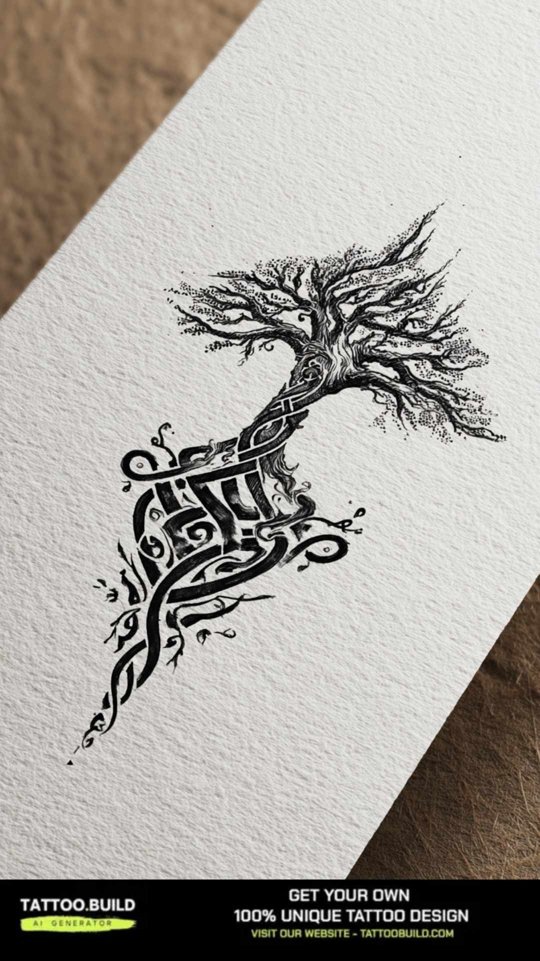
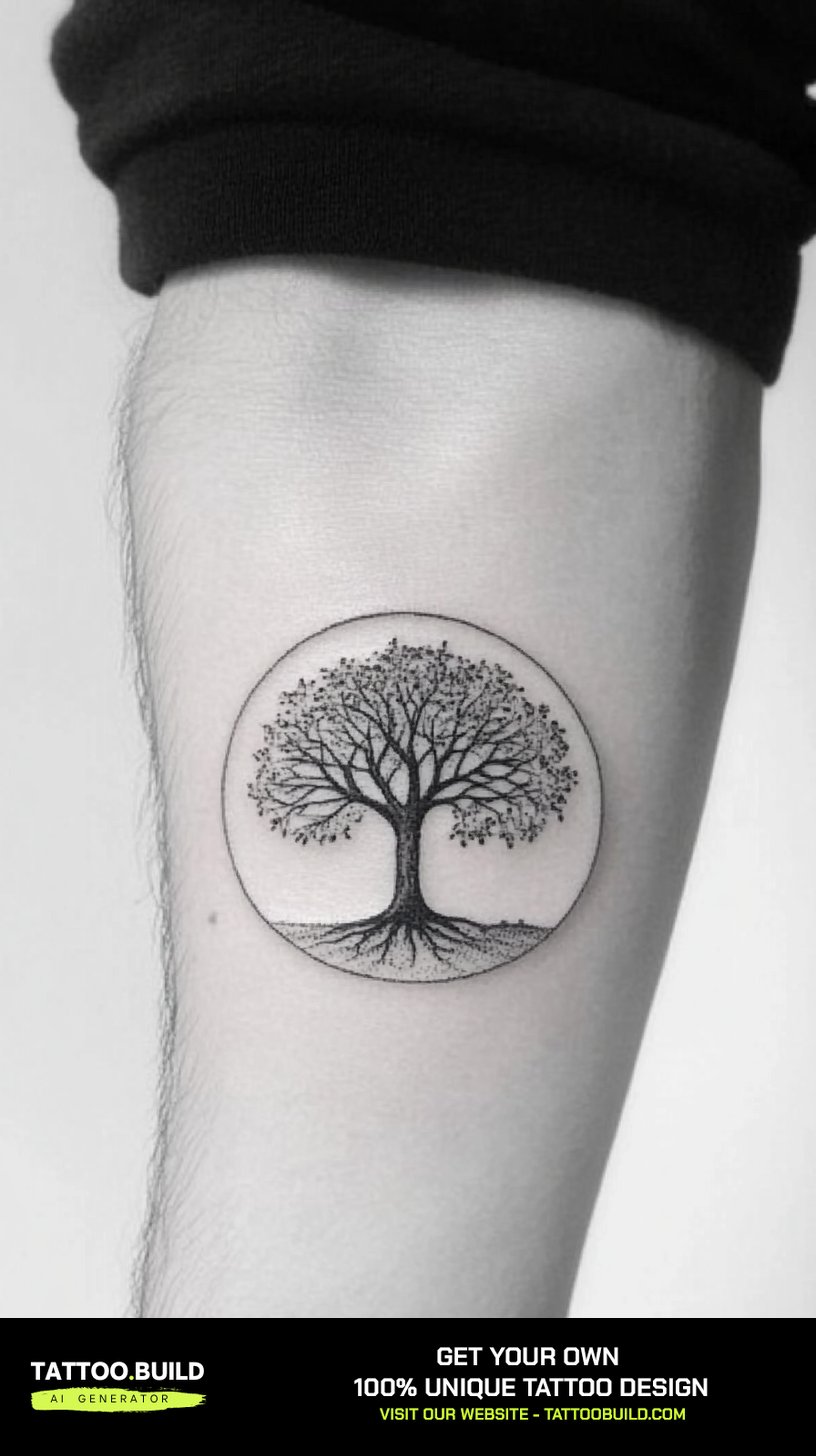
The tree side of the design carries its own lineage. Rooted-tree imagery overlaps heavily with the tree of life tattoo tradition, where the branches and roots mirror each other as a symbol of continuity.
Meaning is not something the artist adds — it is something your composition either supports or fights. A jagged, storm-lit peak and a soft sunrise ridge are the same subject with opposite emotional readings.
My advice: decide the feeling before the details. Artists can execute almost any scene, but they cannot guess whether you want awe or calm.
Mountain and Tree Tattoo Styles That Hold Up
These are the seven approaches I see most often, roughly ordered from lightest to most involved.
1. Fine-Line Minimalist Peaks
A single continuous outline for the ridge, a handful of triangular pines, and nothing else. This is the most requested version and the one I would most carefully size.
Fine-line work relies on thin, evenly-packed lines, and thin lines spread as skin ages. Under about two inches, a treeline can merge into a grey smudge within a few years — especially on hands, fingers, and feet.
Give a minimalist landscape at least three inches of width and real gaps between the trees. The empty space is doing as much work as the ink.
If this is the direction you are leaning, the fine-line tattoo gallery shows how the style behaves across other subjects too.
2. Blackwork and Heavy Silhouette
Solid black peaks, solid black trees, no internal shading. This is the toughest version of the design and the one that photographs best a decade in.
Blackwork asks for commitment because saturated black is difficult to remove or cover later. It also asks more of the healing process — large solid fills tend to feel tighter and flake more heavily than linework.
The trade is worth it if you want a piece that never needs explaining. Silhouette designs stay legible at any distance.
Artists who specialise in this look build whole portfolios around it, and the fastest way to judge one is to check whether their healed black is still genuinely solid rather than patchy.
3. Dotwork and Stippled Shading
Instead of grey wash, the artist builds tone out of thousands of individual dots. Skies, mist, and distant ridges are where this shines.
Dotwork sits somewhere between fine-line and blackwork in durability. Well-spaced stippling ages gracefully; dots packed too tightly eventually blur into flat grey and lose the texture that made it interesting.
It is also slow. A palm-sized dotwork landscape can take considerably longer than the same design in solid black, and it is priced accordingly.
Ask to see a healed dotwork photo, not a fresh one. Fresh stipple always looks crisp; healed stipple tells the truth.
4. Illustrative Landscape Scenes
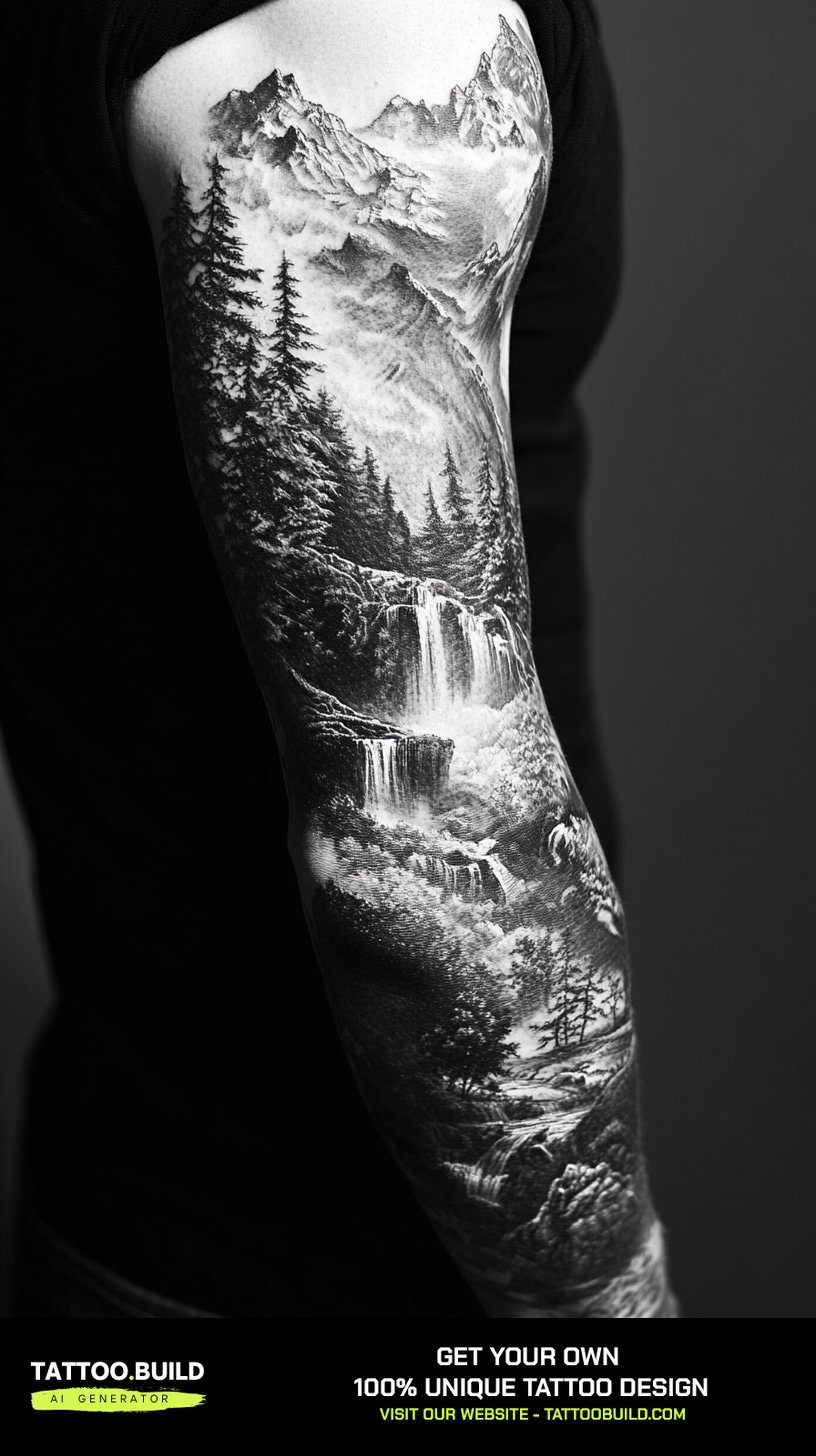
Full scenes — a valley, a lake, layered ridges receding into haze, a forest in the foreground. This is where mountain and tree tattoos stop being a symbol and start being a picture.
Scale is not optional here. A detailed landscape crammed into three inches loses its middle distance almost immediately, because the mid-tones are the first thing to go.
In my experience the sweet spot for a genuine scene starts around six inches — outer forearm, calf, or upper back rather than wrist or ankle.
Every layer needs a different value. If the foreground trees and the far ridge are the same darkness, the depth collapses.
5. Geometric and Framed Compositions
The landscape sits inside a circle, a diamond, a hexagon, or a broken triangle. The frame does two useful things: it contains the design and it gives the artist a clean edge to work against.
Framed pieces suit people who want the tattoo to look deliberate rather than sketched. They also sit comfortably alongside other tattoos without competing.
The vulnerable part is the frame itself. A long, perfectly straight or perfectly circular line shows any wobble, and it shows it forever.
Judge a geometric artist on their circles, not their mountains. The geometric tattoo ideas page is a decent benchmark for what clean framing looks like.
6. Watercolor and Colour Wash
Soft colour bleeding beyond the outlines, sunrise oranges behind a black treeline, cold blues in the valley. It is the most expressive version and the most maintenance-heavy.
Watercolor work usually fades faster than black-heavy styles, and pale pigments are the first to go. Sun exposure accelerates it noticeably.
The version that survives best keeps a black skeleton underneath — a real outlined mountain and treeline — with colour layered around it rather than replacing it.
If you want colour, plan for upkeep rather than pretending it will not fade. The watercolor tattoo gallery shows how differently the style reads with and without a black base.
7. Negative-Space and Double-Exposure Designs
The forest lives inside the mountain, or the mountain lives inside a tree, or a silhouette is carved out of a solid block of black. This is the most conceptually interesting group.
Double-exposure designs succeed or fail on one thing: whether the two shapes are still individually readable. When the inner scene is too busy, you end up with texture rather than an image.
Negative-space work also depends on the artist leaving genuinely bare skin — not lightly shaded skin — so the shape stays sharp as the surrounding black settles.
Squint at the design on paper. If the outer shape disappears when you blur your eyes, it will disappear on skin too.
Placement: Where Mountain and Tree Tattoos Actually Fit
Landscapes are wide; treelines are tall. Getting the two to agree with the shape of a body part is most of the design problem.
Forearm — The Default for a Reason
The inner and outer forearm give you a long, gently curved rectangle that suits a horizontal ridgeline or a vertical stacked scene equally well.
It is also one of the easier areas to sit through and one of the easiest to keep clean while healing. For a first landscape piece, I would start here almost every time.
Upper Arm and Shoulder
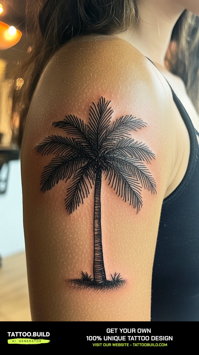
The shoulder cap and outer bicep give you a rounder canvas, which suits circular framed pieces and scenes that fade out at the edges.
This area is often less painful than bony placements and holds ink well, though the curve means the design has to be drawn on the body rather than transferred flat.
Back and Spine
The back is where a mountain and tree tattoo can become a real landscape — full ridges, layered forest, sky. It is also the least convenient area to aftercare alone.
A spine-aligned vertical composition is striking, but bone means more sensation. Plan multiple sessions rather than one heroic sitting.
Ribs, Thigh, and Calf
Vertical panels suit tall pine-and-peak compositions, and all three areas can carry a lot of black.
Ribs in particular are widely reported as one of the more uncomfortable placements — the tattoo pain by placement guide is worth reading before you commit to a long session there.
Variations Worth Considering
If a plain peak-and-pine scene feels too generic, these are the additions I see working most often.
Add an Animal
A wolf, bear, elk, or bird silhouette in the foreground turns a landscape into a narrative. It also gives the composition a focal point, which many pure-landscape designs lack. The wolf tattoo ideas page pairs particularly naturally with mountain scenery.
Add a Celestial Element
A sun cresting the ridge, a crescent moon between the pines, or a scattered star field changes the time of day and, with it, the whole mood.
Lean Into the Outdoor-Life Angle
Tents, canoes, campfires, and trail markers push the design toward lived experience rather than symbolism. If that is your angle, the camping tattoo ideas collection is the more focused starting point.
Strip It Back Instead
The opposite move works too. Two ridge strokes and three pines on the inner forearm can say more than a full valley scene, and it costs a fraction of the chair time.
Getting It Right: Practical Advice
Bring reference for the feeling, not the exact tattoo. Artists work far better from three images that share a mood than from one image you want reproduced line for line — and reproducing another artist’s design is poor form regardless.
Ask for the stencil to be placed and then walk around with it. Landscapes look different on a curved limb than they do flat on paper, and five minutes in front of a mirror is cheaper than a lifetime of a slightly crooked horizon.
Follow whatever aftercare your artist gives you rather than what you read online — practices differ, and they know how they packed the ink. Our general tattoo aftercare guide covers the common ground, and the Mayo Clinic publishes a plain-language overview of tattoo aftercare and healing timelines.
Sun is the single biggest long-term threat to a landscape piece, particularly anything with colour or soft grey. Once healed, sunscreen on the tattoo is the cheapest preservation you will ever buy.
One safety note worth stating plainly: if a healing tattoo becomes increasingly painful after the first few days, spreads redness, weeps pus, or comes with a fever, that is a matter for a doctor rather than a forum thread. Allergic reactions to pigment are uncommon but real, and the US FDA keeps a plain-language page on tattoo risks. Nothing on this page is medical advice, and no landscape design is worth improvising on your own skin — see a licensed artist.
Common Mistakes — and What to Do Instead
Going too small. This is the mistake I see most often. A landscape has layers, and layers need space; shrinking one does not simplify it, it just guarantees it blurs.
Flat values. When the foreground trees, the mid ridge, and the far peak are all the same darkness, the design reads as one grey shape. Insist on contrast between layers.
Chasing photorealism at small scale. A photo has thousands of tonal steps; skin holds far fewer. Stylise deliberately rather than losing the detail by accident.
Picking the artist last. Style specialism matters more than proximity. If you are still narrowing the subject down, the wider nature tattoo collection is a good place to compare landscape work against other outdoor themes.
Frequently Asked Questions
How much does a mountain and tree tattoo cost?
Cost depends almost entirely on size, detail, and your artist’s hourly rate, which varies widely by city and reputation. A small fine-line ridgeline is usually a shop-minimum or short-session piece, while a detailed half-sleeve landscape is multi-session work. The honest answer is to send your reference and placement to two or three studios and compare their quotes. Be cautious of a price that is dramatically below the others — that gap is usually experience.
What does a mountain and tree tattoo symbolise?
There is no fixed meaning, which is part of the appeal. Mountains commonly stand for obstacles overcome, ambition, or a specific place that matters to someone. Trees more often represent roots, growth, resilience, or family continuity. Together they tend to read as endurance — something climbed, and something that stayed standing.
Do mountain and tree tattoos age well?
Better than most nature designs, provided the style suits the size. Blackwork silhouettes and well-spaced dotwork hold up strongly because they rely on shape rather than fine detail. Very small fine-line work and watercolour without a black base are the two versions most likely to need attention within a few years. Sun exposure is the biggest variable you actually control.
Where is the best placement for a first mountain tattoo?
The forearm is the most forgiving starting point in my experience — it suits both horizontal and vertical layouts, it is comfortable to sit through relative to bony areas, and it is easy to keep clean while healing. Outer thigh and calf are close seconds if you want it less visible. I would avoid hands, fingers, and feet for a detailed landscape.
Can I add colour to an existing black mountain tattoo?
Usually yes, and it is one of the more common follow-up requests. A black-outlined landscape gives an artist a solid framework to layer sunrise or sky tones into later. Take it back to the original artist where you can, since they know exactly how the black was packed. Wait until the existing piece is fully healed before adding anything.
Quick Summary
- Choose the style before the scene — it decides how the tattoo ages more than the subject does.
- Blackwork silhouettes and spaced dotwork are the most durable options here.
- Give any detailed landscape at least six inches; small scenes lose their mid-tones first.
- Contrast between foreground, mid ridge, and far peak is what creates depth.
- Forearm is the most forgiving placement; back and ribs suit larger, multi-session work.
- Watercolour needs a black skeleton underneath and ongoing upkeep.
- Sunscreen on a healed tattoo is the cheapest long-term preservation there is.
- Escalate any spreading redness, worsening pain, or fever to a doctor, not a forum.