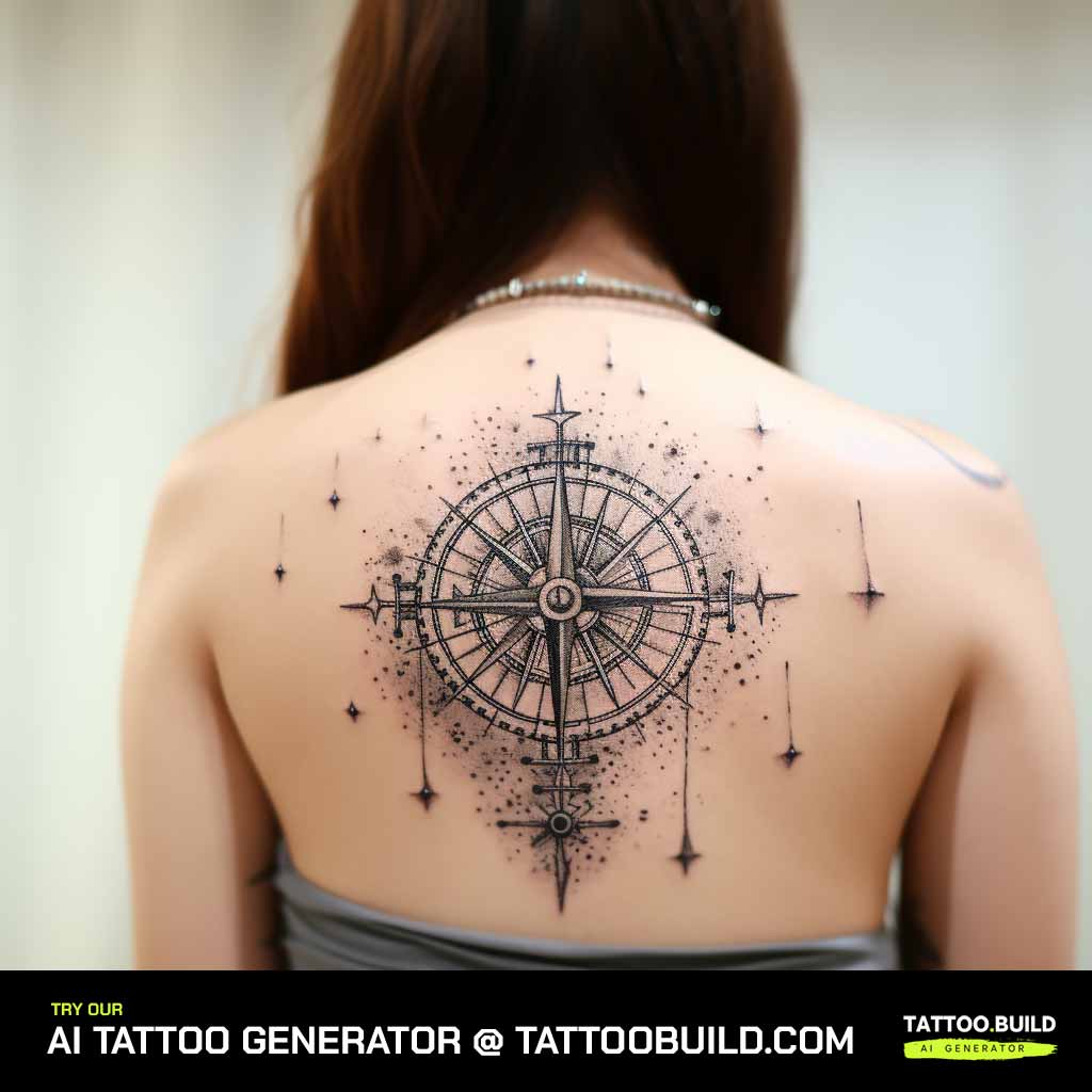
A Gemini tattoo is one of the few zodiac designs that works just as well at two centimetres as it does at twenty. That flexibility is most of its appeal.
I have drawn and watched artists tattoo this sign more than any other air sign, and the pattern is consistent: people arrive wanting the glyph, then discover there are five or six genuinely different ways to say the same thing.
Some want the twins. Some want the stars. Some want neither and just want the word.
This guide walks through each approach with the trade-offs I have actually seen play out on healed skin — how each one ages, where it sits best, and where people tend to go wrong. If you are still deciding between signs, the wider constellation tattoo guide is a useful companion.
Which Gemini Tattoo Style Is Right for You?
Before the individual designs, here is the short version. This is roughly the conversation I have with people in the first ten minutes of a consultation.
| Approach | Best Size | How It Ages | Choose It If |
|---|---|---|---|
| Gemini glyph (⚌) | 2–6 cm | Excellent with medium line weight | You want something small, obvious and low-maintenance |
| Constellation | 8–20 cm | Good if dots are not micro-fine | You prefer astronomy over astrology symbolism |
| Twin figures or faces | 10–25 cm | Depends heavily on the artist | You want a narrative piece with real detail |
| Watercolour or colour wash | 8–20 cm | Softens fastest; needs black anchoring | You like colour and accept future touch-ups |
| Ornamental or mandala | 10–25 cm | Very good; symmetry hides ageing | You want decoration more than a literal symbol |
| Script lettering | 4–12 cm | Poorest if letters are too tight | You want the word, not the symbol |
None of these are rules. They are tendencies, and a very good artist can push past most of them.
What the Gemini Symbol Actually Means
Gemini is the third sign of the zodiac and covers roughly 21 May to 20 June under the tropical system most Western astrology uses.
The glyph ⚌ is a pair of vertical strokes joined top and bottom — two figures standing side by side, reduced to almost nothing.
The mythology behind it is the Greek and Roman story of Castor and Pollux, twin brothers where one was mortal and one was not. The surviving brother asked to share his immortality rather than lose the other, and the pair were placed in the sky together. You can read more about the constellation itself on Britannica.
That is the part most people connect with: not twins as siblings, but two things that cannot be separated.
Astronomically, the constellation is anchored by two bright stars carrying those same names, with Castor and Pollux marking the twins’ heads. That detail matters for tattoo design, because most constellation layouts build outward from those two points.
Gemini Tattoo Ideas That Work on Skin
These are the designs I keep coming back to, roughly in order of how often people actually choose them.
1. The Minimalist Gemini Glyph
This is the default, and there is nothing wrong with being the default.
The glyph is symmetrical, instantly recognisable to anyone who knows the zodiac, and invisible as anything but a shape to everyone else.
My one piece of advice: do not go too thin. Every artist I have asked says the same thing — a glyph tattooed with a single hairline needle at a centimetre wide is the piece most likely to come back for a touch-up. At three to four centimetres with a medium line, it will hold for years.
It also sits well almost anywhere, which is why it is the usual pick for a first tattoo. Look at minimalist tattoo ideas if you want it very small and very quiet.
2. The Gemini Constellation
The constellation version reads as astronomy rather than astrology, which is exactly why a lot of people choose it.
It is a scatter of dots with hairline connectors, and the shape is long and slightly irregular — which makes placement more important than with the glyph.
When I have seen these age poorly, it is almost always because the dots were tattooed too small. Tiny dots close together tend to soften into each other. Ask for slightly larger dots with more space between them than the reference photo shows.
Spine, ribs, inner forearm and collarbone all suit the shape. Celestial tattoo ideas covers the layout question in more depth.
3. Twin Faces and Twin Figures
This is the most literal interpretation and the most demanding one.
Two mirrored faces, two full figures, or a single face split down the middle — all of them depend entirely on the artist’s drawing ability.
I would not book this with someone whose portfolio is mostly script and small florals. Look specifically for healed portrait or illustrative work before you commit.
When it works it is the strongest version of the sign, because it carries the story rather than just the label. When it does not, it is very obvious.
4. Spine and Vertical Constellation Layouts
Running the constellation vertically down the spine is a specific enough choice to deserve its own entry.
The shape suits it: Gemini is elongated, and the spine gives it a natural line to follow.
Two honest warnings from experience. The spine is a bony, high-sensation placement and most people find it a harder sit than the forearm. And it is a placement you will rarely see yourself without two mirrors.
If you want the same vertical run somewhere easier, the outer forearm and the back of the calf both work.
5. Bold Blackwork Gemini
The opposite approach to fine line: heavier lines, solid fills, no delicacy at all.
This is the version I would pick if I only cared about how the tattoo looks in fifteen years.
Bold linework has margin built into it. When the ink spreads slightly, as all ink does, a thick line is still a thick line. A hairline becomes a smudge.
It suits the upper arm, the outer thigh and the calf, where there is enough space for the weight not to feel cramped.
6. The Air Element Treatment
Gemini is an air sign, and some of the nicest designs I have seen lean on that instead of the twins.
Wind lines, small clouds, drifting linework wrapped around or behind the glyph.
It gives the tattoo movement without adding much visual noise, and it reads as decorative rather than astrological to anyone who does not know the sign.
Keep the airy elements lighter than the glyph itself. If they compete, the symbol disappears.
7. Gemini with Birds
Adding one or two small birds is the most common way people extend a Gemini tattoo without changing what it is.
Two birds echoes the twins. One bird just nods to the air element.
Small birds are deceptively hard to tattoo well at tiny sizes — the wing detail collapses first. In my experience anything under about three centimetres is better rendered as a simple silhouette than as a detailed bird.
Shoulder, upper back and ribs give birds room to sit at a natural distance from the glyph.
Variations Worth Considering
If none of the above quite fits, these are the directions people most often move in.
Geometric Framing
A thin circle, a triangle or a simple frame around the glyph turns a plain symbol into a composed piece.
It also solves a practical problem: a bare glyph can look unfinished on a large flat area, and a frame gives it edges.
Symmetry is unforgiving here, so this one genuinely depends on steady linework. See geometric tattoo designs for what strong geometry looks like healed.
Floral Gemini
Flowers behind or around the glyph soften it considerably.
If you want it to mean something specific, the birth flowers associated with June are honeysuckle and rose, which is a natural pairing for the sign.
Ask for the botanicals to sit behind the symbol rather than crossing over it. When they overlap, the glyph stops reading at a glance.
Script Instead of Symbol
Some people want the word, not the sign.
Script is riskier than it looks. Thin cursive letters placed close together are the single most common thing I see come back for touch-ups.
If you want lettering, go slightly larger than feels necessary and pick an artist whose portfolio is mostly lettering.
Watercolour and Colour Wash
A soft wash of colour behind a solid black glyph is a genuinely nice look.
It also fades faster than black. That is not a flaw in the style, it is how lighter pigment behaves in skin, and sun exposure accelerates it.
The version that lasts keeps a strong black element as the anchor so the piece still reads even after the colour softens. Watercolor tattoo ideas goes into the trade-offs properly.
Scattered Stars
Instead of the full constellation, a loose scatter of small stars across the collarbone or shoulder.
It is the most subtle option on this list, and the easiest to add to later.
Follow the natural curve of the bone rather than a straight line — it looks far more deliberate.
Placement, Pain and Aftercare
A few practical things that matter more than the design choice.
Size to the thinnest line, not to the space. If you shrink a design to fit a small spot, the fine details shrink with it, and that is what fails first.
Sit through the stencil properly. Look at it in a mirror, check the angle when your arm is relaxed rather than held out, and ask for it to be moved if it is not right. A good artist expects this.
For healing, follow the written aftercare your studio gives you rather than advice from the internet — including this article. Broadly it means keeping it clean, not soaking it, and keeping it out of direct sun. The American Academy of Dermatology has clear general guidance on caring for tattooed skin.
If you see spreading redness, swelling that gets worse after a few days, pus, or a fever, contact a doctor. Those are signs of infection, not normal healing, and they need medical attention rather than a forum thread. Anyone with a history of skin allergies or reactions to pigment should raise it with both the artist and a doctor before booking.
Common Mistakes — and What to Do Instead
Going too small is the mistake I see most often. A glyph at one centimetre looks perfect on paper and vague on skin within a couple of years.
Copying a reference exactly is the second. Bring three or four images and let the artist build something for your body from them — the proportions of an image made for a flat screen rarely translate directly to a curved limb.
Choosing the artist by price rather than by portfolio is the third, and the most expensive one in the long run.
Still weighing it up? How to choose a tattoo design is worth reading first, and how much a small tattoo costs covers the money side honestly. If you want the shape without the astrology, moon phase tattoos and fine line tattoo ideas are the closest neighbours.
Frequently Asked Questions
What does a Gemini tattoo actually symbolise?
At its core a Gemini tattoo represents duality — two sides held in one person rather than two people. The glyph itself is a stylised pair of twins, and in Greek myth those twins are Castor and Pollux, one mortal and one immortal. Most people I have tattooed with this symbol read it as adaptability, curiosity and a mind that moves quickly. Some read it more personally: a twin sibling, a split in their own life, or two roles they carry at once. There is no single correct meaning, and your artist does not need you to justify it.
Do I have to be a Gemini to get one?
No, and plenty of people are not. I have tattooed the glyph for people marking a partner’s birthday, a child born in Gemini season, or simply because they liked the shape. The symbol carries whatever meaning you attach to it. If you are worried about it reading as a claim about yourself, the constellation version is far more neutral than the glyph.
How much does a Gemini tattoo cost?
It depends on size, placement and your artist’s rate, so anyone quoting you a universal number is guessing. In my experience a small glyph is usually the shop minimum — a single sitting under an hour — while a detailed twin-figure piece can run several sessions. Studios in larger cities charge noticeably more per hour than smaller towns. Ask for a quote on the actual drawing rather than a category, and expect the number to move if you change the size.
Where does a Gemini tattoo look best?
The glyph is small and symmetrical, so it works almost anywhere — inner forearm, wrist, behind the ear, ankle, back of the arm. Constellations suit long flat runs like the spine, ribs, forearm or collarbone, because the star pattern needs room to spread. High-friction spots such as fingers, palms and the outer edge of the hand fade the fastest in my experience, and usually need touch-ups sooner. If it is your first tattoo, the inner forearm is the easiest place to sit through and the easiest to look after.
Will a fine line Gemini tattoo blur over time?
Some spread is normal for any tattoo, and very thin lines placed close together are the most likely to run into each other. That is a function of ink settling in living skin, not bad work. Ask your artist to leave more space between elements than the reference image shows, and keep the finished piece out of direct sun. Most fine line work stays crisp for years when it is placed sensibly and looked after.
Quick Summary
- The Gemini glyph is the simplest option and the safest bet — keep it at least three centimetres with a medium line weight.
- The constellation reads as astronomy rather than astrology and suits long placements like the spine, ribs and forearm.
- Twin faces and figures are the most expressive version and the most dependent on your artist’s drawing skill.
- Bold blackwork ages better than fine line, full stop — choose it if longevity matters most to you.
- Air-element styling, birds, florals and geometry all extend the sign without changing what it means.
- Watercolour looks beautiful fresh but needs a black anchor and accepts future touch-ups.
- Size the piece to its thinnest line, and approve the stencil in a mirror before starting.
- Follow your studio’s written aftercare, and see a doctor for spreading redness, worsening swelling or fever.