A half sleeve tattoo drawing lives or dies on how it wraps, not on how good it looks flat on paper.
I have watched more than one gorgeous sketch fall apart the moment it was stencilled onto an actual arm, usually because the artist drew it as a rectangle instead of a cylinder.
Over the years I have sat in on consultations, redrawn my own sleeve concept three times before committing, and asked every artist I know the same question: what separates a drawing that transfers well from one that has to be rebuilt on the spot?
The answer is almost always composition. The ideas below are the ten themes I keep seeing hold up on skin, and if you want a lighter take on the same format, the fine line sleeve approach is worth a look before you settle on anything.
Which Half Sleeve Style Is Right for You?
Before you draw a single line, it helps to know what you are signing up for in terms of drawing complexity and chair time.
The table below is based on what artists I have worked with quote as a normal range, not a guarantee. Your arm size, your artist’s speed and how much colour you want will move every number in it.
| Style | Drawing Difficulty | Typical Sessions | Ages Best When |
|---|---|---|---|
| Floral / botanical | Moderate | 2 to 4 | Line weights vary and petals overlap |
| Japanese traditional | High | 4 to 6 | Background wind and water are committed to fully |
| Celestial / space | Moderate | 2 to 4 | Dark areas stay solid rather than soft grey |
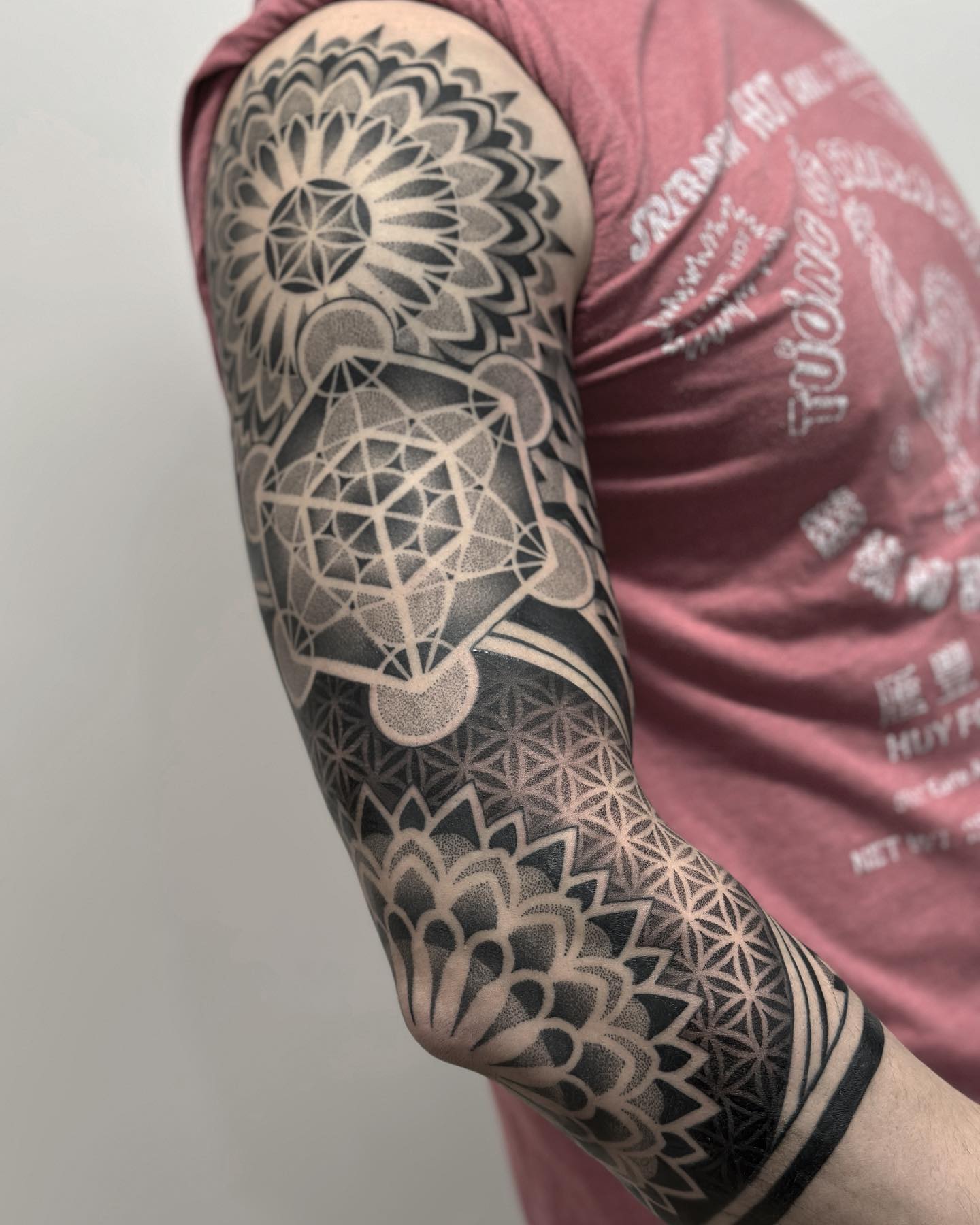
| Blackwork / illustrative | Moderate | 3 to 5 | Shapes read clearly from two metres away |
| Biomechanical / steampunk | Very high | 4 to 8 | Depth order is planned before any detail is added |
| Realism portrait | Very high | 4 to 8 | Placed on flat outer bicep with saturated blacks |
If two rows look equally appealing, pick the one whose drawing difficulty you can actually execute at full size, because a half sleeve concept has to survive being enlarged to roughly 30 centimetres tall.
What Actually Makes a Half Sleeve Drawing Work
A half sleeve normally runs from the shoulder to just above the elbow, or from the elbow to the wrist if you go lower. Either way you are drawing on a tapering cylinder, not a flat page.
That single fact changes everything. Roughly a third of your drawing is invisible from any one viewing angle, so the design needs a focal point on the outer arm and connective material everywhere else.
In my experience the drawings that transfer best are built in three layers: one or two hero elements, a set of mid-sized supporting shapes, and a background texture that fills gaps without demanding attention.
The second thing that matters is flow. Every artist I have asked describes the same test, which is turning the reference sheet on its side to check that the composition still has a clear direction of travel.
Finally, leave more negative space than feels comfortable. Ink spreads slightly over years, and a drawing packed edge to edge on paper will close up on skin.
10 Half Sleeve Tattoo Drawing Ideas Worth Sketching
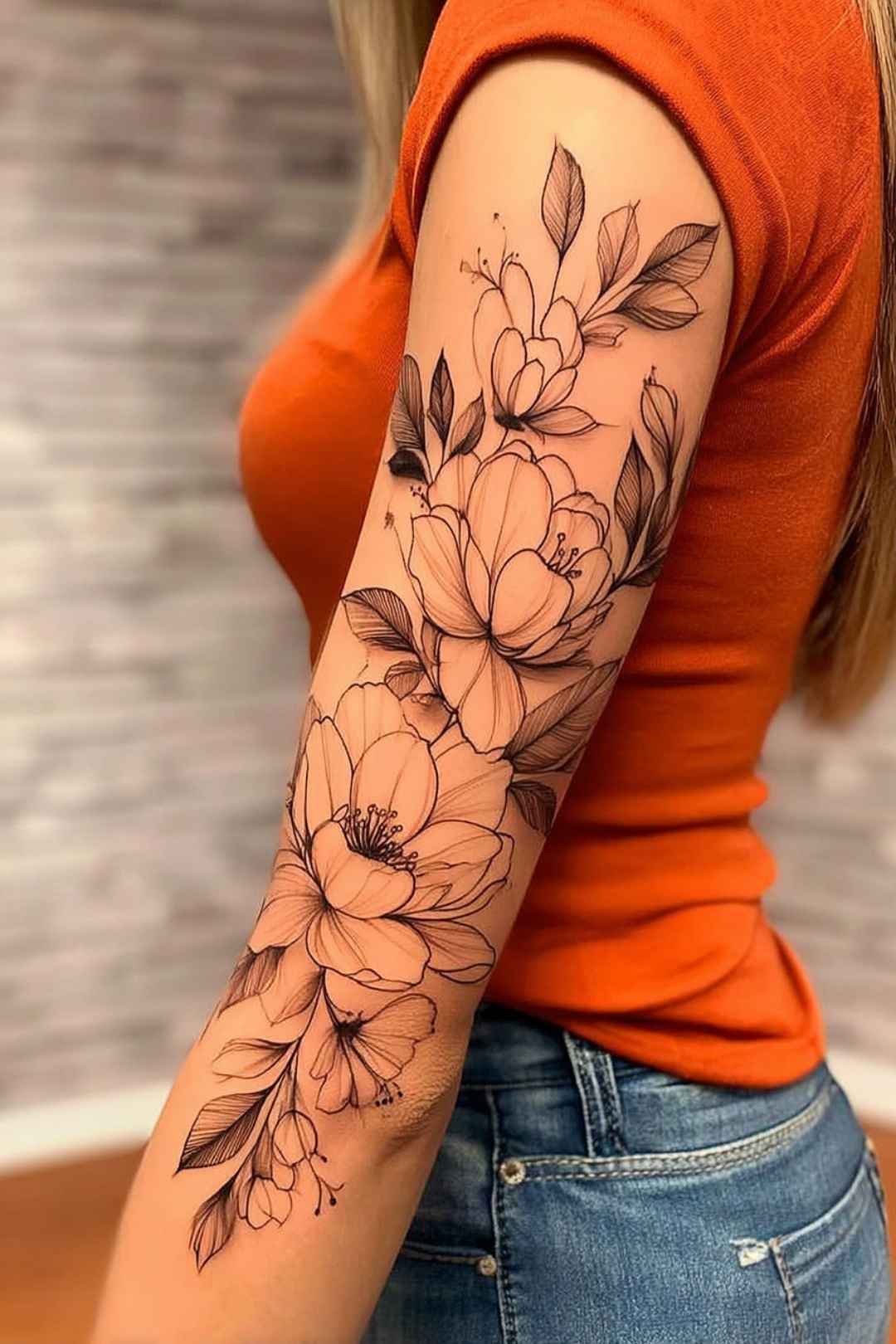
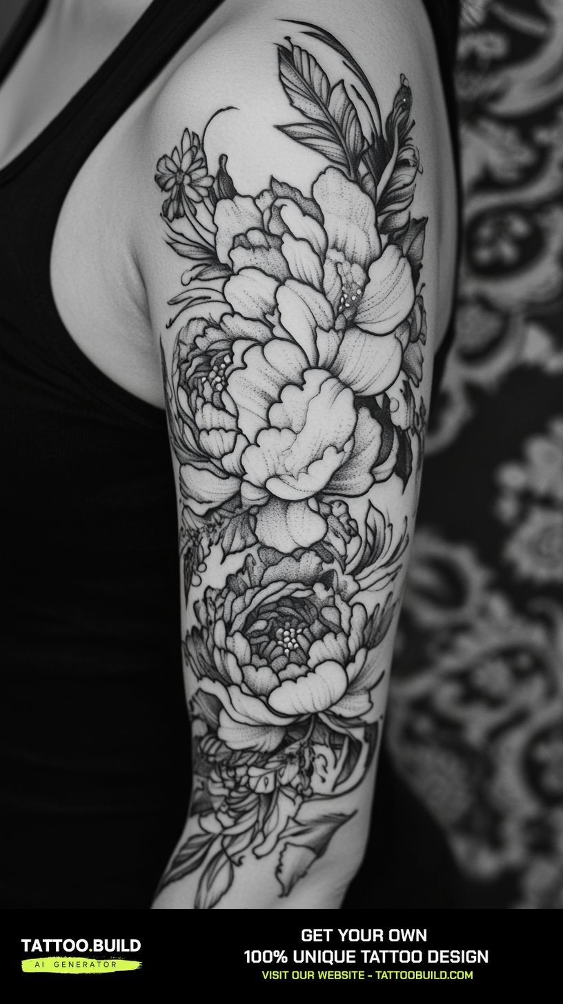
1. Floral half sleeve with roses, lilies and swirling leaves
Florals are the easiest half sleeve to start drawing and the hardest to finish well.
The trick is hierarchy. Pick two or three large blooms as anchors, place them on the outer bicep and inner forearm line, then let smaller buds and leaves carry the eye between them.
When I sketched my own botanical concept, the version that worked had exactly three full roses. The version I scrapped had seven, and at stencil size they merged into one grey mass.
Vary your line weight deliberately: heavy outlines on the front-facing petals, lighter ones on anything meant to sit behind. That is what creates depth once the shading goes in.
If you want more reference for this style specifically, the floral half sleeve gallery shows how the same idea reads across different arm shapes.
2. Japanese koi swimming through waves and maple leaves
Japanese traditional is the most structured style on this list, and that structure is a gift when you are drawing.
The koi is your subject, but the waves, wind bars and maple leaves are what make it a sleeve rather than a single tattoo with empty space around it.
Draw the background first. Every experienced Japanese-style artist I have spoken to blocks in the water and wind before refining the fish, because the background dictates where the koi can physically sit.
Direction carries meaning here. A koi drawn swimming upward is traditionally associated with perseverance, and swimming downward with a goal already reached.
Keep the outlines confident and thick. This style was designed to stay legible for decades, and thin sketchy lines undercut the whole point of it. For the subject on its own, see these koi fish tattoo drawings.
3. Celestial sleeve with moons, stars and nebula clouds
Celestial half sleeves are forgiving to draw because the subject matter has no fixed anatomy to get wrong.
Build it around a sequence. Moon phases running up the outer arm give the viewer a reading order, and everything else becomes atmosphere around that spine.
The danger is greyness. Nebula clouds drawn as an even mid-tone wash look beautiful in pencil and turn into a bruise on skin, so push your darkest areas to solid black in the drawing itself.
I usually recommend leaving at least a few genuinely blank areas of skin between clusters of stars. That contrast is what makes the bright parts read as bright.
More directions for this theme sit in the celestial tattoo collection.
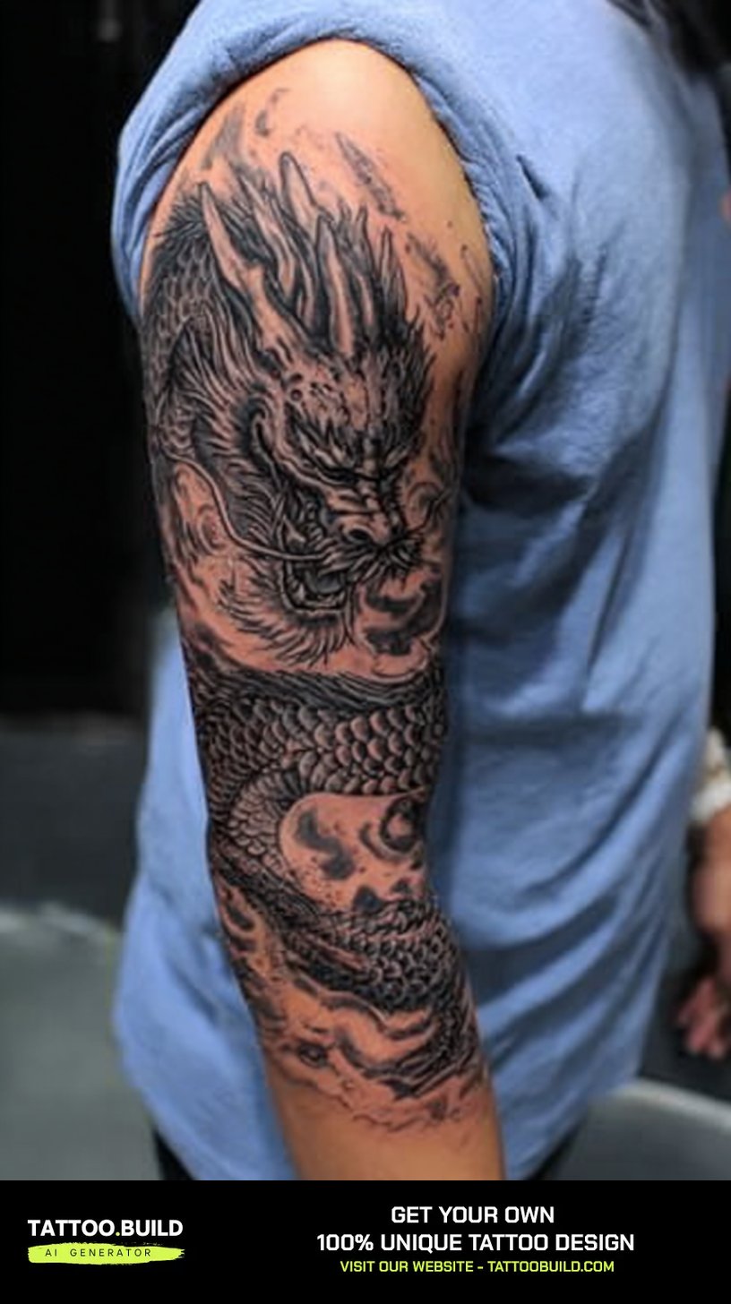
4. Dragon coiled around the arm with flames
A dragon is the single best subject for demonstrating wrap, because its body is already a spiral.
Draw it on a paper cylinder if you can. Roll a sheet, sketch the body path around it, then unroll and refine, which is the only reliable way I have found to keep the coil convincing.
Put the head on the outer shoulder or outer bicep. That is the part of the arm most people see, and the head is where all the detail investment goes.
Flames and clouds fill the leftover space, but they should follow the same direction as the body rather than radiating randomly.
Scale texture is the last thing to add, not the first, and you only need it in full detail on the sections closest to the head. There are more variations in these dragon tattoo designs.
5. Angel and demon contrast split down the arm
A split sleeve is a strong concept that fails more often than it succeeds.
The failure mode is always the same: one half gets the artist’s full attention and the other becomes filler, which kills the tension the design was built on.
Draw both halves at the same time, alternating between them every ten minutes or so. It sounds fussy, but it is the only way I have kept the two sides honest.
Decide early where the seam runs. A hard vertical split down the front of the arm is bold but awkward when the arm hangs naturally, so many artists angle it diagonally instead.
Contrast should come from value and texture, not just subject matter: soft feathering against dense solid black does more work than horns and halos ever will.
6. Forest scene with mist and a hidden wolf silhouette
Landscape sleeves suit the arm because trees are vertical and so is the canvas.
The composition almost draws itself: tall trunks running the full height, mist bands crossing them horizontally, and one shape hidden in the middle distance that rewards a second look.
Keep the wolf as a silhouette. When I tested a fully rendered animal in the same scene, it stopped being a discovery and became a portrait with trees behind it.
Mist is drawn by omission rather than addition. Leave the paper blank in horizontal bands and let the trunks fade out as they enter them.
This one ages well because it is built from large simple shapes. If you want a more graphic version of the animal, keep the silhouette and drop the mist entirely.
7. Mechanical steampunk sleeve with gears and metal plates
This is the hardest drawing on the list and the one most worth planning before you touch a pencil.
Biomechanical and steampunk designs collapse when the depth order is vague, so I block mine out as three flat layers first: torn outer surface, mid-level machinery, deep shadow void.
Only after those layers are established do the gears, pipes and rivets go in, and each one has to belong clearly to a single layer.
Torn skin edges are the traditional way to justify what is underneath, and they need a visible thickness rather than a single outline.
Reflections sell metal more than detail does. A few sharp highlight shapes on a pipe read as chrome far better than a hundred tiny screws.
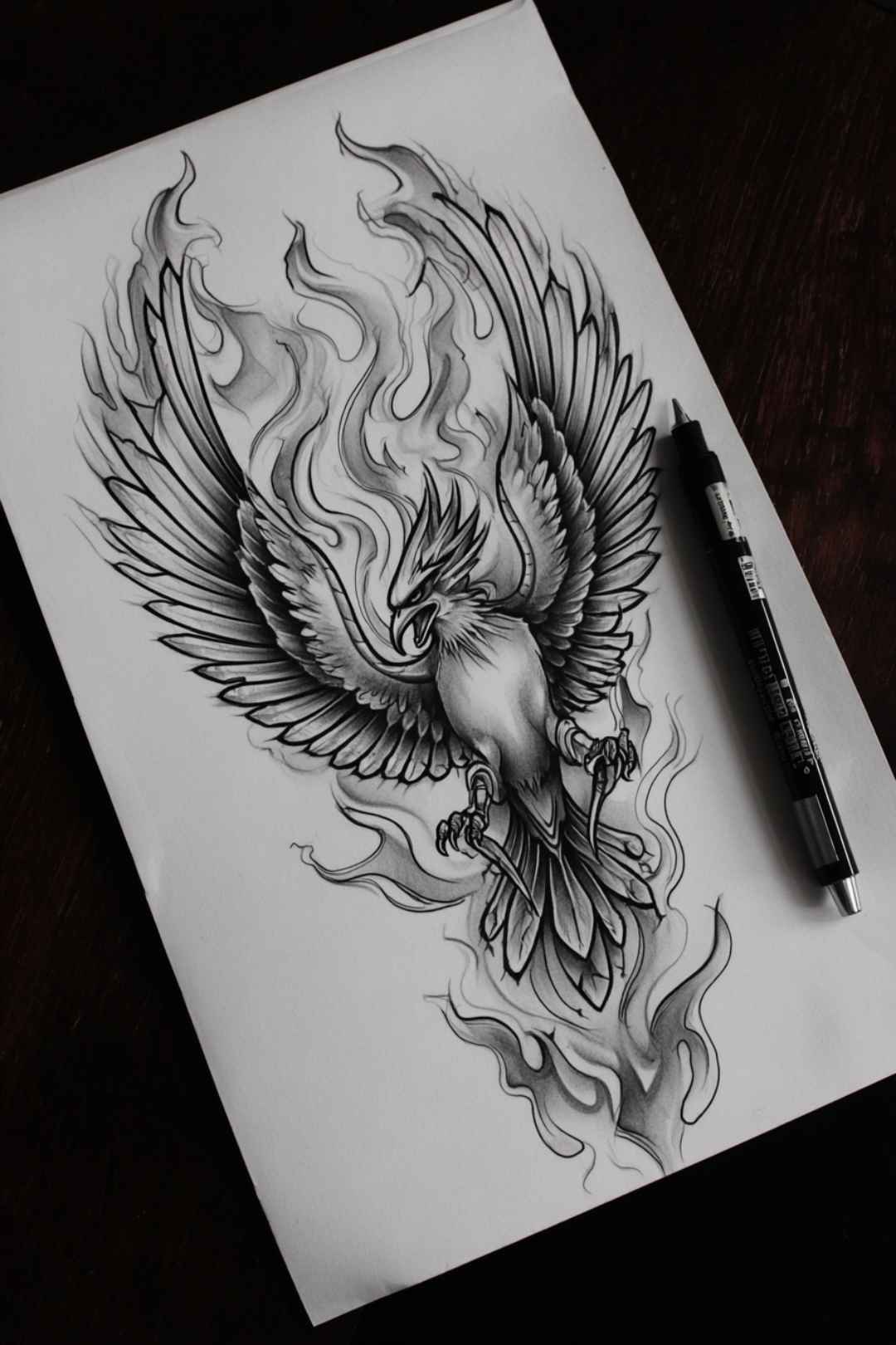
8. Phoenix rising from ashes with sweeping feathers
The phoenix is popular for half sleeves for one practical reason: the tail feathers are an excuse for beautiful, flexible filler.
Start with the body and head on the outer bicep, then let the tail sweep down and around toward the inner arm where nobody will scrutinise the detail.
Layer the plumage in three tiers of size. Big shapes near the body, medium ones through the middle, and fine wisps only at the very tips.
In my experience the most common mistake is drawing every feather with the same weight, which flattens the whole bird into wallpaper.
Fire and ash below the body are optional. Plenty of the strongest versions I have seen skip them entirely and let the feathers imply the flame. More options are in the phoenix tattoo ideas roundup.
9. Greek mythology sleeve with Athena, owls and armour
Mythology sleeves centre on a portrait, and a portrait is the least forgiving element you can put on an arm.
Place the face on the flat outer bicep. Curved surfaces distort features, and a helmet or hair can hide the transition where the arm starts turning away.
Everything else is support. Columns, laurel, armour texture and an owl give you material to fill the arm without competing with the face for attention.
Draw the portrait at the size it will actually be tattooed. A face sketched small and enlarged later loses the subtle value shifts that make it look like a person.
Statue-style rendering is the safer route than photorealistic skin, because carved stone tolerates ink spread far better. See the wider Greek mythology tattoo ideas for more figures.
10. Tiger emerging from bamboo and broken brush strokes
A tiger gives you a strong focal shape and a built-in texture in the stripes, which is a rare combination.
Draw the head three-quarter rather than straight on. It fits the curve of the bicep better and avoids the flat, mask-like look a frontal big cat can get.
Stripes should follow the form of the body underneath. Drawn as flat bands they instantly make the animal look like a printed pattern rather than a living thing.
Ink-wash bamboo behind the head keeps the background loose. Tight, fully rendered leaves would fight the stripes for attention.
Leave the lower part of the body dissolving into brush strokes. It saves you chair time and gives the design a deliberate ending rather than an amputated one.
Variations Worth Considering Before You Commit
If none of the ten fit cleanly, these adjustments usually solve the problem without starting over.
Lower half sleeve instead of upper
Running elbow to wrist gives you a flatter, more visible canvas and a design you actually see on yourself every day.
The trade-off is exposure. It is harder to cover for work, and the inner wrist tends to be more sensitive than the bicep.
Blackwork instead of colour
Committing to solid black and grey removes an entire category of drawing decisions and tends to age more predictably.
It also lets you push contrast harder, which is why so many large-scale designs default to it. It also tends to need fewer touch-ups than heavy colour work.
Connected panels instead of one scene
Rather than a single continuous illustration, some sleeves are built as two or three separate images linked by background texture.
This is far easier to draw in stages and much easier to add to later, which matters if you are not sure you want a full sleeve yet.
Leaving deliberate gaps for later
Plenty of artists will draw a half sleeve with intentional blank zones that can be filled once you know how the piece feels.
Those gaps are also where filler goes if you eventually extend the work, and the sleeve filler ideas page covers what tends to work there.
Practical Tips for Drawing a Half Sleeve
Draw on a curved surface whenever you can. A rolled sheet of paper, a cardboard tube or even a printed arm template will expose flow problems that a flat page hides completely.
Work at final size from the start. A half sleeve is usually somewhere around 25 to 35 centimetres of vertical space, and detail that survives at A5 often disappears at that scale.
Squint at your drawing regularly, or photograph it and shrink the image on your phone. If the composition still reads as clear shapes at thumbnail size, it will read on skin.
Bring your drawing to a consultation as a starting point rather than a finished brief. In my experience artists will tell you within two minutes which parts will not transfer, and that conversation is worth more than another week of refining alone.
On the practical side, remember that a half sleeve is a serious commitment of time and healing. Mayo Clinic’s overview of tattoo risks is a sensible read before booking, and anything that looks like infection, an allergic reaction or unusual swelling during healing should go to your artist and a doctor rather than a forum.
Never attempt to tattoo or remove any of this yourself. Professional FDA guidance on tattoo safety exists for good reason, and a half sleeve is not a place to learn.
Still Not Sure? Common Mistakes to Avoid
The most frequent error is designing for the front of the arm only, which leaves an obvious dead zone at the back that has to be improvised later.
The second is cramming. If your drawing has no area larger than a coin without detail in it, the tattoo will look muddy within a decade.
The third is copying a finished tattoo from a photo. It was drawn for someone else’s arm, and the proportions rarely map onto yours.
If you are still deciding on scale rather than subject, comparing full and half formats helps. The half sleeve ideas for men and half sleeve tattoos for women collections both show how the same themes get adapted to different arm shapes.
Frequently Asked Questions
How long does a half sleeve tattoo take to complete?
Most half sleeves take somewhere between three and six sessions, though very detailed colour or biomechanical work can run longer. Sessions are commonly three to five hours, with several weeks of healing between them. Your artist’s speed and the amount of solid colour involved are the biggest variables. Ask for an estimate in sessions rather than hours, since that is how most studios actually schedule.
Should I draw the whole sleeve before starting, or design it in stages?
Drawing the whole composition first gives you the most cohesive result, because every element is placed with the others in mind. Designing in stages is more flexible and lets you adapt, but it risks awkward joins between sections. In my experience the best compromise is a full rough layout up front, with detailed drawing done section by section. That way the overall flow is locked in without over-committing to fine detail.
What half sleeve style ages best over time?
Bold traditional and Japanese styles generally hold up longest, because they rely on strong outlines and large clear shapes. Fine line work and soft grey washes tend to soften faster, particularly on areas with sun exposure. That does not mean you should avoid delicate styles, only that you should expect to touch them up. Talk to your artist about how their work has aged on previous clients.
Does a half sleeve hurt more than a smaller tattoo?
The pain per moment is not usually worse on the outer arm, which most people describe as one of the more tolerable areas. The difficulty is duration, since a half sleeve means hours in the chair across multiple sittings. The inner bicep and the area near the elbow ditch are typically the sharpest parts. Eating beforehand and scheduling shorter sessions makes a real difference for most people.
Can I combine two of these ideas into one sleeve?
Yes, and plenty of good sleeves do exactly that, but the combination needs a shared visual language. Pairing a floral theme with celestial elements works because both are organic and flowing. Pairing photorealistic machinery with traditional Japanese waves usually does not, because the two styles have incompatible line logic. Ask your artist whether the blend is coherent before you fall in love with the mash-up.
Quick Summary
- Draw for a cylinder, not a page, and test your composition on a rolled sheet of paper.
- Build every design in three layers: hero elements, supporting shapes and background texture.
- Place your most detailed element, especially any face, on the flat outer bicep.
- Leave more negative space than feels right, because ink spreads over the years.
- Match the style to your patience level, since biomechanical and realism work demand the most sessions.
- Work at final size and check the design at thumbnail scale to confirm it still reads.
- Bring the drawing to a consultation early and let the artist adapt it to your arm.
- Treat healing seriously and take any sign of infection to your artist and a doctor.