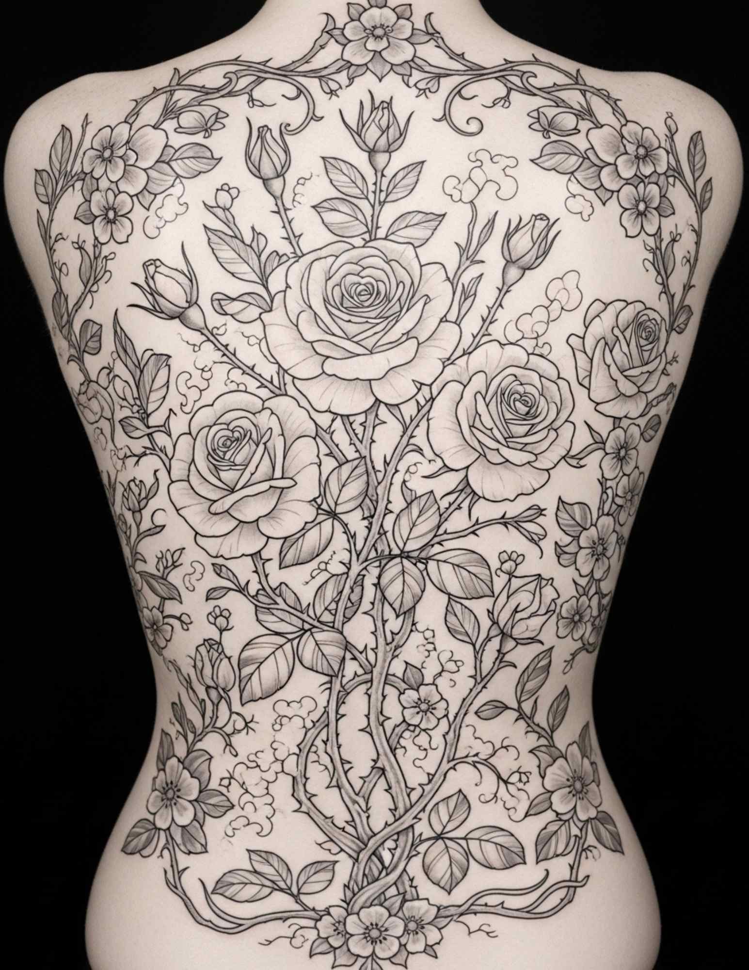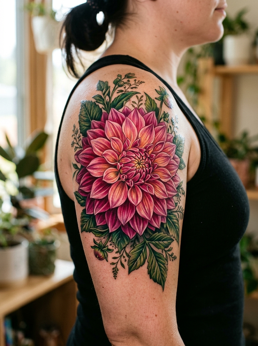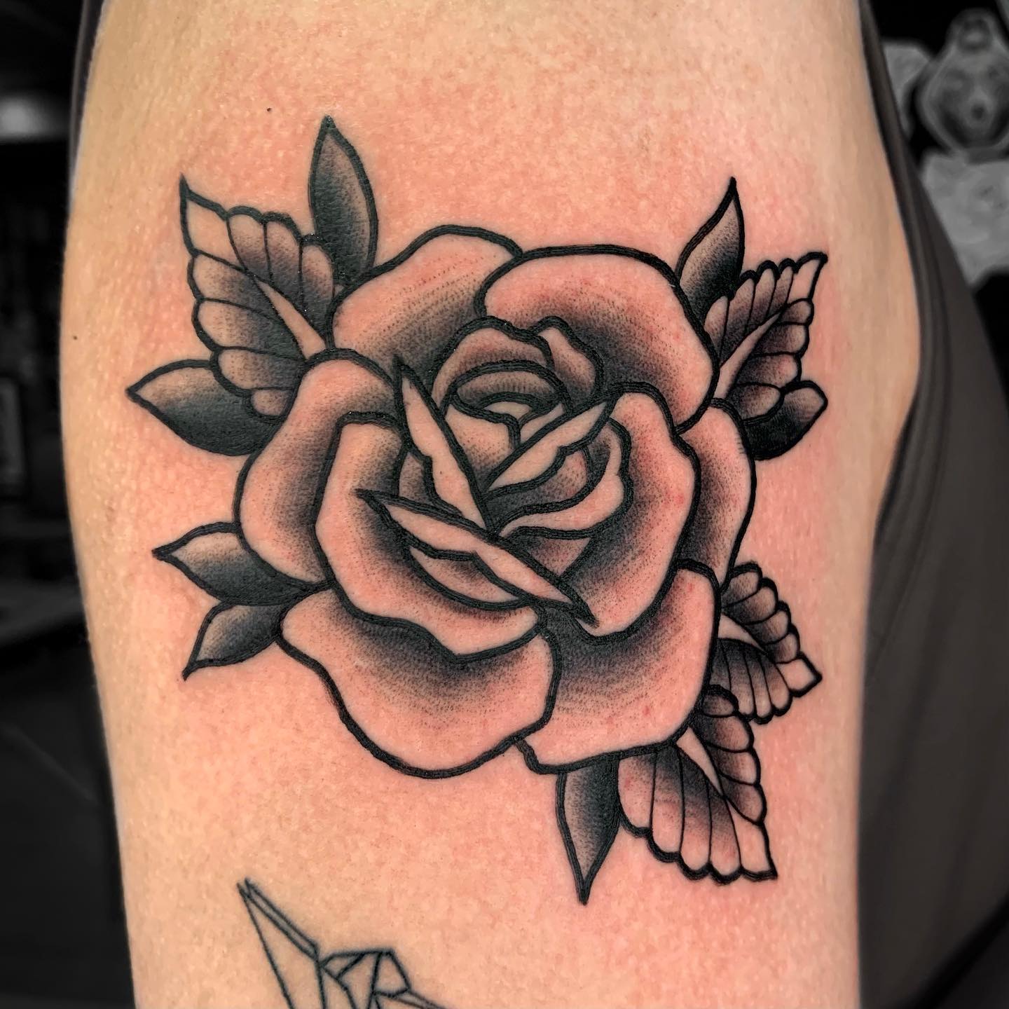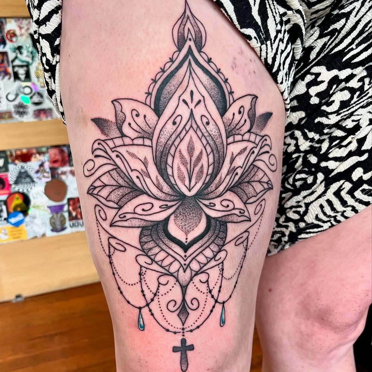
The peony is one of the most generous flowers that exists. Hundreds of petals stacked into a bloom that looks almost impossible in its abundance.
That abundance is exactly why the peony has become one of the most requested floral tattoos for women, and also why it is one of the easiest to get wrong. It is the opposite of minimalism, and it punishes designs that are drawn too small or shaded too flat.
I have spent a lot of time looking at healed floral work, and the pattern is consistent: peonies that were given room hold up beautifully, and peonies that were squeezed into a two-inch gap turn into a grey smudge within a few years. Every artist I have asked about floral work says some version of the same thing.
These 20 ideas cover the full range, from photorealistic single blooms to Japanese irezumi compositions. If you want a wider look at the flower first, the general peony tattoo guide covers designs for everyone rather than this women-focused selection.
Photo: @sweetandoffbeat
Which Peony Tattoo Style Is Right for You?
Style matters more than subject with peonies. The same flower reads completely differently depending on how it is drawn, and each approach has real trade-offs in size, cost and how it ages.
| Style | Smallest Size That Works | Best Placements | How It Tends to Age |
|---|---|---|---|
| Japanese traditional | Around 15 cm and up | Thigh, back, full sleeve | Excellent – built for longevity |
| Neo-traditional | Around 10 cm | Upper arm, thigh, forearm | Very good – bold outlines hold |
| Black and grey realism | Around 12 cm | Upper arm, thigh, back | Good, but soft greys can fade |
| Colour realism | Around 15 cm | Thigh, back, shoulder | Needs sun protection and touch-ups |
| Fine line | Around 5 cm | Forearm, ankle, ribs, spine | Softens over time; may need refreshing |
| Watercolour | Around 10 cm | Shoulder, thigh, upper back | Variable – anchor washes to linework |
| Blackwork / dotwork | Around 8 cm | Forearm, thigh, ribs | Excellent – high contrast lasts |
If you are torn, my honest advice is to pick the style first and the composition second. A great artist working in their own style will always beat a good artist copying someone else’s.
What Peonies Represent and Why Scale Matters
In Chinese tradition the peony is often called the king of flowers and is tied to wealth, honour and feminine beauty. It has been a fixture of Chinese art for centuries.
In Japanese tattooing the peony, or botan, represents bravery and good fortune, and it almost never appears alone. It is paired with lions, dragons and tigers, where the softness of the flower sets off the ferocity of the animal.
In Western tattooing the associations are looser: romance, prosperity and the confidence to take up space. The plant itself is a long-lived garden perennial, and Britannica’s entry on Paeonia is a decent starting point if you want the botany behind the symbol.
The practical point that matters more than any of this is scale. A peony is defined by layered petals, and layering needs space between the layers.
Below roughly eight centimetres, the petals stop reading as separate petals and start reading as texture. That is not a rule so much as a pattern I have seen again and again in healed work, and most floral specialists will tell you the same.
20 Peony Tattoo Ideas for Women
Each of these has been chosen because it solves a different problem: placement, budget, pain tolerance, or how much attention you want the piece to attract.
1. Realistic Single Peony
One full bloom in photorealistic detail, with petals built from precise shadow and highlight rather than outlines.
A single realistic peony on the upper arm or thigh is the most direct way to show off a skilled artist. There is nowhere to hide – if the petal edges are not right, the whole flower collapses into mush.
In my experience this is the style where artist selection matters most. Ask specifically to see healed realism, not fresh photos taken under studio lights.
Expect a longer session and a higher price than most other options here. Realism is slow work.
2. Japanese Traditional Peony with Koi
A peony bloom intertwined with a koi, rendered in classic irezumi style with bold outlines, black shading and wind or water in the background.
This is the peony in its oldest tattoo context. Japanese traditional is designed to be read from across a room and to still be legible in thirty years.
The trade-off is commitment. A proper Japanese peony composition wants a thigh, a back or a full sleeve – it does not scale down gracefully.
If you like the look but not the size, a single botan with a few leaves in the same style is a reasonable compromise.
3. Watercolour Peony
Loose washes of pink, coral and magenta bleeding past the edges of the flower, mimicking paint on wet paper.
Watercolour suits the peony better than almost any other flower because the bloom is already soft-edged. The washes read as petals rather than as splashes. The wider watercolour tattoo styles guide is worth reading before you commit.
The honest caveat is longevity. Watercolour work with no structural linework underneath can lose definition faster than outlined styles.
Most artists I have spoken to about this recommend keeping at least a light line skeleton under the washes. It reads as watercolour but holds its shape.
Photo: @nancy_dongtattoo
4. Peony Sleeve
Multiple blooms at different stages – open flowers, half-open buds, tight buds – flowing from shoulder to wrist with leaves filling the gaps.
A sleeve is where peonies finally get the space they want. The variation between open and closed blooms creates rhythm, so the eye moves along the arm instead of stopping.
Plan for several sessions spread over months. Sleeves are usually built in stages: outline, then shading, then colour.
Talk to your artist about flow early. A sleeve that was designed as one piece looks entirely different from a sleeve that accumulated.
Photo: @taylornphelps
5. Blackwork Peony
Heavy black shading with the petal separations carved out in negative space, no colour anywhere.
Blackwork peonies trade the flower’s obvious prettiness for graphic impact. Done well, they look carved rather than drawn.
This style ages exceptionally well. High contrast is what survives decades in skin, and blackwork is nothing but contrast.
It also suits people who want floral imagery without the softness that colour brings. Every artist I have asked rates blackwork among the safest long-term bets.
Photo: @romatra_
6. Peony with Butterfly
A butterfly landing on or hovering beside the open bloom, usually rendered in the same style and palette as the flower.
The pairing gives the composition a second focal point and a natural sense of movement. It also fills awkward space around the flower without adding another bloom.
Keep the butterfly clearly smaller than the peony. When the two compete for attention, the design stops having a subject.
Photo: @threekingsli
7. Peony Rib Piece
A bloom or small cluster following the curve of the ribcage, often trailing from under the bust toward the hip.
Ribs flatter floral work because the natural curve of the body gives the stem somewhere to go. The result looks placed rather than stuck on.
Ribs are also one of the more painful spots on most people. Thin skin over bone, and breathing moves the area constantly. The tattoo pain chart is worth a look before you book.
Budget for more sitting time than an arm piece of the same size, because most people need more breaks here.
Photo: @offthegroundink
8. Neo-Traditional Peony
Bold outlines, saturated colour packing and stylised petals – traditional tattoo structure with modern detail and depth.
Neo-traditional is my default recommendation for anyone who wants colour and wants it to last. The heavy outline holds the shape even after the colour softens.
It also scales down better than realism. A neo-traditional peony at ten centimetres still reads clearly as a peony.
Palettes here are often deliberately unnatural – teal leaves, mustard highlights – which is part of the appeal.
Photo: @worldofneotrad
9. Peony and Moth
A moth centred above or resting on the bloom, usually in black and grey or a muted palette.
The moth changes the emotional register completely. A peony alone reads celebratory; a peony with a moth reads reflective, even a little melancholy.
Luna moths and death’s-head moths are the two most requested, and they carry very different tones.
This is a strong choice for a memorial piece where you want symbolism without lettering.
Photo: @samwarrentattoo
10. Fine Line Peony
Delicate single-weight linework describing the petal edges, with little or no shading.
Fine line is what makes small peonies possible at all. On a forearm or ankle it stays elegant where a shaded design would go muddy. If you like the look at scale, the fine line sleeve ideas show how it works across a whole arm.
The compromise is that fine line softens as it settles. Lines spread slightly in skin over the years, so spacing between petals needs to be more generous than it looks like it should be.
Ask your artist to leave visible gaps that feel almost too wide on paper. In five years they will look right.
Photo: @jasminwalshtattoo
11. Peony with Hummingbird
A hummingbird feeding at the bloom, wings blurred, usually with a brighter secondary palette than the flower itself.
The bird gives the piece motion and gives the artist a reason to introduce iridescent greens and blues alongside the pinks.
It works particularly well on the upper arm, where there is room for the bird to sit off to one side rather than overlapping the petals.
Photo: @zayfineline
12. Peony Back Piece
One large bloom or a cascade of them spanning the shoulder blades, sometimes running down along the spine.
The back is the one canvas with no interruptions – no elbow, no knee, no constant bending. Large floral work belongs here more than anywhere else. There are more layouts in the floral back tattoo collection.
The practical downside is that you will rarely see it. That does not bother most people who get one, but it is worth sitting with before committing to a multi-session piece.
Back pieces are usually built over several appointments. Healing between sessions matters as much as the tattooing itself.
Photo: @inkedwolfie
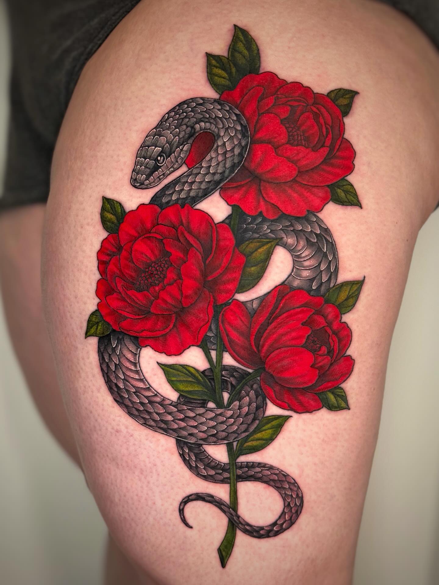
13. Peony and Snake
A snake winding through the stems and behind the petals, its body giving the composition a line to follow.
Flower-and-snake pairings are a tattooing staple for a reason: softness against threat. The same logic drives rose and snake designs, and the peony’s density makes the contrast even sharper.
The snake also solves a compositional problem. It links multiple blooms together so a cluster reads as one piece rather than three separate flowers.
Photo: @inkandartbyida
14. Japanese Peony with Tiger
A tiger’s head or full body set against peony blooms, in traditional Japanese style with black shading and background elements.
This is the classic irezumi pairing – the flower of good fortune against the animal of strength. The combination has been used for well over a century.
It needs real estate. A thigh or a back is realistic; a forearm usually is not.
If you want it, find an artist who actually works in Japanese traditional rather than one who will approximate it. The style has rules, and they exist for good reasons.
Photo: @brandontattoos
15. Dotwork Peony
Depth and shading built entirely from stippled dots, with density doing the work that greywash usually does.
Dotwork peonies have a texture nothing else matches – closer to an engraving than a painting.
It is slow to tattoo, which means it is more expensive per square centimetre than most shading. It also tends to be a gentler sensation than solid packing for many people.
Healed dotwork holds its contrast well, which is one reason artists who specialise in it often have long waitlists.
Photo: @laurenadriennetattoo
16. Shoulder and Chest Peony
A bloom flowing over the shoulder and onto the upper chest, following the collarbone rather than fighting it.
This placement is genuinely flattering because it works with the body’s existing lines. It also hides easily under most clothing.
The collarbone area is bony and can be sharp to tattoo. Most people find the shoulder cap itself much easier than the chest portion.
Photo: @peachpittattoos
17. Peony Ankle Piece
A small simplified bloom wrapping the ankle or sitting just above the bone.
Ankles force simplification, and that is not a bad thing. A peony reduced to eight or ten well-drawn petals reads better here than one crammed with detail.
Ankle work heals slower for a lot of people because socks, shoes and swelling all interfere. Loose footwear for the first couple of weeks makes a real difference.
Photo: @jasminwalshtattoo
18. Peony with Geometric Frame
The bloom set inside a circle, hexagon or arch of clean geometric linework, sometimes with mandala detailing behind it.
The frame gives an organic subject a hard edge, which suits people who want floral imagery without it reading as purely soft.
It also creates a natural boundary, which is useful if you want a standalone piece that will not later be absorbed into a sleeve.
19. Matching Peony Pair
Two coordinated peonies for sisters, partners or close friends, usually echoing each other rather than being identical.
The versions that work best share a style and a palette but differ in the composition – one bloom facing left, one facing right, for example.
Identical copies tend to look better in the moment and worse over the years, as the two pieces heal differently on different skin anyway.
Photo: @redgrizzly123
20. Peony with Script
A word, name or short phrase woven among the petals or running along the stem.
Script inside floral work adds meaning without needing a separate lettering tattoo, which keeps the total footprint smaller.
Keep the text short. Long phrases crowded into petals become unreadable as the piece settles, and lettering is the first thing to blur.
Serif and script fonts both work; the deciding factor is usually whether the letterforms can hold their thin strokes at the size you have chosen.
Photo: @siltyloamtattoo
Alternatives and Variations Worth Considering
If the peony is not quite landing for you, or if your placement genuinely cannot support one, these are the directions I would look in next.
Chrysanthemum Instead of Peony
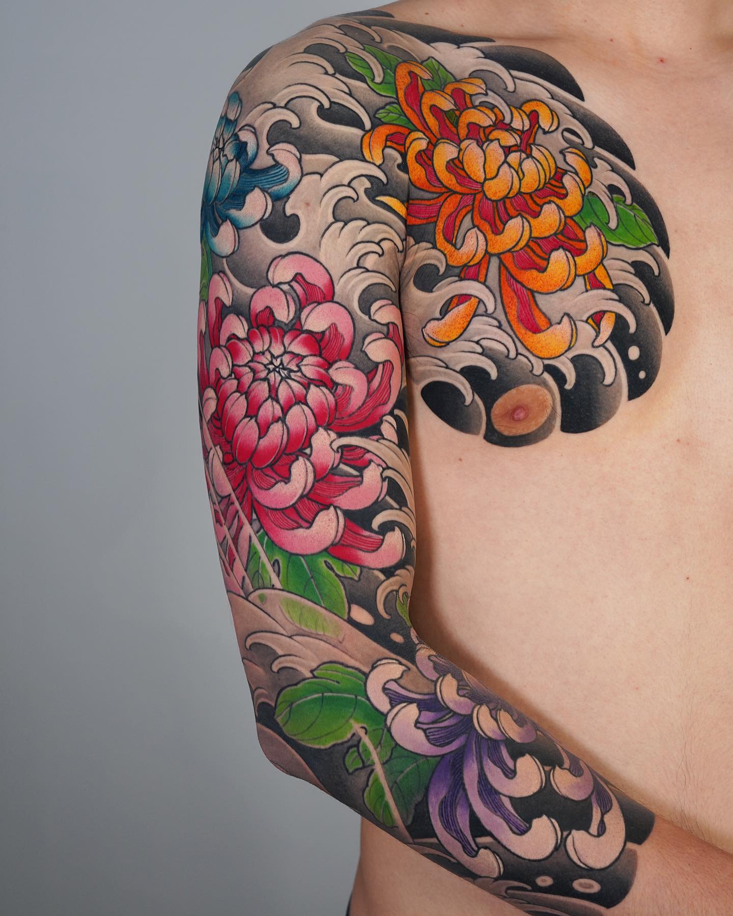
The chrysanthemum has a similar layered density and the same standing in Japanese traditional work, but its petals are narrower and more radial. Chrysanthemum tattoo designs often scale down slightly better than peonies.
A Mixed Wildflower Composition
If you want florals but not one dominant bloom, a mixed arrangement spreads visual weight across several smaller flowers. Wildflower tattoo layouts suit narrow placements like the forearm or spine far better than a single peony does.
Peony Outline Only
A bold outline with no shading and no colour at all. It is quicker, cheaper, and leaves the door open to add colour later if you want it.
Black and Grey Instead of Colour
The same composition in greywash costs less to maintain over time and does not depend on colour saturation holding up. It is the choice I would make for a piece on a sun-exposed forearm.
Getting the Best Result: Practical Advice
Choose the artist before the design. Look at their portfolio for healed floral work photographed in ordinary light, not fresh tattoos shot under a ring light.
Ask to see a piece they finished at least a year ago. Fresh photos tell you about their line work; healed photos tell you whether their shading survives.
Go bigger than feels comfortable. Almost every regret I have heard about floral tattoos is about size, and it is always the same direction – people wish they had gone larger.
For aftercare, follow the instructions your artist gives you over anything you read online, including this page. The general framework is covered in the tattoo aftercare guide, and the American Academy of Dermatology’s tattoo care advice is a solid non-commercial reference.
Sun is the main long-term enemy of colour work. Once a piece is fully healed, sunscreen on it is the single cheapest thing you can do to keep it looking right. The FDA’s tattoo fact sheet also covers ink safety and reaction risks.
If a healing tattoo becomes increasingly painful, hot, swollen or starts weeping after the first few days, contact your artist and see a doctor. Infections and allergic reactions to pigment both happen, and neither is something to manage from a blog post.
Common Mistakes and How to Avoid Them
The most common mistake by far is going too small. A peony crammed below about eight centimetres loses the petal separation that makes it a peony.
The second is picking an artist by price. Floral realism and Japanese traditional both take years to learn, and the cheaper quote usually reflects that gap.
The third is choosing placement before style. A watercolour piece on a hand and a fine line piece on a thigh are both fights against the placement rather than working with it.
If you are still weighing options, it can help to look at a completely different flower to test whether it is the peony you want or just florals generally. Lavender tattoo ideas sit at the opposite end of the density scale and make a useful comparison.
Frequently Asked Questions
How big does a peony tattoo need to be?
In practical terms, around eight centimetres is the smallest size where layered petals still read as separate petals in most styles. Fine line can go smaller because it relies on line rather than shading. Realism and Japanese traditional both want considerably more room – twelve to fifteen centimetres and up. Your artist will give you a better answer for your specific placement, since curve and skin type both matter.
Do peony tattoos hurt more than other flowers?
The flower makes no difference; the placement and the session length do. A peony on the outer thigh is a mild experience for most people, while the same design on the ribs or sternum is not. Larger peonies do mean longer sittings, which is its own kind of difficulty. Ask your artist to break a big piece into shorter sessions if you know you struggle with long ones.
What does a peony tattoo mean?
It depends on the tradition you are drawing from. In Chinese culture it is tied to wealth, honour and beauty, and in Japanese tattooing it signals bravery and good fortune. Western tattooing tends to read it more loosely as romance, prosperity and confidence. Many people getting one today choose it for how it looks and adopt the meaning afterwards, which is a perfectly normal way to arrive at a tattoo.
How much does a peony tattoo cost?
Prices vary enormously by region, artist demand and style, so any figure quoted online is close to meaningless. What is consistent is the relative ordering: realism and dotwork cost more per unit area than fine line or simple blackwork because they are slower to execute. Most artists charge either hourly or a flat day rate for large work. Get a quote in a consultation rather than over direct message, since they need to see the placement.
Will a colour peony tattoo fade?
All tattoos change over time, and colour generally shifts more visibly than black and grey. Sun exposure is the biggest accelerator, followed by placement on high-friction areas like hands and feet. Keeping it covered or wearing sunscreen once healed makes a substantial difference. Many people with large colour work book a touch-up every several years, which is normal maintenance rather than a sign anything went wrong.
Quick Summary
- Peonies reward scale – around eight centimetres is the realistic minimum, and larger is almost always better.
- Pick your style before your composition; the style determines size, cost and how the piece ages.
- Japanese traditional, neo-traditional and blackwork are the most reliable long-term choices.
- Fine line makes small peonies possible but needs generous spacing between petals.
- Watercolour suits the flower well, but keep a light line skeleton underneath it.
- Thigh, back and upper arm give the bloom room; ribs and ankles are tighter and usually more painful.
- Judge an artist on healed floral photos, not fresh ones.
- Sunscreen once healed is the cheapest thing you can do to protect colour work.