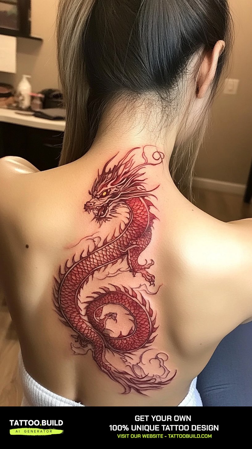
Red ink has quietly become one of the most requested looks in feminine tattooing, and I understand why. Red ink sits somewhere between a tattoo and a mark you were born with – softer than black, warmer on most skin tones, and impossible to mistake for anything else.
I have spent a lot of time looking at red work in studios and in artists’ portfolios, and the same thing keeps coming up: red behaves differently from black, and the people who love their red tattoos are usually the ones who understood that going in.
This guide covers the designs that actually work in red, the placements that suit them, and the honest trade-offs around healing and longevity. If you are drawn to the delicate end of this look, our guide to fine line tattoo ideas pairs well with everything below.
A quick note before the ideas: red pigment is the colour most often linked to delayed skin reactions, so this article treats that seriously rather than glossing over it. More on that further down.
Which Red Ink Style Is Right for You?
Not every red tattoo is the same project. The style you choose changes the session length, how the piece ages, and how often you will be back for touch-ups.
Here is how the main approaches compare, based on what artists I have spoken to consistently say about each.
| Style | Best For | Typical Session | Ageing & Upkeep |
|---|---|---|---|
| Fine line red | Florals, script, small symbols | 1–2 hours | Softens fastest; expect a touch-up in a few years |
| Bold red linework | Geometric, tribal-inspired, zodiac | 2–4 hours | Holds shape well; least fussy of the red styles |
| Red and black combined | Anyone unsure about all-red | 2–5 hours | Most forgiving – black holds the structure |
| Red wash / watercolour | Abstract, painterly pieces | 2–4 hours | Softest edges over time; needs a skilled artist |
| Solid red fill | Hearts, small blocked shapes | 1–3 hours | Can heal unevenly; may need a second pass |
What Affects How Red Ink Ages on Your Skin
The single most useful thing I learned about red tattoos is that red pigment generally does not hold as hard an edge as black does, and planning around that changes the outcome.
Sun exposure is the biggest factor. Red sits high in the visible spectrum and tends to lose saturation faster than black in a piece that gets regular direct sunlight.
Skin tone matters too. On deeper skin tones red reads more as a warm brown-red than a bright scarlet, which many people prefer – but it is worth asking your artist to show you healed photos on skin similar to yours rather than fresh ones.
Placement is the third factor. Hands, fingers and feet turn over skin quickly and are rough on any tattoo; red on those spots usually needs more upkeep than red on an inner arm or upper back.
None of this means red is a bad choice. It means the designs that work best in red are the ones with a bit of room in them – not the ones that depend on hairline gaps staying open forever.
Popular Women’s Red Ink Tattoo Ideas
These are the design families I see most often in red, roughly in order of how frequently they come up.
1. Floral Red Ink Tattoos
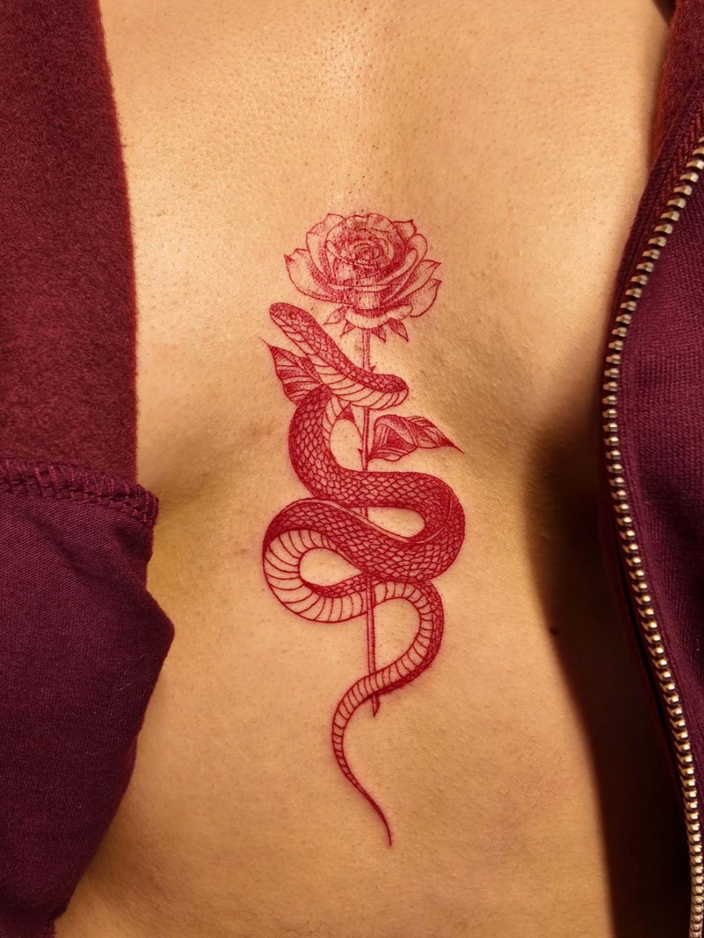
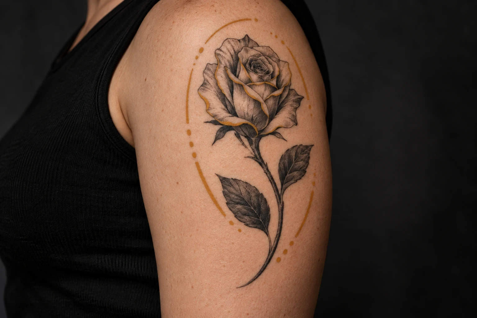
Florals are far and away the most common request in red, and they suit it well – roses, poppies and peonies already read as red flowers, so the colour does half the storytelling for you.
In my experience the pieces that age best are the ones where the petals have visible negative space between them rather than dense overlapping linework.
Wildflower and botanical strands work beautifully running down a forearm or along the spine, where the natural line of the limb gives the stems somewhere to go.
If you want the shape to stay readable for decades, ask for slightly heavier outer petal lines with finer detail inside. The outer silhouette is what carries a floral tattoo as it softens. For more design directions, see our collection of rose tattoo ideas for women.
2. Red Ink Heart Tattoos
A red heart is the most literal use of the colour, and there is nothing wrong with that – it is direct, it is legible from across a room, and it is quick to sit for.
Outline hearts tend to heal more predictably than solid-filled ones. Every artist I have asked has mentioned that small blocks of solid red can heal patchy and sometimes need a second pass.
Small hearts on the wrist, ankle or behind the ear are the classic placement. A hand-drawn, slightly imperfect heart shape usually looks better in red than a geometrically perfect one.
If you want something less obvious, an anatomical heart in red linework reads as far more subtle than a symbol heart at the same size. Our heart tattoos for women guide covers more variations.
3. Red Script and Lettering
Red script has a handwritten, personal quality that black lettering does not quite match – it looks more like ink on a letter than a printed word.
The trade-off is legibility. Red has less contrast against skin than black, so red lettering needs to be sized up and spaced out more generously than you might expect.
When I have seen red script go wrong, it has almost always been because the letters were too small and too tightly kerned, and the counters closed up as the piece settled.
Short phrases, single words and dates work best. Long quotes in fine red script are the pieces most likely to need touching up. If wording is what you are after, browse our quote tattoo ideas for women.
4. Geometric and Tribal-Inspired Red Designs
Geometric red work is, in my view, the most underrated option on this list. Bold, evenly weighted lines are exactly what red does well.
Because the shapes are simple, they stay recognisable even after the colour softens – a triangle is still a triangle in twenty years.
Symmetry is unforgiving here. Ask to see healed geometric work in your artist’s portfolio, not just fresh photos, because line wobble shows up more in straight lines than in florals.
If you are drawn to patterns borrowed from a specific culture, it is worth doing the research on what the motif means and where it comes from before committing. Our geometric tattoo designs gallery has plenty of starting points.
5. Red Mandala Tattoos
Mandalas in red have a warmth that black mandalas do not, and the repeating structure gives the eye something to follow.
These are longer sessions than people expect – a detailed mandala on the back or shoulder can run several hours, sometimes across two sittings.
The centre point is the make-or-break element. If the middle of the mandala is dense with fine detail, that is the part most likely to blur first in red.
A good compromise is a red mandala with black or dark linework at the core and red carrying the outer petals. See more layouts in our mandala tattoo ideas for women.
6. Minimalist Red Ink Tattoos
Minimalist red pieces are the ones I get asked about most by people getting their first tattoo, and they are a sensible entry point.
They are quick, relatively low commitment in terms of space, and the softness of red suits a design that was never meant to shout.
The honest caveat: very small red tattoos are the most likely of any style here to need a touch-up, because there is less line to lose before the shape changes.
If your artist suggests going a centimetre or two larger than you planned, that advice is usually worth taking rather than negotiating down.
7. Zodiac and Astrological Red Tattoos
Constellations, glyphs and zodiac animals all translate cleanly into red, and they have the advantage of being personal without being explanatory.
Constellation dot-and-line designs are a particularly good fit, because the dots can be placed with enough space that they do not merge as the piece ages.
Zodiac animal outlines – a Taurus bull, a Leo lion, a Scorpio scorpion – suit the bolder end of red work and hold up well at medium size.
Glyph symbols on their own are elegant but tiny, so they belong in the same size conversation as minimalist pieces above.
8. Red Butterfly Tattoos
Butterflies are one of the most enduring feminine tattoo motifs, and red gives them a different mood – less whimsical, a bit more striking.
The wing shape is instantly recognisable, which means the design survives well even when the fine internal detail softens.
Placement is flexible. I have seen red butterflies work on the shoulder blade, the outer forearm, the wrist and the ribs, at sizes from a couple of centimetres to palm-sized.
Keep the interior wing pattern open rather than densely filled, and the piece will read correctly for far longer. More options in our butterfly tattoo ideas collection.
Alternatives and Variations Worth Considering
If all-red does not feel right, there are several middle grounds that get you most of the look with fewer trade-offs.
Placement Choices That Suit Red
Inner forearm, upper back, shoulder blade and thigh are the placements I would suggest first – they see less sun and less friction than hands or feet.
Ribs and spine suit long vertical designs like botanical strands and lettering, though both are tender to sit through.
Anywhere that spends the summer uncovered will need sunscreen as a habit, not an occasional gesture.
Red and Black Together
This is the option most artists suggest to someone who is uncertain, and it is a fair recommendation. Black linework carries the structure while red does the shading and accents.
It ages more predictably than all-red, and it gives you the warmth of red without depending on red to hold every edge.
Softer and Deeper Reds
Red is not one pigment. Artists mix everything from a bright scarlet through to a deep oxblood or burgundy, and the deeper shades often hold contrast better on medium and deep skin tones.
Ask your artist to swatch a couple of reds on paper against your skin before you commit – it takes two minutes and settles the question.
When to Choose Black Instead
If the design depends on very fine detail at a small scale, or it is going on your hands or feet, black is usually the more practical choice.
There is no shame in getting the design you love in black now and adding red accents later once you know how your skin holds ink.
Aftercare and Best Practices for Red Ink Tattoos
Red tattoos follow the same aftercare fundamentals as any other tattoo, with a couple of points that deserve extra attention. Our full tattoo aftercare guide covers the basics in detail.
Sun protection is the one habit that makes the biggest difference to how a red tattoo looks in five years. Once the tattoo is fully healed, a high-SPF sunscreen over it whenever it is exposed is the standard advice.
Red is also the pigment most commonly associated with delayed allergic and inflammatory skin reactions in the dermatological literature – sometimes appearing weeks, months or even years after the tattoo. Typical signs are persistent itching, raised or bumpy skin, or swelling confined to the red areas specifically. The American Academy of Dermatology has a plain-English overview of tattoo skin reactions that is worth reading before you book, and clinical case reviews of reactions to red pigment describe the same pattern.
If you notice any of those signs, see a doctor or dermatologist rather than trying to manage it yourself. This article is general information about tattoo design, not medical advice, and a reaction confined to red areas is genuinely worth having looked at.
If you have a history of skin allergies or contact dermatitis, tell your artist before the session and ask about a patch test. Not every studio offers one, and a patch test is not a guarantee, but it is a reasonable conversation to have.
Still Not Sure? Common Mistakes to Avoid
The most common regret I hear about is going too small. Red at a tiny scale is the combination most likely to disappoint a few years in.
The second is skipping the portfolio check. Not every excellent black-and-grey artist is equally practised in red, and it is a fair question to ask directly.
The third is misreading the healing process. Red often looks dull and slightly dusty for the first couple of weeks before it settles – that is normal, and our guide to the tattoo healing stages explains what to expect week by week.
And the fourth is assuming red is the only colour option worth considering. If you like the warmth but are unsure about red specifically, our colorful tattoo ideas for women gallery is a good place to compare.
Frequently Asked Questions
Do red ink tattoos fade faster than black?
In most cases, yes – red generally loses saturation faster than black, particularly on skin that gets regular sun exposure. How much faster depends heavily on placement, sun habits and the specific pigment your artist uses. A red tattoo on an inner forearm that is kept covered or protected can hold up for many years. The practical answer is to plan for a touch-up at some point rather than assuming it will look identical forever.
Are red ink tattoos more likely to cause a reaction?
Red pigment is the colour most frequently associated with delayed allergic and inflammatory reactions in dermatological case literature. That does not mean a reaction is likely for any individual – most people have no problem at all – but it is the colour most worth being aware of. Signs include itching, raised skin or swelling limited to the red parts of the tattoo, sometimes appearing long after healing. If that happens, see a doctor or dermatologist.
Does red ink hurt more than black ink?
The pigment colour itself does not change how much a tattoo hurts. What affects pain is placement, session length and how much the artist has to go over the same area. Solid red fill can involve more passes over one spot than a simple outline, which some people feel as more intense. Ribs, spine, hands and feet are the tender spots regardless of colour.
Can red ink be covered up later?
Red can be covered, but it is harder to cover than a light grey wash and usually needs a darker design over it. Black, deep green and dark purple are the shades cover-up artists tend to reach for. If you think a cover-up is likely down the line, keep the original piece on the smaller and lighter side. A consultation with an artist who specialises in cover-ups will give you a realistic answer for your specific tattoo.
Does red ink show up on darker skin tones?
Yes, though it reads differently – typically as a warm brown-red rather than a bright scarlet, and with less contrast than black would give. Deeper reds such as oxblood and burgundy often hold their presence better than bright reds on medium and deep skin tones. The best way to judge is to ask your artist for healed photos of red work on skin similar to yours, since fresh photos always look brighter than the settled result.
Quick Summary
- Red ink reads warmer and softer than black, which is exactly why people choose it – and also why it needs different planning.
- Florals, hearts, script, geometric shapes, mandalas, zodiac motifs and butterflies are the design families that suit red best.
- Bold, open designs age better in red than dense fine detail at a small scale.
- Sun exposure is the biggest single factor in how a red tattoo looks in five years; sunscreen once healed is the standard advice.
- Inner forearm, upper back, shoulder blade and thigh are the friendliest placements; hands and feet are the hardest.
- Red combined with black linework is the most forgiving option if you are undecided.
- Red is the pigment most often linked to delayed skin reactions – know the signs and see a doctor if they appear.
- Expect a touch-up eventually, especially on small or very fine pieces, and budget for it as part of the design.