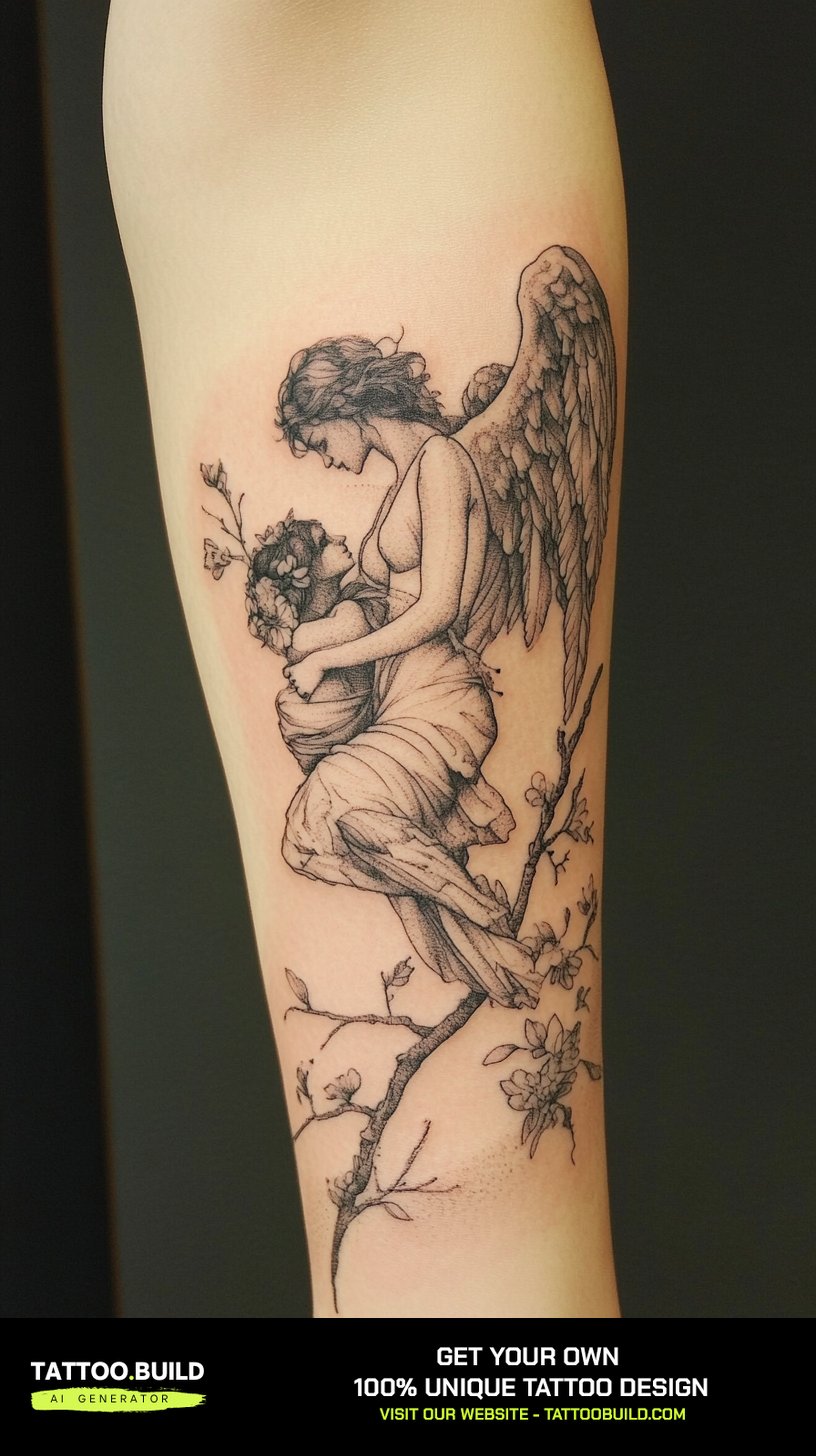
The angel and devil tattoo is one of the few designs where almost everyone already understands the concept before you explain it. The hard part is not the idea — it is stopping the two halves from turning into a cartoon.
I have watched this design go wrong the same way over and over: two characters, both crowded with detail, both fighting for the same few inches of skin. The result reads as noise from more than a couple of feet away.
The versions that work do one thing well. They pick a single relationship between the halves — split, opposed, merged, collapsed — and let the rest of the composition serve it. If you are still in the gathering-references stage, our collection of angel tattoo drawings is a useful place to see how the wing shapes alone change the tone of a piece.
Below are the layouts I keep coming back to, what each one costs you in placement and healing, and the mistakes worth avoiding before you book.
Which Angel and Devil Style Is Right for You?
Every approach below can be done well. They just ask for different amounts of skin, time and patience.
| Approach | Best Placement | Rough Session Load | Ages Like |
|---|---|---|---|
| Half-and-half split | Forearm, upper arm, calf | One to two sittings | Very well — the split line stays obvious |
| Two-figure battle scene | Back, chest, full sleeve | Three or more sittings | Depends on spacing between the figures |
| Shoulder angel and devil | Both shoulders, upper back | Two sittings | Well, if the faces are kept simple |
| Fallen angel | Back, thigh, ribs | Two to four sittings | Well — mostly shading, few fine details |
| Fine line minimal | Inner arm, ribs, ankle | One short sitting | The weakest of the group — thin lines soften |
Session counts here are rough and depend heavily on your artist’s pace and how much detail you ask for. Treat them as a planning sketch, not a quote.
Why This Design Works So Well on Skin
The angel and devil pairing has one built-in advantage most tattoo concepts do not: it comes with contrast already installed.
Tattoos read at distance through value — light against dark — long before anyone can make out a face or a feather. A design whose whole premise is one bright half and one heavy half is doing that work for free.
That is also why it survives ageing better than most detailed designs. Ink softens and spreads slightly over years, and fine internal detail is the first thing to go, but a strong light-dark division stays legible for decades.
The imagery itself is old. The fallen angel narrative that most devil figures draw on has been a fixture of Western art and literature for centuries, which is why the visual shorthand — broken halo, drooping wings, downward gaze — is instantly readable to almost anyone. You can read more about how that figure took shape in Britannica’s entry on Lucifer.
The practical upshot: you are not asking a viewer to learn anything. You are asking them to notice which half is winning. That is a much easier job for a tattoo to do, and it is why this concept scales from a small inner-arm piece up to a full back — as much as any symbolic back tattoo does.
Angel and Devil Tattoo Ideas That Actually Hold Up
Seven layouts, roughly in order of how forgiving they are for a first attempt at this concept.
1. The Straight Half-and-Half Split
One figure, one vertical line down the middle, angel on one side and devil on the other.
This is the version I recommend most often, because it removes the composition problem entirely. There is no negotiation about who stands where — the body’s own centre line does the work.
It also gives your artist a clean rule to follow: whatever happens on the left has a deliberate answer on the right. Wing up, wing down. Smooth shading, broken shading. Halo, horn.
The split does not have to be a hard line. Some of the strongest versions fade one half into the other over an inch or two, which looks less like a diagram and more like a person.
Forearms, upper arms and calves suit it best because those limbs are already symmetrical. On a flat panel like the back it can read stiff unless the figure is turned slightly.
2. The Two-Figure Battle Scene
Two separate characters, actively fighting — grappling, mid-swing, wings tangled.
This is the most dramatic option and the most demanding. When I have seen it done badly, the cause is almost always the same: not enough space between the figures, so the whole thing collapses into one dark mass.
Give it real room. Back pieces, chest panels and full sleeves are the honest placements. A battle scene squeezed onto a forearm is a design fighting its own canvas.
Ask your artist to plan the negative space first — the gaps between limbs and wings are what let a viewer separate the two bodies at a glance.
3. Shoulder Angel and Shoulder Devil
The cartoon convention, played straight: one small figure on each shoulder, arguing.
It is the lightest-hearted take on the concept and the easiest to live with. Nobody has to explain it, and it looks intentional rather than heavy.
Keep both figures small and keep the faces simple. Tiny detailed faces are the single most common thing I have watched blur out over a few years.
This one also works as a staged project — one shoulder now, the other later — which is useful if you are not sure you want both.
4. Chest and Sternum Compositions
The chest gives you a natural axis and two matching panels, which is exactly what this design wants.
Angel across one pectoral, devil across the other, with the sternum acting as the dividing line. It is a genuinely striking placement and it photographs well.
The trade-off is comfort. The sternum and the area over the ribs are among the sharper spots to sit through, and it is normal to want the work split across sessions.
If you are building toward something larger, this pairs naturally with arm work — see how people extend chest pieces in our guide to half sleeve tattoos for men.
5. The Fallen Angel
Not two figures at all — one figure, caught in the moment of becoming the other.
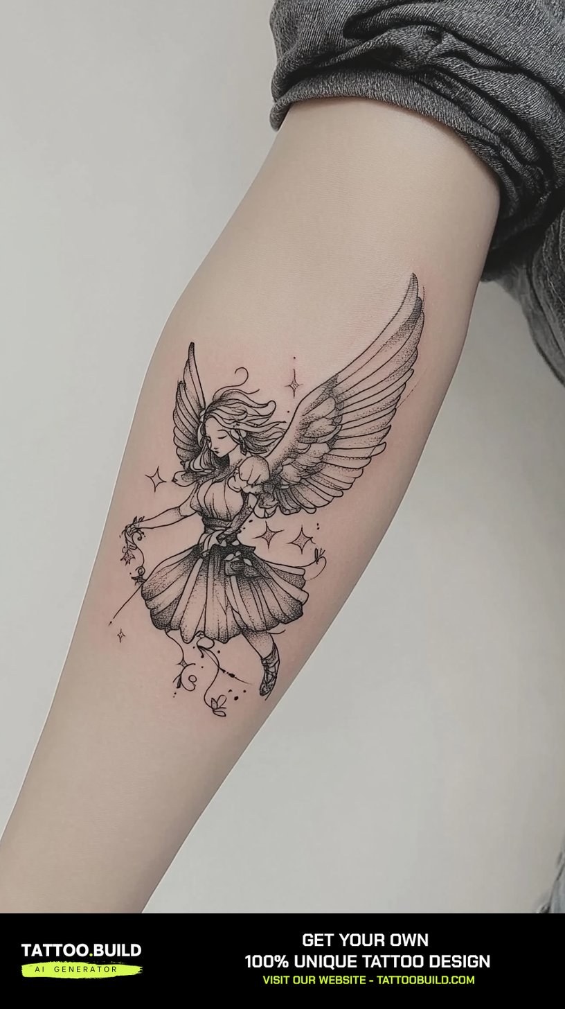
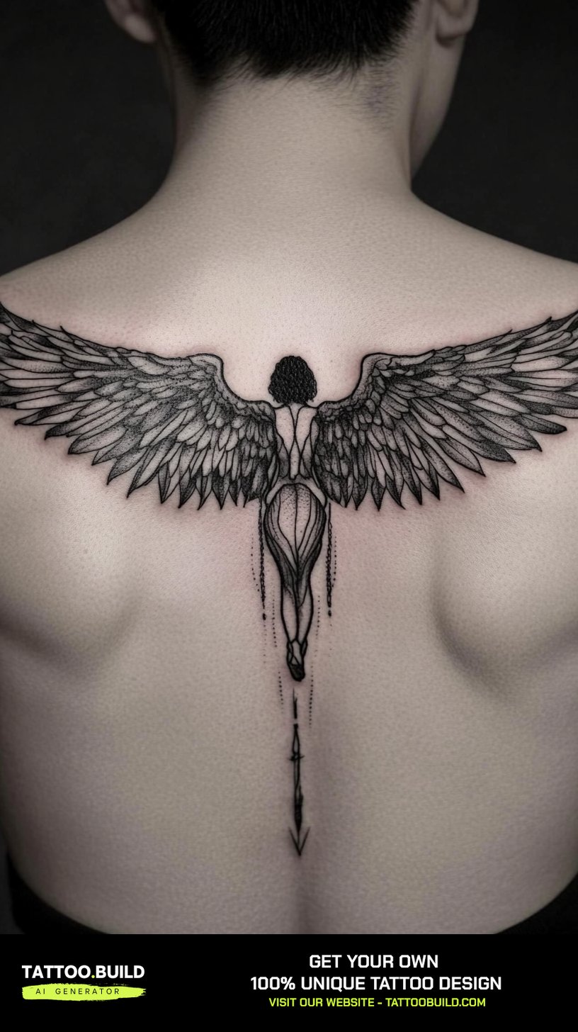
This is my favourite version of the concept, and the one that reads as least clichéd. A single angel with a cracked halo and wings that have started to droop tells the whole story without needing an opponent.
It is also technically friendly. Most of the work is shading and wing texture rather than fine internal detail, so it holds up over time.
Backs, thighs and ribs suit it because those areas give the wings somewhere to fall. The gothic rendering styles in our gothic tattoo drawings collection are a good reference for the mood.
6. Fire, Smoke and Cloud Framing
Instead of dividing the figures, divide the environment around them.
Clouds and light on one side, smoke and flame on the other. The characters can then be rendered in a similar style, and the background carries the contrast.
Every artist I have asked about this prefers it for one practical reason: smoke and cloud fill negative space, so the piece sits on the body instead of floating on bare skin.
It is also the most forgiving option for future extensions. Smoke can be grown outward later; a hard-edged figure cannot.
7. Fine Line and Minimal Versions
The whole concept, reduced to line weight and a few millimetres of shading.
These suit inner arms, ribs and ankles, and they are the right call if you want the idea without the commitment of a large panel.
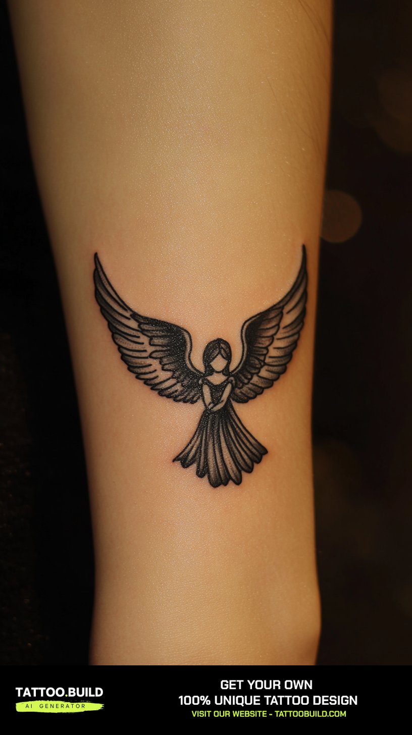
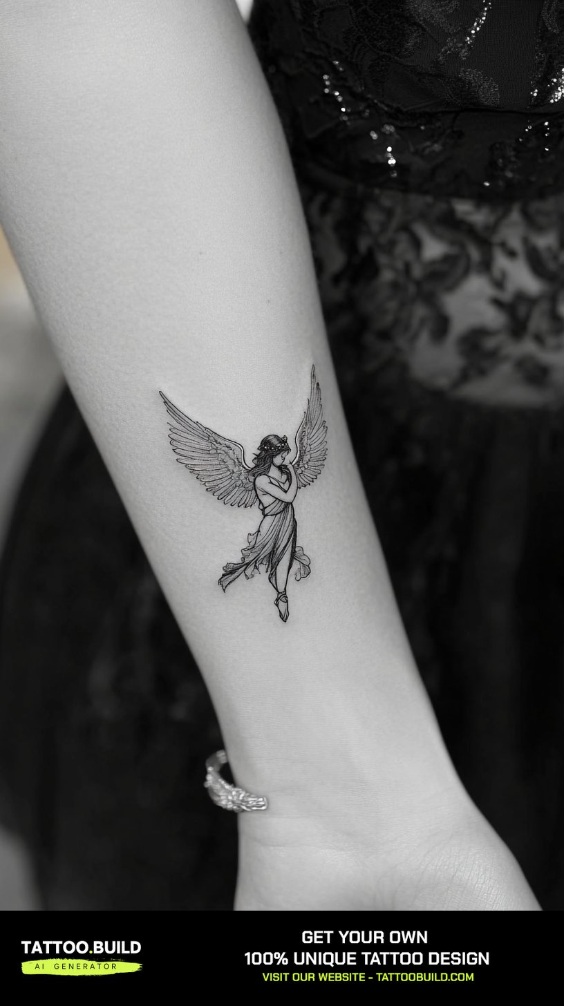
Be honest with yourself about longevity, though. Very thin lines soften more than bold ones over the years, and small pieces have less room to absorb that spread. Many people accept a touch-up down the line as part of the deal.
If you want the delicacy without the fragility, ask for slightly heavier linework than the reference image you brought in. Our angel tattoo ideas for women gallery has a good range of lighter-weight approaches.
Variations Worth Considering Instead
If the straightforward angel-versus-devil read feels too on-the-nose, these carry the same idea with less obvious imagery.
Two Hands, No Figures
One hand offering, one hand taking. It keeps the duality and drops the costumes entirely.
This ages beautifully because hands are mostly line and simple shading, with no faces to blur.
Wings Only
A feathered wing on one side, a bat or leathery wing on the other, with nothing between them.
It is the cleanest possible statement of the concept and works at almost any size.
Masks Instead of Faces
A theatrical mask pair reads as duality without any religious framing at all.
I have seen this used well by people who liked the concept but did not want the spiritual reading attached to it.
Skull and Halo
A skull wearing a halo compresses both halves into one object.
It sits comfortably alongside darker work — the rendering styles in our skull tattoo ideas collection translate directly.
Practical Advice Before You Book
Bring references for the relationship between the halves, not just for individual angels and devils. Your artist can draw either figure; what they need from you is how the two should relate.
Ask to see the stencil placed on your skin before the needle starts, and stand in front of a mirror at arm’s length rather than up close. Designs that look balanced on paper often need shifting once they are on a curved surface.
Plan the darker half first. Heavy black is the element that dictates the whole layout, and it is far easier to build light shapes around solid black than the reverse.
For aftercare, follow the written instructions your artist hands you. If you want a second reference, the American Academy of Dermatology publishes plain-language guidance on caring for tattooed skin, and the US Food and Drug Administration covers ink safety and reaction warning signs. Neither replaces a conversation with your artist or a doctor if something looks wrong.
Still Not Sure? Common Mistakes to Avoid
The most frequent one is symmetry taken too literally. A perfect mirror image looks like clip art; a near-mirror with one deliberate difference looks designed.
The second is overloading the devil half. Horns, fangs, flames, chains and a snarl all at once turn the darker side into visual noise and starve the angel half of contrast.
The third is choosing a placement based on a photo rather than on your own body. If you are weighing options, our guides to forearm tattoo ideas and back tattoo designs show how the same concept changes across placements.
The fourth is rushing the sketch. This design lives or dies on the layout, and a second round of drawing costs you a week, not a lifetime. If a religious framing matters to you, the symbol work in our cross tattoo drawings collection is worth reviewing before you finalise anything.
Frequently Asked Questions
What does an angel and devil tattoo actually mean?
Most of the time it means the tension between two sides of the same person rather than a fight between good and evil in the abstract. Every client I have talked to about this design has framed it personally — a habit they are fighting, a period they came through, two families, two versions of themselves. The religious reading is available if you want it, but it is not required. What matters more is that you can say in one sentence what the piece means to you, because that sentence is what your artist will design around.
Where does an angel and devil tattoo look best?
Anywhere the body already gives you a centre line. The chest, the spine, the front of the thigh and the middle of the forearm all split naturally, which is why the half-and-half concept sits so comfortably there. In my experience, arms are the easiest first placement because you can see the piece yourself and it heals in a low-friction spot. Ribs and the sternum look striking but hurt more and usually take longer to settle.
How much does a piece like this cost?
It depends entirely on size, detail and your artist’s hourly rate, so any exact figure you read online is a guess. A small fine line version is a short single session; a two-figure back piece is a multi-session project and priced accordingly. Ask for a total estimate and a session count in writing before you book. Our guide to sleeve tattoo costs gives a sense of how larger projects are usually quoted.
Does the devil half have to look evil?
No, and some of the best versions I have seen deliberately avoid it. A devil rendered as mischievous, tired or almost sympathetic tells a more interesting story than a snarling gargoyle, and it also keeps the piece from reading as edgy for its own sake. Ask your artist to sketch the darker half two ways — one menacing, one human — before you commit. The second version usually wins.
How long does it take to heal, and what should I watch for?
Surface healing usually takes a couple of weeks, with the deeper layers settling over a month or two, though this varies from person to person. Follow the aftercare instructions your artist gives you rather than advice from a forum. Heavy black shading, which this design tends to involve, can look patchy while it settles — that is normal and often evens out. If you see spreading redness, swelling that gets worse instead of better, pus or a fever, that is not part of normal healing and you should contact a doctor rather than waiting it out.
Quick Summary
- Pick one relationship between the halves — split, opposed, merged or collapsed — and build everything around it.
- The straight half-and-half split is the most forgiving layout and the best starting point.
- Battle scenes need real space: back, chest or a full sleeve, never a crowded forearm.
- Strong light-against-dark contrast is what keeps this design readable as it ages.
- The fallen angel is the least clichéd version and holds up well because it is mostly shading.
- Keep faces simple at small sizes — fine facial detail is the first thing to blur.
- Plan the heavy black first, then build the lighter half around it.
- Follow your artist’s aftercare instructions, and see a doctor for spreading redness, worsening swelling, pus or fever.