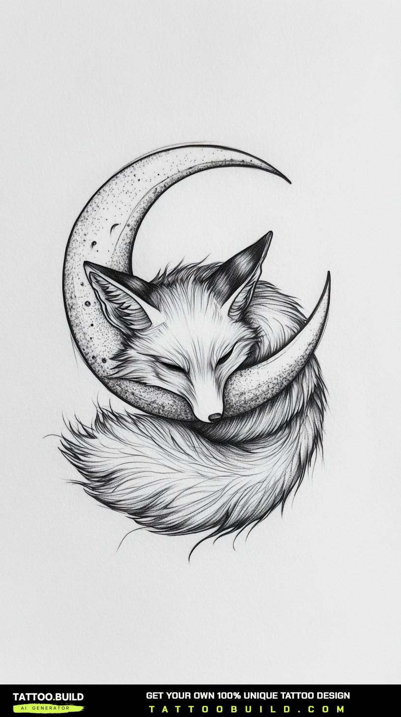
A cool tattoo drawing is not the same thing as a cool drawing — it has to survive being shrunk, stretched over a curved limb and blurred by a decade of healing.
I have spent more evenings than I would like to admit filling sketchbooks with designs that looked sharp on paper and fell apart the moment an artist scaled them down to fit a forearm.
The 27 drawings below are the ones that kept working. Some are beginner-friendly outlines you could finish tonight; others are the sort of composition an experienced artist would happily build a sleeve around, like the pieces in our guide to half-sleeve tattoo drawings.
Take what is useful, ignore the rest, and bring whatever you sketch to a real artist before anyone picks up a machine.
Which Drawing Style Is Right for You?
Before you pick a subject, it helps to be honest about which drawing style matches your current skill and your patience.
| Style | Difficulty to Draw | Typical Sketch Time | How It Ages on Skin | Best For |
|---|---|---|---|---|
| Fine line / outline | Low | 20–40 minutes | Softens fastest; fine lines can spread | Beginners and small placements |
| Traditional bold line | Low to medium | 45–90 minutes | Usually the most forgiving over decades | A first tattoo you want to still read at 50 |
| Blackwork / heavy fill | Medium | 1–2 hours | Holds shape well; solid areas may need touch-ups | Bold statements and cover-ups |
| Black and grey realism | High | 3–6 hours | Mid-tones tend to lift; contrast flattens | Portraits and animal work with a skilled artist |
| Geometric / dotwork | Medium to high | 2–4 hours | Crisp if spaced well; muddy if crowded | Symmetrical designs on flat body panels |
| Neo-traditional | High | 2–5 hours | Ages well thanks to strong outlines | Ornate subjects like pocket watches and florals |
What Actually Makes a Tattoo Drawing Work
The single biggest difference between a drawing and a tattoo design is how it behaves when the detail is removed.
A useful test I use on every sketch: squint at it from across the room. If the silhouette still reads as a wolf, a ship, a compass, the design will probably survive both scaling and ageing.
Skin is also not paper. It stretches, it curves, and ink migrates outward slightly over years, which is why lines placed too close together tend to merge into a grey smudge.
That is the reason experienced artists keep asking for more negative space than beginners want to give. Empty areas are not wasted — they are what keeps the design legible in ten years.
The last factor is placement. A tall vertical composition suits a forearm or calf; a circular one suits a shoulder, chest or thigh. Drawing a design without deciding where it goes is how good sketches end up unused.
27 Cool Tattoo Drawings, Grouped by Theme
I have grouped these by subject rather than numbering them one to twenty-seven, because in practice you pick a theme first and a specific design second.
1. Beasts and Guardians
Animal drawings are the most requested category in almost every shop I have visited, and there is a practical reason for that.
Fur, scales and manes give you texture to hide small errors, which is unusually forgiving for someone still learning to shade.
The dragon coiled around a sword works because the spiral does the compositional heavy lifting — the sword is just a spine for the design to wrap around.
The howling wolf leans on a different trick: the moon behind the head is negative space, not a drawn object, so the silhouette stays clean. If that direction appeals, our collection of wolf tattoo ideas shows how differently it can be handled.
The geometric lion is the hardest of the three, because every line is straight and any wobble is immediately visible. In my experience it is the design most worth drawing with a ruler before freehanding it.
2. Rebirth and Flight
Wings are deceptively difficult. Most beginner sketches fail because the feathers are drawn as identical repeated shapes instead of a graded fan.
The phoenix solves this by letting flames and feathers blur into each other, so exact repetition never becomes the point.
A feather dissolving into a flock of birds is one of the few designs where the empty half is more important than the drawn half. Start dense at the quill and thin out fast.
The bird-wing-and-bat-wing pairing is a symmetry exercise: two wings, one soft and one leathery, sharing a centre line. When I sketched mine the first three attempts failed because I drew the bat wing at the same scale as the bird wing rather than slightly tighter.
All three read well vertically, which makes them natural candidates for a forearm or the outside of a calf.
3. Time, Direction and the Journey
This group covers the symbolism people reach for after a move, a career change or a long trip.
A compass over a map only works if the map lines stay faint. Every artist I have asked about this says the same thing: the map is a texture, not a subject. Our guide to the compass forearm tattoo covers placement in more detail.
Pocket watches are more technical than they look. The chain is where most drawings fall apart, because a thin chain scales down into a smudge — draw the links larger than feels natural, and see our pocket watch tattoo drawing breakdown for the mechanics.
The ship in a storm is carried by the wave, not the ship. Give the swell a clear curved direction and the whole composition gains movement for free.
4. Skulls, Ravens and the Gothic Edge
Dark subjects have an obvious problem: if everything is black, nothing stands out.
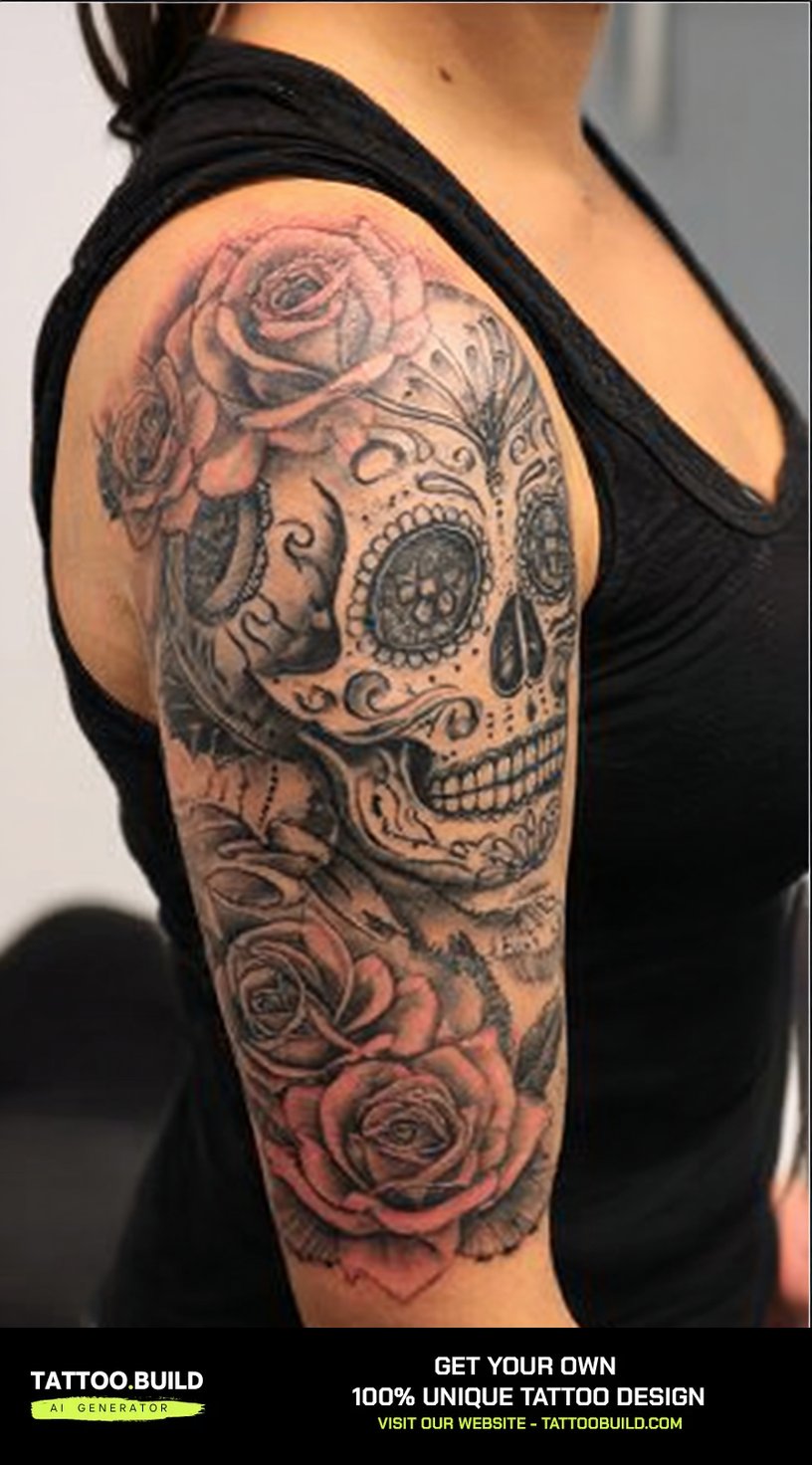
The skull with floral accents solves it by contrast of shape rather than tone — hard geometry against soft petals. There are more variations in our set of skull tattoo drawings.
A raven perched on a skull is the harder version of the same problem, because both elements want to be dark. The fix is texture: smooth bone against broken feather edges.
The serpent wrapped around a sword is quietly the best beginner piece in this group. Scales are a repeating, forgiving pattern, so it is a low-risk place to practise shading rhythm.
If this whole register appeals, the broader gothic tattoo drawings collection is worth a look before you commit.
5. Balance, Water and Eastern Motifs
Koi, tigers and mandalas share a design logic: they are built on a controlling shape rather than on detail.
Two koi circling each other fit a circle, which is why the design sits so naturally on a shoulder, thigh or the top of a calf.
The roaring tiger has a genuinely useful property for a beginner — the stripes are the shading plan. Get the stripe direction right and the form appears almost by itself.
Bamboo behind the tiger gives vertical structure, which stops the head from floating in empty space.
The mandala is the outlier. It needs no drawing talent and enormous patience, because the spacing must stay even all the way to the outer ring. If you want floral variations to build into it, the flower tattoo drawings set is a good reference.
6. Celestial and Symbolic Patterns
The celestial swirl is the design I recommend most often to people who want something meaningful but not literal.
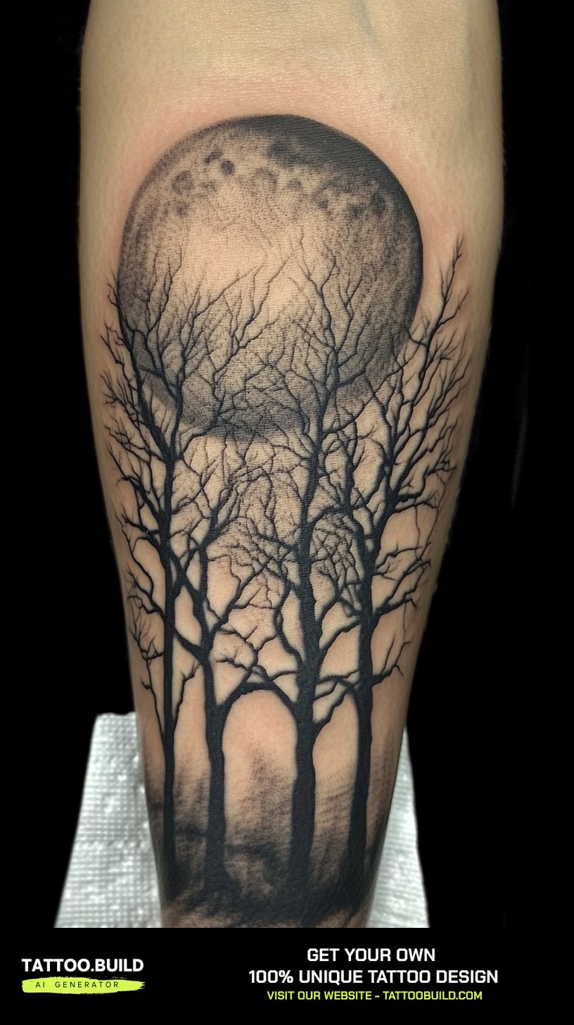
Moon phases give it built-in movement, and the arrangement can be adapted to almost any body panel without redrawing the elements.
Dreamcatchers live or die on web spacing. Too tight and it greys out within a few years; too loose and it looks unfinished on paper.
The eagle with flag drapery is the most technically demanding drawing in this article. Fabric folds are what separate a convincing version from a flat one, and they take real practice to draw.
I would not attempt the eagle as a first project. Sketch the wing alone half a dozen times first — that is what an apprentice I spoke with was told to do, and it is sound advice.
Simpler Variations Worth Sketching First
Not every good tattoo drawing needs to be ambitious. These eight are the ones I hand to people who have never filled a sketchbook before.
Clean Line Studies
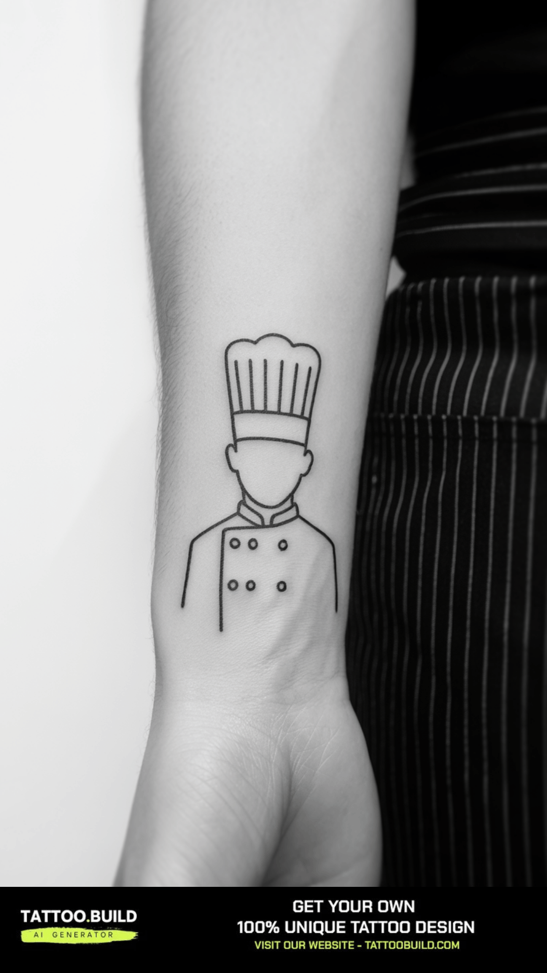
Single-weight linework, no shading, no fill. The entire discipline is committing to one confident line instead of five tentative ones.
If you can draw the subject in twelve lines, it will almost certainly tattoo well. If it takes ninety, it probably will not. Our round-up of simple tattoo designs has more in this register.
Blackwork and Shading Practice
Solid black areas need to be planned before you start, not discovered halfway through. I mark mine with light hatching first so I can still change my mind.
Working from a mid-tone outward, rather than from white to black, is the habit that improved my own shading the fastest.
Small Flash and Filler Designs
Filler drawings are underrated. They are quick to sit for, cheap, and they teach you how much detail actually survives at two inches.
Draw it, then shrink it to the real size on a photocopier or your phone screen. Whatever disappears was never going to hold.
Practical Tips Before You Take a Drawing to a Studio
Bring the drawing as a reference, not as a final instruction. A good artist will redraw it for your specific anatomy, and that redraw is usually an improvement.
Print it at the actual intended size and tape it to the body part for a day. In my experience this single step prevents more regret than any amount of online research.
Check your artist’s healed work, not just their fresh photographs. Fresh tattoos flatter everyone; healed work at twelve months is where technique shows.
On aftercare and risk, follow your artist’s written instructions and a medical source rather than an article like this one. The American Academy of Dermatology and Mayo Clinic both publish plain-language guidance, and the US FDA covers ink safety. If you develop spreading redness, swelling, pus or a fever, see a doctor rather than waiting it out.
Common Mistakes — and What to Do If You Are Still Not Sure
The most frequent mistake is cramming. A design that fills every millimetre of paper will fill every millimetre of skin, and it will grey out.
The second is drawing at the wrong scale. Sketching at A4 and tattooing at three inches is not the same design.
The third is copying a photograph of a healed tattoo without understanding why it was drawn that way. Steal the structure, not the outcome.
If none of the 27 designs above feels right, work outward from a related subject instead. Our skull and rose tattoo drawing guide is a good next stop for anyone drawn to the gothic group.
And if you are genuinely undecided, wait. A drawing that still appeals six months later is a much safer bet than one that appeals tonight.
Frequently Asked Questions
Do I need to be good at drawing to design my own tattoo?
No. Most artists would rather receive a rough sketch that shows what you want than a polished drawing that fights their own style. What matters is communicating the subject, the rough composition and the placement clearly. In my experience a stick-figure layout plus three reference images does more for an artist than a carefully shaded drawing. The artist will redraw it for your anatomy either way.
How large should a cool tattoo drawing be to hold detail?
As a rough working rule, a design with fine internal detail rarely holds well below about three inches on its longest side. Bold-line designs can go smaller because the lines carry the shape on their own. The honest answer is that it depends on the density of your linework, not just the size. Ask your artist to show you a healed example at the size you are considering.
Which of these designs is easiest for a beginner to draw?
The serpent and sword, the clean line studies and the small filler designs are the most forgiving. All three rely on repeating patterns or single confident lines rather than accurate anatomy or smooth gradients. The geometric lion and the eagle with flag drapery are at the opposite end and usually frustrate beginners. Start with something where a small error is invisible.
Will a fine line tattoo drawing still look good in ten years?
Usually it will look softer and slightly thicker than the day it was done, because ink spreads a little in the skin over time. That is normal ageing rather than bad work. Fine line pieces generally need more careful placement and sun protection than bold traditional work. If long-term crispness is your priority, bolder lines are the safer choice.
Can I combine two of these drawings into one tattoo?
Often yes, but combinations need a single dominant subject or they read as clutter. The successful combinations I have seen keep one element large and clear and let the second act as background texture. Bring both references to your artist and let them handle the merge. It is a design problem that is genuinely easier to solve on skin-shaped paper than in your head.
Quick Summary
- Judge every tattoo drawing by its silhouette first — if it fails the squint test, detail will not save it.
- Negative space is a design element, not leftover paper; crowded drawings grey out as they age.
- Match the composition to the body part: vertical for forearms and calves, circular for shoulders and thighs.
- Beasts, scales and fur are forgiving subjects; geometric and drapery-heavy designs are not.
- Bold traditional linework generally ages best; fine line work softens fastest.
- Print your drawing at real size and wear it for a day before committing.
- Bring the sketch as a reference and let the artist redraw it for your anatomy.
- Follow your artist’s aftercare instructions, and see a doctor for any sign of infection.