I have been photographing and writing about fairy tattoos for years, and the same thing happens almost every time someone brings me a reference photo: the design they love is far more detailed than the space they want to put it in. A fairy tattoo lives or dies on how much detail the artist leaves out, not how much they cram in.
Wings are the reason. They are the part of the design everybody wants and the part that ages worst when the lines sit too close together.
That does not make this a difficult subject — it makes it a subject worth planning. In my experience the pieces that still look good five years on are the ones where the artist argued for a slightly larger size, or simplified the wing structure, or both. The same logic applies to wing tattoo designs generally.
Below I have laid out the styles, the placements, the realistic cost and healing picture, and the mistakes I see most often. Every photo in this guide is a real tattoo, not a rendering.
Which Fairy Tattoo Style Is Right for You?
Style choice affects cost, healing and how the piece looks in a decade far more than the pose does. This is roughly how the main approaches compare.
| Style | Smallest size that works | How it ages | Best for |
|---|---|---|---|
| Fine line | 2–3 inches | Lines soften noticeably; may need a touch-up | Subtle, delicate pieces on forearm or ankle |
| Black and grey | 3–4 inches | Very well; grey wash holds shape for years | Detailed wings and realistic faces |
| Watercolour | 4 inches | Softest edges of any style; fades fastest in sun | Colourful, painterly designs |
| Blackwork / silhouette | 1.5–2 inches | Best of the group; solid black stays solid | Small placements and high-contrast looks |
| Neo-traditional colour | 4–5 inches | Strong, thanks to bold outlines holding the colour | Storybook and gothic fairy scenes |
What Fairy Tattoos Actually Mean
Fairies are not one thing. In Irish and Scottish tradition the Aos Sí or “Good People” were treated with real caution, not affection — beings you left offerings for so they would leave you alone.
The tiny winged fairy most people picture is much more recent. It comes largely from Victorian fairy painting and children’s book illustration, then Disney’s 1953 Peter Pan fixed the image in place.
So the meaning you attach to a fairy tattoo is genuinely yours to choose. In my experience the most common readings are transformation, a link to the natural world, protection, and holding onto a sense of play in adult life.
None of those readings are more authentic than the others. Someone drawing on Celtic folklore and someone drawing on a childhood book are both using the same figure honestly.
If the folkloric side is what pulls you, it is worth reading about the older traditions rather than the illustrated ones — Britannica’s overview of fairy folklore is a reasonable starting point.
Fairy Tattoo Styles Worth Considering
These are the approaches I see working most consistently, roughly in order of how often people ask for them.
1. The Classic Winged Fairy
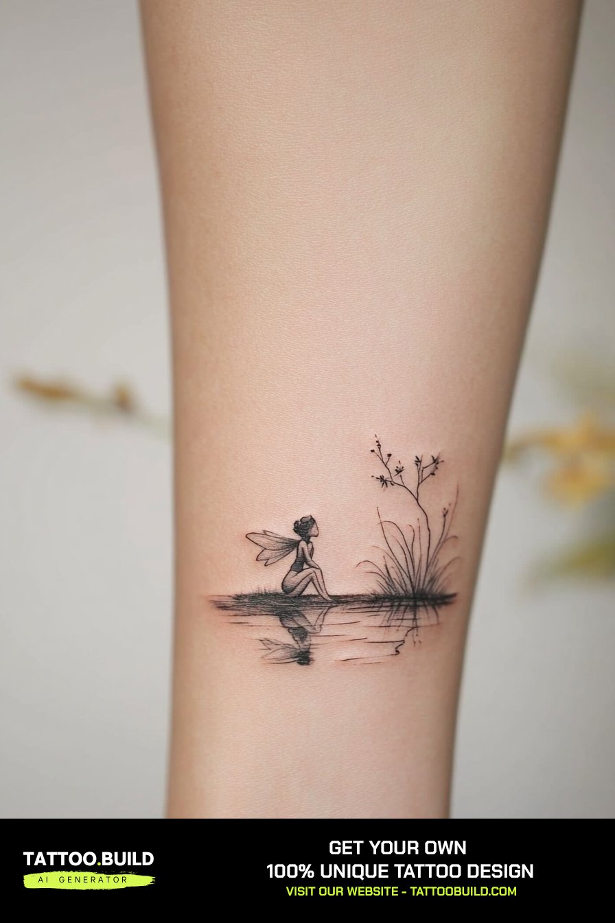
This is the design most people arrive with: a small figure, detailed gossamer wings, a seated or mid-flight pose.
It is also the one that most often needs resizing. Wing membranes drawn at three inches tend to close up over time, because the fine internal lines sit too close together and spread slightly as ink settles.
Every artist I have asked about this gives the same fix — keep the outer wing contour crisp and drop roughly half the internal veining. The eye fills in the rest, and the piece still reads as a fairy from across a room five years later.
Four inches is the size where this design stops fighting itself. Below that, simplify the wings or accept a touch-up somewhere around year three.
2. Woodland and Forest Fairies
Here the fairy shares the frame with ferns, toadstools, tree bark or a branch, and the composition becomes a scene rather than a figure.
I like these because the environment does structural work. Foliage fills the negative space that a lone figure leaves awkward, and it gives the artist somewhere to hide a transition from dark to light.
They also wrap limbs well. A branch that follows the curve of a forearm looks deliberate in a way that a floating figure rarely does.
The trade-off is size — scenes need room. Most of the woodland pieces I have seen work at six inches or more, which pushes them toward forearm, thigh or shoulder placements.
3. Celestial Fairies
A fairy seated in a crescent moon, or trailing star-dust, is one of the most reliable compositions in this whole category.
The reason is structural: the moon gives the design a strong outer shape. Instead of an irregular figure floating on skin, you get a contained circle or crescent that the eye reads instantly.
Dotwork star fields around the figure age well too, as long as the dots are spaced rather than packed. Packed stippling tends to merge into grey.
If this direction appeals, it is worth looking at celestial tattoo ideas alongside your fairy references — the same compositional rules apply.
4. Floral Fairies
Flowers and fairies have been paired since the Victorian flower-fairy illustrations, and the combination still works.
The strongest versions I have seen do not just place a fairy next to a flower — they build the wings out of petals, or seat the figure inside an open blossom so the two elements share an outline.
Botanicals are also forgiving. Leaves and petals can be adjusted in size during stencil placement in a way that a face cannot.
Pairing a fairy with a birth flower is a common request, and wildflower tattoo ideas are a good source of shapes that are loose enough to work around a figure.
5. Dark and Gothic Fairies
Heavy black shading, sharper wing edges, sometimes horns or torn wings — this is closer to the folkloric fairy than the storybook one.
Technically these are among the best-ageing fairy tattoos, because they rely on large areas of solid black and strong contrast rather than fine internal detail.
They are usually a longer sitting, though. Packing solid black is slower and harder on the skin than linework, and most artists will split a large one across sessions.
If longevity matters more to you than delicacy, this is the direction I would point you. It shares a lot of DNA with the heavier blackwork end of the craft.
6. Fine Line and Minimalist Fairies
Stripped back to outline only, sometimes single needle, often small enough to sit on a wrist or behind an ear.
These are the most requested small fairy tattoos I come across, and they are genuinely lovely when fresh.
You should go in knowing the trade-off, though. Fine line work softens — lines that start hairline-thin usually thicken slightly and lose a little crispness over the first few years, especially on high-movement areas like hands and inner wrists.
That is not a failure of the tattoo; it is how skin behaves. Plenty of people book a touch-up around year three and are perfectly happy. Fine line tattoo ideas covers this in more depth.
7. Watercolour Fairies
Soft washes of colour bleeding out behind the figure, mimicking paint on wet paper.
The versions that last are the ones with an underlying structure — a line drawing or a solid black anchor that the colour sits behind rather than replaces.
Pure watercolour with no linework looks spectacular in a healed photo taken at three months. At five years, in my experience, it looks considerably softer than the owner expected.
Sun exposure is the main variable, and it is the one you control. Daily sunscreen on a healed colour piece makes a visible difference. Watercolor tattoo ideas shows the range.
Variations and Related Directions
If none of the seven above is quite right, these adjacent approaches come up often.
Silhouette and Blackwork Fairies
A solid black figure with no internal detail at all. This is the single most durable version of a fairy tattoo and the one that works smallest.
It also suits people who want the shape to read from a distance rather than reward close inspection.
Cartoon and Character-Style Fairies
Bright fills, bold outlines, a recognisable animated look. These read instantly and photograph beautifully.
Worth saying plainly: a specific character design is someone’s copyrighted artwork, and many artists will offer to draw an original fairy in a similar spirit rather than copy it directly. That is usually the better tattoo anyway.
Realistic and Portrait-Style Fairies
A rendered face, real anatomy, full tonal shading. The most technically demanding version by a wide margin.
Look specifically for an artist whose healed portfolio includes healed faces, not just fresh ones. Faces are where inexperience shows up first and hardest.
Large-Scale Scenes and Sleeves
A fairy as one element in a larger forest, night sky or narrative piece across a back, thigh or sleeve.
These are usually multi-session projects planned as a whole from the start. Building one piecemeal is how people end up with a crowded arm, so map the full composition before the first session.
Placement, Pain and Practical Planning
Placement changes the design more than most people expect, because it sets the maximum size and the direction the wings can run.
Forearms and outer thighs are the easiest starting points — flat, low on the pain scale, easy to keep out of the sun while healing.
Ribs, spine, sternum and ankles are the areas where the same tattoo takes noticeably longer to sit through. Bone close to the surface is the common factor.
Ankles deserve a specific warning: they are bony, they swell, and shoes rub them constantly during healing. Still a great placement, just plan around footwear for two weeks. See the most painful tattoo spots for a fuller map.
Aftercare and Getting the Best Result
Follow the aftercare instructions your artist gives you over anything you read online, including this. They know what they put in your skin and how they wrapped it.
The general shape of it: keep it clean with unscented soap, moisturise thinly rather than thickly, and stay out of pools, baths and direct sun until it has fully closed over.
Do not pick or scratch flaking skin. Pulling a scab early is the most common way fine wing lines end up patchy, and it is entirely avoidable.
Some redness, swelling and warmth in the first couple of days is normal. Spreading redness, worsening pain after day three, pus or a fever is not — that is a doctor, not a forum. The NHS guidance on tattoos explains the warning signs, and our aftercare guide covers the routine day by day.
Still Not Sure? Common Mistakes to Avoid
Going too small for the detail level. This is the number one issue with this subject. If your artist suggests going up an inch, they are not upselling you — they are protecting the wings.
Choosing an artist by price rather than portfolio. Look for healed photos in the style you want, not just fresh ones under studio lights.
Copying a reference exactly. Bring three or four images showing what you like about each, and let the artist build something that fits your body.
Booking a bony placement as a first tattoo. Nothing wrong with it, but a forearm is a kinder introduction — worth comparing against ankle tattoo ideas before you decide.
Underestimating the cost. Detailed wings take time, and time is what you are paying for.
Frequently Asked Questions
How much does a fairy tattoo cost?
It depends almost entirely on size, detail and your artist’s hourly rate, which varies enormously by city. A small fine line fairy is typically a short single sitting, while a detailed forearm piece with full wings is usually a half day or more. The honest answer is to send your reference and placement to two or three studios and compare quotes. Beware of a quote that comes in far below the others.
Do fairy tattoos hurt more than other designs?
The design does not change the pain — the placement and the session length do. A fairy on the outer forearm feels much like any other outer forearm tattoo. The same design on the ribs, spine or ankle will be considerably more uncomfortable because the bone sits close to the surface. Long shading sessions also wear you down more than short linework ones.
What is the smallest a fairy tattoo can be?
A simplified silhouette can work at around an inch and a half. A fairy with detailed wing veining generally needs three to four inches to stay readable as it ages. If you want something small, the answer is to simplify the design rather than shrink a complicated one. Ask your artist to show you the stencil at your intended size before you commit.
Will a fine line fairy tattoo blur over time?
It will soften. All tattoos spread slightly as the ink settles, and thin lines have less margin before that becomes visible. High-movement areas like fingers, hands and inner wrists show it soonest. Most people find a touch-up every few years keeps a fine line piece looking the way they wanted, and that is a normal part of owning one rather than a sign anything went wrong.
Are fairy tattoos only for women?
No, and the assumption comes from the Victorian illustration tradition rather than from anything in the folklore. Older fairy figures were frequently unsettling, powerful or ambiguous. Gothic, blackwork and folkloric interpretations read very differently from the storybook version, and I have seen plenty of them on men. Choose the interpretation that matches what the figure means to you.
Quick Summary
- Wing detail is the make-or-break element — simplify it rather than shrinking it.
- Four inches is roughly where a detailed winged fairy stops fighting its own linework.
- Blackwork and silhouette versions age best; pure watercolour softens fastest.
- Celestial and floral framings give the design a strong outer shape that reads from a distance.
- Forearm and outer thigh are the kindest placements; ribs, spine and ankle are the toughest.
- Choose your artist on healed portfolio photos, not fresh ones or price.
- Follow your artist’s aftercare over anything online, and never pick the flaking skin.
- Spreading redness, worsening pain, pus or fever means see a doctor, not a forum.