The iris is the most architecturally interesting flower most tattoo artists ever get asked to draw, and that structure is exactly why it either looks spectacular or looks like a mess.
Three petals stand up (the standards), three fall away (the falls), and the whole bloom twists in space. Get that geometry right and the tattoo has depth without any shading tricks. Get it wrong and you have an unreadable purple blob.
I have sat with artists sketching irises from photo reference more times than I can count, and the ones who nail it always start with the silhouette rather than the petal veining. If you are still deciding what visual language you want the flower spoken in, the guide to tattoo styles is a useful place to start before you look at any of these ideas.
Below are 20 iris directions I would actually recommend, grouped by the approach rather than by body part, plus the practical stuff nobody tells you about how an iris ages on skin.
Photo: @maddie_andrews_art
Which Iris Style Is Right for You?
This is the comparison I keep coming back to when someone is torn between two directions.
| Style | Best size | How it ages | Choose it if |
|---|---|---|---|
| Fine line botanical | 3-6 in | Lines soften; veining can blur first | You want the plant, accurately |
| Black and grey realism | 5 in and up | Holds well if the shading has real contrast | You want depth and drama |
| Japanese | 6 in and up | Excellent – built for bold outlines | You want something that reads at a distance |
| Neo-traditional | 4 in and up | Very well; outlines carry the shape | You want saturated colour with structure |
| Watercolour | 4 in and up | Softest of the group; often needs a touch-up | You want the colour, not the botany |
| Minimal single-line | 1-3 in | Fine if spacing is generous | You want discreet and quick |
What the Iris Actually Means
The flower takes its name from Iris, the Greek goddess of the rainbow and a messenger between gods and mortals. That messenger role is where the associations with news, communication and hope come from.
The genus is enormous – the Britannica entry on the genus Iris puts it at roughly 300 species – which is why “an iris” can mean anything from a tall bearded garden cultivar to a narrow, almost grass-like wild species.
In Japan the iris carries a different weight. Kakitsubata and hanashobu appear constantly in screen painting and textile design, and the flower is tied to Boys’ Day and to the idea of courage, partly because the sword-shaped leaves look like blades.
The single most famous example is Ogata Korin’s “Irises at Yatsuhashi (Eight Bridges)” at the Metropolitan Museum of Art – a pair of six-panel gold-ground screens that most Japanese-style iris tattoos are, knowingly or not, descended from.
In European heraldry the stylised iris becomes the fleur-de-lis, which is why a fleur-de-lis and a botanical iris can sit in the same tattoo without clashing. They are the same flower at two levels of abstraction.
My honest view: most people choosing an iris are choosing it for how it looks, and then finding the meaning afterwards. That is fine. The symbolism is deep enough to support almost any reading you want.
Botanical and Realistic Iris Tattoos
1. Purple Iris Botanical Illustration
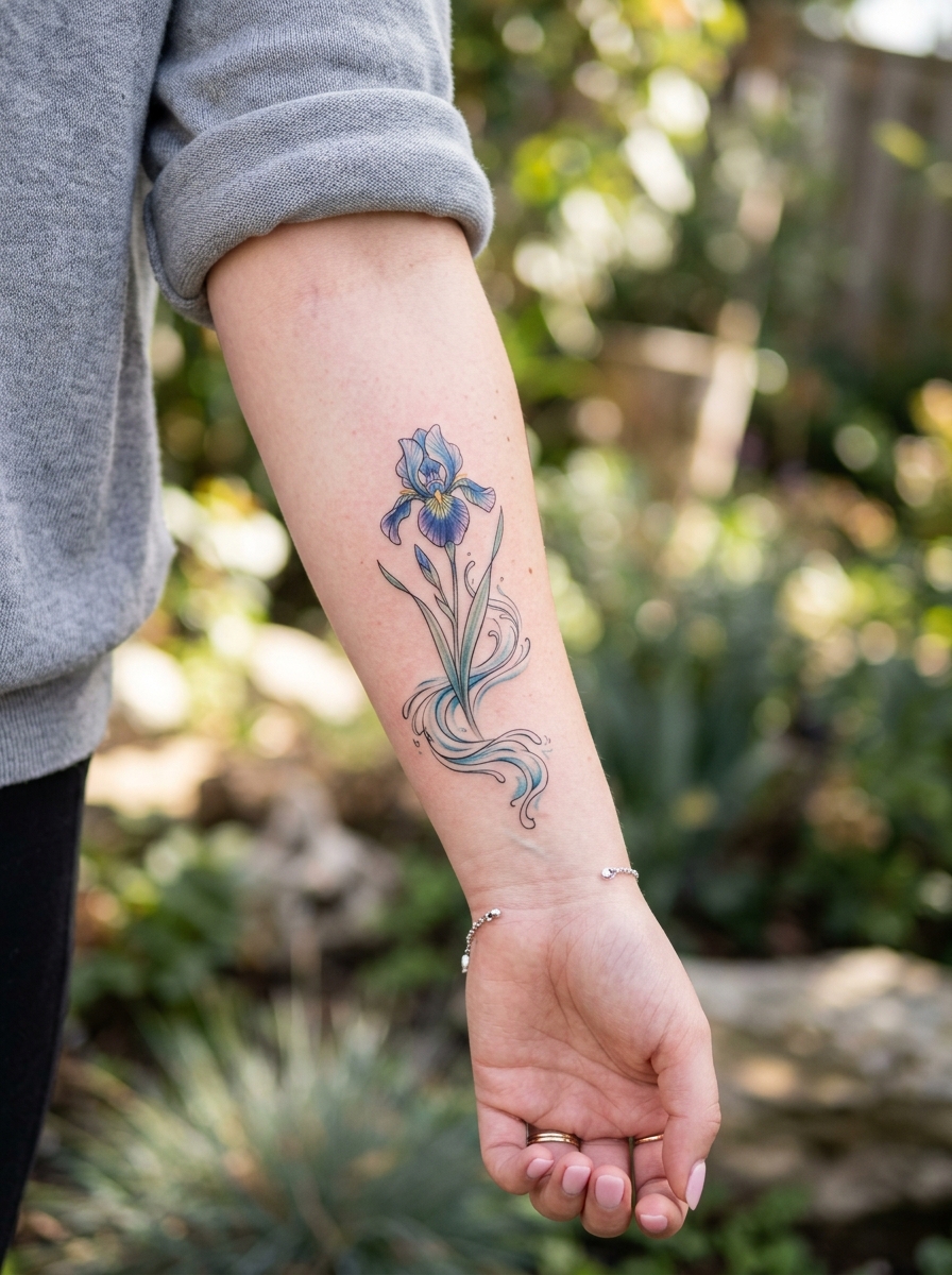
This is the opening image above: the flower drawn the way a 19th-century plant plate would draw it, with the veining described in line rather than shading.
Every artist I have asked about this approach says the same thing – the veining is the part that goes first. Ask for slightly fewer, slightly heavier vein lines than the reference photo shows and it will still read as botanical in ten years.
Works in deep purple, and works just as well entirely in black and grey.
2. Black and Grey Realism Iris
Realism gives you the thing fine line cannot: the papery translucency of an iris petal where light passes through it.
The trade is size. In my experience anything under about five inches forces the artist to compress the tonal range, and a realism iris with no true black and no true white just looks grey.
Give it forearm, calf or upper arm space and let the darkest shadow sit right under the falls.
Photo: @gwrtattoo
3. Bearded Iris Close-Up
A bearded iris has a fuzzy strip along the fall petal, and cropping in tight on that detail makes for a far more distinctive tattoo than another full bloom.
I like this one because it is instantly identifiable to anyone who gardens and pleasantly abstract to everyone else.
Photo: @cryder.tattoo
4. Wild Iris (Iris sibirica)
Siberian irises are narrower and looser than the big bearded cultivars, with thinner falls and grassier leaves.
That makes them ideal for slim placements – inner arm, spine, along a collarbone – where a fat garden iris would look cramped.
Photo: @dar1ablack
Japanese Iris Tattoos
5. Kakitsubata
The Japanese iris in Japanese visual language: flattened, stylised, the petals simplified into confident shapes rather than described.
This is the version that ages best out of everything on this page, because it was designed for bold outlines and flat colour in the first place. The rest of the Japanese tattoo designs follow the same logic.
6. Iris and Water
Irises grow at pond edges, and Japanese composition leans on that constantly – stylised water lines running under the stems.
The water does structural work, not just decorative: it gives the artist somewhere to put movement and negative space so the flower is not floating on bare skin.
7. Iris in Screen Style
Rather than one flower, a rhythm of several blooms at different heights, gold-ground screen style, wrapping a limb.
This is a commitment piece. It needs a panel – outer thigh, ribs, full forearm – and an artist who is comfortable composing across a curve rather than placing a single motif.
When it works it is the most striking iris tattoo there is.
8. Iris with Dragonfly
Iris and dragonfly appear together constantly in Edo-period prints, so the pairing is not a modern invention.
The dragonfly also solves a real compositional problem: it fills the empty space above the bloom that otherwise makes a single iris look bottom-heavy. There are more pairings in the dragonfly tattoo inspiration collection.
Photo: @wistaria.ink
Colour-Led Iris Tattoos
9. Watercolour Iris
Irises bleed beautifully. The natural gradient from pale standards to a deep, saturated fall is already halfway to a watercolour effect.
Be realistic about longevity: soft pigment with no anchoring line will fade faster than outlined work, and a touch-up somewhere around the five-year mark is normal rather than a failure. The watercolour tattoo ideas cover the technique in more depth.
Photo: @siriantattoo
10. Neo-Traditional Iris
Neo-traditional is the best compromise on this list: bold outlines that hold the shape for decades, plus saturated colour and real dimensional shading inside them.
If you want colour and you want it to last, this is the answer. Deep purple with a yellow signal patch on the falls is the classic combination.
11. Yellow Iris (Iris pseudacorus)
The yellow flag iris is a completely different mood from the purple: warmer, wilder, more roadside-ditch than formal garden.
A practical caution I would pass on from artists: yellow is one of the less opaque pigment families, and on deeper skin tones it can read washed out. Ask to see healed yellow work on skin like yours before committing.
12. Abstract Iris
The flower suggested rather than documented: a few brushstroke marks and a colour field that your eye resolves into an iris.
This only works with an artist who has an abstract portfolio. Asking a realism specialist for an abstract iris usually produces a realism iris with bits missing.
Fine Line and Small Iris Tattoos
13. Single Iris Fine Line
One bloom, one stem, two leaves, nothing else. The iris survives simplification better than a rose because the standards-and-falls silhouette is so distinctive.
Keep the internal detail sparse. The most common fine line failure I see is too many vein lines packed into too small a flower, which blurs into a solid grey patch as it heals. More on the trade-offs in the fine line tattoo ideas guide.
14. Iris with Moon
A crescent or full moon behind or beside the bloom, usually in black and grey.
It reads as quiet rather than busy, and the circle gives a small tattoo a definite edge so it does not look like it trailed off.
15. Iris Ankle Piece
A short-stemmed iris just above the ankle bone: discreet, easy to cover, and small enough to be a first tattoo.
Worth knowing that the ankle sits close to bone and most people find it sharper than a fleshy placement – not unbearable, just sharper. The flower ankle tattoos page has more placement options in this vein.
Photo: @rottencandy_ink
Iris Paired With a Second Subject
16. Iris and Butterfly
Predictable, and it works anyway. The butterfly’s wings echo the fall petals, so the two subjects share a visual rhythm instead of competing.
Keep one of them dominant. Matching the butterfly and the bloom in size is what makes this pairing look like clip art.
Photo: @leahleinani.tattoos
17. Fleur-de-Lis
The heraldic abstraction of the same flower. Historically loaded – French monarchy, Florence, New Orleans, scouting – so it carries associations a botanical iris does not.
Check what it signals where you live before you commit to it, because the reading varies a lot by region.
Photo: @yagomillertattoo
18. Iris Bouquet
Several blooms at staggered heights, which gives the artist room to vary the angle of each flower.
This is the format I would choose for a memorial or birth-flower piece, since you can add a second species without the composition falling apart. The birth flower tattoo ideas page shows how those combinations usually get built.
Placement-Led Iris Tattoos
19. Iris Forearm Piece
The forearm is the natural home for an iris because the flower is tall and narrow and so is the canvas.
Running the stem along the arm rather than across it means the design follows the limb instead of fighting it, and it stays readable when your arm is at your side.
Photo: @tattoo.mariah
20. Iris Sternum Piece
Two mirrored blooms either side of the centre line, often with the stems meeting underneath.
Be prepared for this one. Sternum sits directly over bone with very little padding, and almost everyone I have spoken to rates it among the more demanding placements – the sternum tattoo guide sets expectations honestly.
Photo: @inspiredarttattoo
If the Iris Is Not Quite Right
Sometimes what people actually want is the shape, not the species. Three directions worth testing before you book.
The lily
Similar three-and-three petal architecture, more familiar silhouette, and it scales down more forgivingly. See the lily tattoo ideas if you want the comparison side by side.
The peony
If what drew you to the iris was volume and ruffled petals rather than structure, a peony delivers that better and is far more forgiving of an artist’s shading habits.
Leaves only
Iris foliage on its own – those flat sword-shaped blades – makes an unexpectedly strong minimal tattoo, and it never dates.
Getting an Iris That Still Looks Like an Iris in Ten Years
Bring three reference photos of the same species from different angles, not ten photos of ten different irises. Artists consistently tell me the second is harder to work from, not easier.
Ask to see healed work, not fresh work. Fresh photos are taken minutes after the needle stops and show the tattoo at its absolute best; a healed photo at one year tells you what you are actually buying.
Size up rather than down if you are between two options. Compressed detail is the single most common reason a floral tattoo ages badly, and it is completely avoidable at the booking stage.
On healing, follow whatever protocol your artist gives you – they know their pigments and their local climate. General dermatologist guidance on caring for tattooed skin is a sensible cross-check, and our own tattoo aftercare walk-through covers the first fortnight. If a healing tattoo is hot, swollen, oozing or getting more painful after day three, that is a doctor’s call rather than an internet one.
Common Mistakes With Iris Tattoos
Treating it like a rose. A rose reads correctly from almost any angle; an iris has a front. Ask your artist which angle they are drawing and check it sits that way on your body.
Choosing purple by default. Purple is the expected iris colour and it is lovely, but it also sits close to the tone of many veins on pale inner arms. Look at it on your own skin first.
Over-detailing a small piece. If the tattoo is under three inches, every vein line you add is a line that will merge with its neighbour eventually.
Skipping the leaves. The sword-shaped foliage is half of what makes an iris recognisable, and leaving it out is why some iris tattoos read as generic flowers.
Frequently Asked Questions
What does an iris tattoo symbolise?
Most commonly faith, hope, wisdom and communication, drawn from Iris, the Greek messenger goddess of the rainbow. In Japanese tradition the flower leans more towards courage and protection, partly because of its blade-like leaves. Purple irises pick up additional associations with royalty and dignity. In practice the symbolism is broad enough that you can reasonably attach your own meaning to it.
How big does an iris tattoo need to be?
For fine line work, roughly three inches of stem-to-tip height is usually enough to keep the standards and falls distinct. Realism and Japanese styles generally want five or six inches and up, because both rely on tonal range or bold outline weight that compression destroys. If you are unsure, ask your artist to print the stencil at two sizes and hold both against the placement. Sizing up is almost always the safer error.
Does an iris tattoo hurt more in certain places?
Pain varies enormously between people, but placements over bone with thin skin – sternum, ribs, ankle, spine, top of the foot – are consistently reported as sharper than fleshy areas like the outer thigh or upper arm. An iris suits several of the sharper spots because of its tall narrow shape, so it is worth factoring in. Sessions can usually be broken up if you need them to be.
Will a purple iris tattoo fade faster than black and grey?
Colour pigments generally fade sooner than black, and sun exposure is the biggest single factor for both. Purple holds up reasonably well compared with yellow or pastel tones, but a colour iris on a forearm that sees daily sun will need attention sooner than the same design on a thigh. Daily sunscreen once healed makes a real difference. Expect a touch-up at some point rather than treating it as a one-time purchase.
Can I combine an iris with another birth flower?
Yes, and it is one of the more common requests artists get. The usual approach is a bouquet or stem cluster with the blooms at staggered heights so neither flower is crowded. Ask for the composition to be drawn as a single unit rather than two flowers placed next to each other – that is the difference between a design and a collage.
Quick Summary
- The iris has a front – decide the viewing angle before the stencil goes on.
- Japanese and neo-traditional styles age best; watercolour ages softest.
- Fine line works from about three inches up, realism from about five or six.
- Keep vein detail sparse on anything small – it merges as it heals.
- Include the sword-shaped leaves; they are half the recognition.
- Sternum, ribs and ankle are sharper placements than fleshy ones.
- Ask to see healed photos of colour work on skin like yours, especially for yellow.
- Follow your artist’s aftercare, and see a doctor for anything that worsens after day three.