Pastel tattoos are defined by value, not by subject. A pastel tattoo is any design built from light, low-saturation colour — lavender, blush, mint, powder blue, soft peach, pale butter yellow — instead of the dense pigments most tattooing is built on.
I have sat in on enough pastel appointments to know the first thing a good artist says: the palette is the easy part, and the skin underneath is the hard part.
Every artist I have asked about pastel work gives some version of the same warning. Light ink sits in the skin differently, it reads softer the moment it heals, and it asks more of both the artist and the person wearing it.
That is not a reason to avoid it. It is a reason to go in knowing what you are choosing. The 17 ideas below cover the full range of soft-toned tattooing, from watercolour florals to fine line work with muted colour fills, along with the practical detail that decides whether a pastel piece still looks like itself in five years.
Which Pastel Approach Is Right for You?
The three routes below all get called "pastel", but they age and heal differently. This is the comparison I end up drawing for people most often.
| Approach | What it looks like | How it tends to age | Best for |
|---|---|---|---|
| Pure watercolour | Colour washes with no outline, edges bleeding past the shape | The softest of the three, and usually the first to need a touch-up | People who want the painted look and accept the maintenance |
| Fine line plus pastel fill | Thin dark or brown outline holding light colour inside it | Structure stays readable even as the colour lightens | Most people, most placements — the safest bet |
| Illustrative pastel | Solid shapes in muted tones with soft internal shading | Holds well when the artist keeps some mid-tone contrast | Larger pieces where you want colour to carry the design |
What Actually Makes Pastel Tattoos Different
Pastel pigment is not a separate product line. In most cases the artist is mixing standard colour with white, which lowers the saturation and lifts the value.
That matters because white-heavy mixes behave differently under the skin. Your skin is not a white page — it is a translucent layer with its own tone sitting over the ink, and it mutes light colour more than it mutes dark colour.
The practical result is that a pastel tattoo almost always heals lighter and softer than it looked the day it was finished. What you see in the chair is the brightest that tattoo will ever be.
Sun exposure is the other big variable. Ultraviolet light breaks pigment down over time, and dermatologists routinely advise sunscreen on healed tattoos — the American Academy of Dermatology publishes guidance on caring for tattooed skin. Light colours simply have less pigment to lose before they stop reading.
None of this is a verdict against pastel work. It is an argument for going to an artist who builds the design with that fade already accounted for — usually by keeping a little structure, a little contrast, or a darker anchor somewhere in the piece.
17 Pastel Tattoo Ideas
Each of these works in pastel for a specific reason. Where a subject is difficult in a light palette, I have said so rather than pretending otherwise.
1. Watercolour Floral in Pastels
A floral composition in watercolour technique using a pure pastel palette: blush roses, lavender peonies, soft peach dahlias. The loose colour washes of watercolour tattooing suit pastel tones better than almost any other subject, because flowers already have soft edges in life.
The colour spreads slightly past the outlines, which reads as deliberate rather than sloppy. If you are building around a specific bloom, birth flower designs translate especially well — the shape is recognisable even after the colour softens.
In my experience this is the single most requested version of a pastel tattoo, and also the one most likely to want a touch-up somewhere around the five-year mark.
2. Pastel Galaxy
A galaxy or nebula rendered in pastel tones rather than the usual deep space colours: soft purples, pale pinks, lavender and mint replacing the saturated blues and vivid magentas of typical space tattoos.
The trade-off is real. A conventional galaxy tattoo gets its depth from very dark negative space, and a pastel version gives that up. The artists I have watched handle this well keep one genuinely deep tone somewhere in the composition so the light areas have something to push against.
Works at medium to large scale. A small pastel galaxy tends to blur into a single soft patch within a couple of years.
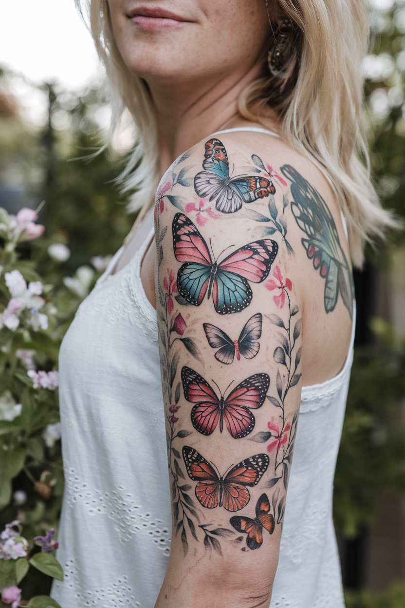
3. Soft Butterfly
A butterfly with wings in blush, lavender and mint rather than vivid colour realism. This is one of the few subjects where the pastel palette is arguably more faithful to the real thing than saturated colour would be.
Wing panels give the artist natural compartments to hold each tone, which is why butterflies hold up better than most soft-palette designs. There is more on the symbolism and the placement options in the wider butterfly tattoo ideas guide.
In fine line with light colour fills, or in watercolour with bleeding edges if you want the painted version.
4. Pastel Portrait
A face rendered in soft blush skin tones, gentle shadow and muted colour through the hair and eyes. The reference point is genuine: chalk pastel portraiture is a centuries-old drawing medium, and the tattoo version borrows that soft-focus quality on purpose.
This is the hardest idea on the list to execute. Portraits live or die on value contrast, and a pastel palette removes most of the range an artist normally works with.
Only book this with someone whose healed pastel portrait work you have actually seen — not a fresh photo taken the same day, which flatters everything.
5. Kawaii Pastel Design
A kawaii-style design in a pastel palette: small characters, food items, animals or objects in the Japanese aesthetic of deliberate cuteness. Kawaii and pastel are natural partners because both are built on softness rather than impact.
Scale is the thing to get right. These read best small and uncluttered — the inner wrist, the ankle, the back of the upper arm. The same logic applies to most small cute tattoo designs.
Keep the character count low. Three tiny pastel items spaced out beat eight crowded together every time.
6. Pastel Rainbow
The classic arc in soft, muted versions of each colour rather than vivid primaries. A pastel rainbow is quieter than the standard version and reads as decorative rather than declarative, which is exactly why some people choose it.
Watercolour washes on the collarbone, inner arm or ankle suit it well. The bands can meet without a hard edge, which is difficult to pull off in saturated colour but natural in pastel.
One honest note: the yellow band is usually the first thing to disappear. Ask your artist to weight it slightly warmer than the reference.
7. Soft Botanical Fine Line
Thin outlines in black or warm brown, with soft pastel tones filling the shapes instead of saturated botanical colour. The result reads like a vintage botanical plate printed in watercolour: precise in structure, gentle in palette.
This is the approach I recommend most often to people who want pastel but are nervous about longevity. The linework carries the design, so even if the colour lifts considerably you are left with a clean botanical illustration rather than a vague smudge.
Forearm, calf and ribcage all work. Fingers and the side of the hand do not — fine lines and light colour both struggle there.
8. Pastel Moon
A crescent, full moon or lunar phase sequence in soft lilac, pale blue or blush rather than grey and black. The moon is a forgiving subject for pastel because its real-world colour is already low in saturation.
Phase sequences along the forearm or spine give the palette room to shift slightly between each moon, which stops the piece looking flat.
Small standalone crescents behind the ear or on the ankle are popular, but genuinely tiny pastel work is the least durable thing on this list.
9. Cotton Candy Sky
A sunset or sunrise gradient in peach, lilac and pale blue — sky as the entire subject, with no figure in front of it. This is pastel tattooing at its most atmospheric.
It needs space. A gradient compressed into a two-inch square has nowhere to travel, and the whole appeal is the transition between tones.
Upper arm, thigh and back panels are the usual homes for it. When I have seen this done small, it healed into a single indistinct band within a year.
10. Pastel Crystals or Gems
Crystal clusters or faceted gems in lilac, mint and rose quartz pink. Crystals are quietly one of the best pastel subjects available, because facets give the artist hard internal edges to separate one light tone from the next.
That internal structure is what stops a light palette turning mushy. Each face reads as its own plane even after the colour softens.
Ask for a slightly darker tone at the base of the cluster. Every artist I have asked about pastel crystals does some version of this to anchor the piece.
11. Soft Celestial Composition
Stars, moons and small planets scattered across a limb in powder blue, lilac and pale gold. Celestial work suits pastel because it is decorative by nature — nobody is judging it against a reference photo.
The scattered layout also solves a real problem: small elements spread over a large area give the eye somewhere to rest between them. If you like the vertical version of this, sun and moon spine designs use the same logic along the back.
Vary the size of the elements. Uniform stars read as a pattern rather than a sky.
12. Pastel Koi Fish
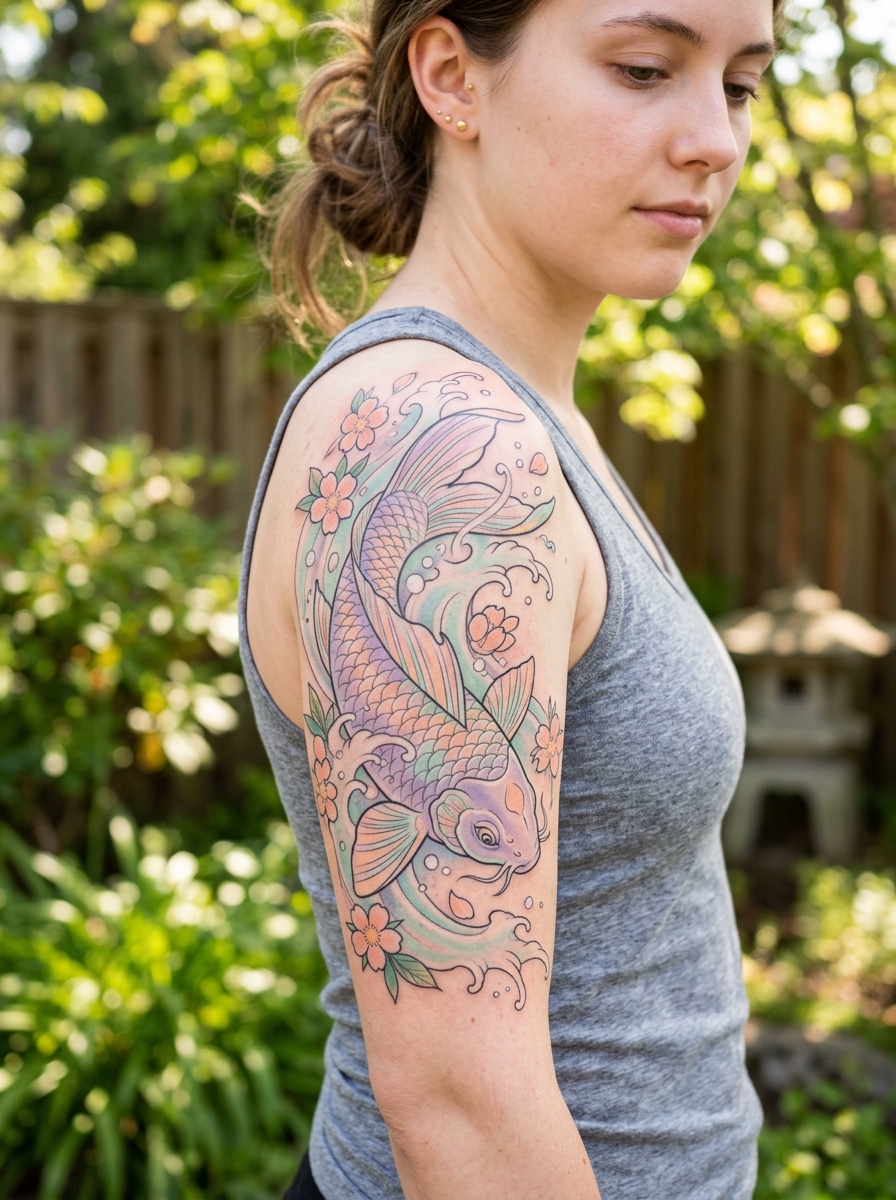
A koi in blush, cream and pale orange instead of the traditional deep red and black. The subject carries a lot of history, and softening the palette changes the tone of the piece considerably — it becomes gentle where the traditional version is bold.
Some traditional artists will push back on this, which is fair. If you want the classic reading, the standard koi fish designs do it better.
If you go pastel, keep the water detail in a slightly deeper tone. The fish needs something behind it.
13. Dreamy Landscape
Mountains, a lake, a treeline or a field rendered in soft lilac and mint rather than realistic greens and greys. Atmospheric perspective — distant things appearing lighter and bluer — is a real optical effect, so a pastel landscape is not as unrealistic as it first sounds.
Layered ridgelines work particularly well. Each ridge sits a shade lighter than the one in front, and the design builds depth from the palette itself.
Forearm, calf and upper back suit the horizontal format.
14. Pastel Mushrooms
Blush caps, mint stems, lavender gills — the forager’s palette softened into something closer to a fairytale illustration. Mushrooms have a compact, well-defined silhouette, which is exactly what light colour needs.
They also cluster naturally, so you can build a small composition without it looking arranged.
Wrist, ankle and inner arm at small to medium scale. This is one of the few genuinely small pastel designs I would still recommend, because the caps are solid shapes rather than gradients.
15. Soft Animal Portrait
A rabbit, cat, deer or bird in muted tones rather than realistic colouring. The pastel animal portrait sits between realism and illustration, which is a comfortable place for it to be — it does not have to survive comparison to a photograph.
Fur and feather texture is where the difficulty lies. Without enough tonal range the artist has little to work with, so the best versions keep the animal’s markings as the contrast source.
Upper arm and thigh give enough room for the detail to hold.
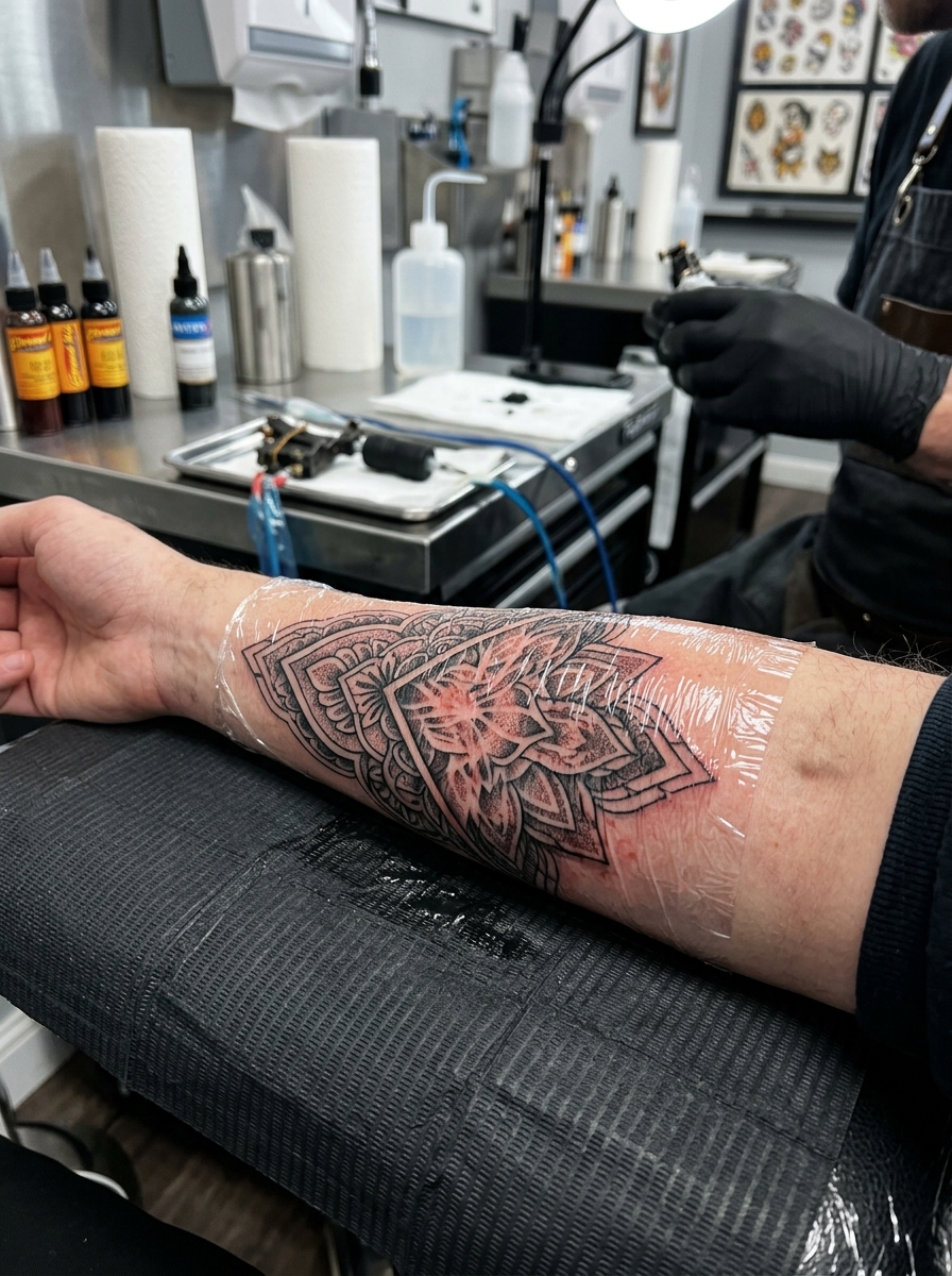
16. Pastel Mandala
The radial geometry of a mandala filled with soft blush, lavender and mint instead of jewel tones. The geometry does the heavy lifting here, so the colour can afford to be quiet.
Dotwork combined with pastel fill is a combination I have seen more of recently, and it works: the dots give the eye texture that the light colour cannot provide on its own.
Shoulder, sternum and outer thigh are the usual placements. Keep the outer ring in a slightly stronger tone so the piece has a defined edge.
17. Pastel Minimalist Quote
A short phrase or single word in soft lavender, blush or pale blue ink rather than black. Pastel text is subtle — present but not stark, readable but not shouting.
Be realistic about longevity. Light-coloured lettering is the most fade-prone thing in this entire article, and thin script in a pale tone can go indistinct faster than you would expect. If you want colour lettering that keeps its punch for longer, coloured ink alternatives in a deeper tone are worth considering.
Inner wrist, collarbone and inner bicep. Choose a font with some weight to it rather than the thinnest script available.
Alternatives and Variations Worth Considering
If pure pastel feels too fragile for what you want, these are the adjustments artists suggest most often.
Pastel with a Black Line Anchor
Keep the palette soft but let the linework stay properly black rather than brown or grey. You get the pastel look with a structure that will outlast the colour by decades.
This is the compromise I have seen satisfy the most people. It barely changes the first impression and substantially changes the ten-year one.
Muted Rather Than Pastel
Dusty rose, sage, terracotta and slate sit one step down from pastel — still soft and low-contrast, but with meaningfully more pigment in them.
If what you actually like is the gentleness rather than the specific lightness, a muted palette gives you most of the feeling with better durability.
Pastel Accents on a Black and Grey Piece
A black and grey design with small pastel highlights — a lilac petal, a mint leaf, a blush cheek — reads as soft without depending on light colour to carry the whole tattoo.
It also ages predictably. When the accents lighten, you still have a complete black and grey piece underneath.
White-Heavy Pastel: Proceed Carefully
Very white-heavy mixes and white highlights are the least predictable thing in colour tattooing. They can heal unevenly, and on some skin they raise slightly. The US Food and Drug Administration describes allergic reactions to tattoo pigments as rare, but notes that people occasionally develop a reaction to a tattoo they have had for years, and that the pigment can be hard to remove once they do.
If you have reacted to a coloured tattoo before, tell your artist and ask about a patch test before committing to a large pastel piece.
Getting a Pastel Tattoo That Lasts
The single biggest factor in how a pastel tattoo ages is sun exposure, and it is almost entirely within your control. Broad-spectrum sunscreen on the healed tattoo, every time it is uncovered, is the whole strategy.
Choose placement with that in mind. The inner arm, inner thigh and ribcage spend far less time in direct sun than the outer forearm, shoulder or calf, and pastel work on those covered areas holds its tone noticeably longer.
Follow your artist’s aftercare instructions during healing rather than a routine you read somewhere else — they know what they put in your skin. As a general rule, keep it clean, keep it lightly moisturised, and do not pick at it. Soaking a healing tattoo, in a bath, pool or hot tub, is the mistake I see most.
Plan for maintenance. Budget mentally for a touch-up in the first year and another every few years after that, and ask your artist about it before you book rather than after.
If the tattoo becomes hot, increasingly painful after the first few days, swollen, or starts weeping anything cloudy, that is a question for a doctor and not for an internet article. Reactions to coloured pigment are uncommon but real, and the AAD has a rundown of unexpected skin reactions to tattoos and what to do about them if you want to know what to look for. Either way, a persistent reaction needs a medical opinion rather than a home remedy.
Still Not Sure? Common Pastel Mistakes to Avoid
Going too small is the mistake I see most. Pastel needs room for the tones to separate, and a design that would be fine in black and grey at two inches often needs four in a light palette.
Picking an artist by their portfolio of fresh photos is the second. Ask specifically to see healed pastel work — a year old at minimum. Any artist who does this regularly will have it. If you are still choosing a subject, browsing small tattoo ideas first can help you separate what you like from what will actually work in pastel.
Ignoring placement is the third. A pastel design on the top of the forearm is going to fade faster than the same design on the inner arm, full stop. If you are set on a visible spot, wrist placement options are worth thinking through carefully before you commit.
And expecting a cover-up to work in pastel is usually a disappointment waiting to happen. Light ink does not conceal dark ink — that is a job for a heavier palette.
Frequently Asked Questions
Do pastel tattoos fade faster than regular tattoos?
In most cases, yes. Pastel colours contain less pigment and sit lighter in the skin, so there is less material to lose before the design starts looking washed out. Sun exposure accelerates this considerably, which is why placement and sunscreen matter more for pastel work than for black and grey. Expect to want a touch-up sooner than you would with a saturated or blackwork piece.
Do pastel tattoos work on darker skin tones?
They can, but the approach has to change. Skin tone sits over the ink and influences how light colour reads, so very pale pastels often do not show the way they do in reference photos taken on fair skin. An artist experienced with your skin tone will usually adjust the mix toward slightly deeper, warmer versions of the same colours. Ask to see their healed work on skin similar to yours before booking.
Are pastel tattoos more expensive?
Often slightly, though it depends entirely on the artist and the design. Pastel work frequently needs more passes to build even coverage in light tones, and colour packing takes longer than linework. Factor in the likelihood of touch-ups too, since that is a recurring cost rather than a one-off. Ask your artist to quote for the touch-up policy as well as the session.
Can a pastel tattoo be covered up later?
Covering a pastel tattoo is generally easier than covering a dark one, because there is less pigment for a new design to work around. Covering something dark with pastel, on the other hand, rarely works — light ink does not hide dark ink underneath it. If you think a cover-up is likely in your future, mention it at the consultation so the artist can plan the piece accordingly.
Do pastel tattoos hurt more?
The palette itself does not change the sensation, but the technique sometimes does. Colour packing means the artist works over the same area repeatedly to build even coverage, and that repetition can make a pastel piece feel more uncomfortable than an outline-only design of the same size. Placement still matters far more than palette — ribs and inner arm are tender regardless of what colour is going in.
Quick Summary
- Pastel tattoos are defined by light, low-saturation colour — the palette, not the subject.
- Fine line outlines with pastel fill is the most durable version of the look and the one to default to.
- A pastel tattoo heals lighter than it looks on the day; what you see in the chair is its brightest point.
- Subjects with built-in structure — crystals, butterflies, mushrooms, botanicals — hold up best.
- Gradient-heavy ideas like galaxies and sunset skies need scale; they blur when done small.
- Sun exposure is the main cause of fading, so covered placements and daily sunscreen make the difference.
- Always ask to see an artist’s healed pastel work, not fresh photos taken the same day.
- Anything painful, hot or weeping days after the appointment is a question for a doctor, not an aftercare guide.