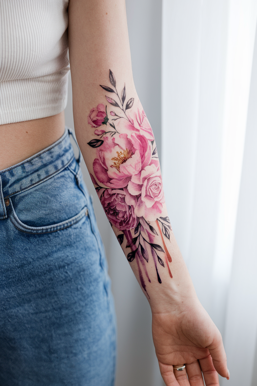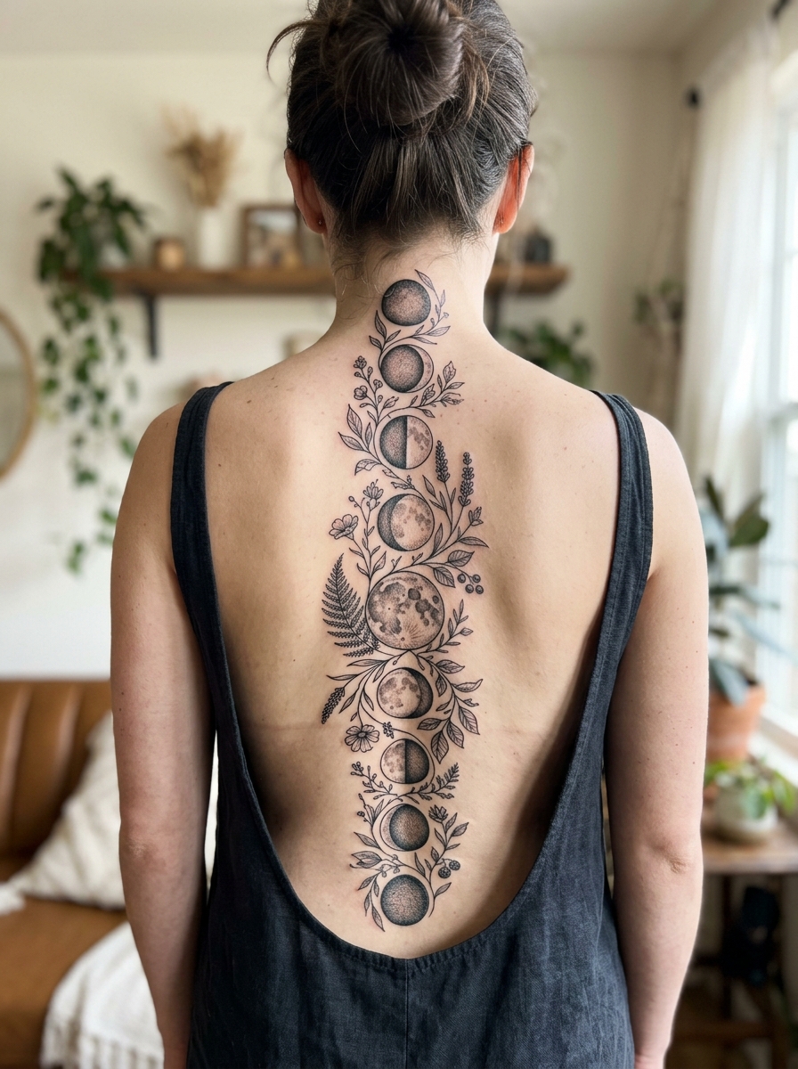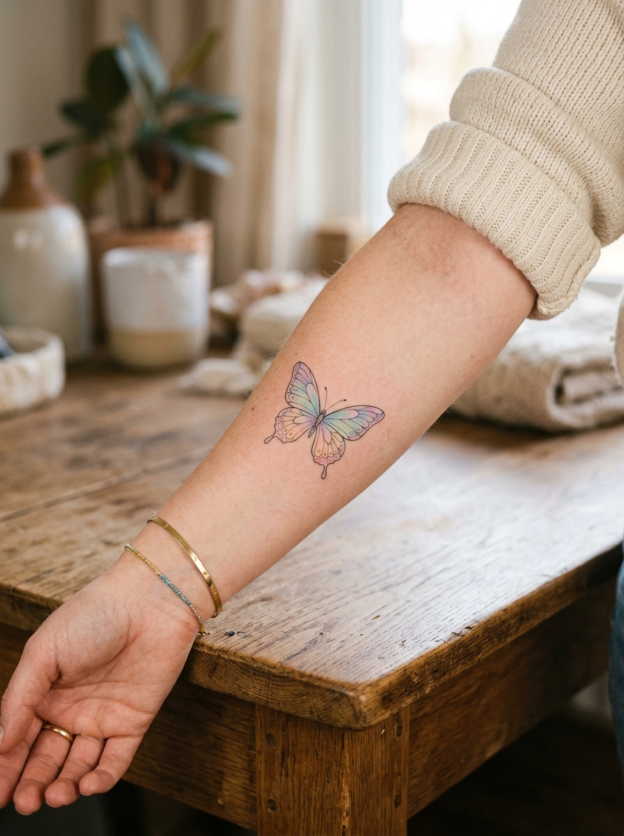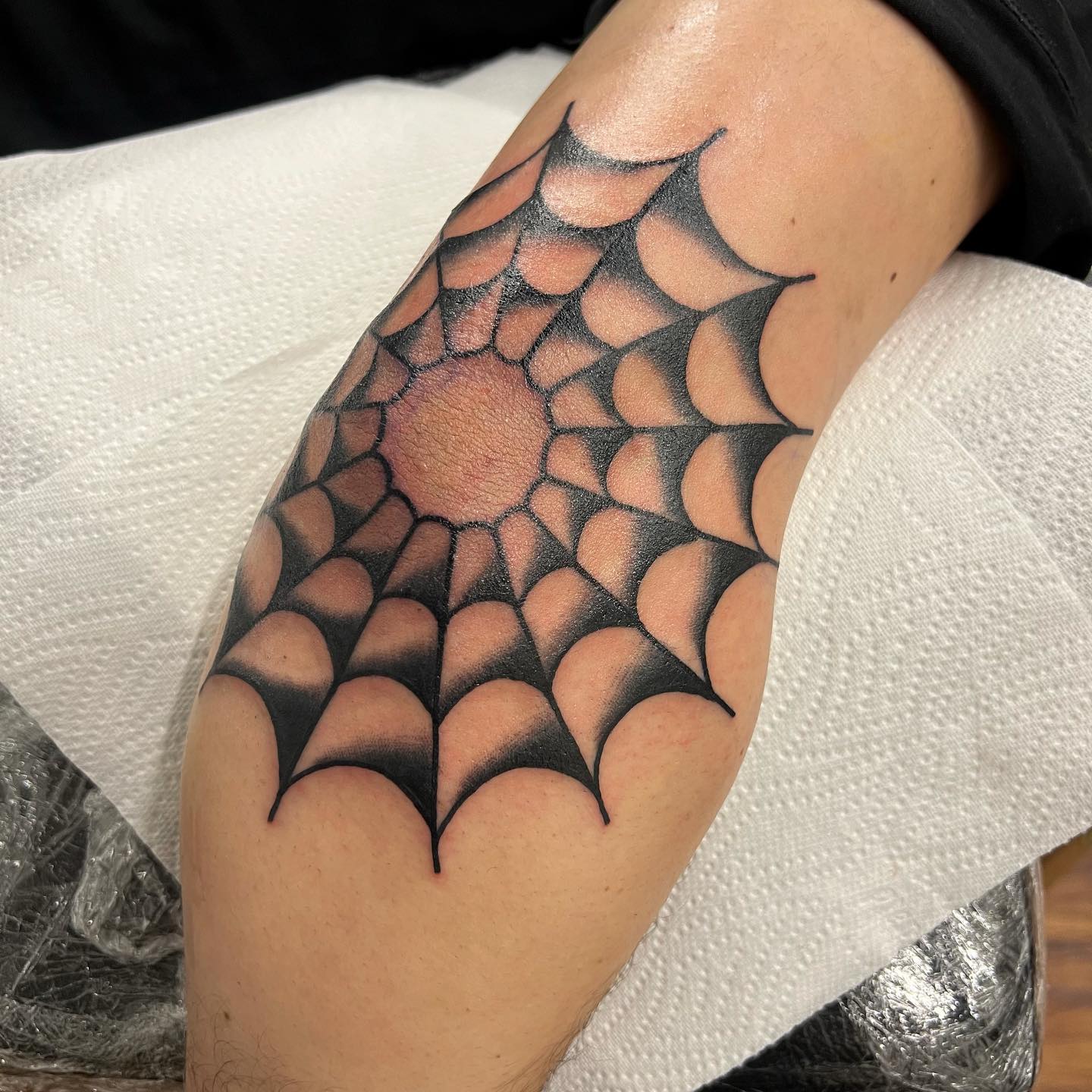
The word aesthetic has been stretched past the point of usefulness by the internet, but it still points at something real. An aesthetic tattoo is one that extends a visual language you already live in, rather than a symbol picked in a hurry from a wall of flash.
I have sat through a lot of consultations where someone arrives with forty saved images and no idea what connects them. Usually something does connect them, and finding it is the actual work.
The 21 ideas below are grouped by that logic. Each one has a distinct visual character, a realistic sense of how it ages, and notes on what makes it succeed or fail — including several that pair naturally with fine line sleeve designs if you plan to keep building.
None of this is a substitute for a consultation with a working artist. It is a way to arrive at one already knowing what you are asking for.
Photo: @txttooing
Which Aesthetic Tattoo Style Is Right for You?
The four broad approaches below cover most of what follows. They differ mainly in how they age and how much chair time they need.
| Style | Best for | How it ages | Typical session |
|---|---|---|---|
| Fine line | Small, precise, detail-led subjects | Softens and spreads; touch-ups common after several years | 1–3 hours |
| Blackwork | Bold botanicals, heavy shapes, high contrast | Holds edges well; the most durable option here | 3–6 hours |
| Engraved / etching | Vintage plates, star charts, anatomy | Cross-hatching can close up if drawn too tight | 2–5 hours |
| Watercolour | Abstract colour, no defined subject | Fades fastest without black linework anchoring it | 2–4 hours |
What Separates an Aesthetic Tattoo From a Decorative One
Intention, mostly. A decorative tattoo occupies space. An aesthetic one continues a visual language that already exists in how someone dresses, what they read, where they spend their time.
The best of them feel found rather than chosen, as if they were always going to end up there.
There is a practical dimension too. A design chosen because it fits your eye tends to be one you have looked at for months, which is the single best predictor of whether you will still like it in ten years.
The opposite pattern is familiar to every artist: a screenshot saved a fortnight ago, booked on a Tuesday, regretted quietly. Sitting with a reference for a season costs nothing.
Placement matters as much as subject. A design that works on a forearm may not survive the curve of a ribcage, and it is worth reading up on how fine line work behaves on the spine before committing to a difficult location.
21 Aesthetic Tattoo Ideas Worth Considering
1. Fine Line Architectural Detail
A fragment of architecture rendered in precise linework: an arched window, a classical column capital, a piece of Gothic tracery. For people whose visual world lives in old buildings, this brings that world onto the skin.
The trick is choosing a fragment rather than a whole building. A single arch reads clearly at four inches; a cathedral facade turns to mush.
I have watched more of these fail from over-detail than from under-detail. Ask your artist to strip out a third of the lines before you commit.
2. Dark Botanicals
Plants rendered in heavy blackwork, with shadow and depth rather than the delicacy of fine line florals. Dark botanicals carry a different mood entirely — witchy, faintly melancholic, beautiful the way overripe things are beautiful.
They sit well on the outer arm and the ribcage, where there is room for the negative space to breathe.
Because the ink is packed solid, these tend to hold their edges better over a decade than fine line work does. That durability is a real argument in their favour if you want one piece to last.
Photo: @hiralupe_tattoo
3. Vintage Illustration Fragment
A single image lifted from a botanical plate, an anatomical diagram, or a 19th-century engraving, rendered with the cross-hatching of the original source.
The antique aesthetic translates into blackwork almost without adjustment, which is why so many artists have a folder of them.
Bring the actual source image to your consultation. Every artist I have asked prefers a scan of the original plate over a screenshot of someone else’s tattoo of it.
Photo: @rhaerayy
4. Mushroom
The mushroom has become one of the defining objects of a specific visual sensibility — cottagecore, dark academia, forest witch, whichever label you prefer.
A fly agaric or a morel drawn in fine line detail is modest in scale but visually specific in a way that reads as considered rather than generic.
Naming a real species is what saves it. When I have seen these go wrong, it is almost always a vague storybook toadstool with no particular identity.
Photo: @hailyeahtattoos
5. Single Eye
A single realistic eye, detached from any face, drawn with photographic precision. The subject has surrealist precedent running back through Magritte and Dalí.
On skin it creates a watchful, slightly unsettling quality that reads as deliberately strange. That is usually the point.
Realism this tight needs an artist with a genuine realism portfolio, not a fine line specialist taking a detour. Ask to see healed photographs, not fresh ones.
Photo: @tattink.lin
6. Fine Line Portrait of a Literary Character
A portrait built from thin continuous linework rather than shading — a figure suggested with the smallest possible amount of ink.
Fine line portraiture is unforgiving. A line placed two millimetres off changes the entire face, and there is no shading to hide behind.
In my experience this is the single hardest piece on this list to get right, and the one most worth travelling for a specialist.
Photo: @jjrtattoos
7. Bleeding Flower
A flower drawn in clean black linework with red ink running from the petals or the cut stem. The contrast between botanical delicacy and the suggestion of injury is the whole idea.
Restraint is everything. One or two drops read as intentional; a wash of red reads as a horror piece.
Red pigment is also the colour most commonly linked to delayed allergic reactions in tattoo ink, so mention any pigment sensitivity to your artist before the needle goes in.
Photo: @guerrerotattooart
8. Abstract Linework Face
A face reduced to a handful of continuous contour lines — the Picasso approach, where the viewer completes the image.
These age unusually well, because there is no fine detail to blur. The lines are few and they are meant to be a little imprecise.
It is also one of the more affordable pieces here, since it is quick to tattoo. If cost matters, this style gives you more visual impact per hour than almost anything else.
Photo: @jiotattoo
9. Celestial Map Section
A section of an antique star chart, with the engraved grid lines, constellation figures, and marginal notation of the original.
Take a real chart section rather than a generic starfield. The specificity is what makes it look like an object rather than a background.
Keep the linework open. Engraved charts rely on white space, and if the lines are packed too tightly they will close up as the tattoo settles.
Photo: @lowbarluka
10. Moth
A moth, drawn symmetrically and in detail, is one of the most reliably beautiful subjects in contemporary tattooing. The wings give an artist an enormous amount of pattern to work with.
Death’s-head and luna moths are the two most requested, and both are common enough now that a slightly less obvious species will stand out more.
Symmetry is the risk. A moth that is off-axis on a curved limb will read as crooked forever, so spend real time on stencil placement.
Photo: @_pat_starfish_
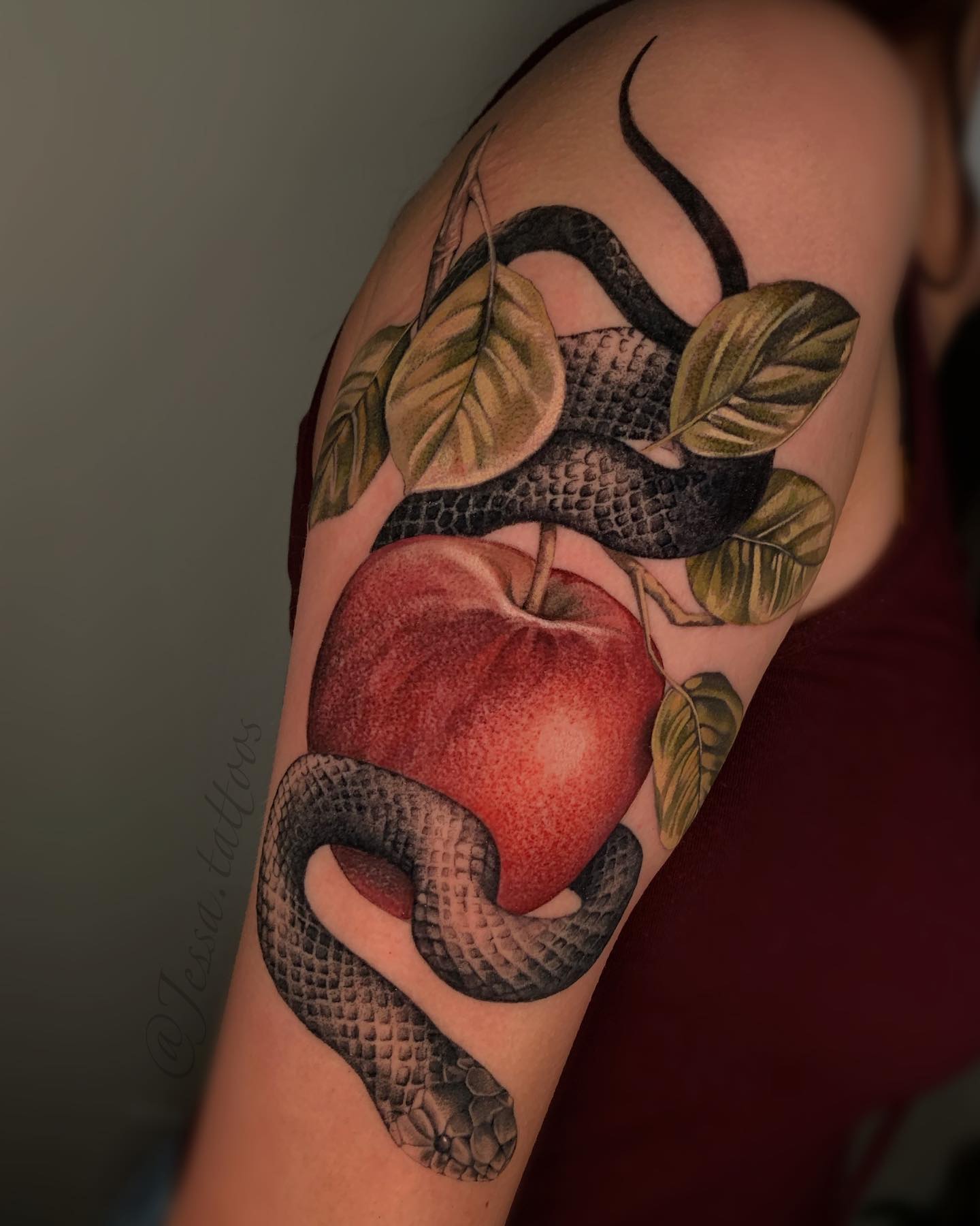
11. Serpent and Apple
The serpent coiled around fruit is roughly as old as narrative imagery gets, which is either the appeal or the problem depending on your tolerance for familiar symbols.
Handled with restraint — thin linework, no heavy drama, no text — it reads as classical rather than obvious.
It also wraps limbs beautifully. A snake that follows the curve of a forearm looks like it belongs there in a way that a flat design never quite does.
Photo: @jessa.tattoos
12. Hourglass
An hourglass rendered in fine line with stippled sand falling through the centre. The stippling adds texture without adding visual weight.
The object carries an obvious meaning, which some people want and others find heavy-handed. Cropping it — showing only the waist of the glass — softens that considerably.
Stipple work does fade faster than solid line. Expect the sand to soften first, usually within the first few years.
Photo: @eden__ronen28
13. Anatomy Fragment
A heart, a spine, a hand skeleton, or a lung drawn in the flat descriptive style of a medical textbook plate.
The textbook styling is what keeps it from tipping into shock value. It reads as an interest in structure, not gore.
Vintage anatomical atlases in the public domain are a far better reference than modern medical illustration, and your artist will thank you for bringing one.
Photo: @olgacaca
14. Fine Line Hand Holding Something
A hand, drawn in thin outline, holding a flower, a match, a piece of fruit, a moth. The gesture does more work than the object.
Hands are genuinely difficult to draw, which is why a well-drawn one carries so much weight. A badly drawn one is immediately obvious to everyone.
Look specifically for hands in an artist’s healed portfolio before booking. It is the fastest way I know to sort competent fine line artists from great ones.
Photo: @rbktatts
15. Text From a Favourite Book
A short line of text in the artist’s handwriting or a chosen typeface, taken from something you have actually read more than once.
Short is better. Every line in a tattoo thickens slightly as it heals and continues to spread over decades, so tightly spaced small text is the first thing to close up.
Ask for the text at a slightly larger size than feels necessary. I have never heard anyone regret going bigger on lettering; the opposite regret is common.
Photo: @delitetattoo
16. Pressed Flower Style
Botanicals drawn as though flattened in a herbarium press — slightly squashed, slightly asymmetrical, with thin brittle stems.
The imperfection is the style. A perfectly symmetrical flower drawn this way loses the entire effect.
These pair naturally with other pressed specimens over time, which makes them a good starting point if you expect to keep adding pieces to the same limb.
Photo: @1sle_tattoo
17. Dark Moon Phase
A row of lunar phases rendered in solid black and heavy texture rather than the thin outlines usually used for this design.
The weight is what distinguishes it. Standard moon phase tattoos are extremely common; a blacked-out version is not.
Solid circles hold their shape considerably better than textured ones. If you want the crater detail, accept that it will soften and plan the size accordingly.
Photo: @tatphomet
18. Fine Line Teacup
An object so domestic that it becomes strange as a tattoo subject. A teacup drawn accurately — ideally a cup you actually own — reads as intimate in a way symbolic objects rarely manage.
Draw from the real object, not from stock imagery. The specific curve of a particular handle is the entire point.
This is the sort of piece that people ask about, which is either a feature or a drawback depending on how much you enjoy explaining your tattoos.
Photo: @jco.artistry
19. Face in Profile With Botanical Hair
A profile with flowers, leaves, or branches growing where the hair would be. The combination of the human form with plant matter runs from Arcimboldo through to contemporary illustration.
On skin it lands as both portrait and still life, which gives it more staying power than either alone.
Keep the botanical half loose and the facial half precise. When both halves compete for detail, the piece stops resolving at a distance.
Photo: @hellabellatattoos
20. Constellation With Specific Stars Named
A constellation that includes the actual star names alongside the points — Betelgeuse, Rigel, Sirius — written in small precise text.
The specificity is what elevates it from decoration to documentation. A nameless scatter of dots could be anything.
Check the star positions against a real chart before the stencil goes on. I have seen more than one constellation tattoo with the geometry quietly wrong.
21. Abstract Watercolour Wash
A patch of colour with no defined subject — a loose wash of blues and greens, or warm pinks and ochres, existing as pure colour on skin.
It is the most abstract idea here and the most vulnerable to the accusation of being unfinished. The right person for this tattoo already knows it isn’t.
Be clear-eyed about longevity: watercolour work without any black linework to anchor it generally softens faster than outlined designs, and many artists will tell you to expect touch-ups.
Photo: @yuki_zerkjad
Variations Worth Considering Instead
Go Bigger and Simpler
If you like a design but worry about how it will hold up, the usual answer is not more detail — it is the same design at 150% scale with a third of the lines removed.
Every artist I have asked says the same thing: they are asked to shrink designs far more often than they are asked to enlarge them, and shrinking is what causes most of the problems they fix later.
Swap the Subject, Keep the Style
The engraved-plate treatment works on almost anything. If the anatomical heart feels too on the nose, the same cross-hatched styling applied to a shell, a key, or a bird carries the identical mood.
This is a useful move when a subject you love has become extremely common. The style is doing most of the aesthetic work anyway.
Colour as an Accent, Not a Field
A single spot of colour in an otherwise black design — the red on a bleeding flower, one ochre leaf in a blackwork botanical — is often more striking than a fully coloured piece.
It also ages more predictably, since the black linework holds the structure while the colour does the work of drawing your eye.
Build a Set Rather Than One Piece
Several small pieces in one consistent style read as a deliberate collection. This is how most of the best-looking arms I have seen were actually assembled — slowly, in one visual register.
If that appeals, blackwork designs and wildflower motifs are two of the easiest families to keep adding to without the arm losing coherence.
Practical Advice Before You Book
Look at healed photographs, not fresh ones. A fine line tattoo photographed an hour after it was finished tells you almost nothing about how that artist’s work settles.
Bring your own references rather than photographs of other people’s tattoos. Source material — the actual engraving, the actual plate, the actual cup — gives an artist something to work from instead of something to copy.
Budget for the piece you want rather than the piece you can afford this month. Waiting two months is cheaper than a cover-up, and a rough guide to what small work costs is available in our small tattoo pricing guide.
For aftercare, follow the instructions your artist gives you over anything you read online, including this page. The American Academy of Dermatology publishes straightforward general guidance, and the US Food and Drug Administration covers ink safety and reaction risk. If a healing tattoo becomes hot, swollen, or increasingly painful after the first few days, see a doctor rather than waiting it out.
Still Not Sure? Common Mistakes to Avoid
Shrinking a detailed design to fit a small space is the mistake that generates the most touch-up appointments. Detail needs room.
Choosing a placement for how it photographs rather than how it wears is another. Some of the most photogenic spots are also the most painful and the fastest to fade, which is worth reading about in advance in our tattoo pain guide.
Booking a specialist style with a generalist artist rarely ends well. Realism, fine line, and blackwork are genuinely different skill sets.
And picking a motif because it is currently everywhere. If you want a moon or a moth, look at how moon phase designs and moth symbolism are usually handled first, then decide what you would do differently. Serpent designs are worth the same treatment — our snake tattoo roundup shows how much range the subject actually has.
Frequently Asked Questions
What makes a tattoo aesthetic rather than just decorative?
An aesthetic tattoo continues a visual sensibility the wearer already has, rather than introducing a symbol from outside it. In practice that usually means the design connects to things the person already looks at — the books, buildings, plants, or films that shape their eye. Decorative tattoos fill space attractively; aesthetic ones read as part of a coherent whole. The distinction is subjective, but it tends to be obvious when you see a set of tattoos that all belong to the same visual world.
Do fine line aesthetic tattoos fade faster than other styles?
Generally yes. Thin lines carry less pigment and sit closer to the surface, so they soften and spread sooner than solid blackwork does. Most people find fine line work needs a touch-up somewhere in the first several years, though this varies a great deal with placement, sun exposure, and skin type. Your artist can give you a realistic expectation for the specific design and location you are considering.
Which placements work best for these designs?
Flat, low-friction areas like the outer forearm, the outer upper arm, the thigh, and the calf tend to hold detail longest. Hands, fingers, feet, and the ribcage are harder on ink and more likely to need touch-ups. If a design depends on symmetry — a moth, a moon phase row — a flatter surface also makes stencil placement much easier to get right.
Is red ink riskier than black ink?
Red pigment has historically been associated with more reported delayed allergic reactions than black, which is why designs like the bleeding flower are worth discussing with your artist first. If you have had a reaction to a tattoo, cosmetic product, or metal jewellery before, say so before booking rather than on the day. Any reaction that involves swelling, persistent itching, or raised skin weeks after healing should be looked at by a doctor rather than treated at home.
How long should I sit with an idea before booking?
There is no rule, but a few months of still wanting the same thing is a reasonable filter. The images that survive that wait are usually the ones connected to something durable in your taste rather than something you saw last week. If you find yourself redesigning it repeatedly, that is useful information too — it often means the subject is right and the treatment is not.
Quick Summary
- Aesthetic tattoos extend a visual language you already live in — they are not a category of subject matter.
- Blackwork holds its edges longest; fine line and watercolour both soften faster and may need touch-ups.
- Choose a fragment rather than a whole scene: one arch, one specimen, one section of star chart.
- Specificity beats generality — a named mushroom species or a real teacup outperforms a generic version.
- Go larger and simpler rather than smaller and more detailed; shrinking is what causes most later problems.
- Match the artist to the style: realism, fine line, and blackwork are separate skill sets.
- Bring original source material to your consultation instead of photographs of other people’s tattoos.
- Follow your artist’s aftercare instructions, and see a doctor for anything that looks like infection or a reaction.