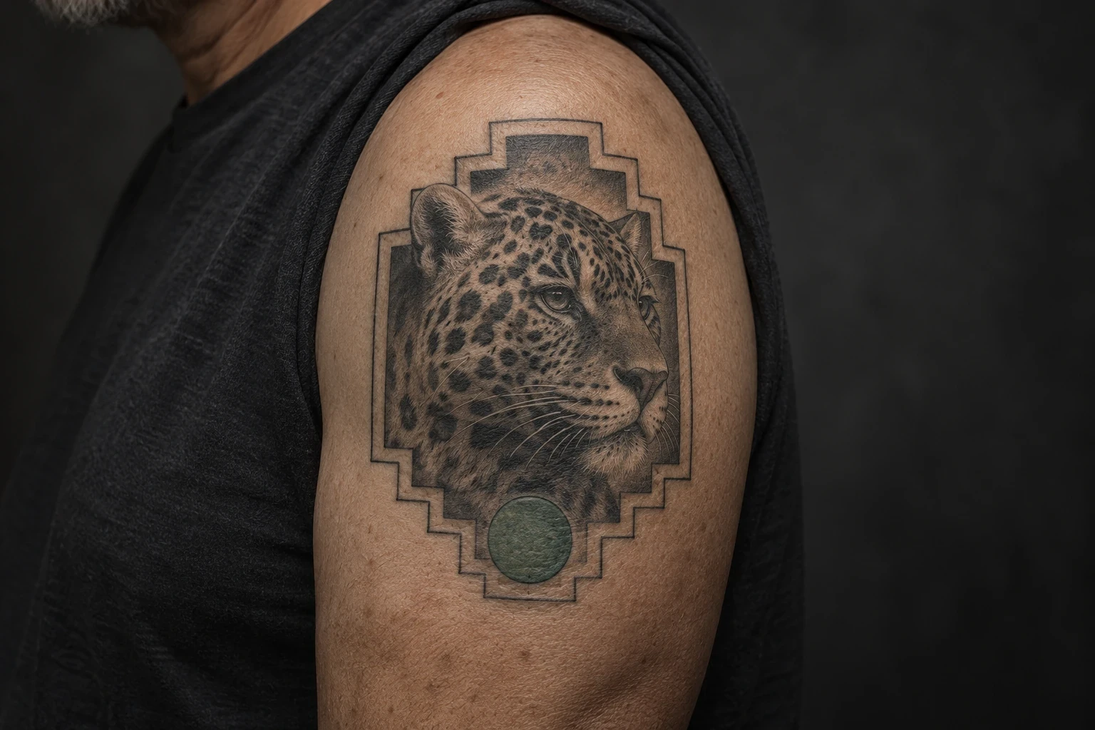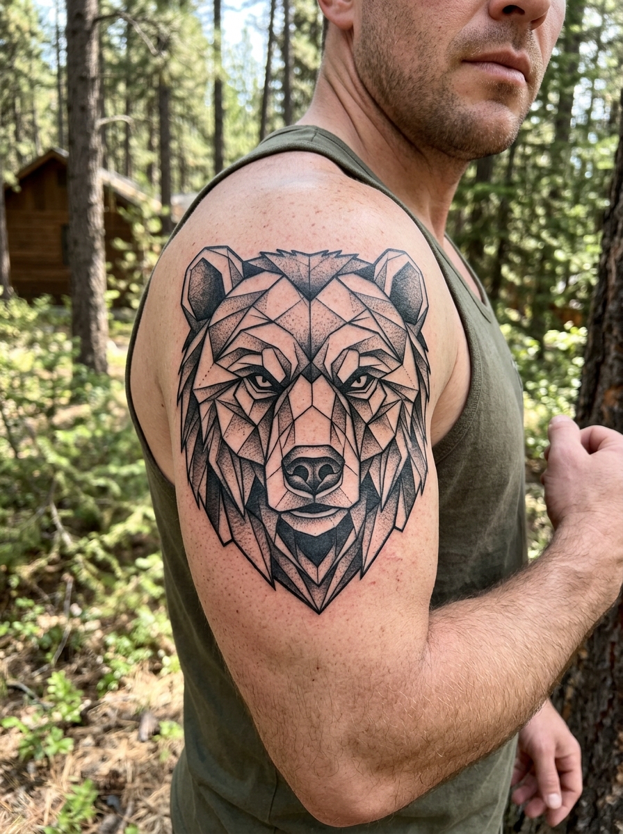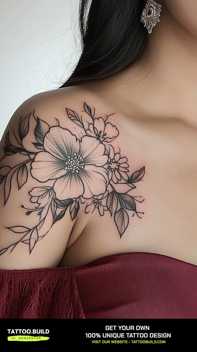
I have spent more hours than I can count scrolling through portfolios with women who know they want something “pretty” but cannot name the style they are after. Nearly every one of them is describing the same three things: soft line weight, an open composition, and a design that follows the body instead of sitting on top of it.
That is really what “pretty tattoos for women” means in practice — not a category of subject matter, but a way of drawing.
A peony can be pretty or it can be heavy metal, depending entirely on how it is inked. The same is true of butterflies, birds, script and mandalas, which is why I usually start these conversations with line weight rather than subject, and often point people toward fine-line tattoo ideas first.
Below is the whole thing laid out the way I would talk you through it in a shop: how the styles differ, where they sit best, what holds up over a decade, and what I would think twice about.
Which Pretty Tattoo Style Is Right for You?
The five styles below cover most of what people mean when they say they want something delicate. They age very differently from each other, which is the part that rarely comes up on inspiration boards.
| Style | What it looks like | Placements it suits | How it tends to age |
|---|---|---|---|
| Fine line | Single-weight black outline, almost no shading | Forearm, collarbone, spine, ribs | Softens the most; usually needs a touch-up sooner than other styles |
| Black and grey floral | Outline plus smooth grey shading and dark centres | Shoulder, upper arm, thigh, back | Very predictable; contrast is what carries it |
| Botanical colour | Soft greens, peaches and corals, often without heavy outline | Inner arm, thigh, upper arm | Light pigments fade first, especially on sun-exposed skin |
| Ornamental / mandala | Repeating geometry, dotwork, jewellery-like strands | Shoulder cap, sternum, wrist, back of the neck | Well, as long as the dot spacing is not too tight |
| Illustrative animal | Birds, butterflies, fish drawn with line and light shading | Upper back, shoulder blade, outer arm | Depends almost entirely on how much internal detail is packed in |
What Actually Makes a Tattoo Look “Pretty”
When I look back at the pieces that still look beautiful five and ten years on, they have almost nothing in common subject-wise. What they share is negative space.
Ink spreads a little under the skin over the years. That is normal and it happens to everyone.
So a design drawn with breathing room between petals stays readable, while the same design packed edge to edge slowly turns into a grey mass. Every artist I have asked about longevity says a version of this before they say anything else.
The second factor is flow. A tattoo that follows the line of a limb, a collarbone or the spine looks intentional; the identical drawing pasted on flat looks like a sticker.
The third is scale, and it is the one people fight hardest. A design that is charming at four inches often cannot survive at two, because the lines that make it delicate are the same lines that blur.
Pretty Tattoo Ideas for Women, Style by Style
These are the directions I see most often, with real examples of each. Take them as starting points to hand your artist rather than designs to copy line for line.
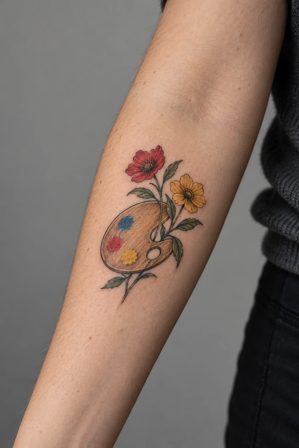
Fine-Line Florals
Fine-line florals are the default answer for a reason: a single open bloom with a couple of leaves works at almost any size and on almost any placement.
In my experience the pieces that hold up best are the ones where the artist drew three or four large petals rather than twenty small ones. The eye reads the shape of the flower, not the count.
If you are drawn to a specific bloom, it is worth checking whether it is your birth flower — it gives an otherwise decorative piece a reason to exist, which matters more than people expect a few years in.
Ask for a slightly heavier outline than the reference photo shows. Fresh fine line always looks crisper than healed fine line, and the photos you are looking at are almost certainly fresh.
Botanical Greenery and Leafy Vines
Leaves without flowers is an underrated direction. Eucalyptus, olive, fern and wildflower stems give you the softness of a floral without the density.
These read especially well on the inner arm and along the collarbone, where the skin is smooth and the design has a natural line to follow.
Green ink is the trade-off. Soft greens sit beautifully when healed but they are among the first pigments to lose punch, and I would plan on a refresh sooner than you would for blackwork.
Butterflies and Winged Designs
Butterflies get dismissed as generic, which I think is unfair — the execution is what separates a beautiful one from a flash-sheet one.
The versions I like keep the wing pattern simple and let the silhouette carry the design. Every extra scallop and dot inside the wing is another line that has to survive.
Centred on the upper back, a butterfly has natural symmetry to work with, and it sits under most necklines if you want the option to cover it.
Birds, Cranes and Doves
Birds give you movement, which is something a static floral cannot. A crane lifting off across the shoulder blades pulls the eye upward and makes the whole back look longer.
When I have watched artists design these, most of the drawing time goes into the wing angle rather than the feathers. Get the gesture right and the detail almost draws itself.
Doves and swallows work at a smaller scale than cranes do, so they suit the upper arm and the ribs where a large wingspan would not fit cleanly.
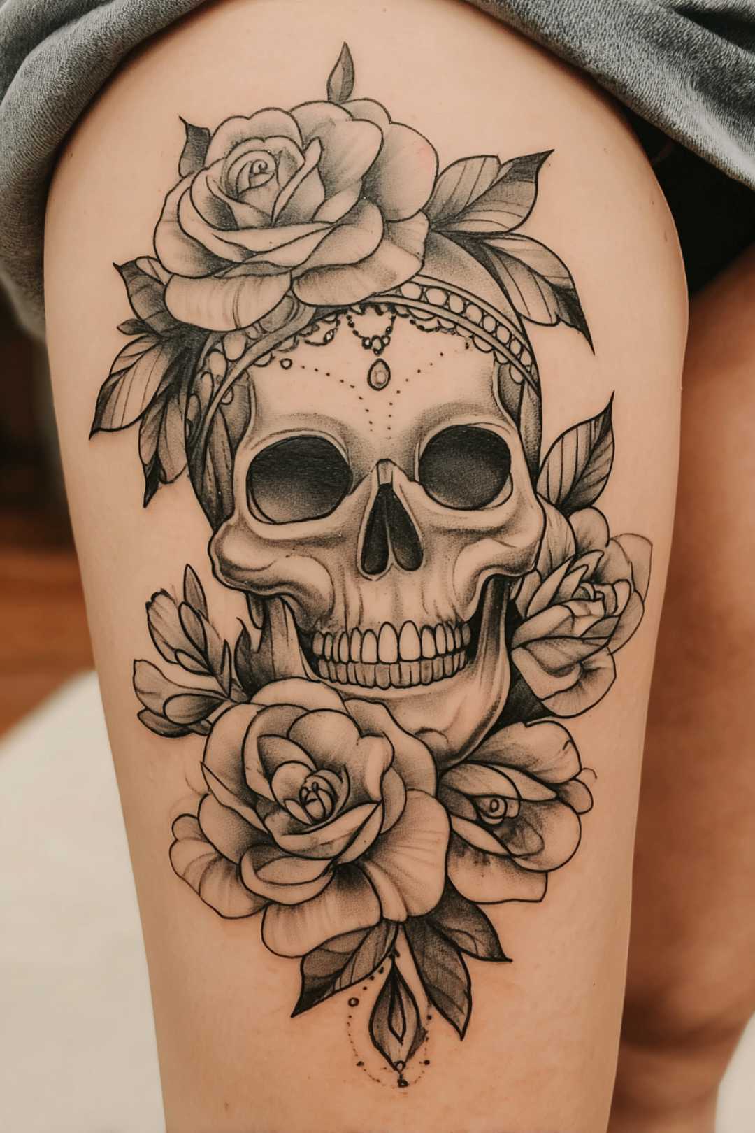
Black-and-Grey Statement Pieces
If you want something unmistakably pretty but not small, black and grey is the most reliable route. The grey does the softening that fine line achieves with restraint.
Contrast is what keeps a black-and-grey piece readable at a distance, so expect your artist to push some areas darker than the reference image.
These are usually multi-session pieces. A full back panel is rarely one sitting, and rushing it is how you end up with uneven healing across sections.
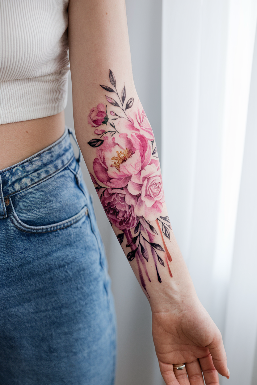
Soft Colour and Colour-Washed Florals
Peach, coral, dusty pink and muted lilac have quietly taken over the “pretty” category over the last few years, and they photograph beautifully.
The honest version of the advice: soft colour is the most maintenance-heavy option on this page. It looks incredible healed and it fades faster than anything else here.
I would only put it somewhere that stays covered most of the year — inner arm, thigh, upper back — and I would commit to sunscreen as part of owning it.
Butterfly-and-Bloom Combinations
Pairing a butterfly with flowers is the most requested combination I come across, and it works when one element clearly leads.
When the butterfly and the flowers are the same size and the same weight, they compete and the piece reads as clutter.
The forearm suits this combination well because it gives you a long, gently curved area to stagger the elements down rather than stacking them.
Ornamental, Mandala and Jewellery-Inspired
Ornamental work is the option for someone who wants decoration without an image — no flower, no animal, just pattern that fits the body.
A mandala capping the shoulder follows the round of the deltoid, and dotwork strands can be drawn to hang like a bracelet or a chain.
One caution from watching these heal: very tight dotwork can blur into solid grey. Ask your artist to open the spacing slightly more than the drawing suggests.
Fine-Line Animals and Small Symbols
Not everything has to be floral. A betta fish, a koi, a single dove — small illustrative pieces carry a lot of personality for very little skin.
These are my usual recommendation for a first tattoo, because they are quick, they sit in low-pain areas, and they do not commit you to a style.
If you are still deciding how big to go, tiny tattoo ideas are a useful reality check on what does and does not work at a small scale.
Placement Changes the Design More Than You Think
The same drawing behaves completely differently depending on where it lands. This is the part of the conversation I wish more people had before they booked.
Collarbone and Shoulder
The collarbone gives you a built-in line to follow, and symmetrical designs either side of the sternum look deliberate without being loud.
It sits in and out of view depending on what you wear, which is why it stays one of the most requested spots. Bone-adjacent skin is on the sharper end of the pain scale, though the sessions are usually short.
There is a lot more range here than people realise — collarbone tattoo ideas is worth a browse before you settle.
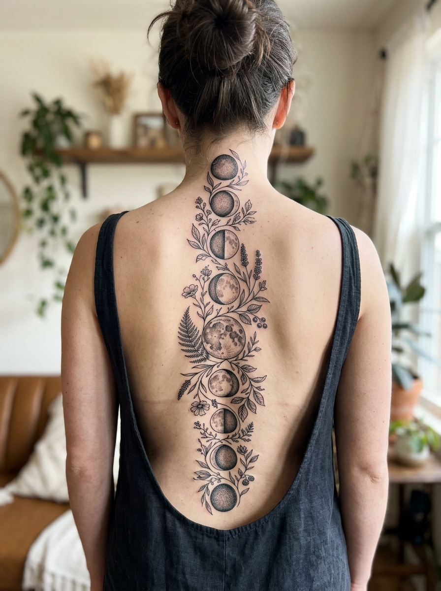
Spine and Back
A spine piece is the most flattering placement on this page and the most demanding to execute, because any drift off the centre line is visible forever.
Expect a longer sitting than the size suggests. The skin over the vertebrae is thin and most people need breaks.
If this is the direction you are leaning, read up on spine tattoo ideas for women and look specifically at healed photos rather than fresh ones.
Neck and Behind the Ear
Neck placements are beautiful and they are the least reversible decision here in practical terms, because they are visible in almost every setting.
They also take more sun than anywhere else on the body, which shortens the life of fine detail. I would go slightly bolder here than you would on a forearm.
Thigh and Hip
The thigh is the most forgiving canvas on the body: generous flat area, mostly covered, and comfortable for both you and the artist over a long session.
It is where I would put anything colour-heavy or highly detailed, precisely because it stays out of the sun for most of the year.
Arm, Forearm and Wrist
The forearm is the placement people are happiest with long term, in my experience, because you see it constantly and it heals easily.
The wrist is trickier — it flexes, it rubs against sleeves and watches, and small designs there blur sooner than the same design a few inches higher. Wrist tattoo ideas covers what tends to survive there.
For anything on the ankle or foot, ankle tattoo ideas is the better starting point, since bone coverage changes the design rules again.
Keeping a Delicate Tattoo Looking Delicate
Sun is the single biggest factor in how a fine-line or soft-colour tattoo looks in five years. Not soap, not lotion, not the first two weeks — sun, repeated over years.
Through healing itself, the routine is unglamorous: keep it clean, keep it lightly moisturised, do not pick, and do not soak it. The American Academy of Dermatology sets out the standard approach in its guidance on caring for tattooed skin, and our own tattoo aftercare guide walks through the same ground day by day.
Once it is fully healed, high-SPF sunscreen on exposed pieces is the whole strategy. It is boring and it works.
Take reactions seriously. Redness that spreads, swelling that worsens after the first few days, pus, fever or a rash appearing weeks or months later are reasons to see a doctor rather than wait it out — the AAD lists several skin reactions that can show up long after the appointment, and the FDA’s consumer guidance on tattoo safety is worth reading before your first session. Nothing on this page is medical advice.
Still Not Sure? The Mistakes I See Most
Going too small is the most common one. People shrink a design to make it more subtle and end up with something that has to be redrawn in four years.
The second is bringing a collage of twelve references and asking for all of them. Pick the one whose line quality you love and let your artist design around it.
The third is booking on price rather than portfolio. Fine line especially is a specialism, and finding the right tattoo artist matters more than the shop’s hourly rate.
And the fourth is underestimating the sitting. If you are nervous about how a placement will feel, a tattoo pain chart gives you a rough map before you commit.
Frequently Asked Questions
What is the best pretty tattoo for a first-timer?
A small fine-line floral or a simple botanical sprig on the forearm or outer upper arm is the easiest place to start. The session is short, the area is comfortable, and the healing is straightforward compared with ribs or feet. It also does not lock you into a style if you decide to add more later. If you love it, that piece becomes the anchor for something larger; if your taste changes, it is small enough to build around.
Do fine-line tattoos fade faster than other styles?
They generally soften sooner, yes — not because the ink is different, but because there is less of it holding the shape. A hairline that spreads slightly has nowhere to hide, while a thicker outline spreading by the same amount still reads as a line. Most artists I have spoken to expect fine-line work to want a refresh before heavier styles do. Sun exposure and placement matter more than the style label itself.
Where do pretty tattoos hurt the least?
Fleshier areas with more padding — the outer thigh, the outer upper arm and the forearm — are usually the most tolerable. Ribs, sternum, spine, ankle, foot and anywhere directly over bone tend to be sharper. Pain is genuinely individual, so treat any chart as a rough guide rather than a promise. Eating properly beforehand and booking a shorter first session helps more than most people expect.
How much do designs like these usually cost?
It varies far too much by city, artist and size for a number here to be useful, and anyone quoting you a universal figure is guessing. What is consistent is that experienced fine-line and ornamental artists charge a premium, and that it is worth it for work this unforgiving. Ask for a quote based on your actual design and placement, not a per-inch estimate. Budget for a possible touch-up too.
Can I get a delicate tattoo if I have sensitive skin?
Often yes, but it is a conversation to have with your artist before you book, and with a doctor if you have a diagnosed skin condition such as eczema or psoriasis. Reactions to specific pigments do happen and can appear well after the appointment. A reputable studio will patch-test or steer you toward safer options if there is any doubt. Never treat a reaction yourself — see a professional.
Quick Summary
- "Pretty" is a way of drawing — light line weight, open space, and a design that follows the body — not a fixed list of subjects.
- Negative space is the single best predictor of how well a delicate tattoo will look in ten years.
- Fine line is the most popular route and the one most likely to want a touch-up.
- Black and grey gives you softness at a larger scale with the most predictable ageing.
- Soft colour looks stunning healed but fades fastest — keep it somewhere that stays covered.
- Placement changes everything: collarbone, spine, thigh and forearm all demand different drawings.
- Sunscreen on healed work does more for longevity than any aftercare product.
- Choose the artist by portfolio and healed photos, not by hourly rate.