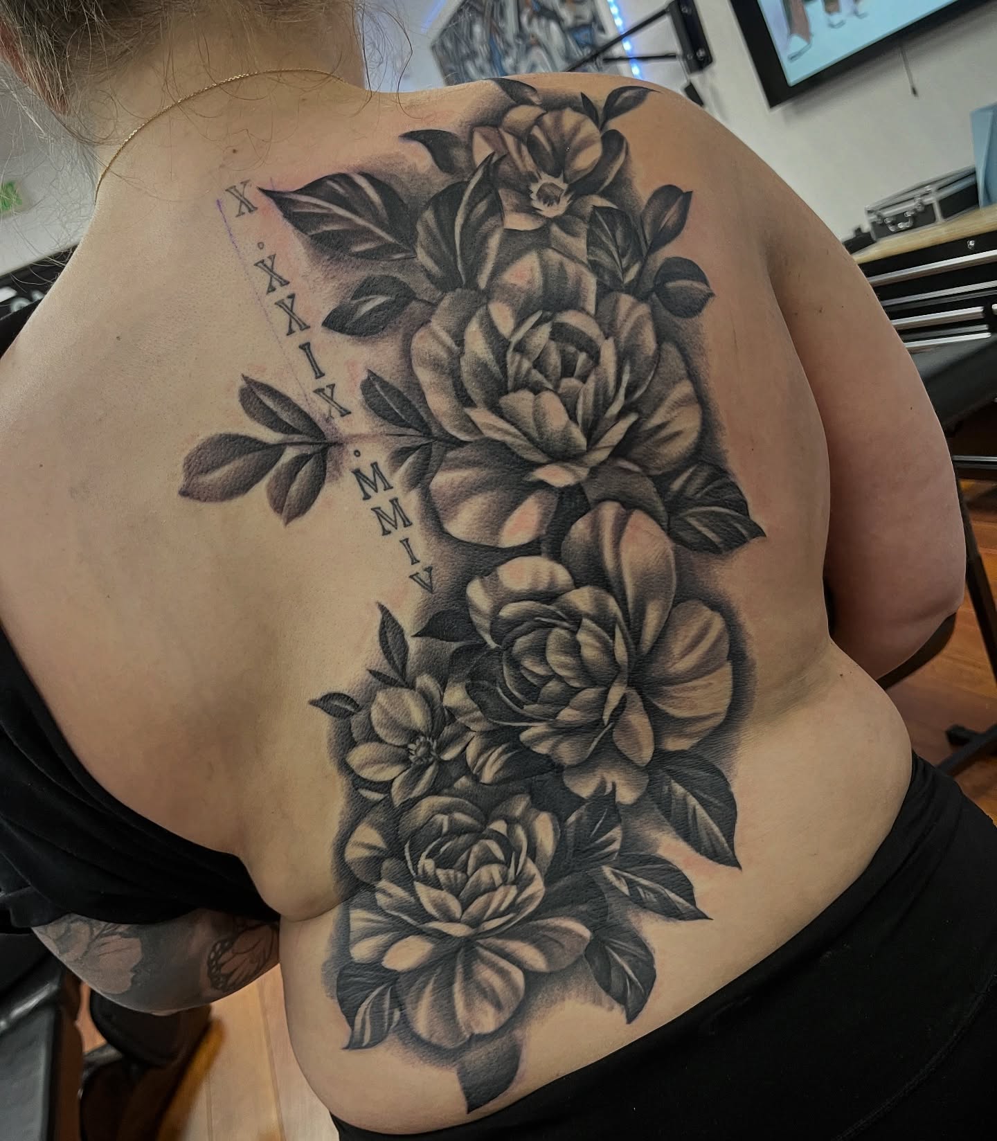
I have watched a lot of people sit down in a tattoo chair and ask for something that means hope, and almost none of them arrive with a picture. They arrive with a feeling. A hope tattoo is not really a design choice — it is a reminder you agree to carry on your skin for the rest of your life, so the symbol matters far more than the style.
Over the years I have seen the same handful of images come up again and again: a sunrise, an anchor, a bird mid-flight, a single word in someone’s own handwriting. What surprised me is how differently each one ages, both on the skin and in the person wearing it.
This guide walks through 20 hope tattoo ideas I keep seeing done well, with honest notes on size, placement and what actually holds up after five years. If you are weighing hope against something adjacent, our guide to tattoos that mean strength and courage covers the overlap.
I have tried to be specific rather than poetic. You can get the poetry from your artist.
Which Hope Symbol Is Right for You?
The table below is the shortlist I usually talk people through before they commit to anything.
| Symbol | What It Says | Smallest Size That Works | Best Placement | How It Ages |
|---|---|---|---|---|
| Script “hope” | Direct, no interpretation needed | About 4 cm wide | Inner forearm, collarbone | Thin script can soften — keep letters open |
| Anchor | Steadiness through bad weather | About 5 cm tall | Forearm, ankle, ribs | Very well — bold shapes hold |
| Sunrise | Things begin again | About 6 cm wide | Inner arm, back of shoulder | Good if rays are spaced, poor if crowded |
| Semicolon | The sentence continues | Under 2 cm | Wrist, finger, behind the ear | Tiny dots can blur — go slightly bigger |
| Phoenix | Came back from the worst of it | About 15 cm minimum | Back, thigh, upper arm | Excellent at size, muddy if shrunk |
| Lotus | Grew out of something ugly | About 6 cm wide | Forearm, sternum, spine | Good with open petals, poor if over-detailed |
| Bird in flight | Release, freedom, moving on | About 3 cm per bird | Shoulder, ribs, forearm | Risky when very small — wings merge |
Why Hope Tattoos Are Different From Other Meaning Tattoos
Most symbolic tattoos are about something that already happened. A hope tattoo is about something that has not happened yet, and that changes how it needs to be designed.
In my experience the pieces that fail are the ones that are too literal about the bad part. A design built entirely around what someone was escaping tends to keep pointing backwards every time they look at it.
The ones that work usually put the weight on the forward half of the image — the bird already airborne rather than the cage, the sprout rather than the crack it came through. The symbol should show the outcome, not the wound.
There is also a practical difference. Hope tattoos are frequently first tattoos, which means people underestimate size and pick placements they will see constantly. Both of those are worth thinking about before the stencil goes on.
And a last thing worth saying plainly: a tattoo is a reminder, not a treatment. It can sit alongside real support, but it does not replace it.
20 Hope Tattoo Ideas
These are ordered roughly from the most literal to the most personal. There is no wrong end of that spectrum.
1. The Word “Hope” in Script
The simplest option and the one people talk themselves out of most often, usually because it feels obvious.
It is not obvious once it is on you. What matters here is entirely the lettering — a good script artist will vary stroke weight so the word has rhythm, and will leave enough space inside the loops of the letters that they do not fill in as the ink settles over the years.
I always suggest asking to see healed script work, not fresh photos. Fresh lettering looks crisp on everyone. Healed lettering is where you find out whether your artist actually knows what they are doing.
Around 4 cm wide is the practical floor. Below that, thin script tends to lose its inner detail.
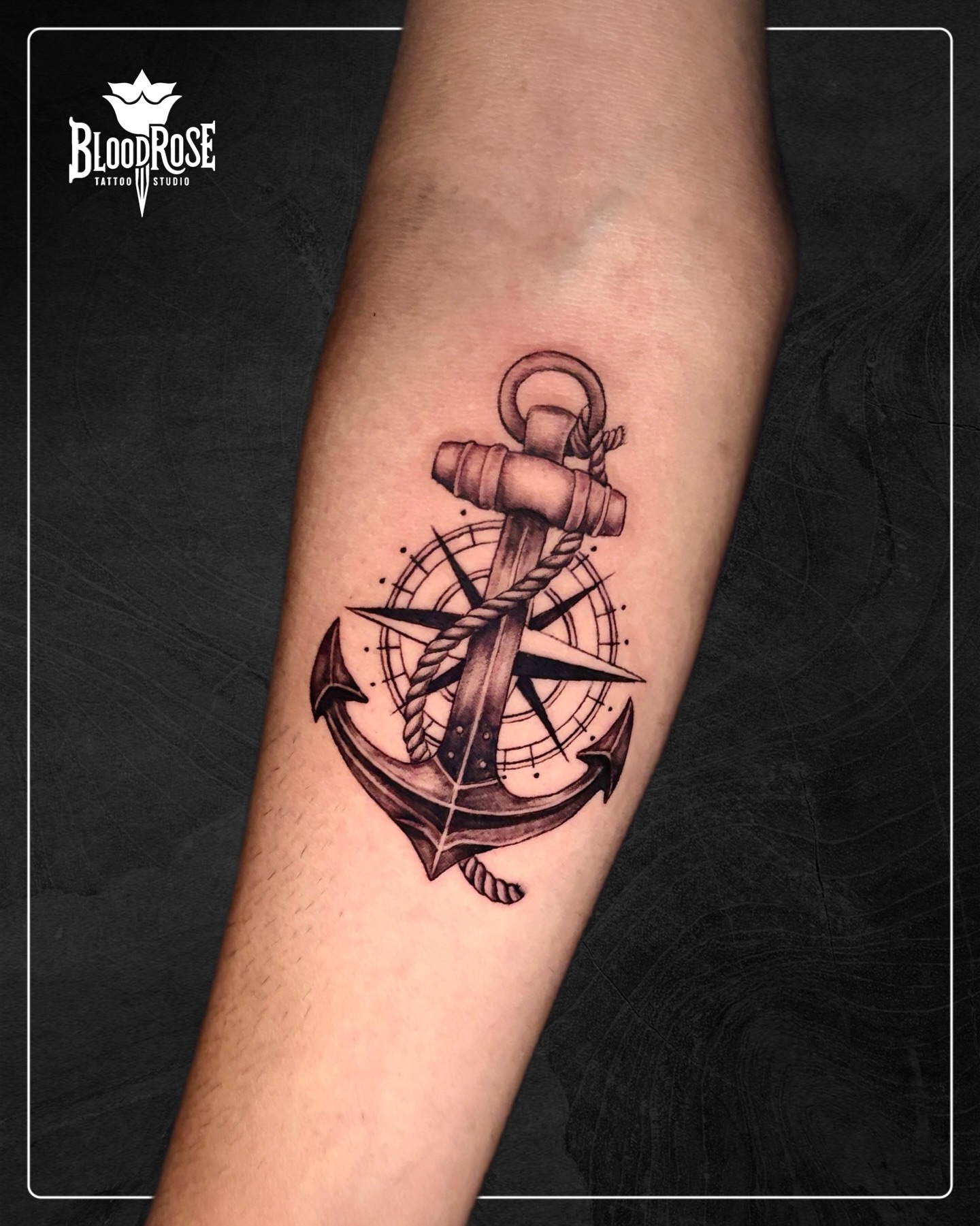
2. Anchor
The anchor is the oldest hope symbol in Western tattooing and it earns its place because the shape is inherently tattoo-friendly.
Thick shank, clear flukes, a rope wrap if you want movement — every element is bold enough to survive decades. This is the design I recommend when someone wants meaning but also wants something that will still read clearly at seventy.
If you want the full symbolic background, we cover it in detail in what an anchor tattoo symbolizes.
Anchors sit well on the outer forearm, the ankle and the ribs. Keep it at least 5 cm tall.
3. Sunrise or Dawn
A half sun over a horizon line is one of the cleanest ways to say the same thing as the word without writing it.
The mistake I see constantly is too many rays packed too close together. When you crowd fine lines that converge on a point, the ink spreads over time and the whole centre goes solid. Ask for fewer rays with more space between them.
Fine line sunrises look beautiful in the studio and can lose definition faster than people expect. A slightly heavier line weight is the safer bet.
4. Butterfly
Butterflies carry transformation, which is why they turn up in so many hope pieces even when the person did not set out to get one.
The design decision that matters is whether the wings are open or angled. Fully open wings read as decorative and symmetrical; angled wings read as mid-flight and feel more like motion, which suits the hope reading better.
Every artist I have asked prefers to do butterflies at a decent size for exactly this reason — the wing detail is the whole design.
5. Bird Taking Flight
A single bird just off a surface, wings still down, is more evocative than a flock of small silhouettes.
Flocks are popular and they are the design most likely to disappoint five years in. Very small birds are essentially three thin strokes, and when those strokes soften the bird turns into a smudge.
If you want birds, get fewer and larger. Three good birds beat eleven tiny ones every single time.
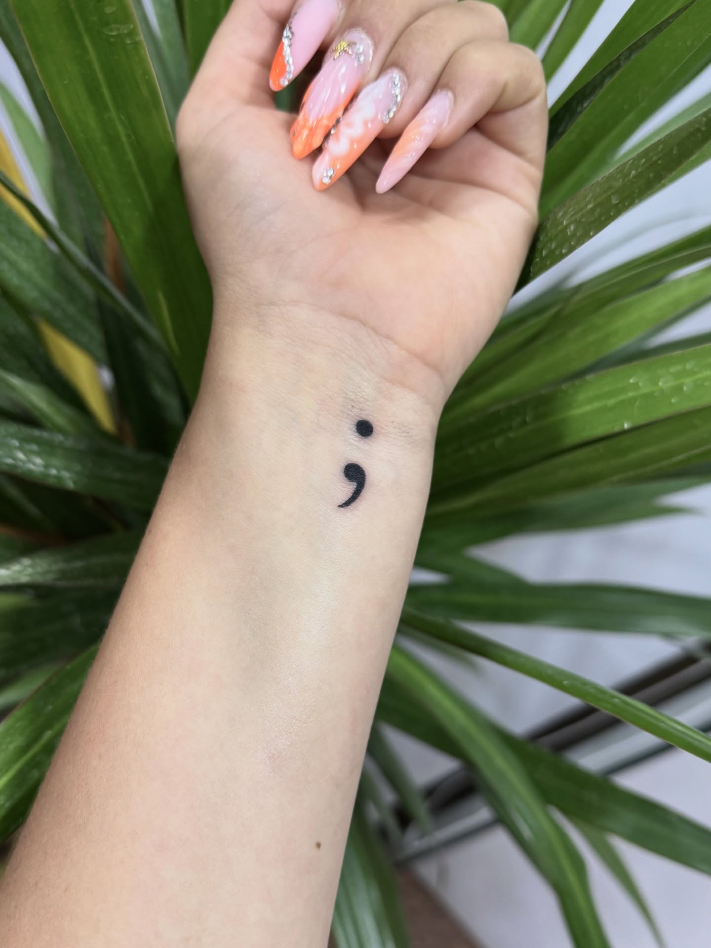
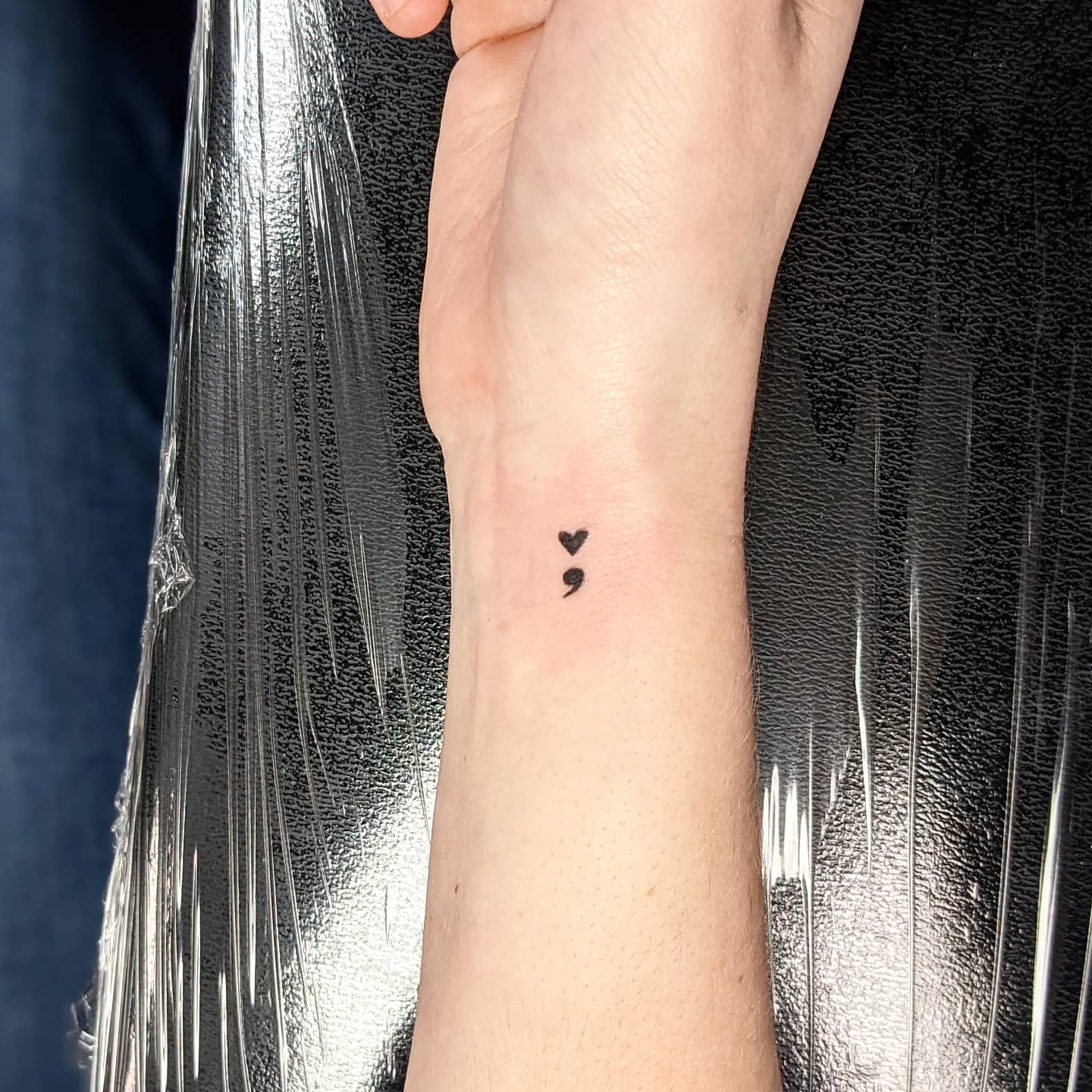
6. Semicolon
The semicolon marks a place where a sentence could have ended and did not. It has been widely adopted as a mental health awareness symbol, largely through the work of Project Semicolon.
It is often combined with something else — worked into a heartbeat line, the stem of a flower, or the tail of a bird — which keeps it personal rather than purely symbolic.
One practical note: at very small sizes the dot and the comma can blur together into a single mark. I would go a little larger than feels necessary.
If this is the direction you are leaning, our roundup of semicolon tattoo ideas has more design variations. And if you are struggling right now, please talk to someone — in the US and Canada the 988 Suicide and Crisis Lifeline is free and available around the clock.
7. Lighthouse
A lighthouse is hope with a job description: it stands in the worst conditions and it keeps working.
This is one of the few hope symbols that genuinely rewards a large piece. The tower gives an artist a vertical structure to build black and grey shading around, and the beam gives them somewhere to put contrast.
When I have seen small lighthouses they mostly read as a generic tower shape. Give it room — upper arm, calf or outer thigh. More variations sit in our lighthouse tattoo ideas collection.
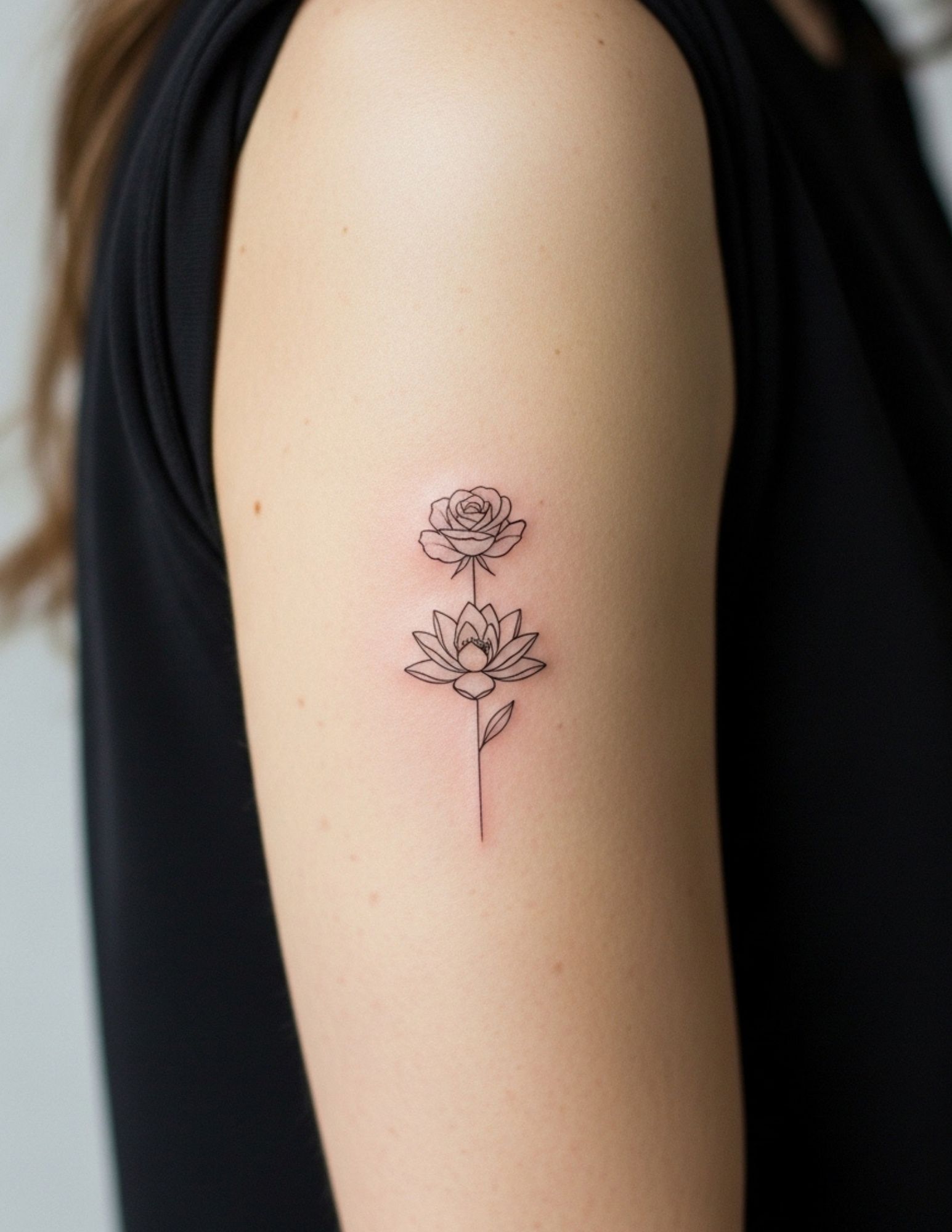
8. Lotus
The lotus grows out of mud and opens clean, which is about as close to a visual definition of hope as a plant gets.
Design-wise, restraint wins. Over-detailed lotus tattoos with dozens of overlapping petal lines tend to blur into a grey mass, while an open geometric or fine line lotus with clear negative space between petals stays readable for decades.
It suits the sternum, the spine and the inner forearm particularly well. Our guide to lotus flower tattoo designs goes deeper on the style options.
9. Small Bird on a Branch
Adding a branch changes the mood completely. A bird in flight is about leaving; a bird perched is about having somewhere to land.
For people whose hope is about stability rather than escape, this is usually the better fit, and it is a design I find myself suggesting more often than the flight version.
The branch also solves a composition problem — it gives the design a horizontal anchor so it does not float awkwardly on the arm.
10. Phoenix Rising
The phoenix is the maximalist option, and it only works at scale.
This is not a wrist tattoo. A phoenix needs feather separation, wing structure and a sense of upward motion, and all three collapse if you shrink it. I would not go below about 15 cm, and most of the good ones I have seen are considerably larger.
Back, outer thigh and upper arm are the placements that give it enough canvas. Our phoenix tattoo gallery shows the range.
11. Rainbow
A rainbow is hope that arrives specifically because the storm happened. That conditional quality is what makes it interesting.
Modern versions are often muted rather than saturated — dusty bands, or a single arc in black with just two or three colours picked out. That reads far less like clip art than a full spectrum.
Worth knowing: coloured ink generally needs touching up sooner than black, and lighter shades fade fastest. Keep it out of daily sun if you can.
12. Arrow Pointing Forward
An arrow has to be pulled back before it goes anywhere, and almost everyone who gets one mentions that.
It is the only symbol on this list that reads unambiguously as direction. A single clean arrow on the forearm, aligned with the length of the limb, is one of the most reliably good small tattoos there is.
Keep the fletching simple. Ornate feather detail on a thin shaft is exactly the kind of fine work that softens with age.
13. Moon and Stars
A crescent moon says that even the dark part of the cycle is temporary.
This one suits people whose difficult period was literally nocturnal — insomnia, night shifts, long stretches of not sleeping. The imagery lands differently when it matches the actual experience.
Small stars scattered around a crescent are common and can look scattered in the bad sense. Ask your artist to weight them deliberately rather than sprinkling them evenly.
14. Wildflower Growing Through Concrete
The concrete is the whole point. Without it you just have a flower.
This is one of my favourite hope designs because the meaning is carried by the least attractive element in the image. A good artist will texture the concrete with stippling or broken linework so it reads as hard surface rather than a vague blob.
It works well vertically — inner forearm, calf, or along the spine.
15. Candle in the Dark
One of the oldest hope images anywhere, and it depends entirely on contrast.
A candle tattooed without heavy dark around it does not read as a candle in darkness — it reads as a candle. If you want this one, you have to commit to solid black or dense shading surrounding the flame, which means a larger piece and a longer session.
Black and grey specialists tend to do these best. Ask to see healed blackwork before you book.
16. Outstretched Hand
A hand reaching upward, or two hands nearly touching, is hope framed as connection rather than survival.
Hands are genuinely difficult to draw. The proportions of fingers and the way knuckles fold are where amateur work falls apart, and a slightly wrong hand looks unsettling in a way a slightly wrong flower does not.
Go to someone with hands in their healed portfolio. This is not the design to give to a promising beginner.
17. Dandelion Blowing Into Birds
Seeds lifting off a dandelion head and turning into birds partway across the skin — heavily requested, and heavily copied.
Because it is so common, the version you find on Pinterest has probably been tattooed several thousand times. Ask your artist to redraw it: change the seed spacing, the bird species, the direction of travel.
It suits long placements — the ribs, the spine, the outside of the calf. See more in our dandelion tattoo ideas.
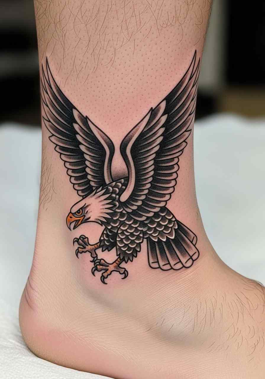
18. Swallow Returning
Sailors traditionally associated swallows with land being near, which makes the swallow a hope symbol about the end of a long journey rather than the start of one.
Traditional American styling suits it — bold outline, limited palette, clean shapes. It is a design that has been tattooed for over a century and still holds up, which tells you something.
The swallow tattoo meaning has more history behind it than most people expect.
19. Green Shoot or Sprout
A single sprout with two leaves is about as understated as a hope tattoo gets, and it is one of the best small options available.
At around 3 cm it still reads clearly, which is rare — most symbols on this list need more room. That makes it a strong choice for a finger, an ankle or behind the ear.
A thin green wash works, but plain black holds better long term. I would go black unless you specifically want the colour.
20. Whatever Actually Got You Through
The best hope tattoo I have seen was a bus route number. The second best was a particular brand of tea.
Neither means anything to a stranger, which is exactly why they worked. A symbol nobody else can decode does not invite questions, and it does not age out of fashion because it was never in fashion.
If something specific carried you, tattoo that thing. The generic symbols on this list exist because most people cannot name theirs — but if you can, use it.
Style and Placement Variations
The same symbol can feel completely different depending on how it is drawn and where it sits.
Fine Line and Single Needle
Delicate, quiet, and the current default for first tattoos. The trade-off is longevity — thin lines spread slightly as they heal and continue to soften over years.
It is a legitimate choice, but go in knowing you may want a touch-up sooner than someone with a bolder piece.
Blackwork and Bold Traditional
Heavy outlines, solid fills, limited detail. Nothing ages better, and anchors, swallows and lighthouses were designed for it in the first place.
If you want the tattoo to look intentional at sixty rather than merely visible, this is the direction.
Watercolour
Soft colour bleeds suit rainbows, sunrises and floral hope designs, and they photograph beautifully.
In my experience they need the most maintenance of any style. Ask your artist honestly how their watercolour work looks after five years, and take the answer seriously.
Micro and Hidden Placements
Behind the ear, inside the finger, along the inner ankle. Good for people who want the reminder without the conversation.
Fingers and hands fade faster than almost anywhere else on the body because of constant use and washing. Expect touch-ups.
Practical Advice Before and After You Get It
Bring reference images of the feeling, not just the design. Telling an artist “I want it to feel like early morning, not like a sunset” gives them more to work with than a saved photo of someone else’s tattoo.
Size up rather than down. Nearly everyone I have spoken to who regrets a placement regrets going too small, and almost nobody regrets going slightly bigger.
For healing, follow the aftercare your artist gives you rather than advice from the internet — they know their ink, their technique and your skin. In general that means keeping it clean, keeping it lightly moisturised, and keeping it out of the sun and out of pools until it has fully closed.
If a healing tattoo becomes increasingly painful, hot, swollen or starts weeping after the first few days, that is not normal healing and you should see a doctor rather than waiting it out. The FDA’s tattoo fact sheet covers the risks worth knowing about, including ink reactions.
And to say it once more clearly: never attempt to tattoo or remove a tattoo yourself. Both carry real infection and scarring risk, and both belong with professionals.
Common Mistakes, and What to Do If You Are Still Not Sure
The most common mistake is rushing. Hope tattoos are often booked at an emotional high point, and the design chosen in that week is not always the one that fits a year later.
The second is copying an exact design from social media. Beyond the etiquette problem, a copied tattoo is drawn for someone else’s body and rarely sits well on yours.
The third is picking a symbol because it photographs well. You will see this tattoo in a mirror thousands of times and photograph it perhaps twice.
If nothing here has landed yet, sit with it. Our roundup of small meaningful tattoos covers quieter options, and if your hope is tangled up with a loss, grief tattoo ideas may be closer to what you actually want.
There is no deadline on this. The design that is right in six months will still be right in six months.
Frequently Asked Questions
What is the most popular hope tattoo?
The word “hope” in script and the semicolon are the two I see requested most often, for different reasons. Script is chosen by people who want the meaning to be unmistakable, while the semicolon is usually chosen by people who want it recognised only by those who already understand it. Anchors and single birds sit close behind. Popularity is not a reason to pick one, though — a common symbol that fits you beats a rare one that does not.
How small can a hope tattoo be?
It depends entirely on the symbol. A green shoot, a semicolon or a simple arrow can work at around 2 to 3 cm and still read clearly years later. Script generally needs about 4 cm to keep its inner letter spaces open, and anything with layered detail — a phoenix, a lighthouse, a detailed lotus — needs considerably more. If your artist suggests going bigger than you planned, that advice is usually worth taking.
Do hope tattoos hurt more in certain places?
Yes, and the pattern is fairly consistent. Ribs, sternum, spine, ankles, fingers and anywhere directly over bone tend to be sharper, while the outer forearm, outer thigh and upper arm are generally more manageable. Most people find the discomfort tolerable for the short sessions these designs usually need. If pain is a real concern, tell your artist before you start rather than partway through.
Should I get a hope tattoo in colour or black ink?
Black holds its definition longer and needs less maintenance, which is why most of the designs here are shown in black or black and grey. Colour makes sense when it is doing actual work — a rainbow, or a specific flower whose colour carries the meaning. If you go with colour, expect to want a touch-up sooner and keep it protected from sun exposure.
Can I add to a hope tattoo later?
Often, yes, and it is worth planning for. Tell your artist at the design stage if you might extend the piece, because they can leave space and orient the composition so additions do not look bolted on. Symbols like sprouts, birds and script lines extend particularly well. A tightly framed circular design is the hardest to build onto later.
Quick Summary
- Pick the symbol first and the style second — meaning outlasts trends.
- Design around the outcome, not the wound; the forward half of the image should carry the weight.
- Bold shapes such as anchors, swallows and lighthouses age best over decades.
- Fine line and watercolour work look beautiful early and need touch-ups sooner.
- Size up rather than down — too small is the most common regret.
- Ask to see healed work from your artist, never just fresh photos.
- A personal symbol nobody else recognises usually beats a generic one.
- Follow your artist’s aftercare, and see a doctor if healing looks wrong.