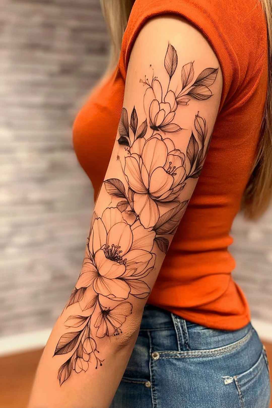
I have spent years looking at tattoo portfolios, and the pieces that still stop me are almost never the biggest ones. A classy women’s tattoo is not defined by size, subject or how much skin it covers – it is defined by restraint, clean execution and a placement that flatters the body it sits on.
The women I have talked to who love their ink a decade later almost all say the same thing: they chose the artist first and the design second.
That is the honest shortcut. A mediocre idea in the hands of a specialist ages far better than a beautiful reference photo tattooed by someone who does not work in that style.
This guide walks through the styles that hold up, where they sit best, what they realistically cost in time and healing, and the mistakes I see most often. If you are still narrowing down a style, the fine line tattoo guide is a useful companion read.
Which Classy Tattoo Style Is Right for You?
Style choice drives almost everything else – the cost, the healing, and how the piece looks in ten years. Here is how the main options compare.
| Style | Best For | How It Ages | Typical Session |
|---|---|---|---|
| Fine line | Small, discreet, first tattoos | Softens and spreads slightly; may need a touch-up | 1–2 hours |
| Black and grey | Florals, portraits, larger pieces | Excellent – the most forgiving option long term | 3–6 hours |
| Watercolor | Soft, painterly, colorful designs | Fades fastest, especially pale tones without linework | 2–4 hours |
| Script / lettering | Names, dates, short quotes | Good if line weight and spacing are generous | 30 min–2 hours |
| Minimalist symbolic | Very small, meaningful pieces | Good, though tiny detail can blur together | 30–90 minutes |
| Ornamental / jewelry | Wrists, ankles, sternum, upper arm | Very good – repeating patterns hide small changes | 2–5 hours |
What Actually Makes a Tattoo Look Classy
Ask ten artists and you will get ten answers, but the same four ideas keep surfacing in every conversation I have had.
The first is negative space. A design that lets skin breathe reads as deliberate; a design crammed edge to edge reads as busy, no matter how good the linework is.
The second is line weight consistency. Uneven lines are the single biggest reason a design that looked elegant on paper looks cheap on skin.
The third is placement that follows anatomy. A piece that curves with the forearm or wraps the shoulder will always sit better than one dropped onto the body like a sticker.
The fourth is simply time. Elegant tattoos are rarely rushed, and in my experience the pieces people regret are almost always the ones booked within a week of the idea arriving.
Classy Tattoo Styles That Age Well
1. Fine Line and Single Needle
Fine line work uses very thin needle groupings to produce delicate, drawing-like results. It is the style most people picture when they say minimalist tattoo.
The appeal is obvious – it is subtle, quick to sit through, and easy to place somewhere a sleeve covers.
The honest trade-off is longevity. Very thin lines sit shallower in the skin and tend to soften over the years, so most fine line pieces need a touch-up at some point. Every artist I have asked about this said the same thing without hesitation.
If you want fine line work that lasts, ask the artist to slightly increase line weight and avoid detail smaller than a grain of rice.
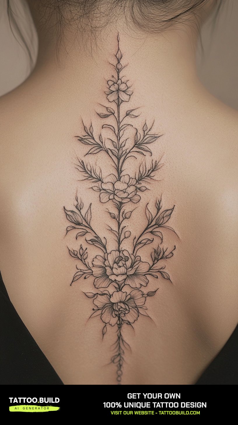
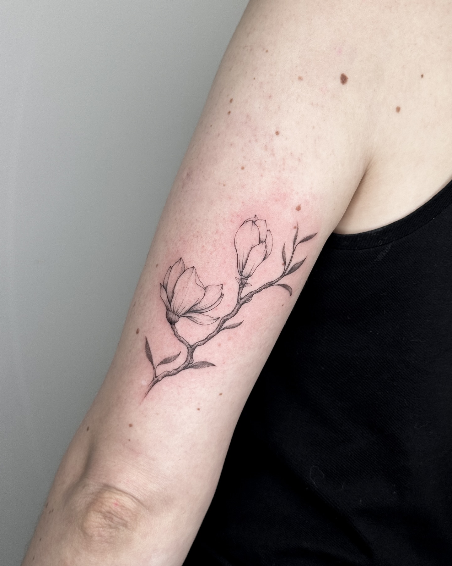
2. Botanical and Floral Designs
Florals are the most requested category in almost every studio I have visited, and for good reason – they are endlessly personal without needing explanation.
Birth flowers, single stems, pressed-flower styles and full vines all sit comfortably under the classy umbrella.
The version that ages best is a botanical piece with real shading rather than outline alone, because shadow gives the design structure as the lines soften.
In my experience, a single well-drawn stem on the forearm looks more expensive than three small scattered flowers in the same space.
3. Watercolor and Soft Color
Watercolor tattoos mimic paint bleeding into paper, with soft gradients and no hard borders.
They photograph beautifully, and in the first year they are stunning.
They are also the style I would be most cautious about recommending without a conversation. Pale, unlined color fades faster than black, and pigments respond differently to sun exposure and skin tone.
The fix most experienced artists use is a subtle black or dark tonal anchor underneath the color, which keeps the shape readable even after the brightest tones soften.
4. Script, Quotes and Lettering
Words carry weight, and a well-set quote tattoo can be the most personal piece someone owns.
The difference between an elegant script tattoo and an awkward one is almost entirely typographic: letter spacing, x-height and the size of the flourishes.
Ask for a printed stencil at full size and look at it on your skin in a mirror before the needle touches you. Every good artist expects this request.
Short is safer than long. A single word or date holds up far better than a paragraph, which will thicken and close up over time.
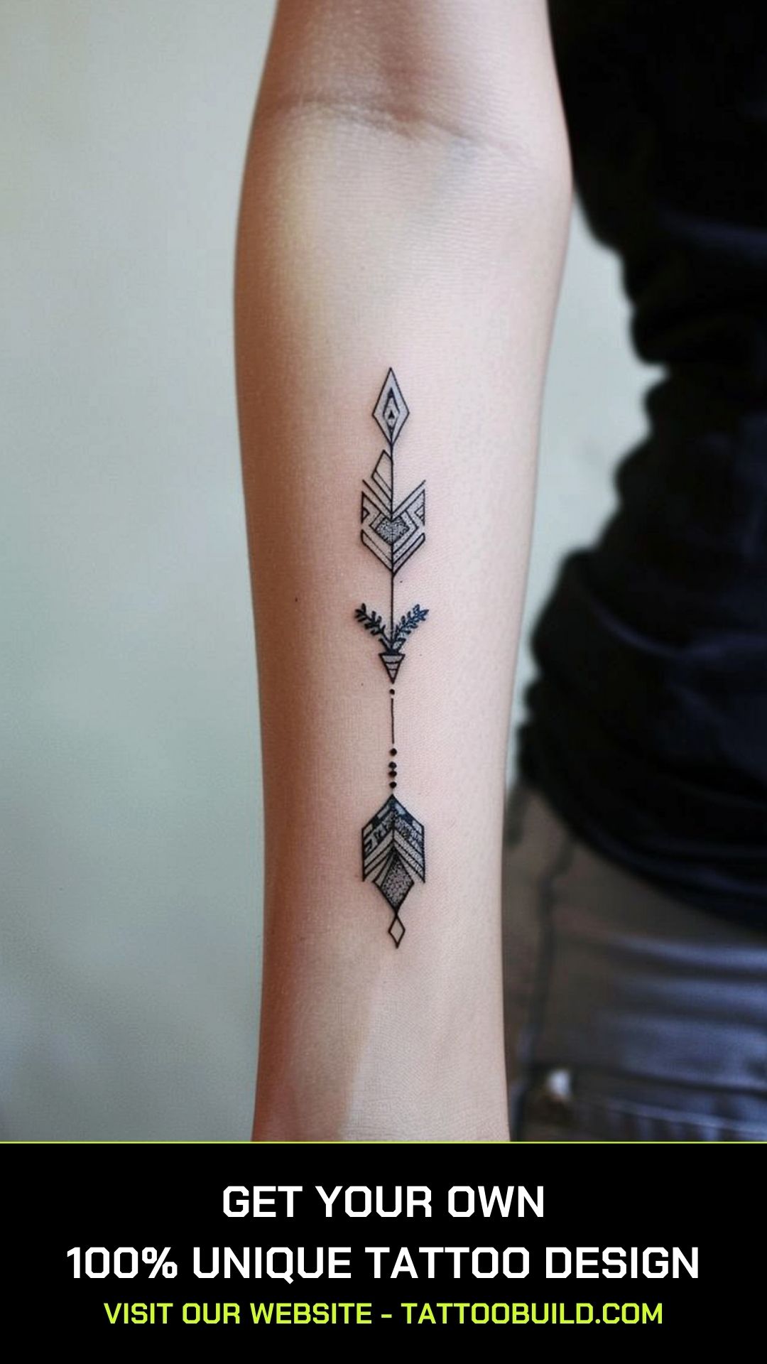
5. Minimalist Symbolic Tattoos
A small crown, an arrow, a mountain outline, a moon phase – symbolic pieces carry meaning in very little skin.
They are usually quick, usually affordable, and easy to place discreetly on the wrist, ankle or behind the ear.
The limitation is detail. Anything smaller than roughly a nickel with internal shading will tend to blur into a solid shape over the years.
When I have asked artists how they handle this, the standard advice is to size up by about twenty percent from whatever feels right on paper.
6. Ornamental and Jewelry-Style Work
Ornamental tattooing borrows from filigree, lace and metalwork rather than illustration – think chandelier shapes, beaded chains and repeating patterns.
It sits especially well on the wrist, sternum, ankle and upper arm, where it echoes jewelry that is already there.
This is quietly one of the best-ageing styles, because repeating geometry disguises the small distortions that all tattoos develop.
It also scales gracefully – you can start with a single band and extend it later without the design looking patched together.
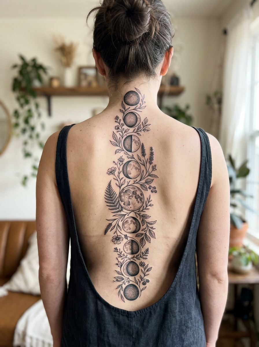
7. Black and Grey Shading
If you asked me to bet on one style still looking good in twenty years, it would be soft black and grey.
Grey wash uses diluted black ink to build tone, which means the piece relies on contrast rather than color pigments that fade at different rates.
It suits florals, portraits, animals and larger arm pieces equally well.
The trade-off is time. Proper shading takes longer in the chair and usually costs more, but it is the closest thing to a safe long-term choice.
Placement: Where Classy Tattoos Sit Best
Placement changes how a tattoo is read far more than most people expect. The same design can look editorial on the forearm and awkward on the calf.
Easy to Conceal
Upper back, ribs, upper arm, hip and inner thigh all disappear under normal clothing.
These are the placements I recommend to anyone in a conservative industry who is not certain how their workplace will react.
Visible but Understated
The inner forearm, collarbone, wrist and back of the neck are visible without being confrontational.
They also tend to be flatter surfaces, which means less distortion as the design settles.
Hands, fingers, feet and necks are the placements artists most often try to talk clients out of – they rub, they fade faster, and they are the hardest to fix.
Comfort and Pain
Pain varies enormously between people, so treat any pain chart as a rough guide rather than a promise.
Broadly, fleshy areas with more padding are easier than skin directly over bone. Our guide to the most painful tattoo spots breaks this down properly.
Practical Tips Before and After You Book
Book a consultation rather than an appointment first. A fifteen-minute conversation tells you more about an artist than an hour of scrolling their feed.
Look for healed photographs in their portfolio, not just fresh ones. Fresh tattoos all look sharp; healed work is the real test of technique.
For aftercare, follow the instructions your artist gives you over anything you read online, including this article. The American Academy of Dermatology publishes clear, non-commercial guidance on caring for tattooed skin that is worth reading alongside it, and our own tattoo aftercare guide covers the day-by-day routine.
Long term, sunscreen does more to preserve a tattoo than any specialist balm. Ultraviolet exposure is the main reason ink looks dull years later.
Common Mistakes – and What to Do Instead
The most common one is going too small. Tiny tattoos are charming for a few years, then the internal detail closes up.
The second is matching a style to a picture rather than to an artist. If you love watercolor, book someone whose portfolio is full of healed watercolor work – not a generalist who is willing to try.
The third is ignoring skin reactions. Redness for a few days is normal; a rash, raised bumps, persistent itching or swelling weeks later is not. The AAD’s page on unexpected tattoo skin reactions is a good reference, and anything that looks infected or does not settle should be seen by a doctor rather than managed at home.
Please do not attempt DIY tattooing or home removal. Both carry real infection and scarring risk, and professional laser removal is slow and expensive even when it goes well.
Finally, do not let age talk you out of it. Some of the most elegant work I have seen was a first tattoo taken in someone’s sixties – there is a whole guide to tattoo ideas for older women if that is you.
Frequently Asked Questions
Are fine line tattoos a bad idea?
No, but they are a commitment to maintenance rather than a permanent solution. Thin lines sit shallower and soften over the years, so a touch-up somewhere between five and ten years in is common. If you want something closer to fit-and-forget, slightly heavier linework or black and grey shading is the safer choice. Talk it through with your artist before booking – most will tell you honestly.
What is the classiest tattoo placement for a professional job?
Upper back, ribs, upper arm and inner thigh all sit under standard workwear without any effort. The inner forearm and collarbone are visible but generally read as understated in most offices. Workplace attitudes vary widely by industry and country, so it is worth knowing your own environment rather than assuming. If you are unsure, choose somewhere a sleeve covers.
How much does a classy women’s tattoo cost?
Prices depend on the artist’s experience, your city and how long the piece takes, so any figure here would be a guess. Most studios work to a minimum charge for small pieces and an hourly rate for larger work. The most useful thing you can do is email two or three artists with a reference image, a size in inches and a placement, and compare their quotes. Paying more for the right specialist is usually cheaper than paying twice.
Does color or black and grey last longer?
Black and grey generally holds up better, because grey wash is diluted black rather than several pigments fading at different rates. Pale colors, particularly white, yellow and soft pastels, tend to soften fastest. Color can absolutely last well with the right artist and diligent sun protection. If longevity is your priority above all else, black and grey is the lower-risk option.
How long does a tattoo take to heal?
The surface usually looks settled in about two to three weeks, while the deeper layers of skin typically continue healing for a couple of months. During that time you should keep it clean, avoid soaking it, and leave the peeling skin alone. Healing speed varies with placement, size and your own health. If you see spreading redness, heat, pus or a fever, contact a doctor rather than waiting it out.
Quick Summary
- Classy comes from restraint, clean line work and good placement – not from a particular subject.
- Choose the artist before the design, and judge them on healed photographs.
- Black and grey shading is the most forgiving style over decades; watercolor is the least.
- Fine line work is beautiful but expect a touch-up at some point.
- Size up slightly from whatever feels right on paper – tiny detail closes up as it heals.
- Placement that follows the shape of the limb always looks more considered.
- Follow your artist’s aftercare instructions, and use sunscreen once healed.
- See a doctor for anything that looks infected or does not settle within a few weeks.
For further reading from a non-commercial medical source, the AAD tattoos and piercings hub is a sensible place to start.