The back of the arm is one of those placements that quietly does everything you want a tattoo to do. It gives you a long, naturally flattering canvas that you can show off in a tank top and cover completely with a t-shirt sleeve or a blazer.
I have watched this spot go from an occasional request to one of the most consistently booked placements for women in the studios I visit, and the reason is practical rather than trendy.
The skin here stays relatively flat, it does not crease the way an elbow or inner wrist does, and it sits far enough from the shoulder joint that fine linework tends to hold its shape for years. If you like the idea but are still weighing placements, it is worth comparing it against the other classy arm tattoo options for women before you commit.
Below are the design directions I keep coming back to, along with the honest trade-offs for each one, real sizing guidance, and what to expect from the healing process.
Which Back of the Arm Style Is Right for You?
Every style behaves differently on this placement. Here is how the most common directions compare in my experience, using typical studio sizing rather than promises.
| Style | Typical Size & Session | How It Usually Ages | Best For |
|---|---|---|---|
| Fine line floral | 4–8 inches, 2–4 hours | Softens gradually; may need a touch-up after several years | Delicate, feminine designs that follow the arm’s length |
| Script or quote | 3–7 inches, 1–2 hours | Thin strokes can thicken slightly; larger lettering holds best | Something personal you want readable up close, not across a room |
| Black and grey illustrative | 5–9 inches, 3–6 hours | Very well; shading gives the design structure over time | Wings, moons, animals and anything with depth |
| Minimalist linework | 2–4 inches, under 1 hour | Simple shapes stay crisp; tiny detail blurs first | A first tattoo or a small addition to existing work |
| Colour work | 4–8 inches, 3–5 hours | Depends heavily on sun exposure; needs consistent SPF | Florals and botanicals where colour carries the design |
Sizes and session lengths above are the ranges I see quoted most often. Your artist may differ, and a consultation is always the honest answer.
Why the Back of the Arm Works So Well
The first thing to understand is that this placement is really three slightly different areas: the tricep, the outer edge just behind the bicep, and the strip that runs down toward the elbow.
The tricep has the most forgiving skin. There is a reasonable layer of tissue underneath, the surface stays flat, and needle work there tends to be steadier than it is over bone.
That matters for pain as much as for line quality. Every artist I have asked puts the back of the upper arm in the lower half of the pain scale, generally kinder than the ribs, spine or the inside of the elbow.
Visibility is the other advantage. You can see the design in a mirror when you want to, but it is not in your own eyeline all day, which is why people who are nervous about tattoo regret often start here.
The one honest limitation is that the area narrows as it approaches the elbow. Designs that ignore that taper end up looking cramped at the bottom, so the shape of the arm should drive the shape of the design.
Women’s Back of the Arm Tattoo Ideas Worth Considering
These are the eight directions I recommend most often, roughly in order of how frequently I see them requested.
1. Floral Vine
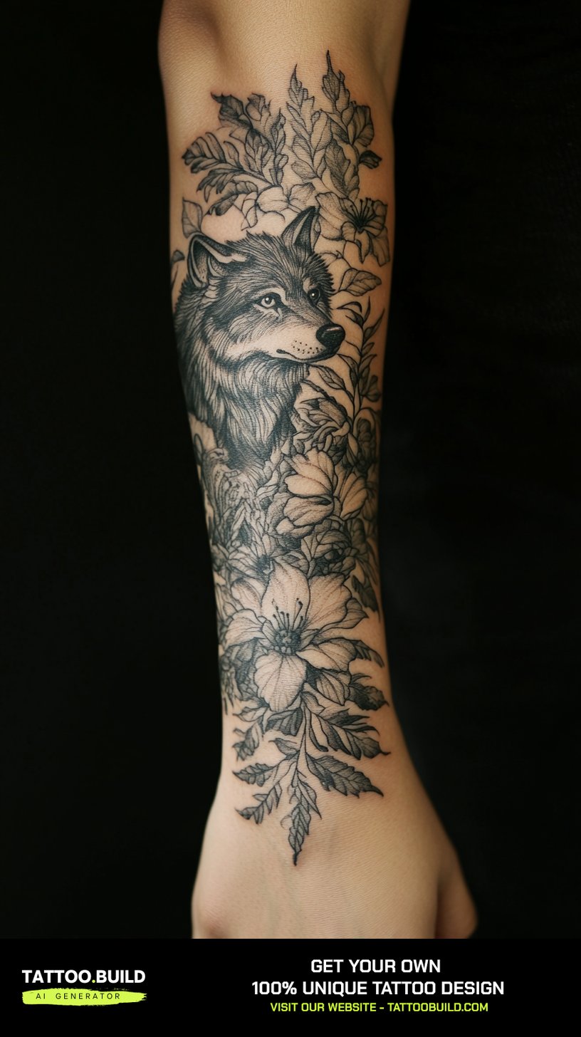
A vine of flowers trailing down the back of the arm is the design that suits this placement best, and it is not close.
The reason is structural: a vine is naturally vertical and naturally tapering, so it follows the arm instead of fighting it.
When I have watched artists lay these out, they almost always stencil the largest bloom near the top of the tricep and let the buds and leaves get smaller toward the elbow. That single decision is what makes the design look like it belongs on a body rather than on a flat page.
Choose flowers that mean something to you — birth month blooms, a grandmother’s garden, whatever the story is. A personal flower choice is what separates a vine tattoo from wallpaper. If you like this direction, the wider gallery of vine arm tattoo designs is a good place to gather references before your consultation.
2. Quote or Script
Script down the back of the arm is quietly one of the most requested designs, and also the one people most often get wrong.
The mistake is scale. A long quote in tiny lettering looks elegant on the stencil and turns into a grey smudge within a decade, because thin strokes spread as ink settles into the skin.
In my experience the sweet spot is a short phrase — three to six words — in lettering large enough that the individual strokes have visible space between them.
Ask your artist to print the stencil at final size and hold it against your arm before anything else happens. Reading it in a mirror at arm’s length tells you more than any screen preview will.
3. Wing
A single feathered wing running down the back of the arm is a design that genuinely benefits from this placement.
Feathers need length to look convincing, and the tricep gives you a straight run of skin that almost nowhere else on the arm offers.
Black and grey is the standard here for a good reason: the shading between feathers is what creates the illusion of depth, and that shading survives ageing better than fine outlines alone.
Wings carry weight for a lot of people — memorial pieces, especially. If that is your reason, tell your artist. It changes how they handle the composition. There is more range in the full wing tattoo ideas collection.
4. Moon Phases
Moon phases are the most reliable minimalist choice for this spot.
The design is a repeating sequence, which means it naturally forms a vertical line — exactly the shape the back of the arm wants.
Most versions I see use somewhere between five and eight phases, spaced evenly, with the full moon carrying the heaviest shading. Even spacing matters more than the individual moons here, because the eye notices an uneven gap immediately.
Dotwork shading gives a softer, more textured result than solid black. It usually takes longer in the chair, so factor that in.
5. Compass
A compass is a heavier, more graphic choice, and it suits people who want something with visual weight rather than delicacy.
The challenge is that a compass is a circle, and a circle on a curved surface has to be stencilled carefully or it distorts when the arm moves.
Good artists solve this by placing it on the flattest part of the tricep and keeping the outer ring slightly imperfect — a perfectly geometric circle is the thing that looks wrong once it is on skin.
Compasses usually pair well with maps, waves or mountains if you want to build outward later. The compass forearm tattoo designs are a useful reference even if your placement differs.
6. Wave
Waves have grown steadily as a back of the arm request, and they solve a problem the other designs do not.
A wave is asymmetric by nature, so it can start wide at the shoulder and curl into a narrow point near the elbow without looking unfinished.
Japanese-inspired waves use bold outlines and repeating curl patterns, and they age exceptionally well because the linework is deliberately heavy.
The minimalist single-line version is the opposite trade: beautiful when fresh, and more likely to need a touch-up down the road.
7. Dragonfly
Dragonflies are an underrated fit for this placement, and I say that as someone who did not expect to like them here.
The body of a dragonfly is already a vertical line, and the wings spread horizontally — which fills the width of the tricep without needing to wrap around the arm.
The wings are where the skill shows. Real dragonfly wings have a visible vein structure, and an artist who renders that properly produces something that reads as delicate rather than cartoonish.
They also carry meaning around change and transformation for many people, which is part of why they show up on memorial and milestone pieces. See more in the dragonfly tattoo gallery.
8. Minimalist Mountain Range
A mountain range is the design I recommend most often to people getting their first tattoo.
It is simple enough to be a short session, meaningful enough to justify permanence, and forgiving enough that a competent artist will not struggle with it.
The horizontal orientation is the one thing to think through. A range sits across the arm rather than down it, so it usually works best positioned high on the tricep where the arm is widest.
Adding pine trees, a sun or a thin horizon line gives it more depth without adding much time in the chair. The mountain and tree tattoo designs show how far that combination can go.
More Back of the Arm Variations to Consider
If none of the eight above are quite right, these variations come up constantly in consultations and are worth knowing about.
Botanical Sprigs and Single Stems
A single stem — lavender, olive branch, wheat — is the quietest version of the floral idea.
It takes under an hour in most cases and leaves room to add more later, which is why I suggest it to anyone unsure about scale. There is more range in the women’s floral upper arm tattoo ideas if you want to see the fuller versions first.
Symbols and Small Meaningful Marks
Small symbols — a semicolon, a birth date, a constellation, a tiny anchor — sit well on the back of the arm precisely because they are easy to miss.
The rule I would give is to keep any single element at least an inch across. Below that, detail closes up as the tattoo heals and settles.
Animals and Insects in Fine Line
Butterflies, moths, bees, birds and snakes all appear regularly on this placement.
Moths in particular have become a common request, and they suit the tricep well because their wing shape is wider than it is tall.
Ornamental and Decorative Patterns
Ornamental work — mandala fragments, filigree, lace-inspired patterning — is the direction to look at if you want the arm to feel decorated rather than illustrated.
It is also the most forgiving style for anyone whose skin has stretch marks or scarring, because pattern hides irregularity in a way that a clean illustration cannot.
Aftercare and Practical Advice for a Back of the Arm Tattoo
The back of the arm is easier to heal than most placements, with one specific catch: you cannot see it properly, so problems get noticed late.
Ask someone you trust to look at it for you at day three and day seven, or use two mirrors. Redness that is spreading outward, warmth, or any discharge after the first day or two is a reason to contact your artist and, if it is not settling, a doctor. That is not something to wait out.
For normal healing, the general guidance from the American Academy of Dermatology is to follow your artist’s instructions, keep the area clean, moisturise it, and protect it from the sun. The surface usually looks settled in a couple of weeks, though the deeper layers take longer.
The practical detail nobody mentions: sleeping. If you sleep on your side, you will roll onto a fresh tricep tattoo. A pillow tucked behind your back for the first few nights genuinely helps, and I have had people tell me it was the single most useful thing they were told.
Longer term, sunscreen is what preserves the work. This placement catches direct sun every time you wear a t-shirt, and faded colour is the most common reason people book a touch-up. The FDA’s tattoo safety guidance is worth reading before your appointment, particularly on ink reactions.
Common Mistakes — and What to Do If You’re Still Not Sure
The most common mistake I see is choosing a design based on how it looks in a photo rather than how it fits an arm.
Reference photos are taken at flattering angles on people whose arms may be shaped differently from yours. Always ask for a stencil placement before the needle comes out, and be willing to say it needs moving.
The second mistake is going too small out of caution. A tattoo that is too small for its detail level does not stay understated — it becomes illegible, which is a different problem entirely.
The third is not researching the artist’s style. Someone brilliant at bold traditional work is not automatically the right choice for delicate fine line florals, and vice versa.
If the placement itself is what you are unsure about, it is worth looking at women’s inner arm tattoos for something more private, or the broader forearm tattoo ideas for females if you want the design where you can see it yourself.
And if you have sensitive skin or a history of reactions to metals or pigments, raise it with your artist first. The AAD documents a number of skin reactions that can follow tattooing, and a patch test conversation is a reasonable thing to ask for.
Frequently Asked Questions
Does a tattoo on the back of the arm hurt?
Most people find it one of the more comfortable placements. The tricep has a reasonable layer of muscle and tissue underneath and very little bone close to the surface, which is what usually makes an area painful. Discomfort tends to increase as the design moves down toward the elbow, where the skin thins. Pain is individual, though, so treat this as a general pattern rather than a guarantee.
How long does a back of the arm tattoo take to heal?
The outer surface generally looks settled within two to three weeks, while the deeper layers of skin continue healing for a few months. Peeling and itching in the first two weeks is normal. What is not normal is spreading redness, warmth, swelling that increases after the first days, or any discharge — contact your artist and see a doctor if those appear. Follow the aftercare instructions your artist gives you, since they know exactly what was used on your skin.
Can I cover a back of the arm tattoo for work?
Yes, and that is one of the main reasons this placement is chosen. Almost any t-shirt sleeve covers the upper portion completely, and a standard shirt or blazer covers the whole area. If full coverage matters for your job, tell your artist before the stencil goes on so they can keep the design above your usual sleeve line.
What size should a back of the arm tattoo be?
It depends entirely on the detail level. Simple designs like a small mountain range or a short word work at two to four inches. Anything with fine interior detail — a compass face, dragonfly wings, layered florals — usually needs at least four to six inches to stay legible over time. If you are torn, going slightly larger is almost always the safer choice.
Will fine line work on the back of the arm fade quickly?
Fine line tattoos generally soften more noticeably than bold work, because thin strokes have less ink to lose before they change appearance. That said, the back of the arm is one of the better placements for fine line work, since the skin does not crease or rub the way it does on hands, feet or the inner elbow. Sun exposure is the biggest factor you can actually control. Expect to consider a touch-up at some point rather than assuming you will never need one.
Quick Summary
- The back of the arm gives you a long, flat canvas that is easy to show and easy to cover.
- Vertical designs — vines, moon phases, script, waves — suit the shape better than horizontal ones, with mountain ranges the useful exception.
- It sits in the lower half of most pain scales, though it gets more sensitive closer to the elbow.
- Bold and black-and-grey work ages better here than very fine linework, but fine line still holds up well on this placement.
- Keep individual design elements at least an inch across so detail does not close up as the tattoo settles.
- Ask for a stencil placement check before any needle work, and be prepared to move it.
- You cannot see this area properly, so have someone check the healing at day three and day seven.
- Sunscreen is the single best thing you can do to keep the work looking sharp long term.